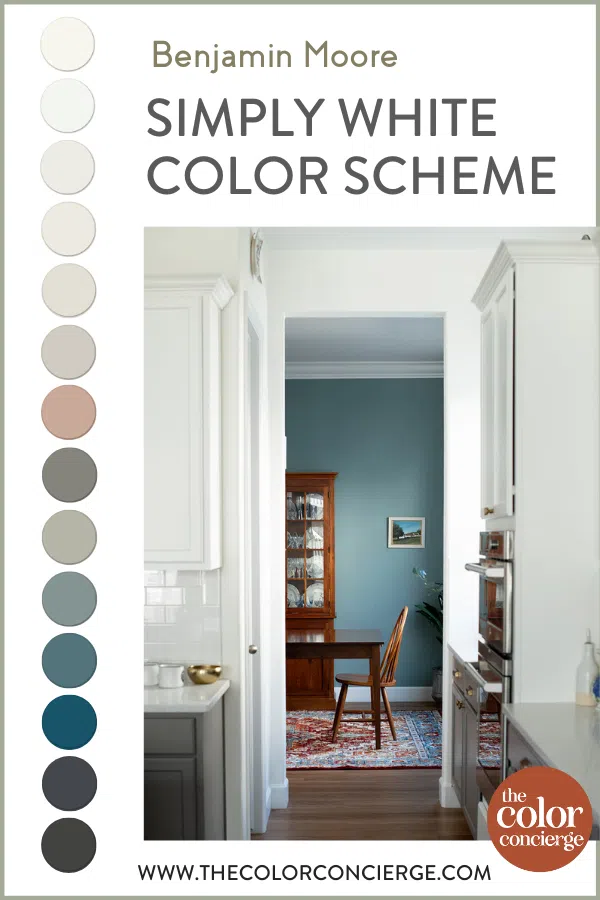
Explore my home’s Benjamin Moore Simply White color scheme and use it to inspire your own home’s paint colors.
Benjamin Moore Simply White (Color review article) is a truly iconic warm white paint color. It’s long been one of my favorite Benjamin Moore whites for everything from open-concept living spaces to kitchen cabinets.
Our pre-made Simply White color scheme has become one of the most popular palettes in my online shop. And I love BM Simply White so much that I made it the foundation of my own home’s timeless whole-house color palette.
When we bought our new-build home in 2019, the entire home was painted with Sherwin-Williams Agreeable Gray. While Agreeable Gray is a lovely and very popular greige, it wasn’t right for the open-concept spaces in my home, some of which have low light.
We kept Agreeable Gray in some rooms, but made BM Simply White our foundation neutral instead and it really brightened up our whole home!
About The Color Concierge
Our Colorado-based paint color consultants make finding the right paint colors for your home easy. Whether you’re painting the exterior or interior of your home, our simple yet effective process lets us get your paint color right the first time. We’ve helped thousands of homeowners transform their homes into a space they love. Learn more about ONLINE COLOR CONSULTATIONS today.
If you’re looking for a timeless, neutral palette with pops of color for your home, keep reading for a full breakdown of my timeless Benjamin Moore Simply White color scheme.
*This post contains affiliate links for products I use and love. If you click on some links and make a purchase, I will get a small commission at no cost to you. This helps pay for the costs of the blog, so I can continue to offer great content to our readers.
How do you pick a whole-house palette for your home?
Before we get into the specific colors I used throughout my home, let’s talk a little bit about how to build a whole-house color scheme.
Our full design guidelines for whole-house color schemes are detailed in the post How to Create a Whole House Color Palette (With Real-Life Examples) (Article), and Why A Whole-House Color Scheme Matters (Article).
But here’s a quick recap:
- Start with a foundation neutral: I usually start by focusing on the kitchen (truly the heart of the home!) and any open-concept spaces. Look for a color that is light, neutral, and works well in many different kinds of lighting. BM Simply White is perfect for that!
- Choose a trim & ceiling color: Unless you’re starting from scratch with a new home or completely renovating from top to bottom, you’re probably going to end up working with the trim color you already have. If you do get to choose a new one, look for one that works well with the other colors in your palette, and your hard finishes such as tile and countertops. Creamier and earthier finishes call for creamier trim and ceiling colors, and crisper brighter finishes need cleaner whites.
- Pick colors for secondary living spaces: Find the perfect hues for your dining room, offices, bathrooms, and bedrooms. These are great places to include more colorful neutrals and even some pops of bold color.
- Choose accent colors: Pay attention to all of the wall colors in your color scheme and your finishes and decor before choosing paint colors for accent walls and rooms.
While I typically recommend choosing between 4-8 colors for a whole-house palette, it’s possible to use more. In my home’s color scheme that I’m sharing today, for example, there are a lot of different paint colors incorporated. But because they’re all different shades of similar colors, they look completely harmonious together.
Don’t forget to sample your paint colors
We always recommend that you test paint colors on your home because lighting can change a color completely, both with interiors as well as exteriors.
In the old days, this meant we painted a large poster board with sample pots and a huge mess.
Now we have a better way to test paint, with Samplize Peel-and-Stick samples!
- Samples pre-painted with 2 coats of real paint from the manufacturer.
- Large 9” x 14” samples to see the color better in the lighting.
- Delivered overnight
- Colors are accurate
- Less expensive than painting a large poster board with sample pots
- No mess, and no toxic paint to dispose of
I use these in my own color consulting practice for exact results. Discover Samplize peel-and-stick paint samples:
Buy 8 samples and get 2 free – no coupon code required. Order today and get samples tomorrow!
Project Spotlight: Benjamin Moore Simply White Color Scheme
Ever since moving in 2019, my Colorado new build has essentially acted as a color lab for The Color Concierge. Whenever I want to test out a new paint color, I find a place in my house to use it. I’ve painted my dining room a few different paint colors since moving in.
This is a big house, with room for our whole blended family of five young adults as well as my parents. Even though most of our kids are out of the house, they still come back, and we have always wanted to have enough room for everyone to stay during the holidays. The home has six bedrooms and bathrooms, as well as a fully finished basement.
The one color that has stayed the longest, however, is Benjamin Moore Simply White. This gorgeous white paint color is the foundation for our palette and looks beautiful throughout many different spaces in our home. My family won’t let me change it because they love it so much.
Keep reading to explore all the paint colors used in this Simply White color scheme.
Main Floor Paint Colors
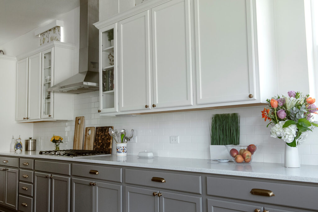
BM Simply White for Open-Concept Spaces
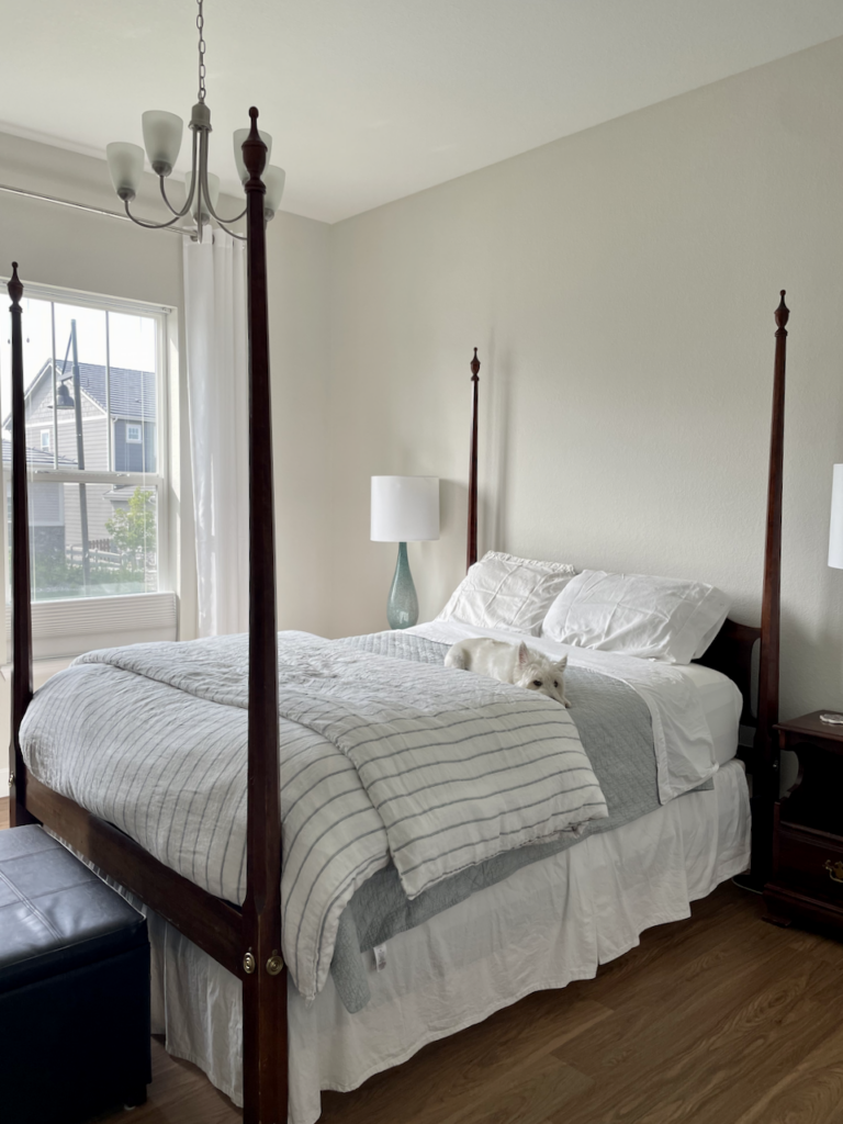
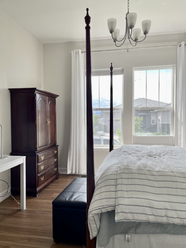
My main living area is open-concept and the lighting shifts a lot throughout the day. I wanted a warm, light, and bright color scheme that wouldn’t look dingy in the darker corners of my home.
Benjamin Moore Simply White (Sample) was the perfect solution. It’s a bright off-white with a low LRV of 89.5 with has strong yellow undertones that keep it looking warm and inviting on the wall. Simply White is one of our favorite paint colors for homes with low light. (Color review article) It doesn’t look yellow because it cuts through the dinge. The best way to explain this is that the low light neutralizes the yellow in Simply.
The reason that this open layout area is darker than expected is that we have a large covered back porch going into the backyard.
We used BM Simply White for the walls of our kitchen and adjoining open-concept living room. It pairs really well with our tuxedo kitchen cabinets (Article) in the kitchen.
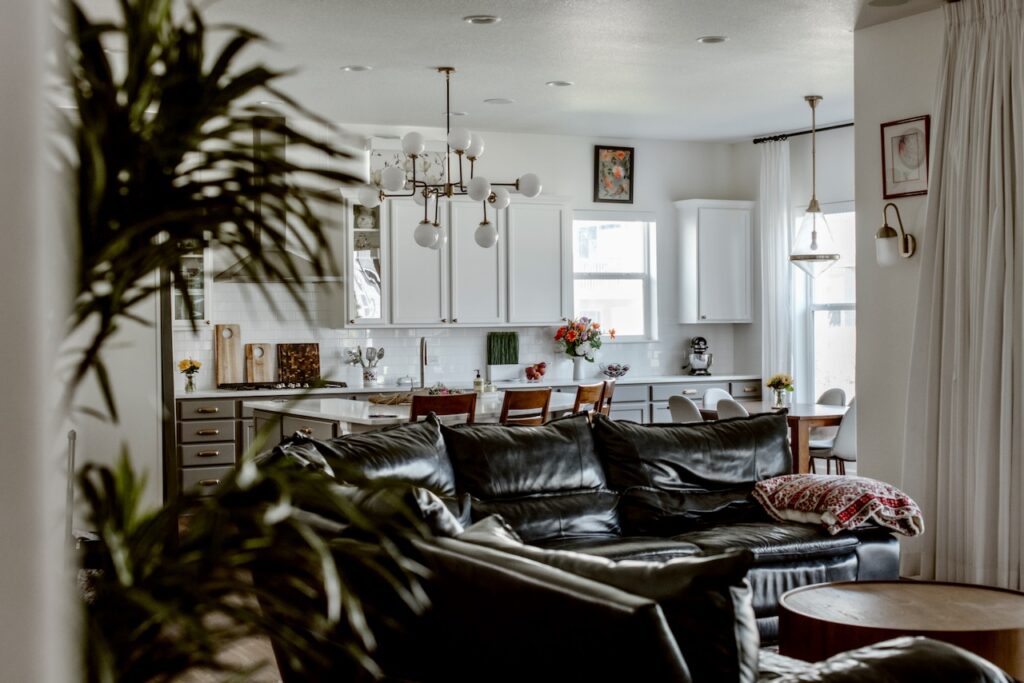
The color stays warm and bright in our living room, too, which is often darker throughout certain times of day.

BM Chantilly Lace Trim, Ceilings and Doors
Benjamin Moore Chantilly Lace (Color review article) (or Sherwin-Williams White Snow are the perfect white colors for trim and ceilings in this palette. If you’re starting from scratch or doing a complete renovation, I’d recommend Chantilly Lace.
But, if you’re like many homeowners (including me!), you probably already have white trim throughout your home and you may have to work with what you have.
Full transparency: our home has Sherwin-Williams Extra White (Sample) as the trim, ceiling, and door color throughout. Extra White (Color review article) is a cool, crisp white paint with blue undertones.
It’s really not my favorite Sherwin-Williams white paint color (Article), but I’ve gotten really good at working with it over the years because so many homes in North America use Extra White trim. Many builders use Extra White as their standard base trim color – and have for many years.
And because painting trim is so labor-intensive and expensive, most homeowners end up sticking with Extra White as their trim color. Thankfully, I’ve learned how to make Extra White look fabulous.
This is part of why I recommend choosing (or identifying) your trim color before you start picking accent colors for your palette. In many cases, you have to make sure your wall colors look good with your trim – not the other way around.
BM Chelsea Gray & SW Pure White Tuxedo Kitchen Cabinets
I knew I wanted to keep our kitchen light and bright, but I also wanted to ensure it didn’t end up looking too stark or cold. Using tuxedo kitchen cabinets was a great solution for a timeless kitchen design (Article).
Our lower cabinets are painted with Benjamin Moore Chelsea Gray (Color review article) and the upper cabinets are Sherwin-Williams Pure White (Sample) (not to be confused with Benjamin Moore Pure White, which is a cool blue-white paint color).
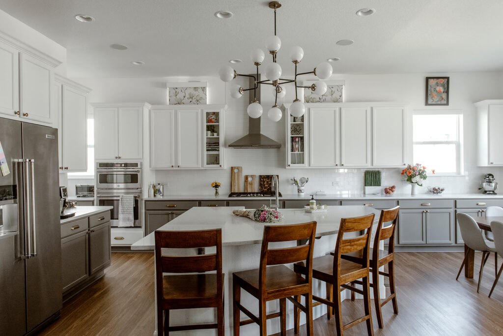
BM Chelsea Gray has green undertones that sometimes flash violet, though you see much more green than violet in the color. These undertones give the color a lovely warmth.
Chelsea Gray lower cabinets add just enough color and depth to the kitchen without making the space feel too dark. It’s also a great transition between my warm wood floors and white quartz countertops.
Sherwin-Williams Pure White is a warm white that complements the warm gray lower cabinets really well and keeps the whole space bright but still cozy and inviting.
SW Pinky Beige Laundry Room with SW Attitude Gray Cabinets
For my laundry room, I knew I wanted to keep many of the same colors as the rest of my main floor but also add a pop of color.
I painted the walls with Sherwin-Williams Pinky Beige (Sample), a warm hue that is a great way to add some color to a space without being too bold. It’s similar to Sherwin-Williams Persimmon, the HGTV by Sherwin-Williams 2024 Color of the Year.
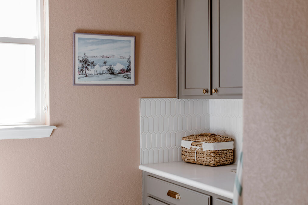
The laundry room cabinets are painted with the same BM Chelsea Gray as my kitchen cabinets and the countertop is Corian White. The combination of pink walls and gray cabinets isn’t for everyone, but I love it! The pink is complementary to the green in BM Chelsea Gray.
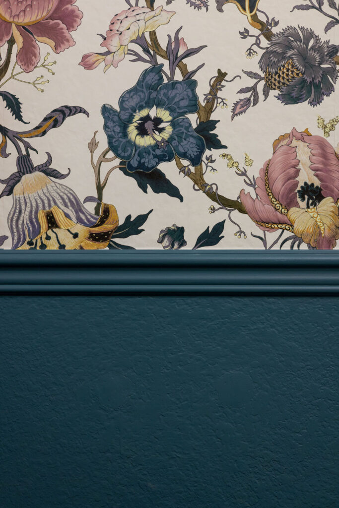
BM Bella Blue Powder Room
Across from the laundry room is the main floor powder room. Note how the SW Pinky Beige flows with the wallpaper. Powder rooms are a great place to use bold colors and patterns. I like to think of the entire room as an accent within a whole-house color scheme. Our main floor powder room features Benjamin Moore Bella Blue (Color review article) paint on the wainscoting and ceiling and a beautiful floral wallpaper (Sample).
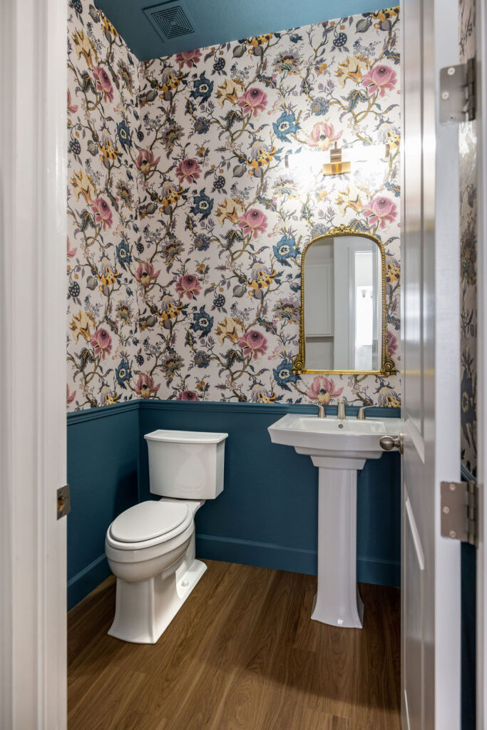
Bella Blue is a gorgeous medium blue paint color with strong green undertones that keep the color leaning toward teal. It has plenty of gray in it, so it looks more muted on the wall than you might think.
With an LRV of 17.5, Benjamin Moore Bella Blue is a bold, deep color that still has plenty of pigment and won’t be overwhelming – even in a small space like my powder room.
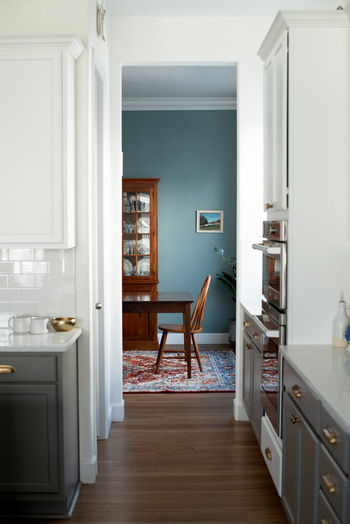
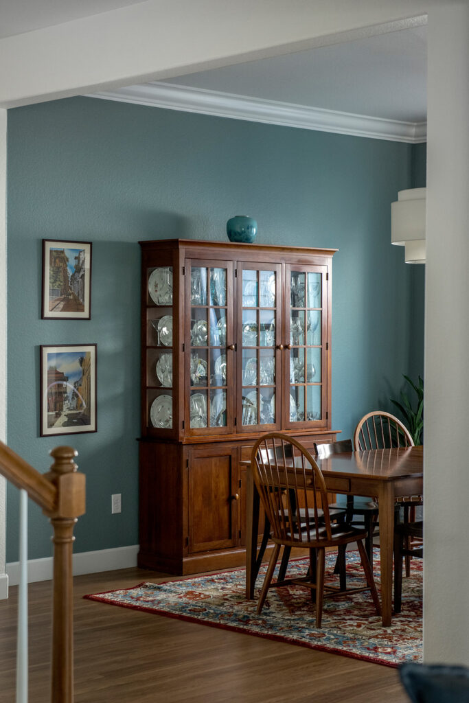
Farrow & Ball Oval Room Blue Dining Room
Dining rooms are another great place to play with color! I’ve repainted my dining room a total of four times as I tried out different accents within my Simply White color scheme. But the Oval Room Blue (Article) version of my dining room pictured below is my favorite, and it’s here to stay now.
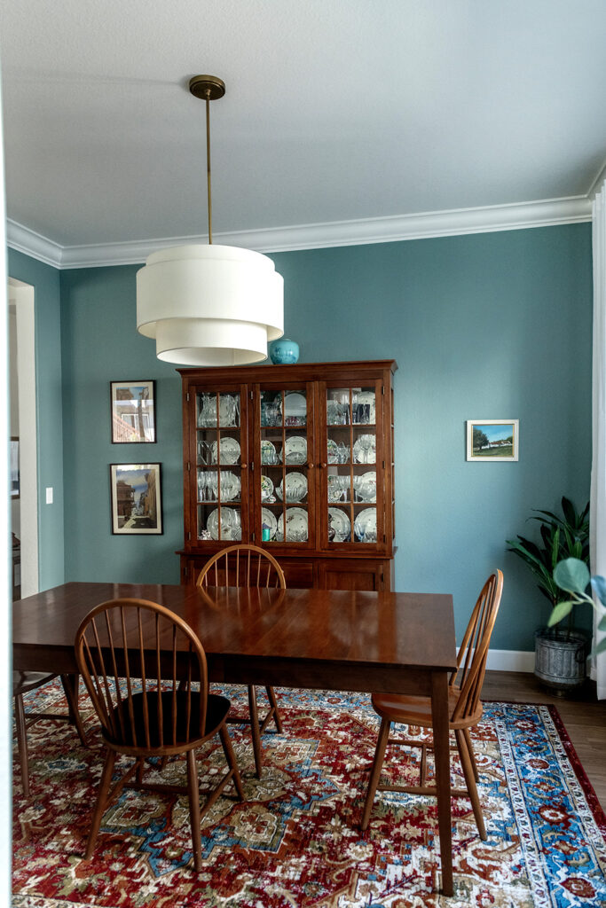
Oval Room Blue (Sample) is one of the best Farrow & Ball paint colors (Article) – a mid-toned teal with warm green undertones, it is truly luminescent on the wall.
The cherry dining room furniture is pretty old-school, but I haven’t replaced it because it makes me happy. I don’t know what I’d do with all my grandmother’s plates and crystal glassware. the Oval Room Blue looks great with the cherry furniture.
I love the way it makes the dining room space feel more special without being overpowering.
Bedroom Paint Colors for a Simply White Color Scheme
When it comes to picking bedroom paint colors, I like to keep things fairly neutral. But bedrooms are a great place to use beige, greige, and gray paint colors with more colorful undertones. This gives each room some personality while still keeping the color scheme cohesive.
SW Mortar Bedroom
When my elderly parents moved in with us, I knew I needed to find the perfect paint color for their bedroom that would keep the space feeling bright and welcoming. I ended up choosing Sherwin-Williams Mortar(Color review article) and we’re all really happy with it!
SW Mortar (Sample) paint is a light and airy warm greige with invisible green undertones. It can be used in place of a traditional white paint color in many applications, including interior rooms and exterior trim. Mortar stays true to its color and doesn’t change much with different lighting throughout the day.
Mortar is part of the Sherwin-Williams Emerald Designer Collection. This exclusive collection includes brighter, purer whites and colors you won’t find anywhere else. The colors are made with an Ultra White base, different from other Sherwin colors.
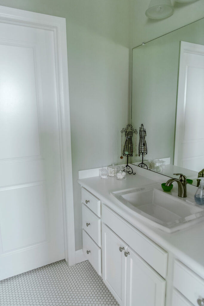
Farrow & Ball Cromarty Bedroom
I was thrilled when one of the young adults in our home selected Farrow & Ball Cromarty for her bedroom and part of her bathroom.
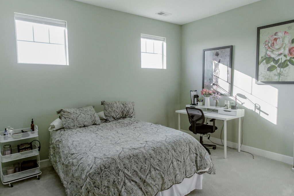
Cromarty (Sample) is a pale soft green-gray neutral color, where the green is strongly saturated. It’s the perfect balance between muted and fresh, and a really unique color that I love recommending to color consulting clients.
Technically, Cromarty can be classified as a warm gray with green undertones. But describing the green shade of this paint as an “undertone” doesn’t feel completely accurate – it really is more green than gray.
We continued the Cromarty walls into part of this bedroom’s adjoining bathroom and it works really well. It’s soft enough to help even a small bathroom feel light and bright, but also offers more depth and interest than a traditional gray or other pale neutral.
Sherwin-Williams Alabaster Guest Bedroom
Sherwin-Williams Alabaster (Color review article) is one of the brand’s most iconic white paint colors – and for good reason! It’s a warm white with strong yellow undertones that can make a room look soft and cozy.
I originally used Alabaster walls in my home’s guest bedroom as an experiment. The room has low light and small north-facing windows, so I wasn’t sure if the color would work. But Alabaster lights up the room and doesn’t shadow out in the corners. I will probably never paint this room again!
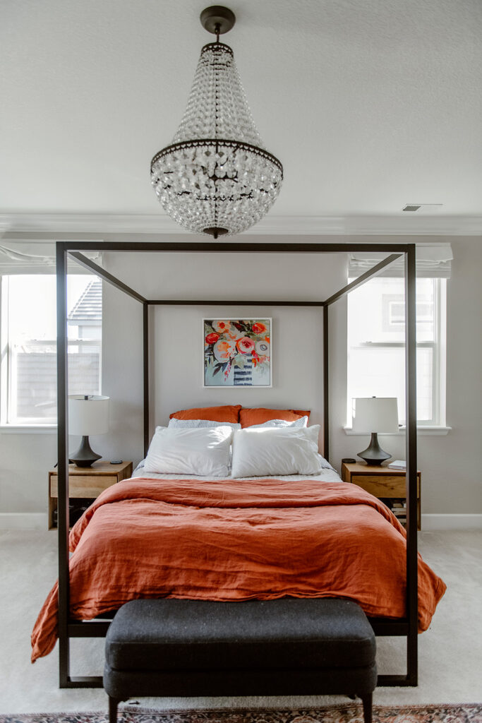
Agreeable Gray Primary Bedroom
The whole-house wall color for my home was originally SW Agreeable Gray (Color review article). A single whole-house color is great for new builds because it gives homeowners a great basis to start from, but it’s hard to find one color that fits every single room and light situation. While I ended up choosing a BM Simply White color scheme for the space instead, I kept Agreeable Gray in most of the basement (Article) and many of the bedrooms – including the primary bedroom.
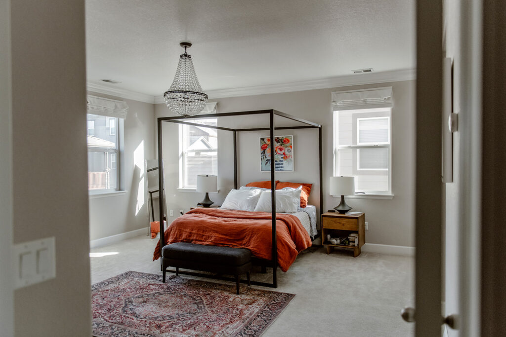
This room has large windows with South and East exposure and is sunny all day long. Agreeable Gray looks soft and lovely in this light. It’s a great backdrop for the colorful art on our walls.
Colorful Accents for a BM Simply White Color Palette
When it came time to incorporate more accent colors into my BM Simply White color scheme, I knew I wanted to stick with blues and greens. The gray paint colors in my home already had green undertones and the blue and teal accents used on the main floor powder room and dining room really complemented the palette.
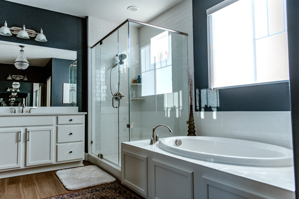
SW Cyberspace Primary Bathroom
I painted the primary bathroom walls with SW Cyberspace (Color review article) to add depth and interest to this space. Painting is one of the most cost-effective bathroom updates you can make – this color truly makes this room feel elevated and special.
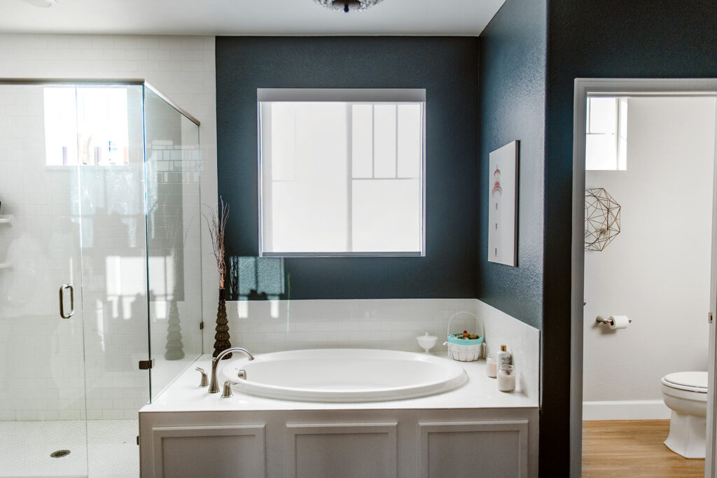
Cyberspace looks best when it’s broken up by white, so it doesn’t end up feeling oppressive. In this bathroom, it’s balanced with lots of white accents, trim, and ceiling.
BM Chelsea Gray Front Door
We painted our interior front door (Article) Chelsea Gray and I love the way it looks with the warm Simply White walls of my entryway. One of the best ways to pull design elements together in a whole-house color scheme (Article) is to repeat similar colors over and over again, creating layers of color throughout the space.
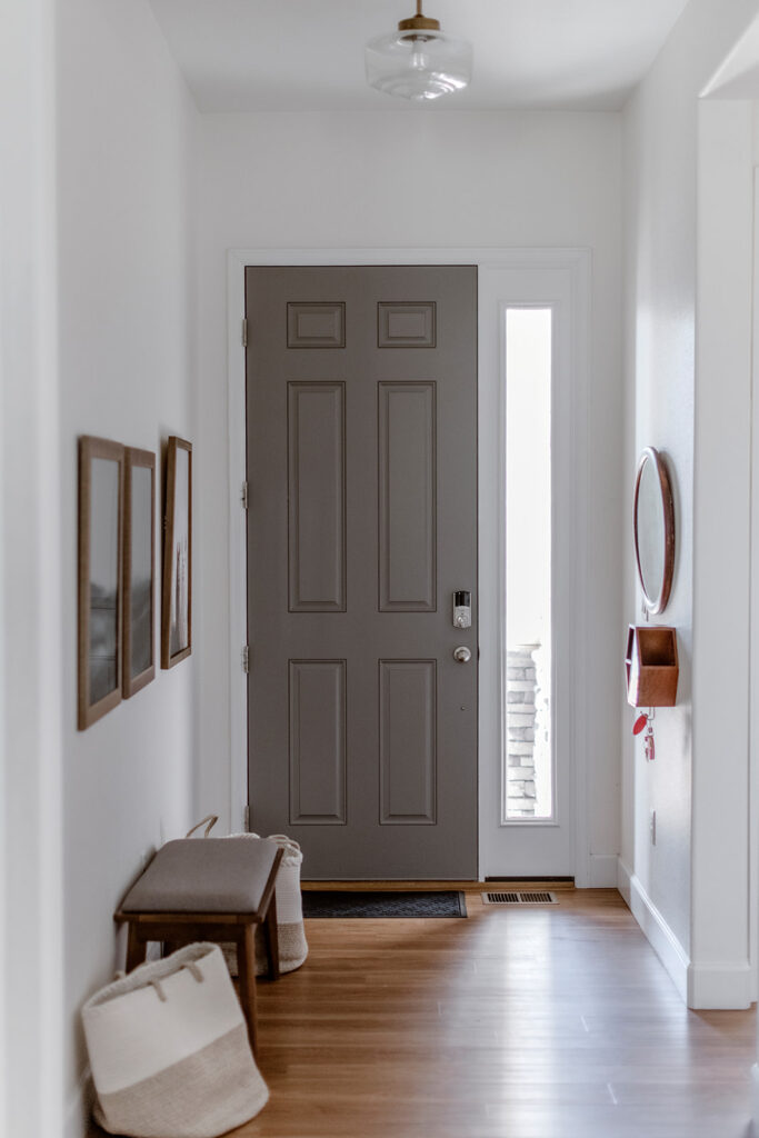
By continuing the BM Chelsea Gray from my kitchen cabinets into the entryway of the home, it keeps the whole main level feeling really cohesive.
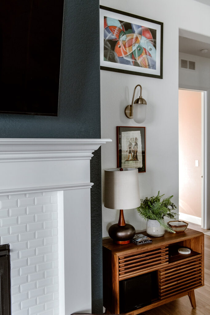
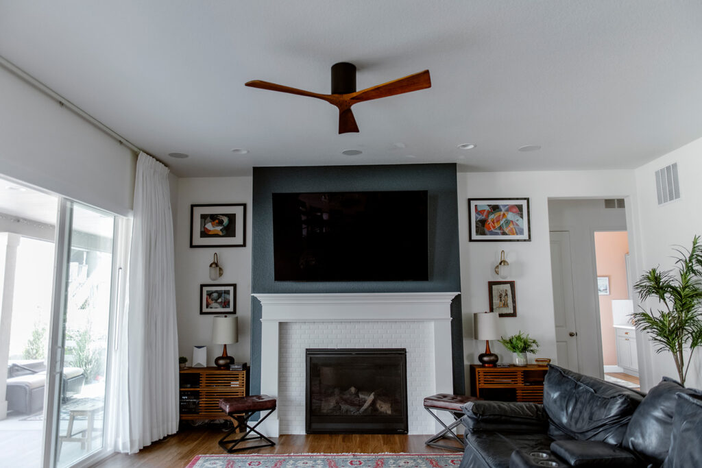
BM Slate Teal Basement Workout Room
Our finished basement features SW Agreeable Gray walls throughout much of the space, but I wanted to add a bold accent color to the basement workout room.
Benjamin Moore Slate Teal (Color review article) has been a beautiful color for this palette! It has green undertones that are especially clear in rooms with lots of natural or artificial light.
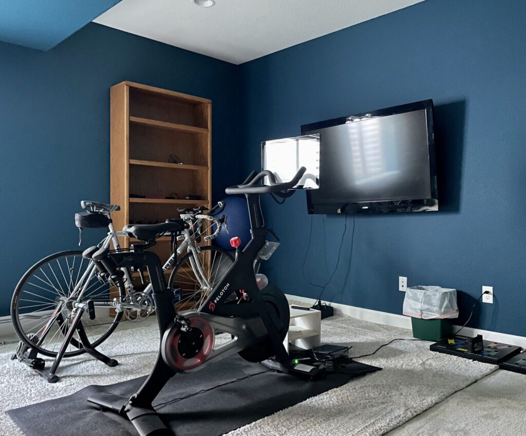
Slate Teal was practically made for accent walls (Article). Its green tones keep it feeling warm on the wall, making it a great option for basements. It’s a great way to add a pop of bold color to your home – it looks like a beautiful jewel!
SW Iron Ore & SW Cheviot Loft
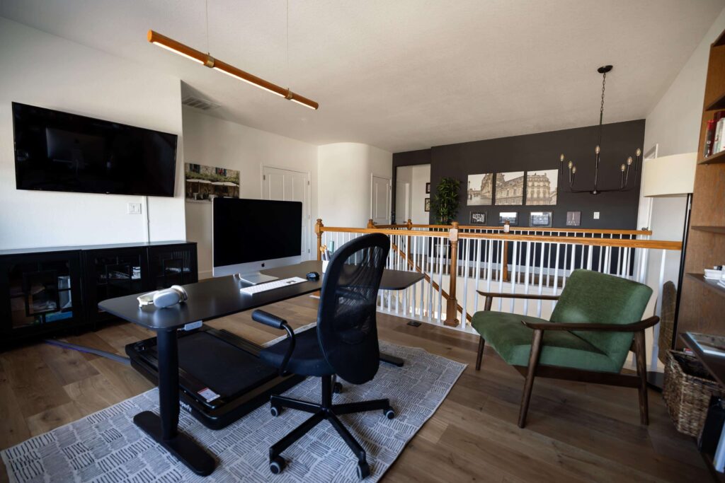
The loft area of my home is my color studio. I knew I wanted to keep this space light and bright but with a bold accent wall. I ended up using Sherwin-Williams Cheviot (Color review article) for the main walls and Sherwin-Williams Iron Ore (Color review article) for an accent wall. The combination is classic and beautiful!
By using Cheviot in the stairway and upstairs landing, I essentially treated Cheviot as the foundation white color. It’s not exactly Simply White, but close enough that most people won’t notice. It was a great way for me to get to know this beautiful new white paint color. Previously, the loft was painted Agreeable Gray, and Cheviot brightened it nicely.
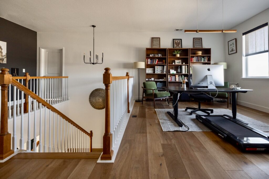
SW Iron Ore is a soft black or a very dark charcoal. It is black, but there are many darker Sherwin-Williams and Benjamin Moore black paint colors on the market. I love the way this wall repeats the color of the black chandelier and makes my photos of Paris pop on the wall.
SW Cheviot is part of the Sherwin-Williams Emerald Design Collection. This was my first time trying this color and I fell completely in love with it. It’s very similar to BM Simply White, which makes it perfect for my whole-house palette. It’s soft and warm on the walls but still looks plenty bright in the shadows and even at night.
Explore all the colors in this Benjamin Moore Simply White Color Scheme
- Benjamin Moore Simply White (Sample)
- Benjamin Moore Chantilly Lace (Sample)
- Sherwin-Williams Pure White (Sample)
- Sherwin-Williams Alabaster (Sample)
- Sherwin-Williams Mortar (Sample)
- Sherwin-Williams Agreeable Gray (Sample)
- Sherwin-Williams Pinky Beige (Sample)
- Benjamin Moore Chelsea Gray (Sample)
- Farrow & Ball Cromarty (Sample)
- Farrow & Ball Oval Room Blue (Sample)
- Benjamin Moore Bella Blue (Sample)
- Benjamin Moore Slate Teal (Sample)
- Sherwin-Williams Cyberspace (Sample)
- Sherwin-Williams Iron Ore (Sample)
- House of Hackney Artemis Wallpaper (Sample)
Key Learning Points
Creating your own whole-house palette is a simple way to change the look and feel of your home – whether you’re doing extensive renovations or not.
Remember, if you want to build your own whole house palette, it’s important to follow these steps:
- Pick your foundation color for the common areas – consider a white or light neutral.
- Pick a white trim color (and stick to it)
- Select paint colors for secondary living spaces (bedrooms, bathrooms, dining areas, etc.)
- Pick a few accent colors to use throughout your home
Remember: NEVER, EVER use paint matches from a different brand than the one specified. Results are poor and there are no standards for the sheens. Even though your painter may truly believe it can be done, don’t do it. See results from paint matching here.
No matter what, always test your paint colors. It’s a standard best practice. Whenever I test my paint colors, they are perfect, and when I don’t test they turn out wrong. Learn how to test your paint colors here.
Get an Expert-Made Whole House Paint Color Scheme
For more details, read our full step-by-step guide to creating a whole house color palette, or contact The Color Concierge to learn more about Online Paint Color Consultations.

Related Posts:
- BM Simply White Color Review
- A Simply White Interior Color Palette for a Cottage (Color review article)
- Creating a Whole-House Color Palette (Article)
- Why a Whole-House Color Scheme Matters (Article)
- Best Benjamin Moore White Paints for Dark Rooms (Article)
- Our Favorite Benjamin Moore White Paint Colors (Article)
About the Author

Hi, I’m Michelle Marceny, founder, owner, and Principal Color Designer at The Color Concierge. I believe a fresh coat of paint can completely transform a space. The Color Concierge was born out of my drive to help clients fall back in love with their homes. My clients trust me to help them find the perfect paint color for their home – whether it’s a whole-house paint color scheme or ideas for a single room.
Since The Color Concierge was founded in 2017, we have completed over 3000 color consultations, both online and in-person. I am a Certified Color Expert with 7 years of experience creating interior and exterior color palettes throughout North America.
If you like this post, don’t forget to pin!
We love your comments! Please note that the blog is meant as general advice, and it is not possible to give out specific answers to your paint questions. If you want more specific advice, our Online Color Consultations will help you pick your paint colours. Thank you for your understanding.
