There’s one mistake I see time and time again when I go into new clients’ homes: instead of using a whole house color palette, rooms are painted one by one in a variety of colors without a cohesive theme.
The master bedroom is a shade they liked in the store and the kitchen was painted the color they saw and loved in their neighbor’s house. The bathroom is the same Day-Glo yellow it was when they moved in.
The result is what I (lovingly) call a “Skittles” house…a rainbow of mismatched colors that just doesn’t lend itself to a beautiful, cohesive design.
If you’re ready to simplify your paint color palette, then you’re in the right place. In today’s post, we’re taking a deep dive into how to create a color palette for the whole house. We’ll explore what to consider when planning your palette and how to use different paint throughout your space.
We’ll even take a look at a real-life Farrow & Ball color palette used in my clients’ historic cottage, so you can see how a palette comes to life in a home.
The key is to create a plan. You can either start with a clean slate or integrate some of the existing colors as we did in this project.
Without further ado, let’s jump right in.
*This post contains affiliate links for products I use and love. If you click on some links and make a purchase, I will get a small commission at no cost to you. This helps pay for the costs of the blog, so I can continue to offer great content to our readers.
About The Color Concierge
Our Colorado-based paint color consultants make finding the right paint colors for your home easy. Whether you’re painting the exterior or interior of your home, our simple yet effective process lets us get your paint color right the first time. We’ve helped thousands of homeowners transform their homes into a space they love. Learn more about ONLINE COLOR CONSULTATIONS today.
How to Create a Whole House Color Palette – Step By Step
Have you ever spent time in the Home Depot paint aisle agonizing over 15 paint swatches that all look pretty much the same? Then you know just how hard choosing paint colors for your home can be.
Most homeowners spend way too much time focusing on the paint itself. The real secret to choosing the right palette for your home comes down to focusing more on the space and less on the color.
A favorite quote of mine illustrates this point perfectly:
“Pick a color that looks good in the room and you will fall in love with the room instead of the color.”
Use the following tips to find the right colors for your rooms (and your whole house).
Consider your hard finishes & decor
Paint colors should always be considered in the context of your home and your room. When you pick paint colors for your whole home color palette, consider the colors that will pair best with the hard finishes in the room, such as your flooring, your furniture, and your decor.
You’re probably not going to buy a new couch to match your paint, but it’s easy enough to make sure your paint coordinates with your existing decor. Look at the colors in your accent pillows, art and other design elements to help you plan your palette.
It’s also a good idea to consider the existing paint in your home. While you may be open to painting every surface of your house, there may be existing paint colors that need to stay. Painting new trim throughout the house, for example, can cost almost the same amount as painting all of the walls, so you may need to use your existing trim color in your palette.
Sample Colors
We always recommend that you test paint colors (article) in your home because lighting can completely change a color, both on interiors and exteriors.
In the old days, this meant we painted a large poster board with sample pots and a huge mess.
Now we have a better way to test paint, with Samplize Peel-and-Stick samples!
- Samples pre-painted with 2 coats of real paint from the manufacturer.
- Large 9” x 14” samples to see the color better in the lighting.
- Delivered overnight
- Colors are accurate
- Less expensive than painting a large poster board with sample pots
- No mess, and no toxic paint to dispose of
I use these in my color consulting practice for exact results. Discover Samplize peel-and-stick paint samples via the link below.
Start with common areas and pick your foundation color.
The first step to creating your whole house color palette is to select a color for the common areas of your home. Typically these include the living room, kitchen, and sometimes dining room.
In some homes, these areas may be completely sectioned off and could be treated as their own spaces. But in most modern homes they are open concept or open layouts and should be considered as one large space.
I love to pick a basic neutral – or a couple of coordinating neutral colors – to use in these kinds of spaces. Benjamin Moore’s Agreeable Gray (Sample) is a great foundation for a whole house color palette. It works well in just about any light and pairs well with a broad range of finishes.
Other good whole-house neutral paint colors (Sample) include Edgecomb Gray (Sample), Stonington Gray (Sample) and Pale Oak (Article).
Pick a trim and ceiling white – and stick to it.
Every good color palette needs great white paint (Article). Pick the trim and ceiling color (or use the trim color you already have), and plan to use that on all your trim, window frames, and doors throughout the house.
The cultural convention is that if you have white cabinets, they should be the same or similar to the trim and ceiling white paint color. If you want a warmer white or light greige for the cabinets, that’s ok as long as it looks visibly different from the trim. Don’t pick a cooler white than the trim and ceiling for the cabinets. It won’t look right.
If your finishes are more modern, go with a clean white like Benjamin Moore Chantilly Lace (Sample) or the slightly warmer Sherwin-Williams Pure White (Sample). If your finishes are earthier (such as granite), then go with an off-white like Cloud White (Sample) or White Dove (color review) by Benjamin Moore or Sherwin-Williams Alabaster (Sample).
Move on to secondary living spaces
Up next in our whole house color palette are the secondary living spaces – bedrooms, offices and sometimes dining rooms. These rooms can be painted with one of the neutral paint colors already selected, but they can also feature more colorful paints that coordinate with the overall palette.
In many traditional homes, the office and the dining room are near the front door. These can be great places to use an accent color that stands out from the rest of the house.
An accent paint color might be a very different shade than your whole house neutrals. This is a great opportunity to pull in the colors in your decor.
As a guideline, I like to use colors that have similar muted levels. As an exaggerated sample, you wouldn’t use a fluorescent color next to the brick.
Choose colors for bedrooms
Bedrooms are a great place to play with more color in your home. I love using blues, greens, and neutral paint colors with colorful undertones when choosing paint colors for bedrooms (Article).
Nimbus Gray (Sample) by Benjamin Moore, for example, is a darker gray paint color with strong blue undertones. Farrow & Ball Cromarty (Article), on the other hand, is a muted green-gray that creates a really calming bedroom space.
Depending on the room, neutral paint with pink or purple undertones can also be beautiful. Benjamin Moore Portland Gray (Sample) has soft pink undertones and works perfectly for a nursery or little girl’s room.
Pick accent colors
The last step to defining a palette is to pick accent colors for walls and even the front door. I like to add accents that coordinate with the decor. It’s easiest to pick an accent color to coordinate with your decor than to pick a piece of art to match an accent wall.
How many colors should be in a whole house color scheme?
I get this question all the time! The actual number of colors to include in a whole house color scheme can vary depending on the size of the home and your paint needs, but generally, I like to choose from 4 to 8 paint colors when building a palette.
These include:
- 1 white trim and ceiling color
- 1 foundational lighter neutral for common spaces and baths (typically white, cream, greige, or beige)
- 1-2 accent colors for walls or accent rooms such as powder rooms, dining rooms, or offices.
- 1-4 bedroom paint colors to show each person’s individuality. You can also use the foundation light neutral color with a headboard wall accent.

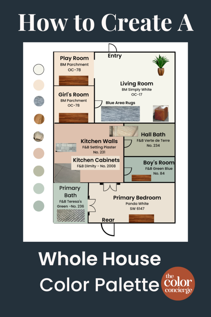
Explore A Real-Life Whole House Color Palette with Farrow & Ball Paints
Sometimes the best way to plan a color palette for your whole house is to see a real-world example to inspire you. This client’s whole home project is sure to do just that!
The setting is their beautiful historic cottage built in 1910. This home features some really unique finishes and design elements, like a wood beam ceiling, exposed brick, and even curved wall features.
This whole home color palette needed to complement these hard finishes, while also bringing together the unique space to feel like a cohesive, well-designed home. This is a warm family house meant for living and that’s exactly how it was set up.
For this home, we went with a Farrow & Ball color palette (with a couple of Sherwin-Williams and Benjamin Moore colors thrown in there too). It was this project that first got me obsessed with Farrow & Ball paints and inspired my recent series of Farrow & Ball paint color reviews (Article).
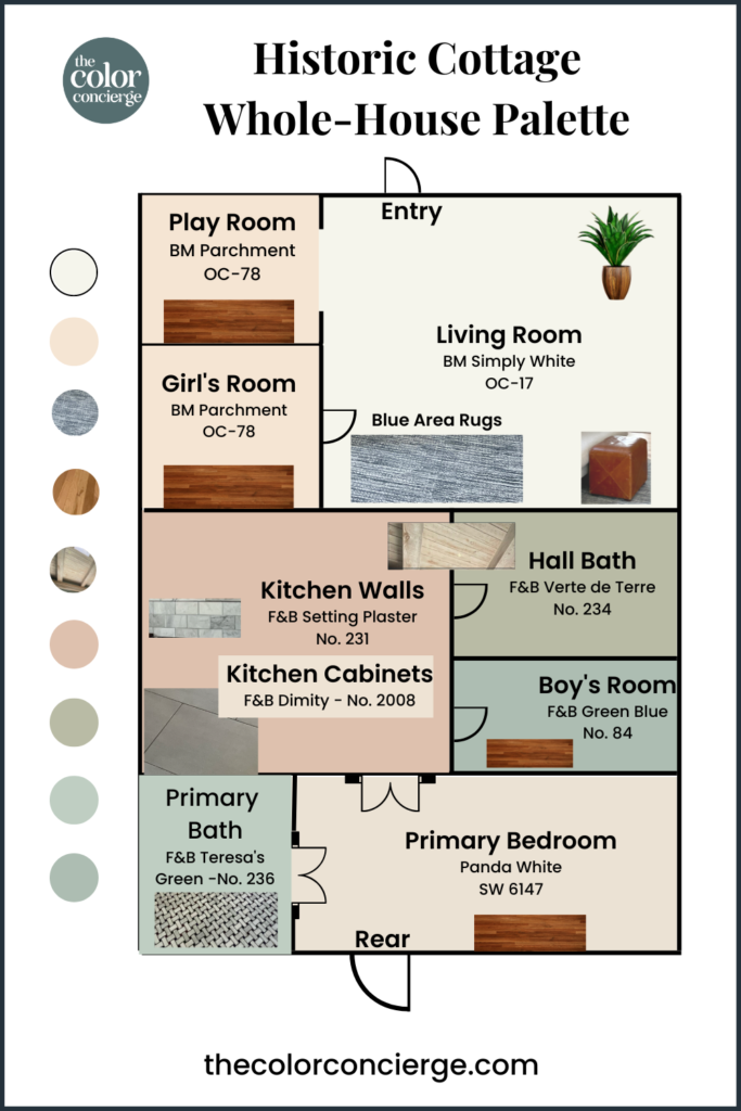
Let’s explore this home room by room to look at how the colors come together in this beautiful whole house color palette.
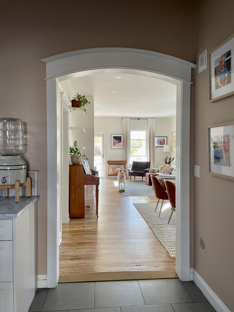
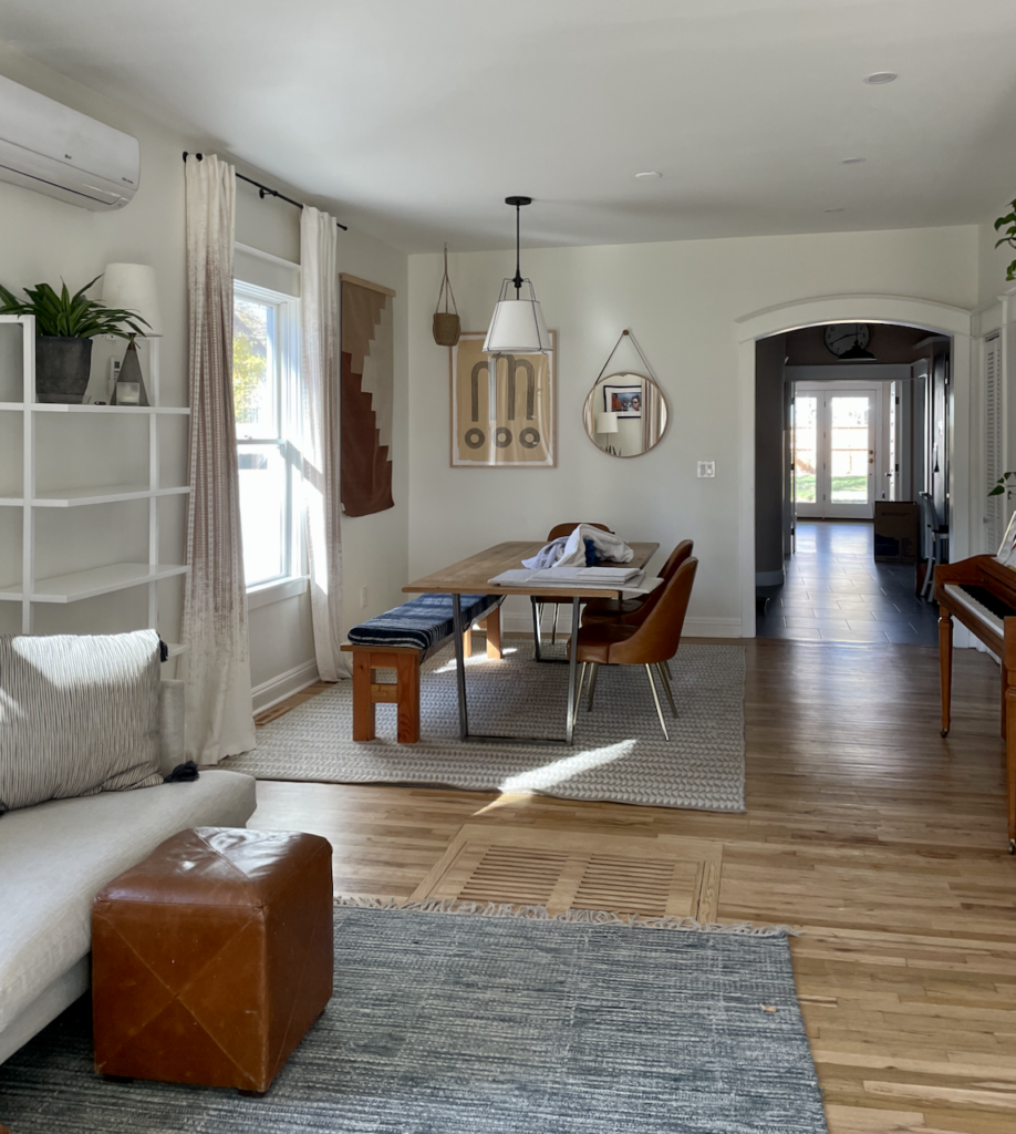
Living Room and Dining Room
This historic cottage features an open-concept living and dining room with beautiful warm wood floors and a mix of neutral colors in the furniture and decor. We knew we had to choose a really beautiful, creamy white to make this space feel warm and inviting.
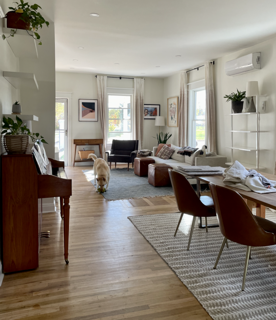
The trim in the house was already painted with Benjamin Moore Chantilly Lace (Color review), so we left that color throughout. This space originally had Chantilly Lace on the walls as well, but without enough natural light, it looked a bit dingy. We changed the walls to Simply White by Benjamin Moore (Color review), a crisp off-white, and it really transformed this space. I don’t know how Benjamin Moore created that formula, but it just lights up a room, even if its a bit dark.
Kitchen
The kitchen paint colors of this historic cottage go against almost all of my own color rules. And yet, it totally works!
This kitchen features a unique combination of warm and cool colors and finishes.
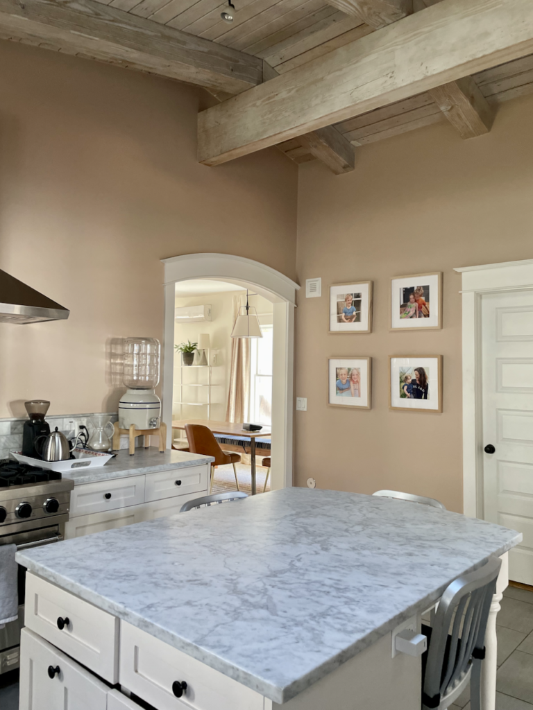
The wood ceiling and natural light from windows and skylights bring a ton of warmth to this kitchen. The kitchen cabinets are also a warm color. They’re painted with Farrow & Ball Dimity paint (Sample), a soft, almost white color that is actually pink.
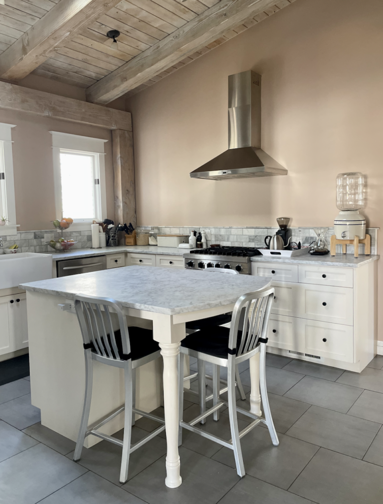
The cool blue-gray is repeated in the Carrara marble countertops, stainless steel appliances, and blue-gray flooring for a cohesive and cool pattern.
When it came to wall colors for this kitchen, I really wasn’t convinced that Farrow & Ball Setting Plaster (Color review) would work. The homeowner picked this amazing combination, and she absolutely nailed it!
I would normally never paint such a warm color in a space with equally warm cabinets and such cool finishes. But Setting Plaster is truly beautiful in this space! The Dimity kitchen cabinets are really just a lighter shade of the same color, so they work really well together, and also repeat the blush theme.
We were able to mix warm and cool colors in this case because we repeated similar colors over and over again, creating layers of color that really tie the room together.
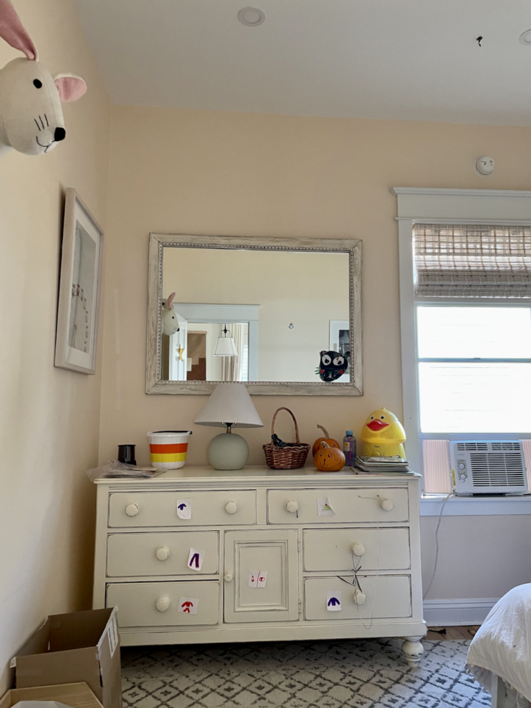
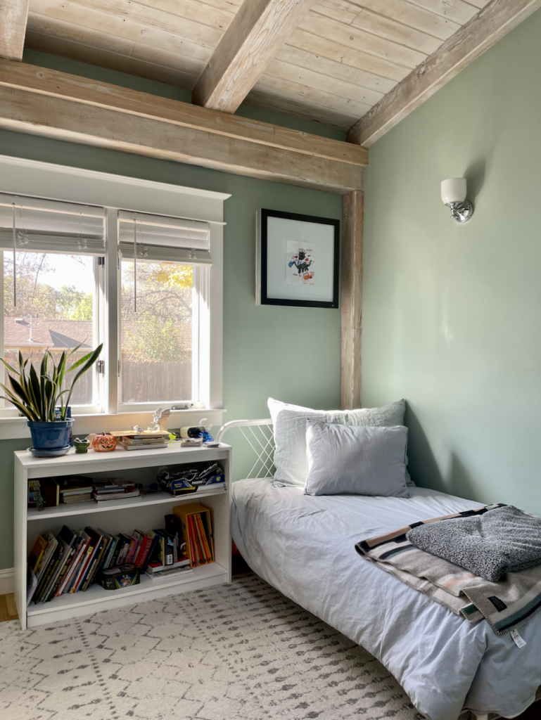
Girl’s Bedroom
We wanted this space to feel like a little girl’s room without being overtly pink. We also wanted it to coordinate well with the warm blush tones that are present throughout this whole house color palette.
Benjamin Moore Parchment (Sample) was the perfect solution. This soft off-white paint has warm pink undertones that pair just as well with the existing white trim as they do with the creamy off-white of the dresser.
Boy’s Bedroom
For the little boy’s bedroom in this home, we wanted a paint color that would contrast with the warm pink and taupe tones in the wood ceiling, wood floors and throughout the rest of the whole house paint color palette.
Farrow & Ball’s Green-Blue (Sample) paint works really well in this space. It sometimes looks blue and sometimes looks green depending on the changing light throughout the day. Its green tones add warmth to the color, helping it easily coordinate with the rest of the Farrow & Ball color schemes in this home.
Hall Bathroom
The other bathroom in this home is also painted a gorgeous Farrow & Ball green. Vert de Terre (Article) is a very earthy green color that adds warmth to the crisp whites and grays of this space. It acts as a beautiful connection between the Carrara marble flooring and the warm wood ceiling and helps tie together the mixed metal finishes in this unique bathroom.
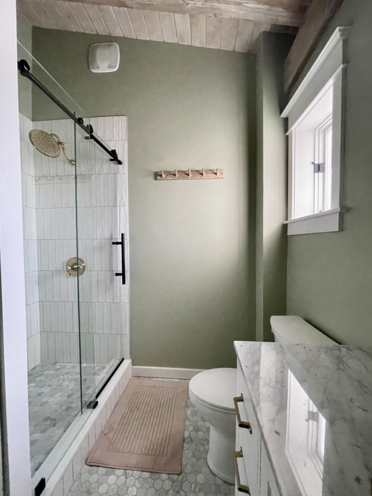
I love this picture of this room because the light shining through the window really helps showcase the depth of the Vert de Terre (Sample) paint. When the light shines on the wall, the color is really bright and vibrant while the shaded corners of the room show the moodiness of this paint color.
Primary Bedroom
The primary bedroom in this home is the perfect example of working with the colors you already have when building a whole house color palette. This room was already painted with Sherwin-Williams Panda White (Sample).
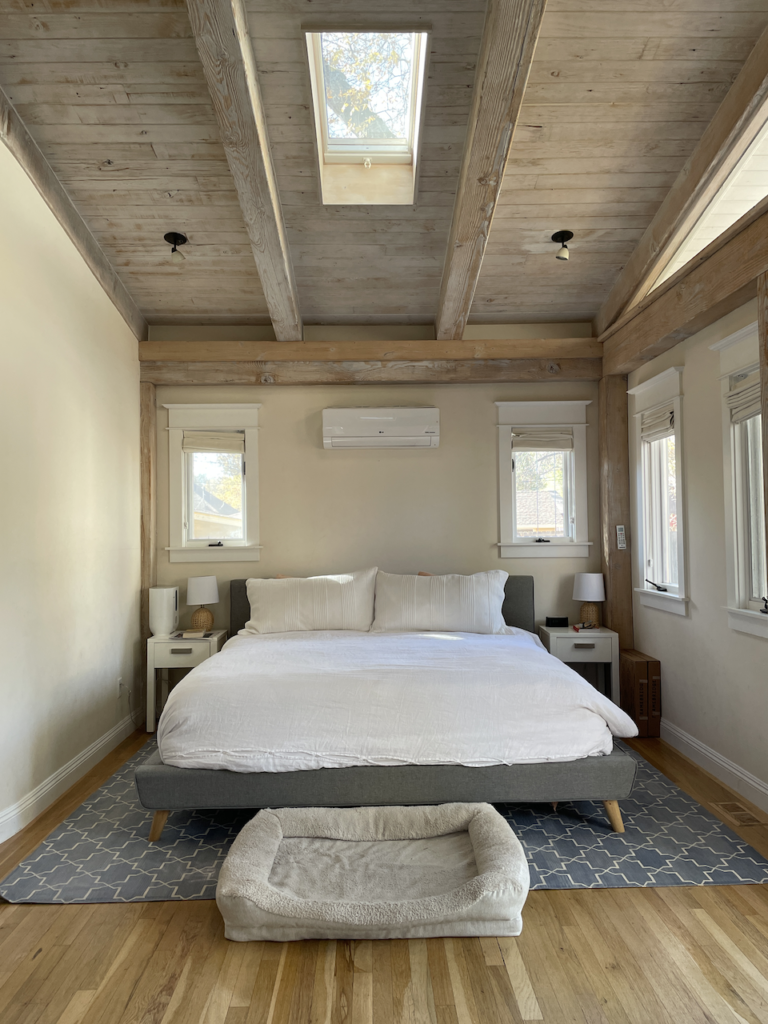
This color is not a favorite of mine, but we decided to leave it because it works well with the rest of the paint palette for the whole house. It looks really beautiful in this room. Panda White is a taupe color that looks almost yellow in these images thanks to light bouncing off fall trees in the yard.
Remember: it’s not about choosing your favorite paint color, but choosing the paint color that looks good in the room. In this case, Panda White (Sample) works perfectly for this space and for the whole palette.
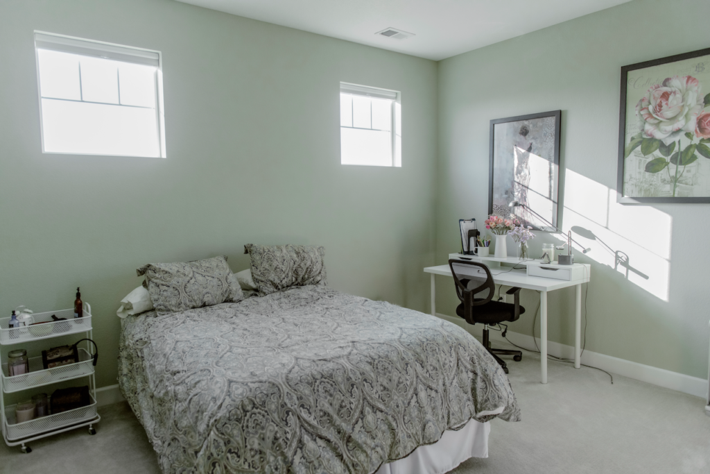
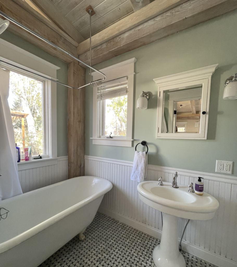
Primary Bathroom
The primary bathroom is one of my favorite spaces in this home. This space is painted with Farrow & Ball Teresa’s Green (Sample), a beautiful aqua paint color that adds a feeling of calm to the spaces it’s used in.
Teresa’s Green (Sample) was the perfect color for this cottage bathroom because it is so versatile. It looks beautiful next to the natural wood beams, wood ceiling, and brick accents of this home and also pairs well with the white wainscoting and trim. This color was already in place, and it made me realize the magic and beauty of Farrow and Ball paint colors.
Additional Considerations for Whole House Color Palettes
But before you head to the store to start buying paint and planning your own whole house color palette, follow these additional tips to make sure your color scheme will truly work in your space.
Create a Pinterest mood board
This is one of my favorite quick and easy ways to check your color palette and make sure it works in your space. Create a Pinterest board with paint color swatches and pictures of your flooring, furniture, decor, and other hard finishes. Add an area rug and curtains to pull everything together.
Choose the right paint sheens
Creating the perfect whole house color palette goes beyond the actual colors – you need to choose the right sheens for each color too. Paint sheens (Article) are critical to the design of a color scheme.
Use these basic guidelines to choose the right sheen for your whole house paint colors:
- Use the shiniest sheen on your trim, doors, millwork, and cabinets. A Satin or Semi-Gloss sheen often works well here to help highlight architectural details. From a practical perspective, these elements also get the dirtiest, and shiny sheens are the easiest to clean.
- Paint walls with mid-sheen paint. If you have children or pets, an eggshell sheen is recommended for walls because it’s easier to clean.
- Paint ceilings with flat or ultra-flat paint. This helps hide imperfections and keep the focus on the walls and trim. Often dry-wallers take less care with the ceilings because they are hard to reach and most people don’t look at them.
And remember, sheens vary between companies and even between one company’s paint collections. What Benjamin Moore calls Eggshell, Sherwin Williams calls Satin. Benjamin Moore Regal Pearl is equal to Benjamin Moore’s Advance Satin. Choosing Farrow & Ball paint sheens can add even more confusion to the process, with finishes like Modern Emulsion and Estate Emulsion.
Read our guide to paint finishes (Article) to make sure you choose the right sheen for each space in your home.
Test Paint Colors in Your Home
Even the best paint colors can look all wrong once they’re actually on the wall. It’s critical to test your paint colors in the spaces you plan to use them and to do your tests in natural light.
In the old days, we had to paint samples onto large poster boards. These paint samples were messy and time-consuming, and we always had to find a way to dispose of the leftover paint.
Today there is another way! You can purchase Peel-and-Stick paint samples from companies like Samplize. Their colors are consistent, they use real paint in an eggshell sheen, and there is no mess.
Our recommendation is to stick them onto a white poster board and move them around the room at different times of the day. Compare them to your trim, carpet, and even your art. With a white background, you can see how the samples compare to the current color and the carpet.
Visit the Samplize website to get samples of a broad range of paint colors and get more whole home color palette ideas and inspiration.
Explore Our Whole House Color Palettes
Not ready to build your own whole house color palette? Leave it to the experts (that’s us)!
Work with The Color Concierge team on an Online Paint Color Consult to build your own custom whole-house palette. Or, DIY your project the right way with our upcoming Ready-Made Interior Color Palettes that can work in any home. The color palettes will drop on November 23, 2022!

About the Author

Hi, I’m Michelle Marceny, founder, owner, and Principal Color Designer at The Color Concierge. I believe a fresh coat of paint can completely transform a space. The Color Concierge was born out of my drive to help clients fall back in love with their homes. My clients trust me to help them find the perfect paint color for their home – whether it’s a whole-house paint color scheme or ideas for a single room.
Since The Color Concierge was founded in 2017, we have completed over 3000 color consultations, both online and in-person. I am a Certified Color Expert with 7 years of experience creating interior and exterior color palettes throughout North America.
We love your comments! Please note that the blog is meant as general advice, and it is not possible to give out specific answers to your paint questions. If you want more specific advice, our Online Color Consultations will help you pick your paint colours. Thank you for your understanding.

4 Responses
Working on a color scheme step by step might really pay off for us if we do it right. We’ve tried a “neutral” look for our house for the longest time and it has made this place look boring and lifeless. If I can find an interior painting expert in the area, I’ll ask them to lend us a hand with getting a palette that will work well for this place.
Thank you for the helpful article. I’m struggling with this and my husband certainly feels like we have too many paint colors / accent walls going on with what previous owners started.
What considerations should be applied if I’d like to bring in some wallpaper in main bedroom + another bedroom that’s used mostly as an office? Thx
Thank you for such a thorough and helpful article! I had picked Collingwood for my open floor plan house but was doubting it wouldn’t have enough depth but after reading this article I think that it will be the perfect color with our warm new cabinets in our kitchen and you gave me ideas of how to bring in other colors to do a feature wall. I feel so much more confident in my decision with my paint colors and so excited to see how the house looks after! Thank you so much!
Hi Jodi,
Thank you so much for letting me know. It sounds amazing! So glad we were able to help.
Michelle