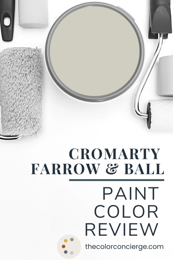
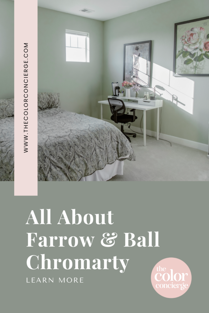
Learn all about Cromarty by Farrow & Ball in this paint color review.
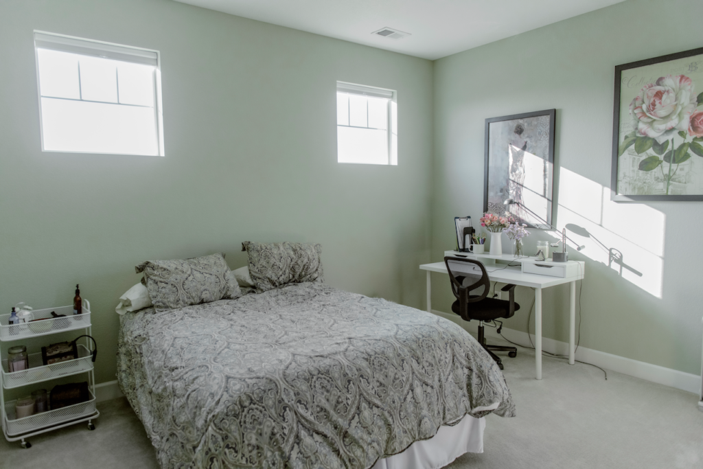
I recently started a series of Farrow & Ball paint color reviews (Article), and this week I want to talk about Farrow & Ball Cromarty, No. 285. One of the young adults in our home selected this color for her bedroom and part of her bathroom, and the transformation is truly remarkable. (Keep reading for before and after photos below.)
Cromarty is a pale soft green-gray neutral color, where the green is strongly saturated. It’s the perfect balance between muted and fresh, and a really unique color that I look forward to recommending to color consulting clients.
Natural colors are trending this year, and Cromarty is the perfect natural green.
Farrow & Ball always writes descriptions of their paints that are almost as beautiful as the colors themselves, so I knew I needed to share it in this Cromarty color review. Here is how they describe Cromarty paint:
“This very light green grey is named after the Cromarty Firth estuary, a place of swirling mists mentioned daily in the Shipping Forecast. A neutral yet atmospheric colour, Cromarty brings a muted softness to any room, creating an easy-to-use finish that is neither too green nor too grey.”
Now that I’ve seen this gorgeous color in my own home, I’ve realized just how accurate this description is. When you step into the room, you can feel the swirling mists of the Cromarty Firth estuary (or what I imagine it to be!). It’s hard to truly capture its beauty in photos.

*This post contains affiliate links for products I use and love. If you click on some links and make a purchase, I will get a small commission at no cost to you. This helps pay for the costs of the blog, so I can continue to offer great content to our readers.
About The Color Concierge
Our Colorado-based paint color consultants make finding the right paint colors for your home easy. Whether you’re painting the exterior or interior of your home, our simple yet effective process lets us get your paint color right the first time. We’ve helped thousands of homeowners transform their homes into a space they love. Learn more about ONLINE COLOR CONSULTATIONS today.
What is the LRV of Farrow & Ball Cromarty?
The LRV (that’s light reflective value) of Farrow & Ball Cromarty is approximately 60. Farrow & Ball doesn’t actually give LRVs for their paint colors, but E-paint in the UK has a good analysis that shows the value.
This color is intense in its pigment and makes it feel richer than the LRV shows. I can see why Farrow & Ball don’t give LRV values to their paint – it doesn’t always do them justice!
Is Cromarty warm or cool?
Because of its green undertones, Cromarty is a warm color. The muted tones in the paint color offer a calming effect to this unique color, allowing this updated neutral to work well in many spaces. The paint will look different throughout the day, depending on the lighting.
What undertones does Cromarty have?
Technically, Cromarty can be classified as a warm gray with green undertones. But describing the green shade of this paint as an “undertone” doesn’t feel completely accurate – it just stands out a little too much. Cromarty is pretty colorful, and it is more green than gray.
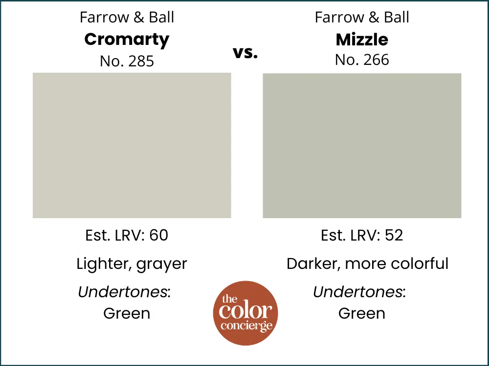
Is Cromarty lighter than Mizzle?
Yes, Cromarty is very similar, but lighter than Mizzle. In addition to being darker, Mizzle also includes a more saturated green color. Cromarty, on the other hand, can easily be used as a neutral in a bedroom, bathroom or general living space as long as it’s a single room.
Sample Cromarty
We always recommend that you test paint colors (article) in your home because lighting can completely change a color, both on interiors and exteriors.
In the old days, this meant we painted a large poster board with sample pots and a huge mess.
Now we have a better way to test paint, with Samplize Peel-and-Stick samples!
- Samples pre-painted with 2 coats of real paint from the manufacturer.
- Large 9” x 14” samples to see the color better in the lighting.
- Delivered overnight
- Colors are accurate
- Less expensive than painting a large poster board with sample pots
- No mess, and no toxic paint to dispose of
I use these in my color consulting practice for exact results. Discover Samplize peel-and-stick paint samples and sample Cromarty (Sample) via the link below.
When should I use Farrow & Ball Cromarty?
There are so many ways to use Cromarty throughout the home. While the soft green hue adds freshness to this paint, and Farrow & Ball calls it a neutral, it is pretty saturated as neutrals go. Its muted nature makes it more neutral, but the color that comes through is stronger than you expect.
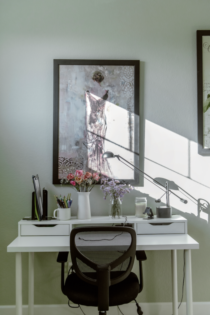
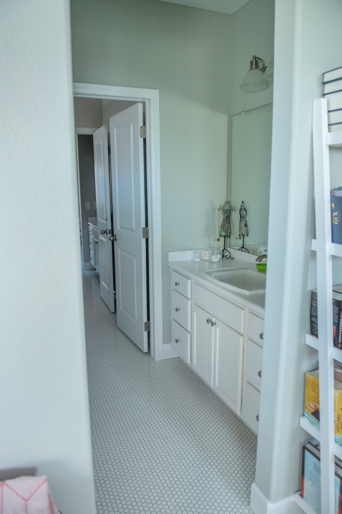
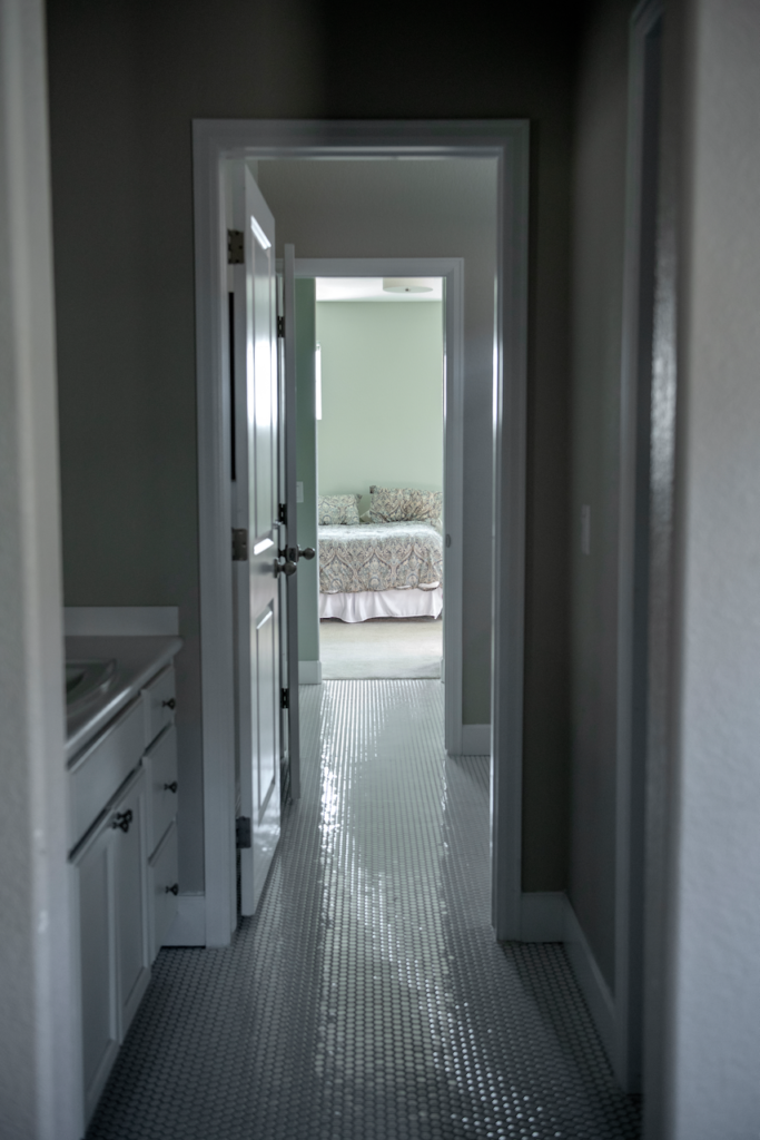
I wouldn’t use it in a large open layout space unless you really love green, for example. This color is used in a bedroom and a bathroom in our home, but it would also look beautiful in a stand-alone kitchen or even a front door.
Is Cromarty a good bedroom color?
It absolutely is! I love choosing bedroom paint colors (Article) that are calming, and the freshness of this muted gray-green makes for a beautiful bedroom. It’s neutral enough to work in most lighting, but offers more interest than a more traditional gray.
I wouldn’t even call Cromarty exactly a gray. It is saturated and beautiful, and even though I’m not given to poetic fancy, I could wrap myself in the pale, soft green color! I could also look at these Farrow & Ball Cromarty images from my home all day.
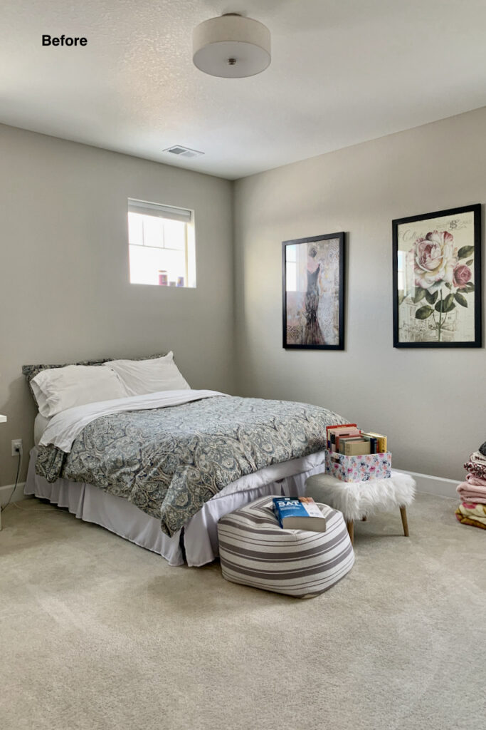
The bedroom, for example, was painted Agreeable Gray (Color review) before we painted it. Agreeable Gray is a blogger favorite and it looked perfectly fine, but it’s not magical like Cromarty.
Should I try a Farrow & Ball Cromarty bathroom?
Cromarty is a beautiful bathroom paint color! It’s soft enough to help even a small bathroom feel light and bright, but also offers more depth and interest than a traditional gray or other pale neutral.
I love the way the bathroom looks with Cromarty walls. I especially love the continuity of the color between her bedroom and on suite bathroom.
Can I use Cromarty for cabinets?
I love the idea of Farrow & Ball Cromarty kitchen cabinets! This color is a more unique neutral for painted kitchen cabinets (Article) than a typical gray or beige, but is still classic enough to stand the test of time. This natural color is trending for cabinets, to be sure.
It reminds me of the colors they use for the cabinets in the baking competition in the Great British Bake Off. I love the idea of pairing a Cromarty kitchen island with warm white cabinets.
Cromarty would also look beautiful on built-ins or shelving in a living room or home office.
Can I use Cromarty for Exteriors?
Farrow & Ball paints are only available in one-gallon quantities in North America. That doesn’t mean you can’t use it on the outside of your house, but it does mean it would be pretty cost-prohibitive.
But if you really want to use this pale green gray on your exterior (and who could blame you?!), then a Farrow & Ball Cromarty front door is a great option. This color is a great neutral for bright sunlight because it’s not so light that it will be washed out. And in the natural light its green color will really shine.
If you’re going to use this paint on your front door, just make sure to opt for Cromarty Modern Emulsion (Farrow & Ball’s version of a gloss paint).
Is Cromarty good for south-facing rooms?
Yes! South-facing rooms are typically filled with warm light for most of the day. A pale, soft tone like Cromarty is perfect for this kind of space because it can accentuate the light and make a space feel even brighter and more spacious.

Is Cromarty good for north-facing rooms?
Absolutely! Cromarty would be one of my first choices for a north-facing room because it has so much warmth that it will cut through the dinge.
Is Cromarty a good trim color?
It can be! While it’s certainly not a traditional color for trim, I love the idea of painting a whole room in this soft, calming color – walls, ceiling and trim. Wrapping a room in this peaceful color would be perfect for a bedroom or for a home office used for quiet, focused work like writing.
In the right situation, for a bedroom or secondary room such as an office or dining room, you could use it as a highlight accent on the trim with white walls. I wouldn’t use it as a trim color throughout the house.
When should I avoid Cromarty?
Avoid Cromarty if your finishes are very earthy. It could look fluorescent in comparison! Also avoid pairing it with cool white colors such as Benjamin Moore Decorator’s White or Sherwin-Williams Extra White.
I prefer not to use it as a whole-house color, or open-layout areas because it’s so saturated. When you use it, think of the room you paint as a jewel-box in your home. It is very special.
What Colors Go with Cromarty?
Does Cromarty go with gray?
Yes, because Cromarty has green undertones, it is very flexible, and pairs well with other gray paint colors, whether they have blue, green or violet undertones. Farrow & Ball recommends pairing Cromarty with the darker Pigeon. Even though they say it’s a blue-gray, Pigeon is really a gray with green undertones. It’s a lovely tonal shift.
Does Cromarty go with white?
Cromarty looks beautiful when paired with the right white paint colors (Article). Because Cromarty is so light, it should be paired with clean whites, off-whites and light creamy whites so that the contrast makes it pop.
What are the Best Trim and Ceiling Colors For Cromarty?
You have a lot of options when it comes to choosing trim colors that go with Cromarty. One option, as referenced above, is to wrap an entire room in this gorgeous light green color, from walls to ceiling and even trim. This is an easy way to create a seamless, relaxing space – perfect for a bedroom or spa-like bathroom.
For a more traditional white trim and ceiling, look for clean whites, off-whites or slightly creamy whites such as All White, Wimbourne White or even light creamy whites such as James White.
Benjamin Moore White Dove (Article) trim color would also pair well with this muted green because its such a balanced off-white color.
What is the easiest way to sample Cromarty?
You should always sample and test your paint colors – no matter how sure you are that you’ve chosen the right shade. The easiest way to sample Cromarty (Sample) (and any paint color for that matter) is via SAMPLIZE. Their peel-and-stick paint samples are easy to use and true to color. With Samplize you can easily see how different shades look on your unique wall.
Check out the SAMPLIZE website HERE.
Farrow & Ball Cromarty Alternatives
Having seen this paint color day-in and day-out in my own home, I have to admit that you’ll be hard-pressed to find a true Farrow & Ball Cromarty dupe. There’s just something so soft, saturated and magical about this color! But, if you’re looking for Cromarty alternatives or similar colors, there are a few to explore:
Cromarty vs. Mizzle
Mizzle (Sample) is another beautiful green color from Farrow & Ball. Mizzle is darker than Cromarty, and is also more colorful while Cromarty is more gray. These colors would look really beautiful paired together in the same space.
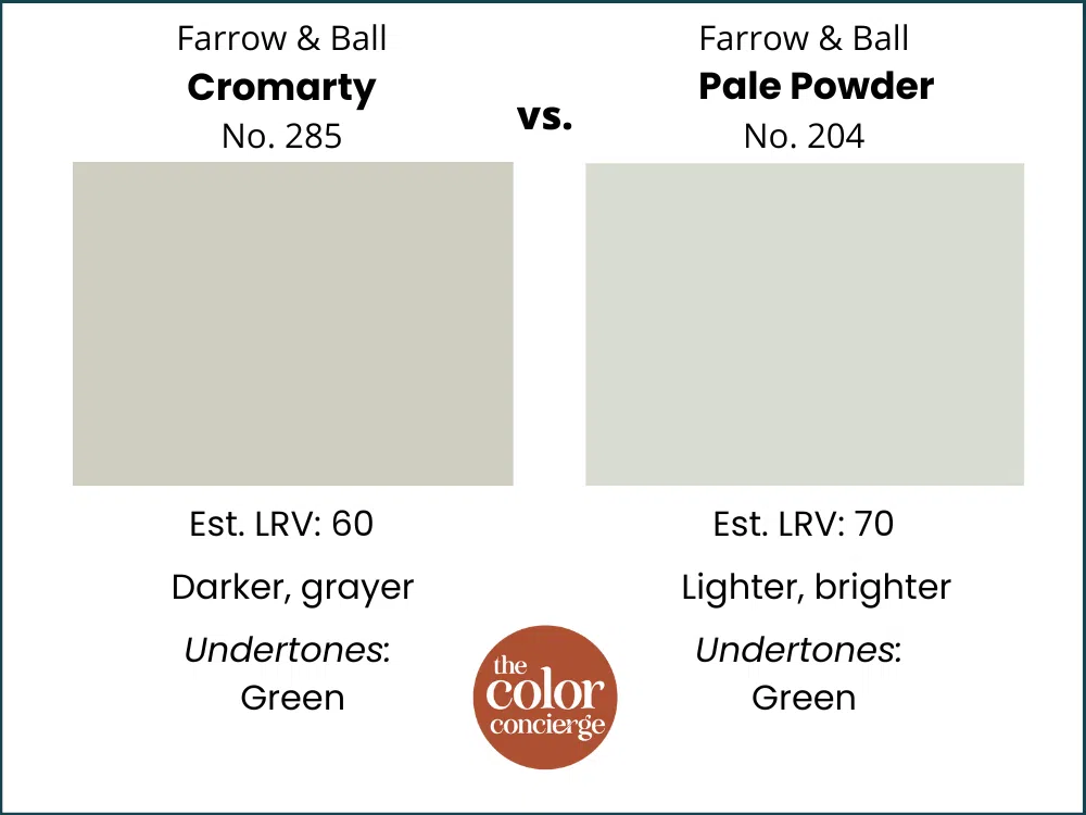
Cromarty vs. Pale Powder
Another Farrow & Ball paint color, Pale Powder (Sample) is lighter, brighter and more colorful than Cromarty. Farrow & Ball describes Pale Powder as a soft aqua – it has blue undertones while Cromarty has green.
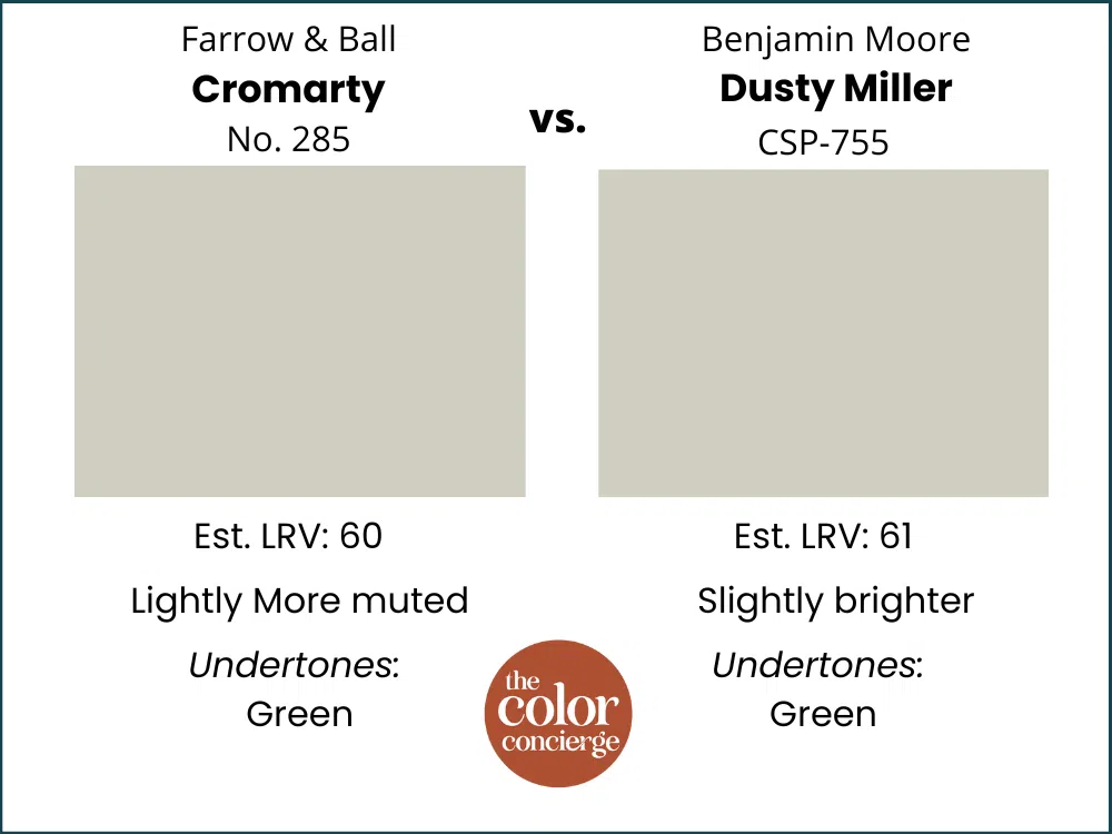
Cromarty vs. Dusty Miller
Dusty Miller by Benjamin Moore (Sample) is probably the closest you can get to a Cromarty dupe. These two colors are essentially identical. The only real difference is that Cromarty is slightly more muted.
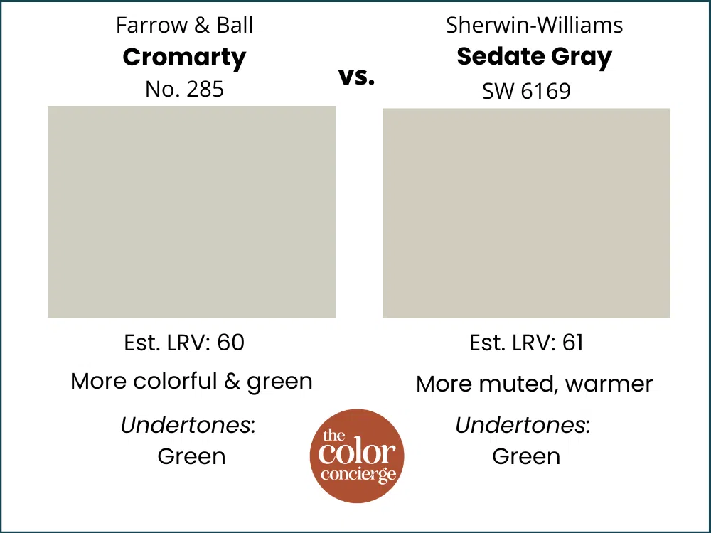
Cromarty vs. Sedate Gray
These two colors are very similar, but Cromarty is more green and Sedate by Sherwin-Williams (Sample) is more gray. If you’re looking for a more classic gray-based neutral, Sedate is a great choice.
What is the Farrow & Ball Cromarty Equivalent from Benjamin Moore and Sherwin-Williams?
As mentioned above, if you are looking for a Cromarty dupe from Benjamin Moore or Sherwin-Williams, BM’s Dusty Miller comes very close. Sherwin-Williams really doesn’t have an equivalent. While Sedate Gray is similar, it’s not as close of a match as Dusty Miller.
Still, it’s important to never attempt a Farrow & Ball Cromarty color match from a different brand. Really, you shouldn’t do this for any paint! Results are poor and there are no standards for paint sheens. What Farrow & Ball calls their “Modern Emulsion” is eggshell or matte in other brands.
Farrow & Ball Cromarty Pros and Cons
Pros:
- Offers a perfect balance between muted and fresh
- More colorful than you’d expect and has more green than gray
- Truly glows on the wall!
Cons:
- Only comes in 1-gallon buckets in the US, so can be cost-prohibitive for exteriors
- Avoid if you have earthy finishes – it could look fluorescent in comparison!
- Not the best choice for a whole-house color or open-concept space because it’s so saturated
The Verdict
Cromarty (Sample) is a beautiful gray-green neutral that can look great in many rooms of your house – in just about any lighting. Although classified as a gray, it has very saturated green tones. It is muted enough to look so natural, which is a trending look for colors.
We like it best in single rooms vs. open layout areas because it’s so saturated. A truly versatile color that wraps your space in soft, natural color, Cromarty can help make any space feel more tranquil.
No matter what, don’t forget to test your paint colors. Check out the SAMPLE website HERE.
And NEVER, EVER use paint matches from a different brand than the one specified. Results are poor. Even though your painter may truly believe it can be done, don’t do it. See results from paint matching Here.
Online Color Consulting
Do you still need help to pick the best paint colors? Discover our Online Color Consulting Package.

Related Posts
Farrow & Ball Hague Blue Color Review
Farrow & Ball Setting Plaster Color Review
About the Author

Hi, I’m Michelle Marceny, founder, owner, and Principal Color Designer at The Color Concierge. I believe a fresh coat of paint can completely transform a space. The Color Concierge was born out of my drive to help clients fall back in love with their homes. My clients trust me to help them find the perfect paint color for their home – whether it’s a whole-house paint color scheme or ideas for a single room.
Since The Color Concierge was founded in 2017, we have completed over 3000 color consultations, both online and in-person. I am a Certified Color Expert with 7 years of experience creating interior and exterior color palettes throughout North America.
If you liked this post, don’t forget to pin it!
We love your comments! Please note that the blog is meant as general advice, and it is not possible to give out specific answers to your paint questions. If you want more specific advice, our Online Color Consultations will help you pick your paint colours. Thank you for your understanding.

One Response
Thank you again. Considering Cromarty BM nock off for stucco exterior. Tired of beiges.l. Too much green,,? Will try sample.
Would you consider a review for FB best exterior stucco color and equivalent.
Love your 👁️.