Learn all about Hague Blue by Farrow & Ball in this paint color review.
Hague Blue (Sample) No. 30 is a truly iconic color. A rich, dark teal with plenty of green undertones, this interior paint looks like different colors in different light at different times of the day. You truly cannot copy it (so don’t start looking for Hague Blue alternatives or dupes!).
This paint color has so many layers of depth. It’s almost iridescent. It requires a room with a lot of light (natural or artificial). But while it’s certainly a statement color, it’s also so versatile. You’ll be hard-pressed to run out of Hague Blue room ideas.
I’ve used this paint in my own home (read more about my Hague Blue fireplace further down in this review) and have been lucky enough to work with clients to create Hague Blue bedrooms, kitchen cabinets, and more.

What is the LRV of Hague Blue?
The LRV of Hague Blue by Farrow & Ball is estimated at 7 (via google), which makes it a very dark, deep color. The scale goes from 1 (pure black) to 100 (pure white) and indicates how dark or light a color is.
Because the LRV (that’s light reflective value) is so low, it’s important to use Hague Blue (Sample) in a room with a lot of light. Otherwise, it may come off as too oppressive.
*This post contains affiliate links for products I use and love. If you click on some links and make a purchase, I will get a small commission at no cost to you. This helps pay for the costs of the blog, so I can continue to offer great content to our readers.
About The Color Concierge
Our Colorado-based paint color consultants make finding the right paint colors for your home easy. Whether you’re painting the exterior or interior of your home, our simple yet effective process lets us get your paint color right the first time. We’ve helped thousands of homeowners transform their homes into a space they love. Learn more about ONLINE COLOR CONSULTATIONS today.
Is Hague Blue warm or cool?
While we often think of blues as being cool colors, Hague Blue is really a warm hue. It looks beautiful with other warm colors, like off-white trims, gold accents, and wood furniture.
What are the undertones of Hague Blue?
Hague Blue, like many of Farrow & Ball’s blue and teal colors, has strong green undertones. These undertones are part of what makes this such a warm color.
So does Hague Blue (Sample) look green? Not really, but it depends on which color you compare it to. The green undertones help make this paint a truly rich teal color. And they also play a major role in the changes this color goes through in various light conditions and at different times of the day.
When should I use Hague Blue?
There are so many applications for a deep teal color like Hague Blue. As long as you have plenty of windows or plenty of light, you can easily create beautiful Hague Blue bedrooms, Hague Blue bathrooms, and even Hague Blue kitchen cabinets. I love the idea of a library or reading nook painted in this color!
Can I use Hague Blue as an interior trim color?
You absolutely could! I love the idea of using Hague Blue as its own trim and ceiling color and wrapping an entire room in this rich color. You would want to make sure you’re only using this kind of application in a room with lots of windows. The deep color could feel too overpowering in a very small or dark space.
Can I use Hague Blue for cabinets?
Hague Blue kitchen cabinets are one of my favorite ways to use this gorgeous color. The warm, green undertones help make your kitchen feel extra cozy and inviting. The deep teal color offers the perfect balance between modern kitchen cabinets (Article) that make a statement and a more classic navy kitchen cabinet.
I often stand in my own home and wonder if I should add Hague blue kitchen cabinets or at least a Hague Blue kitchen island!
Is Hague Blue exterior paint?
We primarily use Farrow & Ball’s Hague Blue (Sample) No. 30 as interior paint. That doesn’t mean you couldn’t use it on the exterior of your home, but it may definitely be cost-prohibitive to do so. Since we live and work primarily in the United States, and Farrow & Ball exterior paints are only available in 1-gallon quantities, it’s also impractical for exteriors.
If you’re dying for a little Hague Blue on the outside of your home, painting a Hague Blue front door (Article) could be the perfect solution. This color would look beautiful in direct sunlight or under the cover of a front porch. And its deep, almost velvety color would change significantly throughout the day.
If you’re going to use this paint on your front door, just make sure to opt for Hague Blue Exterior Full Gloss (one of Farrow & Ball’s eight paint sheen options).
Is Hague Blue good for a north-facing room?
Yes, it is! Hague Blue can really be used in any room that gets a lot of light. However, I especially love to recommend it for north- or east-facing rooms, because they receive cooler natural daylight. The green undertones of Hague Blue paint can help bring a wonderful warmth to this kind of space.
Is Hague Blue a good bedroom color?
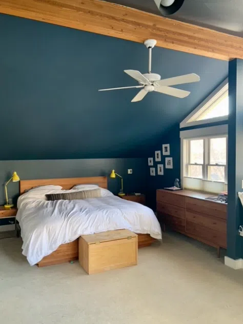
Absolutely. A Hague Blue bedroom is a beautiful thing. One way to use Hague Blue in a bedroom is to wrap the whole room with the color. In this client’s bedroom, we painted the walls and the ceilings with Hague Blue with a Modern Emulsion. The trim was painted with Benjamin Moore White Dove (Color review).
Sample Hague Blue
We always recommend that you test paint colors (article) in your home because lighting can completely change a color, both on interiors and exteriors.
In the old days, this meant we painted a large poster board with sample pots and a huge mess.
Now we have a better way to test paint, with Samplize Peel-and-Stick samples!
- Samples pre-painted with 2 coats of real paint from the manufacturer.
- Large 9” x 14” samples to see the color better in the lighting.
- Delivered overnight
- Colors are accurate
- Less expensive than painting a large poster board with sample pots
- No mess, and no toxic paint to dispose of
I use these in my color consulting practice for exact results. Discover Samplize peel-and-stick paint samples via the link below.
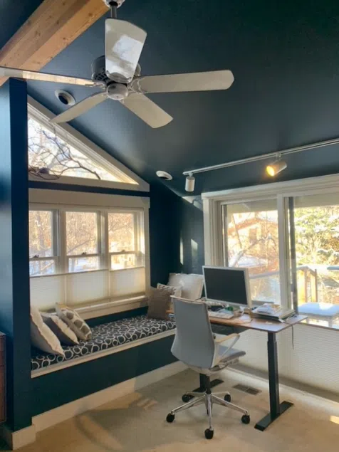
For this type of placement, it’s essential to have as much natural or artificial light as possible (we’ve said that a few times now in this Hague Blue (Sample) color review – because it is that important!). This bedroom has lots of windows with a beautiful blue. The Hague Blue wall color frames the view as if it were a painting, and all of the natural light shows off all the complexity of this paint color.
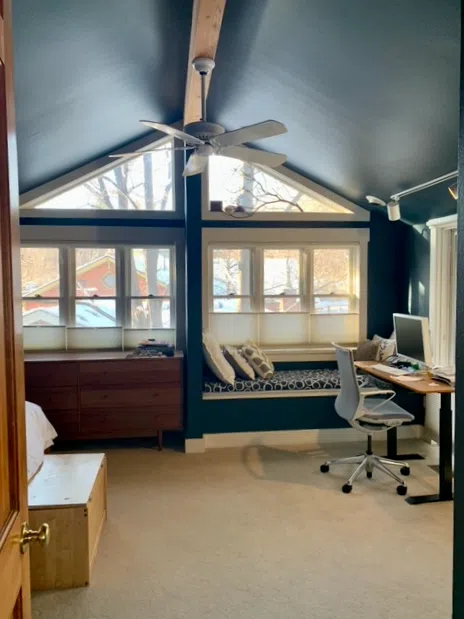
The warmth of this color also works beautifully with the gorgeous wood beam down the center of the room. While this room does use white trim, you could also use Hague Blue as the trim color in a room like this without it feeling overdone.
How else can I use Hague Blue?
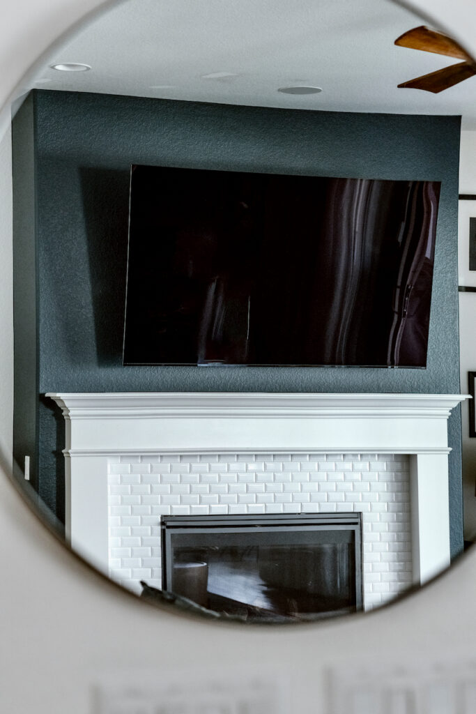
Another practical and super-handy way to use a dark color like Hague Blue (Sample) is as a way to minimize a TV over a mantle. When my husband came home with an 85” TV one day I didn’t know what to do with it. But I definitely wasn’t excited about having it as the focal point above my fireplace!
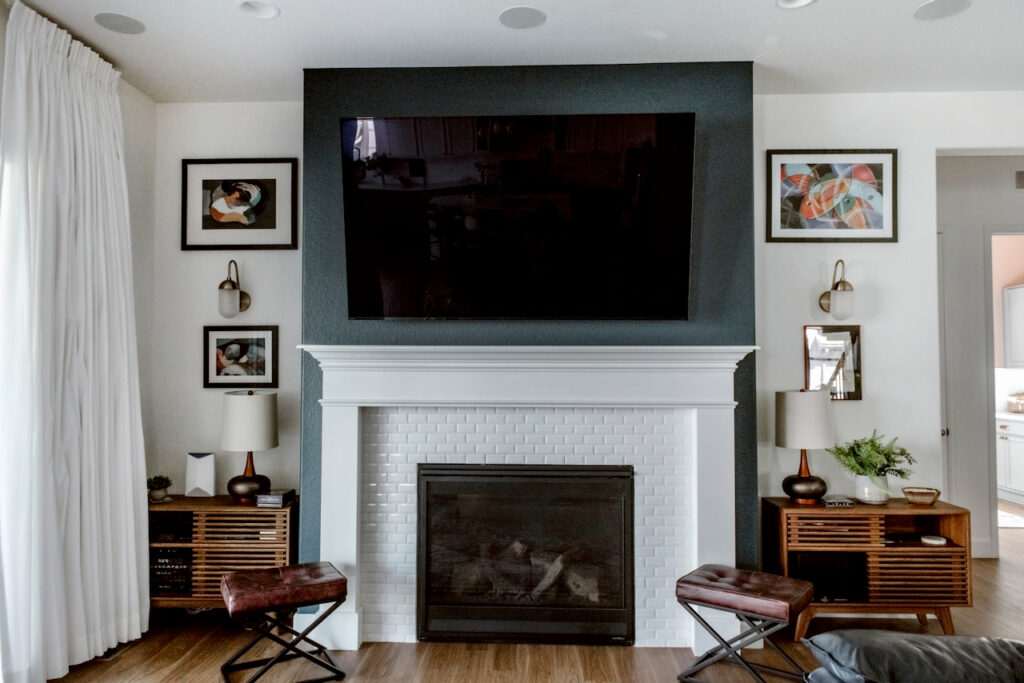
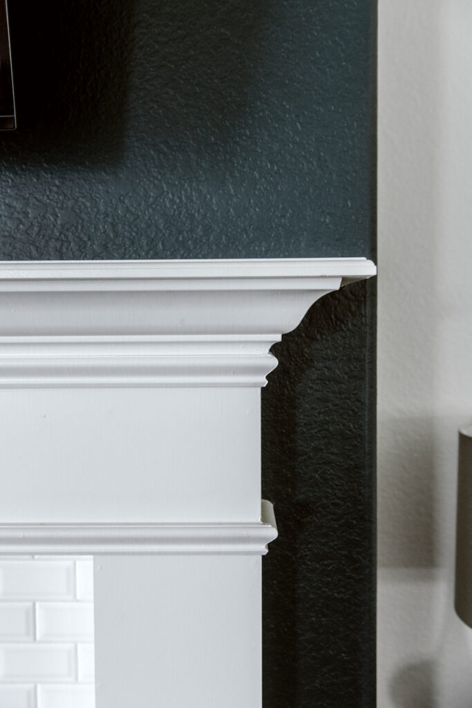
That’s where Hague Blue came in. We painted a Hague Blue fireplace bump-out with a Modern Emulsion (that’s like a matte or eggshell sheen) and the TV practically disappears – especially at night. And while the TV may not be completely hidden, I do get to look at Hague Blue all day long when I’m in the kitchen, so it’s a real win-win.
When should I avoid Hague Blue?
There are so many versatile applications for this deep teal paint color. I would love a Hague Blue (Sample) home office or Hague Blue bathroom. Even a laundry room could be elevated with this color – if there’s enough light.
A lack of light is really the only time you should avoid Hague Blue. If a room doesn’t have enough windows or enough artificial light, Hague Blue could end up feeling too dark and overwhelming. For example, a Hague Blue library would be beautiful, but if all you have is one small reading light in the corner, then a color this dark would likely feel too overbearing.

What color goes well with Farrow and Ball Hague Blue?
Because of its depth and warmth, Hague Blue walls look beautiful when paired with warmer neutrals (Article) like cream, beige, and gold.
A Hague Blue accent wall would work really well in a living room or bedroom with a neutral beige primary color. Hague Blue lower cabinets are gorgeous when paired with off-white or cream-colored upper cabinets.
Does Hague Blue go with gray?
It depends on which gray paint you’re using. A particularly cool gray is not the best complement for the warmth of Hague Blue. But a warm, greige paint could look beautiful paired with this deep teal. Using Hague Blue and Ammonite together, for example, would make for a cozy and inviting combination.
Does Hague Blue go with white?
Hague Blue pairs well with off-whites and clean white paint colors as shown below with Sherwin-Williams Extra White (Sample), a crisp white.
What are the Best Trim and Ceiling Colors For Hague Blue?
Off-whites such as Farrow & Ball Wimborne White (Sample) look great with Hague Blue. My favorite Benjamin Moore off-whites for this wall color are White Dove (Sample) and Cloud White. Farrow & Ball All White (Sample) and Benjamin Moore Chantilly Lace (Article) are also good options if you prefer a crisper white.
My preference is to use the same paint for the trim and ceiling.
Some creamier white colors can look yellow in contrast with Hague Blue, so keep this in mind when choosing your trim and ceiling colors (or, better yet, contact your friendly neighborhood paint color consultant to help you choose the paint that’s right for your home).
What is the easiest way to sample Hague Blue?
You should always sample and test your paint colors – no matter how sure you are that you’ve chosen the right shade. The easiest way to sample Hague Blue (Sample) (and any paint color for that matter) is via SAMPLIZE. Their peel-and-stick paint samples are easy to use and true to color. With SAMPLIZE you can easily see how different shades look on your unique wall.
Check out the SAMPLIZE website HERE.
Hague Blue Alternatives and Similar Colors
While I personally feel like there’s no true Hague Blue alternative (the depth is one-of-a-kind!), there are a variety of similar colors you could choose for your painting project.
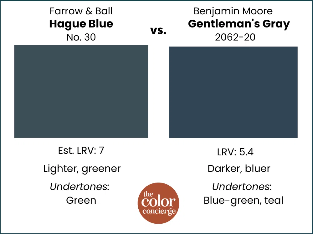
Gentleman’s Gray vs. Hague Blue
Gentleman’s Gray (Sample) is darker, bluer, and more colorful. Hague Blue is lighter and has more green so that it leans to teal. It is much more muted than Gentleman’s Gray by Benjamin Moore.
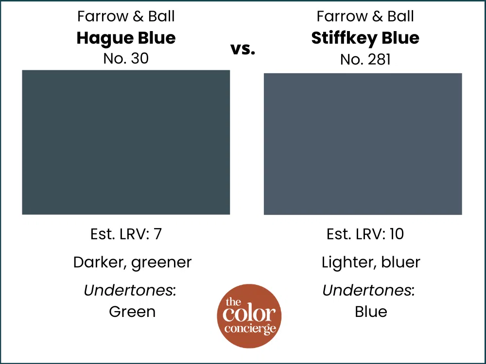
Stiffkey Blue vs. Hague Blue
Your room will look very blue when you paint it with Farrow & Ball Stiffkey Blue (Sample). This color is lighter than Hague Blue, which is much greener. Hague Blue is also more muted than Stiffkey, which makes it a bit more versatile in more spaces.
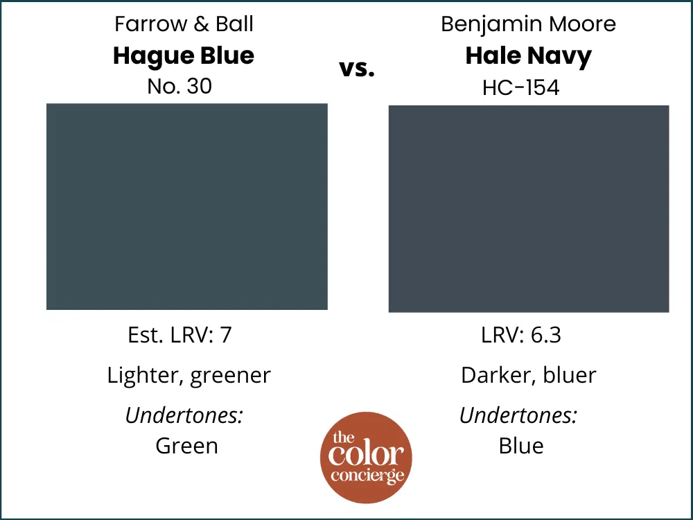
Hale Navy vs. Hague Blue
These two colors are completely different! Benjamin Moore Hale Navy (Sample) is a dark blue color compared with the teal Hague Blue. Hale Navy needs even more light than Hague Blue to come to life in a room. They are both beautiful and may look the same on a small swatch, but once they go up on a wall they will look completely different.
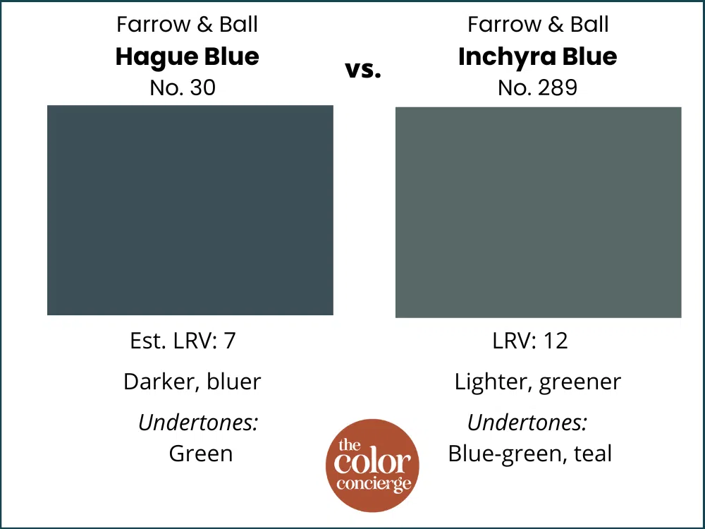
Inchyra Blue vs. Hague Blue
The lighter color is Inchyra Blue by Farrow & Ball (Sample), which is also much greener than Hague Blue. Hague is darker, richer, and bluer. Both are teal colors, but Inchyra is greener. This is especially important to be aware of if you’re using this color in a room with large windows and lots of trees outside – because that green will become even more prominent.
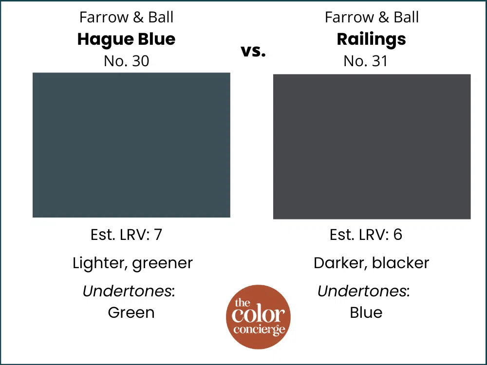
Railings vs. Hague Blue
If you are looking for a soft black, then Farrow & Ball’s Railings (Sample) is for you. Once the color goes up on the walls, it’s not even close to Hague Blue, which is teal, lighter, and more colorful.
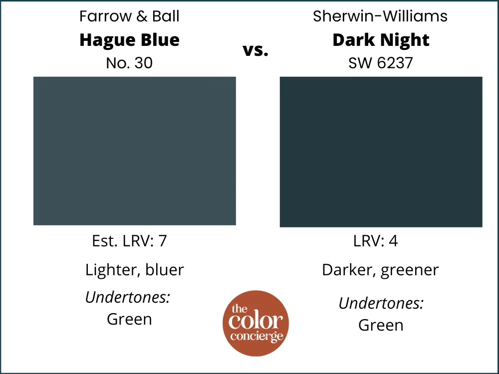
Dark Night vs. Hague Blue
Hague blue is much lighter than Dark Night (Sample). Dark night can read like a black unless you are outside. Hague Blue is softer and bluer. While Hague Blue can sometimes look almost black (especially at night or in low light), it has much more depth of color than Dark Night by Sherwin-Williams.
What is the Hague Blue equivalent from Benjamin Moore or Sherwin-Williams?
If you’re looking for a Hague Blue (sample) alternative, you’re not alone. Farrow & Ball paints can cost significantly more than Benjamin Moore or Sherwin-Williams. But you can also typically use less paint because the paint coverage is so much better. So if the price is the driving factor behind your hunt for a Hague Blue dupe, then rest assured: going with the real thing will be well worth it.
The closest Benjamin Moore match to Hague Blue is Gentleman’s Gray.
Never, ever attempt a Hague Blue color match from a different brand. Don’t do this for any paint color, actually. Results are poor and there are no standards for paint sheens. What Farrow & Ball calls their “Modern Emulsion,” for example, is called eggshell or matte in other brands.
The Verdict
Farrow & Ball Hague Blue is a beautiful deep, rich teal paint color with warm, green undertones. It is most commonly used as an interior wall color and sometimes as a cabinet color. It can be used in rooms with a lot of light (natural or otherwise) and can be used in both modern interiors and more classic or even vintage homes.
No matter what, don’t forget to test your paint colors. Check out the SAMPLIZE website HERE.
NEVER, EVER use paint matches from a different brand than the one specified. The results are poor. Even though your painter may truly believe it can be done, don’t do it. See results from paint matching Here.
Online Color Consulting
Still looking for the best Hague Blue color review? Discover our Online Color Consulting Package.
Related Posts
Farrow & Ball Setting Plaster Color Review
Sherwin-Williams Granite Peak Color Review
Benjamin Moore Britannia Blue Color Review
About the Author

Hi, I’m Michelle Marceny, founder, owner, and Principal Color Designer at The Color Concierge. I believe a fresh coat of paint can completely transform a space. The Color Concierge was born out of my drive to help clients fall back in love with their homes. My clients trust me to help them find the perfect paint color for their home – whether it’s a whole-house paint color scheme or ideas for a single room.
Since The Color Concierge was founded in 2017, we have completed over 3000 color consultations, both online and in-person. I am a Certified Color Expert with 7 years of experience creating interior and exterior color palettes throughout North America.
We love your comments! Please note that the blog is meant as general advice, and it is not possible to give specific answers to your paint questions. If you want more specific advice, our Online Color Consultations will help you pick your paint colors. Thank you for your understanding.

2 Responses
Wonderful article!!
Thanks, Mary Jo!