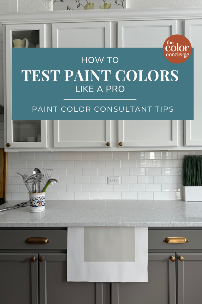
Finding the perfect paint colors for your home can feel completely overwhelming. There are thousands of colors from different brands to explore. And too often, the color that looks perfect on your neighbor’s house or online looks off when it’s actually on the wall in your home. That’s why testing paint colors is so critical.
We consider paint color testing part of the color selection process. This is a standard practice for all interior and exterior home designers.
As paint color consultants, we know the value of testing paint colors on a wall properly. When we work with a client on an interior or exterior color consultation, we make testing a key phase in our work together. When you test paint colors well, you ensure you get the right paint color the first time, saving tons of time and money.
Now, we want to share our expert tips for testing paint colors like a pro. We’re giving away our best practices and step-by-step guidelines for testing interior and exterior paint colors. Keep reading to choose and test paint colors like an online color consultant.
*This post contains affiliate links for products I use and love. If you click on some links and make a purchase, I will get a small commission at no cost to you. This helps pay for the costs of the blog, so I can continue to offer great content to our readers.
About The Color Concierge
Our Colorado-based paint color consultants make finding the right paint colors for your home easy. Whether you’re painting the exterior or interior of your home, our simple yet effective process lets us get your paint color right the first time. We’ve helped thousands of homeowners transform their homes into a space they love. Learn more about ONLINE COLOR CONSULTATIONS today.
How to Test Paint Colors Properly: General Tips
Before we discuss specific tips for interior and exterior paint, a few general recommendations are important.
Test paint colors in daylight
Natural light is critical to test the undertones of your paint colors. If a paint color works in natural light, it will work with artificial light, too (especially because lightbulbs can be changed out for warmer or cooler options).
When you test in natural light, you check to ensure the paint color pairs well with all the other colors in your room. Even as the light changes, the colors still relate to each other.
Artificial lighting will change the way you see the undertones. For example, yellow lightbulbs will make white paint look more yellow.
If the room does not have windows, test after the lighting has been finalized. An LED will look different than an incandescent light.
Give yourself at least one day to make your decision
Don’t rush the process! Test the paint colors at different times of the day. Morning, noon, and evening light varies, making the color look different. Give yourself some time to really examine the color and make sure it looks right in your space.
After you pick the best color, review it in artificial light.
Pro Tip: Take photos with your mobile phone.
When testing paint colors inside or outside, try taking photos of your tests with your mobile phone. The colors are really accurate, and it’s a great way to check your work. Just ensure you don’t use flash and instead rely on natural light.
3 Ways to Sample Paint Colors
Once you have selected the paint colors you want to test, it’s time to follow paint testing best practices. These three methods can help you accurately test paint colors in your home.
Test paint colors with Samplize
I love Samplize as a next-level tool to evaluate how the paint will look on your wall.
Samplize offers large 9”x14” peel-and-stick samples made with two coats of real paint to achieve incredibly accurate color in any light. They’ll even show your wall’s texture so you know exactly how the paint will look.
Their samples guarantee color accuracy and ensure easy application, repositioning, and removal with no mess or dry time. Samples can even go around corners and be used on exterior siding and other surfaces. Samplize is truly the easiest and most accurate way to test paint colors on a wall!
Large color card samples from The Color Concierge
When you work with us as paint color consultants, we send you complimentary large color card paper samples directly from Sherwin-Williams (8.5″ by 11″) or Benjamin Moore (9″ by 9″). These are a good screening tool to start your testing process and a great way to see the colors in real life. They are printed versions of the colors, and not peel-and-stick, but I still find them a good tool for testing.
Paint samples on poster board
Testing technology has come a long way. This is the old-school way of testing paint colors. Essentially, you paint samples on white poster boards (two coats). The challenge is that it makes a mess, and the samples aren’t always perfectly mixed by the vendor so that they can be inaccurate.
How to Test Interior Paint Colors
As a homeowner, you’ve probably faced the challenge of choosing an interior paint color. And you’ve probably started by looking at paint color options online.
Color consultants are trained to understand how colors change in various light conditions, but we still always test our paint colors.
While the internet is a helpful tool for finding the best paint colors, it’s important to remember that colors will always look different in person than on your computer screen or printed on paper.
In reality, they can vary significantly. In bright light, they look lighter and cleaner, and in the shade, they look more muted. If the color is too dark for a room, it can look black in low light.
We recommend that you always test any paint colors you’re considering in the room where they will be used. This is especially important because the light in your home can shift differently from room to room depending on the architecture or the number of windows in the room.
If you plan to color-drench a room, make sure that you test the paint color, and that it doesn’t look black in natural light. The biggest mistake I see with color drenching is picking a color that is way too dark for the conditions.
How Lighting Affects Paint Color Testing
Ideally, you should always test your paint colors with the shades open and without overhead lights so that you can see the undertones. Once you turn a light on, it will change the undertones depending on whether the light is warm or cool.
If you test your paint colors without overhead lighting, in natural light, then you know that all of the colors relate to each other.
Sometimes people change their artificial lighting to make their colors look better. This is why it’s so important to test your paint colors in natural light. You can’t change the color of the sun but you can change out your bulbs! If the color works in natural light, then all will be well.
Testing Dark Paint Colors
It doesn’t matter what kind of paint color you’re working with, testing is always critical. But it can be especially important for very dark paint colors.
If the light is low in a room, I usually lean toward lighter accent or whole-room colors because otherwise, the color can go black on you. When you are testing, pay attention to how the color looks in the room. If it starts to go black, test the lighter version. The exception is if you have tons of artificial lighting, specifically lamps and light fixtures.
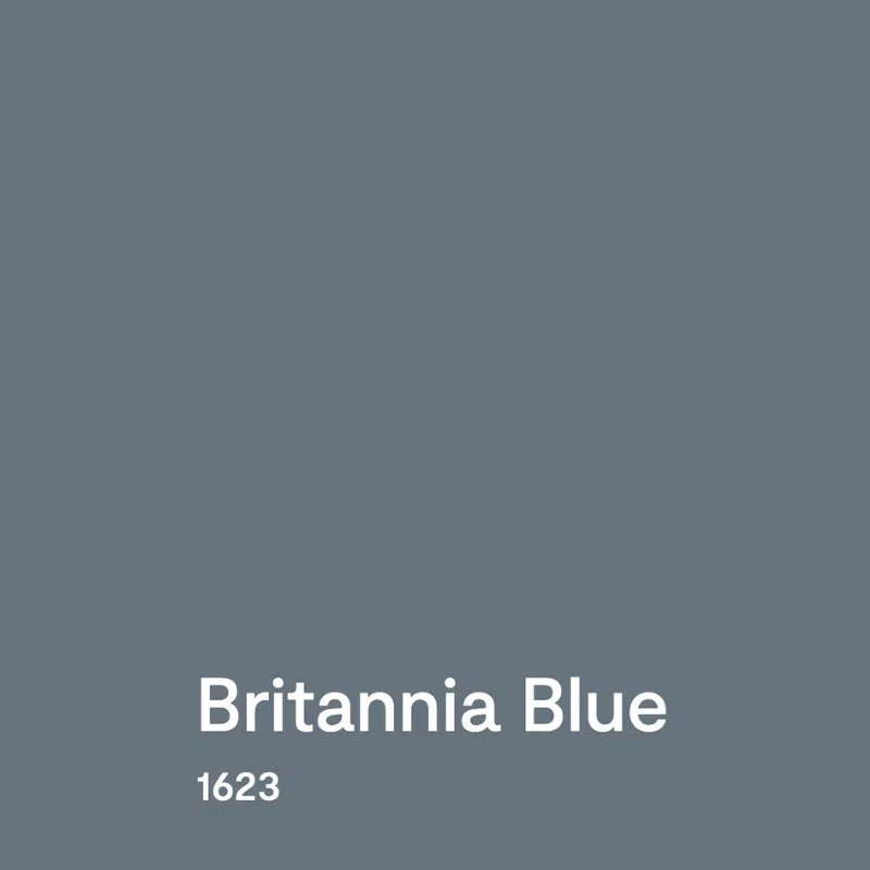
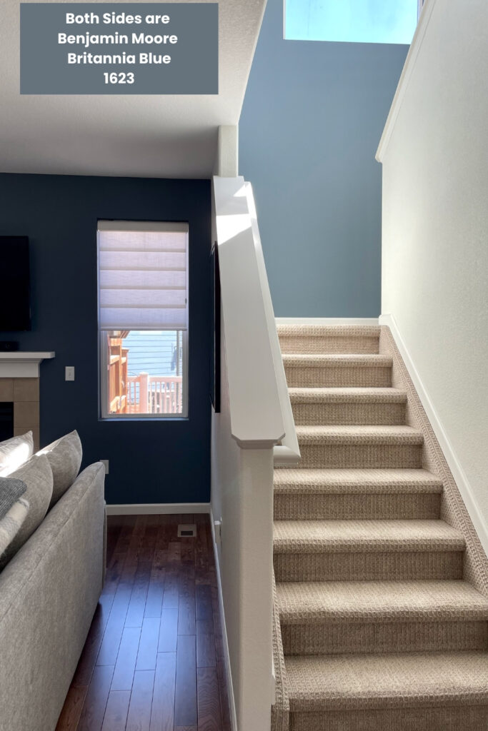
One of my favorite examples is a photo I took with Britannia Blue.
This is what Britannia Blue looks like from the Benjamin Moore website:
The photo of a client’s home below is a great example of just how much lighting can change the look of a dark paint color. Both sides of the wall show the same color – Benjamin Moore Britannia Blue – but it looks like two completely different colors as the light changes.
How to Test Interior Paint Colors: Step-by-Step
Once you’re ready to test interior paint colors, use these steps to ensure you choose the right color the first time.
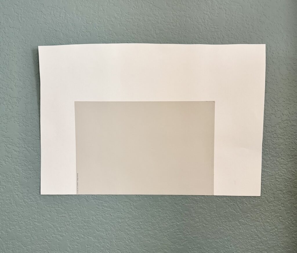
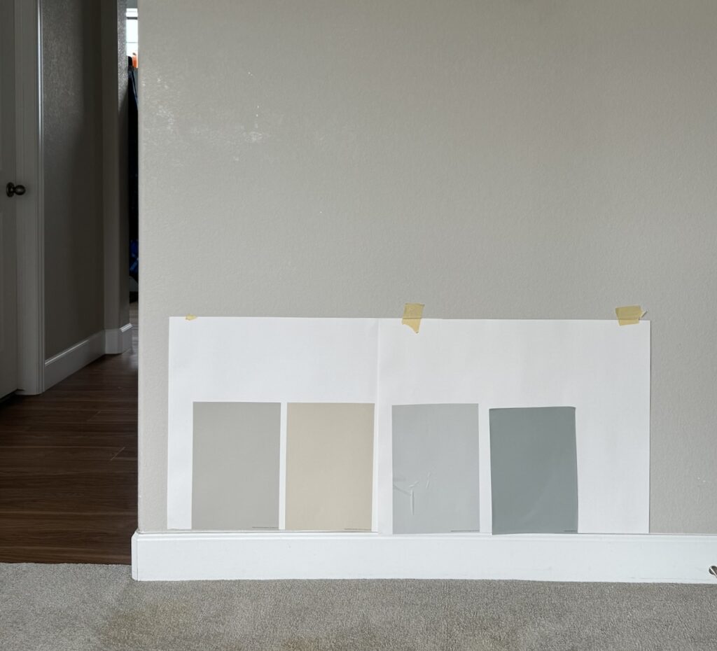
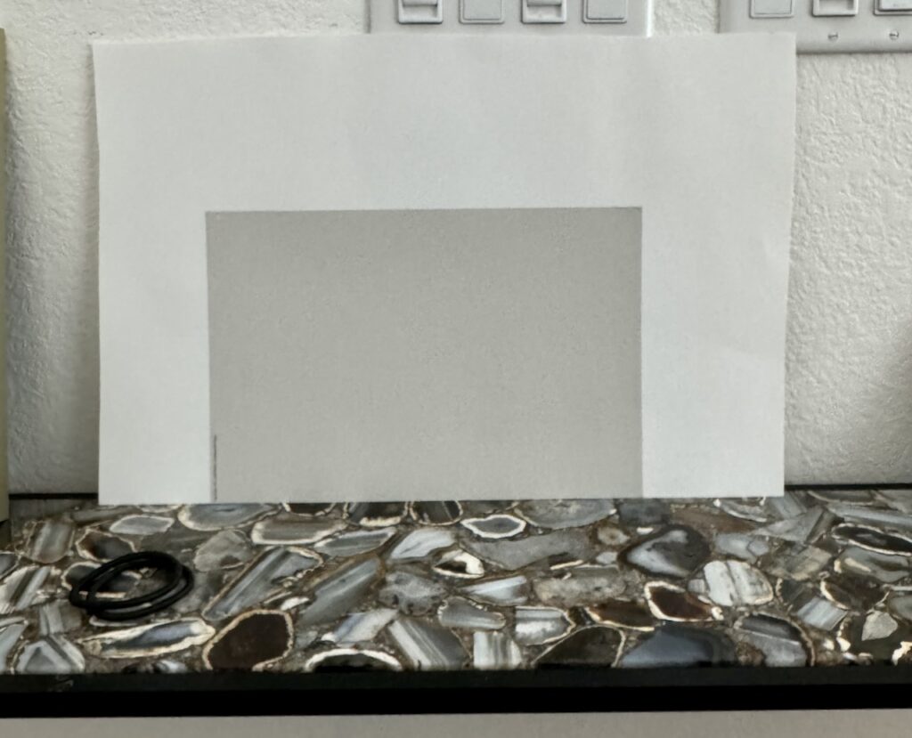
Place sample on poster board with 3 white edges showing
To properly test your colors, use a Samplize peel-and-stick sample OR one of our large color card samples and stick them onto a white poster board.
Make sure that one side of the sample is at the edge of the poster board so that you can place it next to the trim or other fixed surfaces.
Place the samples on a white poster board to create a divider between the current wall color and the proposed paint colors.
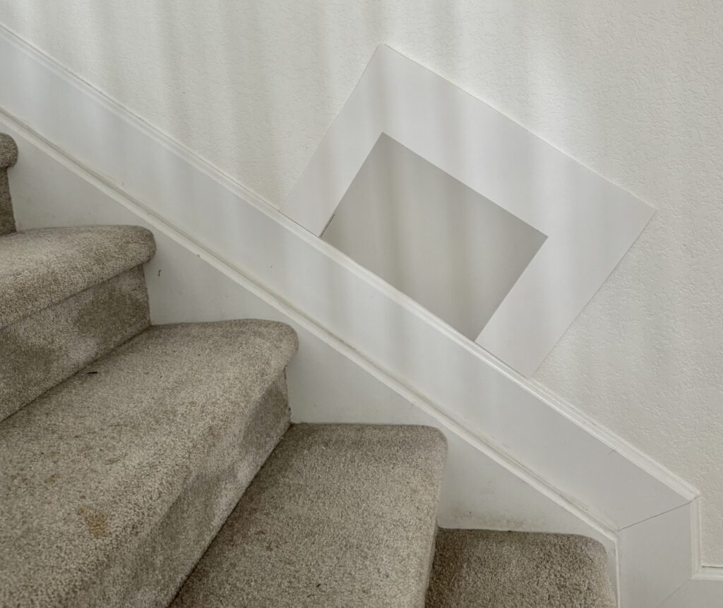
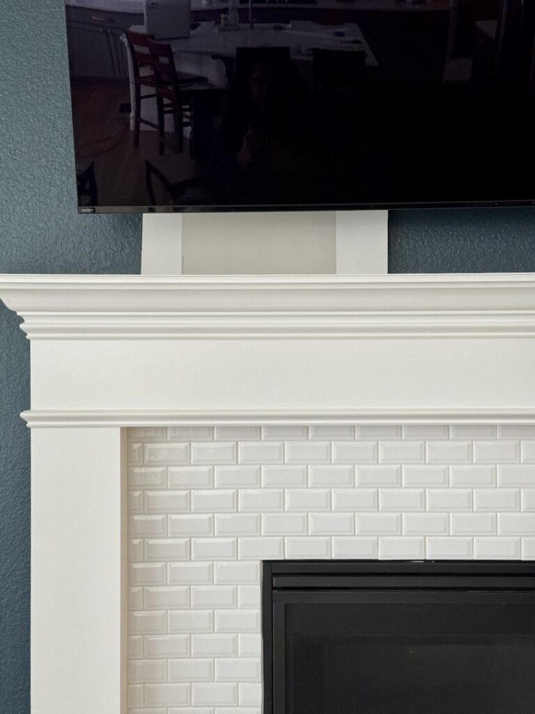
If you don’t have white poster board and you plan to keep the trim the same, you can place the samples on top of the door. This way, you can see how they compare to each other and how they look with the white trim. You can also see the carpet or floor on the bottom for comparison.
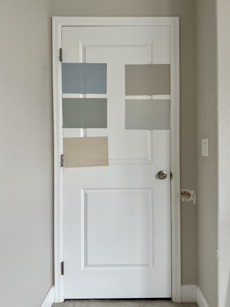
DON’T do this (pictured in the image below)! It’s hard to see the paint colors next to the current paint color. Even the pros can’t see the differences between the paint colors and the paint color in place. These are the same colors shown on the white door above.
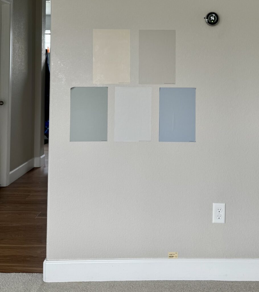
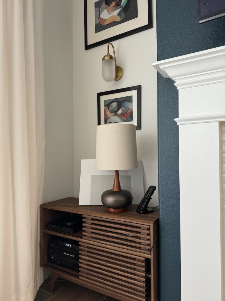
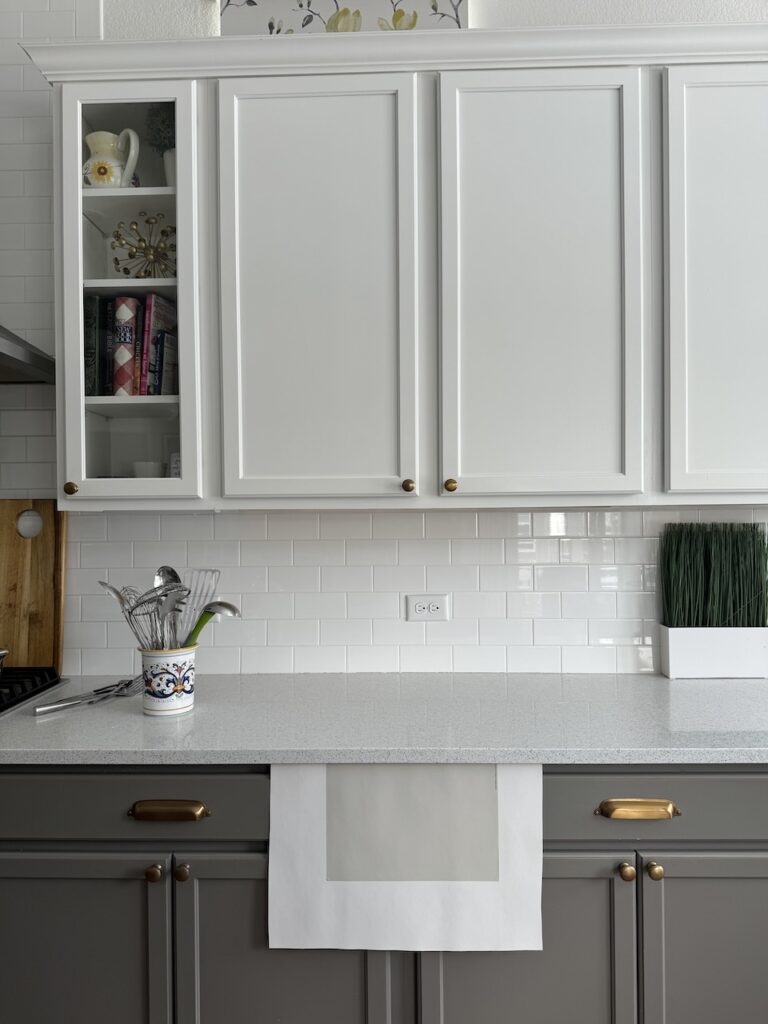
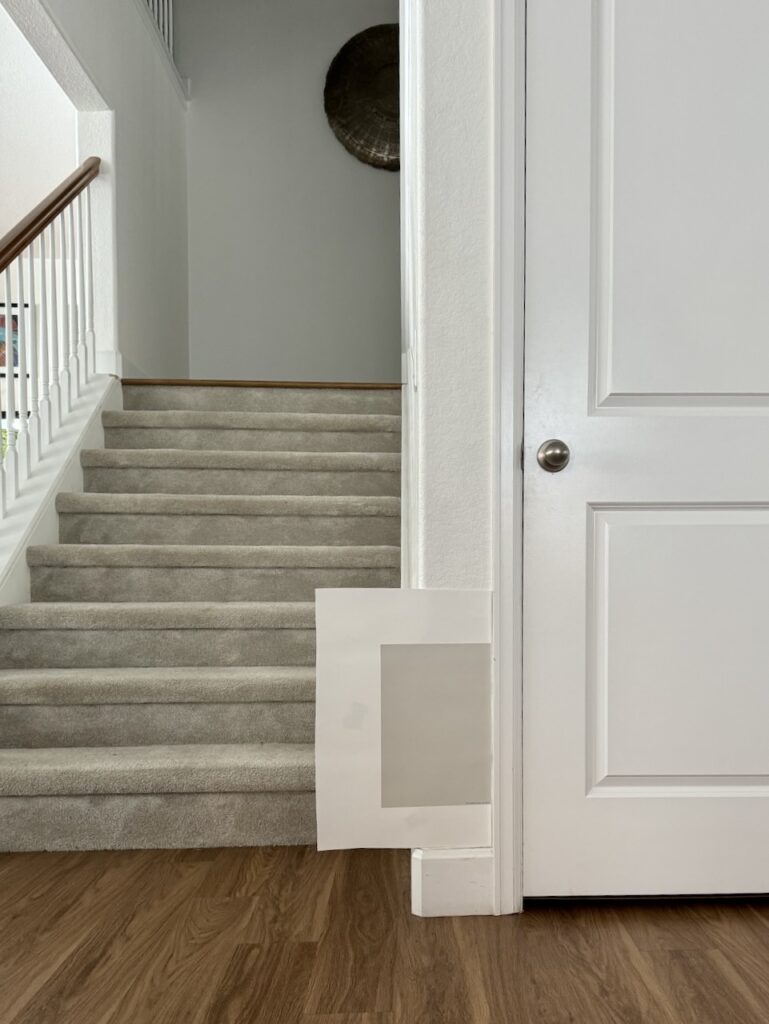
Hold the sample next to trim, decor & hard finishes
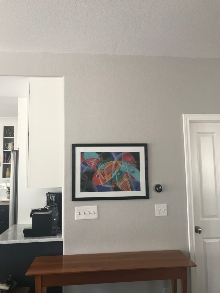
Hold the sample against all your countertops, backsplashes, flooring, and furnishings in the orientation in which they will appear on the wall. In the photo below, for example, we’re testing a sample next to a console table with a very busy and dominant finish.
Test next to the white trim color that you have or plan to change to. This is a great place to test your paint color. In the photo below, the sample is shown next to the trim color. The poster board provides white space around the sample. You can also see how it relates to the carpeting.
View throughout the day in different light conditions
Observe the paint colors throughout the day and in the artificial light in the evening.
Keep in mind that lightbulbs can be changed out so if the color is perfect in the natural light of daylight, that is more important.
Test Next to Existing Finishes & Decor
Always test interior paint colors next to all of the hard finishes, decor and other paint colors in a space, such as in the photo below. This photo also shows a great way to test cabinet colors.
For new builds or remodels, test your paint colors next to your tile, carpet, flooring, and other fixed elements. Ideally, when you have a remodel or new build, the paint should be selected after you have selected the rest of the hard finishes.
For clients with unfurnished homes, we use hard finishes such as tile, countertops, wood floors, and carpeting to test the paint colors.
The Final Test
Once you find your final paint color, paint a large area on a wall that is next to a door or molding and has decor such as a painting and furniture. The more furniture or existing finishes you can use to compare, the better your results will be. If you test your paint directly on the wall, make sure that you use a roller, and cover with at least two coats of paint.
Not everyone has the time or flexibility for this last step, but it is nice to do if you can.
How to Test Paint Colors for Exteriors
Testing exterior paint colors is just as important as testing interior ones. The biggest reason is that colors look so different in the sunshine than they do on a swatch or in the shade. Sometimes the color that looks perfect online, in a store or even inside your home can look completely wrong when used outdoors.
When I first started out as a paint color consultant, my Sherwin-Williams local designer representative told me that the biggest mistake homeowners make is picking paint colors that are way too light for outdoor use. This was one of the most important pieces of advice that I have ever received regarding paint colors.
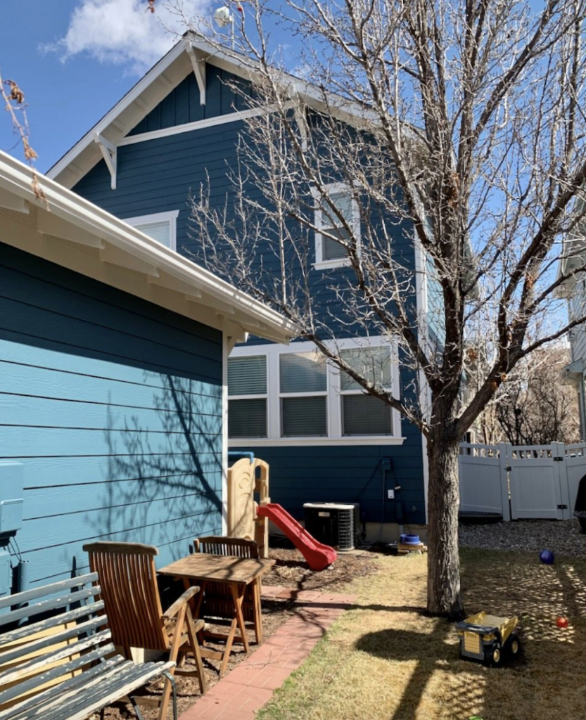
Paint colors can look 4-5x brighter in the sunshine than indoors or in the shade. Take a look at the photos below. All three images show Newburg Green exterior paint.
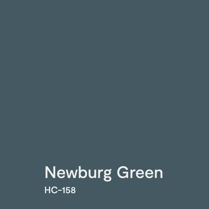
This is what BM Newburg Green looks like on the website:
This home in Colorado shows how different Newburg Green can look in the shade than in the sunshine. I love it in both conditions, but it’s great to learn about that when you are testing.
When I saw the photo of the house below in California that was painted Newburg Green, I couldn’t believe that was the color until I compared it with the house above. The house was in the sunshine, and the color looked gorgeous both ways.
How To Test Exterior Paint Colors
Even if you’re working with a paint color consultant or designer, testing exterior paint colors is a must-do. An actual painted board or paint on the wall is the ultimate test for accuracy.
Testing paint colors this way also ensures you can compare color options to all of your home’s exterior hard finishes. Homes often have a variety of exterior finishes and colors, so it’s important to have a clear picture of what your completed project will look like.
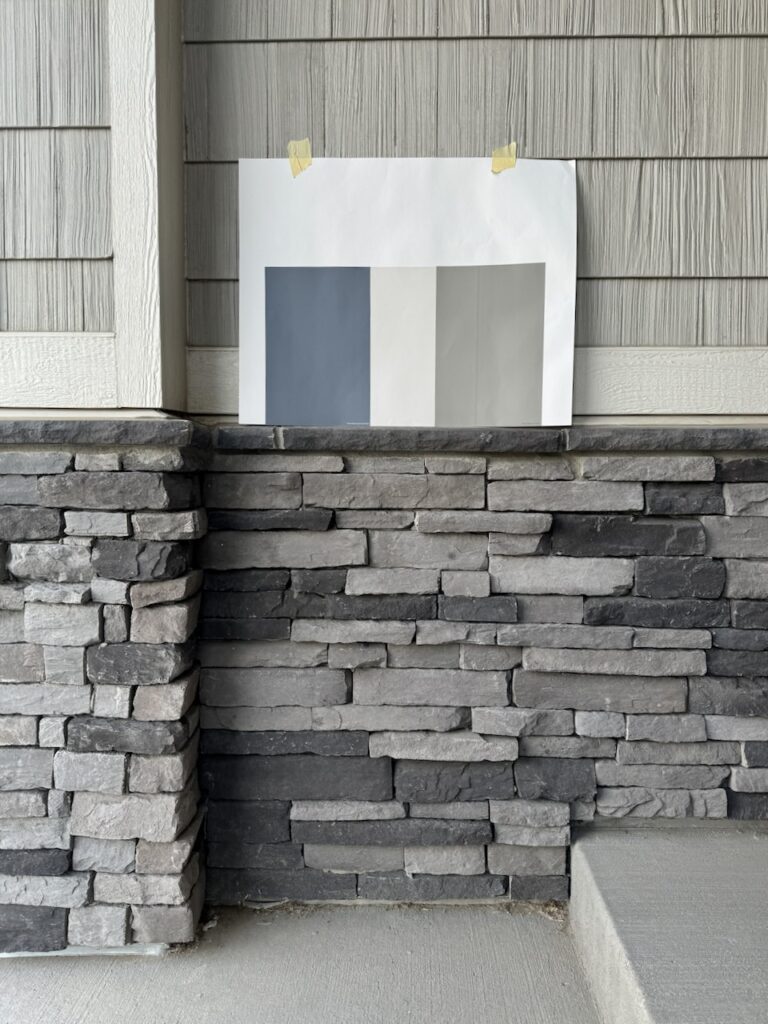
For example, the color tests pictured below were done with Samplize samples attached to a white poster board.
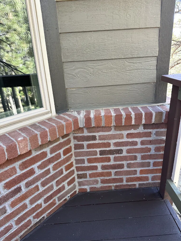
I love to test a total palette this way. Then you can see how the colors relate to each other as well as the brick or stone, and other important finishes. The colors in the palette can touch each other, but should be directly on the stone. The palette should be surrounded by at least 3 inches of white paint or cardboard.
As with interior paint colors, make sure that you move the sample board around the house to see how the colors look in the shade at different times of day. They will look substantially brighter and more colorful in the sun and sometimes much darker and more muted in the shade.
Exterior Paint Testing Do’s and Don’ts
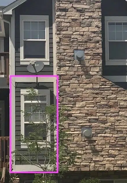
DON’T: add samples on top of your existing exterior paint color. It’s hard to see the true color when it is painted in the middle of the existing color. The background color tricks your eye. It’s also hard to see what the color looks like next to the brick or stone, which is important.
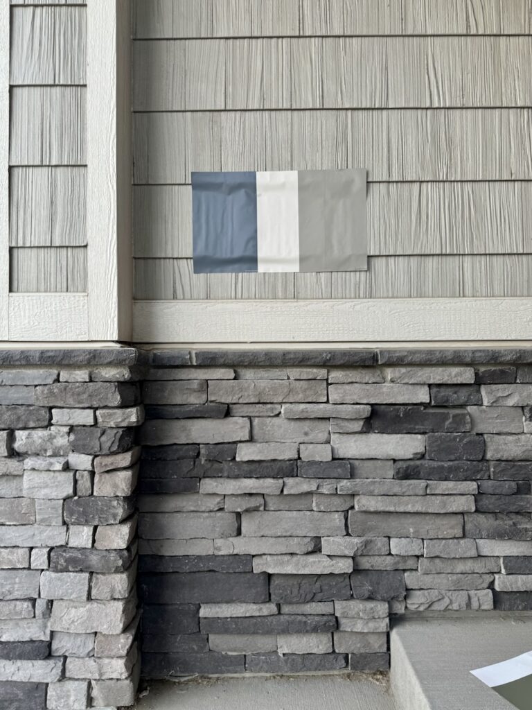
DO: If you use actual paint on the siding, test larger swatches over primer or tape white paper around them to isolate the color. Ensure you have at least 3 inches of white space between the new and surrounding colors. Test adjacent to brick, stone, and trim.
DO: Use Samplize samples or large color cards on white poster boards to eliminate the influence of the existing color. Move the board around to see how it looks in different light.
DO: As a final step, after you find the best palette, paint a larger sample on the siding and trim. Paint both a trim and wall color in a corner, around a window, or near existing brick or stone so you can get a clear picture of how the entire palette works together. The garage door and trim are also a good place for this step. Not everyone has time to do this final test, but it can be helpful.
NOTE: Use primer under the color test to prevent the color underneath from seeping through. Use a good masonry primer for stucco and brick surfaces.
How to Test Exterior Front Door Paint Colors
Test exterior front door paint colors like you test any other paint colors.
Stick your samples on a white poster board to isolate the color from the color in place. If you stick the sample right on the existing door, your eye gets distracted by the current color.
Then, move the poster board around the house and place it next to the trim, stone, or the bottom of the door.
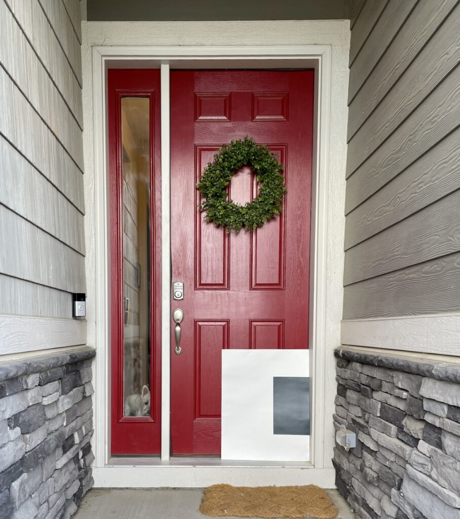
Front door entries are sometimes shady. If your sample looks black and you want a more colorful paint color, then you need to pick a lighter and brighter color.
How to Test Paint Colors for New Builds
While the general rules for testing exterior paint colors like a pro don’t change for new builds, they do come with some additional challenges.
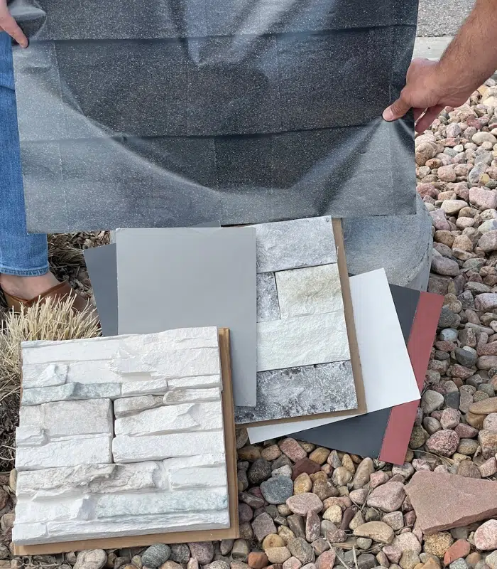
The key to this type of testing is to make sure that any paint color options are compared with the stone, roof and other hard finishes, where they are available. You can usually order samples of stone and roof through your builder.
Ideally, test them at the home site in the sun and in the shade. Place them vertically so you can see how they behave in the same orientation you will have outside. This will give you a good idea of how the colors will look together. In this case, we tested the large color card samples from Sherwin-Williams with the stone. Samplize samples also would have worked very well!
Don’t forget – colors look substantially different outside than inside, or on a computer mockup or rendering. So it’s not enough to choose your exterior colors in the developer’s office!
Common Questions About Testing Paint Colors
Still have questions about testing paint colors like a pro? Explore some of the most common questions we’re asked and read our answers.
Can I choose paint colors online from a blog post?
Reviewing paint colors online is a great way to start the process, but it should never be the only step you take. Colors often look very different in place than they do on a computer screen.
Additionally, photos in blog posts are frequently color-edited. Sometimes bloggers even get photos from other articles and don’t know the actual color that was used. That’s why at The Color Concierge we use photos from our own projects taken in natural lighting, so we can give you the most accurate representation of each color we review.
Are online paint color visualizers accurate?
No, they’re not. Online paint color testing tools can be a fun way to start choosing a paint color, but they should never replace actual paint color testing in your home. Sometimes the visualizers will show the original color of your house peeking through. Even if you upload a photo of your room to an online visualizer tool, it can never replicate the way natural light shifts throughout the day.
Creating a rendering of a house is a long process when done right. We create Photoshop renderings for our clients, but it takes our talented Photoshop artist at least a couple of hours to manually trace the surfaces, and process the photo so that the colors look accurate. The Photoshop renderings offer a great visualization of your transformation, but we recommend homeowners test their paint colors outside as part of the paint selection process.
What is the best material to test paint on?
We recommend starting your paint color testing by adding your sample to white poster board. This gives you a blank slate to review the color without influence from other hues and also lets you easily move your sample around the room or around your home.
If you’re going to paint a sample directly onto the wall, make sure you first add primer around the sample and then use two coats of paint for best results. If you paint directly on stucco or brick, make sure you use a masonry primer.
How to sample paint without painting walls?
The best way to do this is with Samplize peel-and-stick paint samples! We love Samplize because they use two coats of real paint, but their samples are easy to remove, move around, and use over and over again. They won’t damage your walls, and you don’t have to work with messy paint samples.
Key Learning Points
Learning to test paint colors like a pro is the key to finding the right hues for your home. Whether you’re working on an interior paint color project or an exterior paint project, testing is critical.
- Always test paint colors in natural light. Observe how the color looks at different times of day and with artificial light.
- Paint or stick samples onto white poster board for the best results. This ensures existing paint colors won’t influence the test color. The poster board is portable, and you can move the sample around the room or exterior to compare to hard finishes and decor.
- Don’t rush the process. Never rely on paint swatches or online color visualizations to choose your paint colors. Take the time upfront to properly test and you’ll save yourself a lot of time and money by getting the right color the first time.
Online Color Consulting
Still looking for the best white paint color? Discover our Online Color Consulting Package.
Related Posts
- 10 Things Paint Color Consultants Want You To Know
- 22 Best Front Door Paint Colors
- Best Benjamin Moore White Paint Colors
- Best Sherwin-Williams White Paint Colors
About the Author

Hi, I’m Michelle Marceny, founder, owner, and Principal Color Designer at The Color Concierge. I believe a fresh coat of paint can completely transform a space. The Color Concierge was born out of my drive to help clients fall back in love with their homes. My clients trust me to help them find the perfect paint color for their home – whether it’s a whole-house paint color scheme or ideas for a single room.
Since The Color Concierge was founded in 2017, we have completed over 3000 color consultations, both online and in-person. I am a Certified Color Expert with 7 years of experience creating interior and exterior color palettes throughout North America.
We love your comments! Please note that the blog is meant as general advice, and it is not possible to give specific answers to your paint questions. Our Online Color Consultations will help you pick your paint colors if you want more specific advice.

23 Responses
Can you please tell me the differences and similarities of Agreeable Gray and Modern Gray. There is no color strip for Modern Gray so I’m a bit confused about the undertones.
Hi Ruth,
Agreeable Gray is a lovely mid-toned gray with green undertones and slight violet undertones mixed in. It is a pretty magical color. It has an LRV of 60, which is considered slightly light reflecting. The LRV scale goes from 0 to 100 (Dark to Light scale). Modern Gray has a similar LRV at 62, and is very slightly lighter than AG. Modern Gray has taupe undertones, which are warmer than Agreeable Gray. On a chip they will look very close, but once you paint them on a wall they will look completely different. Hope that helps! If you have questions about our recent online consult specifically, please let me know directly. Thanks, Michelle
Great explanation!
Hi, I have painted the living room and the paint on the walls looks different coz the house is facing south. I like to paint the room white, what colour white would you recommend.
Thanks
Hi Zakia,
Its hard for us to recommend a color without having more information. Please consider an online color consulting package. I would recommend the Color Your Room package. https://thecolorconcierge.com/downloads/color-your-room/
Have a great day!
Michelle
Using a paint board is a great idea, but doesn’t that require buying a small can of the paint? I can’t imagine any other way to do it. Please advise.
Hi Lynn,
Yes, you do need to purchase a small can of paint.
Michelle
Hi Michelle,
Its cost me a small fortune in mistakes with paint colours and all the undertones. The lighting in the hardware store are so difficult to see what it woukd look like. Great idea about using a larger chip in the room you want to paint.
Hi Pauline,
The other tip that is very important is to look at the paint colors with natural light and without overhead lights on.
Thanks!
Michelle
What would be a great white to use in a north facing bedroom surrounded by trees. I was thinking about White Dove OC-17 since it is not too yellow and feels fresh,but worried the trees will add too much green?? There is also a roof window for some added light. The trim on windows is medium dark wood – not painted.
If you have alot of greenery outside, try a paint color with more warmth and red to counteract the green in the trees. White is a mirror… White Dove might work, but make sure you test on a VERY LARGE swatch on the wall. By large I mean 5′ high by 3’wide to see the effect of the landscape green. Other possibilities are Ballet White, Cloud White (which has lots of warmth) and SW Snowbound. Test, test test!
Thank you for these tips! My daughter recently had her townhouse interior painted white that looks beautiful. She has given me the six sample pots so I will be painting poster board tomorrow and following your instructions. My interior 2 story foyer hasn’t been painted in 25 yrs.
Which side of the poster board should you paint in! The glossy or flat?
The flat side.
Hi Michelle,
Great blog – really helpful tips! We are redoing our east facing kitchen with chantilly lace cabinets. The wall colours are currently simply white… would you suggest changing our wall colours to chantilly lace as well, or do you think the two whites will compliment?
Thanks so much for your help!
Hi Kristin,
Its difficult for me to make a recommendation about specific colors without seeing your space. I can give you the following general guidelines:
1. We usually like to match the trim white with the cabinet white
2. Chantilly Lace and Simply White look great together, when Chantilly is the trim and ceiling color, if Simply is a good color for the room already.
I hope that helps!
Hi Michelle, I am painting my kitchen cabinets and am trying to decide on white or gray.. I have white subway tiles and colonial white granite.
I also have simply white trim in room.
Kitchen is bright and is a north facing room.
I am looking at chantily white or cloud cover white. No idea what shade of gray to go with, suggestion appreciated.
I would really appreciate your advice.
Hi Trudy,
It’s very difficult for me to advise you without photos and a consultation. Please consider a cabinet color consultation.
Thank you,
Michelle
Hi Michelle,I just had a roof put on from hurricane Ian. I chose GAF Timberline HDZ shingles and it’s called slate. It’s a gray shingle with some shades of blue or even green in it. Trying to find an exterior color that would look beautiful with it!I’m kind of torn between comfort gray that Sherwin-Williams 3286, guys are stream 3285, wormwood Sharon Williams 1505, Also magnetic gray Sherwin-Williams 1506 warm wood and magnetic gray have more blue gray and the other two guys are stream and comfort gray have a little more green tint to it. I also thought that rare gray 3275 Phantom Forest 3276 had more of a blue gray.I would greatly appreciate your opinion on choosing a color or maybe you have something else in mind!
Hi Michelle,I just had a roof put on from hurricane Ian. I chose GAF Timberline HDZ shingles and it’s called slate. It’s a gray shingle with some shades of blue or even green in it. Trying to find an exterior color that would look beautiful with it!I’m kind of torn between comfort gray that Sherwin-Williams 3286, geyser stream 3285, wormwood Sherwin Williams 1505, Also magnetic gray Sherwin-Williams 1506 wormwood and magnetic gray have more blue gray and the other two geyser stream and comfort gray have a little more green tint to it. I also thought that rare gray 3275 Phantom Forest 3276 had more of a blue gray.I would greatly appreciate your opinion on choosing a color or maybe you have something else in mind!
Hi Terry,
We would love to help! Please consider a color consultation. It’s much easier to be thorough if we have all the photos and information to give you informed and insightful recommendations.
Thank you,
Michelle
Thanks for sharing your tips; it really helps a lot.
Just ordered new Andersen windows. I did not want white so I selected the canvas color for interior color and using teratone outside (tudor style house). When I picked the canvas color, they looked creamy white in my house and not too yellow. However, now that I see the matching SW trim color for canvas (Muslin SW 6133) I am worried that it looks so yellow (on the swatch). I do not want my house to go yellow. My previous trim color was BM Muslin OC12 which I love. I am more a beige/greige person. Is there a trim color I can use to tone down the yellow but still make the windows blend into a more beige/greige color mode? Please help!