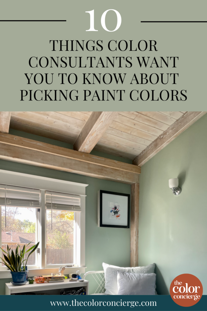
Picking paint colors for your home can feel completely overwhelming. If you’ve ever walked into a paint store and seen just how many different shades of white there are, then you know exactly what I mean. But you can learn how to pick paint colors like a pro.
Why am I so confident? Because I didn’t start my career as a paint color consultant. I actually studied chemical engineering and worked as an engineer for years before I ever thought about making a career in color.
I started learning about paint colors just like you’re doing now: by reading everything I could about choosing the right paint colors for my home. After realizing my passion for color and its ability to make a house a home, I became a Certified Color Expert and started The Color Concierge. We have completed 2500+ color consultations since we launched the company.
Today, I wanted to share a few of the tips and tricks I’ve learned about choosing paint colors throughout my color consultant journey. Keep these things in mind and you’ll be one step closer to finding the perfect paint color for your interior and exterior.
*This post contains affiliate links for products I use and love. If you click on some links and make a purchase, I will get a small commission at no cost to you. This helps pay for the costs of the blog, so I can continue to offer great content to our readers.
About The Color Concierge
Our Colorado-based paint color consultants make finding the right paint colors for your home easy. Whether you’re painting the exterior or interior of your home, our simple yet effective process lets us get your paint color right the first time. We’ve helped thousands of homeowners transform their homes into a space they love. Learn more about ONLINE COLOR CONSULTATIONS today.
Sample Colors
We always recommend that you test paint colors (article) in your home because lighting can completely change a color, both on interiors and exteriors.
In the old days, this meant we painted a large poster board with sample pots and a huge mess.
Now we have a better way to test paint, with Samplize Peel-and-Stick samples!
- Samples pre-painted with 2 coats of real paint from the manufacturer.
- Large 9” x 14” samples to see the color better in the lighting.
- Delivered overnight
- Colors are accurate
- Less expensive than painting a large poster board with sample pots
- No mess, and no toxic paint to dispose of
I use these in my color consulting practice for exact results. Discover Samplize peel-and-stick paint samples via the link below.
10 Paint Color Consultants Tips
1. Paint matching never works.
When it comes to paint matching…just don’t do it. It rarely works. Don’t ask for the Sherwin-Williams equivalent of a Benjamin Moore paint color.
Sure, there are some unicorns out there that can match paint, but it’s a very manual process, and very few people have the patience for it.
One of the reasons it’s so hard to match paint colors is that every manufacturer uses a different color base. For example, when you try to match white paint colors, they often shift to yellow or green.
Instead, find a paint color that is exactly what you need. There are so many paint colors on the market today – you will find the right one for your home.
If you do match a paint color, make sure that you test it by painting in a large area. You may find a color that you like, but it won’t necessarily get the color that you are trying to match.
Learn more about paint matching (and why it doesn’t work) in our guide. (Article)
2. Don’t dilute paint colors
Don’t ask for paint that is 25%, 50%, or 75% of the color you want. Many homeowners are not aware that there is no set formula for these kinds of paint adjustments.
You may get an awesome color, or the paint mixer may miss the undertone altogether. If you do this, make sure that you test, test, test.
Many designers do this, but I can guarantee that they are thoroughly testing their colors. They may even have formulas that they keep stored. Some of the manufacturers will store formulas in their accounts.
This is really a variation of paint color matching. Instead of diluting, just find the lighter version of the color that you like better.
3. Paint sheens aren’t an industry standard.
Picking the right paint sheen (Article) is almost as important as picking a paint color. And paint companies don’t exactly make it easy. There is no standardization of gloss or sheen levels across the industry.
For example, for interior paints:
- BM Satin sheen is MUCH shinier than SW Satin
- BM Satin sheen is like SW Semi-Gloss
- BM Eggshell is like SW Satin
For exterior paints:
- SW Low Lustre is MUCH shinier than BM Low Lustre
- BM Low Lustre is like SW Satin sheen
- BM Soft Gloss is like SW Low Lustre sheen
Even within one paint manufacturer sheen names can be different across different paint lines. Sherwin-Williams Cashmere Eggshell sheen is like Sherwin-Williams Duration Satin sheen.
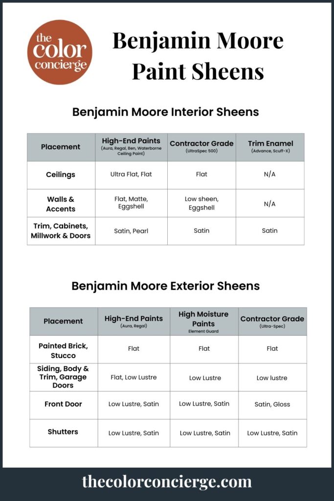
Benjamin Moore’s paint sheens are pictured above. Sherwin-Williams paint sheens are pictured below.
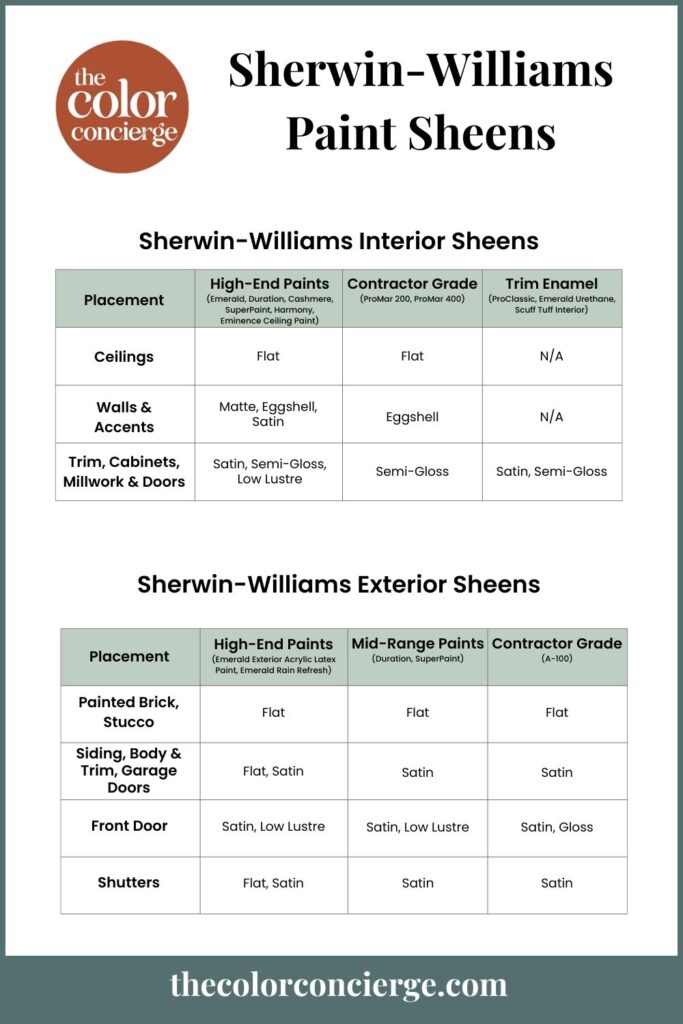
So don’t just grab the sheen you’ve used before. Pay close attention to the paint sheen you’re selecting and make sure to get the right sheen for the space you’re painting.
Think of it this way: Sheens go from shiniest on the bottom to flattest on the top.
Ceilings are painted with the flattest sheen to hide imperfections. Walls are typically painted with flat, matte, or eggshell sheens. Trim, doors, cabinets, and wainscoting are typically painted with glossier sheens, such as semi-gloss or satin.
The shinier the surface, the easier it is to clean. Flatter surfaces hide imperfections better.
Learn more about choosing the right sheen in our paint sheen guide (Article).

4. Testing paint colors is standard practice, even for the most experienced designers.
When you’re excited to change the color of a room, it’s hard to wait. But if you don’t take the time to test your paint colors (Article) you will likely regret it. You just never know how a color is going to change in the light.
It seems as if whenever I test a color I’ve picked, everything goes as expected. When I don’t test, the color always ends up looking bad.
Make sure to test paint colors in the space you’ll actually be using them in and see how they look at different times of day in different lighting. Compare samples to your hard finishes, furniture, and decor items as well to make sure they look good together.
We always recommend that you test paint colors on your home because lighting can change a color completely, both with interiors as well as exteriors.
In the old days, this meant we painted a large poster board with sample pots and a huge mess.
Now we have a better way to test paint, with Samplize Peel-and-Stick samples!
- Samples pre-painted with 2 coats of real paint from the manufacturer.
- Large 9” x 14” samples to see the color better in the lighting.
- Delivered overnight
- Colors are accurate
- Less expensive than painting a large poster board with sample pots
- No mess, and no toxic paint to dispose of
I use these in my own color consulting practice for exact results. Discover Samplize peel-and-stick paint samples:
Buy 8 samples and get 2 free – no coupon code required. Order today and get samples tomorrow!
Read our full guide to testing paint colors like a pro (Article).
5. Don’t rely solely on color strips from the paint store.
The color swatches you find at the paint store are often (but not always) light, medium, and dark versions of the same color. What people don’t know is that sometimes the manufacturer needs to fill a space so they just drop an unrelated color in.
This means you can’t always trust that all the colors on a strip are variations of one another. Again, you need to test every paint color!
6. Photos in color review blog posts are not always accurate.
It’s not always easy to get the true sense of color by looking at it online. Sometimes bloggers use photos from other online sources that have been color edited, especially if the work is not their own.
Occasionally the blogger may color-edit that photo again before posting.
That’s why our photos always come from our own projects or are taken personally by us. We want to show you how paint colors react in different lighting and give you the best insight into how a color might look on your wall.
7. The lighting in your room can significantly affect the color of the wall.
We’ve already talked about how important it is to test your paint colors in natural lighting. That’s because the level of light and the direction light is coming from within a space can have a big impact on how colors look on your wall.
If your room has East-facing windows, for example, the room will get warmer light in the mornings as the sun is rising and cooler light in the afternoons. West-facing light has the opposite effect.
Rooms with North-facing windows get consistently cooler light, while rooms with South-facing windows typically have warmer light.
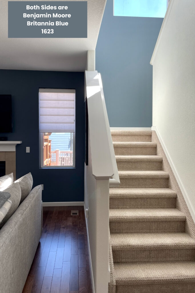
Check out the photo below. Accent walls on both sides of the handrail are painted with the same color: Benjamin Moore Britannia Blue. When we specify a dark blue for a low-light area, it is usually lighter than what you would expect. For example, if we picked Hale Navy for the shadowy area it would look black. Britannia Blue was the perfect balance for both of these areas!
Just one more reason to always test your paint colors! (Article)
8. Creating a whole-house color palette is an easy way to elevate your home’s design.
Have you ever visited a Skittles house? This is what I lovingly call a house where every single room is a different color. You can literally taste the rainbow walking through it.
I’m a big fan of color (I am a color consultant, after all), but if your home has too many different colors it can look disjointed. Instead, I recommend building a whole-house color palette (Article) that lets you use pops of color while still keeping everything cohesive from room to room.
There are so many ways to design a color scheme (Article) for your home. I recommend starting out by choosing a foundational white paint color for your trim, ceilings, and cabinets and a foundational neutral to use as a primary wall color.
From there, you can add in additional neutrals as well as brighter and darker accent colors. Read all about how to choose a whole-house color palette in our guide (Article). Or, purchase a pre-made color palette from The Color Concierge shop.
9. Pick darker colors than expected for exterior color palettes
The most common mistake that homeowners make is to pick colors that are too light and too bright for exterior color schemes (Article). A color such as Agreeable Gray, which is a lovely mid-toned greige inside, can look like a white paint color outside.
The reason is that the sunshine washes out paint colors so that they look 4-5 times lighter and more colorful than they do inside. If you don’t believe me, look at a large swatch in the sunshine and in the shade.
The closer you get to the sun; the more paint colors get washed out. For example, when we pick a white for the Southern US, or high-altitude cities such as Denver, we pick warmer and darker whites. Lighter and brighter whites are for light siding colors, shady areas, or more Northern latitudes. Directions such as North, South, East, or West aren’t as important as how much sunshine is on the house.
Another tip is that paint is more colorful outside than inside, so pick more muted colors than you would expect. They will come to life in the sunshine.
This is another reason to test your paint colors for every project.
10. How can a color consultant help you?
A color consultant is a design professional with training and experience in selecting paint colors for all kinds of homes, rooms, and other spaces. We are well-trained in selecting the right undertones and understand how colors change in different lighting situations.
Hiring a paint color consultant (Article) is one of the best things you can do to pick paint colors like a pro.
Paint color consultants help take the guesswork out of choosing paint colors. When you work with a color consultant, you can save time and money by finding your paint color faster and spending less on paint samples. You also save money on expensive re-dos if you pick the wrong color.
Color Consultants know how to link the many elements of your room together with one color, and they understand the latest trends.
We can help you make a final choice if you are stuck with decision paralysis. A color designer is objective about colors. The prettiest color is the best one for the room, not the one that might be your favorite.
At The Color Concierge, we ask our clients to send pictures of their flooring, furniture, decor, and other hard finishes, along with information about other paint colors used within their homes.
From there, we work with our clients to find the best color options for any space in their home. We help them test and refine the paint color choices until we have the perfect shade.
Ready to work with an online paint color consultant? Contact The Color Concierge today to explore our in-person and online consulting packages. Or, shop our ready-made guides.
Key Learning Points
When exploring how to pick paint colors for your home, there are some simple tips that color consultants want you to know.
- Never try to paint match or change a paint color to get the shade you want. Instead, find an existing color that meets your needs.
- Use the right sheen for the project and the application. There is no industry standard for paint sheens. Try to clearly understand what the sheen is for your manufacturer.
- Always, always, always test your paint colors. With Samplize peel-and-stick samples it’s quick and easy and will help ensure you pick the right paint color every time.
Online Color Consulting
Still need help picking the best paint colors? Discover our Online Color Consulting Package.
If you liked this post, don’t forget to pin it!
Related Posts:
- Why A Whole-House Color Scheme Is Important (Article)
- Guide to Paint Sheens (Article)
- Why Paint Matching Doesn’t Work (Article)
- How to Sample Paint Colors Like a Pro (Article)
About the Author

Hi, I’m Michelle Marceny, founder, owner, and Principal Color Designer at The Color Concierge. I believe a fresh coat of paint can completely transform a space. The Color Concierge was born out of my drive to help clients fall back in love with their homes. My clients trust me to help them find the perfect paint color for their home – whether it’s a whole-house paint color scheme or ideas for a single room.
Since The Color Concierge was founded in 2017, we have completed over 3000 color consultations, both online and in-person. I am a Certified Color Expert with 7 years of experience creating interior and exterior color palettes throughout North America.
We love your comments! Please note that the blog is meant as general advice, and it is not possible to give out specific answers to your paint questions. If you want more specific advice, our Online Color Consultations will help you pick your paint colours. Thank you for your understanding.

One Response
Dear color concierge,
In the Netherlands, it is not possible to get samples from very big paint companies like Akzo Nobel.
This cost us dearly, as we had raufase wall paper (uneven walls) on our walls that we painted over and the translucent orange that was in our paint came out much more pronounced.
The point about Akzo Nobel is that they can mix any color at any shop. And they have beautiful colors, only…. You cannot test them.
In the times micro and nano engineering, why can’t Akzo Nobel provide samples that get mixed to specification, not starting out with pigments but with diluted pigments? So that samples can be ordered in shops, or otherwise through the internet.
Engineering wise, I can think of harder problems.
It is a mystery to me, how they can loose market share like there is no tomorrow to Farrow and Ball and more in Europe.
Farrow and Ball are way to grey for me. I live in the Netherlands and the Grey is provided naturally!
But F and B sells testers.
I am a chemical engineer like you, and it irritates me a lot that our chemical engineering collègues at Akzo Nobel have so many beautiful colors that I cannot test.
We also have RAL in NL. They are German. Very a-warm colors as well.
I know Akzo Nobel sells paint in the US too. How do they manage there?