Whether you plan to design a new build or want to refresh your longtime family home, a whole house paint color scheme is your design best friend. Think of it as a plan for the future. Not everyone paints every single room in their house at once. It’s more of an evolution as time goes by.
It’s better to create a cohesive plan to work toward with a foundation color palette. That way you don’t get distracted by pretty colors that may not look good together. This is exactly what professional designers do, and you can too!
A good home color palette will consider all of your home’s finishes (like flooring, kitchen and bathroom fixtures, furniture, and decor), your surroundings, and natural light.
Today I’ll walk you through a real-life example of a whole house paint color scheme for some lovely empty-nester clients of mine. With their son officially out of the house, they were ready to update their family home to reflect their new phase of life.
Before we dive into their whole house paint colors, let’s take a moment to get clear on what a whole house palette is and how to create it.
*This post contains affiliate links for products I use and love. If you click on some links and make a purchase, I will get a small commission at no cost to you. This helps pay for the costs of the blog, so I can continue to offer great content to our readers.
About The Color Concierge
Our Colorado-based paint color consultants make finding the right paint colors for your home easy. Whether you’re painting the exterior or interior of your home, our simple yet effective process lets us get your paint color right the first time. We’ve helped thousands of homeowners transform their homes into a space they love. Learn more about ONLINE COLOR CONSULTATIONS today.
What Is A Whole House Color Scheme?
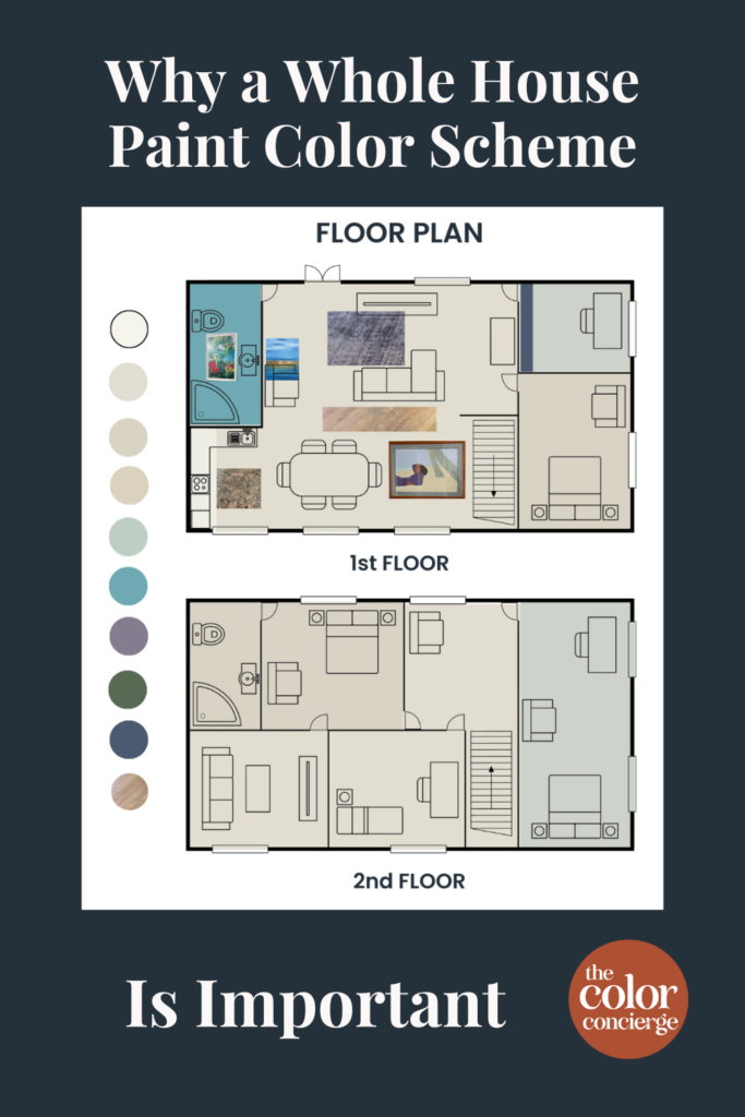
A whole house paint color scheme is a selection of paint colors curated to work together. You can use these colors throughout your home in different ways, from common areas like open-concept spaces to bedrooms, bathrooms, and offices.
Why is a color palette so important?
Work with any kind of interior designer or paint color consultant who knows their stuff and you’ll see them create and use a whole house paint color scheme for the project.
A curated color palette creates a feeling of harmony in your living spaces and should incorporate your favorite colors and decor items. A color palette is also used to create a specific feeling within a room or a whole house, such as calm, focus, or creativity.
Without a whole house paint palette, it’s hard to create that cohesive look and your home may feel like a bunch of mismatched puzzle pieces that have been forced together.
Should your whole house have the same color scheme?
This is a question I get all the time. Homeowners often think that using a whole house paint color scheme means every room of their home will end up with the same color.
When you pick a color scheme, color elements should be repeated throughout the home. Use the curated color scheme as a guide. You don’t have to use every color in every room. Pick the ones that look the best for each room.
You can have one wall color throughout the house if that’s your preference, but use your decor to incorporate your color scheme. Of course, I love to use paint colors. You can also add strategic accent walls (Article).
Sample Colors
We always recommend that you test paint colors (article) in your home because lighting can completely change a color, both on interiors and exteriors.
In the old days, this meant we painted a large poster board with sample pots and a huge mess.
Now we have a better way to test paint, with Samplize Peel-and-Stick samples!
- Samples pre-painted with 2 coats of real paint from the manufacturer.
- Large 9” x 14” samples to see the color better in the lighting.
- Delivered overnight
- Colors are accurate
- Less expensive than painting a large poster board with sample pots
- No mess, and no toxic paint to dispose of
I use these in my color consulting practice for exact results. Discover Samplize peel-and-stick paint samples via the link below.
How do you pick a whole-house palette for your home?
These are the steps to creating a whole-house palette, along with the steps. These are detailed in the post How to Create a Whole House Color Palette (With Real-Life Examples)(Article).
1. Pick your foundation color for the common areas.
The first step to creating your whole house color palette is to select a color for the common areas of your home. Typically these include the living room, kitchen, and sometimes dining room.
2. PIck a white paint color for the trim and ceiling.
Every good color palette needs great white paint (Article). Pick the trim and ceiling color (or use the trim color you already have), and plan to use that on all your trim, window frames, and doors throughout the house.
3. Pick paint colors for the secondary living spaces
Next, we move to the adjoining spaces, such as dining rooms, offices, bathrooms and bedrooms.
As a guideline, I like to use colors that have similar muted levels. As an exaggerated sample, you wouldn’t use a fluorescent color next to the brick.
4. Choose paint colors for the bedrooms.
Bedrooms are a great place to play with more color in your home. I love using blues, greens, and neutral paint colors with colorful undertones when choosing paint colors for bedrooms (Article).
5. Select the accent colors last.
The last step to defining a palette is to pick accent colors for walls and even the front door. I like to add accents that coordinate with the decor. In some homes, the powder rooms, offices or dining rooms can act like an accent rooms with dramatic pops of color.
It’s easiest to pick an accent color to coordinate with your decor than to pick a piece of art to match an accent wall.
How many colors are too many in a house?
The number of colors to can vary depending on the size of the home and your paint needs, but generally, I like to choose from 4 to 8 paint colors when building a palette. The colors include a trim/ceiling white, the foundation color, and additional colors for adjacent rooms.
Ensure that you’re using colors with complementary undertones that are similarly muted. After that, it’s the repetition of the same colors throughout a home that really makes a palette work.
Which color is best for the whole house?
The foundation of any whole house color palette is a versatile neutral – typically either white, gray, or beige. Agreeable Gray by Benjamin Moore (Sample) is one of the most popular whole house paint colors because it looks beautiful in just about any space. In the color palette I’m sharing today, Benjamin Moore Gray Mist (Sample) is my foundational neutral.
Make sure that the foundation neutral color looks great with your hard finishes, especially kitchen countertops, backsplash, and floors.
While neutral paint colors may often be the focus of a whole house paint color scheme, don’t be afraid to go a bit bolder with accents. In today’s whole house color palette examples, you’ll see how we mixed bright, bold colors into an otherwise neutral palette with beautiful results!

A Real-World Whole House Paint Color Scheme Example
When I first started working with these wonderful clients, they wanted to update their home. They love the beach and are lucky enough to have one of the few houses in Denver that has a water view.
Their art and decor already brought a coastal vibe to their home, but their current paint colors were too dark throughout the house, too bright, and not the right hues for their space or personal style.
The goal of this whole house paint color scheme was to simplify the colors used throughout their home, create a cohesive look between their decor and their paint and reflect their shared love of the water.
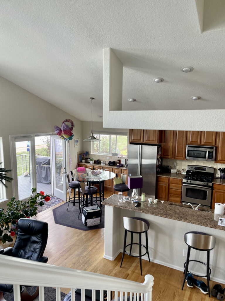
Benjamin Moore Gray Mist for the Foundation Neutral
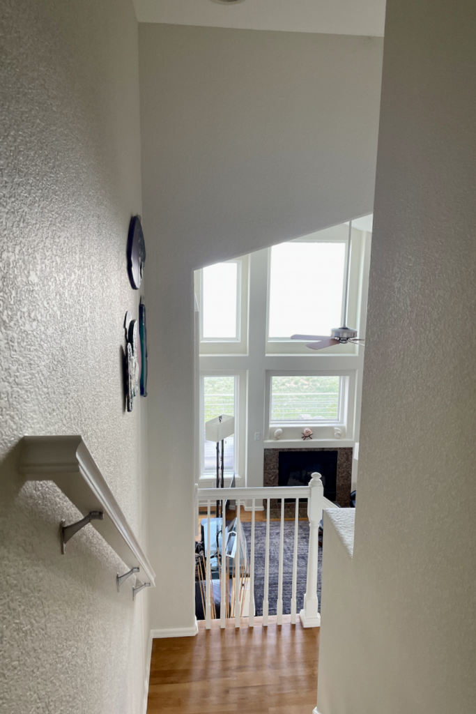
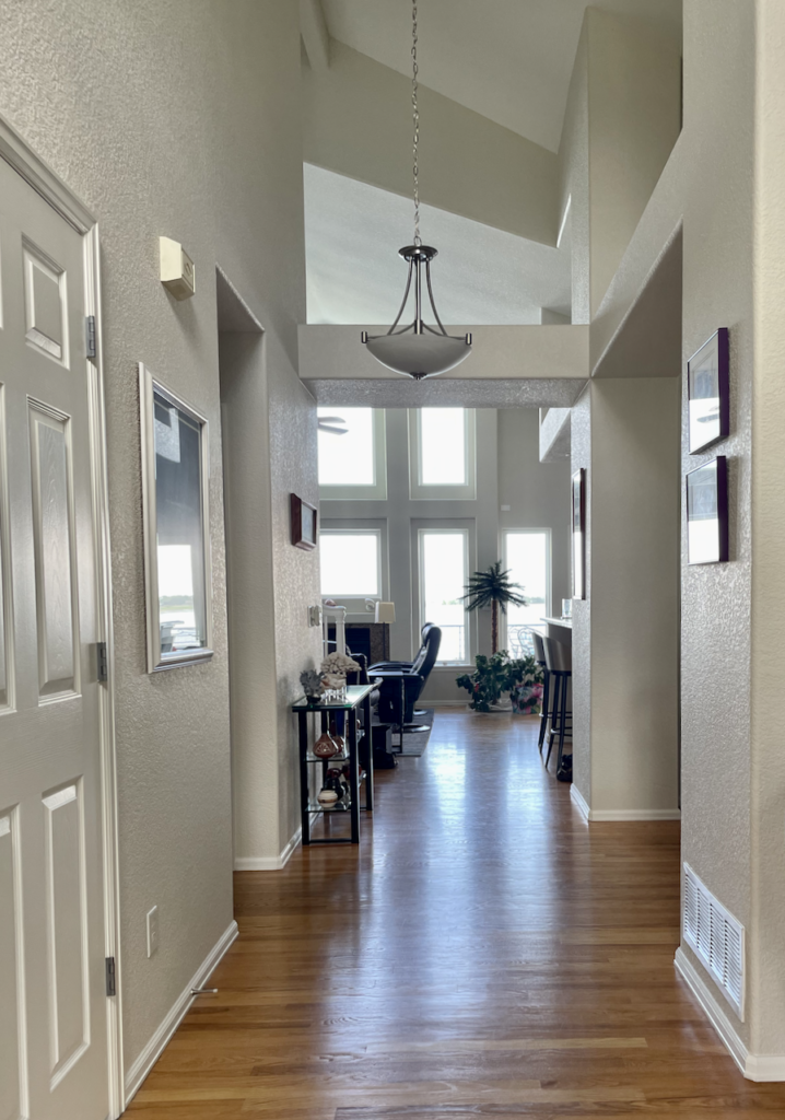
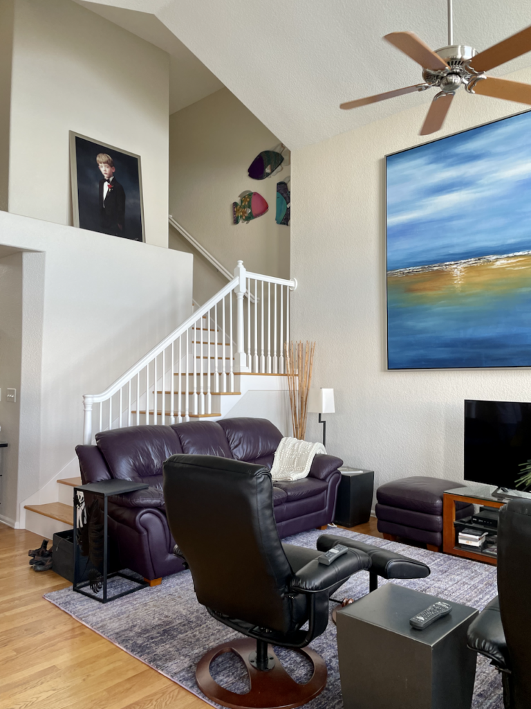
We started the project by selecting a foundation neutral color, Benjamin Moore Gray Mist (Sample). Gray Mist is a very light greige paint with hushed green undertones.
With an LRV of 74, Gray Mist is almost off-white, but it still offers enough vibrancy to work well in spaces with lots of natural light (like this client’s living room) and in spaces with less sunlight (like the hallways of this home). For more information, read our Gray Mist Paint Color Review.
Gray Mist on the walls of this bright and sunny living room helped simplify the look and feel of the room. Removing the former accent wall helped bring more focus to the fireplace in the room, which itself was updated with some black paint over the original brass fixtures.
Benjamin Moore White Dove – Trim and Cabinet Color
Our next step was to pick the white trim color for this color palette, which is used on all of the baseboards, molding, cabinets and trim throughout the home. We selected Benjamin Moore White Dove (Article) for this important spot in the palette because it is warm and versatile.
White Dove (Sample) has soft, yellow undertones and works equally well in lighter or darker spaces. This color is used as a trim color in every room of the house. White Dove kitchen cabinets were also painted to brighten up the kitchen space and simplify the palette in that room.
Benjamin Moore Oxford White Ceilings
In many homes, we use the same white paint color for both trim and ceilings. But in this space, we wanted to use a lighter white for the ceilings. This is another cultural convention, and we loved it here. We used Benjamin Moore Oxford White (Sample) – one of my favorite Benjamin Moore white paint colors (Article) – for the ceilings in this home to help brighten up some of the darker spaces.
Oxford White is a clean white paint color with slightly warm undertones that looks really nice with cool gray finishes. It’s just a bit brighter than White Dove and when used on the ceilings really brightens up the whole room.
Benjamin Moore Edgecomb Gray Guest Room
We knew we wanted to incorporate another, slightly darker gray color into this whole house paint color scheme. Benjamin Moore Edgecomb Gray (Article) was the perfect complement to Gray Mist and the other colors in this home.
Edgecomb Gray (Sample) is a light greige color that pairs well with both earthy finishes and modern, crisp white finishes. It also works really well in both brightly lit or low-light rooms, making it perfect for this client’s bedroom.
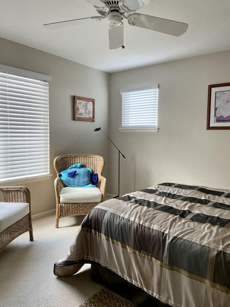
The warm green undertones of this gray is also really helpful for neutralizing any green foliage from the outside so that it doesn’t reflect on your interior walls. For these clients who live in the beautiful Denver woods, this was a big selling point for this paint color.
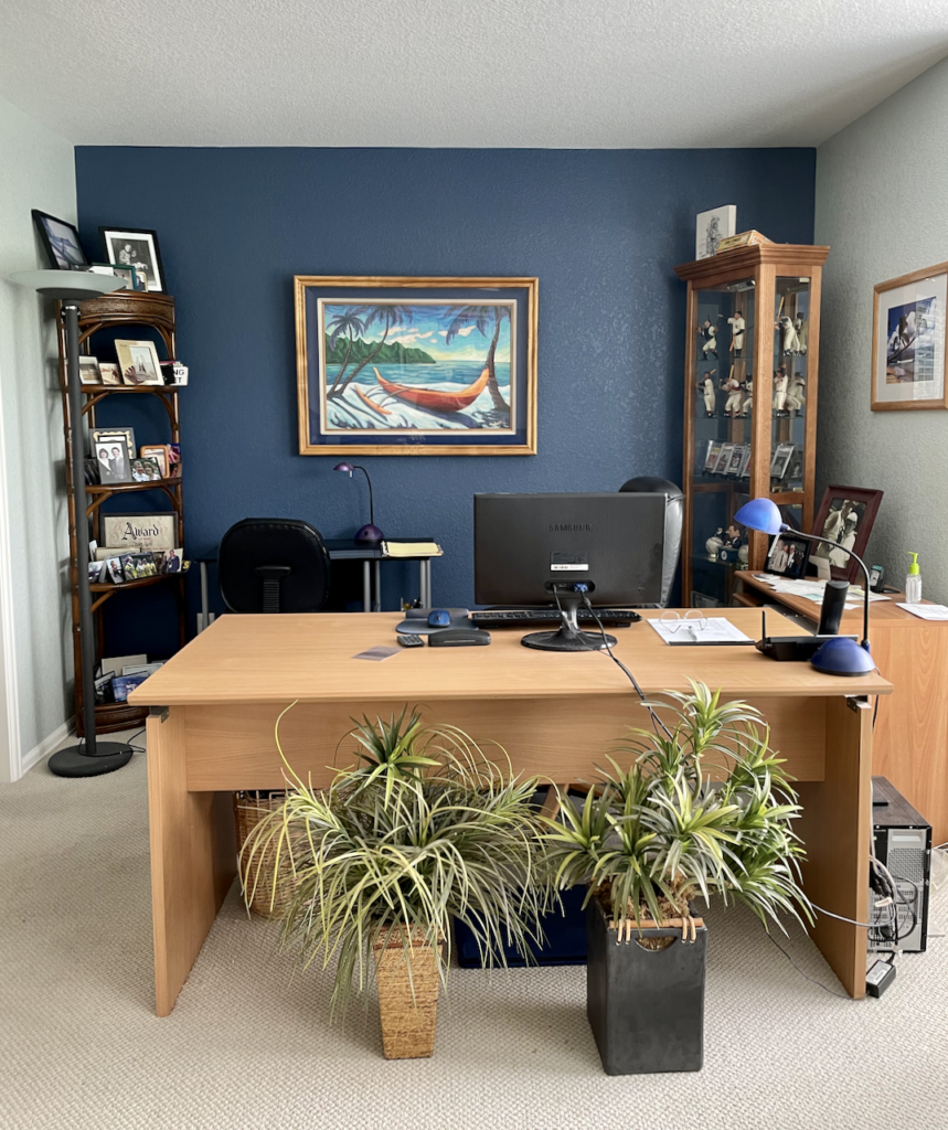
Sherwin-Williams Sea Salt Office
For this client’s office, we wanted to create a breezy, coastal feeling to pair with his beautiful and happy beach art and surfboard. Sherwin-Williams Sea Salt (Article) was the perfect primary paint color for this space.
Sea Salt (Sample) is an iconic blue-green paint color that is soft and muted, but still colorful. It leans more toward green than blue and its warmth helps it pair really well with warm terra cotta-colored wood flooring.
Sea Salt introduces a dose of beachy freshness to this space and pairs beautifully with the client’s beach-themed art and the office’s Kensington Blue accent wall.
Benjamin Moore Kensington Blue Accent Wall
We wanted a darker accent wall in the office that would help create a calm, focused environment for this client’s workspace. Benjamin Moore Kensington Blue (Sample) was the perfect complement to the client’s coastal decor. A dark, classic navy with gray undertones, this color looks beautiful paired with the Sea Salt walls in the rest of the office.
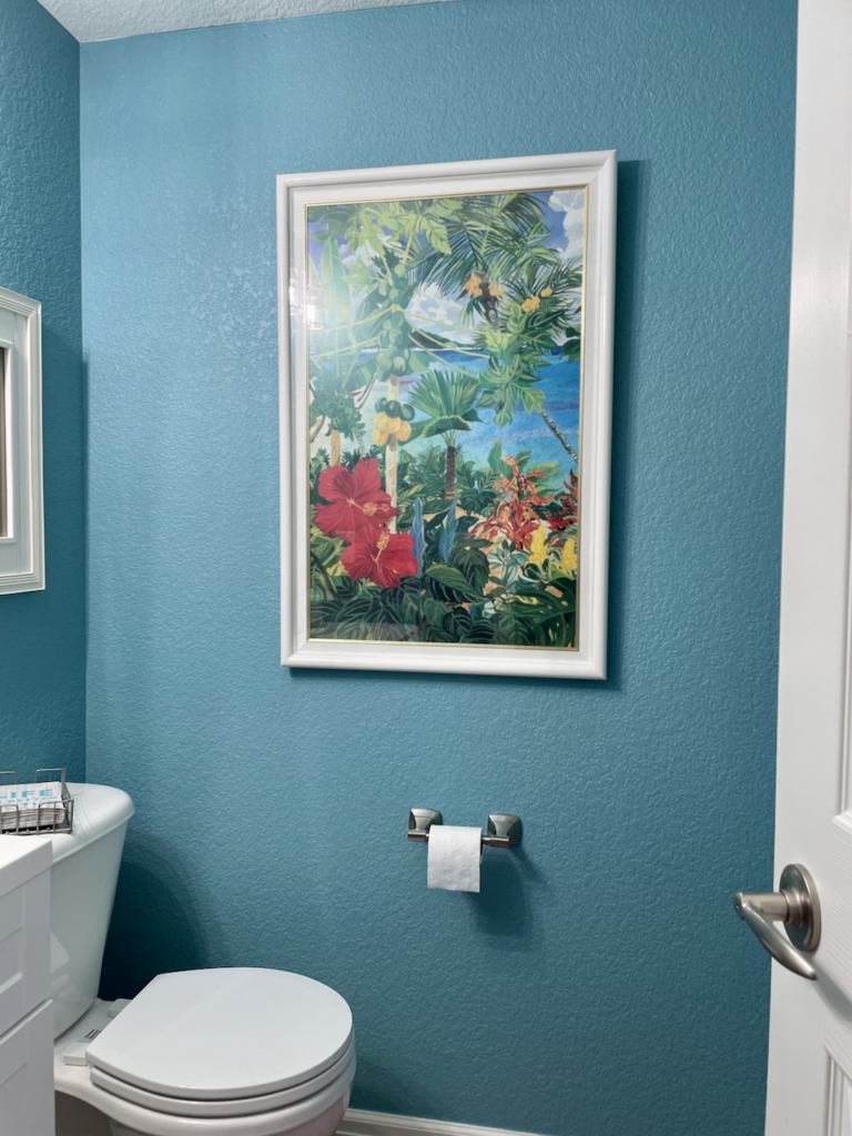
Benjamin Moore Seaside Resort Powder Room
This client was not afraid to incorporate color into their whole house paint color scheme.
The painting in the bathroom was our inspiration, and Benjamin Moore Seaside Resort (Sample) matched one of the colors in the piece.
A nicely balanced turquoise, this color brings warmth to this room and the vibrant color works well in this small space.
Hard Finishes, Furniture & Decor
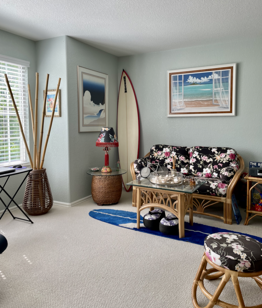
This whole house color scheme is rounded out by incorporating warm wood and earthy tones through the floors and decor. A muted purple shade comes through in their unique living room couch and is carried through the rest of the house in their artwork and decor.
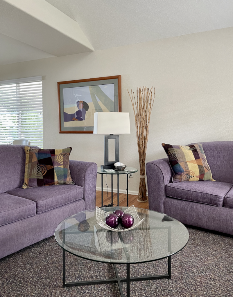
Together the combination of neutral greige paints, warm white trim and ceiling, and coastal blues and aqua colors merge to create a simple, yet vibrant color palette. This combination of colors is cohesive and feels like it uniquely belongs to this couple and their home.
Sample Your Paint Colors
Our favorite way to test paints is to purchase Peel-and-Stick paint samples from companies like Samplize. Their colors are consistent, they use real paint in an eggshell sheen, and there is no mess.
Our recommendation is to stick them onto a white poster board and move them around the room at different times of the day. Compare them to your trim, carpet, and even your art. With a white background, you can see how the samples compared with the current color in place.
Visit the Samplize website to get samples of a broad range of paint colors and get more whole-home color palette ideas and inspiration.
Key Learning Points
Creating your own palette is a simple way to change the whole look and feel of your home – even without extensive renovations or redesigns.
Remember, if you want to build your own whole house palette, it’s important to follow these steps:
- Pick your foundation color for the common areas
- Pick a white trim color (and stick to it)
- Select paint colors for secondary living spaces (bedrooms, bathrooms, dining areas, etc.)
- Pick a few accent colors to use throughout your home
Most importantly, don’t forget to test your paint colors in the spaces you plan to use them and to do your tests in natural light.
Get an Expert-Made Whole House Paint Color Scheme
For more details, read our full step-by-step guide to creating a whole house color palette, or contact The Color Concierge to learn more about our Online Paint Color Consultations.

About the Author

Hi, I’m Michelle Marceny, founder, owner, and Principal Color Designer at The Color Concierge. I believe a fresh coat of paint can completely transform a space. The Color Concierge was born out of my drive to help clients fall back in love with their homes. My clients trust me to help them find the perfect paint color for their home – whether it’s a whole-house paint color scheme or ideas for a single room.
Since The Color Concierge was founded in 2017, we have completed over 3000 color consultations, both online and in-person. I am a Certified Color Expert with 7 years of experience creating interior and exterior color palettes throughout North America.
We love your comments! Please note that the blog is meant as general advice, and it is not possible to give specific answers to your paint questions. If you want more specific advice, our Online Color Consultations will help you pick your paint colors. Thank you for your understanding.

2 Responses
Very informative article about selecting a whole home paint palette! ?
What is the wall color paint in the living room with the purple sofas above ?
Thank you
Danielle