Learn all about Benjamin Moore Britannia Blue (Sample) in this color review (Sample Here). If you are looking for a rich, muted mid-toned blue for an accent wall or accent room, Britannia Blue is the color for you! It can be used as an interior or exterior paint color. We consider this a mid-toned color with an LRV of 18.1. It has the softest of green undertones.
Please note that all our photos come from Color Concierge projects in this post. Some of the photos may not be perfect, but we love the way they show the color. Also, we don’t color edit the photos so that you can see what these paint colors really look like.

Benjamin Moore Britannia Blue for Interiors
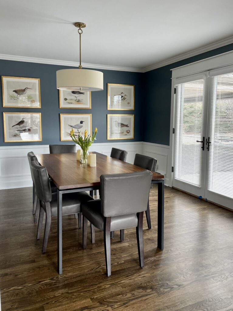
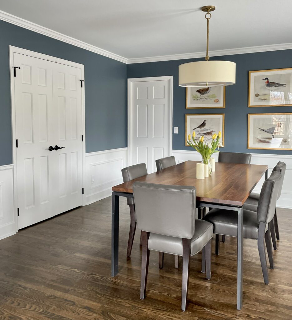
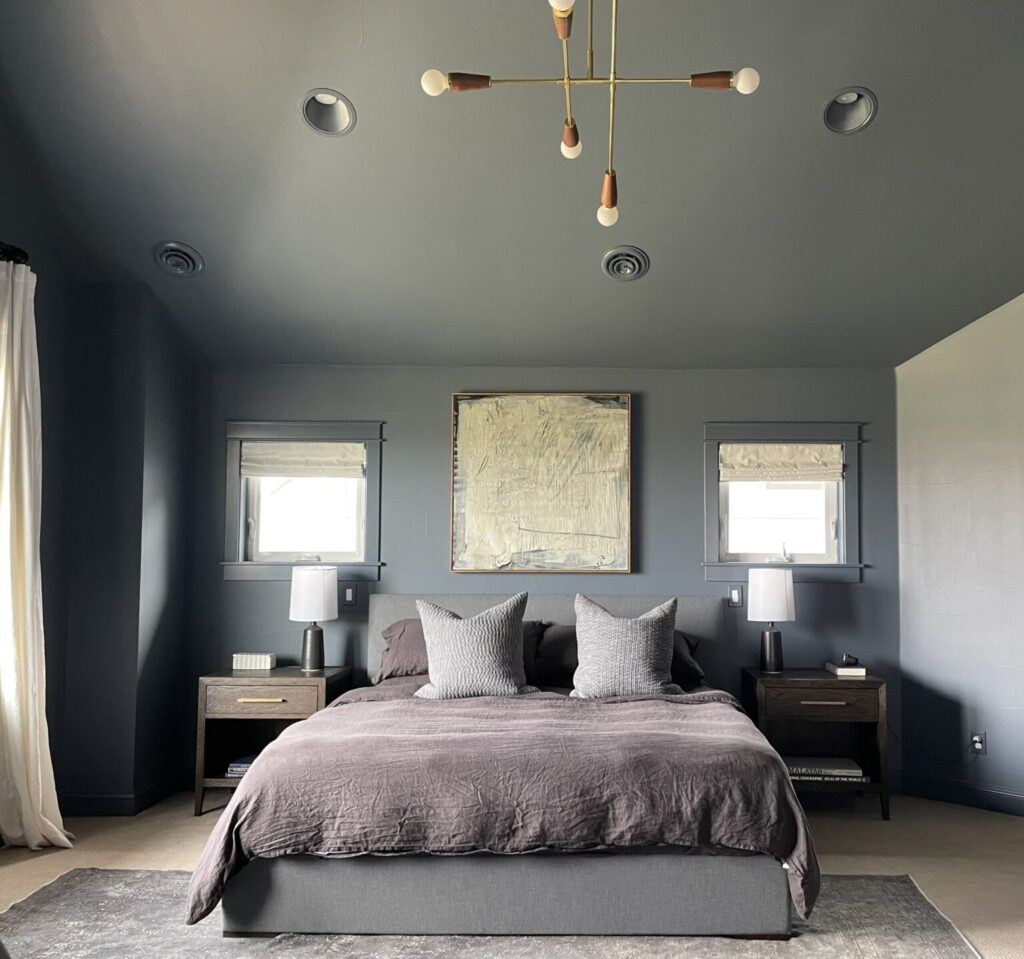
We love to use Britannia Blue for dark accent rooms, such as offices or dining rooms, or as accent walls. This color is dark enough to make an impact, but not so dark that it looks oppressive. Use this color in a room with lots of natural or artificial light. We like to paint the ceilings and trim white to keep the room feeling sophisticated and airy.
Britannia Blue looks fantastic with wood finishes, but my favorite pairing is with lots of white. In the photo below, the ceilings and trim are Oxford White.
*This post contains affiliate links for products I use and love. If you click on some links and make a purchase, I will get a small commission at no cost to you. This helps pay for the costs of the blog, so I can continue to offer great content to our readers.
About The Color Concierge
Our Colorado-based paint color consultants make finding the right paint colors for your home easy. Whether you’re painting the exterior or interior of your home, our simple yet effective process lets us get your paint color right the first time. We’ve helped thousands of homeowners transform their homes into a space they love. Learn more about ONLINE COLOR CONSULTATIONS today.
Best Trim and Ceiling Colors for Britannia Blue
Consider clean whites and off-whites such as Benjamin Moore Chantilly Lace, Oxford White, Simply White, Snowfall White, Cloud White, and White Dove ceilings (flat sheen), trim, and doors (satin sheen). We like to use the same white for the ceiling as the trim.
These beautiful wood floors balance the mid-toned blue. We used Oxford White for the trim and ceiling in the project below.

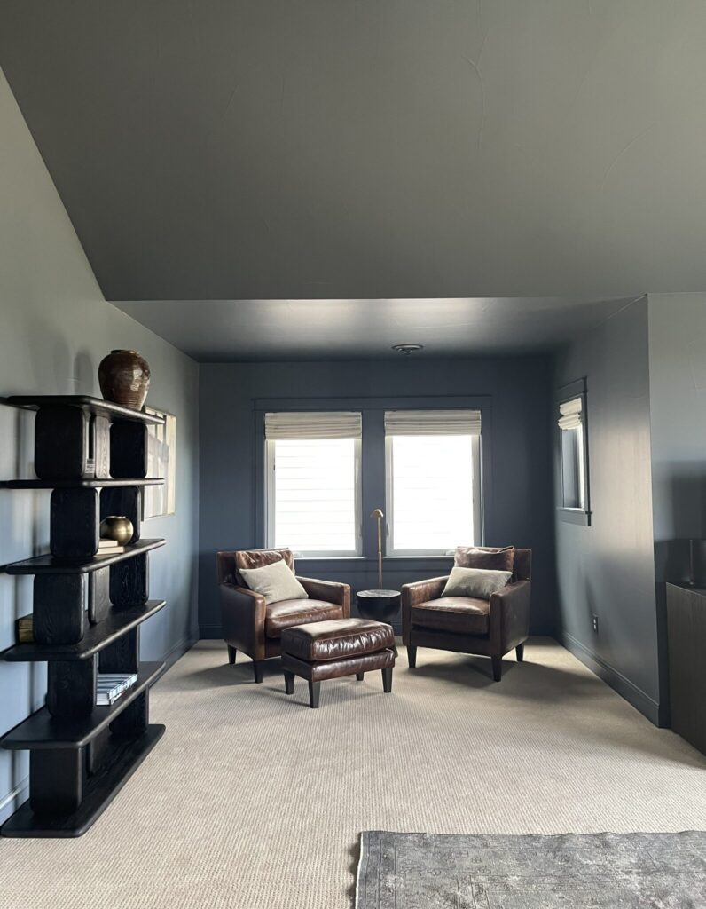
Britannia Blue Accent Walls
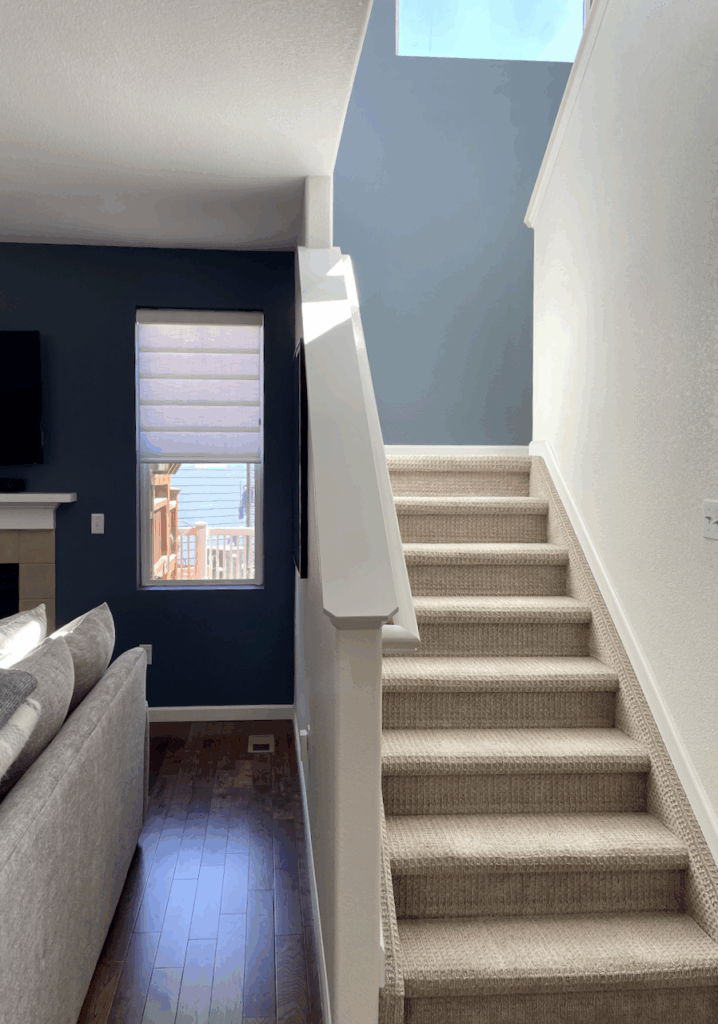
Like other dark paint colors, Britannia Blue can appear differently in dark rooms or areas with natural light.
Below is a photo of Britannia Blue in a living room (left) and a starway filled with natural light in the adjacent stairway. When I saw this room, I was stunned, and I had to take a photo to show you.
Is Britannia Blue a good color for Color Drenching?
Britannia Blue looks fabulous in a drench. In the photo below, we drenched most of an accent wall, including the bookshelves, and it looks great!
Below is a photo of a Primary bedroom drenched in SW Granite Peak, which is the closest color to Britannia Blue. It would look almost identical. You can see how the paint color changes in almost every surface.
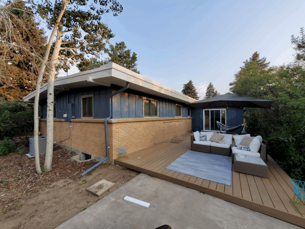
Britannia Blue for Exteriors
Britannia Blue can be pretty for exteriors, especially with red, orange, or even pink brick. You can use it as a siding color or for accents such as shutters and front doors (Article). It pairs well with Benjamin Moore Swiss Coffee, Pale Oak, Classic Gray, or Seapearl as a white trim color when used outside.
Below is a photo of a home painted with SW Granite Peak and Egret White, analogous colors to BM Britannia Blue and BM Pale Oak. Britannia Blue will look slightly lighter in the sunshine.
When should I avoid Britannia Blue?
A creamy white can look yellow and discordant as an accent color with Britannia Blue.
Sample BM Britannia Blue
We always recommend that you test paint colors (article) in your home because lighting can completely change a color, both on interiors and exteriors.
In the old days, this meant we painted a large poster board with sample pots and a huge mess.
Now we have a better way to test paint, with Samplize Peel-and-Stick samples!
- Samples pre-painted with 2 coats of real paint from the manufacturer.
- Large 9” x 14” samples to see the color better in the lighting.
- Delivered overnight
- Colors are accurate
- Less expensive than painting a large poster board with sample pots
- No mess, and no toxic paint to dispose of
I use these in my color consulting practice for exact results. Discover Samplize peel-and-stick paint samples and sample Benjamin Moore Britannia Blue (Sample) via the link below.
Britannia Blue vs. other paint colors
Britannia Blue is a pretty unique color, and here we show how it stacks up with other options.
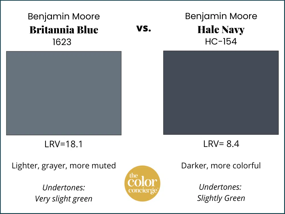
Hale Navy vs. Britannia Blue
Britannia Blue is a lighter version of Hale Navy, even though they don’t appear on the same swatch. This is handy to know if one of the colors is too light or too dark, then you can go in another direction.
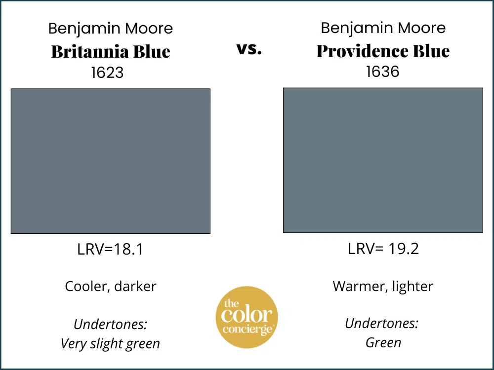
Providence Blue vs. Britannia Blue
Britannia Blue is slightly darker, more gray and less colorful. Providence Blue (Sample) is lighter with more green.
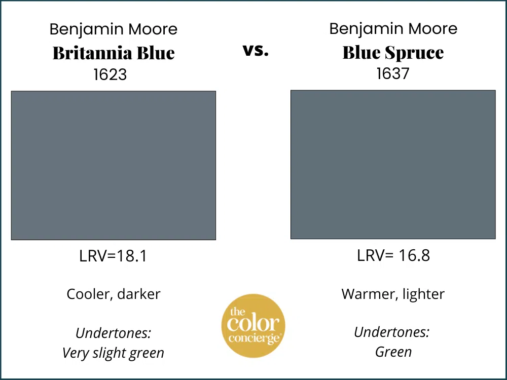
Blue Spruce vs. Britannia Blue
Another favorite in this family is Blue Spruce (Sample), which is gorgeous as a cabinet color. Britannia is clearly lighter with less green than Blue Spruce.
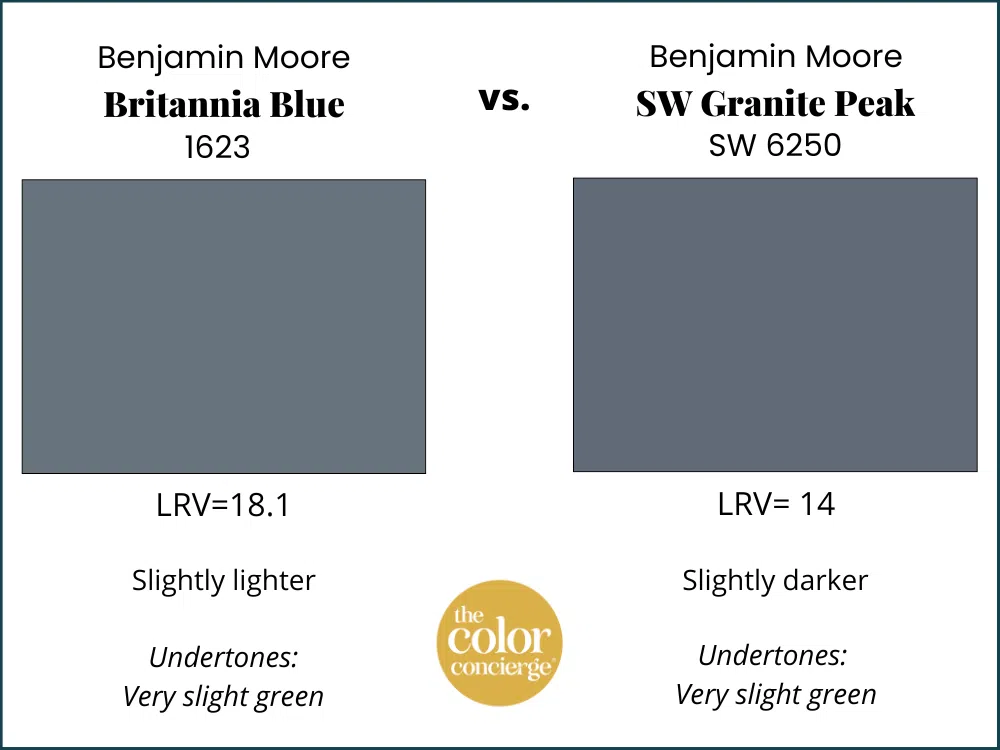
Granite Peak vs. Britannia Blue
The closest Sherwin-Williams color to Britannia Blue is Granite Peak (Sample). Granite Peak is darker and more saturated with more blue tones. Granite Peak will do the same work in similar interior and exterior situations where Britannia looks good. You can expect Britannia Blue to look lighter in the sunshine.
Can my painter match Benjamin Moore Britannia Blue to Sherwin Williams?
Granite Peak is the closest match, although it’s slightly darker. It will give you the same look and feel as Britannia Blue. We never recommend paint matching unless you are willing to spend a lot of time going back and forth with the paint company. If you want to match, then make sure you check the paint color with a swatch from Benjamin Moore. Instead, consider SW Granite Peak, understanding that it is a darker version.
Learn more about matching paint colors here.
Britannia Blue Pros and Cons
Pros:
- Looks fantastic in rooms with lots of light, but can still work in rooms with shadows as long as you have lots of artificial lighting
- Looks great balanced with lots of white colors.
- A silky, muted blue that can be used when you want a blue that is not too bright.
- Pairs will with muted finishes such as brick and some granites.
Cons:
- Darker colors can make a room feel oppressive if there is not enough light, and not balanced with enough white.
- It can look very gray or black in a room with low light.
- Britannia Blue can appear differently in various lighting conditions.
Key Learning Points – Britannia Blue
Britannia Blue is a rich, mid-toned blue paint color. You can use it for interiors or exteriors. If you use it for interiors, make sure to have plenty of natural or artificial light so that you can appreciate the beauty of the color. For exteriors, it looks great on its own or paired with light brick or earthy stone.
No matter what, don’t forget to test your paint colors. It’s a standard best practice. Whenever I test my paint colors, they are perfect, and when I don’t test, they turn out wrong. Learn how to test your paint colors here.
NEVER, EVER use paint matches from a different brand than the one specified. Results are poor and there are no standards for the sheens. Even though your painter may truly believe it can be done, don’t do it. See results from paint matching here.
We always recommend testing paint colors in your house, because lighting can significantly change the way a color appears.
In the old days, this meant we painted a large poster board with sample pots, which resulted in a huge mess.
Now we have SAMPLIZE, 9X14″ Pre-Painted peel-and-stick paint samples. Check out the SAMPLIZE website HERE.
Online Color Consulting
If you still need help with paint colors, check out our Online Color Consulting packages or an In-Person Color Consultation in the Denver Metro area.
Related Posts
Greek Villa Paint Color Review – shows Britannia Blue Accent Wall
Granite Peak Paint Color Review
Hale Navy Paint Color Review
Benjamin Moore Slate Teal Paint Review
Sherwin-Williams Granite Peak Paint Review
Accent Walls – The Ultimate Guide
About the Author

Hi, I’m Michelle Marceny, founder, owner, and Principal Color Designer at The Color Concierge. I believe a fresh coat of paint can completely transform a space. The Color Concierge was born out of my drive to help clients fall back in love with their homes. My clients trust me to help them find the perfect paint color for their home – whether it’s a whole-house paint color scheme or ideas for a single room.
Since The Color Concierge was founded in 2017, we have completed over 3000 color consultations, both online and in-person. I am a Certified Color Expert with 7 years of experience creating interior and exterior color palettes throughout North America.
We love your comments! Please note that the blog is meant as general advice, and it is not possible to give specific answers to your paint questions. If you want more specific advice, our Online Color Consultations will help you pick your paint colors. Thank you for your understanding.

One Response
Britannia Blue what white goes best with this color in your pic?