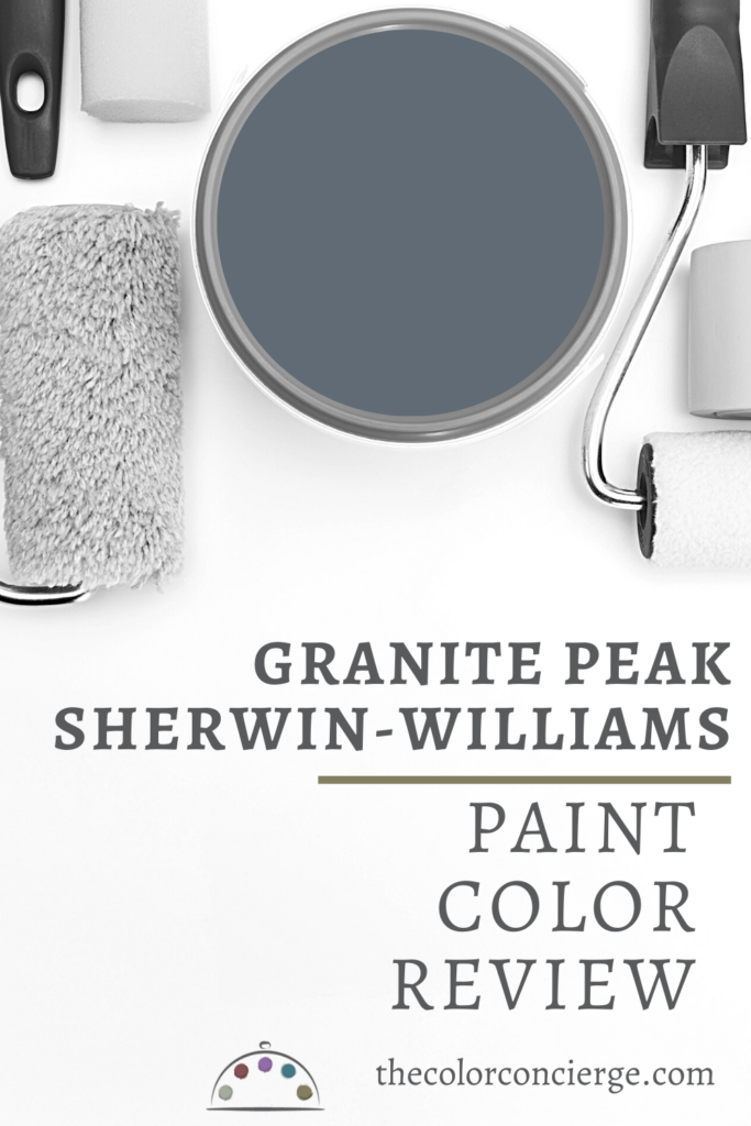
Sherwin-Williams Granite Peak is a dark and silky sophisticated blue paint color. Learn all about Sherwin-Williams Granite Peak (Sample) in this color review.
If you are looking for a rich muted dark blue for an Interior accent wall, accent room, or exterior Granite Peak is the color for you! It can be used as an interior or exterior paint color. We consider this a dark blue with an LRV of 14. It has the softest of green undertones. Granite Peak is one of the most forgiving dark blues I have ever worked with. If there were a perfect accent wall blue color, Granite Peak would be it.
Please note that all our photos come from Color Concierge projects in this post. Some of the photos may not be perfect, but we love the way they show the color. Also, we don’t color edit the photos so that you can see what these paint colors really look like.
*This post contains affiliate links for products I use and love. If you click on some links and make a purchase, I will get a small commission at no cost to you. This helps pay for the costs of the blog, so I can continue to offer great content to our readers.

About The Color Concierge
Our Colorado-based paint color consultants make finding the right paint colors for your home easy. Whether you’re painting the exterior or interior of your home, our simple yet effective process lets us get your paint color right the first time. We’ve helped thousands of homeowners transform their homes into a space they love. Learn more about ONLINE COLOR CONSULTATIONS today.
What Color is Sherwin-Williams Granite Peak?
SW Granite Peak is a deep, muted and warm blue paint color. It’s dark enough to make a space feel moody but not so dark that it risks looking black on the walls.
What is the LRV of Granite Peak?
The LRV (Light Reflectance Value) is 14 (scale from 1/dark to 100/light), which makes it a dark, silky, and moody blue.
What are the Granite Peak undertones?
Granite Peak has the softest green undertones. They keep this hue looking warm but aren’t strong enough to consider this a blue-green paint color.
Is Granite Peak warm or cool?
Granite Peak is a warm paint color, thanks to its soft green undertones. This helps the hue feel cozy and inviting, even in rooms with low light.
Sample SW Granite Peak
We always recommend that you test paint colors (article) in your home because lighting can completely change a color, both on interiors and exteriors.
In the old days, this meant we painted a large poster board with sample pots and a huge mess.
Now we have a better way to test paint, with Samplize Peel-and-Stick samples!
- Samples pre-painted with 2 coats of real paint from the manufacturer.
- Large 9” x 14” samples to see the color better in the lighting.
- Delivered overnight
- Colors are accurate
- Less expensive than painting a large poster board with sample pots
- No mess, and no toxic paint to dispose of
I use these in my color consulting practice for exact results. Discover Samplize peel-and-stick paint samples and sample Sherwin-Williams Granite Peak (Sample) via the link below.
Using Sherwin-Williams Granite Peak Interior Paint
We love to use Granite Peak for dark accent rooms, such as home offices or dining rooms, or as accent walls. This color is dark enough to make an impact, but not so dark that it looks oppressive. Use this color in a room with lots of natural or artificial light.
We usually like to paint the ceilings and trim white to keep the room feeling sophisticated and airy, but you can consider color-drenching a space in this hue (which you’ll see in a client’s bedroom below!).
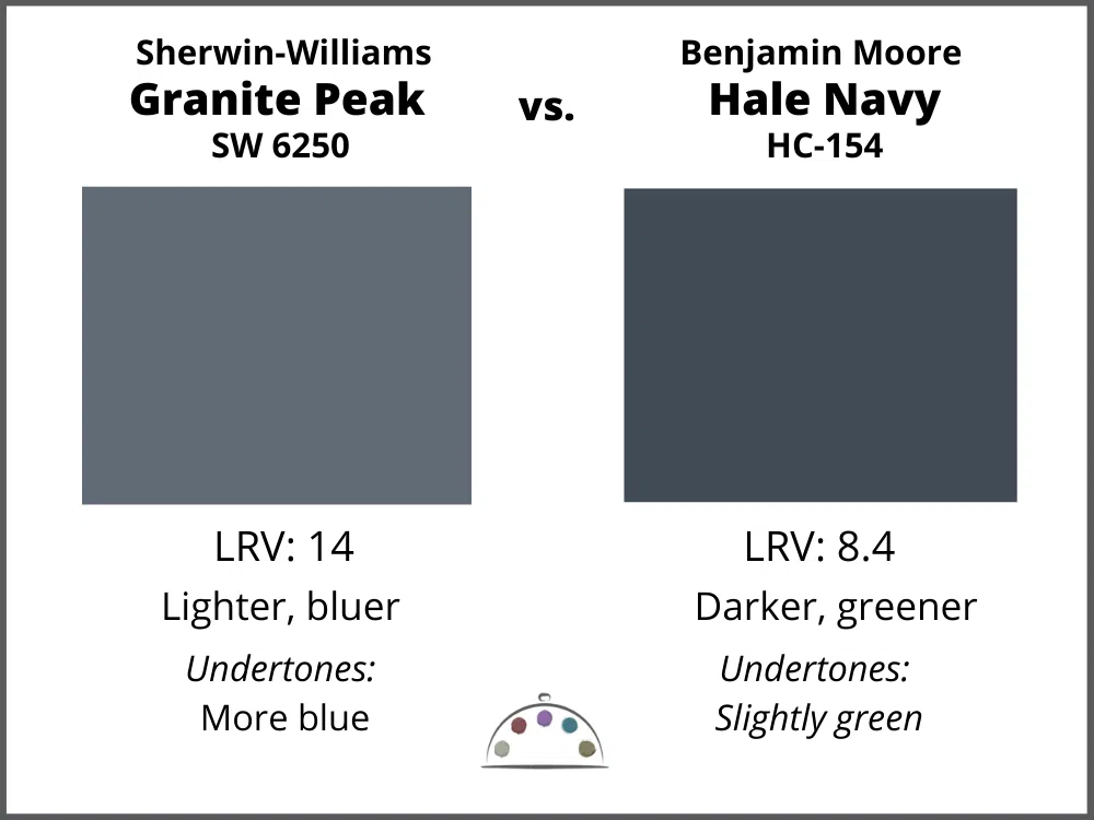
It is a great replacement for Benjamin Moore Hale Navy if you think it might be too dark for your room. The end result with Granite Peak is similar to Hale Navy, just not as dark or oppressive. It is nice and easy to live with!
Here are some of our favorite ways to use Granite Peak interior paint:
Can I paint a Granite Peak dining room?
Granite Peak looks fantastic in a formal dining room. It looks lovely with wood finishes, but my favorite is to pair it with lots of white. In the photo below, the ceilings and trim are SW Extra White.
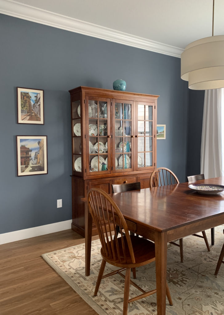
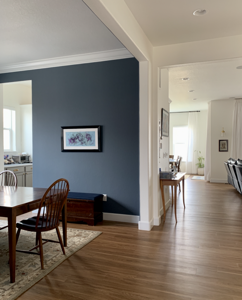
This is another view of the dining room. As you can see, it ends up working more as an accent wall or accent room in a primarily white Open Layout space.
Can I use Granite Peak for color-drenching?
Yes, absolutely! Make your house look designer-polished with a STUNNING monochromatic, color-drenched placement of Granite Peak, as shown in one of our projects below.
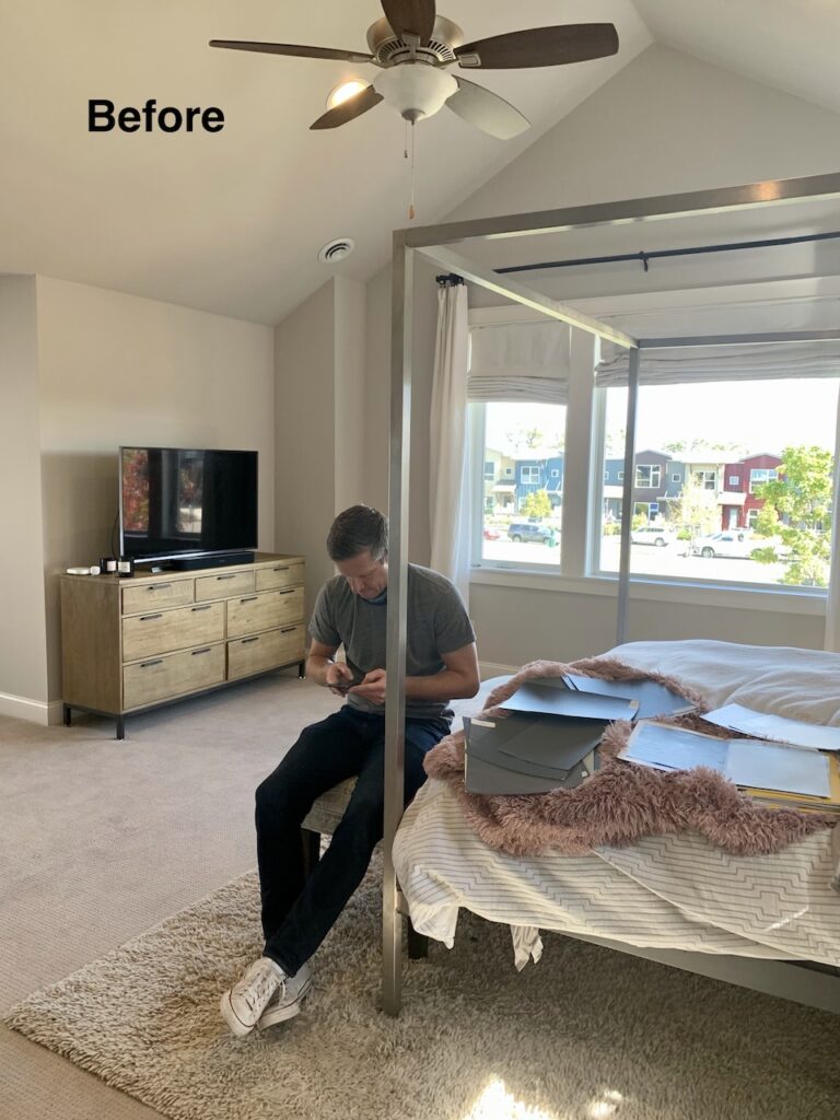
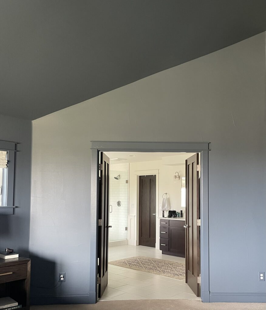
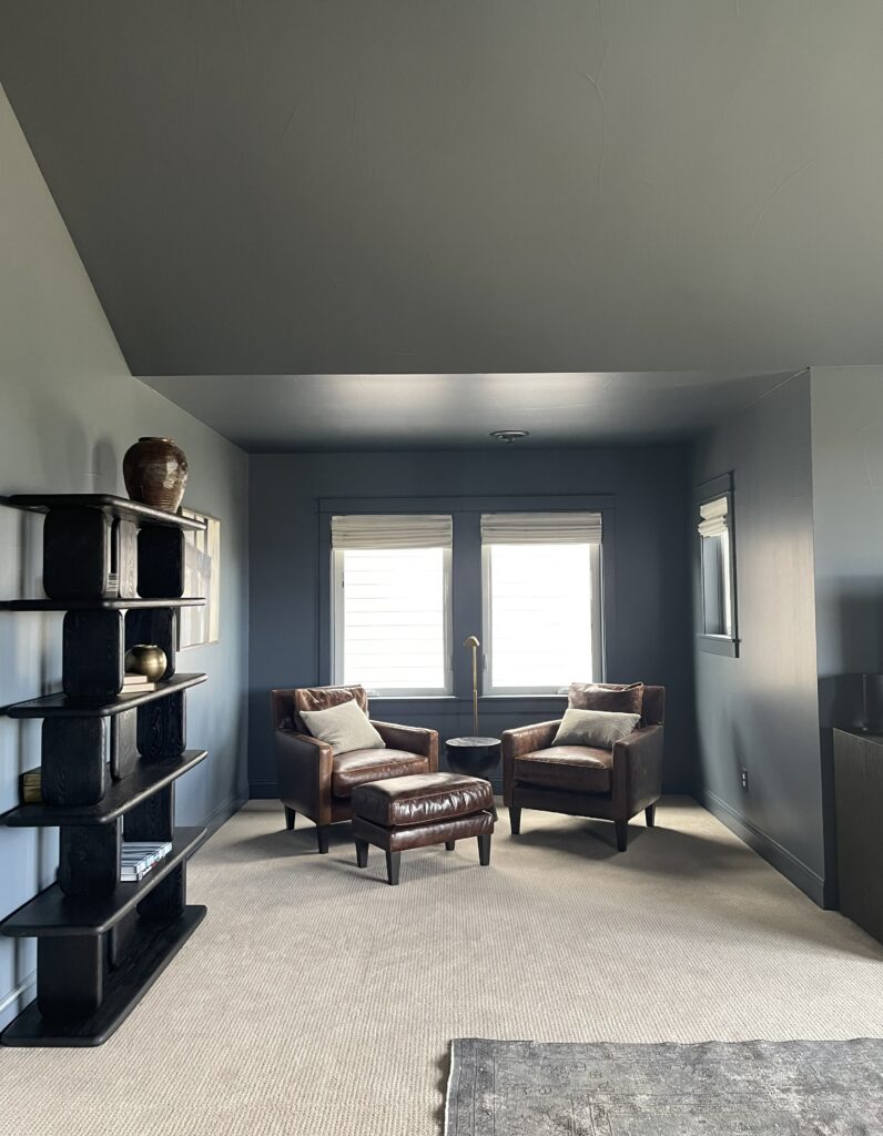
In this primary bedroom, we painted the ceilings, walls, and trim with this gorgeous color. This trendy placement is starting to become very popular. We have seen the use of monotone palettes of dark colors in bedrooms, dining rooms, and offices. In this case, we painted the ceilings, and walls and trim the same Duration Satin sheen. It looks so sophisticated!
In the photo below, all walls, ceilings, and trim are painted with Granite Peak, but the color changes naturally as the light hits it in different ways. Note how that right wall looks much lighter. It is the same color, but across from a bright open window.
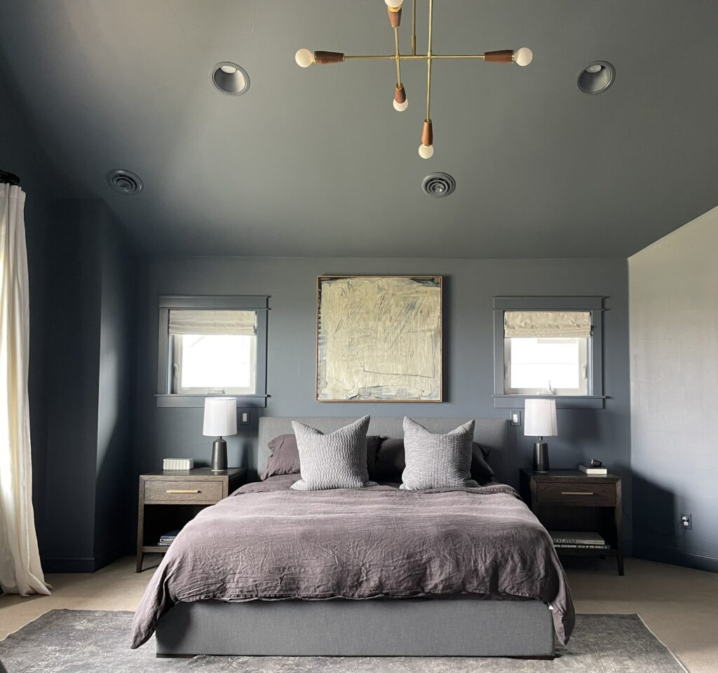

It’s hard to believe this is the same room!
These walls opened into the Primary bathroom, which is painted with Benjamin Moore Cloud White.
The dark leather chairs in the seating area look so rich with the Granite Peak (Sample), and the black bookshelves really pop.
Can I use a Granite Peak accent wall?
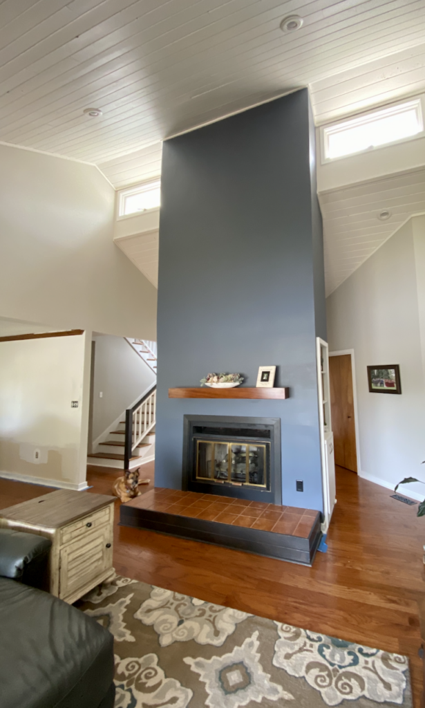
Of course, Granite Peak makes a perfect accent wall. In this case, we used it to accent a tall fireplace in a room with a vaulted ceiling. The ceiling and trim are SW Pure White (Sample). The walls are SW Gray Heron.
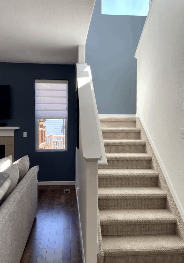
In the client’s home below, we used a BM Britannia Blue accent wall on both the living room and the adjacent stairwell. This color is a very close match for Granite Peak. You can see just how much this hue can shift based on the amount of light in a space.
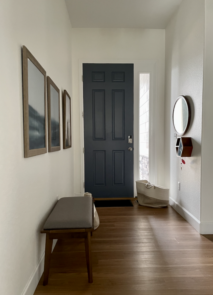
Is a Granite Peak interior front door a good idea?
Yes! A painted front door adds depth and interest. We painted this front door SW Granite Peak and left the trim and sidelights SW Extra White (Sample).
What are the best interior white trim and ceiling colors for Granite Peak?
Consider clean whites and off-whites such as Sherwin-Williams Extra White, SW High Reflective White, SW Alabaster, and SW Greek Villa. In most cases, we like to use the same white for the ceiling (flat sheen) as the trim (semi-gloss sheen).
When should I avoid Granite Peak interior paint?
A creamy white trim can look yellow and discordant as an accent color. We don’t recommend Britannia Blue in rooms with low light and dark ceilings unless you plan to have the lights on all day long.
Using Granite Peak Exterior Paint
Granite Peak (Sample) is a beautiful color for exteriors. Although it looks dark inside, the exterior color ends up looking like a darker mid-toned blue. It is great with red or pink brick. You can use it as a siding color or for accents such as shutters and front doors. It pairs well with Sherwin-Williams Egret White (Sample) or Oyster White (Sample) outside.
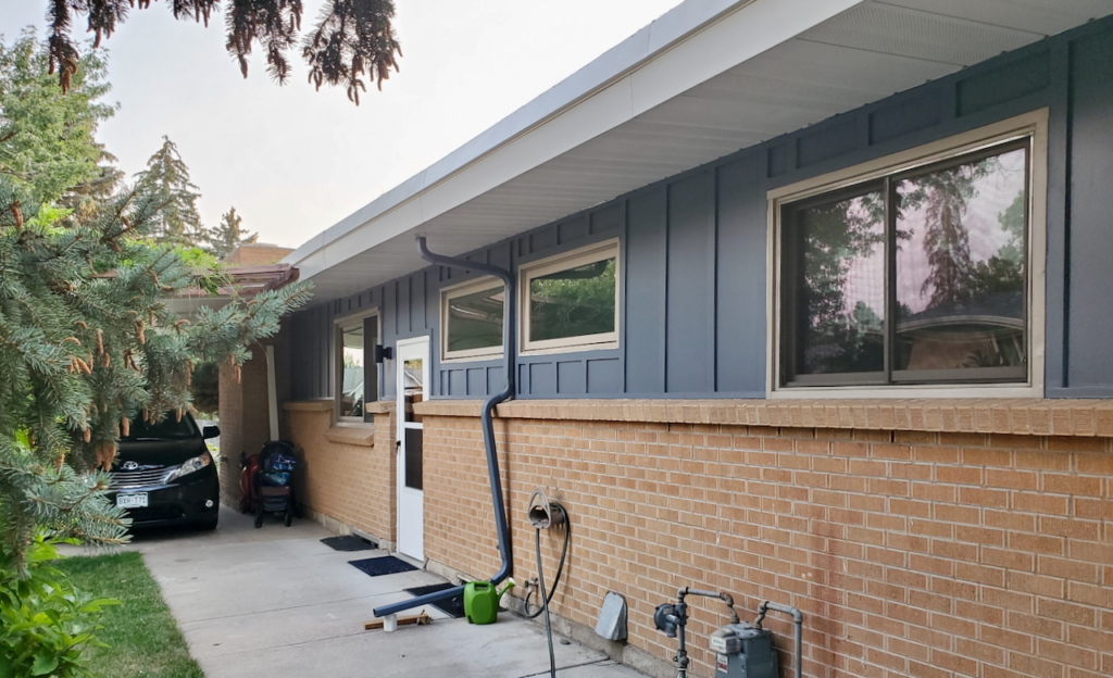
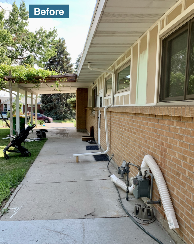
Granite Peak completely changed the look of the home below.
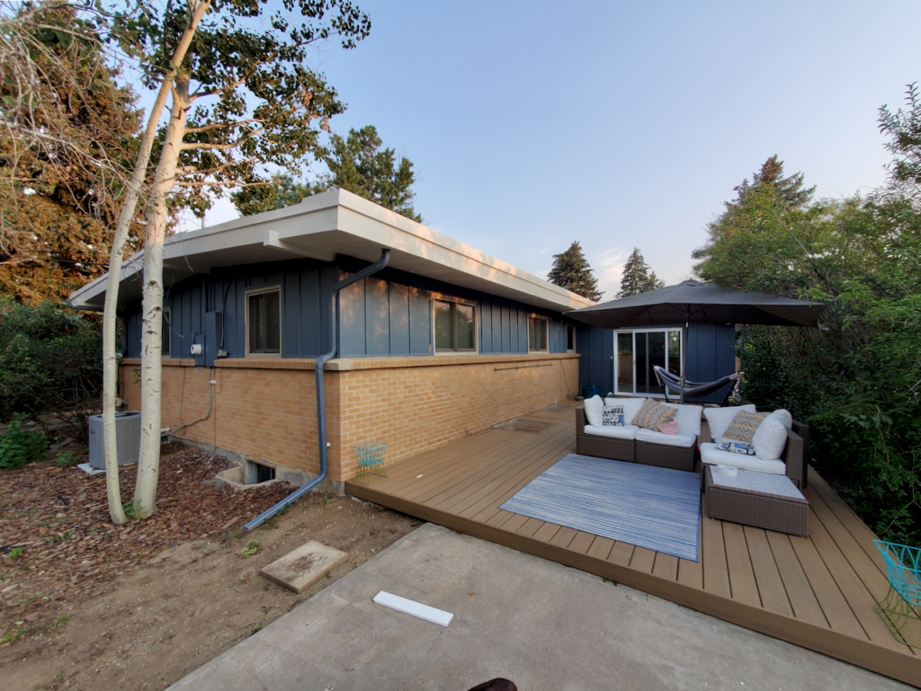
Check out the transformation!
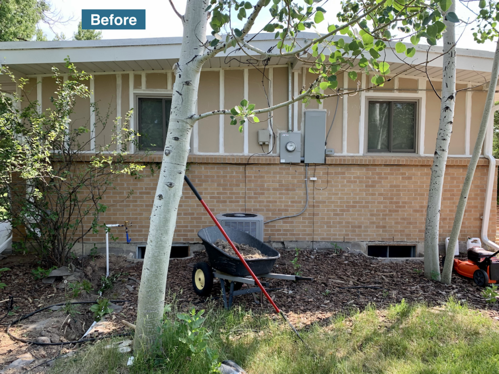
The driveway and side entrance were dramatically transformed.
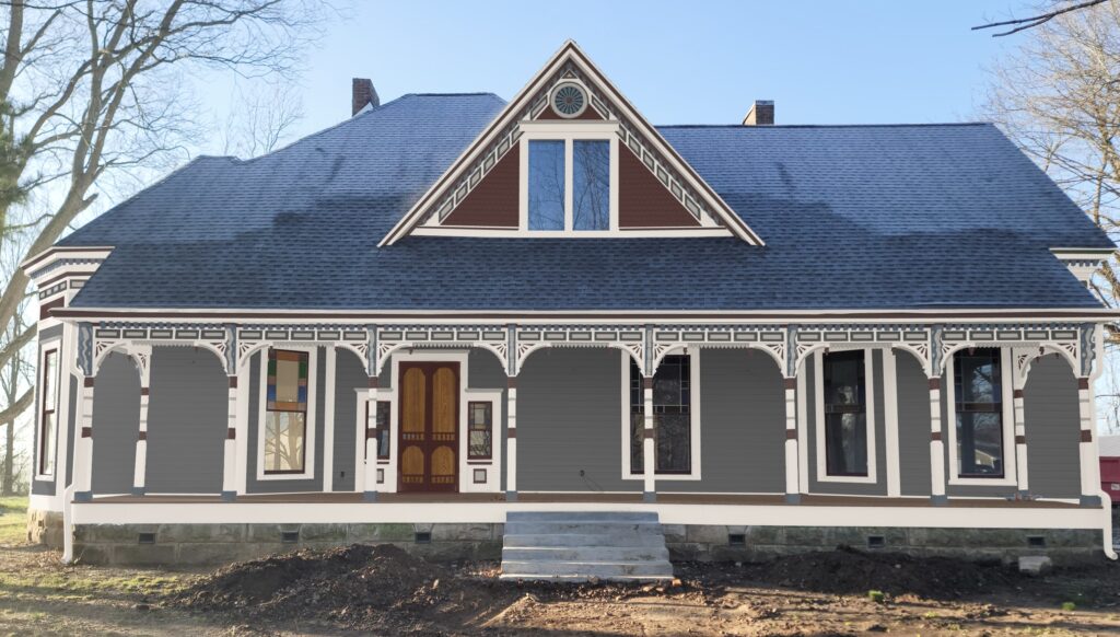
Granite Peak can even be used as dark exterior trim in some home color palettes, particularly historic and Victorian homes. The Photoshop rendering of a Victorian home below, for example, features SW Peppercorn siding and uses SW Granite Peak for the gable peak decorative inner circle, dentils, corbels, column bases and side of house brackets.
Best SW Granite Peak Alternatives
Sherwin-Williams Granite Peak (Sample Here) is a soft and silky color that never lets me down. Here we show how it stacks up with other options.
BM Hale Navy vs. Granite Peak
These two colors are similar, but Granite Peak is significantly lighter. I prefer Granite Peak to Hale Navy as an interior dark blue color because although it’s dark, it isn’t too dark. Hale Navy (Sample Here) has the tendency to look black if the room doesn’t have enough light.
SW Slate Tile vs. Granite Peak
Slate Tile is another lovely darker blue color, but it’s greener and slightly more muted. Test both the colors in your space. Slate Tile (Sample Here) might look better in a room with lower light.

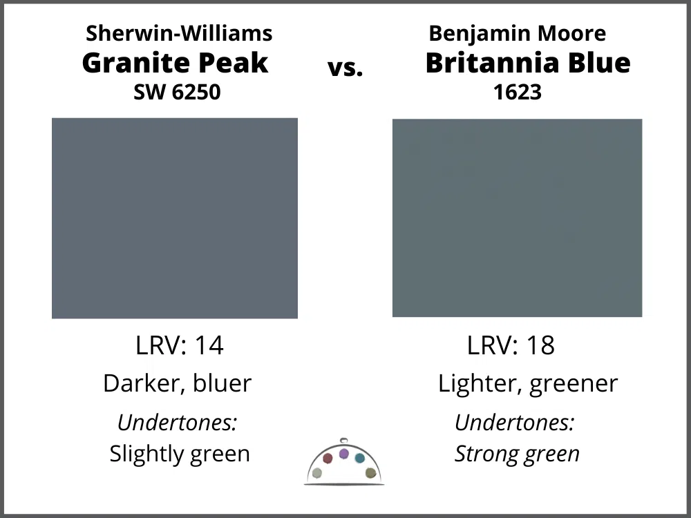
Granite Peak vs. Britannia Blue
The closest Benjamin Moore color to Granite Peak is Britannia Blue (Sample Here). Granite Peak is darker and more saturated with tones that are bluer. To be honest, Granite Peak isn’t really that close to Britannia, but it will work in the same interior room situations where Britannia looks good. For exteriors, Britannia Blue is substantially lighter in the sunshine.
What is the best Benjamin Moore Granite Peak alternative?
Britannia Blue is the closest match, but it’s not that close. We never recommend paint matching unless you are willing to spend a lot of time going back and forth with the paint company. If you want to match, then make sure you check the paint color with a swatch from Sherwin-Williams. Instead, consider BM Britannia Blue, understanding that it is a lighter version of Granite Peak.
Learn more about matching paint colors here.
Key Learning Points
Granite Peak is a rich and saturated mid-toned blue paint color! You can use it for interiors or exteriors. If you use it for interiors make sure you have tons of natural or artificial light so that you can see the beauty in the color. For exteriors, it looks great by itself or with warm brick or earthy stone.
No matter what, don’t forget to test your paint colors. It’s a standard best practice. Whenever I test my paint colors, they are perfect, and when I don’t test they turn out wrong. Learn how to test your paint colors here.
NEVER, EVER use paint matches from a different brand than the one specified. Results are poor and there are no standards for the sheens. Even though your painter may truly believe it can be done, don’t do it. See results from paint matching here.
Online Color Consulting
If you still need help with paint colors, check out our Online Color Consulting packages or an In-Person Color Consultation in the Denver Metro area.

Related Posts
Benjamin Moore Slate Teal Paint Review
Accent Walls – The Ultimate Guide
Benjamin Moore Britannia Blue Color Review
About the Author

Hi, I’m Michelle Marceny, founder, owner, and Principal Color Designer at The Color Concierge. I believe a fresh coat of paint can completely transform a space. The Color Concierge was born out of my drive to help clients fall back in love with their homes. My clients trust me to help them find the perfect paint color for their home – whether it’s a whole-house paint color scheme or ideas for a single room.
Since The Color Concierge was founded in 2017, we have completed over 3000 color consultations, both online and in-person. I am a Certified Color Expert with 7 years of experience creating interior and exterior color palettes throughout North America.
We love your comments! Please note that the blog is meant as general advice, and it is not possible to give specific answers to your paint questions. If you want more specific advice, our Online Color Consultations will help you pick your paint colors. Thank you for your understanding.

2 Responses
Hello.
We are in the process of the first time building of a brand new home. WOW – the learning curve is sure not for the faint of heart! It’s such a immense creative endeavor, especially if you have no professional design expert to help with the myriad of choices vs final decisions – a blank canvas in front of us and our head full of ideas (some NOT so great ones and others right on the MARK!) We are nearing the proverbial home stretch now (pun intended!) and the results are so very satisfying. The exterior of the double (1/2 leaded glass) front door was a smaller item and yet seemed to present the most tedious of choices. We’ve learned so much about paint from LRVs to R/G/B etc after much research and the of purchase of way too many paint samples. The house body color is SW Dorian Gray and the trim is SW Gauntlet Gray. Today we FINALLY settled on SW Granite Peak 6250 for the front door. It’s in a covered alcove so there’s not too much natural light. We arrived home from the build and took one last internet dive to see how we were feeling about the decision and there was YOUR article on SW 6250. So we just wanted to share that we too had come down to Granite Peak vs Slate Tile and agree with you 100% with the latter being a bit green in the undertone. The roof is Owens Corning / Sand Dune – the colors are reminiscent of soft, serene coastal colors, constantly transforming it’s color depending on time of day and the weather – truly living up to it’s name. Because it has a bit of blue, especially on a sunny day, we hope Granite Peak on the front door will pull out that soft blue on some days. Perhaps we’ll send a photo once we get it all done!
Many thanks for all of the wonderful, helpful and easy to understand info regarding all things PAINT!!!
Hi, considering Granite Peak for our front door. How did the color work out for you? Our home is newly constructed with a soft grey exterior, white window trim and black roof etc. Thank you.