Learn all about Sherwin-Williams Agreeable Gray (SW7029) and how to use it in your home in this paint color review.
Sherwin-Williams Agreeable Gray (SW 7029) (Sample) is an IMMENSELY popular Sherwin-Williams greige paint color. It is an iconic warm gray with barely-there green undertones. This is one of the most written-about colors in North America.
It’s a self-fulfilling prophecy – bloggers write about the color because it’s popular and does well in web searches (forgive my cynicism). Readers use the color and make it more popular.

Of course, I like Agreeable Gray, but as with any paint color, it should be used in the right situation. It’s not automatically the right whole-house paint color for every home. For more about how to create a whole-house color palette, link here (Article).
Please note: All the photos in this post come from Color Concierge projects and are part of our portfolio. These are not professional photos, and most are customer photos that give a realistic look of the paint color. These photos are not color-edited.
Most bloggers say that Agreeable Gray is a perfect greige color that will go with anything, but that is just not true. It can be a beautiful color only when used the right way.
Paint colors are a tool, and you should pick a color because it looks great in the room, not because the color is pretty on a swatch or at your neighbor’s house. If it looks great in the room with your hard finishes and decor, then you will love it!

*This post contains affiliate links for products I use and love. If you click on some links and make a purchase, I will get a small commission at no cost to you. This helps pay for the costs of the blog so I can continue to offer great content to our readers.
What Color is SW Agreeable Gray?
Sherwin-Williams Agreeable Gray (Sample) is a warm greige paint color that works very well as a foundational neutral in many homes.
What is the LRV of Agreeable Gray?
The LRV (Light Reflectance Value) is 60 (scale from 1/dark to 100/light), which makes it light-reflecting, and an excellent color for many residential rooms. It’s a bit darker than many of today’s trending light greige paint colors, but that doesn’t matter if you use it in a room with lots of light.
What are the Agreeable Gray undertones?
Agreeable Gray has warm green undertones with flashes of violet in certain light. For this reason, I often describe Agreeable Gray as a “fleshy” gray.
Is Agreeable Gray warm or cool?
Agreeable Gray is a warm greige paint color thanks to its green undertones. While it does sometimes flash violet (which is cool), it still looks warm overall.
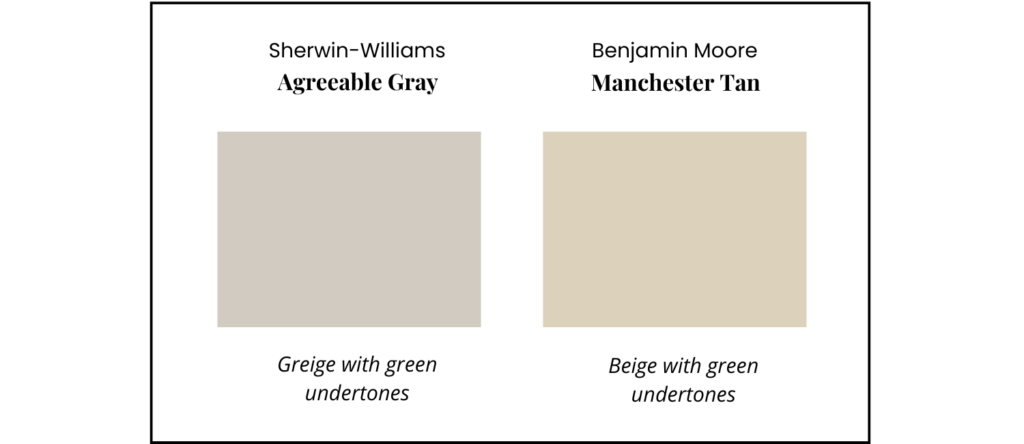
Is Agreeable Gray more gray or beige?
Agreeable Gray is a greige. It looks warmer than you would expect a gray to look because of its warm green undertones. It is definitely more of a gray than a beige. You can really see this when you compare it to a beige color, like BM Manchester Tan below. Because of its green undertones, it looks warmer than many cooler gray paint colors.
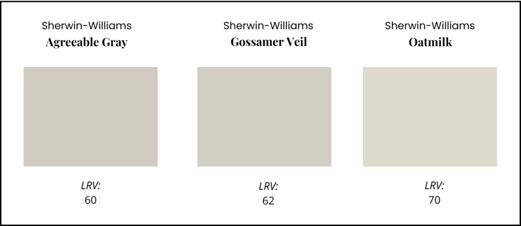
What is a lighter version of Agreeable Gray?
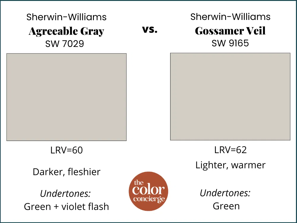
Sherwin-Williams Gossamer Veil (LRV=62)l is a lighter hue that is similar to Agreeable Gray, but cleaner and crisper. Oat Milk, one of the gorgeous designer colors, is substantially lighter (LRV=70) with a soft green undertone.
Will Agreeable Gray look purple?
Agreeable Gray can sometimes look fleshy and flash a bit violet in cool lighting or darker rooms. But I’ve never seen it look truly purple on the wall.
Will Agreeable Gray look green?
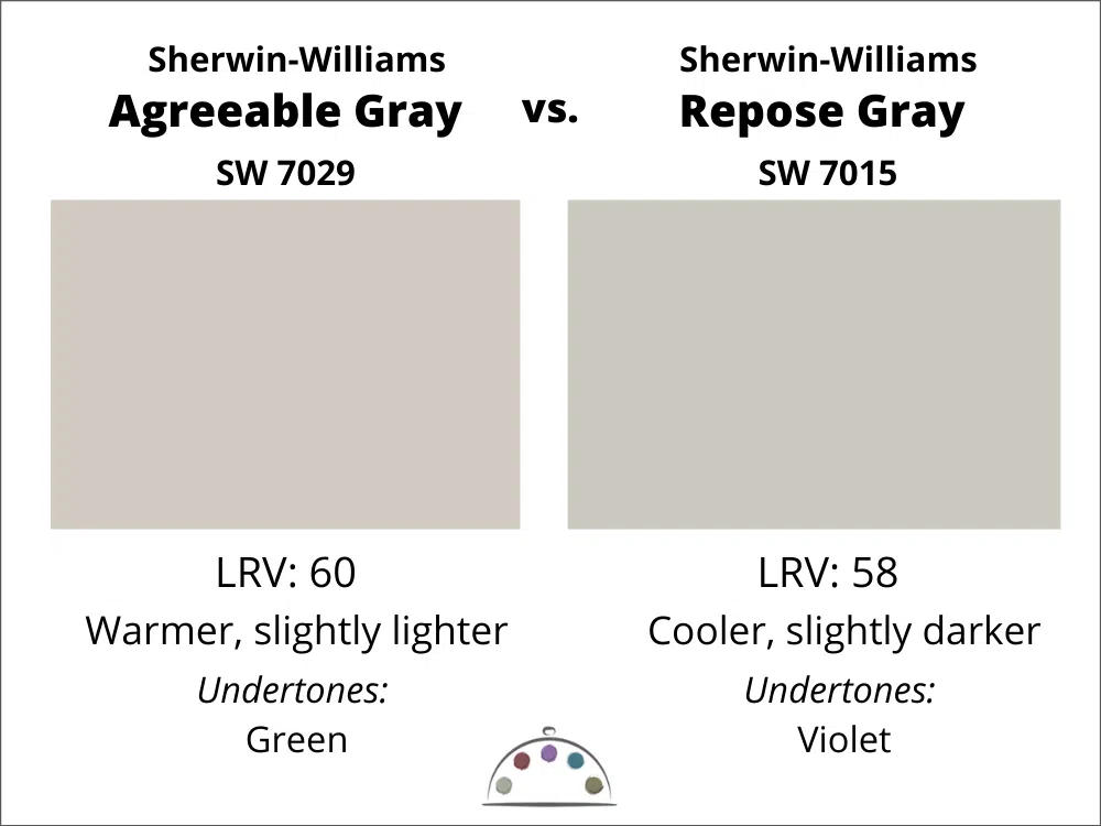
Agreeable Gray does have green undertones, but they’re not overly pronounced. Instead, they provide lots of warmth to this greige paint color. They can look green if you place them next to a gray with violet undertones such as Repose Gray.
Sample SW Agreeable Gray
We always recommend that you test paint colors (article) in your home because lighting can completely change a color, both on interiors and exteriors.
In the old days, this meant we painted a large poster board with sample pots and a huge mess.
Now we have a better way to test paint, with Samplize Peel-and-Stick samples!
- Samples pre-painted with 2 coats of real paint from the manufacturer.
- Large 9” x 14” samples to see the color better in the lighting.
- Delivered overnight
- Colors are accurate
- Less expensive than painting a large poster board with sample pots
- No mess, and no toxic paint to dispose of
I use these in my color consulting practice for exact results. Discover Samplize peel-and-stick paint samples and sample Sherwin-Williams Agreeable Gray (Sample) via the link below.
Is Agreeable Gray still popular in 2025?
The quick answer is YES! Agreeable Gray (sample here) is an iconic Sherwin-Williams greige paint color and is still one of the 50 most popular colors (Article) on the Sherwin-Williams website. This post on Agreeable Gray has been one of our most popular paint color reviews on this blog for years!
Why is Agreeable Gray so popular?
I think Agreeable Gray is so popular because it’s a light neutral wall color that goes with a broad range of decor, furniture, and hard finishes – but it still has warmth.
White wall colors are very popular now, but they can be cold and difficult to decorate with. Plus, not everyone wants a white house. For those who want a warmer and friendlier paint color, Agreeable Gray can work very well.
Using Sherwin-Williams Agreeable Gray Interior Paint
This paint color is glorious when there is LOTS of natural light from any direction, even cooler North-facing light. In a lighted room, it looks like a warm light greige that makes a room warm, friendly, and inviting.
It also looks great in a dark room that has constant artificial light, such as a basement.
I’m very familiar with Agreeable Gray (sample) because it’s the whole-house color our builder gave us when we purchased our new build 2 years ago. As with most paint colors, I don’t consider it a whole-house paint color because very few houses are flooded with warm, perfect light.
We painted the rooms that had low light or shifting light with other colors. We kept Agreeable Gray in the basement, where we have lots of artificial light. The bedrooms had tons of beautiful light, but most of the main floor with east-facing windows and low light conditions have been painted other colors.

Agreeable Gray in rooms with lots of light
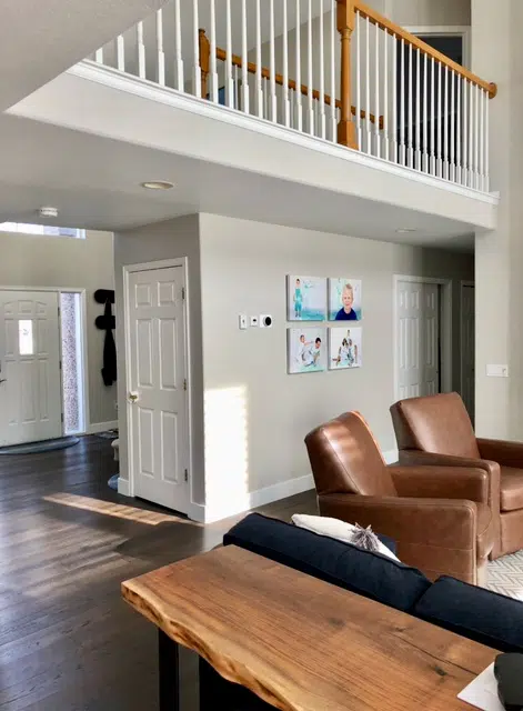
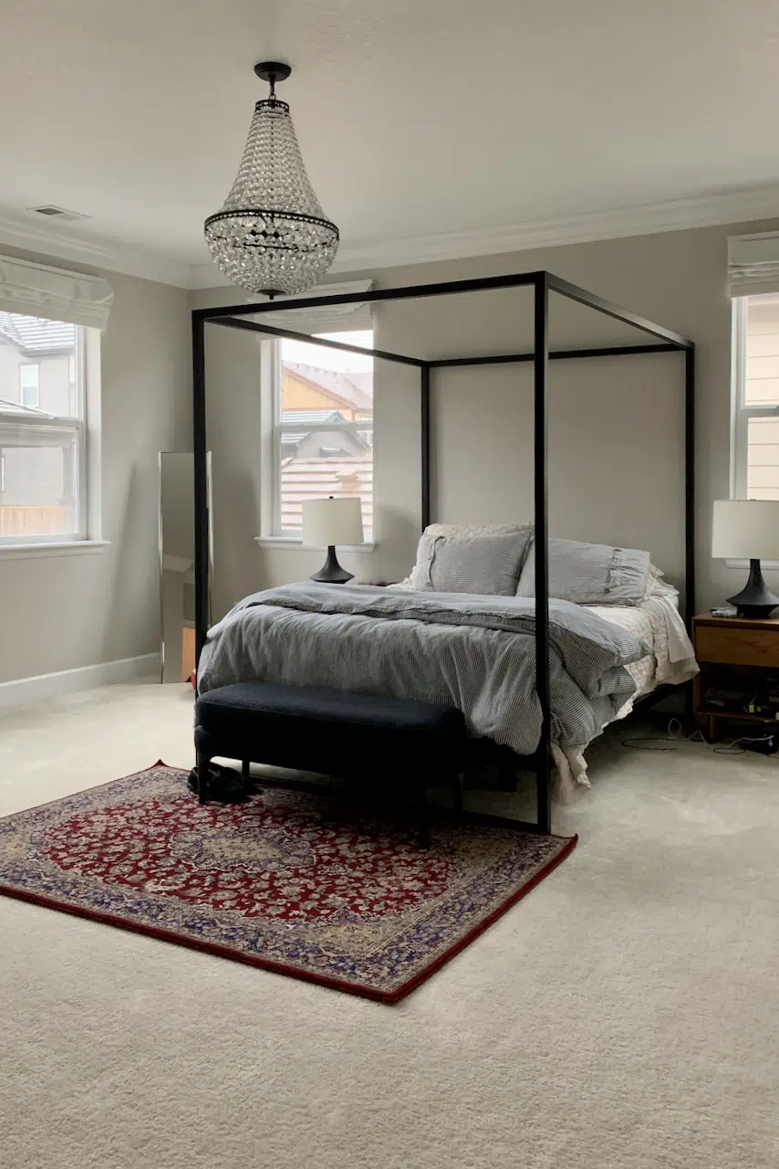
Below is my bedroom, with South and East exposure. This room is sunny all day long and has lots of large windows. This color is also a great backdrop for colorful art!
Even though Agreeable Gray is not one of my personal favorite paint colors, we still have it in our bedroom because it is so pretty in this space.
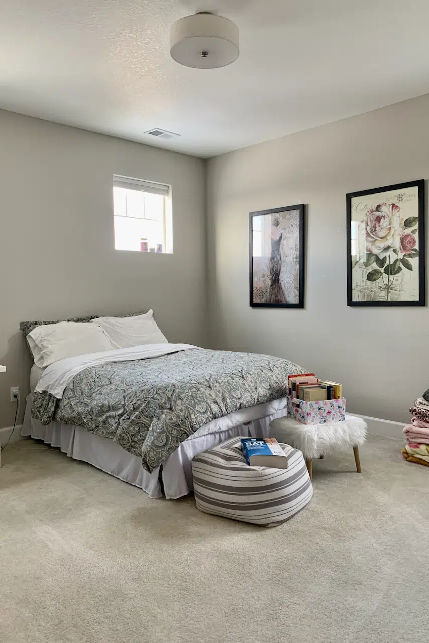
This bedroom also has tons of light, although it is North and West facing. It looks fabulous at all times of day, even with cooler North-facing light.
Agreeable Gray in rooms with artificial light
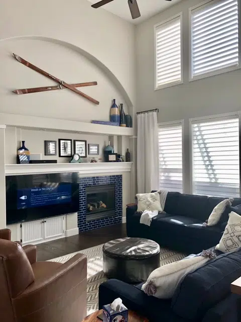
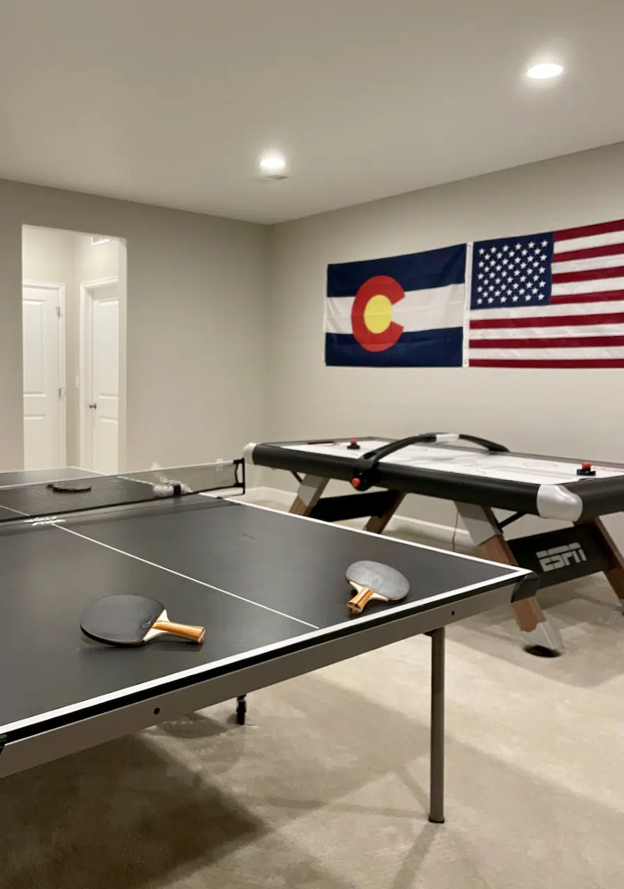
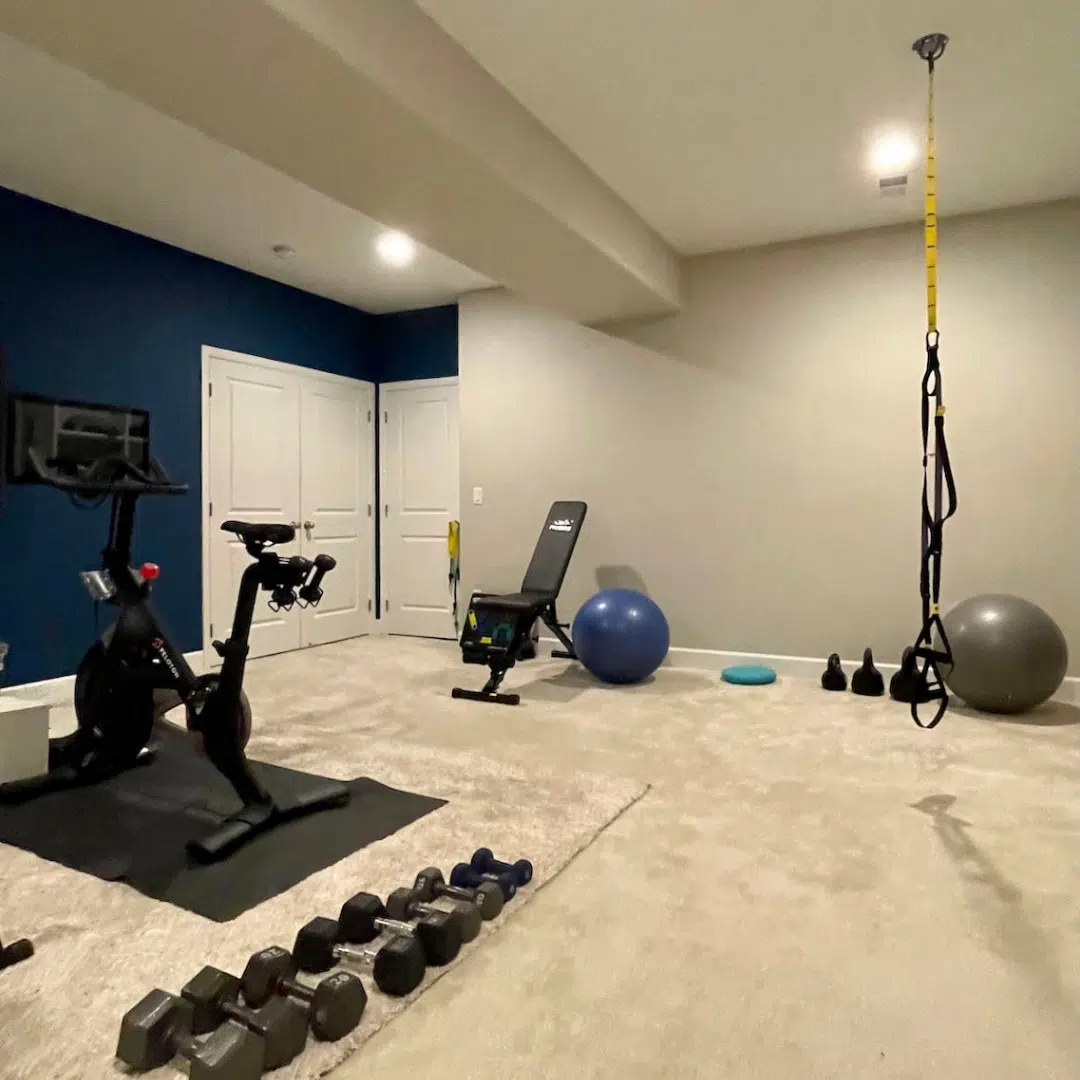
Basements and bathrooms without windows are fabulous places for Agreeable Gray (Sample). In fact, Agreeable Gray is one of our favorite basement paint colors (Article). Make sure that you use warmer bulbs. The color looks lovely and inviting and is a fan favorite.
I snuck in a BM Slate Teal (Sample) Accent wall in the gym! Learn more about this color here (Article).
Agreeable Gray in dark rooms or low light rooms North facing light
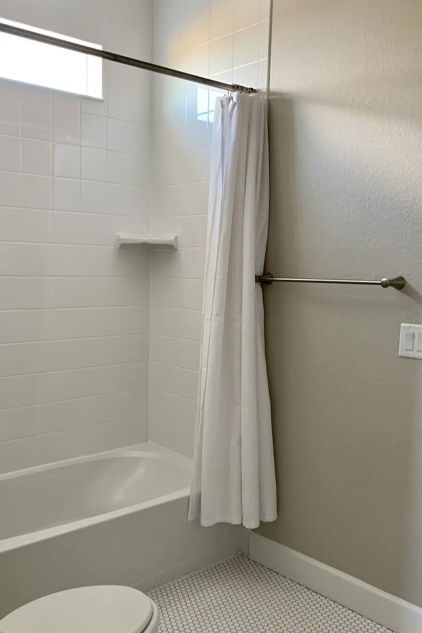
This paint color makes a room look grim in low or cool light. The fleshy purple tones hidden in the bright light make their way out to the surface so that the room looks like a dingy icky prison. I’m not sure if I can be more eloquent.
Here is a photo of Agreeable Gray in a North-facing bathroom with very low light. Not it’s best moment.
Would Sherwin-Williams Agreeable Gray cabinets look good?
Agreeable Gray can be a great cabinet color. If you want to have a light, warm kitchen but don’t want to use white cabinet paint colors then Agreeable Gray could be a good alternative.
If you do plan to try Agreeable Gray kitchen cabinets, be sure to consider the lighting in your kitchen to ensure the color will look soft and warm. It’s also important to test Agreeable Gray next to any existing hard finishes. If you have cool gray tile or countertops, for example, Agreeable Gray may not be the best cabinet color.
Should I try an Agreeable Gray living room?
I love to recommend Agreeable Gray as a living room paint color or even an open-concept paint color for a full lower level. However, this only works when these spaces are flooded with natural light.
If you want to use Agreeable Gray on an open concept space in which one area is in shadow or cool light, the color could look discordant compared to areas with more warm light.
Using Sherwin-Williams Agreeable Gray Exterior Paint
This color can look like a soft white outside, where the bright sun makes colors 5-10 lighter and brighter in the sunshine. Typical interior whites like SW Pure White can look stark when used outside as a trim color.
It’s important to understand that using this color outdoors in direct sunlight is very different from using it indoors. Although it looks like a nice greige inside, when you take it outside it looks like a very light, warm gray or a creamy off-white without flashes of yellow.
Sherwin-Williams Agreeable Gray Exterior Trim
Agreeable Gray is a soft “white” trim color and works especially well with darker exterior siding colors or earthy brick or stone. It’s a great way to go darker with white instead of shifting to a cream which would be more yellow.
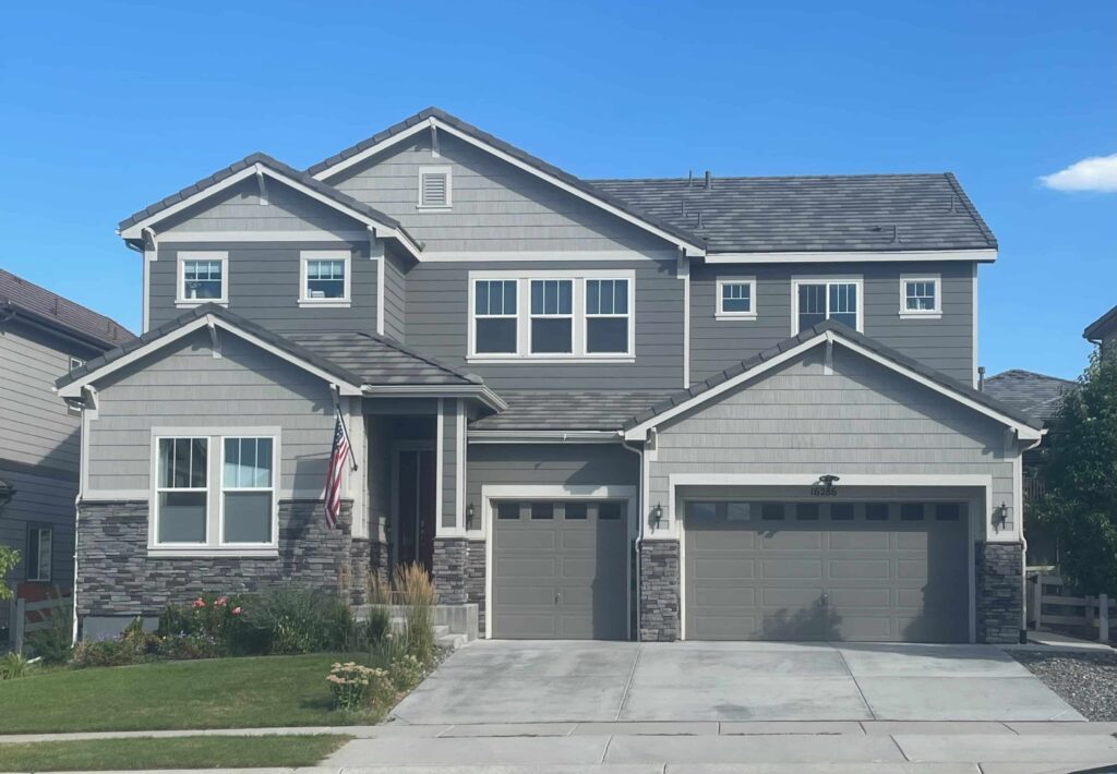
The white trim in the house below is painted with Agreeable Gray. The house is facing West.
I was STUNNED that Agreeable Gray (Sample) (LRV=60) was the “white” trim color. But we live in a new neighborhood, and many houses are painted with this palette. I love how it looks like a soft white trim outside!
Sherwin-Williams Agreeable Gray Siding
We also like to use Agreeable Gray as a “white” siding color in exterior palettes. This works especially well in more Southern latitudes of North America and higher altitude cities such as Denver and Salt Lake City.
Agreeable Gray is also a fantastic choice for a red brick exterior color palette (Article). It can work as trim paint for a brick house but can also pair well as siding on a home with brick accents, like the client’s home pictured below.
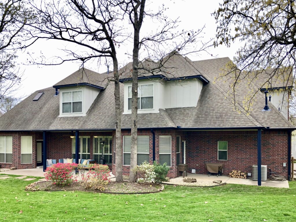
Its warmth complements the brick really well, while the green undertones balance out the red color of the brick.
What trim color goes with Agreeable Gray for exteriors?
You can use either dark or light trim colors with Agreeable Gray. With white vinyl windows, it’s important to find a white trim color that is lighter and brighter than Agreeable Gray without looking too stark. A warm off-white, such as SW Westhighland White (Sample), can pair well with the warmth of Agreeable Gray.
You can also use Agreeable gray as both the body and the trim color. If the window frames are black, for example, I prefer to use Agreeable Gray for the trim and the body because a dark window trim would look too heavy paired with black window frames.
What are the best interior trim and ceiling colors for Agreeable Gray walls?
Trim and Doors
For white trim, you can use crisp whites such as SW Extra White (Sample), cleaner whites such as SW Pure White (Sample), or off-whites such as SW Alabaster (Sample) or SW Greek Villa (Sample). Creamy Whites such as SW Shell White are too dark and can look dingy. The trim and doors should be the same white color. The sheen should be Semi-Gloss.
Ceilings
We like to use the same ceiling white as the trim white for ceilings. The ceiling should be painted with a flat sheen.
When not to use Agreeable Gray?
This greige color can look fleshy in a room with low or cool North facing light. We do not recommend that color in a room with low natural light.
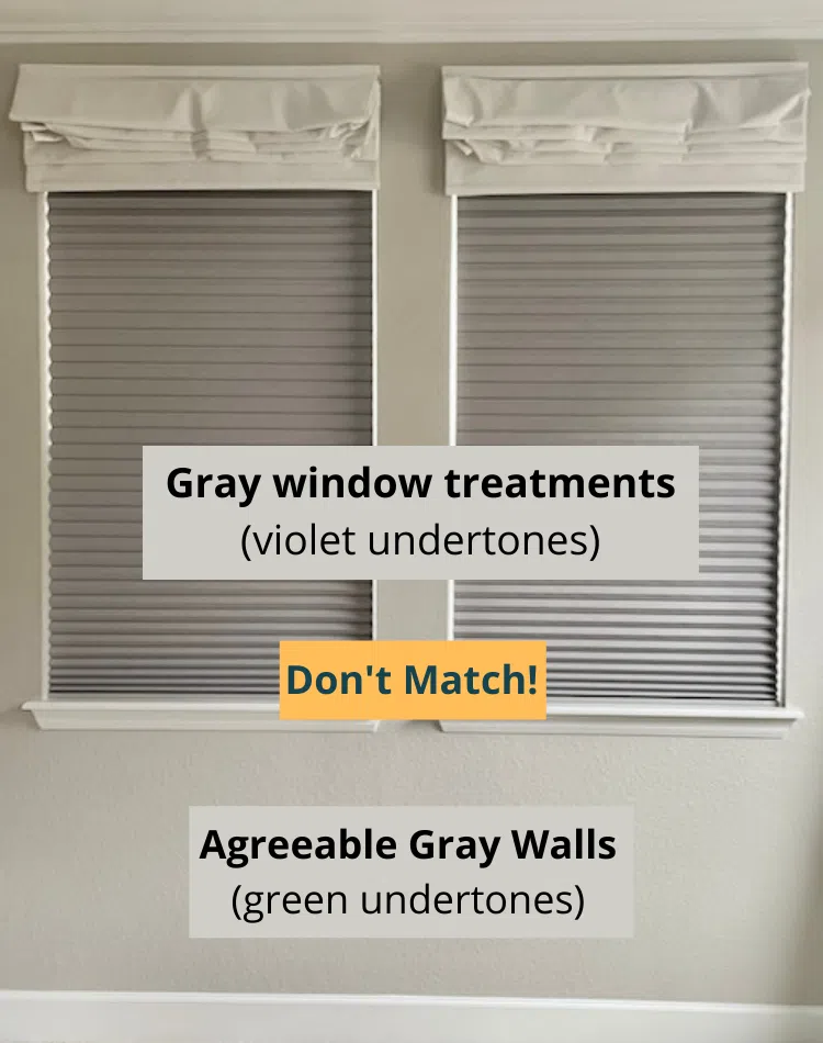
Don’t use Agreeable Gray in the same space as creamy white colors or cool grays with violet undertones, such as Repose Gray. For some reason, they suck the life out of each other. You can have them in rooms next to each other, though.
Below is a photo of my bedroom where I accidentally purchased gray cellular shades with a violet undertone – the gray color people associate with elephants, like Repose Gray. The shades look dirty because they don’t pair well with the green undertones in Agreeable Gray.
Best Sherwin-Williams Agreeable Gray Coordinating Colors
Agreeable Gray is a pretty versatile paint color that can work with many different colors and finishes.
White Paint Colors
Warm white paint colors work best with the warm green undertones of Agreeable Gray, while still providing enough contrast. Sherwin-Williams Alabaster, Sherwin-Williams Greek Villa and Benjamin Moore White Dove (Color Review Articles) are all great examples of whites that would pair well with Agreeable Gray.
Blue and Green Paint Colors
Because of its undertones, Agreeable Gray also pairs well with green paint colors and even blues with warm green undertones. The Slate Teal accent wall in the basement gym pictured above, for example, complements the color perfectly.
Black Paint Colors
Soft, warm black hues like Sherwin-Williams Iron Ore or Benjamin Moore Wrought Iron (Color Review Articles) can also pair well with Agreeable Gray as an accent wall. I love the idea of pairing Agreeable Gray walls with a black interior door.
Sherwin-Williams Agreeable Gray Alternatives
Agreeable Gray vs Gossamer Veil
Gossamer Veil (Article) is similar to Agreeable Gray, but lighter. It has warm, green undertones without the fleshy flashes of violet you can see with Agreeable Gray. As a result, I prefer Gossamer Veil (Sample) for rooms with lower light conditions.
Agreeable Gray vs. Repose Gray
Repose Gray (sample here) is a darker, cooler gray color with strong violet undertones (color review here). Agreeable Gray (sample here) is a greige color (vs. gray) with warm green undertones that can look fleshy in low light. Repose can look better in North-facing light. If one of these colors looks great in a room, the other will not look good.
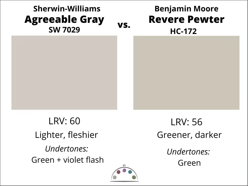
Agreeable Gray vs. Revere Pewter
Benjamin Moore Revere Pewter (sample here) is a cleaner and crisper gray/greige color than Agreeable Gray. They are warm greige paint colors with green undertones, but Agreeable has a splash of violet undertones compared to Revere. Agreeable Gray will likely be the better choice if your room has tons of natural light. If one of these colors looks good in a room, the other will also look nice because they have similar undertones.
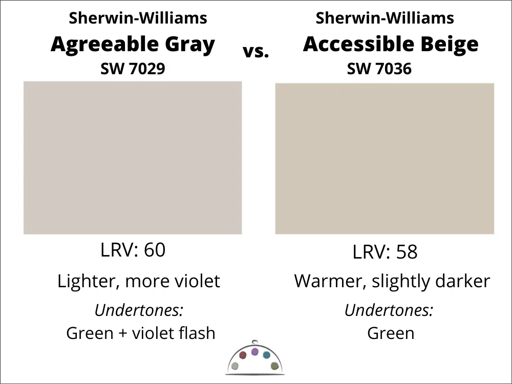
Agreeable Gray vs. Accessible Beige
Both colors have warm green undertones, but SW Accessible Beige (Sample) is warmer. Pick Accessible Beige for rooms with North facing light. If Accessible Beige (sample here) looks good in a room, Agreeable Gray will look good too.
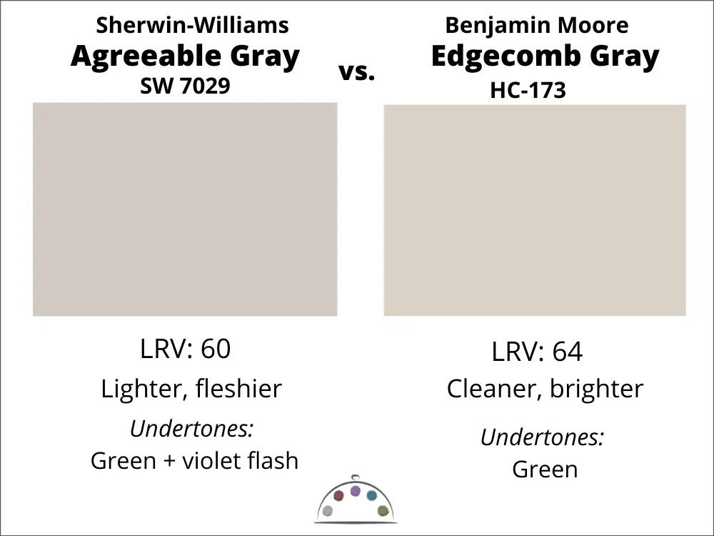
Agreeable Gray vs. Edgecomb Gray
Benjamin Moore Edgecomb Gray (Sample) is lighter, cleaner, and warmer than Agreeable Gray. They are both warm greige colors with green undertones. Edgecomb (sample here)would likely be the better choice for a room with low light or Northern exposure. If Edgecomb Gray looks good in a room, Agreeable will likely look good.
Which Benjamin Moore paint color is closest to Agreeable Gray?
Agreeable Gray is one of those colors that doesn’t have a close match in the Benjamin Moore paint catalog. If you want a paint color that behaves similarly, choose from BM Revere Pewter or BM Edgecomb Gray. They aren’t the same, but they are both greige colors with green undertones that I would use in similar situations. Edgecomb is probably the closest one.
Of course, we never recommend matching paint colors from Sherwin to Benjamin Moore. Learn more about matching paint colors here (Article).
If you’re looking for a color similar to Agreeable Gray that performs better in lower light, I recommend Gossamer Veil (Article) from Sherwin-Williams. I prefer Gossamer Veil because it has the best qualities of Agreeable Gray without the tricky fashes of violet.
Sherwin-Williams Agreeable Gray Pros and Cons
Pros:
- Warm, muted paint color that is still fairly light but isn’t a white paint color
- Looks beautiful in rooms with lots of natural light
- Versatile neutral that works with lots of different finishes
Cons:
- Its green undertones can sometimes flash violet, creating a fleshy look
- Does not work well in rooms with low or cool light; can look grim
- Looks discordant with very creamy whites and other grays with violet undertones
Key Learning Points – Agreeable Gray
Agreeable Gray is a glorious warm greige paint color with green undertones. Here are some quick reminders about how to use this color in your home:
- Agreeable Gray looks great in rooms with lots of natural or artificial light. If you have a room with low light, the hidden violet undertones will look fleshy, and Agreeable Gray will make the room look like a prison.
- Agreeable Gray works very well as an exterior “white” paint color for trim or siding. While it’s actually a greige color, it looks like a soft white outdoors in the bright sunlight.
- While Agreeable Gray is a great neutral paint color, it doesn’t work in every room or in every space. Always make sure to take your lighting into consideration and test before painting.
NEVER, EVER use paint matches from a different brand than the one specified. Results are poor and there are no standards for the sheens. Even though your painter may truly believe it can be done, don’t do it. See results from paint matching here.
Online Color Consulting
Still looking for the perfect paint color? Discover our Online Color Consulting Packages.

Related Posts
SW Gossamer Veil Paint Color Review
Benjamin Moore Slate Teal Color Review
About the Author

Hi, I’m Michelle Marceny, founder, owner, and Principal Color Designer at The Color Concierge. I believe a fresh coat of paint can completely transform a space. The Color Concierge was born out of my drive to help clients fall back in love with their homes. My clients trust me to help them find the perfect paint color for their home – whether it’s a whole-house paint color scheme or ideas for a single room.
Since The Color Concierge was founded in 2017, we have completed over 3000 color consultations, both online and in-person. I am a Certified Color Expert with 7 years of experience creating interior and exterior color palettes throughout North America.
We love your comments! Please note that the blog is meant as general advice, and it is not possible to give out specific answers to your paint questions. If you want more specific advice, our Online Color Consultations will help you pick your paint colours. Thank you for your understanding.

25 Responses
You have no idea how much this article helped me!! Such important information and the photos were so important to see. Thank you so much!
I’m really glad! I felt it was a story that needed to be told. So many people just say its a perfect color. Too much crowdthink.
Michelle
Hi, you mentioned using AG in the basement but make sure to use warmer bulbs. Could you specify what is the appropriate color temperature? I have 4000K led lighting in my basement and trying to decide between Agreeable gray or Repose Gray. I have vinyl flooring in light cool gray. Do you think either could workm
Thank you.
I absolutely love this color I have used it for years and most of my house flipping projects. iPhone trick I have been using for the last few is to paint the ceiling and walls a flat agreeable gray with a tone on tone affect with semi gloss for the trim indoors it really pops.
What floor colors and cabinets go with agreeable gray
Would you please comment about using Agreeable Gray in an east facing room?
If you use Agreeable Gray in an East facing room, if you have lots of windows, it should look great, especially in the mornings. The room will look darker and less crisp in the afternoons.
AG looks great in your photos. We recently painted a south facing, lots of natural light family room that color. It looks either steel gray or light blue depending on time of day. I was really bummed about that. Trying to choose a color to repaint because I hate it.
Love this website and your advice regarding color-I am learning so much, especially the role of outside color like green trees. I loved AG on a swatch, and we tried AG in a west facing bedroom. Unfortunately it looked purple, In fact literally every color of off white, beige or gray we tried looked some shade of pink or purple because the homes next door (like many here in Southern California) have a red tile roof. Would love to see this challenge addressed,
Hi Dalene,
Unfortunately, It’s hard to fight a red reflection in your rooms, especially with light colors because they act like a mirror. One way to fight this is to pick paint colors with a green undertone. Even though AG has green undertones, it still has enough flashes of violet to skew to purple. Try colors that have a stronger green undertone. Try Benjamin Moore Revere Pewter Or Edgecomb Gray. BM Spanish Olive is also a nice choice to test.
This article was very helpful. Iv been trying to find the right light grey. Thank you for the info about lighting and how it effects the tint or shade that the gray can turn to w different lighting. Very Very helpful. Still looking for a slightly lighter gray..
Thank you so much for this information! I am thinking about using AG in my dining room. What colors could I use for a pop in the room? I am painting a faux bamboo china cabinet and had been thinking about a light blue or a blush. What would you suggest?
Thank you,
Steph
Hi Steph,
Please consider a color consult or one of our ready-made palettes. We have one for Agreeable Gray.
Thank you,
Michelle
Unpopular opinion but agreeable gray does not agree with me at all. Unfortunately, my new home is a pre-speced home so it comes with agreeable gray everywhere so I really would appreciate your expert recommendations in this case. My house is West-facing, with the living room being in the back of the house (windows face East, South and North), and rooms primarily facing West (windows face West, South and North). Lighting in the house is pretty dim in general. What shade of hot / saturated pink (not a fan of pastel or neutrals) would you suggest that would go well with agreeable gray? I so desperately need help! Thank you.
It sounds exactly like my new build, where they used Agreeable Gray everywhere. I kept the AGreeable Gray upstairs in the rooms with tons of light. I painted over it with Simply White in the lower light rooms. It’s hard for me to make specific recommendations without seeing photos. Please consider one of our color consultations.
Thank you,
Michelle
Hi Michelle, Thanks for your post on AG. We are using it in our open plan bungalow with pure white trim. We were originally thinking Pure White for the kitchen cabinets but would like a little more depth if we’re brave enough! We have lots of natural light north and south facing and are looking at Dovetail or Before the Storm for the cabinet colour (both Sherwin Williams). I’ve found recommendations for Dovetail but nothing for Before the Storm. What are your thoughts on AG walls, PW trim and Before the Storm kitchen cabinets?, Thanks for your time 🙂
How does this color do with little hands. I have little ones and there little hand prints end up everywhere!
It’s great as long as you paint in an eggshell sheen so that you can wipe.
We are helping refurbish an old community center so that it can be used for receptions, family gatherings, special services, etc. It is a large building with fairly high ceilings and a stage. What colors do you reccomend for such a large space as that? There is a large rectangular frame over the large windows that we were thinking to paint a darker compatible color. If we use AG, which I love, what darker shades would go well with it? And any ideas on what kind of shades could be used?
Hi Michelle –
I purchased your Agreeable Gray Color Palette and it’s so helpful! I have one suggestion for a correction. I had a really hard time searching for “Cascade Green SW 6247”. That’s because it’s SW 0066 (Krypton is SW 6247) 🙂
Love your website!
Hi Tara,
Thank you so much for the feedback and I’m glad the palette is helpful. We will correct that.
Michelle
We had a flood over the Christmas Holidays. The entire interior of my house has to be painted. I was thinking about going AG and Silver Strand SW 7057 in the bathrooms. I was going to go AG with a durable finish like satin or eggshell in the garage. Any recommendations?
My wife wants me to pick the color (s). I want to show her I can do this. I thought about repose gray and I love Redend SW 9081, but “Wow” colors can be overbearing. Your thoughts.
https://www.zillow.com/homedetails/10403-Colonel-Hancock-Dr-Louisville-KY-40291/73521264_zpid/
How would AG look in a east facing stairway going into a wall in a living room that’s a west exposure? My living room is so dark in the morning.
Do you recommend Agreeable Gray for a home that house pecan wood trim? My home is open concept and my main room has a pecan wood tongue & groove ceiling. It’s so difficult finding a not too warm/not too cool color to compliment the wood.
hi! our newly built is painted agreeable gray,. unfortunately, we dont get a lot of natural light what can you advise to make the kitchen and living room look brighter without having to repaint? thank you