Learn all about Sherwin Williams Repose Gray, a greige paint color in this color review (Sample Here). Although this greige color can show warmth with brighter light conditions, it is usually on the cooler side.
The photos in this post are from one of our favorite Color Concierge projects with another historic home in Denver. None of the photos are color edited, and we don’t use any filters in the photos so that you can see what the color looks like in a room.
I love this project as a case study because it has rooms with North, South, East and West facing exposures as well as examples with white trim and warm wood accents.
Throughout this post, you’ll see just how versatile Sherwin-Williams Repose Gray really is!

*This post contains affiliate links for products I use and love. If you click on some links and make a purchase, I will get a small commission at no cost to you. This helps pay for the costs of the blog, so I can continue to offer great content to our readers.
About The Color Concierge
Our Colorado-based paint color consultants make finding the right paint colors for your home easy. Whether you’re painting the exterior or interior of your home, our simple yet effective process lets us get your paint color right the first time. We’ve helped thousands of homeowners transform their homes into a space they love. Learn more about ONLINE COLOR CONSULTATIONS today.
What Color is SW Repose Gray?
Repose is a versatile neutral that looks best in a light-filled room. It’s a light greige paint color that is on the cooler side but still warmer than a true gray.
What is the LRV of Repose Gray?
The LRV of Repose Gray is 58, which is slightly darker than most grays we select today. A lighter version would be SW City Loft (Sample HERE), with an LRV of 70. The scale goes from 1 (pure black) to 100 (pure white) and indicates how dark or light a color is.
What are the Repose Gray undertones?
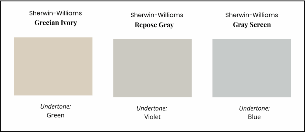
Repose Gray has violet undertones. Grays with violet undertones are the color homeowners most often think of as “gray”. Violet grays are the ones that look like the color of elephants.
Like most gray paint colors, it can be hard to see Repose Gray’s undertones until it’s compared to greige hues with different undertones. In the graphic below, you can clearly see this color’s violet undertones.
Is Repose Gray warm or cool?
Although this greige color can show warmth with brighter light conditions, it is usually on the cooler side. In darker rooms or rooms with low light, it looks cooler, and I prefer to contrast with clean white ceilings and trim to help bring out more warmth.
Is Repose Gray still a popular color?
Yes! Although more homeowners are moving away from gray paint colors, this greige has enough warmth that it still works with today’s warm neutral trends.
For those who want a color that shows contrast with trim and ceiling, Repose Gray could be a contender for your home. The key is to make sure this color pairs well with your countertops, floors, carpets and decor.
Sample SW Repose Gray
We always recommend that you test paint colors (article) in your home because lighting can completely change a color, both on interiors and exteriors.
In the old days, this meant we painted a large poster board with sample pots and a huge mess.
Now we have a better way to test paint, with Samplize Peel-and-Stick samples!
- Samples pre-painted with 2 coats of real paint from the manufacturer.
- Large 9” x 14” samples to see the color better in the lighting.
- Delivered overnight
- Colors are accurate
- Less expensive than painting a large poster board with sample pots
- No mess, and no toxic paint to dispose of
I use these in my color consulting practice for exact results. Discover Samplize peel-and-stick paint samples and sample BM White Dove via the link below.
Using Sherwin-Williams Repose Gray Interior Paint
Sherwin-Williams Repose Gray is a gorgeous paint color for interiors. It’s one of our favorites for whole-house color palettes because it’s so versatile and flexible, which you’ll see in the project photos below.
Use Repose Gray when you have lots of light, warm wood finishes and when you have crisp whites and matching stone or quartz countertops. It’s important that you use it with flooring, countertops and decor that have similar undertones.
This gorgeous house was transformed with paint and a few other simple changes. We recommended that the homeowner install one floor throughout the first floor. I don’t have photos, but in the entry he had four different wood floors meeting in one place. Another super simple update was to raise the curtain rods so that they were between the top of the window sill and the ceiling. This small change instantly made the ceilings look taller.
All of the photos were taken in our client’s historic Denver home and have not been color corrected or edited in any way.
For this project, we used SW Westhighland White (Sample Here) as the foundation white for ceilings, trim and doors that were painted white. Westhighland White is a dark off-white, or even a very light creamy white. We picked this white because there were several cases where we had warm wood in the house and a brighter color would have looked harsh.
Both white trim and warm wood tones look beautiful with Repose Gray, and they bring life to each other.
Can I use Repose Gray for cabinets?
You can absolutely use this color for cabinets, but I don’t have an example from our work. It is especially beautiful with quartz that has matching undertones. Compare your samples carefully with counter and backsplash colors.
Repose gray violet undertones pair well with many of the quartz veins which are violet gray. This color can also work well with granite countertops and earthy finishes as long as they have the same undertones.
Is Repose Gray a good whole-house paint color?
It can be! Repose looks different depending on the lighting in a room. When you use it throughout a home, you can get slightly different looks for each space while also ensuring a coordinated, cohesive look.
How does Repose Gray look in different lighting?
Repose Gray is a flexible hue that looks cooler in low light and warmer in rooms with lots of natural light. In our client’s home, we were able to see just how it looks in different exposures.
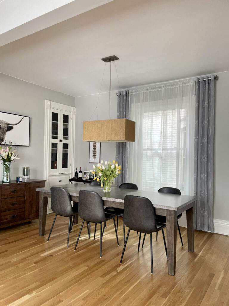
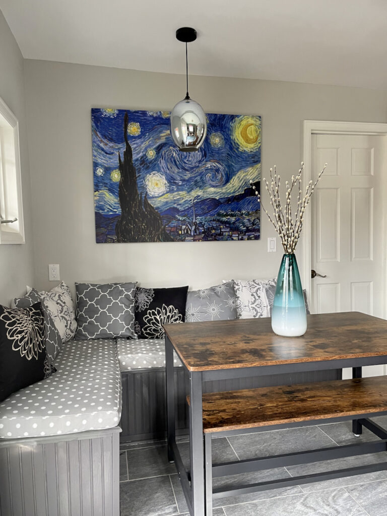
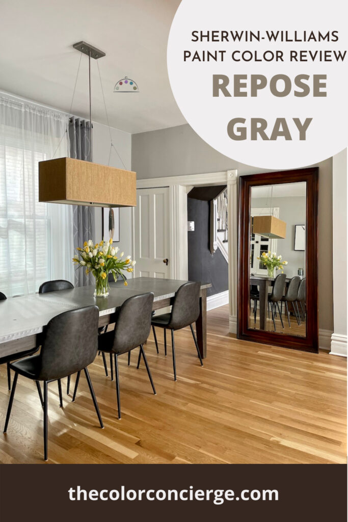
Repose Gray with Southern Exposure
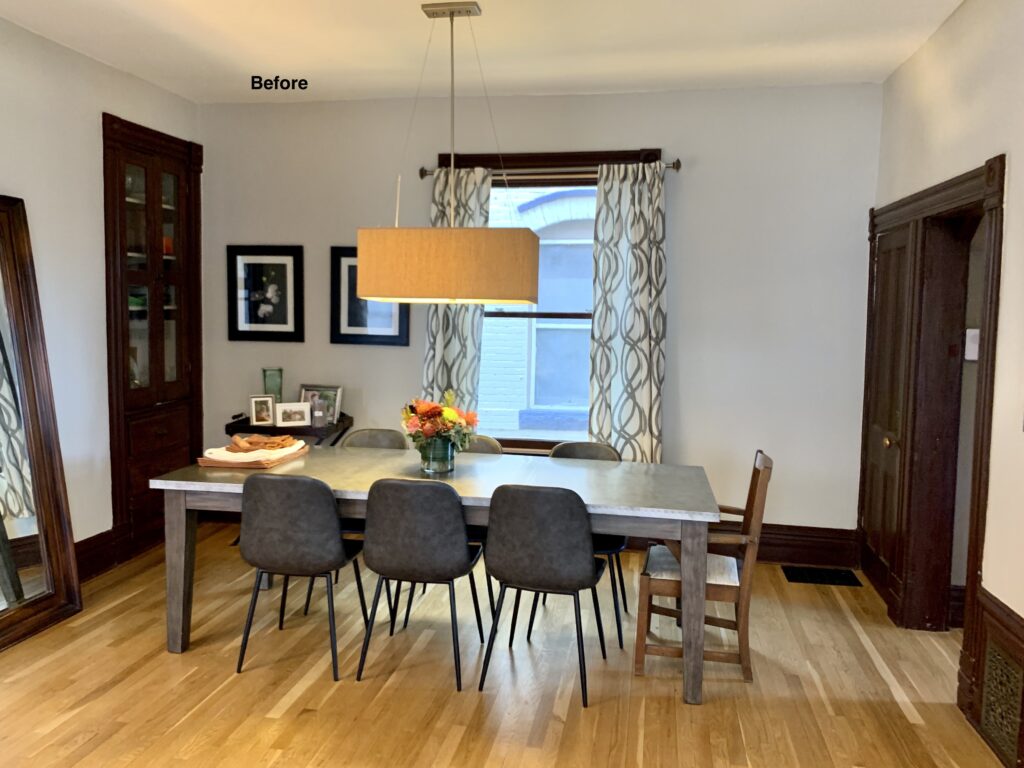
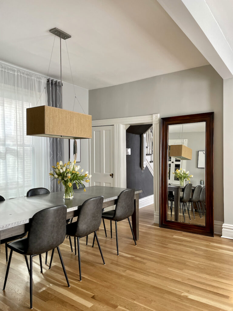
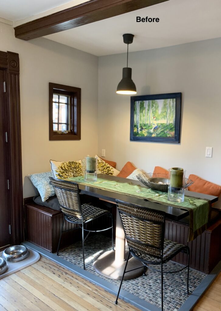
This dining room is so beautiful with South facing light. You can see the before and after photos. In addition to Repose Gray on the walls, we also painted the built-in china hutch Westhighland White. We painted the trim and doors white on the main floor, but left them as wood on the second floor. It really brightened the main floor.
Also, check out the before and after window treatments. The ceilings look taller and more graceful with the curtain rods raised.
The room looks cramped with the curtain rod resting on the window trim and the dark hutch.

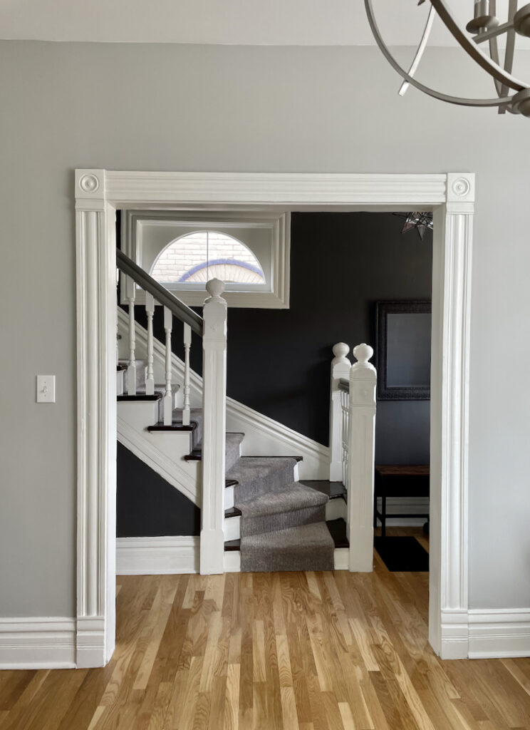
Here is another view of the dining room into the Entry. The contrast is beautiful, and the wood tones in the trim and mirror bring the room to life. On this floor, we painted the trim, baseboards and doors white because they were in bad shape. Painting wood white is a courageous step to take, but in this situation it made sense, and made the room light and bright!
The following photo was taken upstairs. We had to paint the ceiling SW Westhighland White because of the condition of the wood. Both brick and plaster walls were painted with Repose Gray. Other wood trim still remains unpainted.
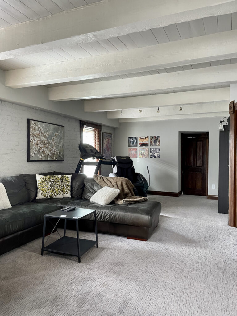
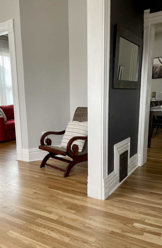
Repose Gray with Northern Exposure & Low Light
This small area shows Repose Gray with Northern Exposure and low light. Light from the North is cool with blue undertones. Although it looked darker it was still lovely because of the white trim and ceiling. Adjacent light-filled rooms also added interest. I wouldn’t use this paint color in a house that had this type of light in the majority of the areas.
Here is a great example of how Repose Gray looks in low light:
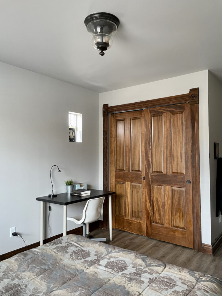
Repose Gray with Northern Exposure & Lots of Light
Repose gray looks lovely, but cooler in North facing light. You can see how the corners are much colder than the areas with more sunshine. In this upstairs bedroom, we kept the trim and ceilings unpainted, and they added so much warmth.
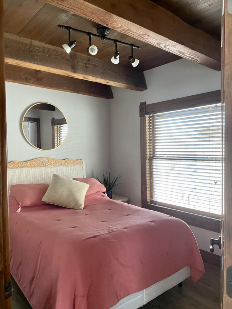
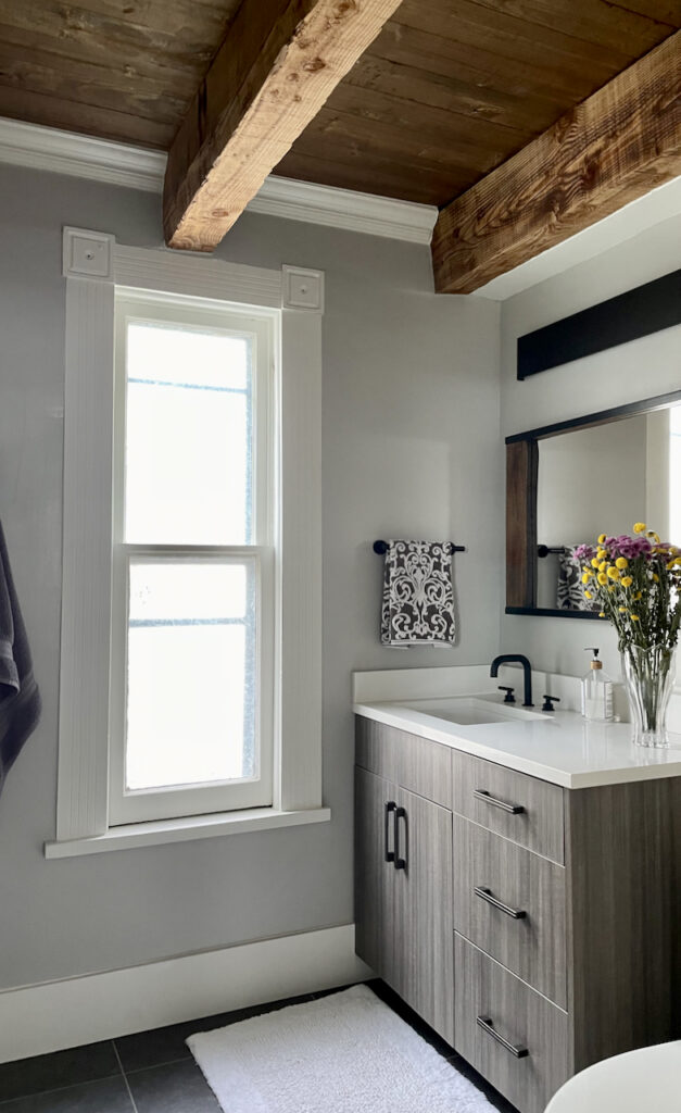
This bathroom is adjacent to the bedroom and shows a gorgeous combination of painted trim and warm wood ceilings. Most of the upstairs had wood trim, but in some places we had to paint it because of its condition. this room shows a really nice balance.
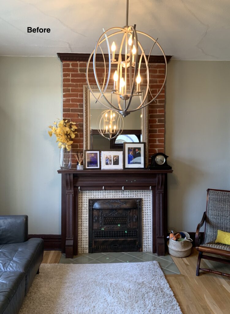
Repose Gray with Eastern Exposure
Eastern and Western Exposure are similar. Rooms with light from the East get the most light in the morning, and west facing rooms are sun-filled in the afternoon (in the Northern Hemisphere). This example has warm light from the east with big lovely windows.
Another simple update was that we painted the fireplace brick Westhighland White (flat sheen). The mantle was also painted Westhighland White, but in a semi-gloss sheen.
The homeowner had considered replacing the tile, but we left it unchanged. The brick wasn’t in great condition and a simple coat of paint made the room light and airy. When you paint brick, make sure that you prep rigorously. Clean the brick carefully and use a good masonry primer before you paint. We picked Westhighland White because it was the trim and ceiling color. This made a harmonious and consistent palette.
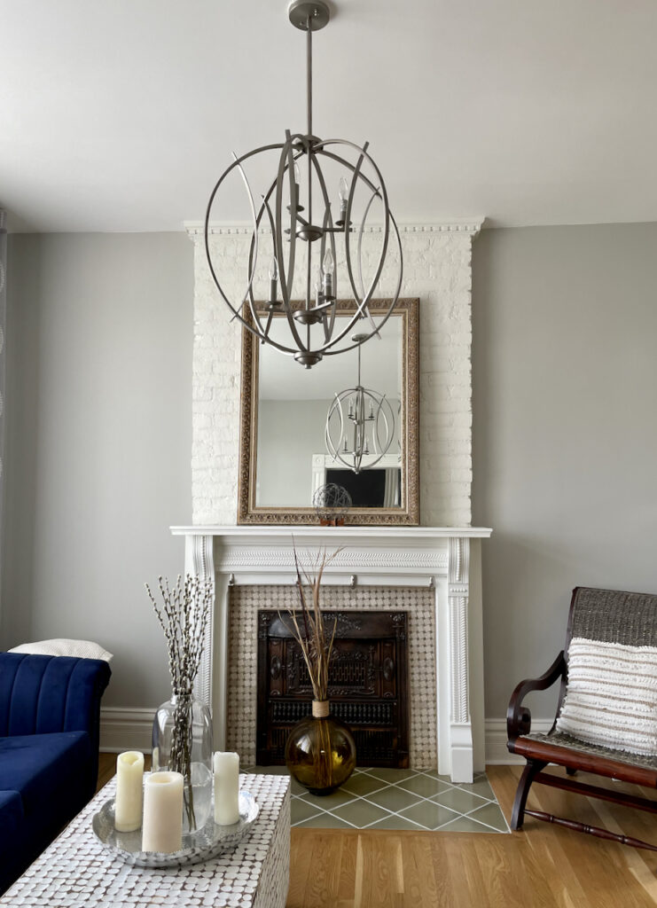
Note that the before was essentially the same. When we painted the brick, mantle and trim it TRANSFORMED the room!
Repose Gray with Western Exposure
This downstairs dining nook had West facing windows into the backyard, with tons of foliage. This photo was taken in the winter, so not as much green outside. In the summer the gray will look more neutral. The floors were replaced and all the trim painted for a total transformation!
The following “before” photo shows how extreme the transformation was.
This bedroom was also West facing, later in the afternoon. The wood looks so beautiful with the Repose Gray walls.
What are the Best White Trim and Ceiling Colors For Repose Gray?
I prefer to use this paint color with clean or bright off-whites such as SW Extra White, SW White Snow or SW Pure White. SW Westhighland White is warmer than those colors, and it worked very well because we had so many warm woods to work with. Westhighland White is a darker off-white, and we chose it bA brighter or lighter white would have looked too stark near the wood. Whites with strong yellow undertones such as SW Alabaster or SW Greek Villa will work, but are not my favorites with this color because the yellow can look funky with this undertone.
Using SW Repose Gray Exterior Paint
Repose Gray is a FANTASTIC color for “white” trim for exteriors. It also makes a great whole-house white paint color, especially in a heavily wooded lot. The warmth in this greige color will neutralize the green tones from the foliage. Remember that colors look much lighter outside in the sunshine, and this color will look like a soft white without harshness.
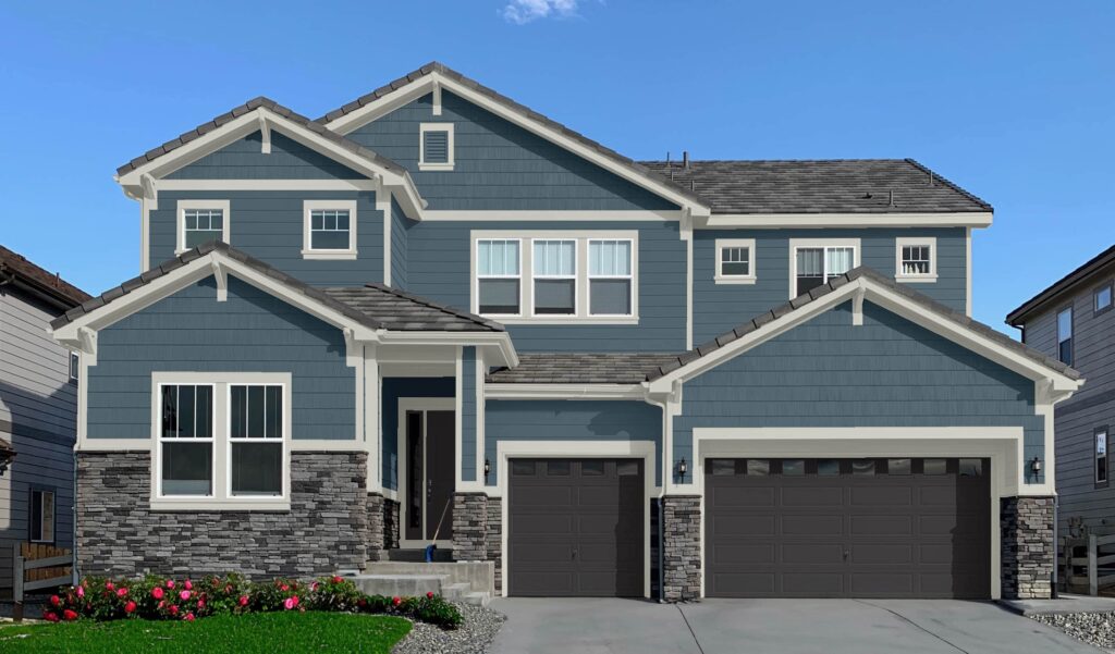
In the exterior color palette below, SW Repose Gray is used as exterior trim alongside Sherwin-Williams Needlepoint Navy siding and SW Deep Forest Brown garage doors. It offers just enough warmth and complements the cool gray stone beautifully.
The Best Repose Gray Coordinating Colors
Pair Repose Gray with rich, muted, saturated jewel tones or fresh colors. Don’t pair muted and fresh colors together. Repose can go either way, either muted or fresh. Yellow paint colors or creamy yellowish whites can look dingy alongside its violet undertones.
The color palette below is a great example of how Repose Gray can be used as the foundation for a whole-house color palette, working alongside a variety of muted hues like blues, greens, beige and even pink.
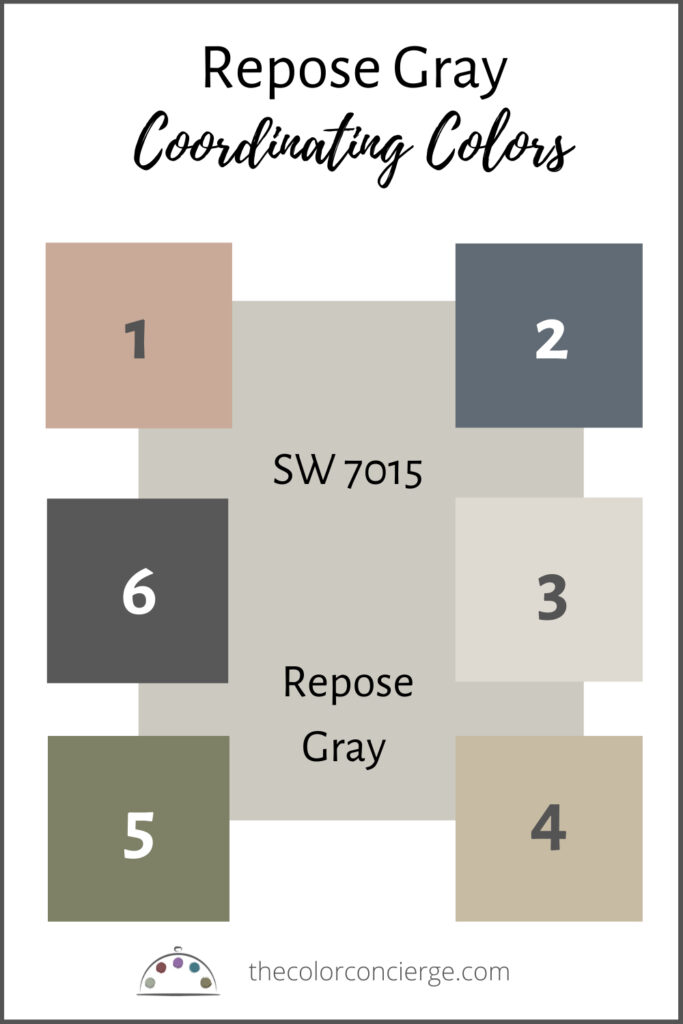
- Pinky Beige (Sample HERE)
- Granite Peak (Sample HERE)
- City Loft (Sample HERE)
- Wool Skein (Sample HERE)
- Artichoke (Sample HERE)
- Iron Ore (Sample HERE)
Best Sherwin-Williams Repose Gray Alternatives
Not sure if Repose Gray is the right color for your next project? See how it compares to other similar paint colors.
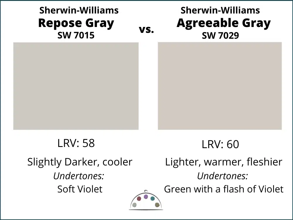
Agreeable Gray vs. Repose Gray
Repose Gray is darker and cleaner than Agreeable Gray (Sample Here). Agreeable Gray is warmer with a green undertone. Usually if one of these colors looks great in a room the other will look bad. Learn more about Agreeable Gray in our Paint Color Review here.
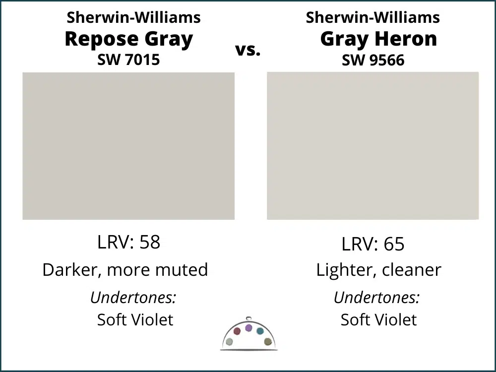
Gray Heron vs. Repose Gray
Between these two, Gray Heron is my favorite and part of the Sherwin-Williams Emerald Designer Edition Collection. Paint colors in the Emerald Designer Collection start with a white base vs a gray base like the rest of the Sherwin-Williams paint colors. They both have violet undertones, but Gray Heron is a cleaner, lighter, and crisper version. Repose is murkier. Sadly, it comes with a higher price tag.
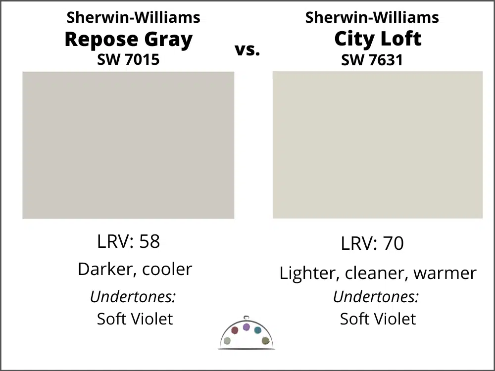
City Loft vs. Repose Gray
If you love Repose Gray but want a lighter version, then pick City Loft (Sample Here) Both colors have violet undertones and accomplish similar color tasks. I would say that City Loft is the more modern version.
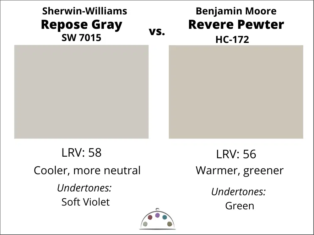
Revere Pewter vs. Repose Gray
These are two iconic colors, with similar functions. Revere Pewter (Sample Here) has green undertones, whereas Repose Gray has violet ones. If one looks great in a room, the other one won’t. They are both crisp and clean but Repose is slightly darker.
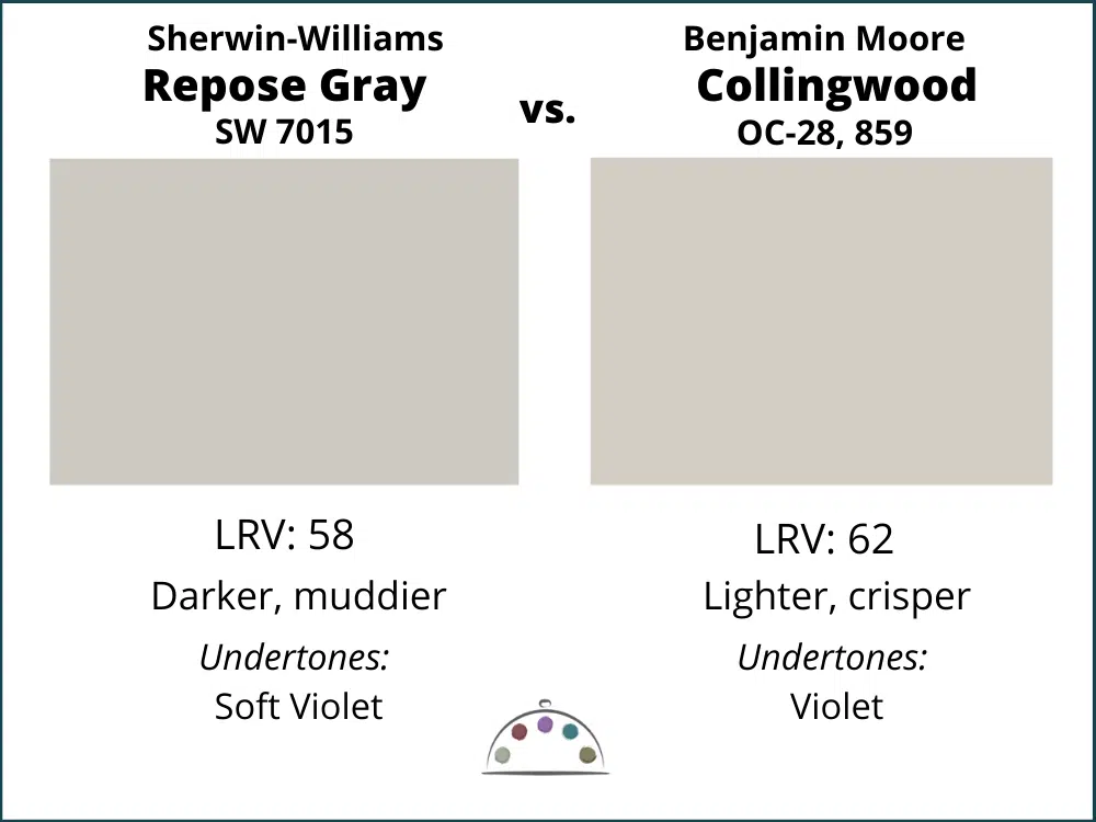
Collingwood vs. Repose Gray
If you are looking for the Benjamin Moore version of Repose, then Collingwood (Sample Here) is your color. It is slightly lighter and cleaner but most people won’t notice it in a room. If Repose looks great, then so will Collingwood.
What is the best Benjamin Moore Repose Gray alternative?
As mentioned above, the very closest is Benjamin Moore Collingwood, though it is slightly lighter. We never recommend paint matching, especially with light neutrals or white paint colors. They can shift to green which wouldn’t be noticeable until you painted your walls. Collingwood will give you the same look and feel as Repose Gray, even though they are not identical.
Learn more about matching paint colors here.
Sherwin-Williams Repose Gray Pros and Cons
Pros:
- A versatile neutral that looks best in a light-filled room
- Has enough pigment to contrast well with white trim and ceiling
- Fantastic color for “white” exterior trim and siding, especially in a heavily wooded lot
Cons:
- Cooler than many of today’s popular warm white and beige interior color schemes
- May not pair well with some flooring, countertops and decor depending on their undertones
- Doesn’t pair as well with warm white paint and finishes as a green-gray hue
Key Learning Points
Sherwin Williams Repose Gray is a gorgeous greige with violet undertones that looks fantastic with bright whites or wood tones. I would consider this color generally cool. It is most commonly used as an interior wall color, and sometimes as an exterior “white” trim color. As you can see in the photo below, the gray looks cooler in the shadow.
No matter what, don’t forget to test your paint colors. Check out the SAMPLIZE website HERE.
NEVER, EVER use paint matches from a different brand than the one specified. Results are poor and there are no standards for the sheens. Even though your painter may truly believe it can be done, don’t do it. See results from paint matching Here.
Online Color Consulting
Still looking for the best white paint color? Discover our Online Color Consulting Package.

Related Posts
About the Author

Hi, I’m Michelle Marceny, founder, owner, and Principal Color Designer at The Color Concierge. I believe a fresh coat of paint can completely transform a space. The Color Concierge was born out of my drive to help clients fall back in love with their homes. My clients trust me to help them find the perfect paint color for their home – whether it’s a whole-house paint color scheme or ideas for a single room.
Since The Color Concierge was founded in 2017, we have completed over 3000 color consultations, both online and in-person. I am a Certified Color Expert with 7 years of experience creating interior and exterior color palettes throughout North America.
If you liked this article, don’t forget to pin it!
We love your comments! Please note that the blog is meant as general advice, and it is not possible to give specific answers to your paint questions. If you want more specific advice, please consider purchasing a color consultation. Thank you for your understanding.

9 Responses
What color paint would you recommend for kitchen walls that have Repose Gray cabinets?
Thank you so much!
Hi Lynn,
I would need to see it. Please consider a color consultation package.
Michelle
I am thinking about painting my kitchen cabinets repose gray..any chance you can share a pic of yours? Thanks
I’m wanting to paint my walls repose grey with slightly darker grey trim what color you suggest?
Is there a blue that you recommend to go with repose grey
I used SW Naval (accent wall and kitchen Island cabinets all other cabinets are white) with Repose Gray walls. Other great blues SWare Salty Dog and Indigo or BM Hale Navy.
Can you post a photo? Thank you!
What color is the dark wall going up the stairs in the entrance/stairs picture at the beginning of the article? And what color are the stair treads? It’s a beautiful pallet.
We are planning to paint the exterior shakes of our house in Repose Gray with Pure White trim, and the siding with Tony Taupe. Is that a good combination?