Learn all about Sherwin-Williams Pearly White (sample here) in this color review. This is a muted creamy white paint color that doesn’t look yellow. It is a versatile white that looks great in a bright or dark room. Its soft invisible green undertones make it pair well with just about everything.
The beautiful house in this post was once a recording studio for many famous artists, with living room acoustics that won’t stop!
Whites are still popular as a trend, but have you noticed that warmer colors and even beiges are gaining in popularity? I love Pearly White because it gives you that warmth that so many crave, but still stays soft, light and bright.
We don’t see this color much in blogs, but it has become very popular, and one of the colors we often select for clients.

*This post contains affiliate links for products I use and love. If you click on some links and make a purchase, I will get a small commission at no cost to you. This helps pay for the costs of the blog so I can continue to offer great content to our readers.
About The Color Concierge
Our Colorado-based paint color consultants make finding the right paint colors for your home easy. Whether you’re painting the exterior or interior of your home, our simple yet effective process lets us get your paint color right the first time. We’ve helped thousands of homeowners transform their homes into a space they love. Learn more about ONLINE COLOR CONSULTATIONS today.
What Color is Sherwin-Williams Pearly White?
Pearly White is actually a very light version of beige. It isn’t quite a white, but will read like a creamy white. I refer to it as a complex cream, which is the warm version of a very light greige.
SW Pearly White LRV
The LRV of Pearly White is 76.5, which makes it a muted complex cream – a very light beige. A darker version would be SW Wool Skein or BM Manchester Tan. The LRV scale goes from 1 (pure black) to 100 (pure white) and indicates how dark or light a color is.
Is Pearly White warm or cool?
Pearly White is a darker warm white paint color. While it’s not as well-known as creamy off-whites like SW Alabaster (Article) or SW Greek Villa (Article), it’s a wonderful color that we recommend to clients frequently.
What are the Pearly White undertones?
Pearly White has soft, invisible green undertones. These undertones give the color its warmth without looking yellow on the wall. Its undertones also help it pair well with just about any color or finish. It looks especially nice when paired with earthy finishes and can help to bring a space into the modern era.
What is the best way to test SW Pearly White?
We always recommend that you test paint colors on your home because lighting can change a color completely, both with interiors as well as exteriors.
In the old days, this meant we painted a large poster board with sample pots and a huge mess.
Now we have a better way to test paint, with Samplize Peel-and-Stick samples!
- Samples pre-painted with 2 coats of real paint from the manufacturer.
- Large 9” x 14” samples to see the color better in the lighting.
- Delivered overnight
- Colors are accurate
- Less expensive than painting a large poster board with sample pots
- No mess, and no toxic paint to dispose of
I use these in my own color consulting practice for exact results. Discover Samplize peel-and-stick paint samples:
When Should I Use Pearly White?
Use Pearly White when you want to update a darker room (Article) with earthy, muted finishes. It crosses the bridge between old and new very well.
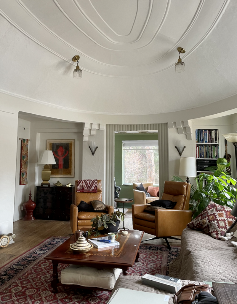
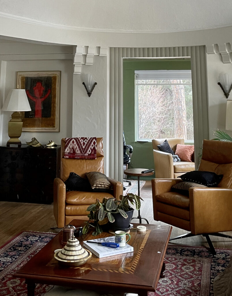
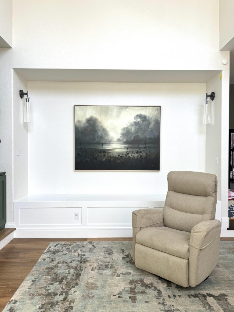
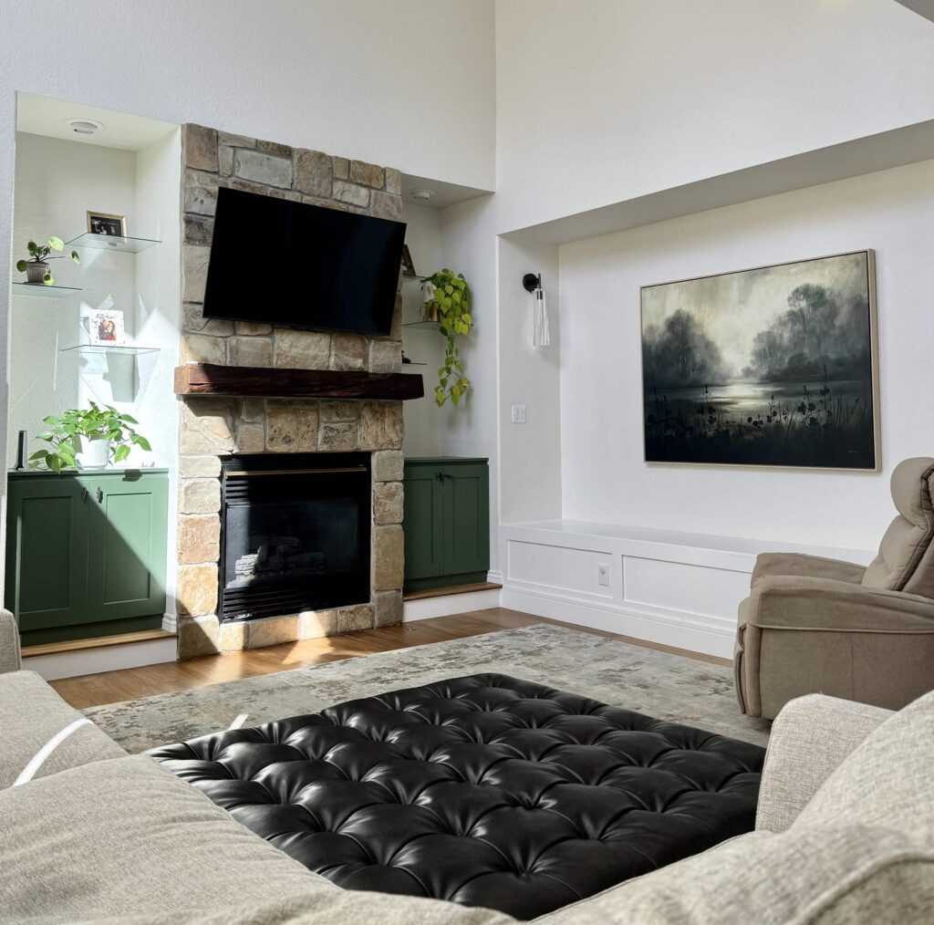
The house featured in many of the photos in today’s post is a beautiful and unique historic house in Denver, built from concrete. The living room is in the shape of an oval and the acoustics are amazing. A few decades ago, the house was used as a recording studio, and famous musicians such as Lionel Richie recorded their songs in the living room.
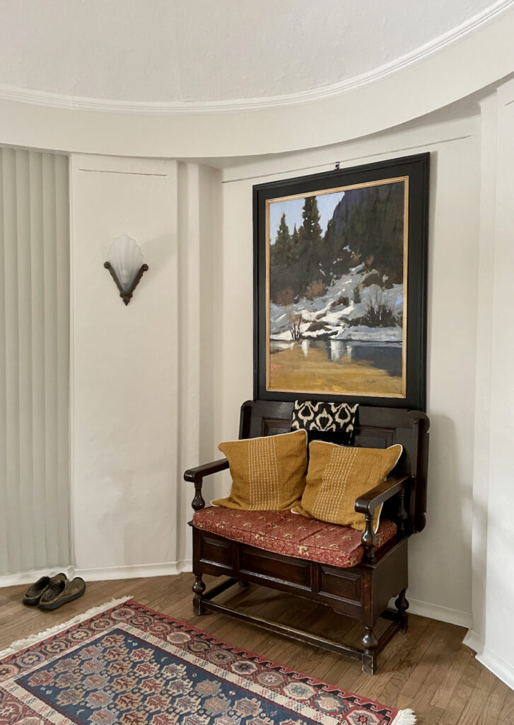
Today, the house is back to life as a residence. Check out that amazing white ceiling! The home’s SW Pearly White walls look like a soft cream and help bring the home into the modern age. Check out the darker gray accent in the doorway that looks like a curtain.
This photo shows the other side of the room. When the homeowners bought the house, they found these amazing wood floors under an old carpet.
The light in the house is low, which shows how well the colors look here.
Can I use Pearly White as an interior trim color?
Pearly White is too earthy and dark to use as a trim color. You could potentially use it for a monochromatic palette with Pearly White walls, trim and ceilings in varying sheens, but it could end up looking dingy. I prefer to use a lighter white to contrast with Pearly White walls.
Can I try Pearly White cabinets?
Pearly White cabinets (Article) can be really beautiful! It is lovely and performer for warmer, darker granite colors where a warm white like Alabaster would still look too stark.
If your walls are a crisp white, then Pearly White would look like a lovely putty color that is so in style right now.
Is Pearly White a good whole-house paint color?
Yes, it is! In fact, Pearly White is such a great option we designed an entire Pearly White whole-house color palette (Article) for a client.
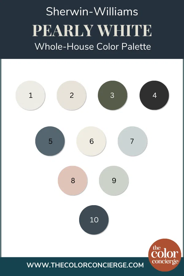
This warm white color palette was the perfect complement to the home’s existing finishes and helped the whole space feel much brighter and more modern.
Pearly White was used in the home’s living space and entryway. The family room has a Southern exposure, and this warm white looks warm and glorious.
Pearly White really brought the home’s family room to life.
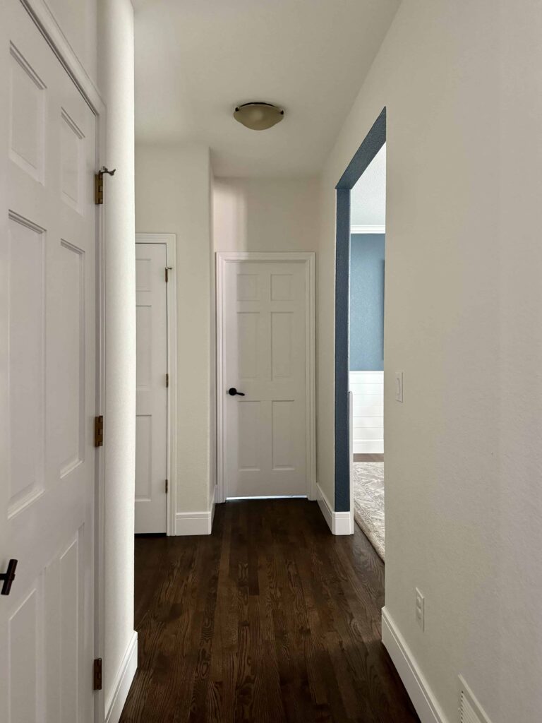
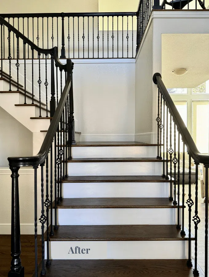
We continued the Pearly White walls throughout the home’s main entry, hallways, and stairway, providing a cohesive look throughout the home. The ceiling, trim, and doors were painted with SW Pure White, which is a crisper white.
Should I try Pearly White exterior paint?
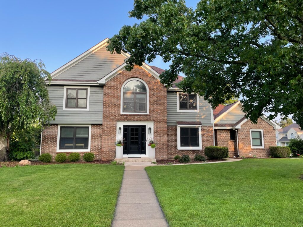
Pearly White looks fantastic as a whole-house exterior white paint color. While it looks like a light beige paint color indoors, the bright sun makes it look white outdoors.
Pearly White is also a FABULOUS color for white trim for exteriors (Article). It will look like a bright white color without harshness.
With an LRV of 77, it’s on the lighter side for an exterior white paint color but it still has enough pigment to work well in bright sunshine. We especially love to pair Pearly White exterior trim with red brick.
On the client’s home featured below, for example, we used SW Pearly White as the trim color, pairing it with the red brick exterior and SW Attitude Gray (Sample) siding.
We even used the Pearly White trim around the home’s black windows. I love the way these came out. They help brighten up the whole palette and tie all of the colors together.
When should I avoid Pearly White?
Pearly White is a great paint color with just about every decor. It works best with higher-contrast designs. I don’t recommend this paint color for a monochromatic paint scheme because it might end up looking dingy.
What are the Best Trim and Ceiling Colors For Pearly White?
I prefer to use this paint color with clean or bright off-whites such as SW High Reflective White, SW Pure White, BM Chantilly Lace or BM Oxford White.
Blue-whites such as SW Extra White or BM Decorator’s White look discordant because the blue is too cold for a warm white such as Pearly. Warmer off-whites and creams such as SW Alabaster, SW Greek Villa or SW Westhighland White won’t have enough contrast to bring this color to life.In the client’s home pictured below, the trim and ceilings are painted with Sherwin-Williams Pure White (color review post).
Sherwin-Willams Pearly White Coordinating Colors
Because Pearly White is creamy, but muted and doesn’t skew yellow in place, it is a very versatile paint color. There are so many beautiful colors you could use in a Pearly White color scheme, but these are a few of my favorites.
Does Pearly White go with green?
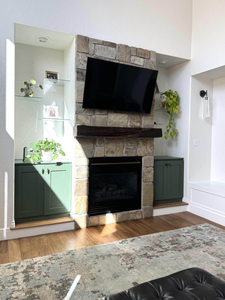
With its soft green undertones, Pearly White looks gorgeous paired with green paint. We transformed our client’s living room with Sherwin-Williams Pearly White walls and Sherwin-Williams Rookwood Dark Green painted cabinets.
The green color ties in with the plants on the surrounding shelves and the greenery outside this home’s large windows.
Does Pearly White go with black?
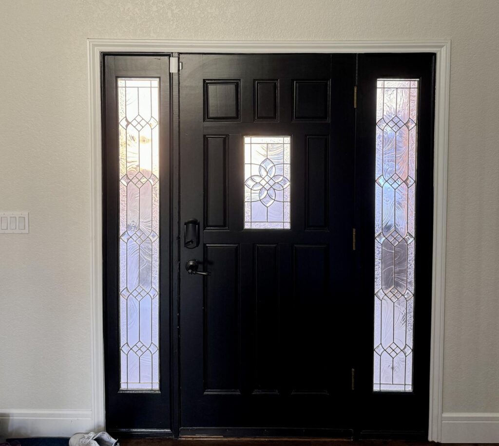
Is there anything more classic than black and white? Pearly White looks really lovely paired with black paint. We painted our client’s interior front door (Article) slab and sidelights with Sherwin-Williams Tricorn Black and it completely transformed their entryway. Tricorn Black (sample here) is the darkest of blacks. It provides a nice contrast with the SW Pearly White walls and gives the entryway a modern, yet classic look.
Does SW Pearly White go with blue?
Blue paint colors are a wonderful addition to a Pearly White color palette, particularly warm blues with green undertones.
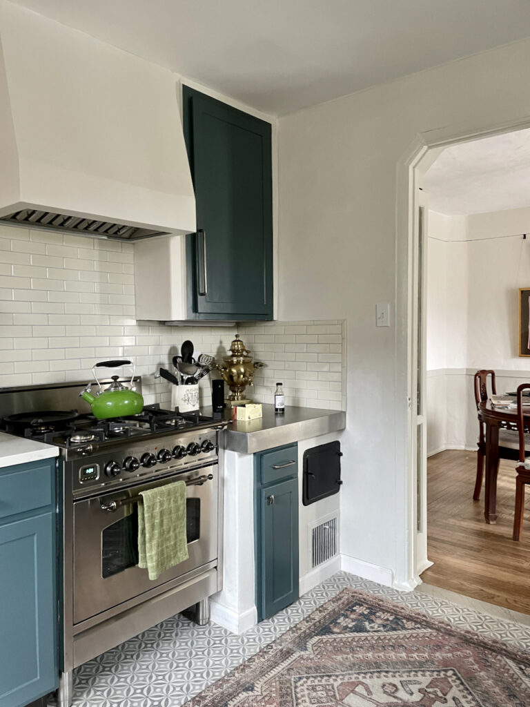
In the kitchen below, for example, SW Pearly White walls pair well with deep, blue-green kitchen cabinets.
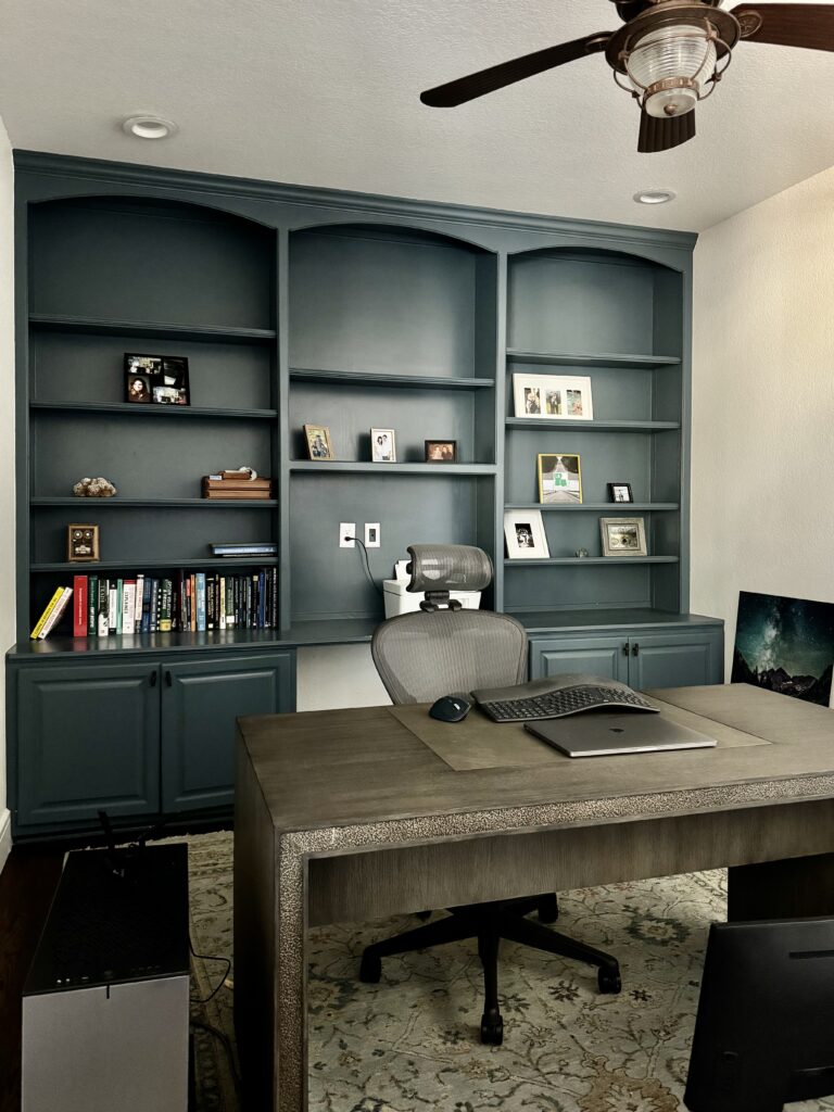
In another client’s Pearly White color palette, we incorporated a variety of blue paint colors into their home.We used Sherwin-Williams Needlepoint Navy (sample), which has warm green undertones, for an accent color in their dining room and for the built-ins in their office. The office featured SW Greek Villa (sample) walls, which is similar to Pearly White but a bit lighter and more yellow.
Sherwin-Williams Pearly White Alternatives
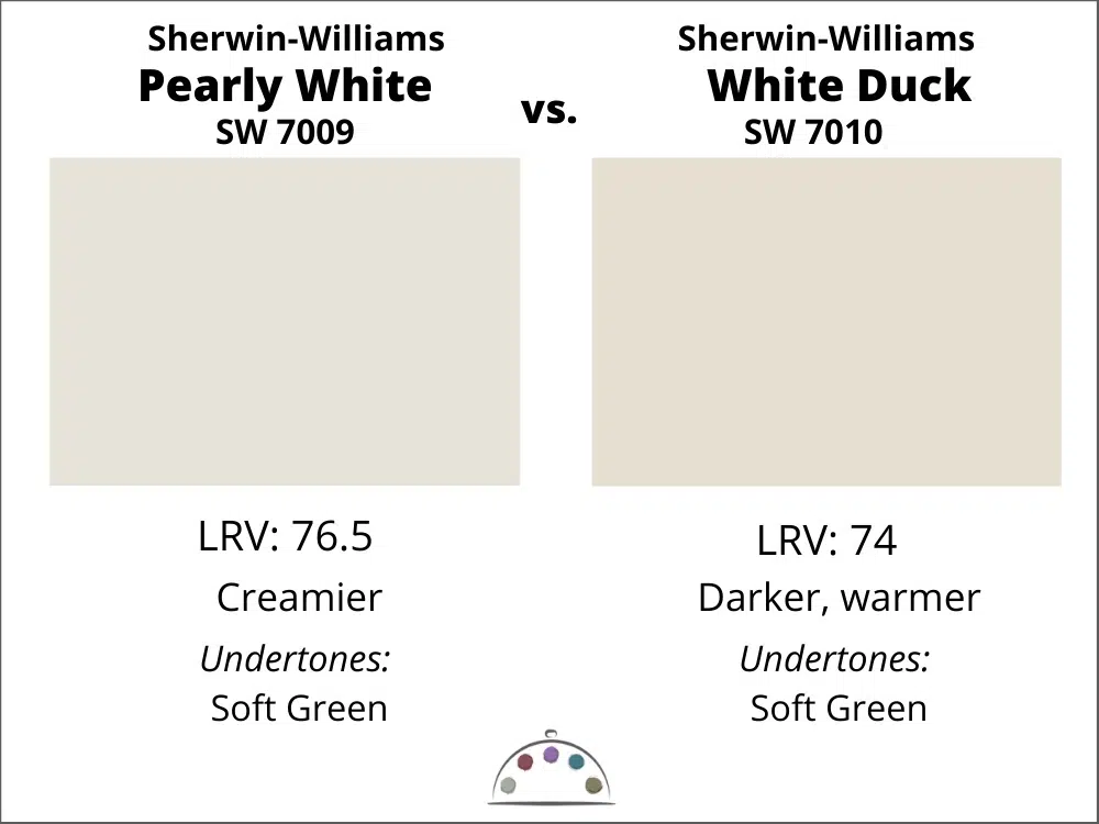
Sherwin-Williams White Duck vs. Sherwin-Williams Pearly White
Pearly White is lighter and creamier than White Duck, although they both have subtle green undertones. The difference is tiny in LRV, but White Duck (color review post) will look like a darker cream on the walls than Pearly White.
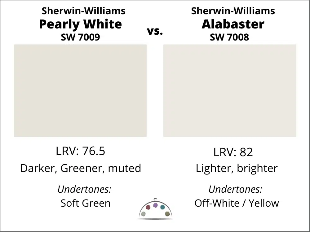
Sherwin-Williams Alabaster vs. Sherwin-Williams Pearly White
Pearly White is darker than Alabaster (Sample). They aren’t that far apart on the page, but on the walls, Alabaster (Color review post) will look much more yellow and lighter than Pearly White. I wouldn’t use Alabaster as a trim color with Pearly White because there won’t be enough contrast.
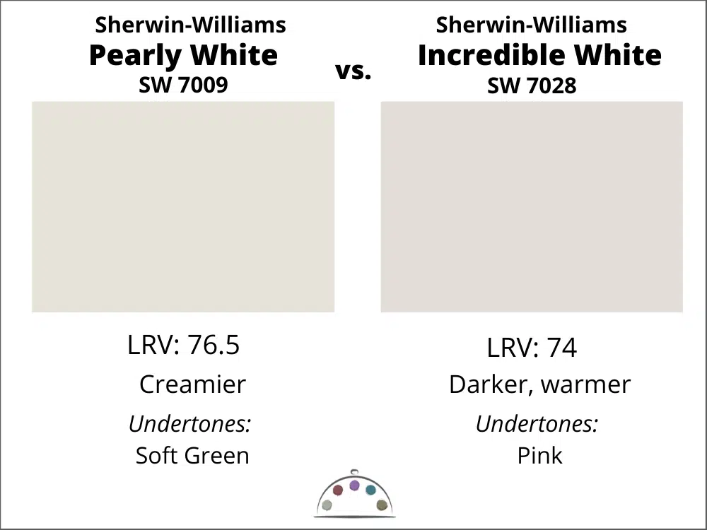
Sherwin-Williams Incredible White vs. Sherwin-Williams Pearly White
Pearly White is a very different color than Incredible White (color review post). Incredible White has pink undertones, and if you paint it in a darker room or a room with lots of foliage outside, it can turn into pink, even if your paint color tests show perfection. You won’t ever have that problem with Pearly White. It’s creamy without a shift to yellow or pink. I don’t recommend Incredible White unless you want a pink oom. NEVER.
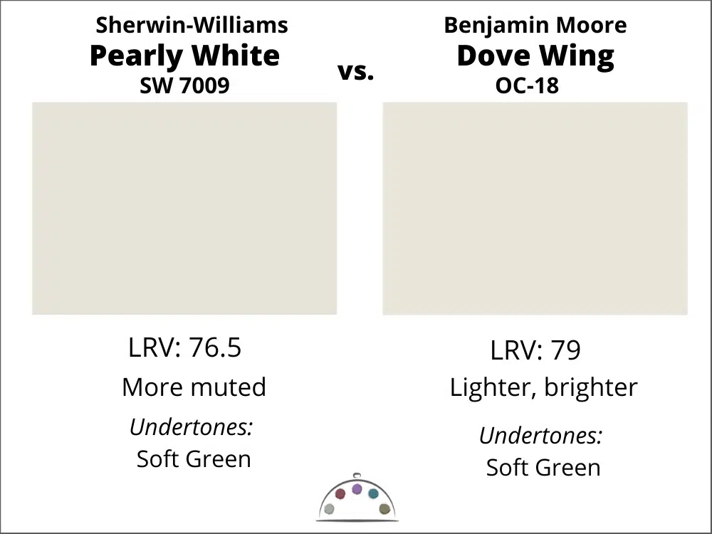
Benjamin Moore Dove Wing vs. Sherwin-Williams Pearly White
The closest Benjamin Moore color to SW Pearly White is BM Dove Wing (Sample)(not to be confused with BM White Dove). Pearly White is warmer and more muted, and slightly lighter.
What is the Best Sherwin-Williams Pearly White Benjamin Moore Alternative?
As mentioned above, the closest is Benjamin Moore Dove Wing (NOT White Dove), but they are not exactly the same. Dove Wing will evoke the same look and feel, though. It is just as pretty!
We never recommend matching paint, especially with light neutrals or white paint. They can shift to green which wouldn’t be noticeable until you painted your walls. These two colors aren’t exactly the same, but using the right color for the brand will save frustration from a color match.
Learn more about matching paint colors (article).
Sherwin-Williams Pearly White Pros and Cons
Pros:
- This is a muted complex cream – a very light beige – so it won’t look too stark
- Soft, invisible green undertones keep the color warm without looking yellow
- Perfect for updating a darker room with earthy, muted finishes
Cons:
- Too earthy and dark to use an interior trim color
- May look dingy if used for a monochromatic or color-drenched paint scheme
- Does not pair well with blue-white trim paints, such as SW Extra White

Key Learning Points
Sherwin-Williams Pearly White is a muted, complex cream color with soft green undertones. It is most commonly used as a wall color instead of a cream, without a shift to yellow like other creamy paint colors.
- Pearly White can work well as an exterior white trim paint and looks especially nice with red brick homes.
- SW Pearly White is a great option for a whole-house color palette because it can coordinate with a variety of other paint colors and decor.
- Pearly White pairs well with earthy, Tuscan finishes, so it’s a good paint color to help modernize an older home.
No matter what, don’t forget to test your paint colors. Check out the SAMPLIZE website.
NEVER, EVER use paint matches from a different brand than the one specified. Results are poor and there are no standards for the sheens. Even though your painter may genuinely believe it can be done, don’t do it. See results from paint matching here (Article).
Online Color Consulting
Still looking for the best white paint color? Discover our Online Color Consulting Package.

Related Posts
Sherwin-Williams Pearly White Color Palette
19 Best Exterior White Trim Colors
Best White Paint Colors for Red Brick Exteriors
Our 5 Favorite Benjamin Moore Whites
Benjamin Moore Chantilly Lace Color Review
Benjamin Moore White Dove Color Review
Benjamin Moore Simply White Color Review
Benjamin Moore Cloud White Color Review
The 6 Best White Paint Colors For Dark Rooms
About the Author

Hi, I’m Michelle Marceny, founder, owner, and Principal Color Designer at The Color Concierge. I believe a fresh coat of paint can completely transform a space. The Color Concierge was born out of my drive to help clients fall back in love with their homes. My clients trust me to help them find the perfect paint color for their home – whether it’s a whole-house paint color scheme or ideas for a single room.
Since The Color Concierge was founded in 2017, we have completed over 3000 color consultations, both online and in-person. I am a Certified Color Expert with 7 years of experience creating interior and exterior color palettes throughout North America.
We love your comments! Please note that the blog is meant as general advice, and it is not possible to give specific answers to your paint questions. If you want more specific advice, our Online Color Consultations will help you pick your paint colors. Thank you for your understanding.

26 Responses
In your opinion would SW Pearly White work as a kitchen cabinet color if the tile floor is a pink beige? The tile is not real dark beige like Tuscan homes have, lighter in color.
I am thinking of using a Cambria Quartz counter called Ironsbridge, it has varying shades of white and a fine veining of olive. The olive veining looks more like a sand color in most areas.
I am trying to work with my pink beige floor so it doesn’t clash. Do you think it could work?
I have searched through HOUZZ and those that have this counter have commented they wish the would have gone a little whiter and not as yellow in their cabinet color.
It appears tonight to be a great match, I will be watching in different lighting to see if it still looks good.
Appreciate any comments you may have.
Thank you
Hi Judy,
Pearly White would be a beautiful color to pair with a pink beige floor since it has soft green undertones. Ironsbridge would be really lovely with that, and the combination could be lovely. Just make sure that you pull samples of the counter and the paint color together on the floor to make sure it looks good. Its most important to see this in Natural light without artificial light so that you can see the true undertones.
Thanks for your review.
I love SW natural choice and would like to use it on walls throughout my condominium with floor to ceiling windows and lots of natural light with NW exposure.
My question is
can I paint the condo ceilings SW pearly white or should I use SW pure white or SW Greek villa instead? Or do you have another recommendation?
Regards,
Robert
San Diego
I would not paint the trim Pearly White because its too dark. Use a white such as Alabaster or Greek Villa.
I really like the color pearly white. It’s only white I have tried on our new build that doesn’t go yellow. But like you said it’s too dark for trim I really wanted to monochromatic look. So should I do it at 75% or do you have another color I should look at? I’m also still unsure of my kitchen cabinet color.
There is no formula to reduce the percent lightness; the mix is created manually and may or may not look right. Instead, try an off-white such as Greek Villa.
You mentioned several times to not use Pearly White as our trim color. BUT, that is exactly what the builders of our house used in 2007! It has been recommended we now paint our walls Pearly White as well because our house needs lightened up. How do you feel about that idea?
Thank you.
Hi Cindy,
If you have Pearly White trim, you can still work with it. Builders in 2007, were doing things differently than we do today. I suggest painting the walls Pearly White or a darker color. If you paint Pearly White, use a sheen that is less shiny than the trim, like a matte or eggshell.
Michelle
How did your walls and trim turn out? I had the same experience. Builders painted trim, doors Pearly White. Pure White walls and cabinets. Crazy. Hated the trim at first but warmed up to trim because it looks nice on the thick craftmans style trim.
So I have to paint walls, and possibly cabinets in contrasting colors, maybe deep taupe. Do you have ant pics to see on your wall/trim? Thank you in advance.
I painted all the trim in our back entrance Pearly White back in 2010; used the ProClassic latex semi gloss, painted the walls with the same colour with Duration matte, door colour is BM Sandy Hook Gray. Still loving it to this day. North Facing.
I am looking for a pretty green to go in visitors bedroom and bath. The rest of the house is pearly white.
Hi Tina,
Consider an online consultation.
Michelle
Hello, I am thinking of brightening up our open concept from SW Colonnade Gray to SW Pearly White. We have SW Pure White trim, kitchen cabinets and ceilings. Our floors are darker tans and browns with some lighter mango wood pieces. And white curtains! Very neutral decor with black, white, grays, black and gold metals and warm textured decor. Safest bet would probably be SW Agreeable Gray, but I’m tired of griege. Would you recommend Pearly White perhaps with an accent wall (or 2) with SW Pavestone or Valspar Coastal Villa?? I want to bring in warmer, cozier tones!!
H Lisa,
Its hard to comment without seeing the space and your decor. Pearly White and Agreeable both have green undertones, so if one works the other should too. Personally, I prefer Pearly to Agreeable. Have a great day!
Michelle
Hi Michelle! Thank you so much!! That does help and I’ll be sure to get samples, probably both peel and stick and an actual paint sample!!!????
Would a fireplace mantle painted a warm gray like Anew or Mindful Gray work on a wall painted Pearly White? Many Thanks
Do you know what color green those cabinets are in the photos?
Hi! What color green is the wall in the acoustic room? Would love to know! Thank you!
Hi Michelle,
We’re redoing a condo with red oak floors and low light. I thought the green undertones in SW Pearly White might be a nice contrast to the oak floors, but was also considering BM Simply White to brighten up the place. Would you recommend one over the other?
Many thanks!
I’m trying to decide on a white paint for my walls. All doors and trim are dark stained wood. The floor is brown laminate and the ceiling is honey oak slatted. It’s our second home and we call it a cabin. Please recommend a soft white that won’t look too yellow or green. Thank you!
Great analysis of Pearly White! I chose Pearly White for the walls of an older, small kitchen to work with the existing pale beige tiles with orange-pink undertones. Would painting the kitchen cabinets Pearly White as well work to keep things uncluttered or would Pure White be a better choice?
I have an open staircase and a 2 story entry trim and wainscoting is painted Sherwin-Williams Dover White.
Looking for a warm neutral white or cream color for the walls. South facing with a lot of natural light. Thank you for any suggestions.
Would pearly white look good with cabinets that are painted SW Smoky Azurite. I also will have other blues and some warm grays in bathrooms, and bedrooms, and I would like to use Pearly white as an all house interior wall paint. I have pure white for the trim color.
Would Pearly White trim/garage door look good with SW Unusual Gray body on exterior facing lots of afternoon sun?
It could, but really depends on your hard finishes, roof color, and light conditions.
Good to know, our home has no hard finishes, just stucco with wood trim. Roof is a warm gray and front of home gets full sun in afternoon. Located in California.