Sherwin-Williams Pearly White is a beautiful warm white paint color that we love for whole-house color palettes. Explore this Pearly White color scheme from a client’s home.
White has been a popular color for interiors for years now. When all-white interiors first became popular several years ago, we saw many cool, stark white paint colors in homes. Today, however, warm white color palettes are trending.
So, when our clients wanted to update their home to feel lighter and brighter but still work with their warm, earthy finishes we knew a creamy white palette would be a great fit.
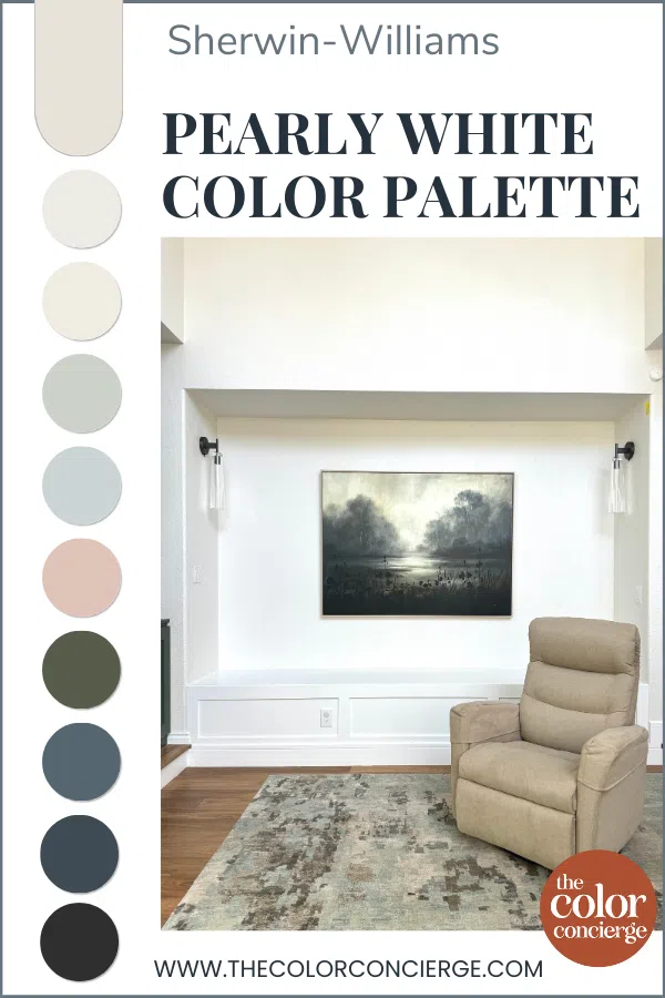
We built this palette around Sherwin-Williams Pearly White, a gorgeous creamy white that doesn’t lean yellow. Pearly White doesn’t get a lot of attention from bloggers, so it’s not as well known as some Sherwin-Williams off-whites like SW Alabaster or SW Greek Villa. But it’s a wonderful color for a whole-house color scheme that we recommend to clients frequently.
Keep reading to learn more about Pearly White and explore this whole-home color palette.
*This post contains affiliate links for products I use and love. If you click on some links and make a purchase, I will get a small commission at no cost to you. This helps pay for the costs of the blog, so I can continue to offer great content to our readers.
About The Color Concierge
Our Colorado-based paint color consultants make finding the right paint colors for your home easy. Whether you’re painting the exterior or interior of your home, our simple yet effective process lets us get your paint color right the first time. We’ve helped thousands of homeowners transform their homes into a space they love. Learn more about ONLINE COLOR CONSULTATIONS today.
Sample Pearly White
We always recommend that you test paint colors (article) in your home because lighting can completely change a color, both on interiors and exteriors.
In the old days, this meant we painted a large poster board with sample pots and a huge mess.
Now we have a better way to test paint, with Samplize Peel-and-Stick samples!
- Samples pre-painted with 2 coats of real paint from the manufacturer.
- Large 9” x 14” samples to see the color better in the lighting.
- Delivered overnight
- Colors are accurate
- Less expensive than painting a large poster board with sample pots
- No mess, and no toxic paint to dispose of
I use these in my color consulting practice for exact results. Discover Samplize peel-and-stick paint samples and sample Pearly white (Sample) via the link below.
What Color is Pearly White?
Sherwin-Williams Pearly White is a muted, creamy white paint color that is very versatile and well-balanced. It looks great in a bright room or a dark room, which makes it perfect for the foundation of a whole-house palette.
Pearly White is light enough to keep a space feeling bright (with an LRV of 77) but has enough pigment to feel warm, cozy, and inviting. If Pearly White were any darker I would actually consider it a beige paint color.
Sherwin-Williams Pearly White Undertones
Pearly White has soft, invisible green undertones. These undertones give the color its warmth without looking yellow on the wall. Its undertones also help it pair well with just about any color or finish. It looks especially nice when paired with earthy finishes and can help to bring a space into the modern era, as it did in the client’s home featured in today’s post.

Sherwin-Williams Pearly White Color Palette
The clients featured in today’s post have a beautiful home in Colorado. They wanted to update the home with a warmer, more modern color palette that would stand the test of time and coordinate with the home’s existing earthy finishes.
Follow along room by room to see all the paint colors we chose for this house.
Sherwin-Williams Pure White Trim & Ceiling
The trim and ceilings in this home are painted with Sherwin-Williams Pure White (article), a lovely off-white paint color that is a go-to for trim (article). It can also work well as a wall color for a brightly lit room (we used it as a wall color in this home’s master bathroom, for example).

I picked this white because it’s a lighter off-white, which looks good with all of the earthy hard finishes and provides enough contrast with SW Pearly White and the other colors in this palette.
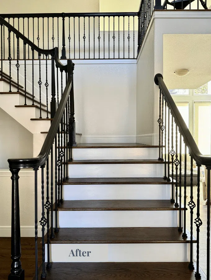
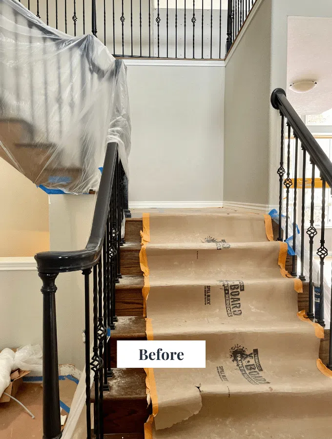
The client’s main staircase was also updated with Pure White risers and stringers, creating a much more timeless and classic look for their entryway. The entry faces North, and even in that cool light, this paint color is soft and warm.
Sherwin-Williams Pearly White Living Areas
SW Pearly White (sample) served as the foundation for the entire whole-house palette.

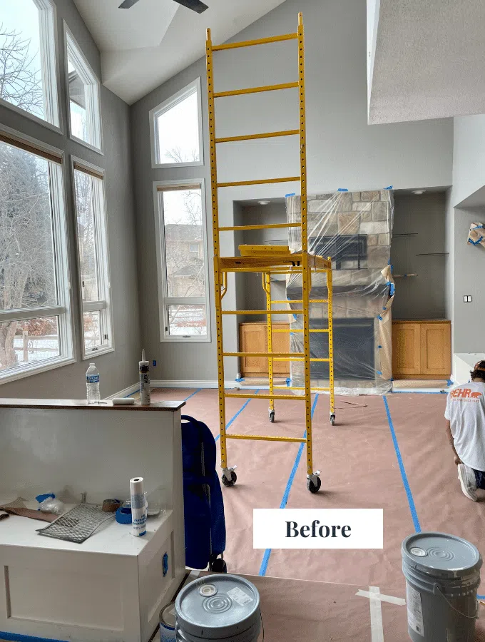
This warm white color palette was the perfect complement to the home’s existing finishes and helped the whole space feel much brighter and more modern. The family room has a Southern exposure, and this warm white looks warm and glorious.
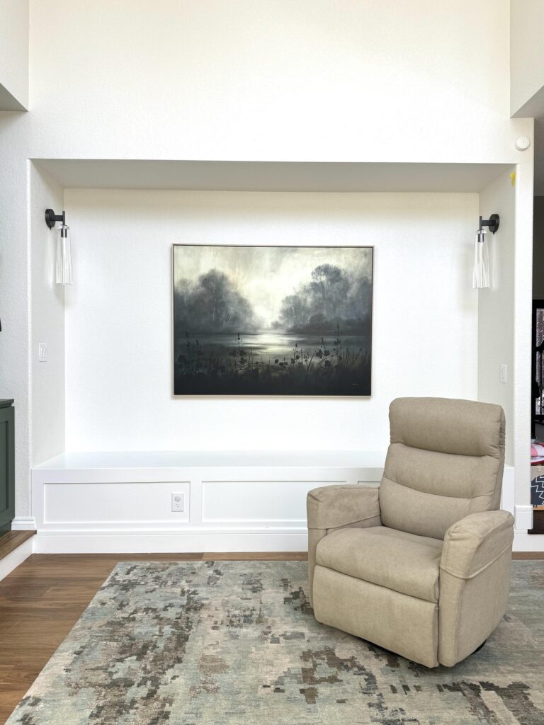
Pearly White brought the home’s family room to life.
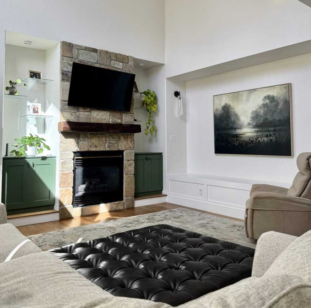
While this room has very large windows on one side, the cool gray paint color that was previously in this space made it feel darker than it should and didn’t pair well with the original oak built-in cabinets.
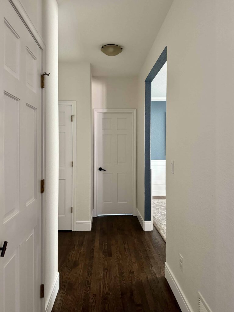
We continued the Pearly White walls throughout the home’s main entry, hallways, and stairway, providing a cohesive look throughout the home. The ceiling, trim, and doors were painted with SW Pure White, which is a crisper white.
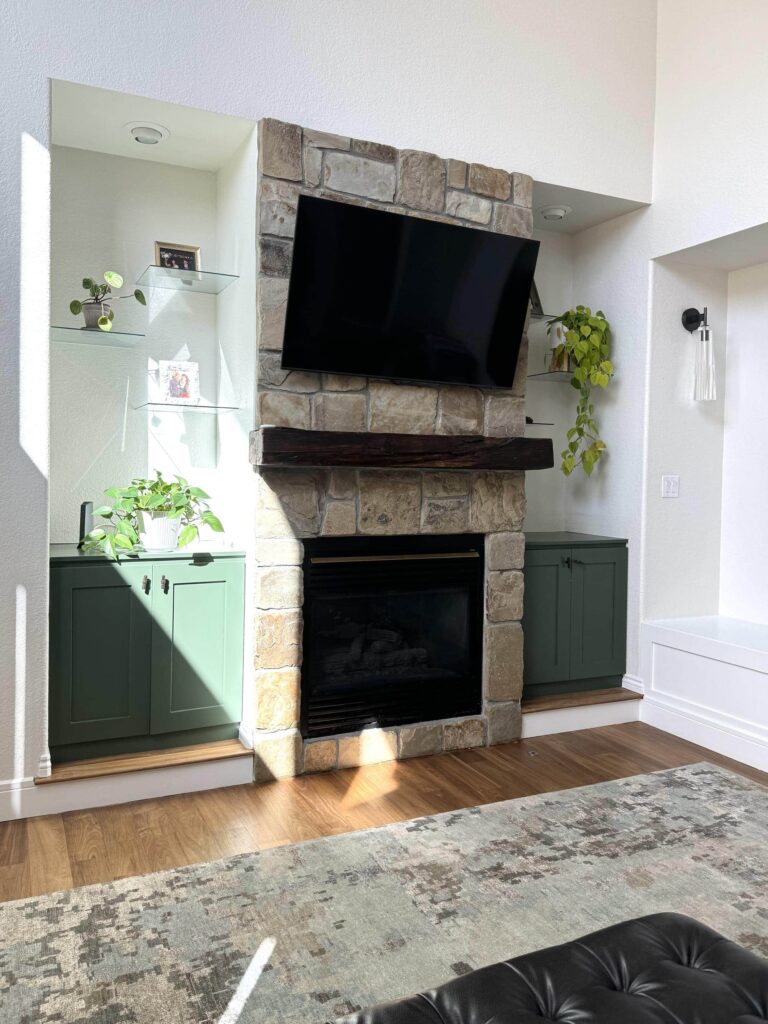
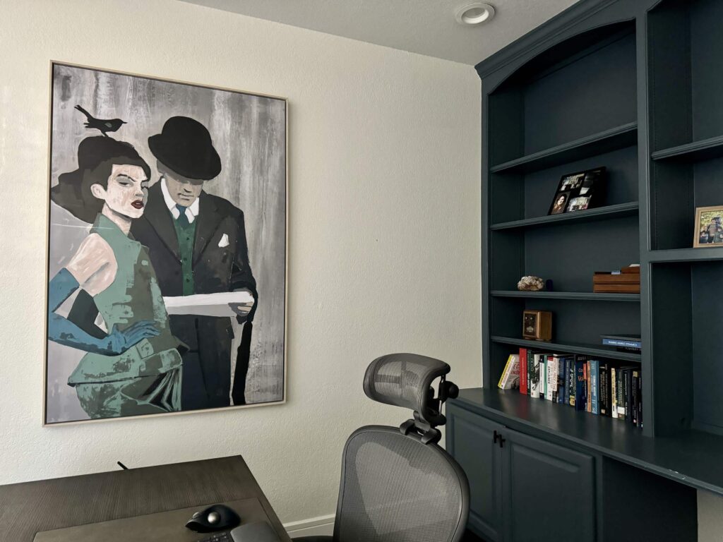
Rookwood Dark Green Cabinets
We transformed this family’s living space even further by painting the built-in cabinets (article) a rich, deep green color.
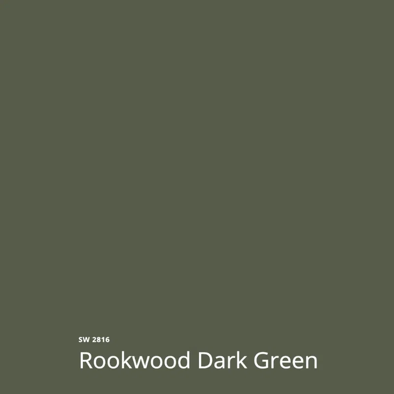
Sherwin-Williams Rookwood Dark Green tied in beautifully with the greenery visible in the backyard and looks much greener in this space than it does on the swatch. You can see the impact of light and shade on the color. It’s important to test paint colors in both conditions because they can look so different. In this case, they were gorgeous in the dark or the light.
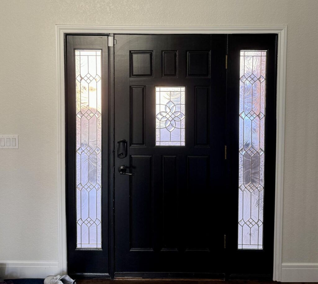
Sherwin-Williams Tricorn Black Interior Front Door
Painting an interior front door (Article) black is one of my favorite simple touches for a home. It looks especially beautiful with white and other light-neutral walls.

We used Sherwin-Williams Tricorn Black for the front door slab and sidelights. Tricorn Black (sample) is the darkest of blacks. It provides a nice contrast with the SW Pearly White walls and gives the entryway a modern, yet classic look.
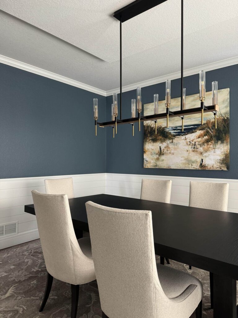
Sherwin-Williams Needlepoint Navy Dining Room & Office Built-Ins
This client’s dining room already featured white shiplap wainscoting and dark gray wall color, but we wanted to bring more warmth to the space. Sherwin-Williams Needlepoint Navy (sample) was the perfect hue, thanks to warm green undertones.

We painted the wainscoting with SW Pure White (sample) in a satin sheen to match the doors and trim. These white accents keep the room light and bright. The ceiling throughout the home is also Pure White in a flat sheen.
We also used SW Needlepoint Navy in the home’s main floor office space, completely transforming the built-ins in this room.
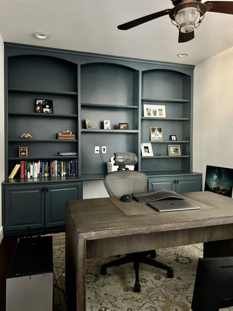
Needlepoint Navy is a wonderful color to use in multiple spaces because it changes so much depending on the lighting in a room.
In the dining room the windows are South- and East-facing, so they get flooded with light and Needlepoint Navy looks much lighter than expected. In the office, on the other hand, the windows are smaller and North-facing, so it ends up looking more like a true navy blue.
We often see this effect with paint colors and it’s kind of fun to have the same paint color with different looks in the same color palette.
Sherwin-Williams Greek Villa Office
In the main floor office, we paired the Needlepoint Navy built-ins with Sherwin-Williams Greek Villa (Article) walls.

Greek Villa is muted like Pearly White, but with an LRV of 84, Greek Villa is lighter. Greek Villa also has subtle yellow undertones, so it can look a bit creamier in place.
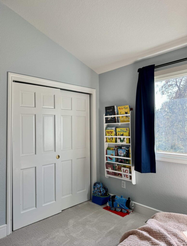
Sherwin-Williams Lullaby Boy’s Room
Sherwin-Williams Lullaby is basically begging to be used in a kid’s bedroom.

This family has young kids, so we wanted to find colors that worked well while they are young but would also grow with them. When you see SW Lullaby (sample) on the swatch, it actually looks gray. With its blue undertones, it comes to life in a light-filled room.
Our trick with light blues is to pick a blue-gray so that the blue wall color doesn’t end up looking electric.
We ended up with a soft, warm, gorgeous muted blue calming bedroom color (article) and it can easily be paired with different styles of furniture and decor as their son grows up.
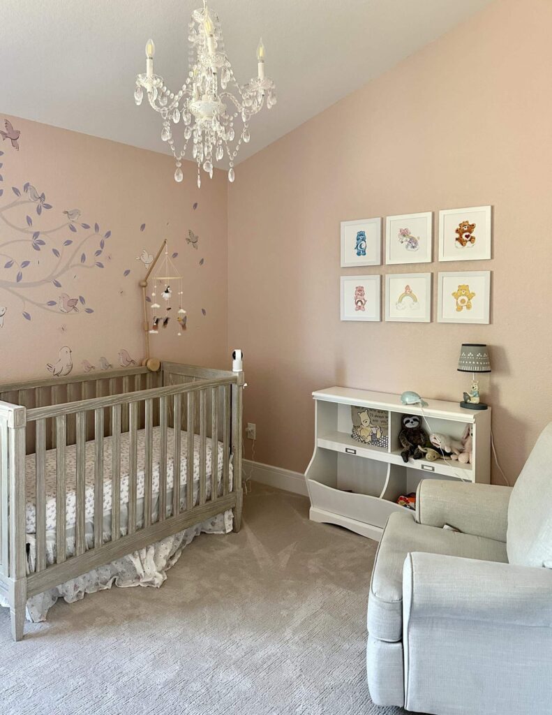
Sherwin-Williams Pink Shadow Girl’s Room
For the client’s young daughter, we wanted to find a pink paint color that felt young and vibrant but was soft and versatile enough to last her for many years – maybe even until she is a teenager!

SW Pink Shadow (sample) was the perfect choice. It’s muted and rich without being too bright. I like to think of this as ballet-slipper pink.
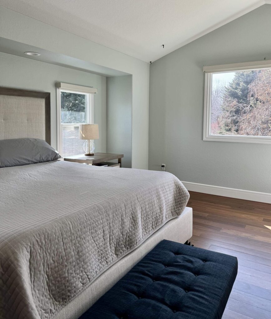
Sherwin-Williams Sea Salt Primary Bedroom
Just like the children’s bedrooms, we wanted to keep the master bedroom as a more colorful accent within this warm white color palette. Sherwin-Williams Sea Salt (color review) is a wonderful option when you want a more colorful wall color but still want it to be fairly muted.

This iconic blue-green paint color leans more toward green, bringing a soft warmth to just about any room. SW Sea Salt (sample) looks gorgeous with the primary bedroom’s warm wood floors.
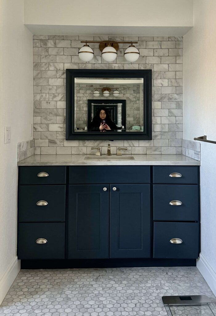
Sherwin-Williams Sea Serpent Bathroom Vanity
We wanted the master bathroom to align with the primary bedroom’s color scheme without matching paint colors directly. Sherwin-Williams Sea Serpent (sample) was a perfect accent color for this space. The previous cabinet color was the wrong undertone of gray and made the marble look dirty. Sea Serpent pulled the blue from the Carrara marble bathroom tile.

This space was transformed with beautiful blue tile, SW Greek Villa walls, and a vanity painted with Sherwin-Williams Sea Serpent (Color review article). We picked Greek Villa to create a contrast with the beautiful marble. Pure white would have been too cold.
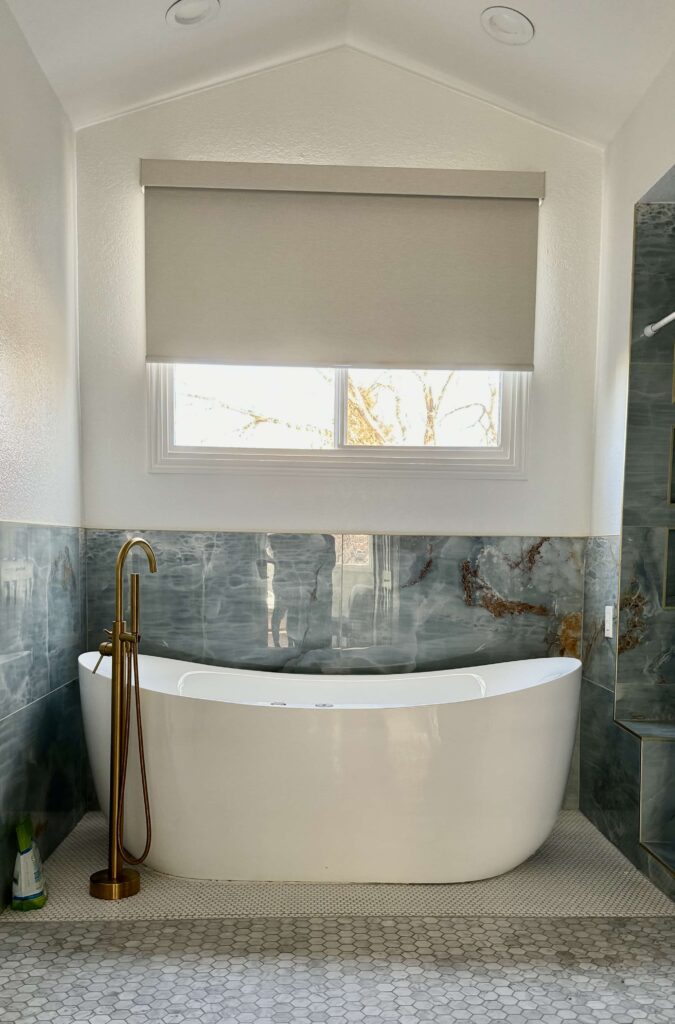
Sea Serpent is a dark, muted blue-green paint color that ties into the rest of the home’s color palette and looks so beautiful with the unique blue tile around the tub.
During the renovation, the marble floor tile was damaged. The homeowners had tried (unsuccessfully) to match the tile. Instead, we used a white penny tile under the tub as a simple replacement solution.
It looks seamless as if it was the plan all along. Although the space below is backlit, you can still see how the blue finishes pop when contrasted with Sherwin Greek Villa on the walls.
Explore All the Colors in This SW Pearly White Color Palette
Click the links below to sample all of the paint colors in this gorgeous warm white color palette.
Sample the colors in this palette with Samplize:
- Sherwin-Williams Pure White (Sample)
- Sherwin-Williams Pearly White (Sample)
- Sherwin-Williams Rookwood Dark Green (Sample)
- Sherwin-Williams Tricorn Black (Sample)
- Sherwin-Williams Needlepoint Navy (Sample)
- Sherwin-Williams Greek Villa (Sample)
- Sherwin-Williams Lullaby (Sample)
- Sherwin-Williams Pink Shadow (Sample)
- Sherwin-Williams Sea Salt (Sample)
- Sherwin-Williams Sea Serpent (Sample)
Key Learning Points
A cohesive whole-house color palette is a simple way to change the look and feel of your home, whether you’re updating your hard finishes or working around them.
Remember, if you want to build your own whole house palette, it’s important to follow these steps:
- Pick your foundation color for the common areas
- Pick a white trim color (and stick to it)
- Select paint colors for secondary living spaces (bedrooms, bathrooms, dining areas, etc.)
- Pick a few accent colors to use throughout your home
Remember: NEVER, EVER use paint matches from a different brand than the one specified. Results are poor and there are no standards for the sheens. Even though your painter may truly believe it can be done, don’t do it. See results from paint matching here.
No matter what, always test your paint colors. It’s a standard best practice. Whenever I test my paint colors, they are perfect, and when I don’t test they turn out wrong. Learn how to test your paint colors here.
Online Color Consulting
If you still need help with paint colors, check out our Online Color Consulting Packages.

Related Posts:
- Sherwin-Williams Pearly White Paint (Color Review)
- Sherwin-Williams Sea Salt Paint (Color Review)
- Sherwin-Williams Pure White Paint (Color Review)
- Sherwin-Williams Sea Serpent Paint (Color Review
- Whole-House Color Palette with Real-World Examples (Article)
- Why a Whole House Color Scheme Matters (Article)
About the Author

Hi, I’m Michelle Marceny, founder, owner, and Principal Color Designer at The Color Concierge. I believe a fresh coat of paint can completely transform a space. The Color Concierge was born out of my drive to help clients fall back in love with their homes. My clients trust me to help them find the perfect paint color for their home – whether it’s a whole-house paint color scheme or ideas for a single room.
Since The Color Concierge was founded in 2017, we have completed over 3000 color consultations, both online and in-person. I am a Certified Color Expert with 7 years of experience creating interior and exterior color palettes throughout North America.
We love your comments! Please note that the blog is meant as general advice, and it is not possible to give out specific answers to your paint questions. If you want more specific advice, our Online Color Consultations will help you pick your paint colours. Thank you for your understanding.
