Explore a warm, neutral Sherwin-Williams Alabaster whole-house color scheme that is perfect for today’s trends but timeless enough to work for years to come.
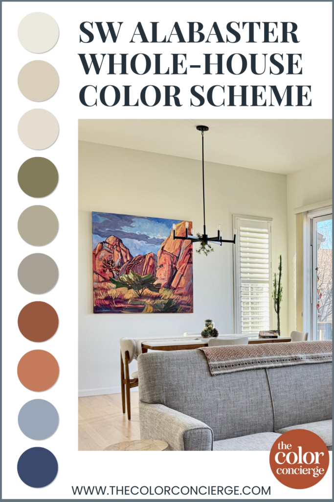
Sherwin-Williams Alabaster (Color Review Article) is the foundation color of this gorgeous color palette. Since it’s a warm, off-white paint color, our inclination is to surround it with other beautiful warm, muted colors. In this palette we did just that – with some pops of unexpected color choices.
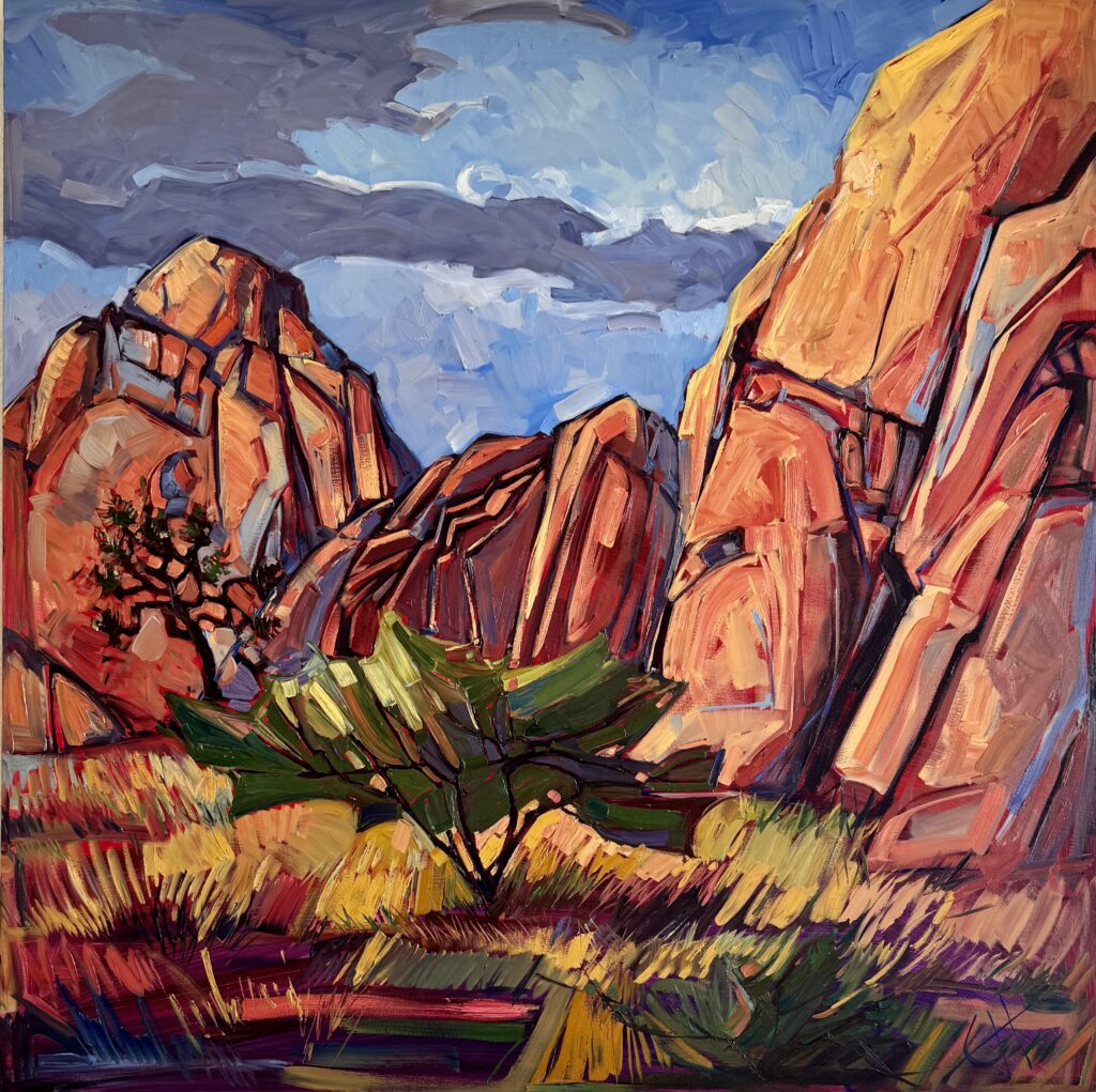
This color scheme was created for a client and inspired by a beautiful painting, which hung in their home. It features lovely warm and welcoming colors that really reflects the joy in the home.
Looking for your own Alabaster interior color palette? Keep reading for the full breakdown of paint colors used in this home.
*This post contains affiliate links for products I use and love. If you click on some links and make a purchase, I will get a small commission at no cost to you. This helps pay for the costs of the blog, so I can continue to offer great content to our readers.
About The Color Concierge
Our Colorado-based paint color consultants make finding the right paint colors for your home easy. Whether you’re painting the exterior or interior of your home, our simple yet effective process lets us get your paint color right the first time. We’ve helped thousands of homeowners transform their homes into a space they love. Learn more about ONLINE COLOR CONSULTATIONS today.
Building an Alabaster Color Scheme
When building an interior color palette (Article), it’s important to consider not just the paint colors in your home but also the hard finishes and decor.
The inspirational piece of art that started this palette featured a wide range of warm, muted colors along with some really beautiful cool blue and indigo tones.
We used the warm neutral tones as wall colors throughout the home and incorporated the other hues into painted accents like an interior front door and bathroom vanity, hard finishes such as flooring and cabinets and in furniture, bedding and other decor.
As you review all of the colors in this palette, keep in mind that there are a variety of ways to incorporate these hues into your home. It’s a flexible, neutral color scheme that can work in just about any home!
Don’t Forget to Sample Your Paint Colors
We always recommend that you test paint colors on your home because lighting can change a color completely, both with interiors as well as exteriors.
In the old days, this meant we painted a large poster board with sample pots and a huge mess.
Now we have a better way to test paint, with Samplize Peel-and-Stick samples!
- Samples pre-painted with 2 coats of real paint from the manufacturer.
- Large 9” x 14” samples to see the color better in the lighting.
- Delivered overnight
- Colors are accurate
- Less expensive than painting a large poster board with sample pots
- No mess, and no toxic paint to dispose of
I use these in my color consulting practice for exact results. Discover Samplize peel-and-stick paint samples:
Project Spotlight: Sherwin-Williams Alabaster Whole-House Color Scheme
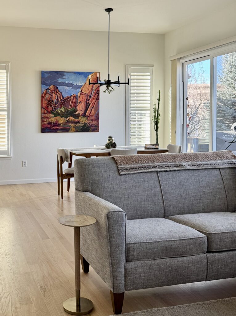
This client’s Colorado home is full of warm, inviting colors that keep things neutral but definitely not boring! The palette flows from room to room, so the whole home feels cohesive from the moment you walk in the front door.
Explore all the colors in this palette:
Sherwin-Williams Alabaster

We used Sherwin-Williams Alabaster (Color Review Article) as the foundation for this palette. Alabaster is a warm, muted off-white paint color with yellow undertones.
We used Alabaster (Sample) in the entryway, hallways, primary bathroom, kitchen, dining room, dining nook and living room. We also used Alabaster in a satin sheen for the trim, doors and ceiling for a really lovely white color drench (Article).
Alabaster serves as the framework for the entire home, with the rich colors of the painting pulled in with decor and accent paint colors.
Benjamin Moore Natural Linen (Sherwin-Williams Wool Skein)

We used Benjamin Moore Natural Linen (Color Review Article) as a slightly darker neutral in some of the secondary living spaces of this home. Sherwin-Williams Wool Skein would be a great Sherwin-Williams alternative. The two colors are almost identical and can be used in similar ways.

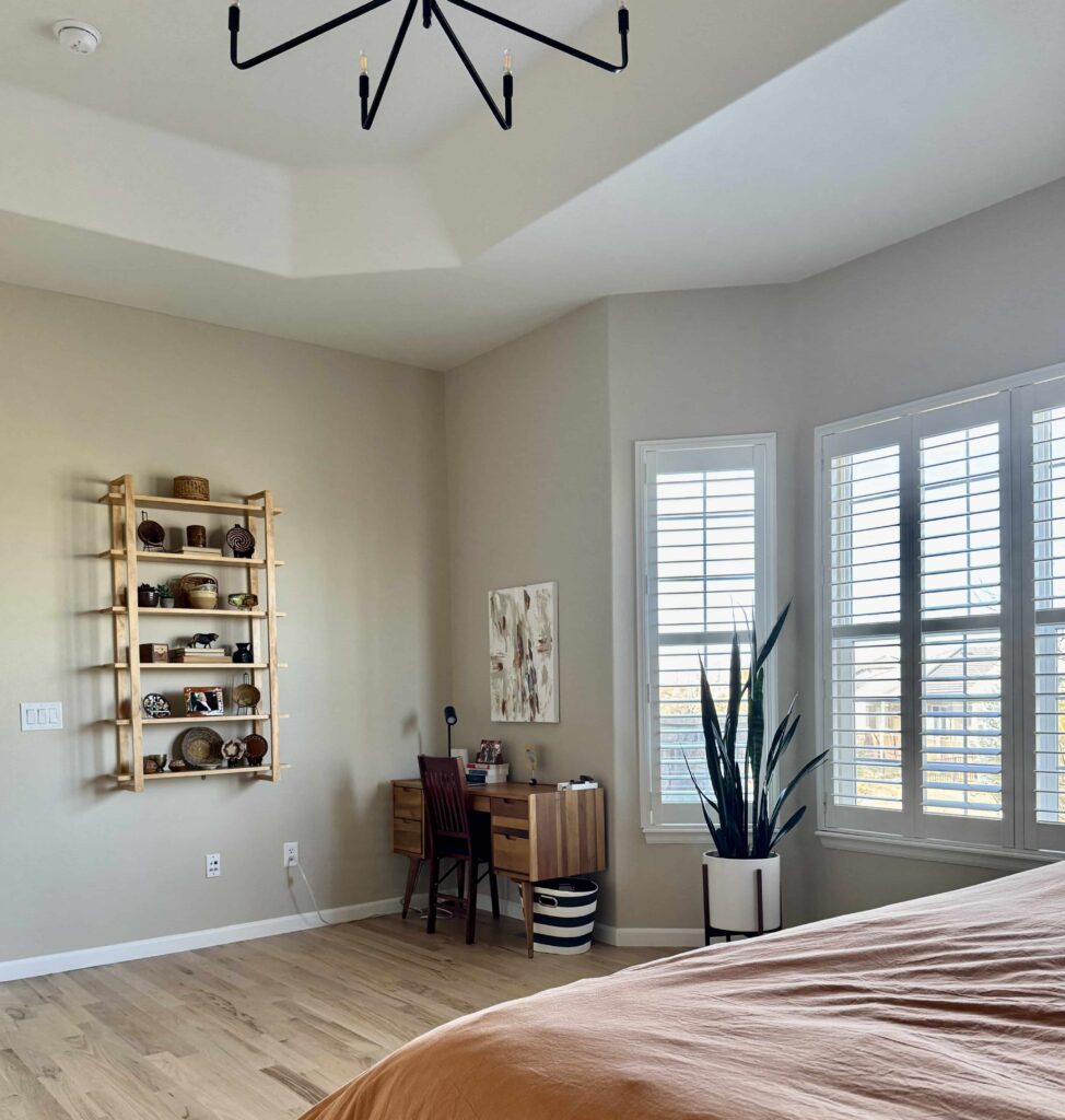
We painted the primary bedroom and toilet room in the primary bathroom with BM Natural Linen (Sample). This color is a wonderful, warm complement to the Alabaster color scheme throughout the home. Please note that BM Natural LInen is NOT the same as SW Natural LInen.
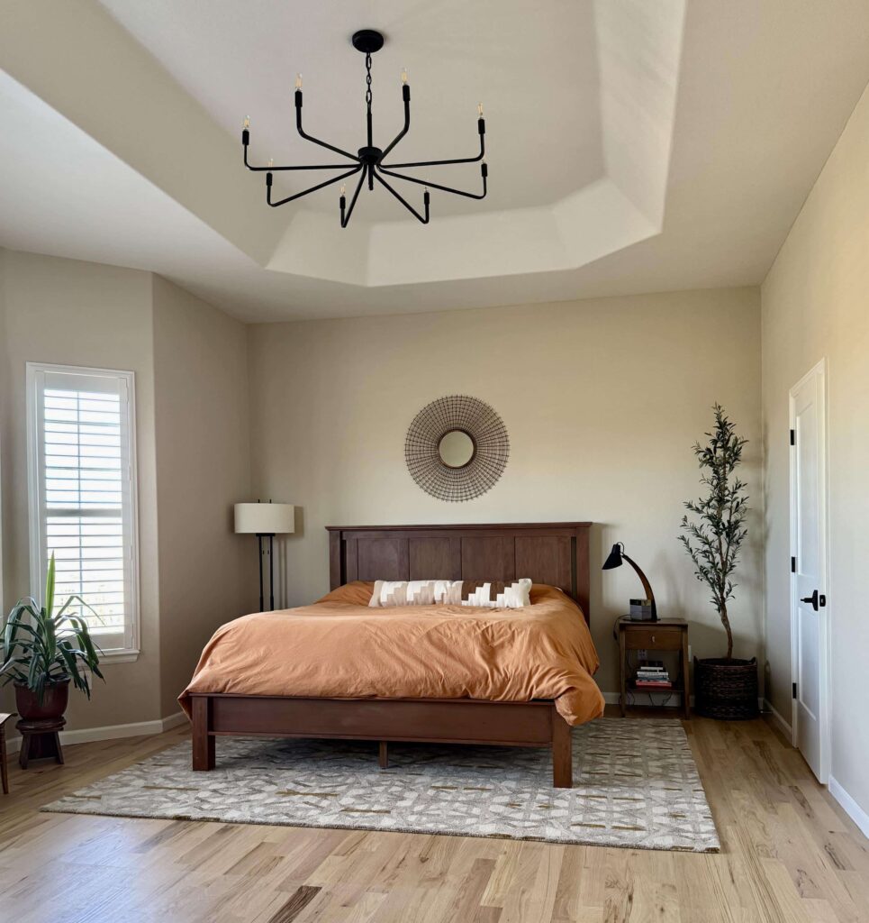
BM Natural Linen has green undertones that sometimes flash peachy. It definitely leans more toward green so that it won’t look pink on the wall.
Benjamin Moore Maritime White (Sherwin-Williams Pacer White)


BM Maritime White (Color Review Article) is a warm, creamy paint color that feels so cozy. I don’t consider it a white, off-white or cream as an interior color. It’s closer to a light beige with peachy undertones. Sherwin-Williams Pacer White (Sample) is very similar and a great alternative.
We used Maritime White (Sample) for the hall bathroom, guest room, and laundry room. This is a wonderful addition to the Alabaster color palette because instead of Alabaster’s yellow undertones, it has warm pinkish-apricot undertones.
This is a great option if you want a warm, bright paint color but have very warm light and don’t want it to skew yellow.
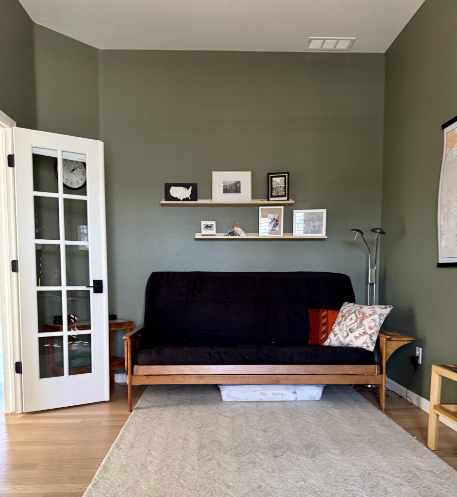
Benjamin Moore Tate Olive (Sherwin-Williams Edamame)


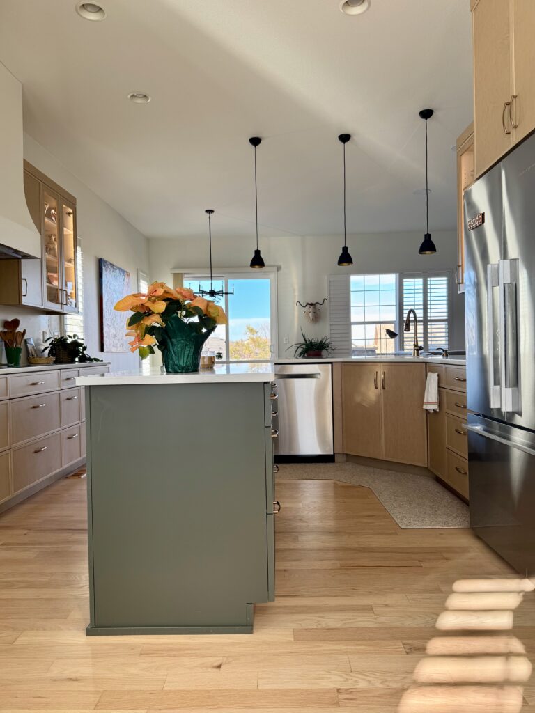
We used a warm, muted green to add freshness to this Alabaster color scheme and tie in the existing green island in the kitchen. Benjamin Moore Tate Olive (Color Review Article) was the perfect hue, with subtle yellow undertones that keep it feeling inviting. Sherwin-Williams Edamame (Sample) is a great alternative.
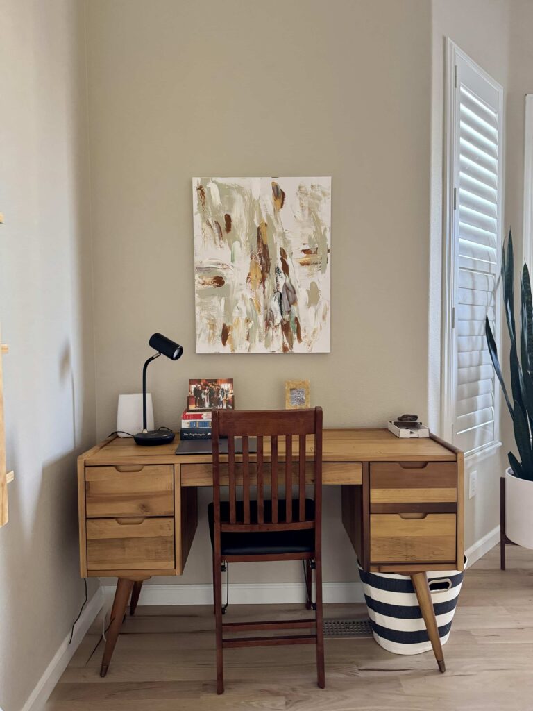
In a dark room, Tate Olive (Sample) can look almost gray, but it is saturated enough to stay colorful in most rooms. It pairs well with other warm paint colors and earthy accents. In this home’s study, Tate Olive walls are paired with warm wood furniture and Alabaster trim for a calming but colorful space.
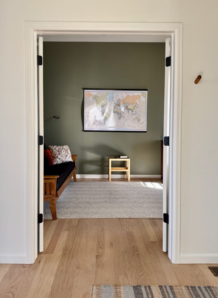
Benjamin Moore Texas Sage (Sherwin-Williams Svelte Sage)
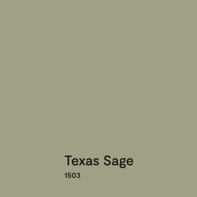
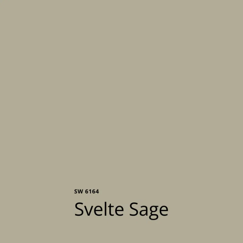
We continued the warm green hues in the home’s entryway, with a BM Texas Sage (Sample) painted interior front door. This color is basically a lighter version of Tate Olive. Sherwin-Williams Svelte Sage (Sample) is a close alternative.
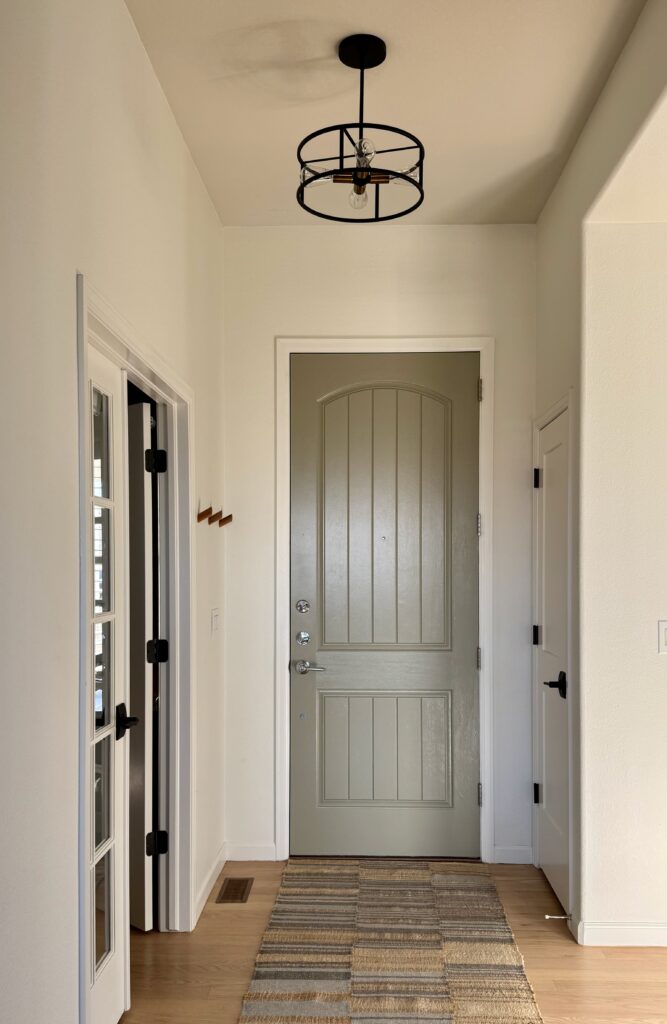
The BM Texas Sage front door was a great way to tie the palette together while also keeping the entryway feeling light and bright.
Sherwin-Williams Fawn Brindle

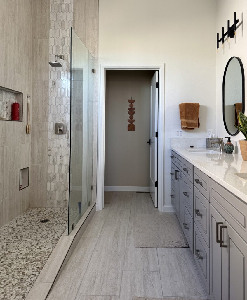
SW Fawn Brindle (Sample) is a darker version of SW Gossamer Veil (Color Review Article), a popular warm neutral with green undertones. We used this color to paint the primary bathroom vanity, but you could also use it as an accent wall paint color, for an accent room or even for interior doors.
Bold Accent Colors
In addition to the lovely warm neutrals used in this palette, the homeowner also incorporated some of the bolder hues from the painting into this home, primarily through furniture and decor.
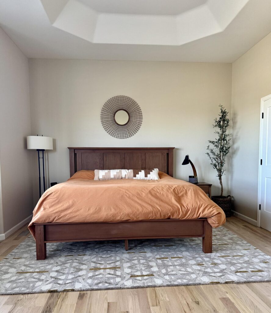
Sherwin-Williams Chrysanthemum
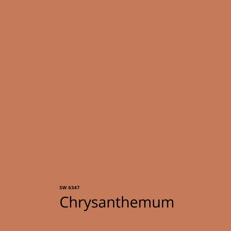
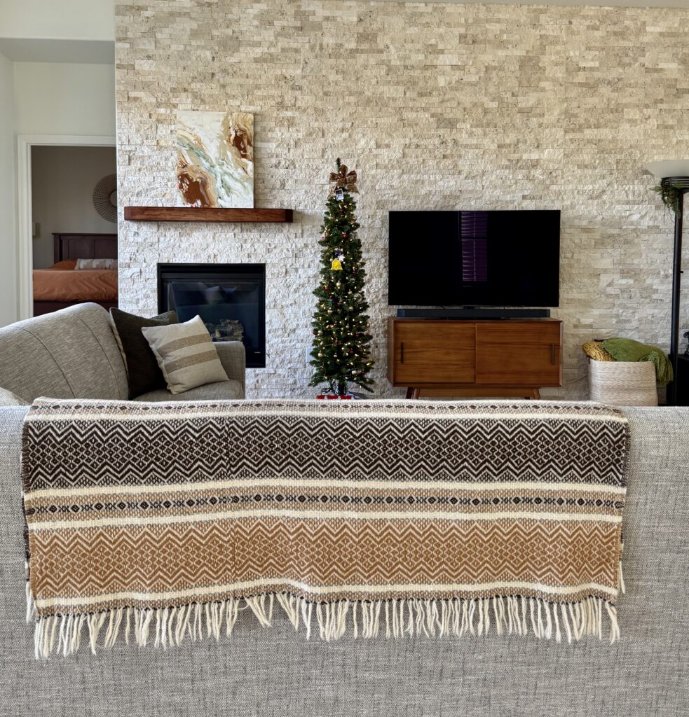
Sherwin-Williams Chrysanthemum (Sample) is a warm rust color incorporated into the palette as the bedspread in the primary bedroom, the throw blanket in the living room, and the art throughout the space.
Sherwin-Williams Rookwood Terra Cotta
We used this darker rust hue throughout the home, represented by all of the warm, dark wood furniture throughout this home.
The same hues were also incorporated into the art and the desk in the primary bedroom below.
In the main living area, the wood kitchen cabinets and throw pillows in the background add a warm splash of rust:
Sherwin-Williams Solitude and Sherwin-Williams Dignified
Contrary to what many designers say, I don’t always create palettes with only warm colors or only cool colors. I always like to add an opposite element to balance the palette.
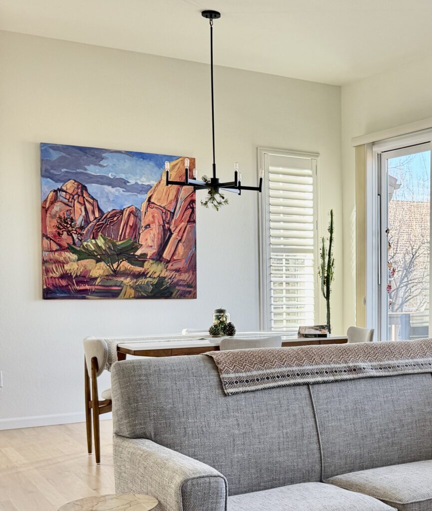
In this case, we get balance from the blues and violets in the original inspiration painting. We don’t see a lot of blue throughout the home, but it’s there in splashes of color. In the living room, the painting itself offers a strong pop of blue.
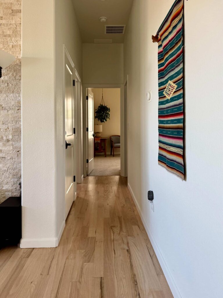
In the hallway, a beautiful tapestry has cool blues in it alongside warmer hues we see throughout this house.
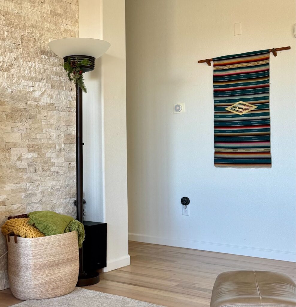
I always tell my clients that the views out the window are part of their color palettes, too. This is the case for this Colorado home, where the expansive windows have views of the blue Colorado sky!
If you were using this SW Alabaster color scheme in your own home, you could add similar pops of blue through decor or with paint.
Sherwin-Williams Solitude (Sample), a soft, warm blue, or Sherwin-Williams Dignified (Sample), dark and rich, would look gorgeous as a color drench or accent walls.
Explore all the colors in this Sherwin-Williams Alabaster color scheme
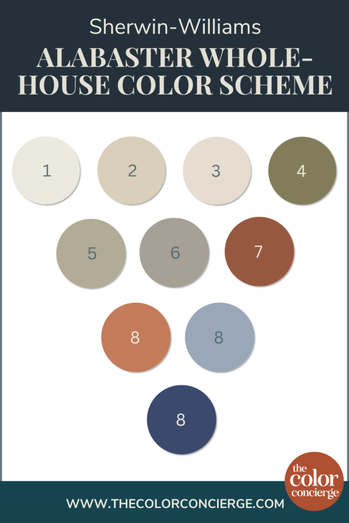
- SW Alabaster
- BM Natural Linen or SW Wool Skein
- BM Maritime White or SW Pacer White
- BM Tate Olive or SW Edamame
- BM Texas Sage or SW Svelte Sage
- SW Fawn Brindle
- SW Rookwood Terra Cotta
- SW Chrysthanemum
- SW Solitude
- SW Dignified
Key Learning Points
Sherwin-Williams Alabaster is a warm and muted off-white paint color perfect for a whole-house color scheme. If you want to create an Alabaster color palette, keep these things in mind:
- Alabaster looks best paired with other paint colors that are similarly warm and muted, like warm greens and rust colors.
- Alabaster can be used in many different spaces throughout the home, including open-concept spaces and even color-drenched applications for walls, trim, and ceilings.
- Don’t be afraid to balance your Alabaster color scheme with pops of cool hues. In this home, we used blue decor items – and the bright blue sky outside the home – to balance out the palette.
Remember: NEVER, EVER use paint matches from a different brand than the one specified. Results are poor and there are no standards for the sheens. Even though your painter may truly believe it can be done, don’t do it. See results from paint matching here.
No matter what, always test your paint colors. It’s a standard best practice. Whenever I test my paint colors, they are perfect, and when I don’t test they turn out wrong. Learn how to test your paint colors here.
Online Color Consulting
Do you still need help picking the best paint colors? Discover our Online Color Consulting Package.

Related Posts
- Sherwin-Williams Alabaster Color Review
- Benjamin Moore Tate Olive Color Review
- Benjamin Moore Natural Linen Color Review
- Benjamin Moore Maritime White Color Review
- Sherwin-Williams Gossamer Veil Color Review
- Best Sherwin-Williams White Paint Colors
- Best Benjamin Moore White Paint Colors
- Creating a Whole-House Color Scheme
About the Author

Hi, I’m Michelle Marceny, founder, owner, and Principal Color Designer at The Color Concierge. I believe a fresh coat of paint can completely transform a space. The Color Concierge was born out of my drive to help clients fall back in love with their homes. My clients trust me to help them find the perfect paint color for their home – whether it’s a whole-house paint color scheme or ideas for a single room.
Since The Color Concierge was founded in 2017, we have completed over 3000 color consultations, both online and in-person. I am a Certified Color Expert with 7 years of experience creating interior and exterior color palettes throughout North America.
We love your comments! Please note that the blog is meant as general advice, and it is not possible to give out specific answers to your paint questions. If you want more specific advice, please consider purchasing a color consultation. Thank you for your understanding.

4 Responses
Hi,
I would like to know what wood flooring this is? Natural Hickory?
Thanks,
Wendy
Hi Wendy,
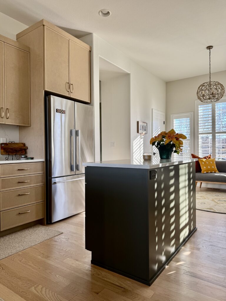
This flooring is red oak.
My husband and I are getting the majority of our home interior painted SW Albaster. Did you paint the ceiling the same color?
You could paint the ceiling Alabaster, and if you paint both the walls and ceiling with a matte sheen it would work. Whatever you do though, don’t paint your ceiling with a sheen that is shinier than Matte, though. it will look wrong.