Learn all about Benjamin Moore Tate Olive in this review from The Color Concierge.
Benjamin Moore Tate Olive is a dark, warm paint color perfect for an accent room like a dining room, office or study. It’s colorful enough to add depth to a space, but dark enough to give your eyes a rest when you’re working on a computer all day in an office.
This warm hue is a fantastic accent color to pair with similar greens and other colors popular in today’s warmer interior palettes.
Want to use BM Tate Olive paint in your home? Keep reading to learn more about the best applications for this gorgeous color.
*This post contains affiliate links for products I use and love. If you click on some links and make a purchase, I will get a small commission at no cost to you. This helps pay for the costs of the blog, so I can continue to offer great content to our readers.
About The Color Concierge
Our Colorado-based paint color consultants make finding the right paint colors for your home easy. Whether you’re painting the exterior or interior of your home, our simple yet effective process lets us get your paint color right the first time. We’ve helped thousands of homeowners transform their homes into a space they love. Learn more about ONLINE COLOR CONSULTATIONS today.
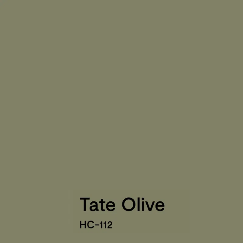
What Color is Tate Olive?
Tate Olive (Sample) is a muted green paint color. In a dark room (Article), it can look almost gray, but it has enough saturation to stay colorful. It pairs well with other warm paint colors and earthy accents like granite.
What is the BM Tate Olive LRV?
Tate Olive has an LRV of 21.6, which makes it light-absorbing. It’s a dark paint color, but light enough to stay colorful on the wall – especially in a room with lots of natural light.
What are the Tate Olive undertones?
BM Tate Olive has subtle yellow undertones that keep it feeling cozy and inviting.
Is Tate Olive paint warm or cool?
Tate Olive is more of a warm green than a cool green, thanks to its yellow undertones.
Sample BM Tate Olive
We always recommend that you test paint colors on your home because lighting can change a color completely, both with interiors as well as exteriors.
In the old days, this meant we painted a large poster board with sample pots and a huge mess.
Now we have a better way to test paint, with Samplize Peel-and-Stick samples!
- Samples pre-painted with 2 coats of real paint from the manufacturer.
- Large 9” x 14” samples to see the color better in the lighting.
- Delivered overnight
- Colors are accurate
- Less expensive than painting a large poster board with sample pots
- No mess, and no toxic paint to dispose of
I use these in my color consulting practice for exact results. Discover Samplize peel-and-stick paint samples:
Using Benjamin Moore Tate Olive Interior Paint
Tate Olive paint is a gorgeous option for many interior paint projects, from whole rooms to smaller accents.
Can I use try Tate Olive cabinets?
Absolutely! Tate Olive would be a beautiful option for lower cabinets in a tuxedo cabinet palette (Article), paired with warm white uppers (Article) or even natural wood uppers.
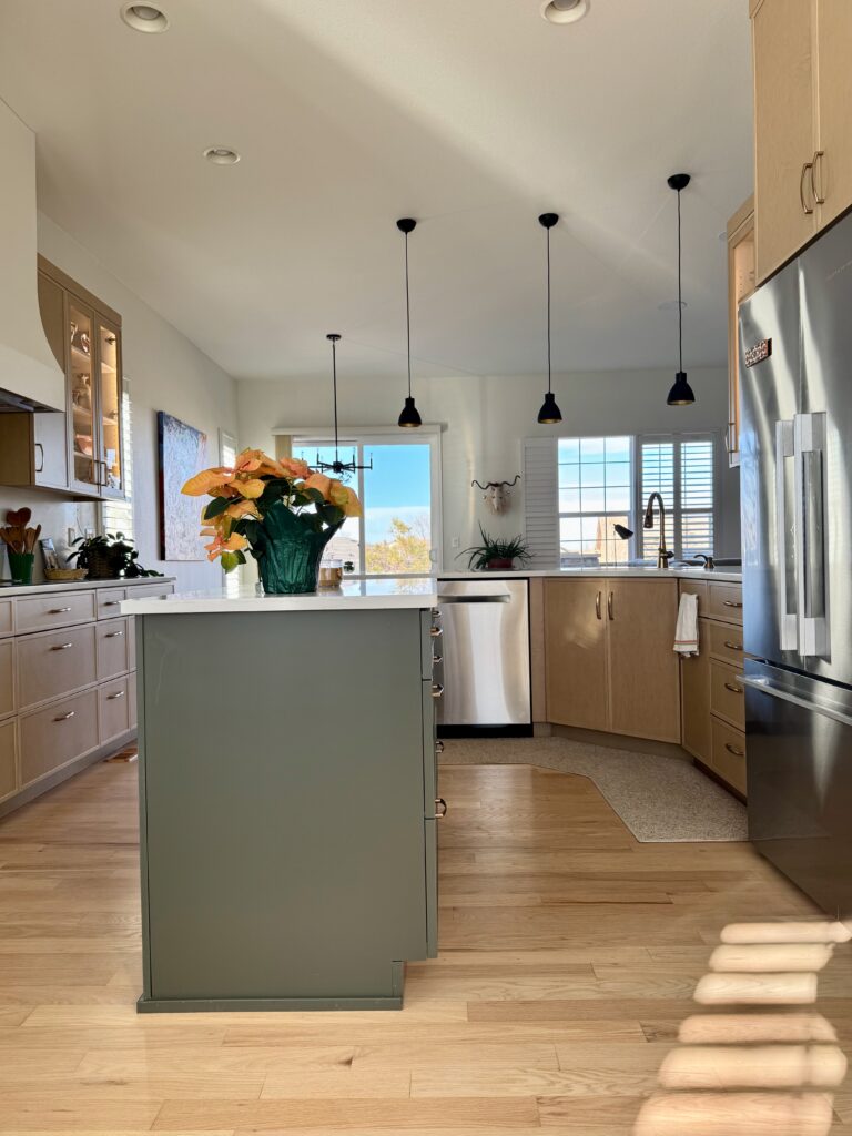
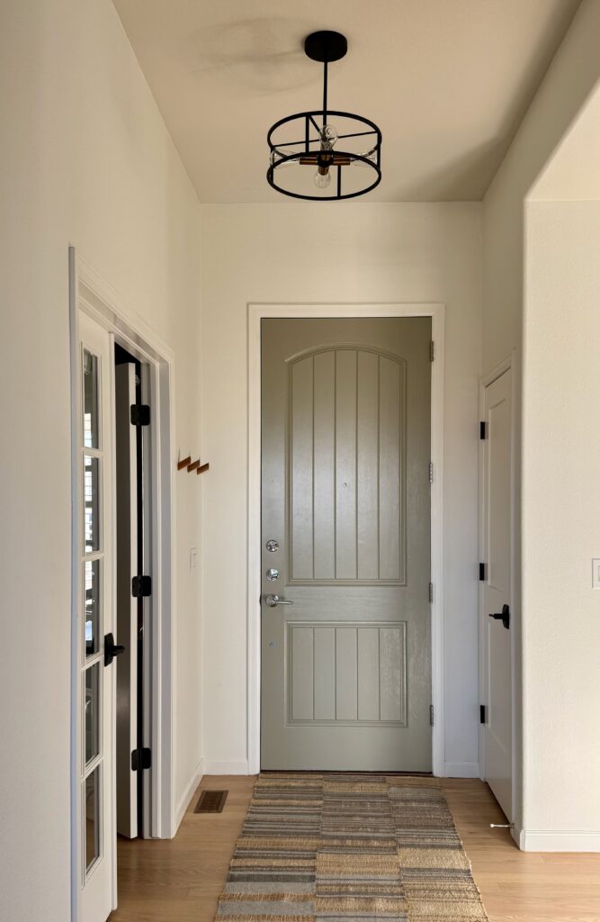
It also works really well as a kitchen island paint color. In fact, the whole inspiration for our client’s Tate Olive office (shared below) was pulled from the kitchen island on the other side of the hallway. Tate Olive is very similar to this unknown island color.
Is a BM Tate Olive office a good idea?
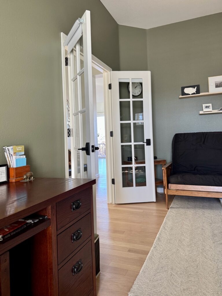
Painting a Tate Olive office is one of my favorite uses for this color! The homeowner I worked with was skeptical about using such a dark color, but in this case, we balanced it with lots of white trim and ceilings, and it looked lovely.
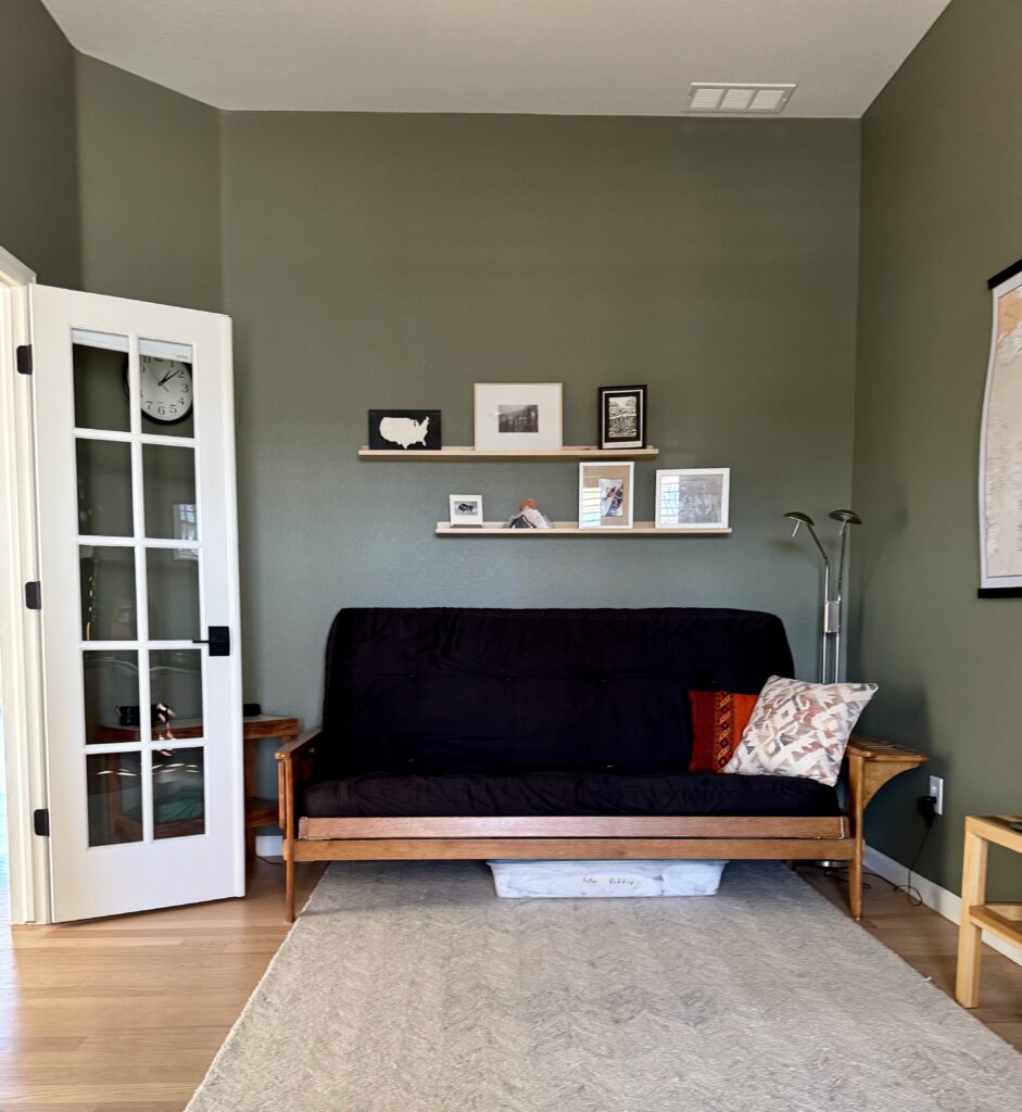

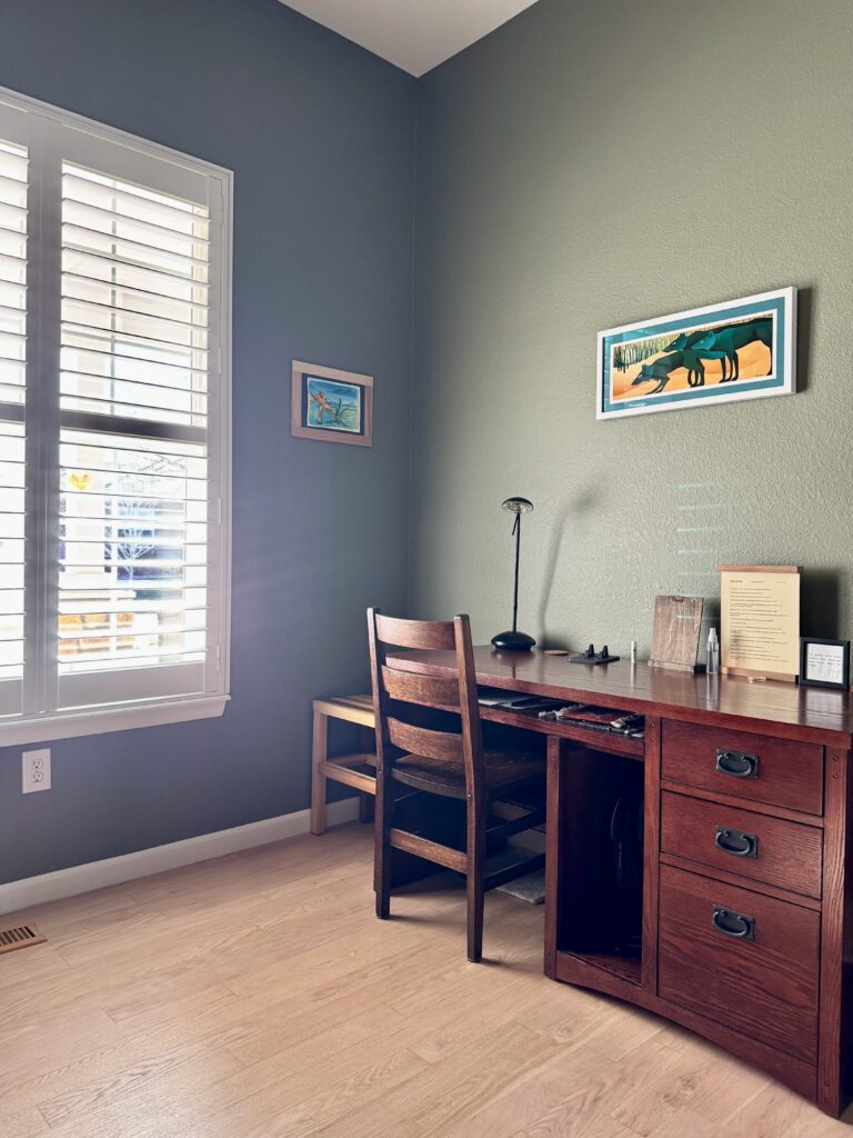
I love the way the walls look with the dark wood desk and colorful art prints in this space.
Could a Tate Olive dining room work?
Absolutely! Much like an office, a dining room is a great place to use a bold accent color. This color would look beautiful paired with a natural wood dining table.
You can get an idea of that combination from the image below of my client’s office walls with her warm wood floor.
Should I try color-drenching with Tate Olive?
Yes, this is a great candidate for color-drenching (Article)! We could have painted all the surfaces in my client’s office Tate Olive, but the room had very low light, and we felt it would have been too much.
We always recommend that if you want to color-drench a room, to make sure that you have enough natural and/or artificial light to keep the room from looking oppressive.
Is Tate Olive a good whole-house paint color?
BM Tate Olive is too dark to use as a whole-house paint color, but it is a wonderful accent color to include a whole-house color palette (Article).
It pairs really well with warm white and beige paint colors (Article), which are gaining popularity for interior color palettes. Some of my favorite Tate Olive coordinating colors are SW Alabaster, BM Swiss Coffee and BM Natural Linen (Color Review Articles).
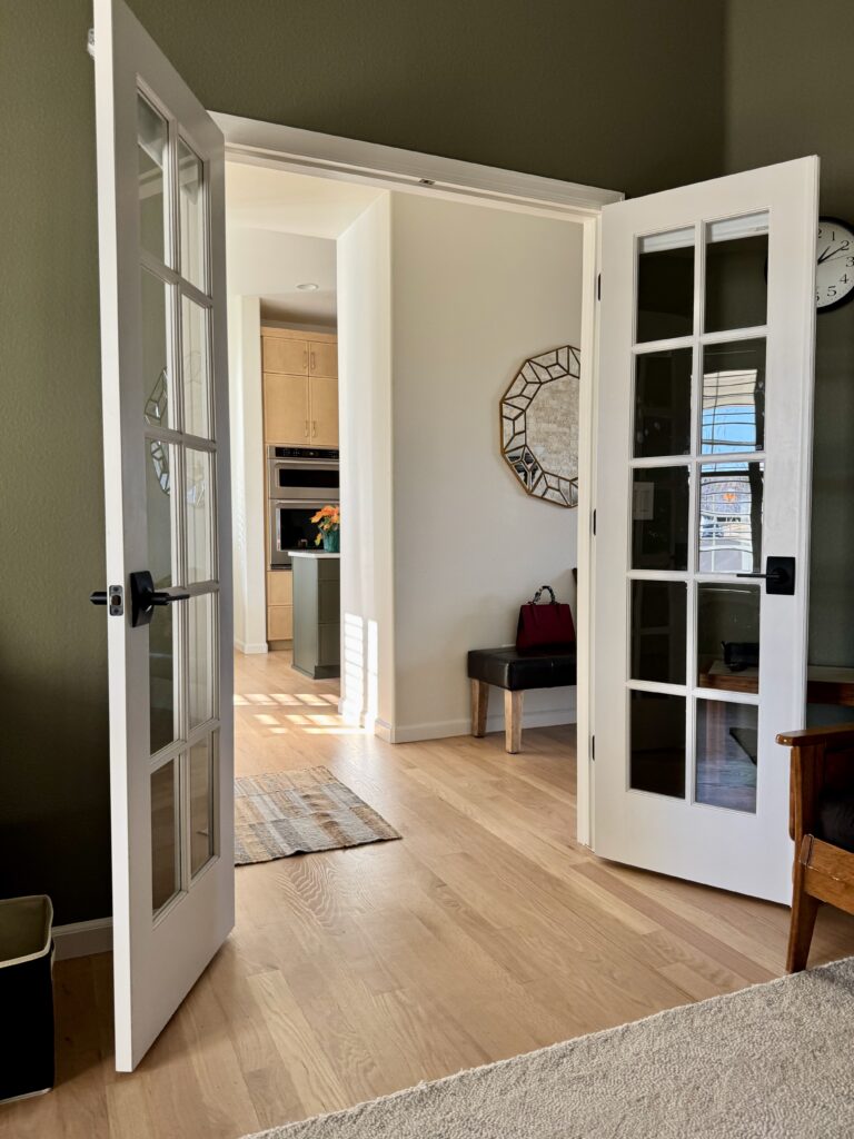
In this client’s home, for example, trim and ceilings (Article) were painted with Sherwin-Williams Alabaster.
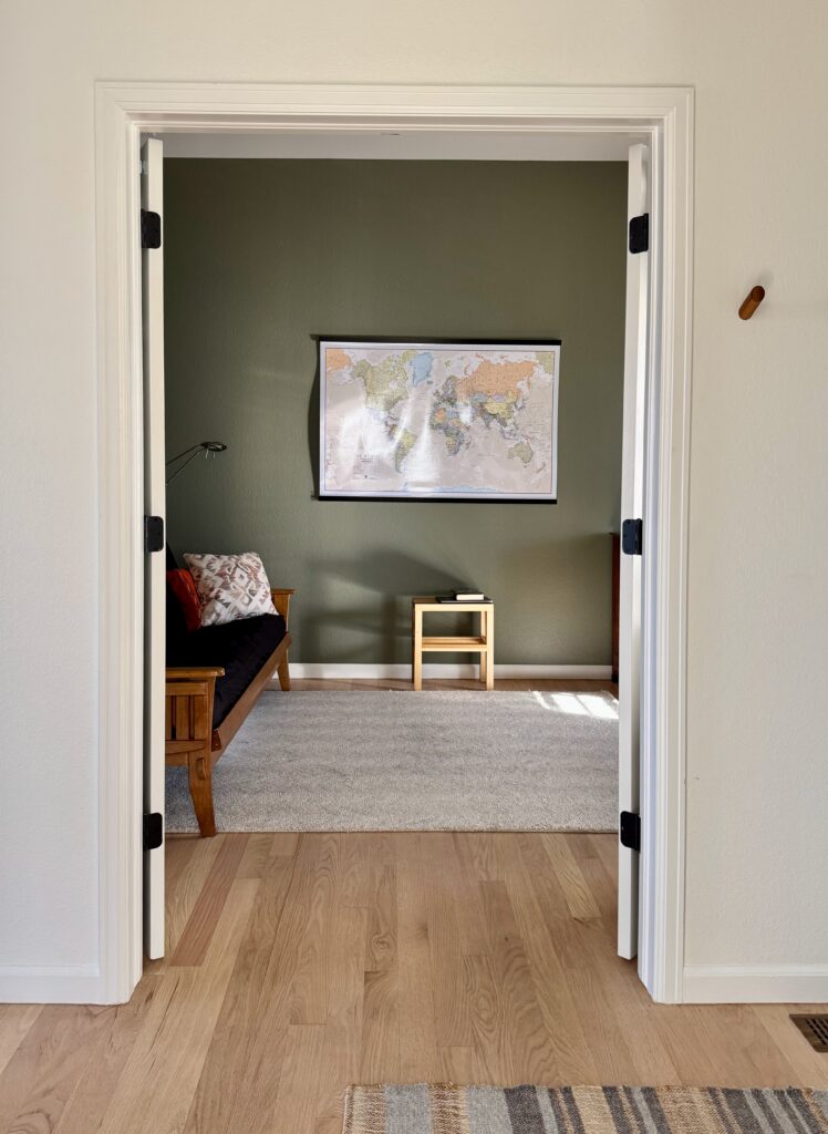
Here is the view from the study. You can see the Alabaster entry hallway along with the kitchen on the other side, with the same muted green island. These layers in a home are elegant and nicely balanced.
In this home, I also played with various tones of green to together the study, front door, and island.
We started with an interior front door color called Benjamin Moore Texas Sage (Sample). It’s just the perfect shade for a subtle, warm green accent.
Using Benjamin Moore Tate Olive Exterior Paint
BM Tate Olive exterior paint would be really beautiful. It would look especially lovely on a home with dark red brick (Article) and light, warm trim – such as Benjamin Moore Pale Oak (Color Review Article) – to balance out the dark color.
A Tate Olive front door would also be beautiful. We recommend a few green hues in our guide to the best front door paint colors (Article), and BM Tate Olive could easily be added to this list!
What are the Best Trim and Ceiling Colors For Tate Olive?
Warm and muted white or off-white paint colors work well as trim and ceiling paint with Tate Olive. Sherwin-Williams Alabaster and Benjamin Moore Swiss Coffee are two good options. You could also try the slightly lighter Sherwin-Williams Greek Villa (Color Review Article) or the slightly lighter and cooler Benjamin Moore White Dove (Color Review Article).
As with any color, be sure to take your lighting, hard finishes, furniture and decor into consideration when choosing the best trim and ceiling paint.
Best Benjamin Moore Tate Olive Alternatives
Looking for a color similar to BM Tate Olive? Explore these alternatives.
Benjamin Moore Tate Olive vs Benjamin Moore Dark Olive
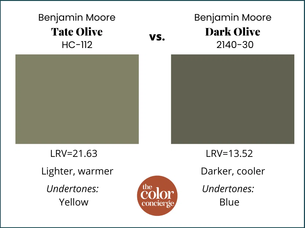
The biggest difference between Benjamin Moore Tate Olive vs Benjamin Moore Dark Olive (Sample) is right in the name: Dark Olive is much darker, with an LRV of 13.52. Dark Olive also has undertones that lean more toward blue and looks much cooler on the wall.
Benjamin Moore Tate Olive vs Benjamin Moore Springfield Sage
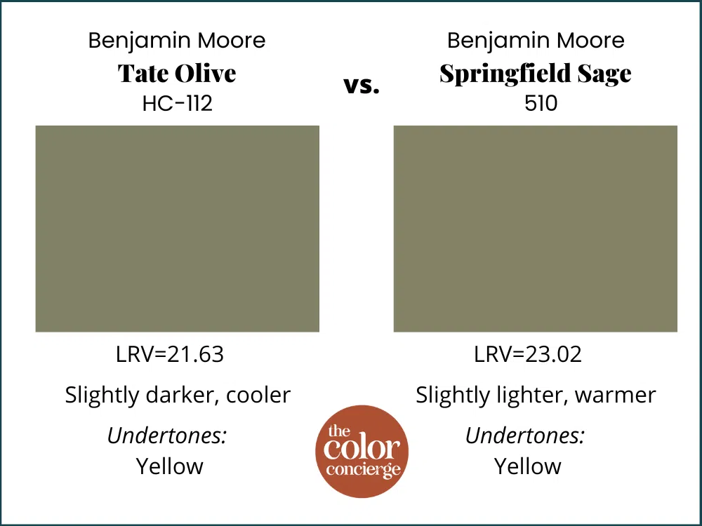
Benjamin Moore Springfield Sage (Sample) is a very similar hue to Tate Olive. It’s just slightly lighter, with an LRV of 23.02. It also has similar yellow undertones and looks slightly warmer in place.
Benjamin Moore Tate Olive vs Sherwin-Williams Olive Grove
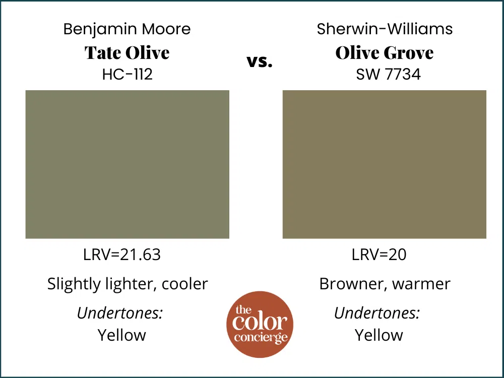
Sherwin-Williams Olive Grove (Sample) sounds similar to BM Tate Olive, but they’re actually pretty different. Olive Grove is just slightly darker, with an LRV of 20, but has much stronger yellow undertones and more brown tones. It looks significantly warmer on the wall.
Benjamin Moore Tate Olive vs Sherwin-Williams Messenger Bag
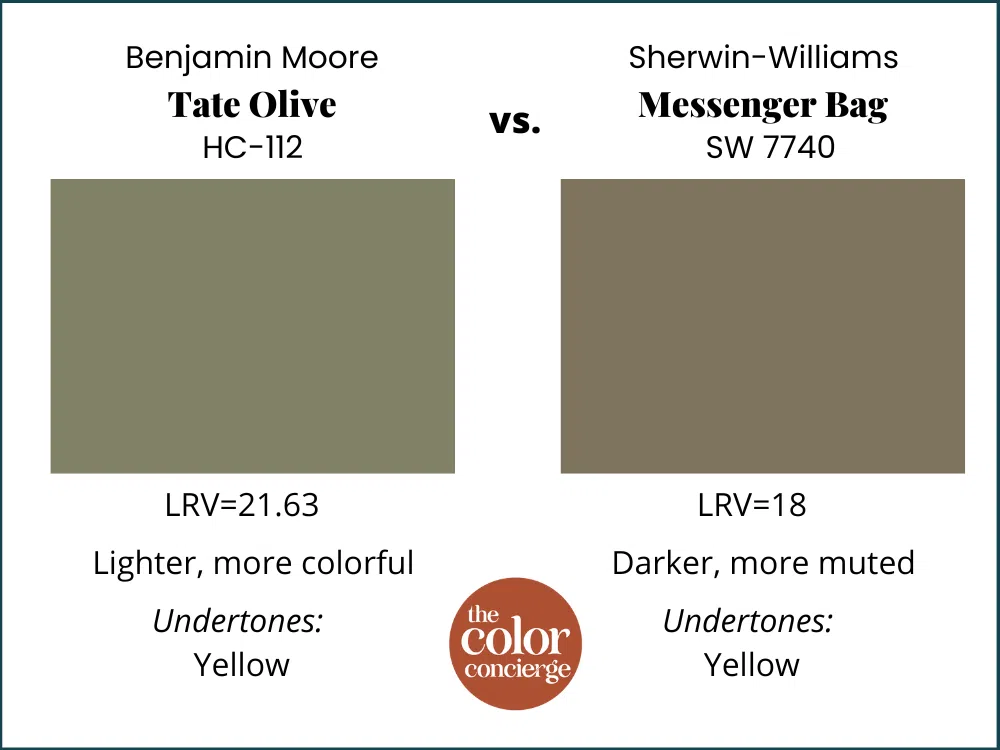
Sherwin-Williams Messenger Bag (Sample) is darker than Tate Olive, with an LRV of 18. While it has similar yellow undertones, Messenger Bag is more muted than Tate Olive and looks less colorful in place.
Benjamin Moore Tate Olive vs Farrow & Ball Olive
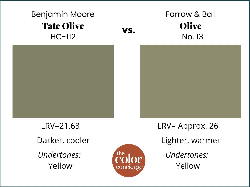
Farrow & Ball Olive (Sample) is another beautiful olive-green paint color. Its LRV is approximately 26 (Farrow & Ball doesn’t provide LRV details for its paint colors), so it is noticeably lighter than Tate Olive. It also appears a bit warmer than Tate Olive.
Best Sherwin-Williams Tate Olive Alternative
While it’s not an exact match, I recommend Sherwin-Williams Messenger Bag (Sample) if you’re looking for a Sherwin-Williams paint color that will give you a similar look as Tate Olive. Messenger Bag is slightly darker, but has warm undertones and is similarly muted.
Benjamin Moore Tate Olive Pros and Cons
Pros:
- Pairs well with the creamy off-white and warm beige paint colors (Article) trending today
- Great option for color-drenching, especially in a secondary space like an office or dining room
- Dark and cozy but has enough pigment to look colorful in place
Cons:
- May feel too dark in rooms with low light, especially when color-drenching (Article)
- Does not pair well with cool whites or grays thanks to its warm undertones
- Too dark to be used as a whole-house paint color
Key Learning Points
Benjamin Moore Tate Olive is a warm, muted green paint color perfect for accent rooms within a home.
- Tate Olive has warm, yellow undertones that keep it looking cozy and inviting, even in rooms with low light.
- Tate Olive is a fantastic candidate for color-drenching, especially for an office or dining room.
- Benjamin Moore Tate Olive works beautifully with the warm white and beige paint colors popular in today’s interior color palettes.
Remember: NEVER, EVER use paint matches from a different brand than the one specified. Results are poor and there are no standards for the sheens. Even though your painter may truly believe it can be done, don’t do it. See results from paint matching here.
No matter what, always test your paint colors. It’s a standard best practice. Whenever I test my paint colors, they are perfect, and when I don’t test they turn out wrong. Learn how to test your paint colors here.
Online Color Consulting
Still need help picking the best paint colors? Discover our Online Color Consulting Package.

Related Posts
- Best Front Door Paint Colors
- Sherwin-Williams Alabaster Paint Color Review
- Benjamin Moore Swiss Coffee Paint Color Review
- Sherwin-Williams Greek Villa Paint Color Review
- Tuxedo Kitchen Cabinet Color Pairings
About the Author

Hi, I’m Michelle Marceny, founder, owner, and Principal Color Designer at The Color Concierge. I believe a fresh coat of paint can completely transform a space. The Color Concierge was born out of my drive to help clients fall back in love with their homes. My clients trust me to help them find the perfect paint color for their home – whether it’s a whole-house paint color scheme or ideas for a single room.
Since The Color Concierge was founded in 2017, we have completed over 3000 color consultations, both online and in-person. I am a Certified Color Expert with 7 years of experience creating interior and exterior color palettes throughout North America.
We love your comments! Please note that the blog is meant as general advice, and it is not possible to give out specific answers to your paint questions. If you want more specific advice, please consider purchasing a color consultation. Thank you for your understanding.

One Response
I am doing an cabinets under my kitchen island that is capped with a nice speckled llight granite. MY kitchen has birch floors and mapple cabinets that have aged 20 years very warm walls likely to remain Bavarian Cream.
I debate between Tate Olive or gloucester Sage. or even Turtle Green all Ben Moore. Any advice? my thanks!