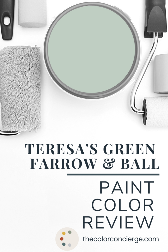
Learn all about Teresa’s Green by Farrow & Ball in this paint color review.
I recently started a series of Farrow & Ball paint color reviews (Article), and this week I want to talk about Farrow & Ball Teresa’s Green, No. 236.
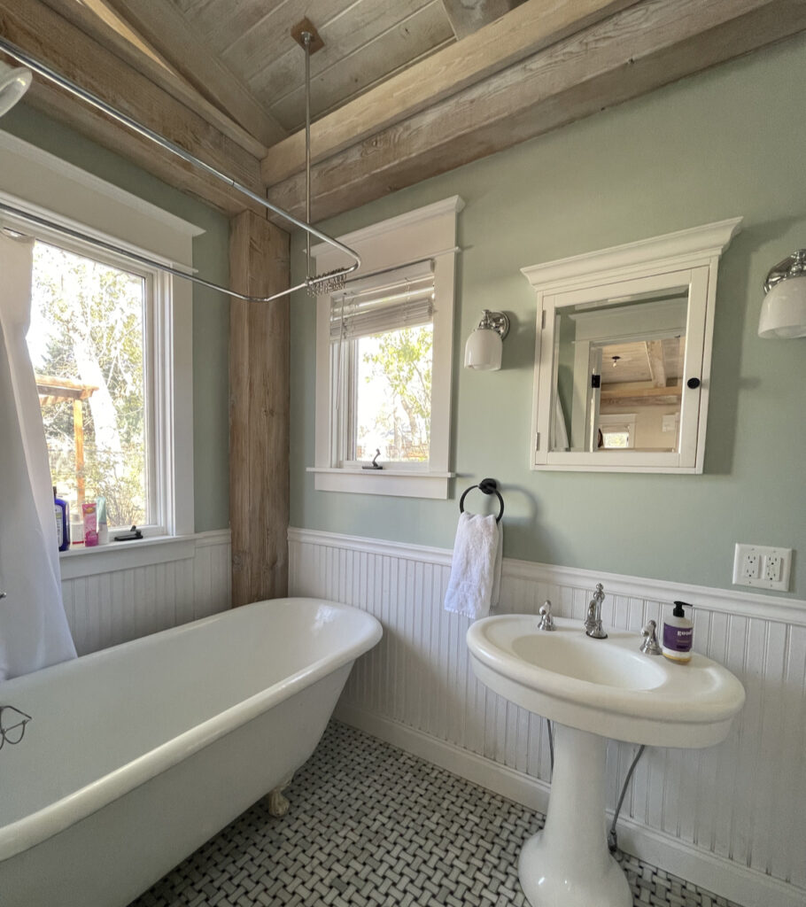
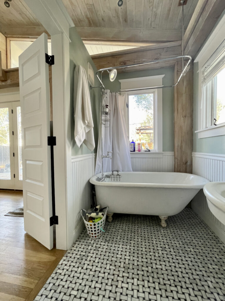
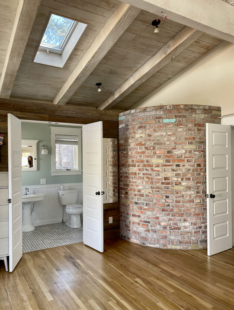
This color was truly my gateway into Farrow & Ball paint colors. I first encountered it in a gorgeous bathroom at my client’s home when I came over for a paint color consultation and I instantly fell in love!
It’s no wonder that Teresa’s Green (Sample) reviews are so wonderful – this color has so many of the properties of Farrow & Ball colors. It absolutely glows!
It’s very versatile too, looking just as beautiful with earthy finishes like wood and brick (like in my client’s Teresa’s Green bathroom) as it does with clean white colors and modern subway tile.
Farrow & Ball describes Teresa’s Green this way:
“Teresa’s Green owes its freshness to a rich blue base and its warmth to soft green undertones. In the middle of our range of aquas, Teresa’s Green has a calming and therapeutic effect…”
The calming qualities of Teresa’s Green by Farrow & Ball make it a beautiful option for bedrooms (Article), bathrooms and just about any room in the house!

*This post contains affiliate links for products I use and love. If you click on some links and make a purchase, I will get a small commission at no cost to you. This helps pay for the costs of the blog, so I can continue to offer great content to our readers.
About The Color Concierge
Our Colorado-based paint color consultants make finding the right paint colors for your home easy. Whether you’re painting the exterior or interior of your home, our simple yet effective process lets us get your paint color right the first time. We’ve helped thousands of homeowners transform their homes into a space they love. Learn more about ONLINE COLOR CONSULTATIONS today.
What is the LRV of Teresa’s Green?
The LRV (that’s light reflective value) of Farrow & Ball Teresa’s Green (Sample) is approximately 60. Farrow & Ball doesn’t actually give LRVs for their paint colors, but I estimated the LRV with color comparisons and other information on the internet.
This color is soft and muted, but still feels richer than the LRV shows. This is true of many Farrow & Ball paint colors, and probably one of the reasons this company doesn’t give LRV values to their paints. LRV simply doesn’t do justice to the way this color glows on the wall.
What color is Teresa’s Green?
Teresa’s Green is definitely an aqua color. It offers the perfect combination of blue and green. But unlike some darker teal colors that can feel overwhelming in some spaces, Teresa’s Green is a beautiful soft blue-green paint that adds a feeling of calm to the spaces it’s used in.
What undertones does Teresa’s Green have?
There’s a reason this paint is called Teresa’s Green (Sample). While it is very solidly an aqua or light teal color, it gets its warmth from soft green undertones.
Sample Teresa’s Green
We always recommend that you test paint colors (article) in your home because lighting can completely change a color, both on interiors and exteriors.
In the old days, this meant we painted a large poster board with sample pots and a huge mess.
Now we have a better way to test paint, with Samplize Peel-and-Stick samples!
- Samples pre-painted with 2 coats of real paint from the manufacturer.
- Large 9” x 14” samples to see the color better in the lighting.
- Delivered overnight
- Colors are accurate
- Less expensive than painting a large poster board with sample pots
- No mess, and no toxic paint to dispose of
I use these in my color consulting practice for exact results. Discover Samplize peel-and-stick paint samples and sample Teresa’s Green(Sample) via the link below.
Is Teresa’s Green warm or cool?
Farrow & Ball Teresa’s Green is one of those colors that is hard to read. It looks fairly cool thanks to its fresh, blue base. But it’s actually a warm color, with warmth provided by its soft green undertones.
Is Teresa’s Green lighter than Green Blue?
Yes, it is. Teresa’s Green is just a bit lighter in tone than Farrow & Ball’s Green Blue (Sample), and is also slightly warmer. If you’re looking for the rich aqua of Green Blue but want a softer color palette, then Teresa’s Green is a great option!
When should I use Farrow & Ball Teresa’s Green paint?
One of the best things about Teresa’s Green by Farrow & Ball is that this gorgeous color can go with so many different colors and work in so many different spaces. It’s a truly special color and I think it has so many different uses throughout a home.
Can I use Teresa’s Green for kitchen cabinets?
Teresa’s Green kitchen (Article) cabinets would look really beautiful! Green cabinets have been a trend for a few years now, and the look seems to be staying strong. The soft green-blue of this Farrow & Ball paint color is a great compromise between classic white kitchen cabinets and a more saturated green or blue kitchen cabinet.
Teresa’s Green also looks really beautiful when paired with warm, natural wood, so it would look lovely in a kitchen with wood floors, wood beams or even a wood-block kitchen island.
Can I use Teresa’s Green for exteriors?
This color would look beautiful outdoors! While Farrow & Ball paint colors tend to be cost prohibitive to use as a full house exterior paint (Article), I love the idea of a Farrow and Ball Teresa’s Green front door or shutters. This would be such a beautiful color to welcome people into your home!
Teresa’s Green (Sample) also makes a great front porch ceiling color. This muted aqua adds a fun pop of color to a front porch without making the space feel dark or reflecting too much color into the windows of your home.

Can I use Teresa’s Green in an east-facing room?
Absolutely! Light in east-facing rooms is warmer in the mornings as the sun is rising and cooler in the afternoon. Using light green or blue paint in an east-facing room complements the cooler evening light to create a calming space – perfect for a bedroom or living room.
When you use a warm color like Teresa’s Green, you’ll also get the benefit of green undertones that help bring some warmth to a space even when the natural light is cool.
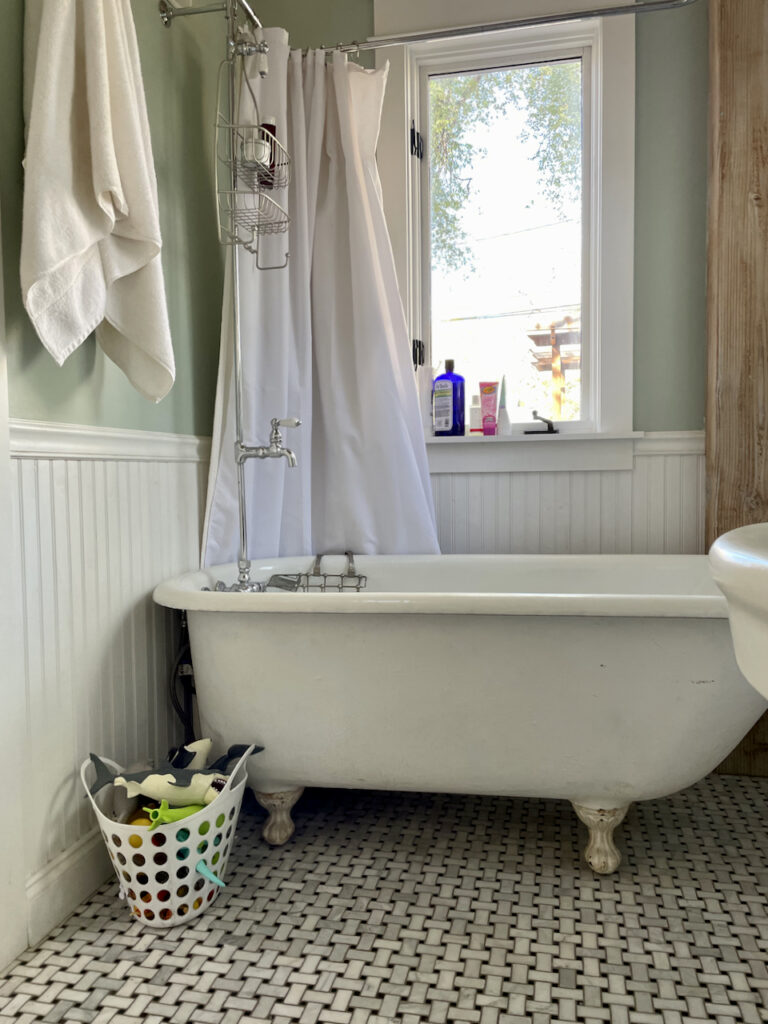
Is Teresa’s Green a good bathroom color?
Yes, it is! After all, it was this bathroom painted that first introduced me to Teresa’s Green (Sample) (and started my love for all things Farrow & Ball!). This color is a wonderful bathroom color because of the calming effect it has. It makes a bathroom feel totally spa-like!
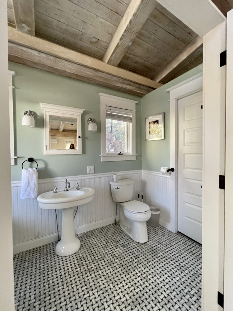
Teresa’s Green was the perfect color for this gorgeous cottage because it is so versatile. It looks beautiful next to the natural wood beams, wood ceiling, and red brick accents of this home, and looks just as good paired with white wainscoting and white trim. It also really brings this classic basketweave floor tile to life in this space.
When should I avoid Teresa’s Green?
I prefer not to use Farrow & Ball Teresa’s Green (Sample) as a whole house color because it is a bit too saturated. While it is a muted color, it has a strong aqua hue and is definitely not a neutral (Article). This paint is better used as a beautiful, soft accent in a small room like a bedroom or bathroom or as a beautiful pop of color on kitchen cabinets, in the back of built-in shelving, etc.
I’d also avoid this paint color in a north-facing room, which tends to bring out the cooler tones within a color. With so much green in this paint, it may end up looking too blue or glowing a bit too brightly in northern light.
Which Colors Look Best with Teresa’s Green?
Because Teresa’s Green is such a muted color itself, it goes well with equally muted colors – including blues, greens, yellows, clean and off-whites, and even grays!
Does Teresa’s Green go with gray?
Teresa’s Green can look really beautiful with a soft, muted gray like Stonington Gray (Color review) from Benjamin Moore. It’s a cool gray with blue undertones that complement the blue hues in Teresa’s Green.
Farrow & Ball recommends pairing Teresa’s Green with another one of their paint colors: Pale Powder (Sample). While Pale Powder is technically a very soft aqua, it can look like more of a delicate gray with green undertones.
Does Teresa’s Green go with white?
Yes! Teresa’s Green can actually pair well with many different kinds of whites, including both clean whites and off-whites.
Farrow & Ball recommends pairing Teresa’s Green with School House White (Sample) or White Tie (Sample). School House White is a soft off-white that looks really creamy when paired with Teresa’s Green. White Tie is a creamy, warm white deepened with a touch of black pigment. Both would look beautiful as neutral paint colors to use alongside Teresa’s Green.
Does Teresa’s Green go with brick?
It absolutely does. In my client’s cottage, there is a lot of natural wood and brick accents inside the home, including this beautiful brick wall just outside the bathroom. These warm, rustic design elements are sometimes challenging to match with paint colors, but Teresa’s Green complements both really well thanks to its muted color and warm undertones.
What are the Best Trim and Ceiling Colors For Teresa’s Green?
Because Teresa’s Green is a warm color, the best whites for ceiling and trim are also warm. Farrow & Ball’s All White (Sample) or Wimbourne White are both beautiful choices. Benjamin Moore’s Oxford White or White Dove would also look really nice when paired with Teresa’s Green.
This muted aqua can also pair really well with clean whites, such as Benjamin Moore Chantilly Lace. Chantilly Lace (Color review) is basically the cleanest white color there is because it has no warm or cool undertones. It works really well for trim and ceilings in most spaces – especially spaces with a lot of light.
What is the easiest way to sample Teresa’s Green?
You should always sample and test your paint colors – no matter how sure you are that you’ve chosen the right shade. The easiest way to sample Teresa’s Green (and any paint color for that matter) is via SAMPLIZE. Their peel-and-stick paint samples are easy to use and true to color. With Samplize you can easily see how different shades look on your unique wall.
Check out the SAMPLIZE website HERE.
Are There Any Good Farrow and Ball Teresa’s Green Dupes?
While there’s no true comparison for Farrow & Ball paint colors (including Teresa’s Green) there are a number of colors that come very close. If you’re looking for a Teresa’s Green dupe, then you’ve come to the right place.
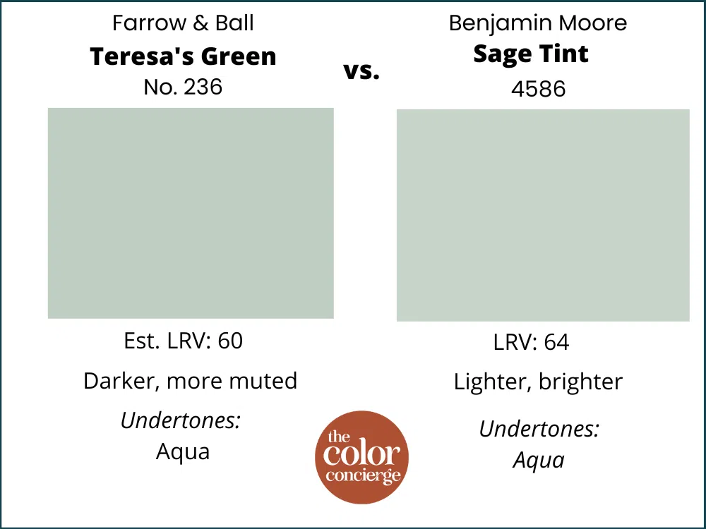
Farrow & Ball Teresa’s Green vs Sage Tint by Benjamin Moore
With an LRV of 64, Benjamin Moore’s Sage Tint (Sample) is very similar to Teresa’s Green by Farrow & Ball but a little bit lighter. It’s also brighter than Farrow & Ball’s muted version of a pale aqua paint.
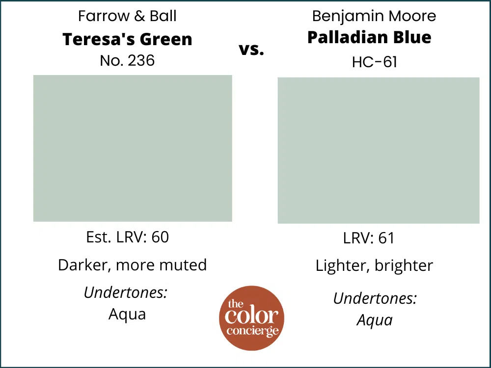
Farrow & Ball Teresa’s Green vs Palladian Blue by Benjamin Moore
These two light aqua paint colors are very similar. Benjamin Moore’s Palladian Blue (Sample) is a little bit lighter and brighter, with an LRV of 61 compared to Teresa Green’s 60.
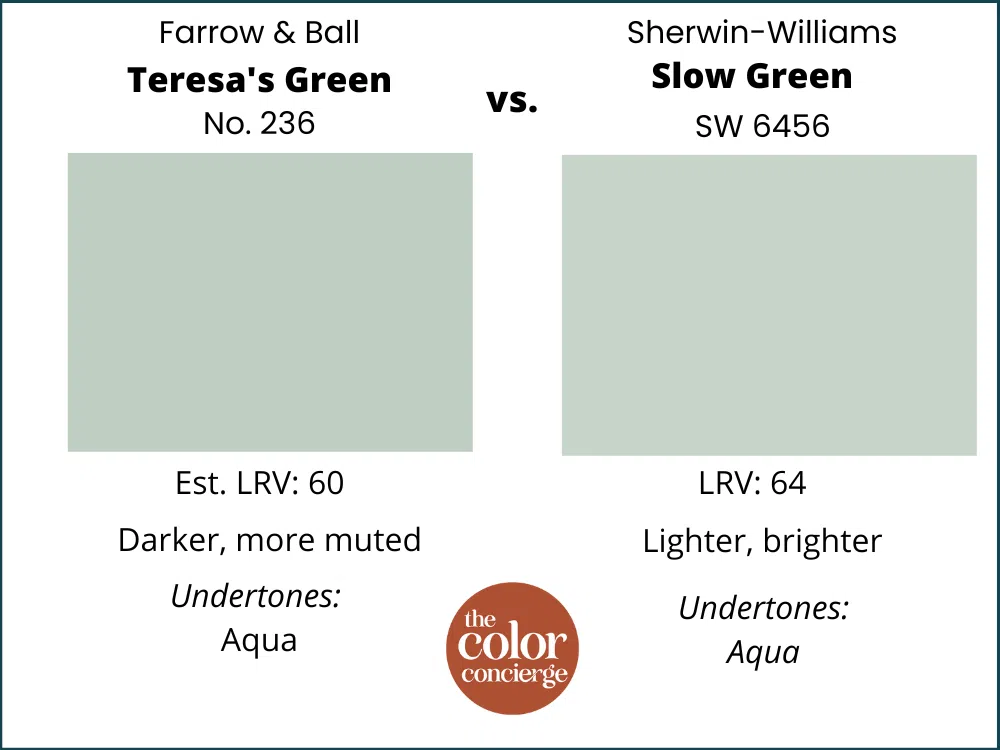
Farrow & Ball Teresa’s Green vs Slow Green by Sherwin-Williams
Slow Green by Sherwin-Williams (Sample) is a pretty good Farrow & Ball Teresa’s Green dupe. It has similar aqua undertones but it is a bit lighter and a brighter aqua than Teresa Green’s muted hue.
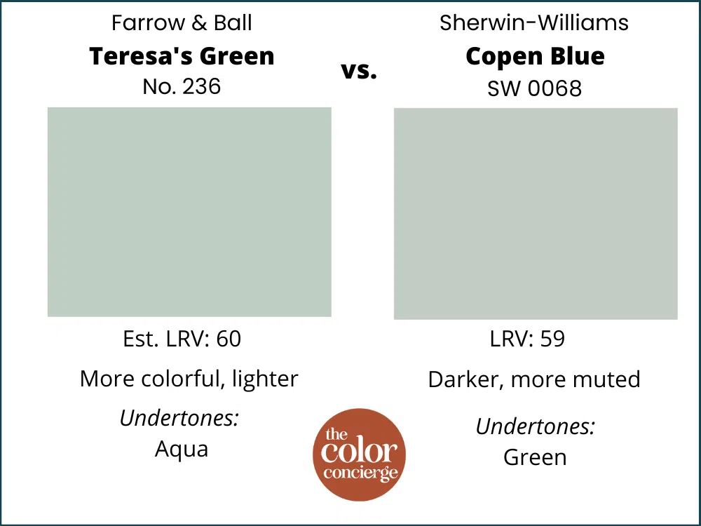
Farrow & Ball Teresa’s Green vs Copen Blue by Sherwin-Williams
Sherwin-Williams Copen Blue (Sample) is darker than Teresa’s Green and is more of a blue with green undertones than a true aqua like Teresa’s Green.
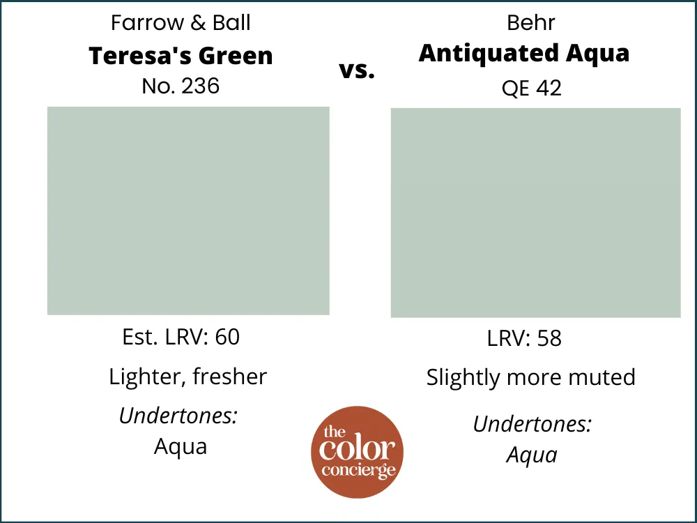
Farrow & Ball Teresa’s Green vs Antiquated Aqua by Behr
These colors are very similar, but Antiquated Aqua is a bit more muted than Teresa’s Green. Its LRV is also a little bit lower than Teresa’s Green, so it is a bit darker.
The Verdict
Farrow & Ball Teresa’s Green (Sample) is a truly beautiful paint color. It’s a soft, muted shade that still manages to glow on the wall. It is also versatile – pairing well with many other muted colors and a broad range of white paint colors. And it looks really nice paired with warm, rustic design elements like wood beams, wood floors, and brick accent walls.
Teresa’s Green is also really calming, perfect for a bedroom, living room or spa-like bathroom.
No matter how you plan to use Teresa’s Green paint, don’t forget to test your paint colors. Check out the SAMPLIZE website HERE. And NEVER, EVER use paint matches from a different brand than the one specified. The results are poor. Even though your painter may truly believe it can be done, don’t do it. See results from paint matching Here.
Online Color Consulting
Do you still need help to pick the best paint colors? Discover our Online Color Consulting Package.

Related Posts
Farrow & Ball Oval Room Blue Color Review
Farrow & Ball Cromarty Color Review
Farrow & Ball Hague Blue Color Review
Farrow & Ball Setting Plaster Color Review
About the Author

Hi, I’m Michelle Marceny, founder, owner, and Principal Color Designer at The Color Concierge. I believe a fresh coat of paint can completely transform a space. The Color Concierge was born out of my drive to help clients fall back in love with their homes. My clients trust me to help them find the perfect paint color for their home – whether it’s a whole-house paint color scheme or ideas for a single room.
Since The Color Concierge was founded in 2017, we have completed over 3000 color consultations, both online and in-person. I am a Certified Color Expert with 7 years of experience creating interior and exterior color palettes throughout North America.
We love your comments! Please note that the blog is meant as general advice, and it is not possible to give out specific answers to your paint questions. If you want more specific advice, our Online Color Consultations will help you pick your paint colours. Thank you for your understanding.
