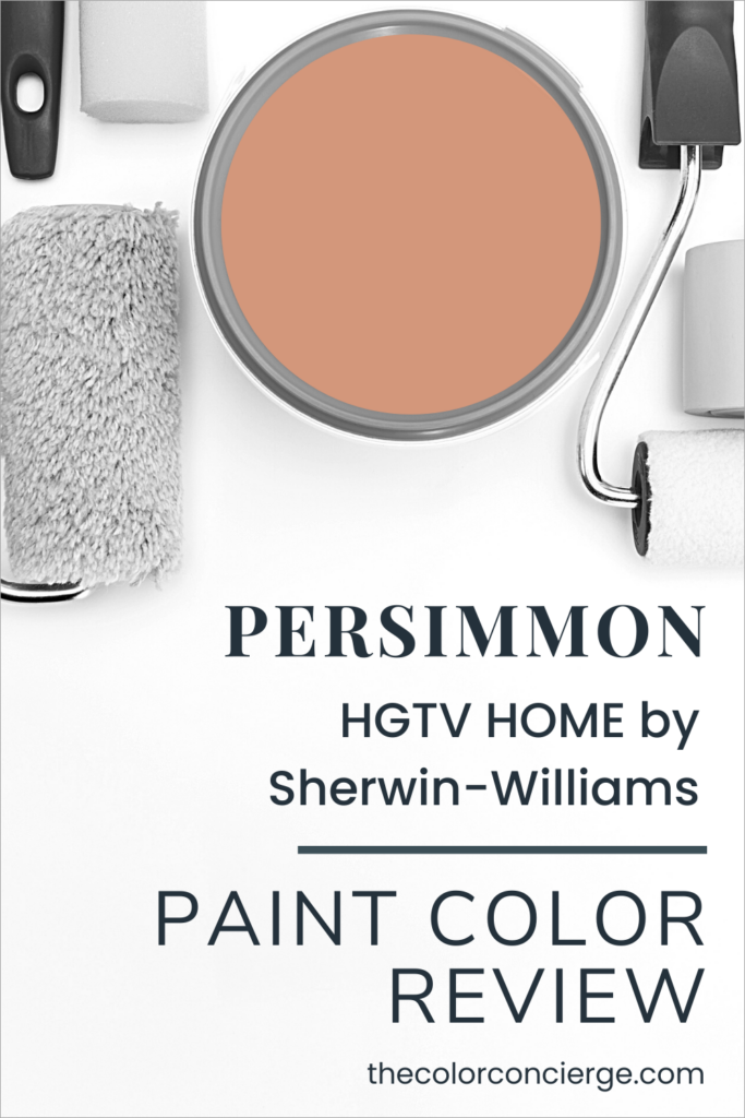
The Paint Color of the Year (COTY) season has begun, and SW Persimmon is my new color obsession.
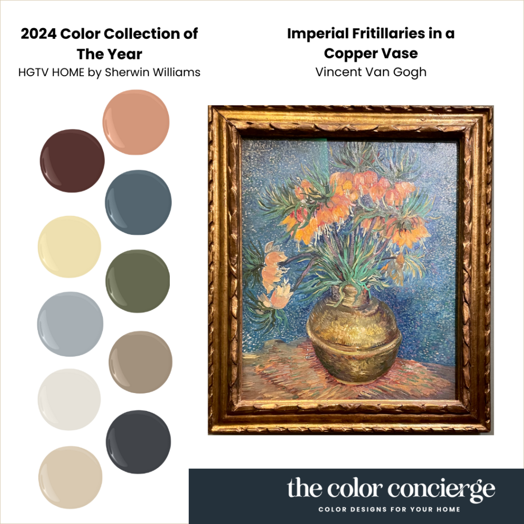
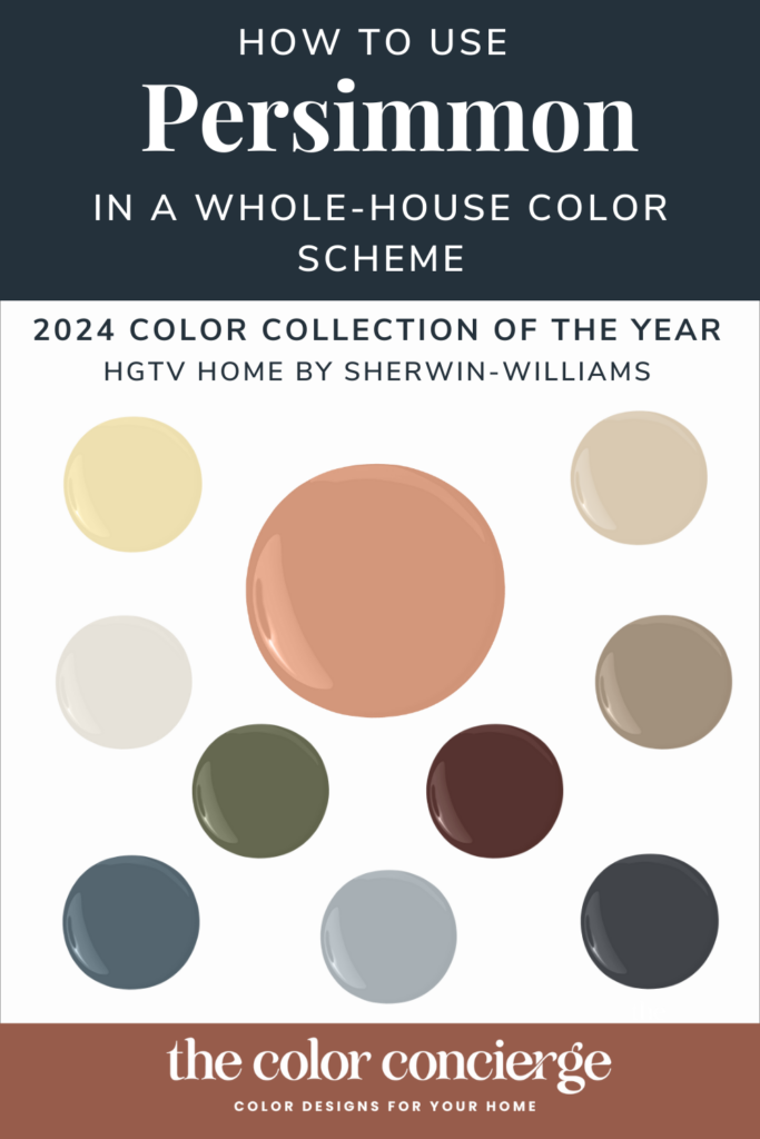
Persimmon is the HGTV Home by Sherwin-Williams 2024 Color of the Year, and we love it! It is also part of the Renewed Comfort Color Collection of the Year, which I must say was brilliantly composed.
According to HGTV Home by Sherwin-Williams Color Marketing Manager Ashley Banbury: “The shades in our 2024 Color Collection of the Year feel familiar and dependable, yet versatile, with the ability to be reshuffled to create a custom look for your home.”
The color palette reminds me of a Van Gogh painting I saw at the D’Orsay in Paris. This photo I took doesn’t do it justice, but it is one of the most beautiful things I’ve ever seen. In this post, I’ll review Persimmon and show how you can use their curated Color Collection as a whole-house palette (Article).
These paint colors are available in the HGTV Home Collection at Lowes and the Sherwin-Williams paint store.
Note: We are brand-neutral when it comes to paint companies. We were not compensated by the paint company for this article. In this article, we used photos courtesy of HGTV Home by Sherwin-Williams because we don’t have these in our collection of projects yet.
What is the difference between HGTV Home by Sherwin-Williams and Sherwin-Williams Paint?
HGTV Home by Sherwin-Williams paints are sold exclusively at Lowe’s and are targeted for DIY homeowners. It’s a convenient way to buy paint as a 1-stop shopping experience at Lowes.
This brand competes with the Behr paint brand at Home Depot. HGTV Home paints are part of the Sherwin-Williams Consumer Brands Group vs. the Paint Stores Group.
Although a large majority of their paint colors are cross-overs with the paint colors you buy at Sherwin-Williams stores, they also have some unique paint colors. The cross-over paints have the same names, but since they use different bases, the colors and sheens can be slightly different.
The color difference between the two brands of the same color is very slight, but you may not be able to touch up the Lowe’s paint color with the one that comes from the paint store. HGTV Home paint color codes are slightly different ( HGSW6339 vs. SW 6339, for example).
The HGTV Home Paint retail prices are generally lower than the ones you purchase from the Sherwin-Williams paint stores, which are targeted at professional painters. Keep in mind that pro painters usually get substantial volume discounts when they buy from the paint stores. The Sherwin-Williams paint stores also frequently have sales for consumers.
The Emerald Designer Collection of Paint Colors is not available at Lowe’s.

What kind of color is Sherwin-Williams Persimmon?
The color of the year, Persimmon (sample here), is an earthy warm apricot color, slightly lighter than terra cotta. It is happy and refreshing, but still sophisticated. It has an LRV of 39, which makes it light absorbing, but light enough to be cozy and comfortable.
How can you use Persimmon as a paint color in your home?
The first time I ever saw this color was in an office on a Zoom call. I was talking to the graphic designer that designed my new website, Karima Neghmouche, and her office was a color like this one. It was simply gorgeous. By the way, if you are looking for a web designer check out Karima Creative.
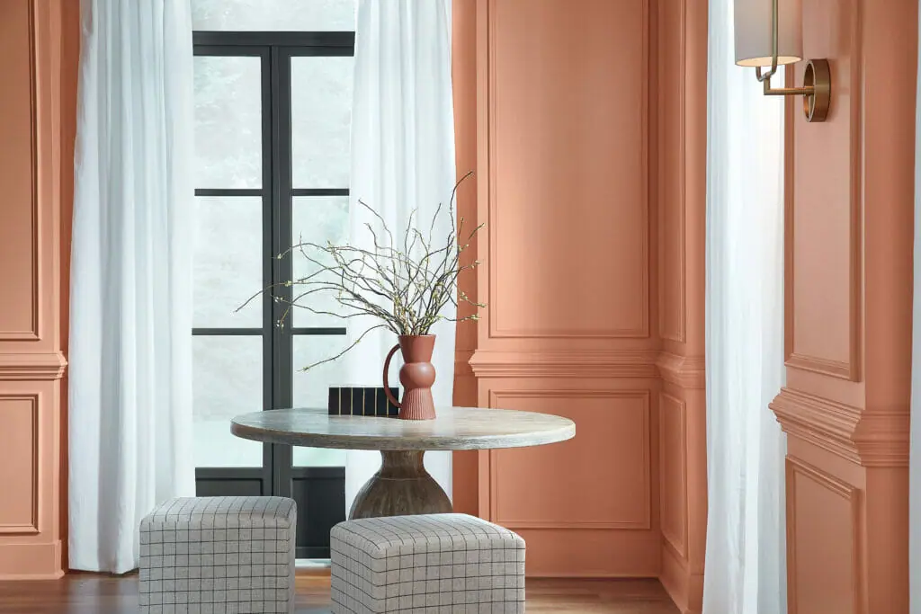
I would use Persimmon as an accent in a room with light neutrals, or a wall color in an office, bedroom, laundry room, or other single room. I would not use it as a whole-house color; it would be too much.
Below is a beautiful living room painted with Persimmon.
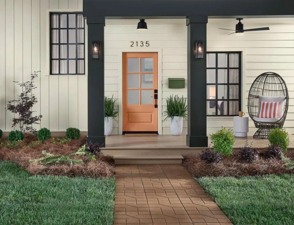
For exteriors, this is the perfect paint color for an exterior front door, especially for a pop of joyful color with a Black and white farmhouse palette. Otherwise, it might be too bright for most residential exteriors, except for most residential exteriors, except in a Victorian exterior color scheme.
What colors work well in a Persimmon color palette?
HGTV Home by Sherwin-Williams curated a gorgeous palette that can be used as a guideline for a whole-house color scheme. Note that the colors in these palettes aren’t just for paint colors, you can use them for decor and other accents.
These colors are available at Sherwin-Williams paint stores as well as Lowe’s.
Pearly White as a whole-house color
For whole-house color schemes, we like to start with a foundation neutral as the color that you would paint the Open Layout area, other common areas such as staircases and hallways, and even the whole house. We recommend Pearly White (color review) as the foundation color in this palette. It is soft, bright, lovely, and neutral. Learn more about Pearly White in our color review.
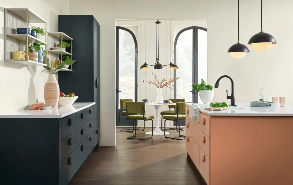
Sherwin-Williams shows Pearly White in the great room area with SW Cyberspace and Persimmon as cabinet colors. The effect is soft, cozy, and sophisticated.
This is a real-life photo of Pearly White. Learn more about it in our Pearly White color review.
Which trim, doors, and ceiling color are best with Persimmon?
For this palette, we recommend SW Pure White (color review) as the ceiling and trim color, with some exceptions. You can use the wall color for the trim as indicated in this palette.
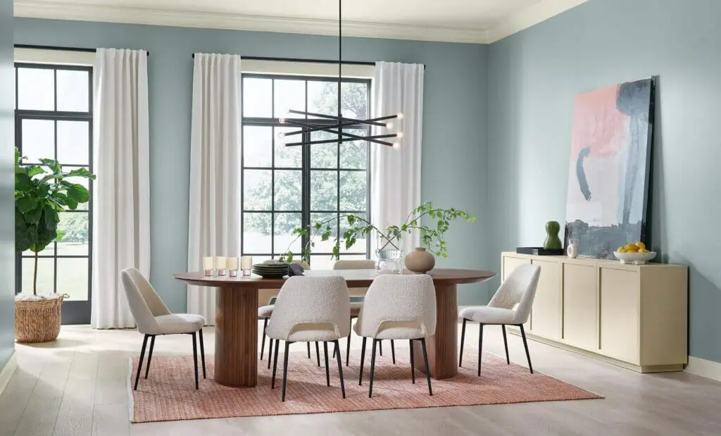
Dining Room Color – Stardew
Stardew (sample here) is one of the Sherwin-Williams paint colors that we often recommend as a bedroom or even a dining room color. The team absolutely nailed this one! Light blues can be hard to specify, but this one has just a skosh of green to warm it up, and is muted enough to be warm and friendly.
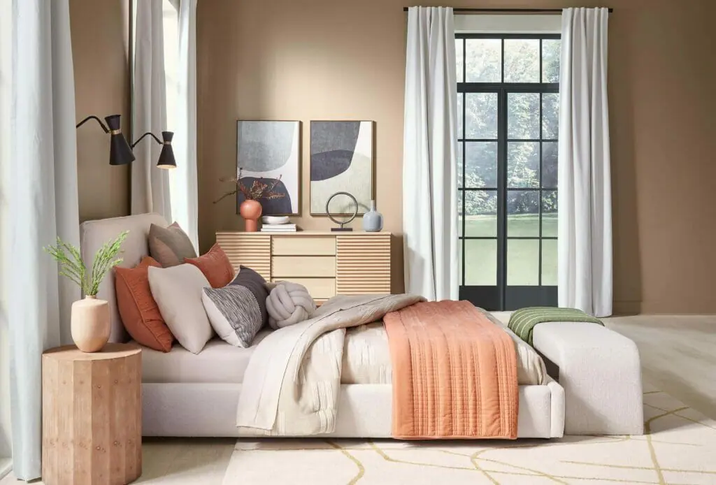
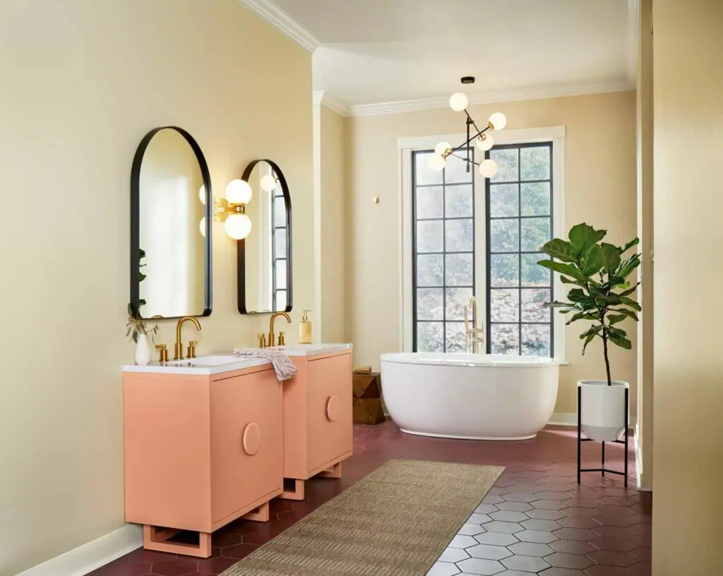
Formal Living Room Paint Color – Persimmon
Color of the Year Persimmon (sample here) is great for this type of formal living room which is a separate area in the home. Note the other colors in the palette that were pulled in to style the room to give it depth and texture. The chairs are Oakmoss, and the accent pillows and throw reflect the other colors in the palette.

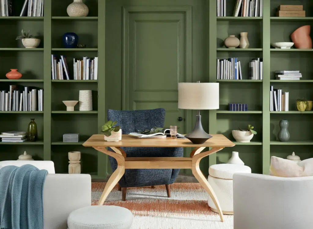
Office Paint Color – Oakmoss
Oakmoss (sample here) is a color that we frequently specify as an interior accent or exterior front door color. I LOVE this photo of an office. It’s muted enough to be elegant, and so bold and gutsy. It reminds me of a rich glamorous office in a stately historic home.
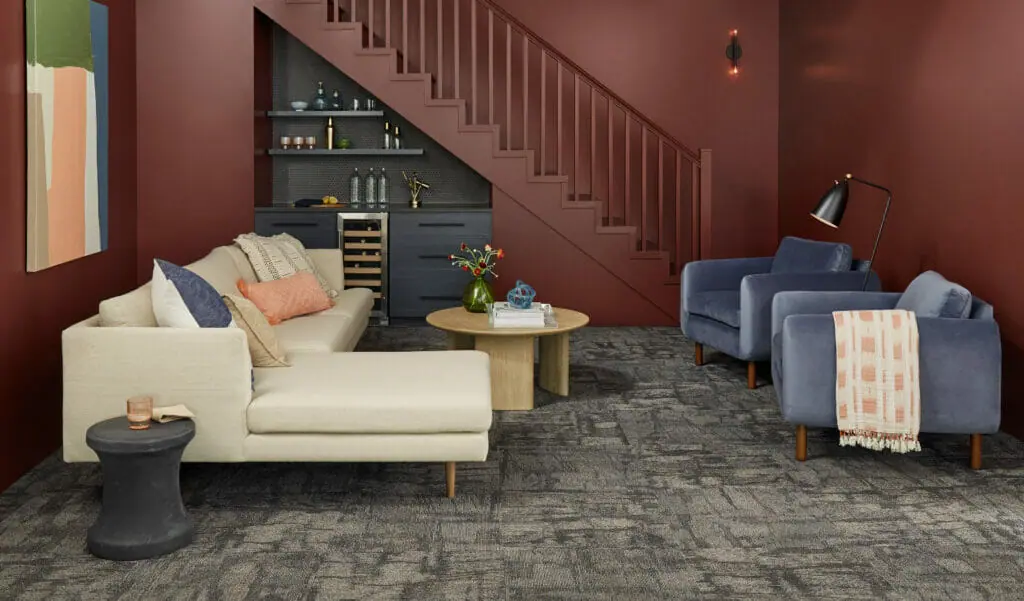
Basement Living Room – Dark Auburn
With basements, you can pick very light colors, or embrace the darkness. Dark Auburn (sample here) is a warm dark burgundy color that would look fabulous in a basement space, especially in a media or TV room. I love the way they painted the stair railings and trim the same color. Some might even paint the ceiling this color, but if you do, make sure you balance it with lighter colors and tons of artificial lighting. Use a matte sheen for this type of dark color so that it absorbs the light for a velvety feel.
I’ve never used this color before, but I really love the richness and I could also see using it for an exterior as a red color.
Utaupeia – Primary Bedroom Color
In the last year or two, we have seen a lot of brown as a primary bedroom retreat color. If it’s too dark, the color can be oppressive. Utaupeia (sample here) is a darker taupe color, that can look good in the right setting. I recommend using it in a room with tons of light and balanced with a lot of white. Otherwise, it can be too dark and, well, too brown.
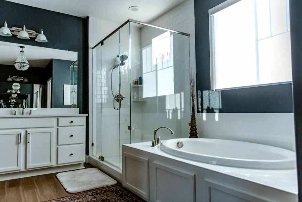
Primary Bathroom Color – Cyberspace
Here is Cyberspace (color review) in my primary bathroom – it is beautifully balanced by white cabinetry, subway tile and ceiling. It would be a lovely complement to Utaupea in a master suite.
Fun story – in a family conversation, I mentioned our bathroom was painted Cyberspace (sample here), a dark midnight color. My husband literally didn’t remember the bathroom was painted with a dark color, and the reason is that it was so well balanced by the white.
Hall Bath Color – Softer Tan
Softer Tan (sample here) is such a pretty warm beige. It is best applied in a bathroom with warmer finishes, such as tile and countertops. It also looks great with rich blues and greens. I’m not sure I would use it with Persimmon cabinets such as in the application below, but most people wouldn’t use Persimmon cabinets in their bathroom. Otherwise, it’s a great bathroom color.
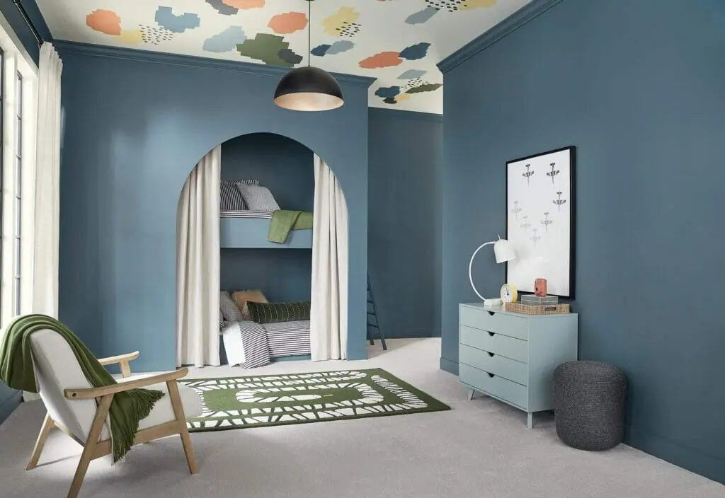
Bedroom Color – Waterloo
Waterloo (sample here) is a beautiful mid-toned blue with subtle warm green undertones. We use this color all the time as an exterior paint color, an interior accent wall, or a cabinet color for a kitchen island. I never thought of using it as a paint color for a children’s room. I think it’s beautiful. As with the other darker colors in this palette, consider balancing with lots of white. An accent wall in Waterloo might be enough if the room doesn’t have a ton of light.
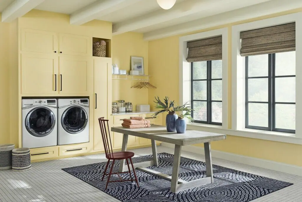
Craft or Laundry Room Color – Friendly Yellow
I have such a soft spot for yellow rooms and this one is no exception. My grandmother used to say that yellow walls were good luck. She painted the exterior as well as interior walls yellow.
Friendly Yellow (sample here) is exactly what it’s called – warm, friendly, and joyful. Perfect for a room for housework. This color should be balanced with white trim and ceilings. Warm bamboo roman shades help tone down the color, along with a beautiful dark blue area rug. This room also balances a hint of black nicely with the window frames. If you have too much black in a yellow color scheme it can be reminiscent of a bumble bee.
What is the best way to test these paint colors?
We always recommend that you test paint colors on your home because lighting can change a color completely, both with interiors as well as exteriors.
In the old days, this meant we painted a large poster board with sample pots and a huge mess.
Now we have a better way to test paint, with Samplize Peel-and-Stick samples!
- Samples pre-painted with 2 coats of real paint from the manufacturer.
- Large 9” x 14” samples to see the color better in the lighting.
- Delivered overnight
- Colors are accurate
- Less expensive than painting a large poster board with sample pots
- No mess, and no toxic paint to dispose of
I use these in my own color consulting practice for exact results. Discover Samplize peel-and-stick paint samples:
Buy 8 samples and get 2 free – no coupon code required. Order today and get samples tomorrow!
Sample the paint colors in this Persimmon color scheme by linking to the colors below:
- Persimmon (Sample)
- Dark Auburn (Sample)
- Pearly White (Sample)
- Cyberspace (Sample)
- Softer Tan (Sample)
- Friendly Yellow (Sample)
- Utaupeia (Sample)
- Stardew (Sample)
- Oakmoss (Sample)
- Waterloo (Sample)
Key Learning Points
HGTV Home by Sherwin-Williams launched their 2024 Color of the Year, Persimmon, and we couldn’t be more excited.
- Persimmon is a warm apricot color that will look great as an accent wall or accent room. Consider it as an exterior front door color(Article).
- The 2024 palette of the year can also be used as a whole-house palette (Article).
- Balance Persimmon with whites and style with the other colors in the 2024 palette.
Remember: NEVER, EVER use paint matches from a different brand than the one specified. Results are poor and there are no standards for the sheens. Even though your painter may truly believe it can be done, don’t do it. See results from paint matching here.
No matter what, always test your paint colors. It’s a standard best practice. Whenever I test my paint colors, they are perfect, and when I don’t test they turn out wrong. Learn how to test your paint colors here.
Online Color Consulting
Do you still need help picking the best paint colors? Discover our Online Color Consulting Package.

Related Posts
- How to Create a Whole-House Color Palette (Article)
- Cyberspace Color Review
- Pearly White Color Review
- SW Agreeable Gray Color Review
- SW Accessible Beige Color Review
About the Author

Hi, I’m Michelle Marceny, founder, owner, and Principal Color Designer at The Color Concierge. I believe a fresh coat of paint can completely transform a space. The Color Concierge was born out of my drive to help clients fall back in love with their homes. My clients trust me to help them find the perfect paint color for their home – whether it’s a whole-house paint color scheme or ideas for a single room.
Since The Color Concierge was founded in 2017, we have completed over 3000 color consultations, both online and in-person. I am a Certified Color Expert with 7 years of experience creating interior and exterior color palettes throughout North America.
If you liked this post, don’t forget to pin it!
We love your comments! Please note that the blog is meant as general advice, and it is not possible to give specific answers to your paint questions. If you want more specific advice, our Online Color Consultations will help you pick your paint colors. Thank you for your understanding.
