If you are considering a renovation, new build, or home purchase, an interior whole-house color scheme is a great strategy. In today’s post, we’re sharing a Benjamin Moore Simply White color palette to inspire your next project.
Creating a whole-house color palette is a simple way to ensure your home looks cohesive and put together. Think of it as a plan for the future that will make your home look like a designer was there.
Many of our big color projects start with homeowners going through a change in their lives. In the home we feature today, two stylish empty nesters were moving to live near their grandchildren. They renovated a historic cottage built in 1910 from the inside out for a lovely, fresh new home.
They wanted a classic design with white walls that would look and feel happy and comfortable. We added accent walls and painted the bedrooms, office, and living room with a harmonious color palette inspired by Benjamin Moore Simply White paint.
The Exterior project was also one of my favorites.
Keep reading to learn more about building a whole-house color palette and all the colors featured in this client’s historic modern-classic cottage.
*This post contains affiliate links for products I use and love. If you click on some links and purchase, I will get a small commission at no cost to you. This helps pay for the costs of the blog, so I can continue to offer great content to our readers.
About The Color Concierge
Our Colorado-based paint color consultants make finding the right paint colors for your home easy. Whether you’re painting the exterior or interior of your home, our simple yet effective process lets us get your paint color right the first time. We’ve helped thousands of homeowners transform their homes into a space they love. Learn more about ONLINE COLOR CONSULTATIONS today.
Don’t forget to sample your paint colors
We always recommend that you test paint colors on your home because lighting can change a color completely, both with interiors as well as exteriors.
In the old days, this meant we painted a large poster board with sample pots and a huge mess.
Now we have a better way to test paint, with Samplize Peel-and-Stick samples!
- Samples pre-painted with 2 coats of real paint from the manufacturer.
- Large 9” x 14” samples to see the color better in the lighting.
- Delivered overnight
- Colors are accurate
- Less expensive than painting a large poster board with sample pots
- No mess, and no toxic paint to dispose of
I use these in my own color consulting practice for exact results. Discover Samplize peel-and-stick paint samples:
Buy 8 samples and get 2 free – no coupon code required. Order today and get samples tomorrow!
How do you pick a whole-house palette for your home?
Our design guidelines for whole-house color schemes are detailed in the post How to Create a Whole House Color Palette (With Real-Life Examples) (Article), and Why A Whole-House Color Scheme Matters (Article).
Before I share our clients’ Benjamin Moore Simply White (Sample) color palette, I wanted to review our method for picking whole-house colors again.
1. Pick your foundation color for the common areas.
We usually start in the kitchen, since it is truly the heart of the home. A foundation color is typically a light neutral, such as a white, gray, beige or greige. In this case, we went with BM Simply White, a versatile warm white with strong yellow undertones that looks beautiful in many different kinds of lighting – even darker rooms.
2. Select a white paint color for the trim and ceiling.
Every good color palette needs great white paint (Article) for trim and ceilings. This should be used throughout the home on all the trim, window frames, doors, and kitchen cabinets (if they are white). If you move into a home and the trim looks good, then start with the trim color that you have.
Many homes in the United States today have Sherwin-Williams Extra White (Color review article) trim. That trim paint works really well for many color schemes. But if you have the option to choose a new trim color, look for one that works well with the wall colors in your palette.
3. Pick paint colors for the secondary living spaces
Next, we move to the adjoining spaces, such as dining rooms, offices, bathrooms, and bedrooms. I love using blues, greens, and neutral paint colors with colorful undertones when choosing paint colors for bedrooms (Article) and other smaller spaces. These rooms are great places to include accent walls (Article) as well.
4. Select accent colors last.
The biggest mistake homeowners make is picking their accent walls without considering their décor. These should relate to your décor, area rugs, furniture, art, and other elements.
It’s easier to pick an accent color to coordinate with your decor than a piece of art to match an accent wall.
How many colors should I use in my interior whole-house palette?
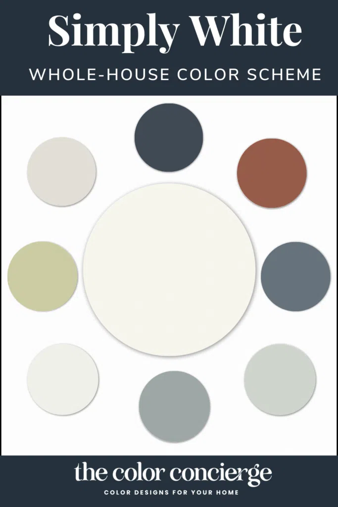
The number of colors varies depending on the size of the home, but I like to choose from 4 to 8 paint colors when building a palette. The colors include a trim/ceiling white, the foundation color, and additional colors for adjacent rooms.

BM Simply White Color Palette from a Real-World Renovation
Our homeowners were looking for a classic design with white walls that would look and feel happy and comfortable. They didn’t want a home with white paint that looked stark, cold, and uninviting. After we picked the white foundation color, we painted the bedrooms, office, and living room with a harmonious color palette, and then added the accent wall colors.
Keep reading to learn more about all of the paint colors selected for this color scheme, or purchase our pre-made Benjamin Moore Simply White color palette guide.
Benjamin Moore Simply White for the Foundation Neutral
We started the project by selecting a foundation white color, Benjamin Moore Simply White (color review). The home in this project has relatively low light, with houses on the North and South sides. The garage is a separate building on the West side of the home. The property has large mature trees that shade the house in the summer, so we needed a warm, light, and bright color scheme that wouldn’t look dingy in the corners.
We went with Benjamin Moore Simply White walls because it’s one of our favorite paint colors for homes with low light (Article).
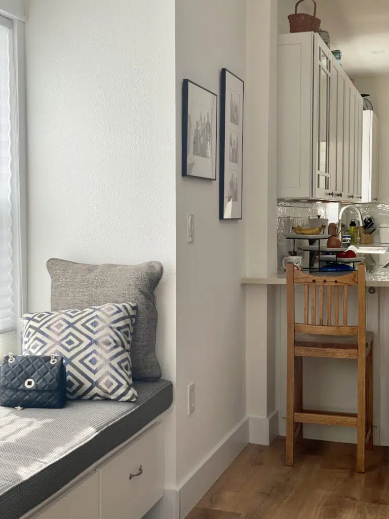
BM Simply White (Sample) paint is a magical bright white color that lights up spaces with low light without looking dingy. It works the way it does because it combines a low LRV of 89.5 with strong yellow undertones that keep it looking warm and inviting. BM Snowfall White works similarly.
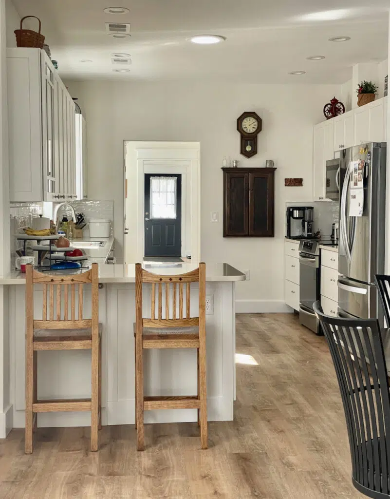
Benjamin Moore Oxford White – Kitchen Cabinet, Trim, and Ceiling Color
Our next step was to pick the white trim color for this color palette, which is used on all of the baseboards, molding, cabinets, and trim throughout the home.
The homeowners wanted white kitchen and bathroom cabinets throughout the home. A cultural convention is to paint the trim the same white color as the cabinets. The finishes in the home were clean and crisp, so we picked BM Oxford White trim, a clean white color. Oxford White (Sample) also looks great with Simply White.
We like to pick a ceiling white the same as the white trim, so we selected Oxford White as the ceiling color, with ceiling paint in an ultra-flat sheen.
In the kitchen, Oxford White cabinets add depth to the monochromatic palette and keep the space looking bright.
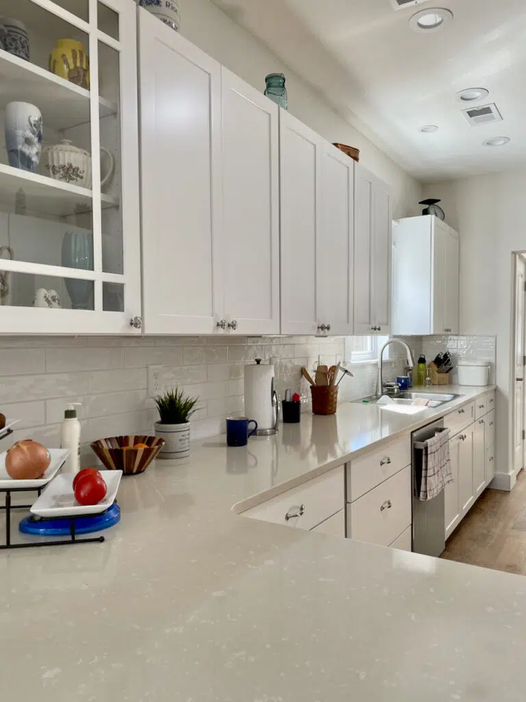
Oxford White is one of our favorite interior white trim colors. It is cleaner and brighter than Simply White. We like to pick trim and ceiling colors that are the same or brighter than the foundation color. Our homeowners prefer a contrast between walls, trim, and ceilings so we picked Oxford White.
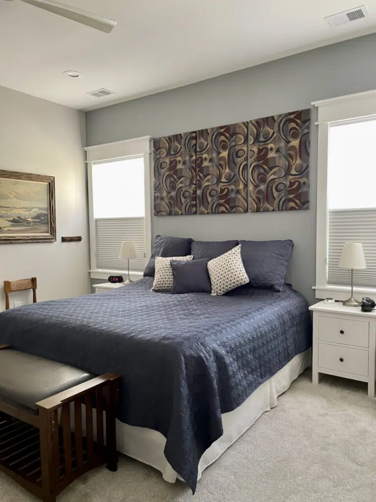
Benjamin Moore Classic Gray Primary Bedroom
Our clients wanted a calming, neutral bedroom that would fit in with the rest of their home’s color palette. Benjamin Moore Classic Gray (Sample) was an easy choice. Classic Gray (color review) is a warm gray thanks to nearly invisible warm green undertones, which can flash violet in cooler light.
Because its undertones are so subtle, this paint pairs really well with both other warm or cool colors. It laid a great foundation for the client’s bedroom, which featured navy blue and dark wood decor and accents.
It also looks beautiful with the gray-blue accent wall in this space, painted with Benjamin Moore Adagio (Sample). Adagio is a beautiful mid-tone gray with blue undertones.
Benjamin Moore Gray Cashmere Guest Room
For this client’s guest room, we wanted a color that was neutral enough to pair well with the rest of the home, but still offered some color. We went with Benjamin Moore Gray Cashmere (color review). With an LRV of 65, it’s light and bright but still saturated with color.
Gray Cashmere (Sample) is a muted blue-green color. Its undertones are more green than gray, although in cool light it looks bluer. The way the color appears on the wall depends on the lighting in the space and on the other colors around it.
When you look into this room from the doorway, it looks grayer than you would expect because it’s contrasted with Simply White walls and Oxford White trim from the adjoining room.
Standing inside the office, however, the color looks brighter and more blue-green.
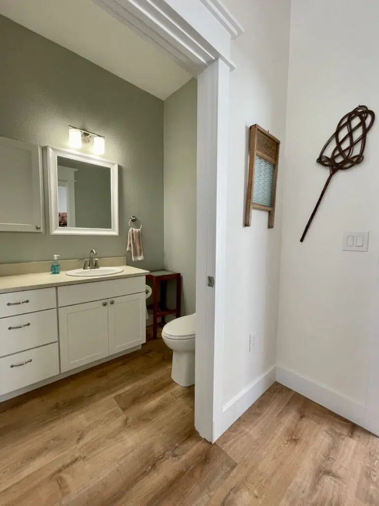
Benjamin Moore Gray Cashmere Powder Room
One of the best ways to help a whole-house color palette feel cohesive is by repeating the same colors throughout different spaces in the home. We continued our use of Gray Cashmere (Sample) from the guest bedroom to the powder room.
This room is windowless, so we needed a color with enough pigment to hold up in the shadows and look good with artificial light. With the warm natural light from the hall area, Gray Cashmere looks more green than blue in this space.
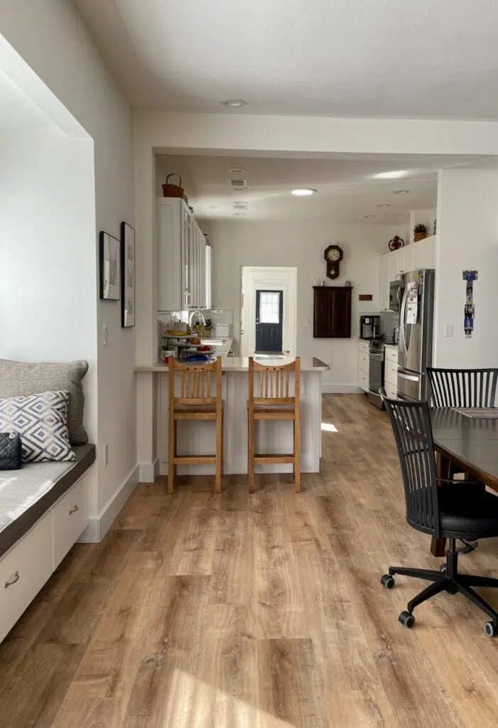
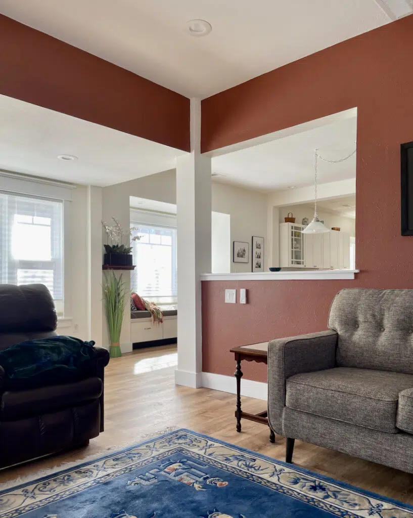
Colorful Accents for the Open Layout Area
This whole house color scheme was rounded out by incorporating warm wood and earthy tones through the floors and decor. We also used a variety of colorful paint accents throughout the open-concept main living area of the home.
We focused on Benjamin Moore Simple White color combinations that would keep this space looking cohesive even with the pops of color.
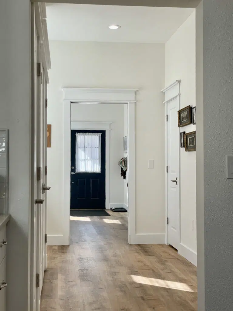
BM Hale Navy Front Door and Back Door
We painted the interior entry doors BM Hale Navy (color review), which always looks fabulous when contrasted with white paint. With its subtle green undertones, Hale Navy (Sample) is a muted, warm blue that pairs well with the warmth of Simply White paint.
A rich blue door can make an entry so welcoming! A colorful interior front door elevates the design of a home. In this client’s home, the blue front door ties in with the blue accent wall in the dining room.
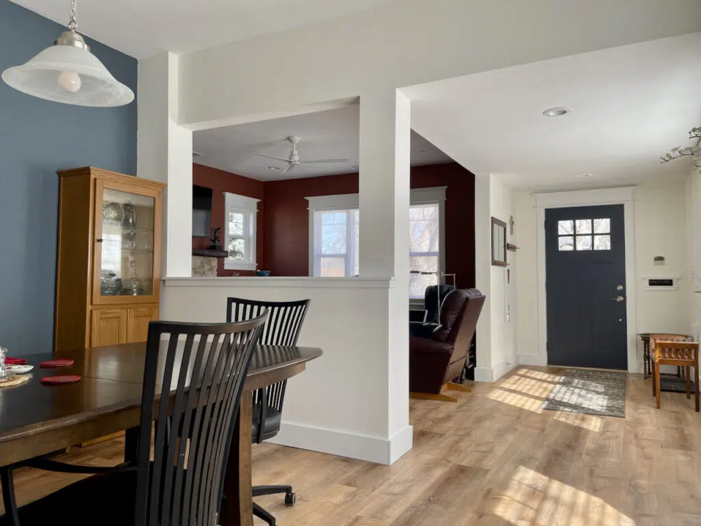
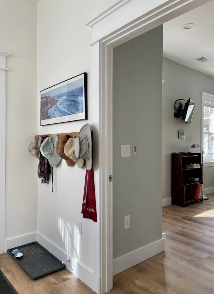
The home’s common areas were a shotgun layout so that you could see the back door from the entry. With the shadows that play with the Simply White paint, the arches that go through the house are lovely.
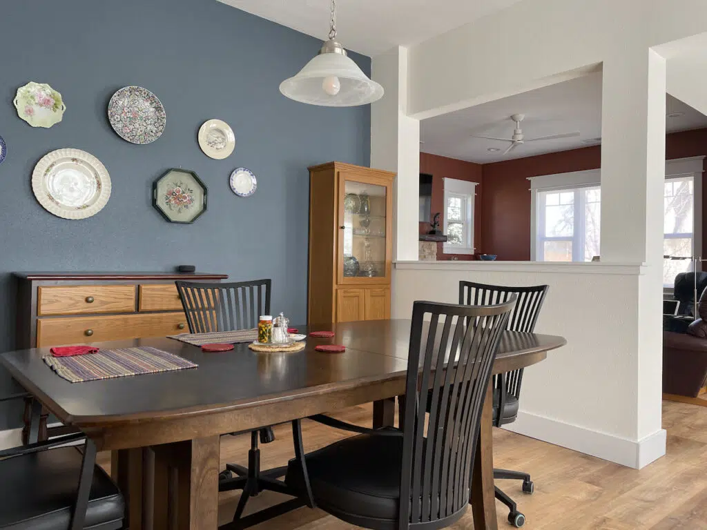
Dining Room Accent Wall
The dining room was part of the open layout area but had a perfect wall to add an accent. We picked BM Britannia Blue (Sample), one of our favorite mid-toned accents. In a light room, it looks soft, rich, and silky.
It ties in beautifully with the BM Hale Navy interior doors and adds a lovely pop of color that looks beautiful with the warm wood floors and surrounding BM Simply White walls.
Living Room Paint Color
I had planned to paint the living room Simply White, the same as the rest of the open layout spaces. This would have looked warm, bright and lovely but the homeowner was interested in a rich accent color for this space.
We picked Benjamin Moore Giant Sequoia (Sample), a rich terra cotta color, for the living room and it worked beautifully!
The living room as a whole is the accent in this case vs. just a wall. The color is a foil for the Britannia Blue accent in the dining room and the interior front door. And it looks so beautiful next to the Simply White walls of the main level.
Although this was a single room, we considered this an accent because the living room is open to the common spaces with a half wall.
They picked a warm and simple stacked stone for the fireplace.
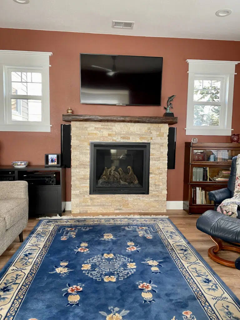
Even though the living room rust color is darker, it creates a beautiful color story with the dining room and the entry.
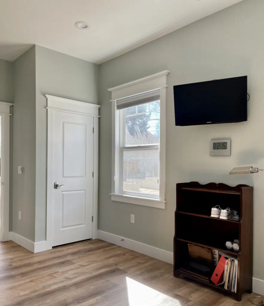
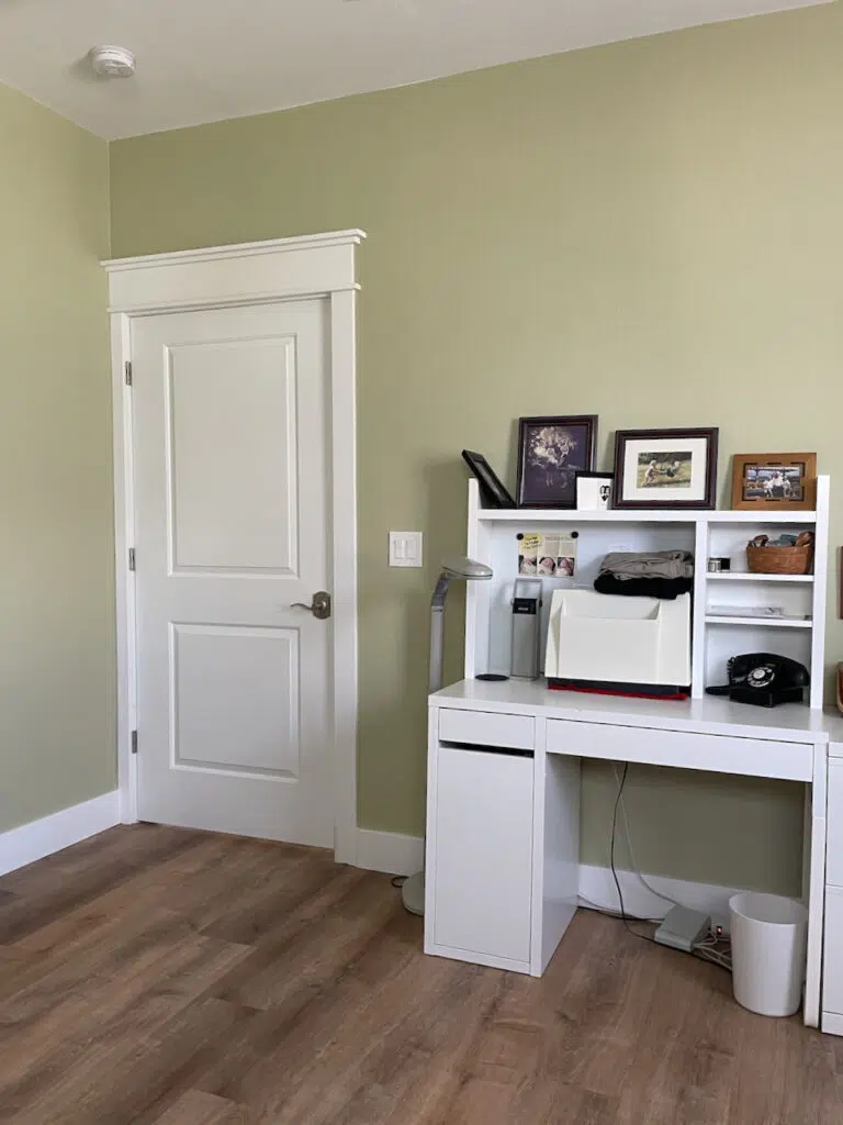
North-Facing Office
I’m adding this room last because it is so very unique! You could consider it an accent, but I don’t. We went all out in this room.
The office has north-facing walls with an ancient tree outside the window, and another house next door. We knew the room would have very low light, so we picked a color that would light up the room.
One of our favorite surprises for this home is the rich and bright green color we picked for the walls. Fernwood Green (Sample) is one of those colors that looks terrible on the swatch but is just lovely on the walls. The color is more muted than you would think, and a very mid-century modern choice.
Fernwood Green is ideal for low-light rooms and looks great with clean whites such as Oxford White (Sample) and Chantilly Lace (Sample). A perfect application for this color!
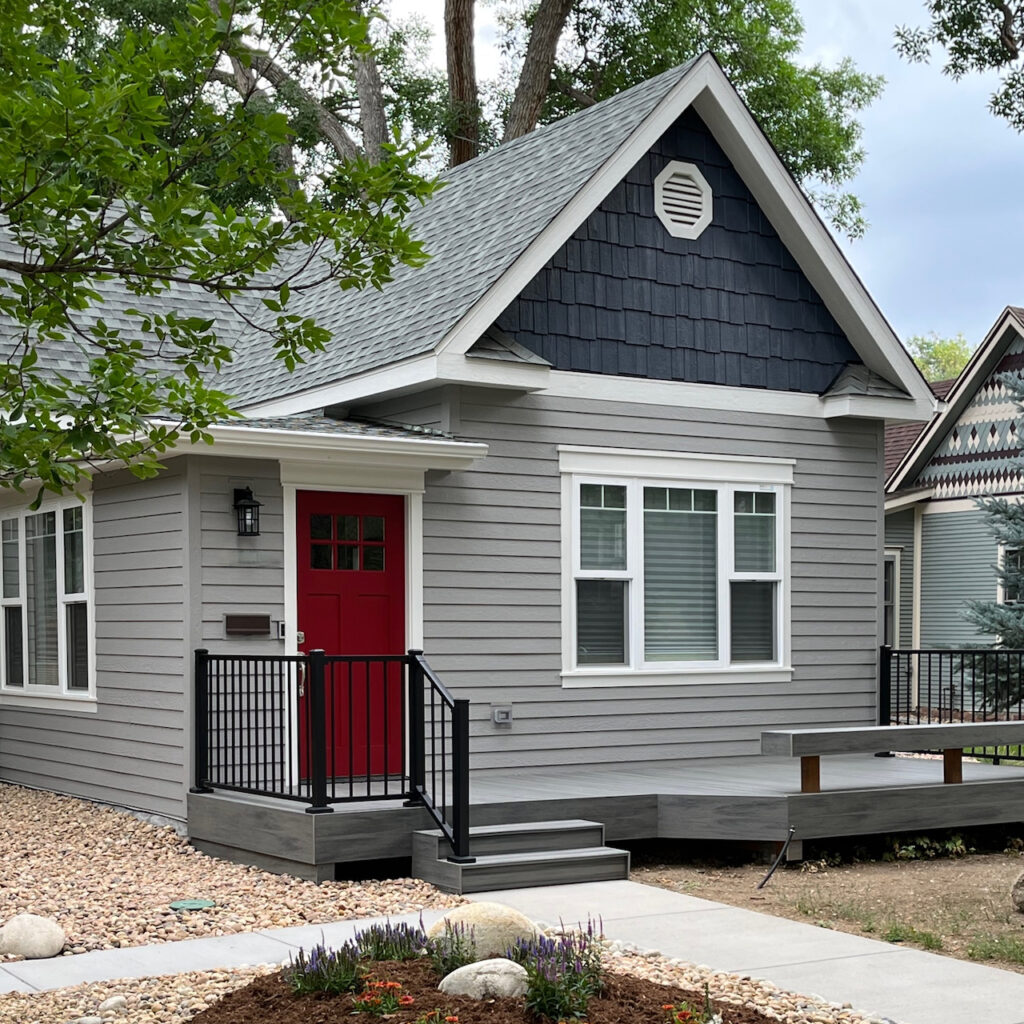
Exterior Color Palette for the BM Simply White Home
We also picked the exterior paint colors for this home. While we knew we weren’t going to use a BM Simply White color palette for the exterior, we still wanted colors that would coordinate with the look inside the home.
We plan to take more photos later this spring so that you can see how beautifully this home looks with the foliage. For now, check out one of our favorite exteriors. The siding is BM Willow Creek (Sample), the trim is BM Classic Gray (Sample), The shingles are BM Polo Blue (Sample), and the front door color is SW Stolen Kiss (Sample), my favorite red front door color!
If you’d like more ideas for a whole-house color palette, consider one of our Ready-Made Palettes, or hire us for an online color consultation!
Explore all the colors in this Benjamin Moore Simply White Color Palette
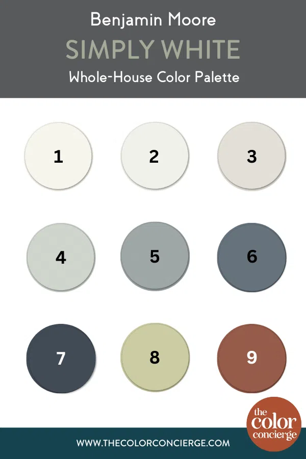
- Benjamin Moore Simply White (OC-117) (sample)
- Benjamin Moore Oxford White (CC-30) (sample)
- Benjamin Moore Classic Gray (OC-23) (sample)
- Benjamin Moore Gray Cashmere (2138-60) (sample)
- Benjamin Moore Adagio (1593) (sample)
- Benjamin Moore Britannia Blue (1623) (sample)
- Benjamin Moore Hale Navy (HC-154) (sample)
- Benjamin Moore Fernwood Green (2145-40) (sample)
- Benjamin Moore Giant Sequoia (2094-30) (sample)
Key Learning Points
Creating your own palette is a simple way to change the whole look and feel of your home – whether you’re doing extensive renovations or not.
Remember, if you want to build your own whole house palette, it’s important to follow these steps:
- Pick your foundation color for the common areas
- Pick a white trim color (and stick to it)
- Select paint colors for secondary living spaces (bedrooms, bathrooms, dining areas, etc.)
- Pick a few accent colors to use throughout your home
Remember: NEVER, EVER use paint matches from a different brand than the one specified. Results are poor and there are no standards for the sheens. Even though your painter may truly believe it can be done, don’t do it. See results from paint matching here.
No matter what, always test your paint colors. It’s a standard best practice. Whenever I test my paint colors, they are perfect, and when I don’t test they turn out wrong. Learn how to test your paint colors here.
Get an Expert-Made Whole House Paint Color Scheme
For more details, read our full step-by-step (Article) guide to creating a whole house color palette, or contact The Color Concierge to learn more about our in-person and Online Paint Color Consultations.

Related Posts:
- Willow Creek Cottage Exterior (same house)
- Simply White Color Review
- A Timeless Benjamin Moore Simply White Color Scheme for the Whole-House (Article)
- Whole-House Color Palette with Real-World Examples (Article)
- Why a Whole House Color Scheme Matters (Article)
- Benjamin Moore Simply White Color Review (Article)
About the Author

Hi, I’m Michelle Marceny, founder, owner, and Principal Color Designer at The Color Concierge. I believe a fresh coat of paint can completely transform a space. The Color Concierge was born out of my drive to help clients fall back in love with their homes. My clients trust me to help them find the perfect paint color for their home – whether it’s a whole-house paint color scheme or ideas for a single room.
Since The Color Concierge was founded in 2017, we have completed over 3000 color consultations, both online and in-person. I am a Certified Color Expert with 7 years of experience creating interior and exterior color palettes throughout North America.
We love your comments! Please note that the blog is meant as general advice, and it is not possible to give out specific answers to your paint questions. If you want more specific advice, our Online Color Consultations will help you pick your paint colours. Thank you for your understanding.
