Learn more about my Benjamin Moore Bella Blue powder room with wallpaper and wainscoting in this project spotlight.
When I decided to work on a powder room makeover in my own home, I knew I wanted to try something a little different. I have six bathrooms in my home and I wanted to create one that was truly unique and special.
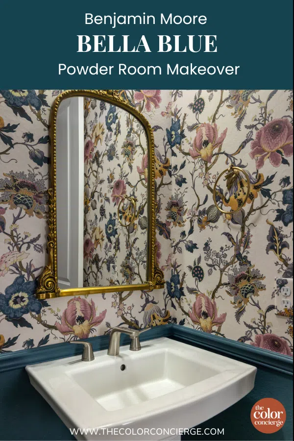
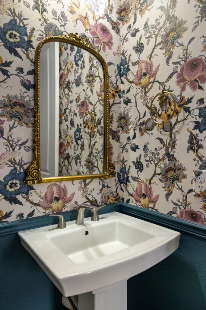
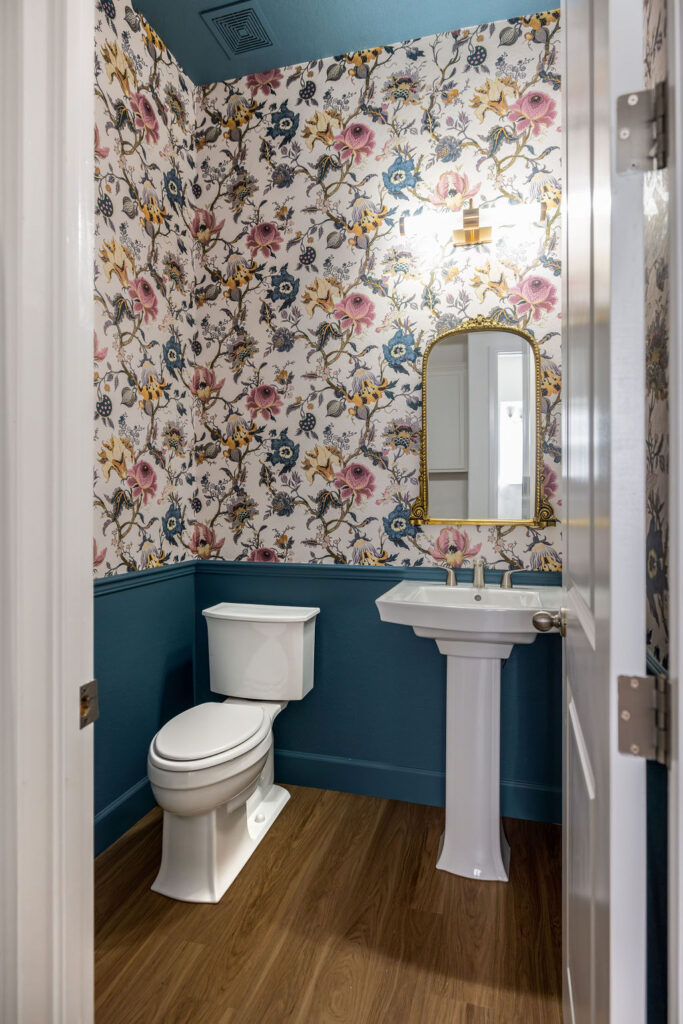
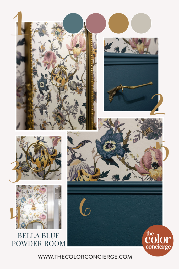
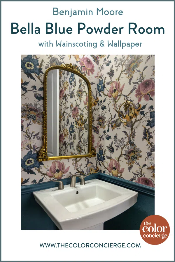
This Benjamin Moore Bella Blue (720) bathroom absolutely meets that criteria! The combination of gorgeous, slate teal paint, elegant wallpaper, wainscoting, and gold bathroom finishes came together to create a truly beautiful space that my whole family loves. Seriously, we have six bathrooms in our home and this one (located just off our mudroom as you enter from the garage) gets used the most often because it’s so pretty!
This project also represents the first time I have ever installed wallpaper. In the past, I’ve always ripped it down! But I found this beautiful pattern about two years ago and considered it very carefully before pulling the trigger. Now that this powder room makeover is complete, I have no regrets. This room brings me and my family so much joy!
Along the way, I learned a lot about how to choose wallpaper, how to pair wallpaper with paint, and how to bring a space together with the right finishes. Keep reading for a complete walkthrough of this Benjamin Moore Bella Blue powder room.
*This post contains affiliate links for products I use and love. If you click on some links and make a purchase, I will get a small commission at no cost to you. This helps pay for the costs of the blog, so I can continue to offer great content to our readers.
About The Color Concierge
Our Colorado-based paint color consultants make finding the right paint colors for your home easy. Whether you’re painting the exterior or interior of your home, our simple yet effective process lets us get your paint color right the first time. We’ve helped thousands of homeowners transform their homes into a space they love. Learn more about ONLINE COLOR CONSULTATIONS today.
Sample Bella Blue
We always recommend that you test paint colors (article) in your home because lighting can completely change a color, both on interiors and exteriors.
In the old days, this meant we painted a large poster board with sample pots and a huge mess.
Now we have a better way to test paint, with Samplize Peel-and-Stick samples!
- Samples pre-painted with 2 coats of real paint from the manufacturer.
- Large 9” x 14” samples to see the color better in the lighting.
- Delivered overnight
- Colors are accurate
- Less expensive than painting a large poster board with sample pots
- No mess, and no toxic paint to dispose of
I use these in my color consulting practice for exact results. Discover Samplize peel-and-stick paint samples and sample Bella Blue (Sample) via the link below.
How to Pick Wallpaper for a Powder Room (or Any Space)
Picking wallpaper is a similar process to choosing the perfect paint color. You want to find a pattern you really love, but it’s also important to consider the wallpaper within the space you’re installing it.
If you’re completely redesigning a space like I was with this powder room, then you don’t have to worry as much about making sure your wallpaper coordinates with your finishes. Instead, pick a pattern you love and design the room around it.
Find the Right Color and Pattern
Think about which colors you want to use within a space before selecting your wallpaper. And make sure to pick the wallpaper before you pick your paint color. It’s much easier to match paint to wallpaper than the other way around!
If you have a bathroom color palette selected for the room, look for a patterned paper that incorporates many of the colors in that palette.
Consider the look and feel you want your space to have when selecting a pattern, too. Do you want a clean, modern look? Choosing a simple, geometric pattern might work best. Are you looking for an elegant design? A classic floral pattern is a great choice. Want something bold and funky? Look for abstract shapes and pops of metallic and bright colors.
Be sure to consider the size of the pattern and the size of your space when choosing wallpaper, too. A pattern that is very small and repeats often could end up looking too busy in a small space. A pattern with great big shapes or flowers can get cut off.

Sample Your Wallpaper
When you pick a wallpaper, get a sample first to make sure the colors and the product will actually work in your room. Most suppliers will sell you a small sample for a nominal fee. Then test, test, test – especially with a sample of the paint color you plan to use. You can buy your paint color samples online from Samplize.
Buy Enough Wallpaper
One of the biggest mistakes I see people make when choosing wallpaper is not buying enough. Calculate how much wallpaper you’ll need based on the size of your room using this online wallpaper calculator from Family Handyman. Then, buy more than you need. Consider checking in with your wallpaper hanging pro (if you have one). They can scope out the space and your pattern to advise you how much to buy.
Pro Tip: When you order your wallpaper make sure you get it all at once. Colors can vary from batch to batch, so you don’t want to have to buy more later.
My Powder Room Wallpaper
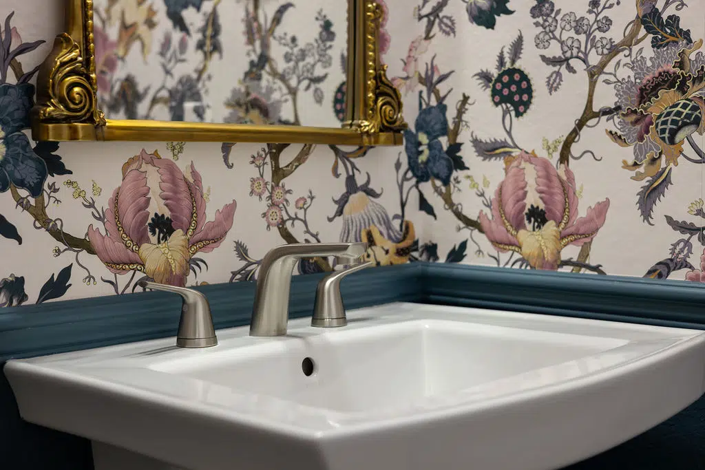
For my powder room makeover, I knew I wanted to create a beautiful, elegant space that felt like an elevated oasis in my home. I first spotted this House of Hackney Artemis Wallpaper in Ivory two years ago and immediately fell in love. Still, I thought long and hard about it before finally making my purchase and finding the best paint color to match the wallpaper.
The rest of my home is fairly minimalistic, so I picked this pattern as a maximalist jewel to balance the simplicity in the rest of the home.
I’m so happy with my selection! I just love the soft palette of warm ivory, soft pink, slate blue, teal, and gold. It was the perfect color foundation for this powder room design.
How to Match Paint to Wallpaper
While installing wallpaper was new to me, picking paint to match wallpaper was not. As a color consulting practice, we don’t select wallpaper but we pick paint colors to harmonize with wallpaper all the time.
When you pick paint colors to go with wallpaper, the easiest way is to pick a color that is exactly the same shade as one of the colors in the wallpaper. You can also pick a color that is a darker or lighter version of one of the colors.
My Pick: Benjamin Moore Bella Blue
I am so happy with the paint color I chose to go with my powder room wallpaper. The name of the color is Benjamin Moore Bella Blue (Sample). Bella Blue is a new color to me and I hadn’t ever recommended this color to a client before. But I can definitely see myself using this color in the future!
What color is Benjamin Moore Bella Blue?
Bella Blue is a gorgeous medium blue paint color with strong green undertones that keep the color leaning toward teal. It has plenty of gray in it, so it looks more muted on the wall than you might think.
I often refer to this family of colors as “AirBnb blue”. It seems as if so many of those properties have this type of color as an accent wall. It’s not unexpected, it’s beautiful and pleasing to the eye.
With an LRV of 17.5, Benjamin Moore Bella Blue is a bold, deep color that still has plenty of pigment and won’t be overwhelming – even in a small space like my powder room. If you picked a color that was much darker, it would start to go black inside.

Does Benjamin Moore have special paint for bathrooms?
Yes, they do! I used the Benjamin Moore Aura Bath and Spa (Article) product, which is an excellent paint that is formulated for high-humidity environments. This type of paint is only available in a matte sheen. I used BM Bella Blue in matte sheen for both the ceiling and wainscoting in this space.
For the wainscoting, I experimented with one sheen – matte – for all surfaces and it looked great. The wainscoting is really a poor woman’s version, made with chair rail, drywall, and base molding. I painted all three surfaces with Matte sheen and it looked just fabulous. I’ll absolutely recommend this to my clients in the future for bathroom wainscoting.
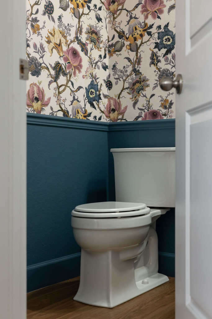
I also used the matte sheen (Article) for the ceiling in this powder room. I absolutely love the way the painted ceiling helps to bring this room together and really elevates the look.
Powder Room Wallpaper Installation Tips
This powder room makeover was my only first-hand experience installing wallpaper, and I learned a lot I wanted to share with you. Use these tips to ensure you get the best installation for your perfect wallpaper.
Start with a Smooth Wall
Out west where I live, rough drywall textures (orange-peel) are really common, and you usually need to skim-coat the walls before applying wallpaper. This is an expensive and messy process where you create a very smooth wall for the wallpaper to be installed.
You may not know this about me but I’m incredibly impatient. I didn’t want to go through the messy and time-consuming process of having the walls above the chair rail drywalled. Instead, my wallpaper installer suggested that I use a wallpaper liner to smooth out the wall.
The benefit of using a liner is that you can skip the skim coating process, and then if you ever want to remove the wallpaper it is removed easily with the liner underneath.
I took his advice and chose the liner. You can still see some bumps through the wallpaper – it’s not perfect. But since this is a very busy pattern, and my tolerance for the skim-coat process was low, I’m overall okay with it.
If I had to do it over again, I’d probably get my very bumpy wall skim-coated, especially since this wallpaper was so expensive. But I don’t think anyone notices it but me.
Use a Professional
If you only follow one tip from this post, let it be this one: hire a professional wallpaper installer. The wallpaper I chose was really expensive, and we almost ran out of it. I never would have been able to make it work without his artistry.
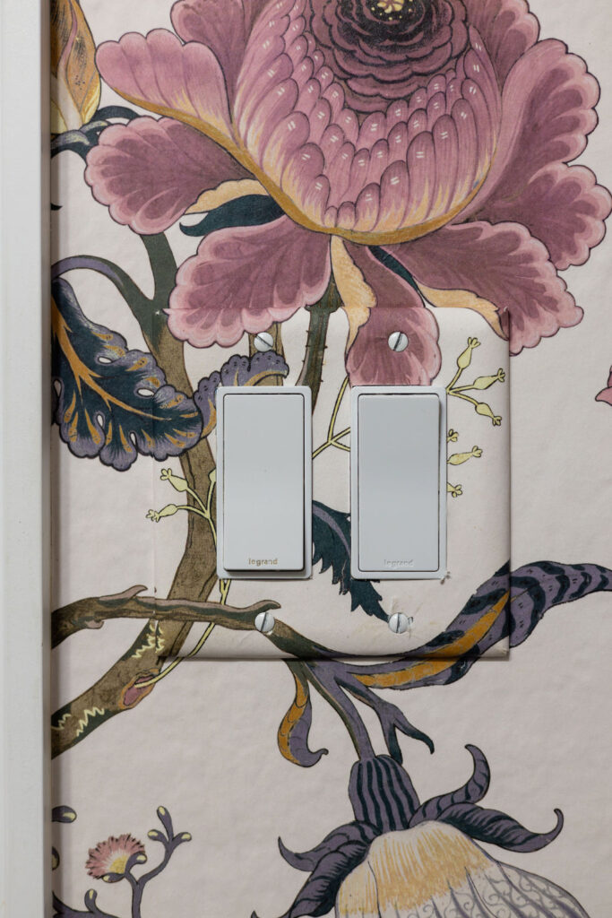
A pro will understand how to make the paper stretch if you didn’t get enough. They also know how to add perfect details like covering the light switch to match the wallpaper seamlessly without disrupting the pattern. Just look at the beautiful job my installer did!
Finishing Touches to My Bella Blue Powder Room
The combination of deep blue paint, colorful wallpaper, wainscoting and a painted ceiling already completely transformed this powder room.
But I knew that if I wanted to take the elegance of this room to a whole new level (which I did!)I would need to find the perfect bathroom fixtures to complete the look.
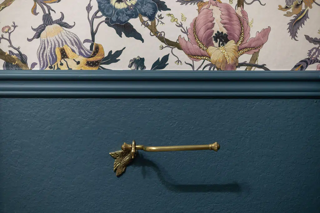
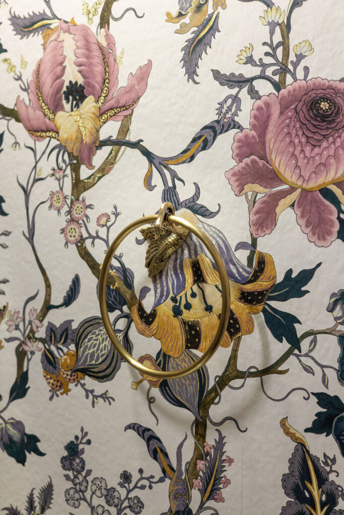
In order to make the bathroom look more blingy, I used brass finishes that paired perfectly with the metallic gold colors in the wallpaper.
I installed a Swan Toilet Paper Holder from Anthropology. Have you ever seen a more beautiful toilet paper holder?!
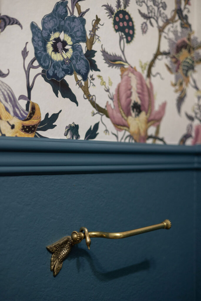
I also used a coordinating Peacock Towel Ring next to the sink.
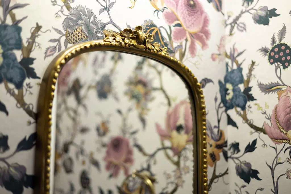
Finally, I installed a Gleaming Primrose Mirror with a brass finish and a brass sconce above it to complete the look.
I am so happy with how this powder room makeover turned out! It completely transformed this space and made it the most sought-after bathroom in the house!
Shop This Look
Love this Bella Blue powder room with wallpaper and wainscoting as much as I do. Check out the full mood board and click the links below to shop the finishes for your own home.
- Gleaming Primrose Mirror
- Swan Toilet Paper Holder
- Peacock Towel Ring
- Elise Vanity Sconce
- House of Hackney Artemis Wallpaper
- Benjamin Moore Bella Blue Paint
Key Learning Points
I learned a lot about working with wallpaper during this powder room project and I’m happy to pass along these tips to you:
- If you’re designing a new space or updating an old one, choose your wallpaper first. Then, base your paint colors on the color scheme of the wallpaper.
- Choose a paint color that matches one of the colors in your wallpaper. Or, choose a shade that is just a bit lighter or darker than a color in the wallpaper.
- Make sure to buy enough wallpaper. In fact, buy more than you think you’ll need! And buy it all at once since different batches can look slightly different.
- Work with a professional wallpaper installer. They will ensure you get the most beautiful installation and that your money will be well spent!
No matter what, always test your paint colors. It’s a standard best practice. Whenever I test my paint colors, they are perfect, and when I don’t test they turn out wrong. Read our post to learn how to test your paint colors like a pro.
Online Color Consulting
Do you still need help picking the best paint colors? Discover our Online Color Consulting Package.

Related Posts
- Powder Room Update (Article)
- 15 Classic Kitchen Design Elements in My Kitchen (Article)
- Benjamin Moore Stonington Gray Color Palette (Article)
About the Author

Hi, I’m Michelle Marceny, founder, owner, and Principal Color Designer at The Color Concierge. I believe a fresh coat of paint can completely transform a space. The Color Concierge was born out of my drive to help clients fall back in love with their homes. My clients trust me to help them find the perfect paint color for their home – whether it’s a whole-house paint color scheme or ideas for a single room.
Since The Color Concierge was founded in 2017, we have completed over 3000 color consultations, both online and in-person. I am a Certified Color Expert with 7 years of experience creating interior and exterior color palettes throughout North America.
If you liked this post, don’t forget to pin it!
We love your comments! Please note that the blog is meant as general advice, and it is not possible to give out specific answers to your paint questions. If you want more specific advice, our Online Color Consultations will help you pick your paint colours. Thank you for your understanding.
