Whether you’re moving into a new home or just want to give your current home a refresh, creating a whole-house color scheme for your interior ensures your space feels cohesive.
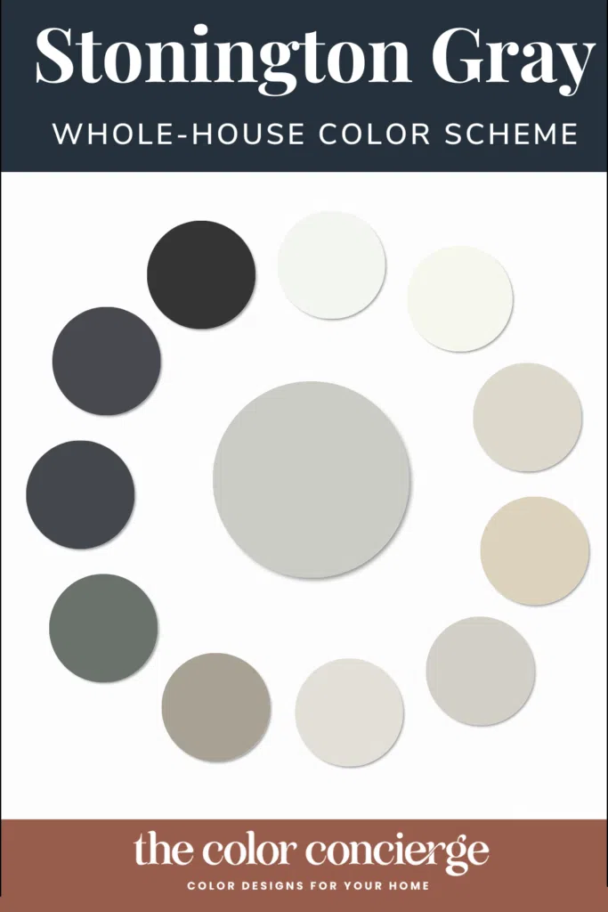
In today’s post, we’re sharing a Benjamin Moore Stonington Gray (color review) color scheme to inspire your next project. Stonington Gray is a cool gray with blue undertones that changes a lot from room to room depending on the light.
This color scheme is built around the actual paint colors of my former home, which was our family home for 20 years. My first husband and I built this home when I was pregnant and brought our son home from the hospital here in 1999. I raised my two children in this home and when I remarried years later, it became a home to my husband’s three children too.
Over 20 years, this home saw love, laughter, sadness, tears, a devastating divorce and a joyful beginning. It was everything a home should be. And as our lives changed, our home kept changing to meet our needs, moods and the people that lived in these rooms.
Using a whole-house color scheme ensured that our home could be a living, breathing, changing thing (as it should be!) and still look put together and cohesive.
Keep reading to explore all the colors in this Stonington Gray color scheme and learn how to build your own whole-house palette (Article).
*This post contains affiliate links for products I use and love. If you click on some links and make a purchase, I will get a small commission at no cost to you. This helps pay for the costs of the blog, so I can continue to offer great content to our readers.
About The Color Concierge
Our Colorado-based paint color consultants make finding the right paint colors for your home easy. Whether you’re painting the exterior or interior of your home, our simple yet effective process lets us get your paint color right the first time. We’ve helped thousands of homeowners transform their homes into a space they love. Learn more about ONLINE COLOR CONSULTATIONS today.
Sample Stonington Gray
We always recommend that you test paint colors (article) in your home because lighting can completely change a color, both on interiors and exteriors.
In the old days, this meant we painted a large poster board with sample pots and a huge mess.
Now we have a better way to test paint, with Samplize Peel-and-Stick samples!
- Samples pre-painted with 2 coats of real paint from the manufacturer.
- Large 9” x 14” samples to see the color better in the lighting.
- Delivered overnight
- Colors are accurate
- Less expensive than painting a large poster board with sample pots
- No mess, and no toxic paint to dispose of
I use these in my color consulting practice for exact results. Discover Samplize peel-and-stick paint samples and sample Stonington Gray (Sample) via the link below.
BM Stonington Gray Color Palette in Real Life
The Stonington Gray color palette I’m sharing today is how my home looked when we sold it in 2019. The palette is timeless and still stands today, four years later.
But this home changed a lot over the years. Throughout all these changes, I discovered the joy of being a color consultant. Eventually, we built a new home and now there is another family living in our former house, enjoying it, changing it and making it their own.
If you’re currently in your own phase of changes and renovations, I hope this Stonington Gray color scheme helps inspire your painting choices and allows you to create a home that is uniquely yours!
Whole House Paint Colors
These colors were used in many different spaces throughout my home. They formed the foundation of the palette.
Benjamin Moore Stonington Gray
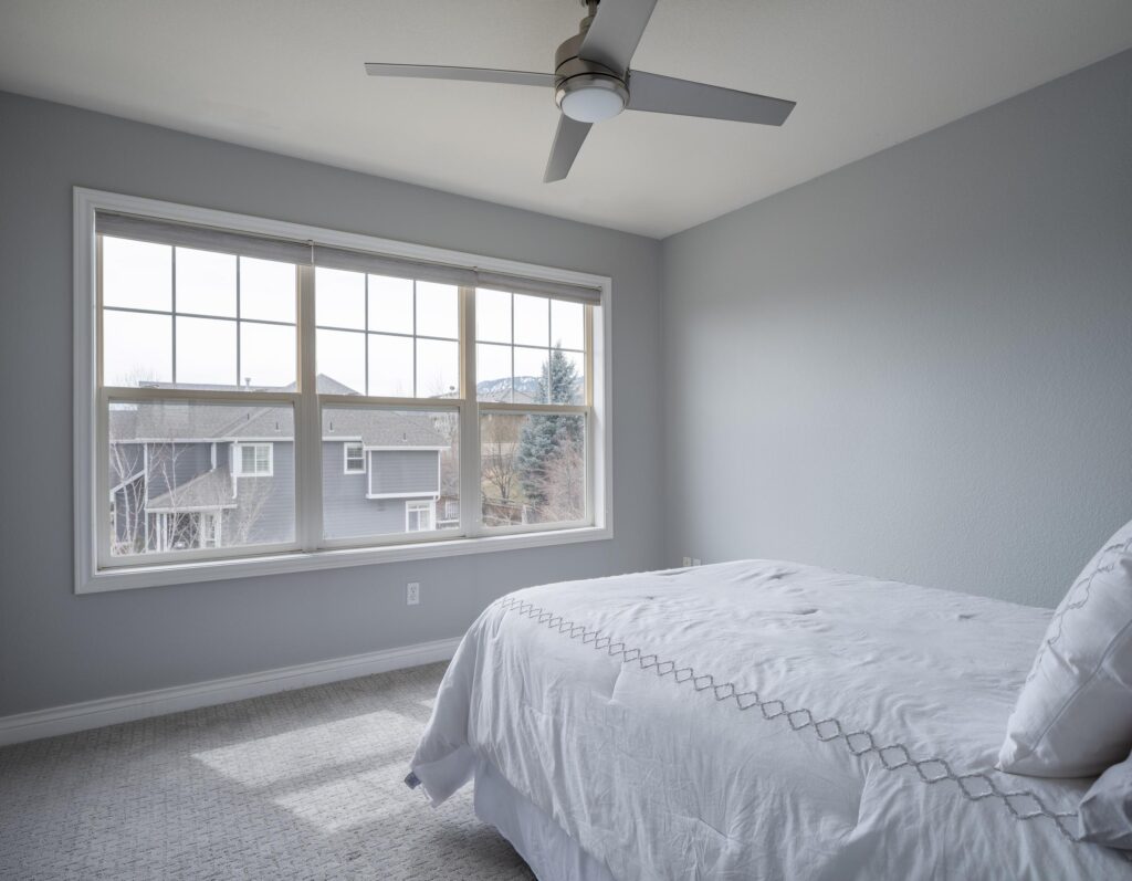
BM Stonington Gray (color review) is a muted, cool gray paint color that can be used in just about any space throughout the home. It has an LRV of 59, which makes it a fairly light color that still has a good amount of pigment. It has strong blue undertones.
In rooms with low or North-facing light, it may look more blue than gray. In rooms with warmer lighting, it appears more neutral. It’s this shifting color that makes it such a good choice for a whole-house paint color. Each room will look slightly different even using the same color.
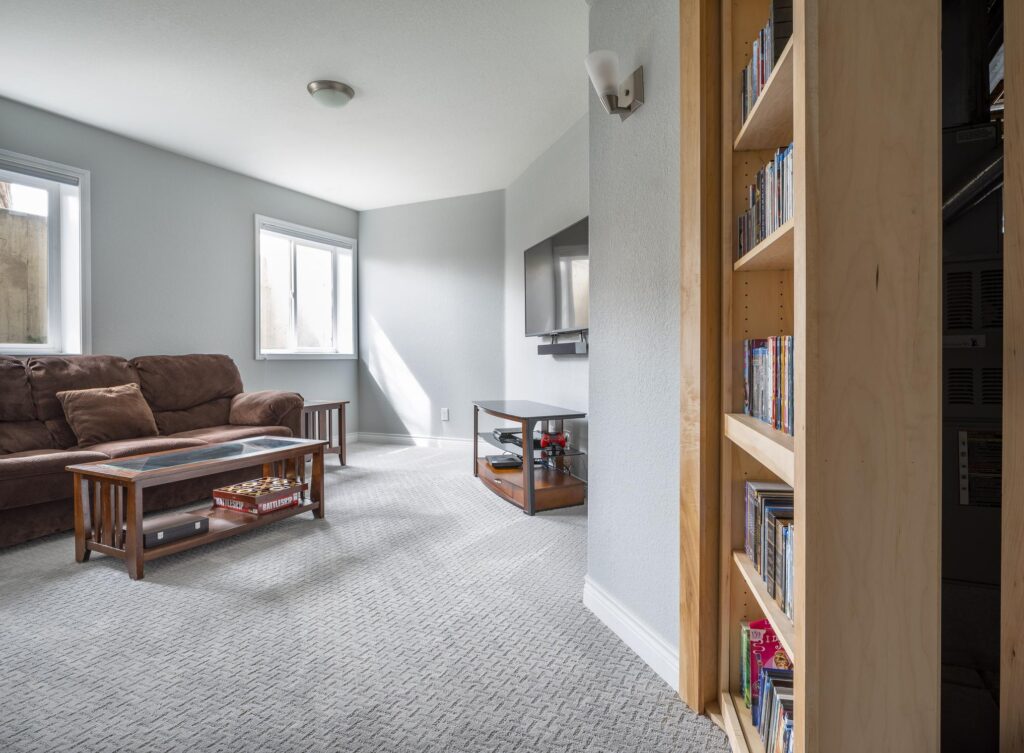
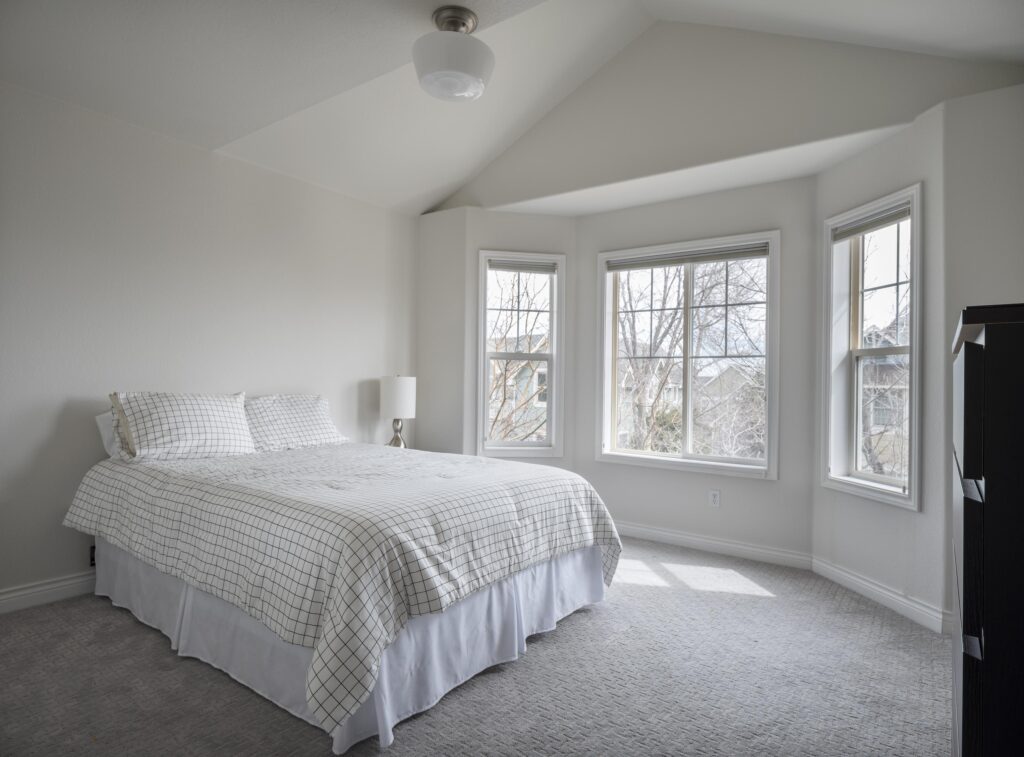
In the basement of my former home (pictured above), the low basement lighting makes Stonington Gray (sample) look very blue. It also looks blue in one of the upper bedrooms of the home in the cool morning light (pictured below).
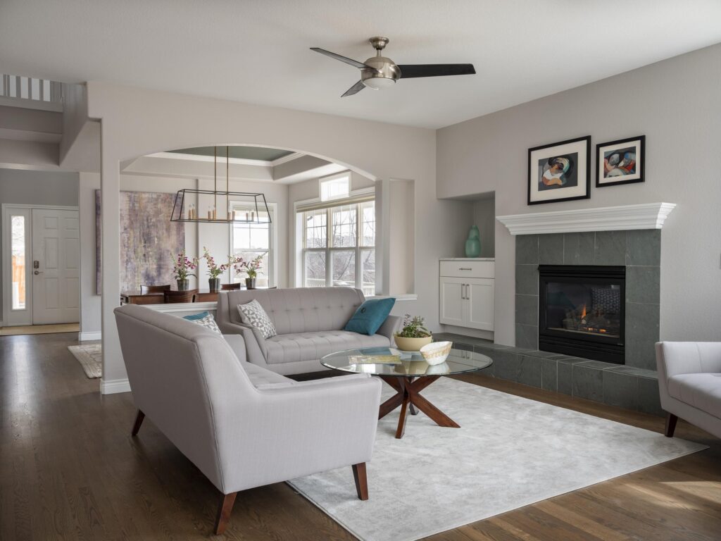
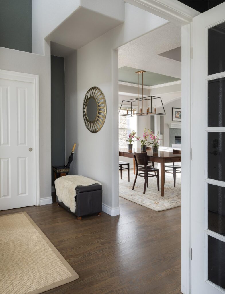
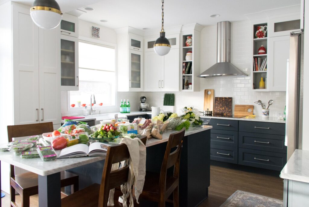
The open-concept living area is flooded with light, with large East, South and West facing windows. I didn’t know how good we had it! In the photo below, you can see the fireplace wall flashes blue, where the sunnier areas of the room such as in the background are more neutral as the sun washes them out.
In my bright and sunny front entryway, Stonington Gray looks even lighter.
Sample BM Stonington Gray here.
Benjamin Moore Chantilly Lace
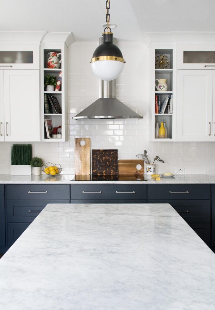
We chose Benjamin Moore Chantilly Lace (color review) as our trim and ceiling color throughout the home. Chantilly Lace is a clean white with barely-there cool undertones. With an LRB of 92.2, it’s a very bright white. The upper cabinets of our tuxedo kitchen cabinets (Article) were also painted with Chantilly Lace.
If you’re going with a white kitchen, I love to match the cabinets to the trim and ceiling color in the home. In this case, the crisp Chantilly Lace color paired beautifully with the deep blue lower cabinets and gorgeous cool Carrara Marble countertops. This white paint color is also fantastic for cabinets if you have white quartz, real marble, and other crisp finishes.
We don’t often recommend using Chantilly Lace (sample) as a wall color in many homes because most rooms don’t have enough light to make this color work well. But we did find a few places to use this gorgeous color on the wall as part of our Stonington Blue color palette.
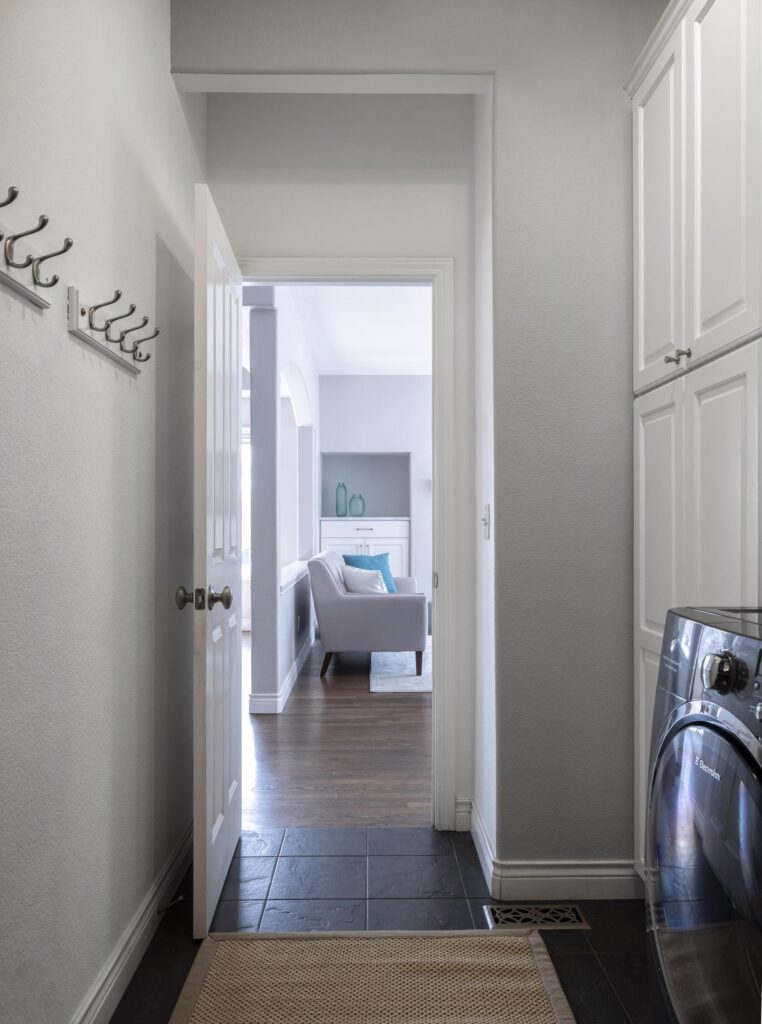
The laundry room featured Chantilly Lace cabinets and walls, but it ended up feeling way too cold. I added a BM Stonington Blue accent on the wall leading into the hallway and it added just enough color to keep the room from feeling too harsh and dingy.
Sample BM Chantilly Lace here.
Complementary Neutral Colors
Once we had our foundation color and trim color, it was time to mix in some other neutral paint colors to expand the Stonington Blue color palette.

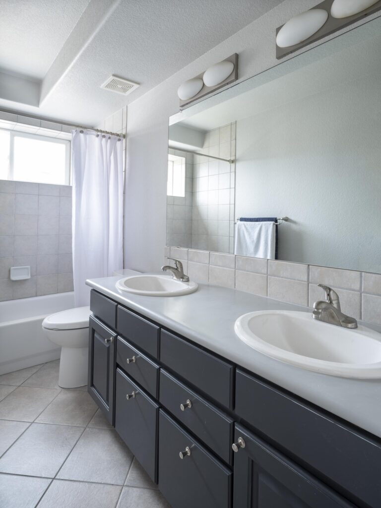
Benjamin Moore Snowfall White
BM Snowfall White (sample) is a bright, versatile off-white paint. It’s similar to BM Simply White (review), but with softer yellow undertones. It has an LRV of 91.8 and often looks even brighter than Chantilly Lace.
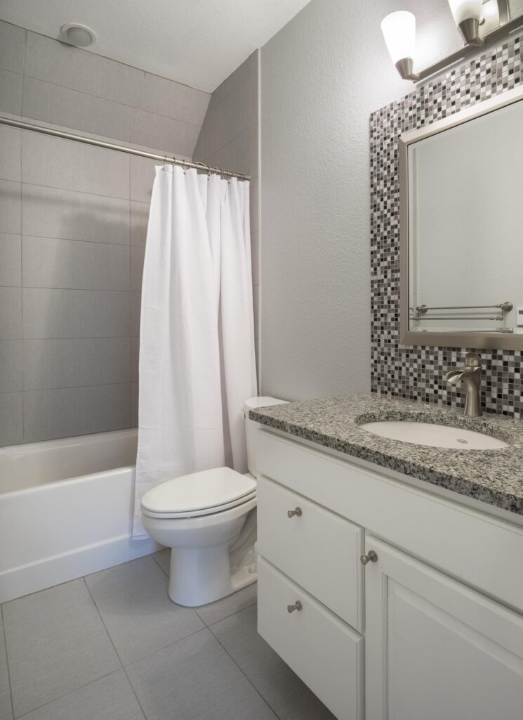
We used Snowfall White (review) on this basement bathroom vanity to brighten up the darker room. It pairs really well with the crisp gray granite on the countertop. The granite was left over from another project, and we repurposed it in this basement bathroom.
Sample BM Snowfall White here.
Benjamin Moore Pale Oak
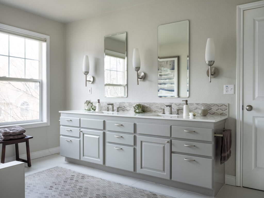
We continued with soft neutral colors in the master bathroom, which features BM Pale Oak (color review) walls. The LRV of Pale Oak is 69, which makes it a very light greige with taupe undertonesp. It can read like a warm cream paint color but without yellow undertones.
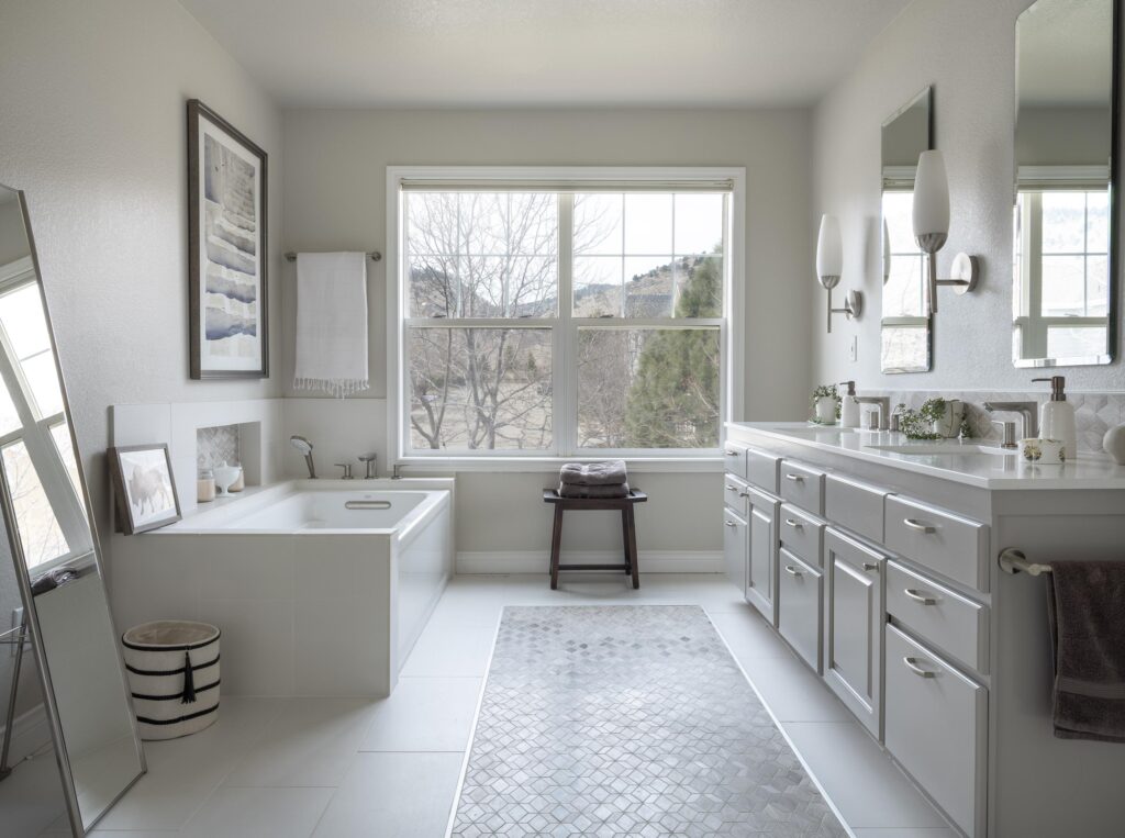
I love to pair Pale Oak (sample) with warm wood finishes or with crisp whites and matching stone or quartz countertops. In the master bathroom, Pale Oak walls look really beautiful paired with the crisp white tub and countertop and the BM Silver Fox (sample) cabinets.
Benjamin Moore Manchester Tan
BM Manchester Tan (color review) is a lovely warm beige paint color that’s versatile enough to work in many spaces throughout a home. It has an LRV of 64, which means it’s a fairly light color but still has a good amount of pigment.
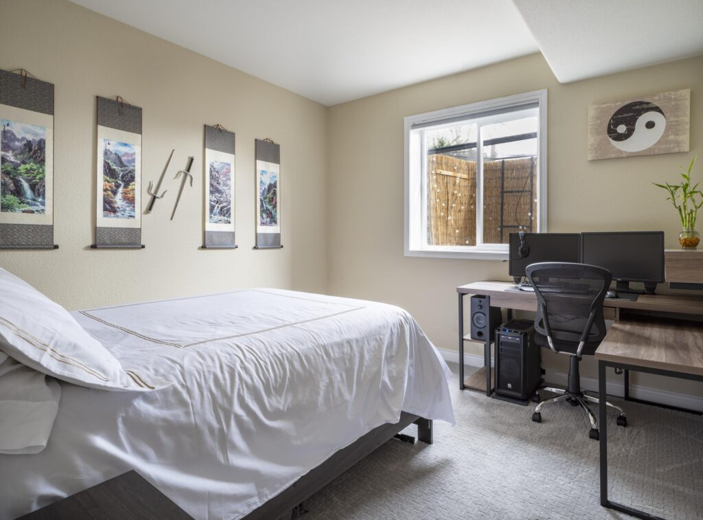
While it looks beautiful in spaces flooded with lots of light, it still works in darker rooms – even the basement! That’s exactly where we used Manchester Tan (sample) in my former home – a teenage boy’s bedroom.
This bedroom was East Facing, but it looked sunny and warm throughout the day. Manchester Tan added lots of warmth to this space.
Sample BM Manchester Tan here.
Benjamin Moore Abalone
The other basement bedroom in our home was painted with BM Abalone (sample), an iconic gray paint color with subtle violet undertones.
I’ve used this color with clients for offices, bedrooms, and living rooms. While I typically don’t recommend this color for rooms with low light, the basement bedroom (pictured below) got enough warm South-facing light to keep this color looking crisp, bright and beautiful.
The violet undertones are a great option if you’re looking for a color for a girl’s room that is still fairly neutral. The subtle violet color is really lovely.
Benjamin Moore Classic Gray
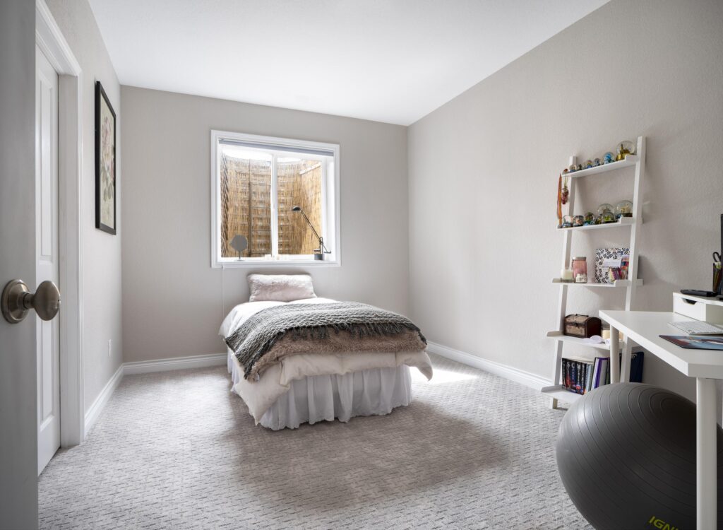
BM Classic Gray (color review) is a soft, very light gray color that looks white in rooms with lots of light. It has an LRV of 74.8 and subtle green undertones that can flash purple in cool light. It’s another great option for a whole-house color because it changes a lot depending on the light. Sometimes it looks so warm it’s almost beige and other times it looks more like a light gray.
While I love Classic Gray (sample) as a whole-house color, we used it in our Stonington Gray color palette as a bedroom paint color (pictured below). It’s a great choice if you want a bright, neutral bedroom space that still feels warm and cozy. This bedroom had East facing light. When we tested Stonington Gray, it looked too cool in the afternoons.
Benjamin Moore Rockport Gray
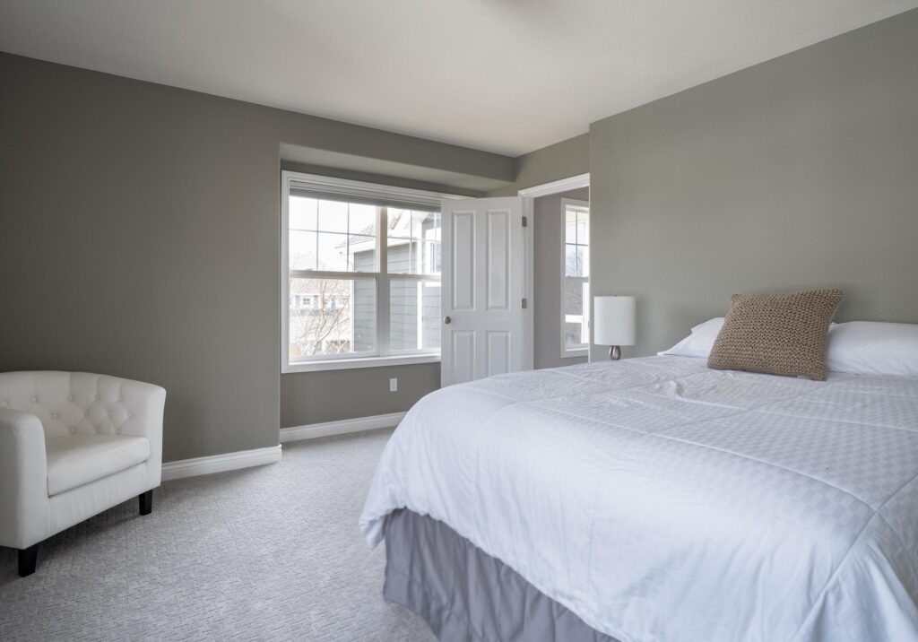
BM Rockport Gray (sample) is another, darker neutral paint color that I love building into whole-house color palettes. We used Rockport Gray for an upper bedroom and continued the color on the ensuite bathroom vanity, which really brings the whole space together.
With an LRV of 36.6 and soft green undertones, it adds a layer of depth to our palette but still flows very well with the Stonington Gray hallway outside.
This bedroom had a difficult light combination – windows with both North and East facing exposure. Rockport Gray was an experiment. It was very dark but really cozy, and it wasn’t affected by the funky lighting as a lighter neutral would have been.
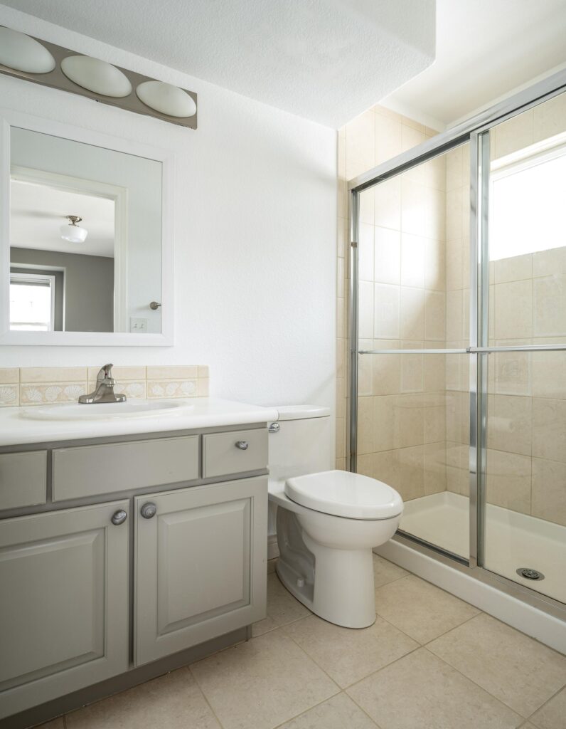
The ensuite bathroom was painted with Chantilly Lace walls and a Rockport Gray vanity. This room is flooded with light all day, so the bright white color worked on the walls and paired really well with the white counter, peach-colored tile, and Rockport Gray vanity.
The vanity was originally a warm maple that had yellowed over the years. it clashed with the peachy tile. Rockport Gray was a fantastic improvement and paired very well with the peachy tile.
Dark Accent Colors
I love to add pops of dark paints or brighter colors throughout a whole-house color scheme. In our BM Stonington Gray color palette, we used a few different shades of deep grays and blacks to add interest while still keeping the house cohesive.
Benjamin Moore Millstone Gray
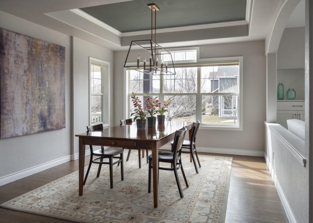
BM Millstone Gray (sample) is a really unique and gorgeous deep gray. It has strong green undertones and in warm lighting looks more green than gray. We used this beautiful color as an accent for the dining room ceiling.
With an LRV of 16.9, I love the way this dark color draws the eye. It also pairs really well with the cooler Stonington Gray walls throughout the dining and living areas.
Sample BM Millstone Gray here.
Sherwin-Williams Cyberspace
SW Cyberspace (color review) is the one Sherwin-Williams color used in this whole-house palette. And that’s because it’s seriously special! It is one of Sherwin-Williams’ darkest paint colors, with an LRV of 6. While it is really a deep blue color, Cyberspace (sample) has deep charcoal undertones that help make this color feel muted.
I love to use this color as a modern take on dark cabinets, which is exactly what I used it for in my former home. I still think about this kitchen all the time! SW Cyberspace paired really well with the Chantilly Lace upper cabinets and its gray undertones kept it looking aligned with the Stonington Gray palette throughout the home.
Benjamin Moore Witching Hour
BM Witching Hour (sample) is another dark blue accent color that added depth to our whole-house color scheme. Witching Hour is a deep, charcoal blue that is dark but still muted. With an LRV of 8.71 it is a very dark blue-black color.
We used Witching Hour on a bathroom vanity in the upstairs hall bath of our former home. The color looked really beautiful paired with the Stonington Gray walls and blue-gray tiles. This bathroom was another example of a yellowish maple transformed with rich paint.
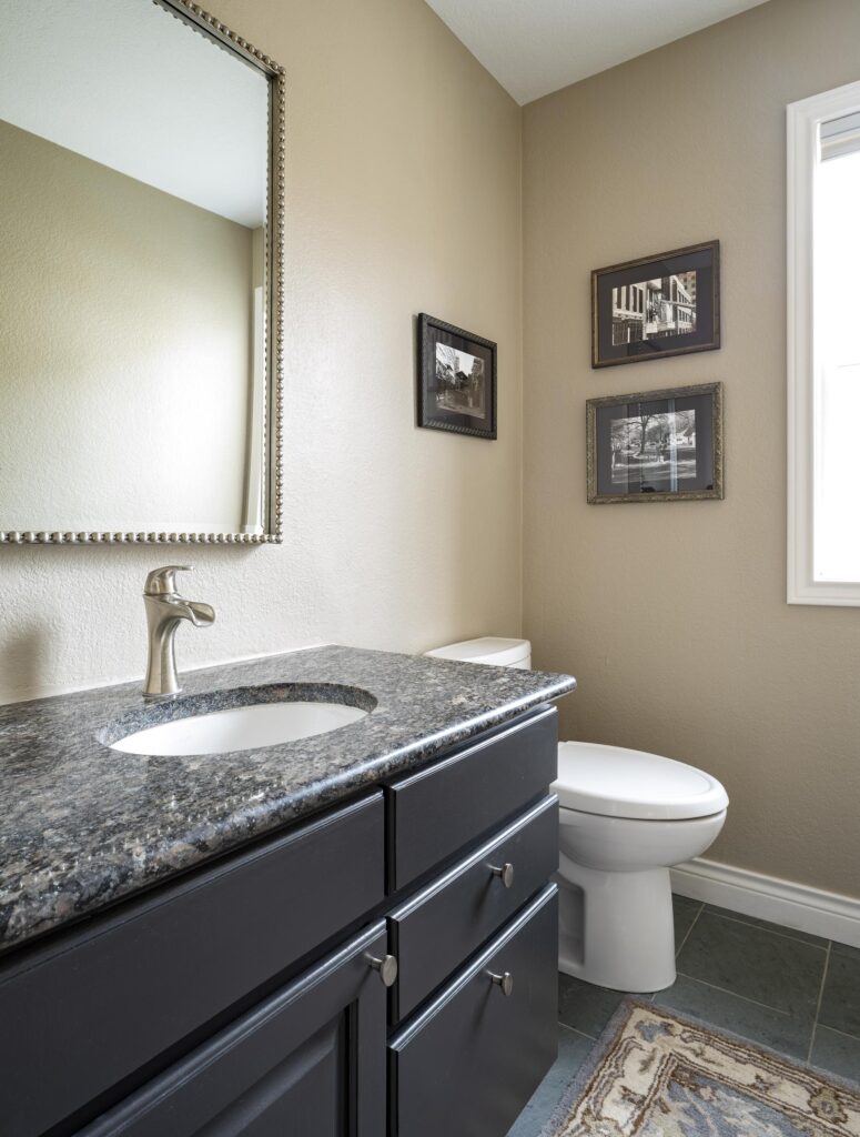
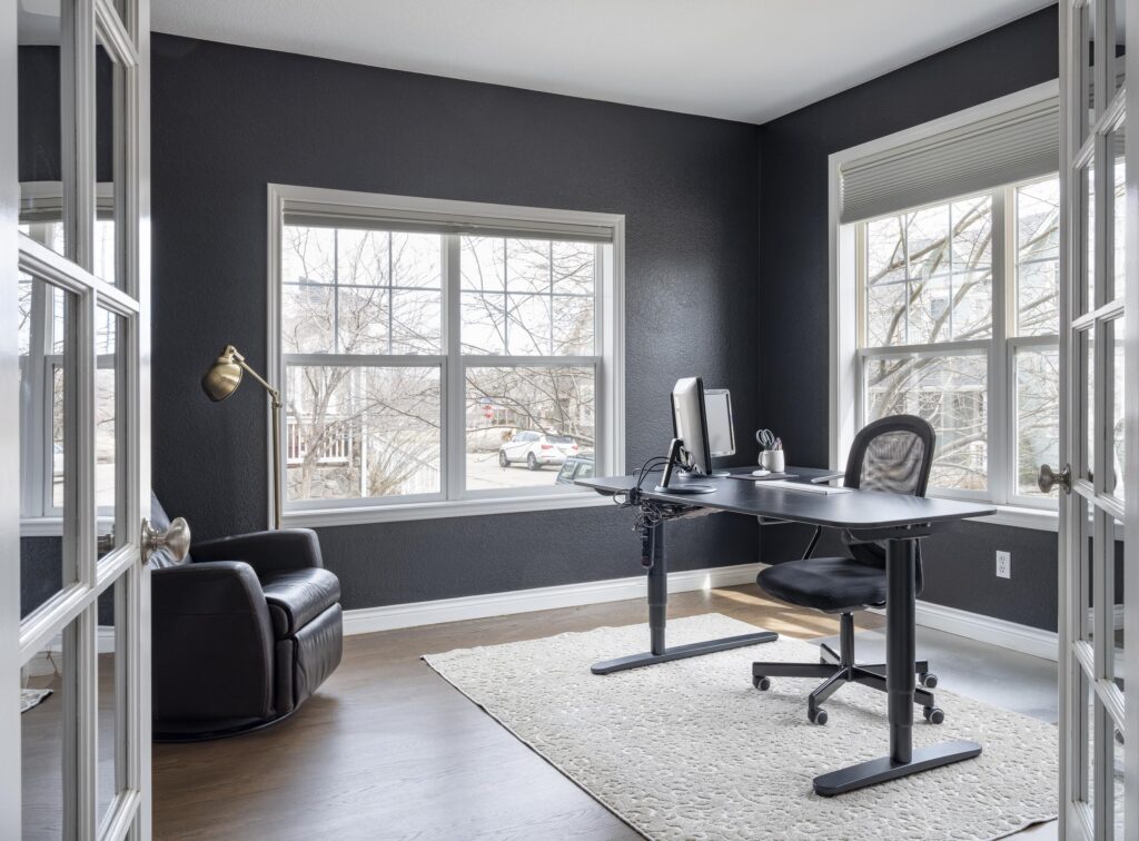
Benjamin Moore Onyx
BM Onyx (color review) is the darkest color we used in our Stonington Gray color palette. It is a dark black with little to no undertones. It’s a really beautiful color that we often use for a front door, cabinet color, or accent wall. We used Onyx (sample) for the bathroom vanity in our downstairs powder room, where it paired really well with beige BM Stone House walls and the dark granite countertops.
We also decided to use Onyx to create a dramatic office space. It’s a great color for a room where you’re going to do a lot of computer work because it can help you see the screen better. This room also had funky Northern and Eastern exposure. I tried so many colors over the years and this one was my favorite. In the summer the leaves on the trees were framed by the black. It was fabulous.
Build Your Own Color Palette
Inspired to create your own Stonington Gray color palette? You can buy a pre-made Stonington Gray palette here. It is completely different than the one shown in this house.
Or, use the tips below to build your own whole-house color scheme:
1. Pick your foundation color for the common areas.
We usually start in the kitchen, since it is truly the heart of the home. A foundation color is typically a light neutral, such as white, gray, beige, or greige. In our home, BM Stonington Gray was the foundation color.
2. Select a white trim and ceiling paint color.
Every good color palette needs great white paint (Article) for trim and ceilings. This should be used throughout the home on all the trim, window frames, and doors. If your kitchen has white cabinets, I like to use the trim and ceiling color for those as well.
Keep in mind that repainting all the trim in your home can be very expensive. If you’re changing colors in an existing home, you may want to leave your trim as-is (many homes in the U.S. have Sherwin-Williams Extra White (review) trim, for example) and pick colors for your palette that work with that trim.
3. Pick colors for secondary living spaces
Next, we move to the adjoining spaces, such as dining rooms, offices, bathrooms, and bedrooms. Blues, greens, and neutral paint colors with colorful undertones are lovely as paint colors for bedrooms (Article) and other smaller spaces. These rooms are great places to include accent walls (Article) as well.
4. Choose accent colors last.
When choosing accent colors, make sure to consider not only the other paint colors in your palette but also your hard finishes (like flooring, fixtures, etc) and decor. It’s easier to pick an accent color to coordinate with your decor than a piece of art to match an accent wall.
5. Don’t forget to test your paint colors
We always recommend that you test paint colors on your home because lighting can change a color completely, both with interiors as well as exteriors.
In the old days, this meant we painted a large poster board with sample pots and a huge mess.
Now we have a better way to test paint, with Samplize Peel-and-Stick samples!
- Samples pre-painted with 2 coats of real paint from the manufacturer.
- Large 9” x 14” samples to see the color better in the lighting.
- Delivered overnight
- Colors are accurate
- Less expensive than painting a large poster board with sample pots
- No mess, and no toxic paint to dispose of
I use these in my own color consulting practice for exact results. Discover Samplize peel-and-stick paint samples:
Buy 8 samples and get 2 free – no coupon code required. Order today and get samples tomorrow!
Explore all the colors in this Benjamin Moore Stonington Gray Color Palette
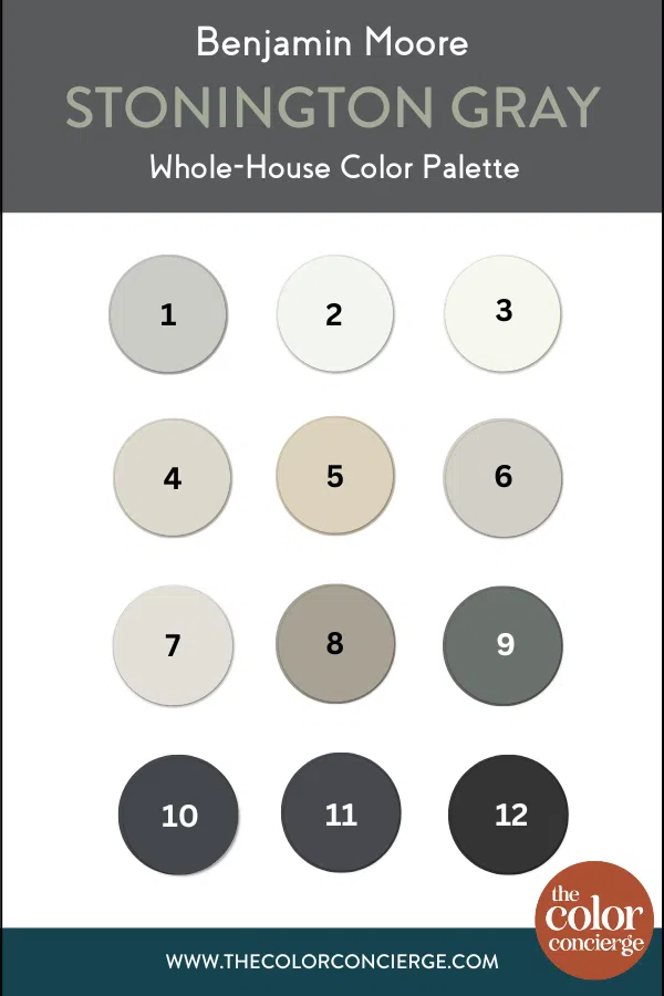
- Benjamin Moore Stonington Gray (Sample)
- Benjamin Moore Chantilly Lace (Sample)
- Benjamin Moore Snowfall White (Sample)
- Benjamin Moore Pale Oak (Sample)
- Benjamin Moore Manchester Tan (Sample)
- Benjamin Moore Abalone (Sample)
- Benjamin Moore Classic Gray (Sample)
- Benjamin Moore Rockport Gray (Sample)
- Benjamin Moore Millstone Gray (Sample)
- Sherwin-Williams Cyberspace (Sample)
- Benjamin Moore Witching Hour (Sample)
- Benjamin Moore Onyx (Sample)
Key Learning Points
Creating your own palette is a simple way to change the whole look and feel of your home – whether you’re doing extensive renovations or not.
Remember, if you want to build your own whole house palette, it’s important to follow these steps:
- Pick your foundation color for the common areas
- Pick a white trim color (and stick to it)
- Select paint colors for secondary living spaces (bedrooms, bathrooms, dining areas, etc.)
- Pick a few accent colors to use throughout your home
Remember: NEVER, EVER use paint matches from a different brand than the one specified. Results are poor and there are no standards for the sheens. Even though your painter may truly believe it can be done, don’t do it. See results from paint matching here.
No matter what, always test your paint colors. It’s a standard best practice. Whenever I test my paint colors, they are perfect, and when I don’t test them, they turn out wrong. Learn how to test your paint colors here.
Get an Expert-Made Whole House Paint Color Scheme
For more details, read our full step-by-step (Article) guide to creating a whole house color palette. Don’t want to do the design work yourself? Contact The Color Concierge for more about our online paint color consultations.

Related Posts:
- Real-World Whole-House Color Palette (Article)
- Why A Whole-House Color Scheme Is Important (Article)
- BM Simply White Whole-House Color Palette (Article)
- Benjamin Moore Stonington Gray Color Review (Article)
About the Author

Hi, I’m Michelle Marceny, founder, owner, and Principal Color Designer at The Color Concierge. I believe a fresh coat of paint can completely transform a space. The Color Concierge was born out of my drive to help clients fall back in love with their homes. My clients trust me to help them find the perfect paint color for their home – whether it’s a whole-house paint color scheme or ideas for a single room.
Since The Color Concierge was founded in 2017, we have completed over 3000 color consultations, both online and in-person. I am a Certified Color Expert with 7 years of experience creating interior and exterior color palettes throughout North America.
We love your comments! Please note that the blog is meant as general advice, and it is not possible to give out specific answers to your paint questions. If you want more specific advice, our Online Color Consultations will help you pick your paint colors. Thank you for your understanding.
