
If you’ve been following along with the blog this fall you might have noticed our growing love for Farrow & Ball paints. There’s something so special about their paint collections – they really offer a depth of color not found in other paint brands. As we close out 2022, we wanted to put together a collection of the best Farrow & Ball colors for your home.
It’s hard to resist the quality and color of Farrow & Ball. I was first introduced to these paints in a client’s home (she had Farrow & Ball Teresa’s Green on her bathroom walls) and my obsession started growing instantly.
The more I explored this company’s hues, the more I realized what I had read about their paints was correct: the colors are saturated, vivid and full of pigment. Even the best photos can’t do these colors justice – you really have to see them in person to see the way they glow on the walls.
Feeling inspired? There are many popular Farrow & Ball colors, and today we’re going to be breaking down some of our favorites from our client projects. But first, let’s explore how to choose the best Farrow & Ball paints for your home.
*This post contains affiliate links for products I use and love. If you click on some links and make a purchase, I will get a small commission at no cost to you. This helps pay for the costs of the blog, so I can continue to offer great content to our readers.
About The Color Concierge
Our Colorado-based paint color consultants make finding the right paint colors for your home easy. Whether you’re painting the exterior or interior of your home, our simple yet effective process lets us get your paint color right the first time. We’ve helped thousands of homeowners transform their homes into a space they love. Learn more about ONLINE COLOR CONSULTATIONS today.
How do you choose a Farrow & Ball color?
Choosing between Farrow & Ball popular colors is really not much different than choosing paint colors in general. It all comes down to choosing not the color you like best, but the one that will look best in your space – taking into consideration your lighting, furniture, decor and whole house color palette (Articel).
It’s also important to note that Farrow & Ball paints do cost considerably more than Benjamin Moore, Sherwin-Williams and other larger paint brands. There are some potential ways to save, however.
In my personal experience using F&B paints I used about 30% less paint for two coats than with Benjamin Moore. I also didn’t use primer on my walls that were already painted (although Farrow & Ball does recommend it).
Using LRV to Choose a Paint Color
One factor to consider when choosing a paint color is the paint’s LRV (that’s light reflective value). LRV is a percentage scale that measures how light or dark a paint color is based on how much light it reflects. 0% is black and 100% is pure white. LRV can help determine what a color will actually look like on the wall.
Farrow & Ball doesn’t list an LRV for its paints (probably because LRV just really doesn’t do these colors justice), but we can use the internet to estimate the LRV of Farrow & Ball paint colors. You’ll see the estimated LRV listed for each Farrow & Ball color in our round-up below.
Choosing a Paint Sheen
It’s also important to consider sheen when choosing a paint color. Farrow & Ball sheens (also known as paint finishes) have different names than the more common Benjamin Moore and Sherwin-Williams sheens.
Take care when choosing your paint sheen to ensure you get the right finish for your walls, trim, ceiling, and cabinets. You can use our paint sheen guide (Article) to help understand what kind of finish to use on each space of your home.
Testing Paint Colors
And of course, the most important step in choosing a paint color is testing the color in your home (in natural light!). We recommend using Samplize for easy paint testing.
For best results, place the peel-and-stick paint samples (made with actual paint for the best color quality) on a white poster board and move that around your space at different times of day to see how the colors look in natural light.
You can test all the paint colors from this article in your home by grabbing my custom Sample Bundle from Samplize!

The Best Farrow & Ball Colors (with Real-World Examples)
We started seeing a growing number of Farrow & Ball paint colors in our client homes this year and we can’t wait to start incorporating more in our work in the year ahead.
While there are many options for Farrow & Ball paints, these were some of our favorites this year. Keep reading to learn more about each color and see the paint in real homes.
Our Favorite Farrow & Ball Popular Colors
- Hague Blue
- Oval Room Blue
- Green Blue
- Teresa’s Green
- Cromarty
- Vert de Terre
- Setting Plaster
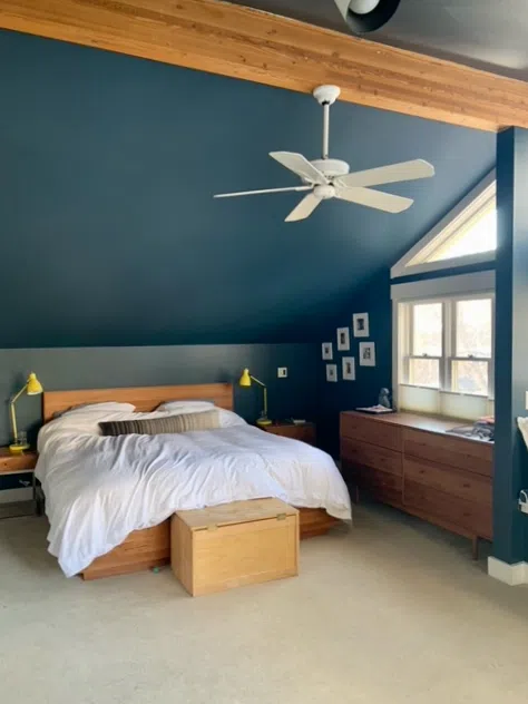
Farrow & Ball Hague Blue
There’s a reason Hague Blue (Article) is one of the most popular Farrow & Ball colors – it’s truly iconic! A rich, dark teal with strong green undertones, this color changes as natural light changes throughout the day.
This is definitely a statement color, but it’s also really versatile. There are many ways you can use this color throughout your home – in bedrooms, as an accent wall color or even on kitchen cabinets. In my home, we used Hague Blue on our fireplace wall to help hide our TV above the mantle.
No matter how you plan to use Hague Blue (Sample), make sure the space has a lot of light so the color doesn’t come across as too oppressive.
Tips and Tricks:
- Estimated LRV: 7
- Use with: Rooms with lots of natural light (especially the cooler light of north- or east-facing rooms), natural wood accents, warm neutrals
- Don’t use with: Cool whites or grays, small or dark spaces, creamy whites with yellow undertones (which will likely look too yellow next to Hague Blue)
- Best ceiling & trim color: Off-white paint colors such as Farrow & Ball Wimborne White (Sample) look great with Hague Blue. Benjamin Moore White Dove (Sample) or Chantilly Lace (Article) would also work well. Be sure to choose a flat sheen for the ceiling and satin or semi-gloss for the trim.
- Best Paint Matches: Benjamin Moore Gentleman’s Gray (Sample) is probably the closest Hague Blue alternative. But there’s truly no replacing the real thing!
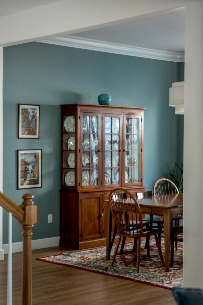
Farrow & Ball Oval Room Blue
Oval Room Blue (Sample) is another one of the best Farrow & Ball colors – it is truly luminescent on the wall. A mid-toned team with warm green undertones, this color glows in a really beautiful way. It’s like jewelry for your walls!
Farrow & Ball counts Oval Room Blue among their most popular blue paints, but it is truly a teal color. I’ve used Oval Room Blue (Article) in my own dining room and love the way it makes a space feel more special without being overpowering.
Tips and Tricks:
- Estimated LRV: 32
- Use with: All kinds of natural light (the color will change with the light throughout the day), warm natural wood accents, accent trim like wainscoting or board-and-batten
- Don’t use with: Other bright fresh colors, and sometimes cool white colors such as Benjamin Moore Decorator’s (Article)White or Sherwin-Williams Extra White
- Best ceiling and color: Farrow & Ball’s All White or Wimbourne White are both beautiful choices for trim and ceiling paint. Benjamin Moore’s Oxford White, Chantilly Lace(Article), Cloud White (Article) or White Dove would also look really nice. Choose a flat sheen for the ceiling and a satin or semi-gloss for the trim.
- Best Paint Matches: Benjamin Moore Mystic Lake (Sample) or Atmospheric (Sample) are both close color matches.
Farrow & Ball Green Blue
What makes Green Blue (Sample) one of the best Farrow & Ball colors? For me, it’s the versatility of the balance between green and blue tones. Depending on the natural light, sometimes this color looks more blue and sometimes it looks more green. As a result, it pairs just as well with fresh, modern finishes as it does with warmer, earthy finishes.
Green Blue is a beautiful calming bedroom paint color (Article) and also works really well in a bathroom, gender-neutral nursery, or even as a kitchen cabinet paint color in a tuxedo kitchen (Article).
While Green Blue offers a lovely burst of color to a space, it is still fairly muted. This makes it easy to use in a whole home color palette without overpowering more neutral colors.
Tips and Tricks:
- Estimated LRV: 49
- Use with: Warm wood tones, brick accents, warm neutrals like beige and taupe, clean whites
- Don’t use with: bright colors or whites (it’s better off paired with other muted tones)
- Best ceiling and trim color: Use a warmer white for trim and ceiling if the other finishes in your room are warm (like a wood floor). Some warmer white paints include Sherwin-Williams Pure White (Sample), Sherwin-Williams Alabaster (Sample) and Cloud White by Benjamin Moore (Article). If you have more modern finishes with cooler colors you can try a clean white like Benjamin Moore Chantilly Lace (Article). Use flat paint for the ceiling and satin or semi-gloss for the trim.
- Best Paint Matches: Both Benjamin Moore Catalina Blue (Sample) and Sherwin-Williams Quietude (Sample) are very close Green Blue alternatives.
Farrow & Ball Vert de Terre
Vert de Terre (Article) is easily one of the best Farrow & Ball green paint colors. It offers so much depth and richness to a room and is versatile enough to work with both cool and warm finishes. In fact, in one of my client’s homes Vert de Terre is used to help bring together warm and cool finishes in the same space to create a cohesive look (and it totally succeeds!).
Vert de Terre (Article) is a very muted, calming color, making it perfect for bedrooms, bathrooms and even the kitchen. It is a warm green color with muted blue undertones that add a lot of depth to this already gorgeous color.
Tips and Tricks:
- Estimated LRV: 49
- Use with: Warm, earthy accents like brick, natural wood, and warm neutrals; cooler, modern whites and grays; Carrara marble tile
- Don’t use with: Bright whites and colors (it pairs much better with other muted tones); as a whole-house color (it is a bit too saturated to be used as a neutral)
- Best ceiling color & trim color: A warm off-white trim color works well for Vert de Terre, including Farrow & Ball Pointing, All White (Sample) or Wimborne White (Sample). It would also work well with clean white trim paint, such as Chantilly Lace (sample) by Benjamin Moore. Be sure to use a flat sheen on the ceiling and a satin or semi-gloss sheen for trim.
- Best Paint Matches: Benjamin Moore October Mist (Sample) and Sherwin-Williams Softened Green (Sample) are probably the closest Vert de Terre alternatives out there.
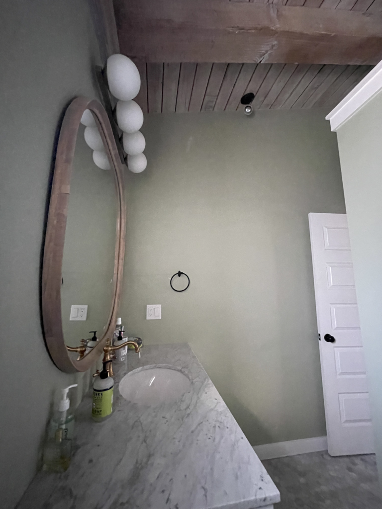
Farrow & Ball Teresa’s Green
Teresa’s Green (Sample) was my first experience with Farrow & Ball, so it’s no surprise that it’s on my list of the best Farrow & Ball colors. I first encountered this color in a client’s bathroom and I fell in love right away – it truly glows on the wall!
Much like the other best Farrow & Ball green paints, Teresa’s Green (Article) has a mix of warm and cool tones and is very versatile around the home. It looks lovely with earthy finishes like wood and brick but also pairs well with clean white paint and modern tile.
I consider Teresa’s Green to be an aqua or light teal color, with warm green undertones. I love using it in bathrooms, kitchens or bedrooms.
Tips and Tricks:
- Estimated LRV: 60
- Use with: Soft, muted gray colors like Stonington Gray (Article) from Benjamin Moore; warm wood and brick accents
- Don’t use with: Rooms with north-facing light, which would make this color look a bit too glowing blue
- Best ceiling & trim color: Because Teresa’s Green is a warm color, the best whites for ceiling and trim are also warm. Farrow & Ball’s All White or Wimbourne White are both beautiful choices. Benjamin Moore’s Oxford White or White Dove would also look really nice. Use flat paint for ceilings and satin or semi-gloss for trim.
- Best Paint Matches: Benjamin Moore’s Sage Tint (Sample) is very similar to Teresa’s Green but a little bit lighter and brighter.
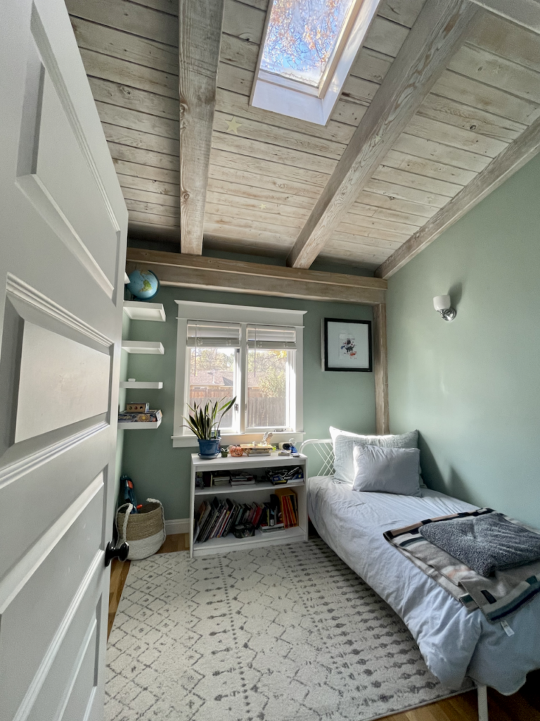
Farrow & Ball Cromarty
Cromarty (Sample) is a pale soft green-gray neutral color, where the green is strongly saturated. It’s a wonderful balance between muted and fresh, and a really unique color that I look forward to recommending to color consulting clients.
Cromarty (Article) is a natural green and offers warmth to any space it is used in. One of the young adults in our home chose this color for her bedroom (painting over the original gray) and Cromarty really transformed her space.
This color works beautifully in bedrooms, bathrooms and offices.
Tips and Tricks:
- Estimated LRV: 60
- Use with: Soft, warm whites and muted neutrals
- Don’t use with: Very earthy finishes (it could look fluorescent in comparison!) or cool white colors
- Best ceiling color & trim color: Look for clean whites, off-whites or slightly creamy whites, including All White, Wimbourne White or even light creamy whites such as James White. Benjamin Moore White Dove (Article) trim color would also work well. Use flat sheen paint for the ceiling and satin or semi-gloss paint for any trim.
- Best Paint Matches: The best Cromarty dupe is Benjamin Moore’s Dusty Miller (Sample).
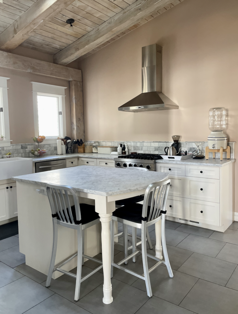
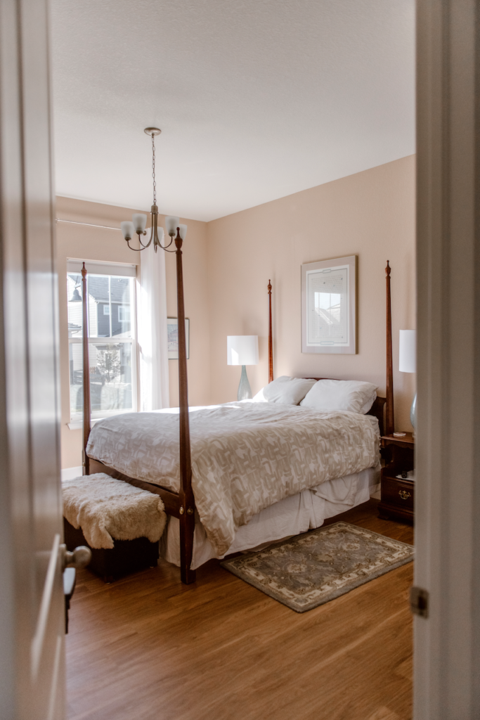
Farrow & Ball Setting Plaster
We’ve mostly been focusing on the best Farrow & Ball blue and green paint colors so far, but for our last color, we need to talk about Setting Plaster (Sample). This paint is a beautiful warm pink paint color that is highly saturated.
It is neutral enough to look like a pink-ish taupe, but can also be used in the place of a more traditional pink color in a girls’ room or nursery. I actually have Setting Plaster (Article) on the walls of my master bedroom in my home. I love waking up to it every day. My husband thinks of it as taupe and I think of it as pink.
I’ve also seen this color used in a kitchen in a client’s home and think it would also work well in an office or other small space.
Tips and Tricks:
- Estimated LRV: 55
- Use with: Warm woods like cherry or mahogany; muted tan and grays with green undertones
- Don’t use with: Overly creamy whites (which will look dingy paired with Setting Plaster); yellows or too many other pastel colors (the combination could end up looking like an Easter egg)
- Best ceiling & trim color: Consider clean whites and off-whites such as Benjamin Moore Chantilly Lace (Sample), Oxford White (Sample), or Cloud White (Sample). Use flat paint for the ceiling and satin or semi-gloss for the trim.
- Best Paint Matches: The most similar colors to Setting Plaster are Benjamin Moore Boudoir (Sample) or Sherwin-Williams Classic Sand (Sample).
Is it worth color-matching Farrow & Ball?
Whenever I write about the best Farrow & Ball colors, I always get questions about color matching. Farrow & Ball paints are significantly more expensive than Benjamin Moore and Sherwin-Williams, so it’s not surprising that homeowners want to look for alternatives.
But paint matching is never a good choice! You might be able to get similar colors. But you won’t get the beautiful glowy-ness and richness of Farrow & Ball paints from a color match.
If you don’t want to spend the money on Farrow & Ball, you’re better off buying one of the Benjamin-Moore or Sherwin-Williams alternatives than trying to get paint color matched. Learn more about matching paint colors here.
What is the easiest way to sample Farrow & Ball paints?
We always recommend that you test paint colors in your house because lighting can change a color completely.
In the old days, this meant we painted a large poster board with sample pots and a huge mess.
Now we have SAMPLIZE, 9X14” Pre-Painted peel-and-stick paint samples. Check out the SAMPLIZE website HERE.
Related Posts
Farrow & Ball Teresa’s Green Color Review
Farrow & Ball Vert de Terre Color Review
Farrow & Ball Green Blue Color Review
Farrow & Ball Oval Room Blue Color Review
Farrow & Ball Cromarty Color Review
Farrow & Ball Hague Blue Color Review
Farrow & Ball Setting Plaster Color Review
Online Color Consulting
Still need help to pick the best paint colors? Discover our Online Color Consulting Package.

About the Author

Hi, I’m Michelle Marceny, founder, owner, and Principal Color Designer at The Color Concierge. I believe a fresh coat of paint can completely transform a space. The Color Concierge was born out of my drive to help clients fall back in love with their homes. My clients trust me to help them find the perfect paint color for their home – whether it’s a whole-house paint color scheme or ideas for a single room.
Since The Color Concierge was founded in 2017, we have completed over 3000 color consultations, both online and in-person. I am a Certified Color Expert with 7 years of experience creating interior and exterior color palettes throughout North America.
We love your comments! Please note that the blog is meant as general advice, and it is not possible to give out specific answers to your paint questions. If you want more specific advice, our Online Color Consultations will help you pick your paint colours. Thank you for your understanding.

One Response
Would Oval Room Blue or Berrington Blue work best in a living room with burnt orange sofas?