The best Benjamin Moore off-white paint colors for interiors depend on your lighting, finishes and the look you want for your space. Most Benjamin Moore off-whites have an LRV between about 70 and
85 and get their warmth from yellow, green or violet undertones. Match the undertone to your light
and hard finishes, then test to find your perfect match.
White paint is the color our clients ask about most, and off-whites are where most of them end up. A clean, bright white can look stark or go dingy in the corners. An off-white color has enough pigment to keep a room light and bright while still feeling warm and inviting. For more information on how to pick a white paint color, see our article, How to Choose White Paint Colors Like a Pro.
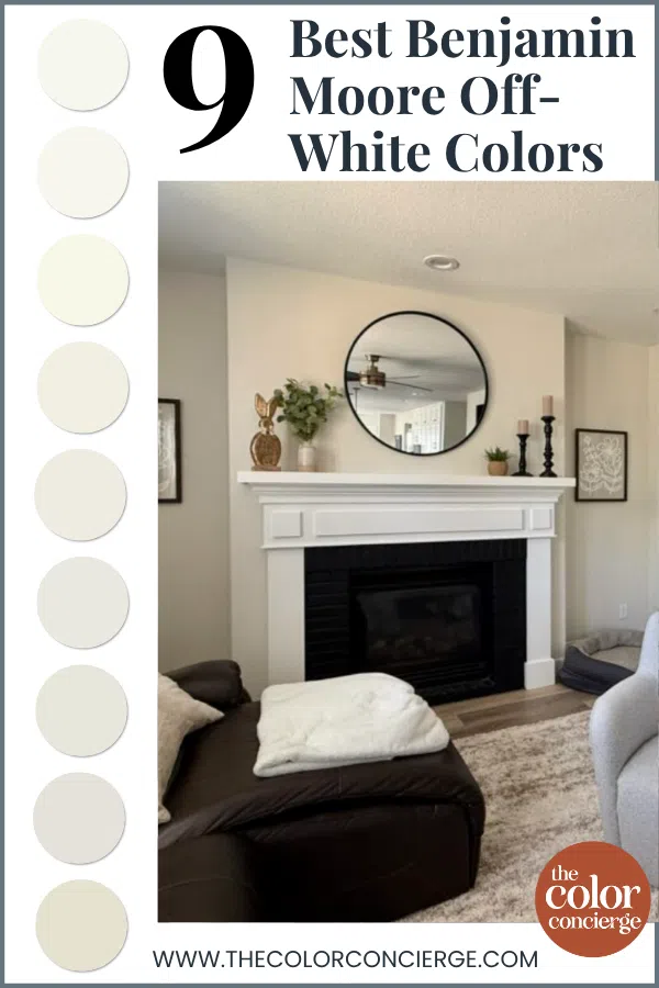
Benjamin Moore makes some of the most beautiful off-white paint colors on the market, and we use them all the time in our color consultations. These are our favorite warm off-white paint colors from Benjamin Moore for interiors, ordered from lightest to darkest. Each one is shown in a real home we’ve worked in.
| Benjamin Moore color | LRV (Light Reflectance Value, 0–100) and undertones |
|---|---|
| Benjamin Moore Snowfall White (OC-118) | LRV 91.8; soft yellow undertones |
| Benjamin Moore Simply White (OC-117) | LRV 89.5; strong yellow undertones |
| Benjamin Moore Mascarpone (AF-20) | LRV 89; strong yellow undertones |
| Benjamin Moore White Dove (OC-17) | LRV 83.16; grayed-out yellow undertones |
| Benjamin Moore Swiss Coffee (OC-45) | LRV 82; invisible green undertones that lean toward yellow |
| Benjamin Moore Cloud Cover (OC-25) | LRV 80.28; invisible violet undertones |
| Benjamin Moore Dove Wing (960) | LRV 77.52; green undertones |
| Benjamin Moore Classic Gray (OC-23) | LRV 74.8; nearly invisible warm green undertones that can flash violet in cooler light |
| Benjamin Moore Ballet White (OC-9) | LRV 71.97; green undertones |
*This post contains affiliate links for products I use and love. If you click on some links and make a purchase, I will get a small commission at no cost to you. This helps pay for the costs of the blog, so I can continue to offer great content to our readers.
About The Color Concierge
Our Colorado-based paint color consultants make finding the right paint colors for your home easy. Whether you’re painting the exterior or interior of your home, our simple yet effective process lets us get your paint color right the first time. We’ve helped thousands of homeowners transform their homes into a space they love. Learn more about ONLINE COLOR CONSULTATIONS today.
What Makes a Benjamin Moore Color an Off-White?
An off-white is a white with enough pigment to soften it, so it looks warmer and less stark than a clean white. Most Benjamin Moore off-whites have an LRV between about 70 and 85. LRV, or Light Reflectance Value, measures how light (100) or dark (0) a color is.
The lightest off-whites, like Simply White, get tons of warmth from yellow undertones. The darker ones, below an LRV of about 80, tend to have more specific undertones. At the darkest end, Benjamin Moore Ballet White (OC-9) is really more of a light warm beige, but it functions as an off-white color in many spaces.
The colors on this list get their warmth from three different undertones. Snowfall White, Simply White, Mascarpone and White Dove get it from yellow. Swiss Coffee, Dove Wing, Ballet White and Classic Gray get it from green, which has yellow in it. And Cloud Cover gets its undertones from violet.
Benjamin Moore Off-White Tips and Tricks
- LRV is a guideline, not the whole story: Benjamin Moore Mascarpone (AF-20) has an LRV of 89, but it looks darker on the wall than Benjamin Moore White Dove (OC-17) at 83.16, because Mascarpone has so much pigment and such strong yellow undertones.
- Keep trim and ceilings lighter or the same color as the walls: A ceiling that’s darker than the wall color can look dingy. Clean whites like Benjamin Moore Chantilly Lace (2121-70) and Benjamin Moore Oxford White (869) work with almost every color on this list.
- Don’t mix in blue-whites: Benjamin Moore White Diamond (OC-61), Benjamin Moore Decorator’s White (OC-149) and Sherwin-Williams Extra White (SW 7006) look discordant as trim with warm off-whites.
- Yellow and pink-beige clash: Yellow-based off-whites like Simply White and Mascarpone fight with travertine and Tuscan tile that have pink-beige undertones. It’s one of those moments where something looks off, and you don’t know why.
- Green undertones can make taupe look pink: Green is opposite red on the color wheel, so off-whites like Benjamin Moore Dove Wing (960) can bring out the pink in taupe carpet or stone.
- Never match paint: Benjamin Moore whites matched to another brand tend to go green. Buy the real color, and test it next to your hard finishes. More on our method here: how to test paint colors.
9 Best Benjamin Moore Off-White Colors, Lightest to Darkest
These are the Benjamin Moore off-white paint colors we keep coming back to for walls, trim, ceilings and cabinets, each one shown in a real home.
1. Benjamin Moore Snowfall White (OC-118)
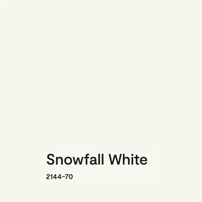
Benjamin Moore Snowfall White (OC-118) is a bright, versatile off-white with soft yellow undertones and an LRV of 91.8. It’s similar to Simply White, but with much softer yellow undertones. We don’t see this color often in blogs, so it’s relatively unknown, and we love it.

Common wisdom tells us not to use a bright white in a darker room, but we’ve found that whites with yellow undertones are the exception. Snowfall White is one of the few bright whites we’ll use in a darker space, like the client’s room above. I actually consider it brighter than Benjamin Moore Chantilly Lace (2121-70), even though Chantilly Lace has a slightly higher LRV of 92.2. The yellow is what makes Snowfall White look brighter.
Use Snowfall White with crisp, clean, bright hard finishes. It’s also one of our favorite trim, ceiling, and cabinet colors, and it tested beautifully as trim with Mascarpone walls. Avoid it in rooms with Tuscan or very earthy finishes.

2. Benjamin Moore Simply White (OC-117)
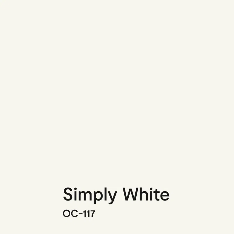
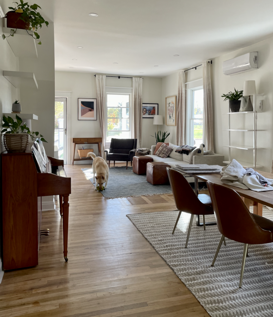
Benjamin Moore Simply White (OC-117) is a magical, crisp off-white with strong yellow undertones and an LRV of 89.5. It was Benjamin Moore’s 2016 Color of the Year, and we use it all the time, including in my own Colorado home, where my family won’t let me change it. In my client’s kitchen below, you can see just how warm and inviting Simply White cabinets, walls, and ceilings make this space feel.

According to the rules of whites, you should never use such a light paint color in a dimly lit room, but somehow Simply White shines like a beacon. When we first tried it in a low-light house at the homeowner’s request, we didn’t believe it would work, but it did. I call this cutting through the dinge: the low light neutralizes the yellow in Simply White, so the walls look soft, lovely and bright instead of gray and shadowy. A cool white can’t do that.
Simply White is gorgeous with clean, crisp finishes, and on cabinets it adds warmth to an all-white kitchen. Don’t use it with tile that has pink-beige undertones, or with Carrara marble. As trim, darker whites like White Dove or Swiss Coffee will look dirty next to Simply White walls.
3. Benjamin Moore Mascarpone (AF-20)
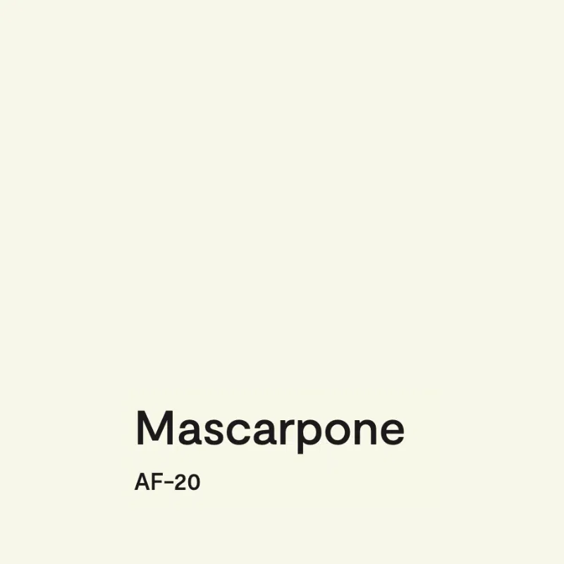
Benjamin Moore Mascarpone (AF-20) is a warm, creamy off-white with strong yellow undertones and an LRV of 89. It truly glows on the wall. Despite being very light, it has tons of warmth and won’t look washed out, even in the brightest light. In warm lighting, it can look almost like a very pale butter yellow.
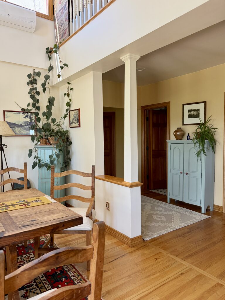
Mascarpone is the perfect example of why LRV is only a guideline. In a Colorado farmhouse we worked on, pictured below, the dining room walls are Mascarpone, and the wall extending up into the loft is White Dove. White Dove has the lower LRV, but Mascarpone looks darker because it has so much pigment and such strong yellow undertones.
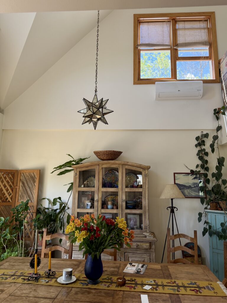
Because its undertones are so strong, Mascarpone isn’t as versatile as White Dove. It can look discordant with taupes and finishes that have pink undertones. In that same farmhouse, we specified White Dove for the kitchen walls and the fireplace wall because Mascarpone clashed with a pinkish-taupe backsplash and the stone. I also wouldn’t use Mascarpone as a trim color. It’s too creamy to pair with most other whites, and it limits your future wall color choices.
4. Benjamin Moore White Dove (OC-17)
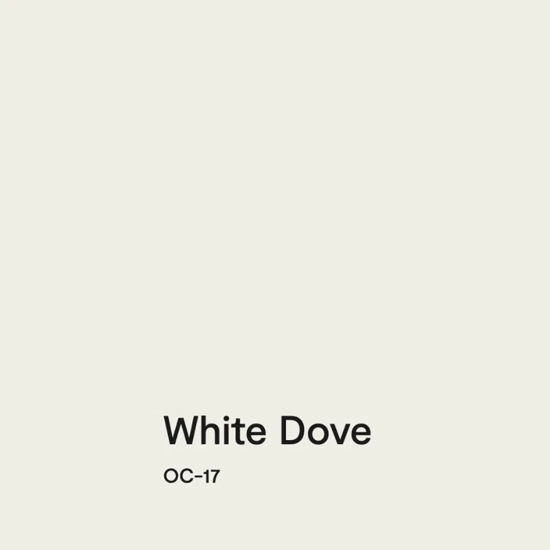
Benjamin Moore White Dove (OC-17) is a soft, muted off-white with grayed-out yellow undertones and an LRV of 83.16. It’s one of our favorite whites for walls, trim, ceilings, and cabinets. It looks fantastic in bright rooms and lower-light rooms alike, because it has enough yellow that it won’t gray out in the shadows, but that yellow rarely shows through.
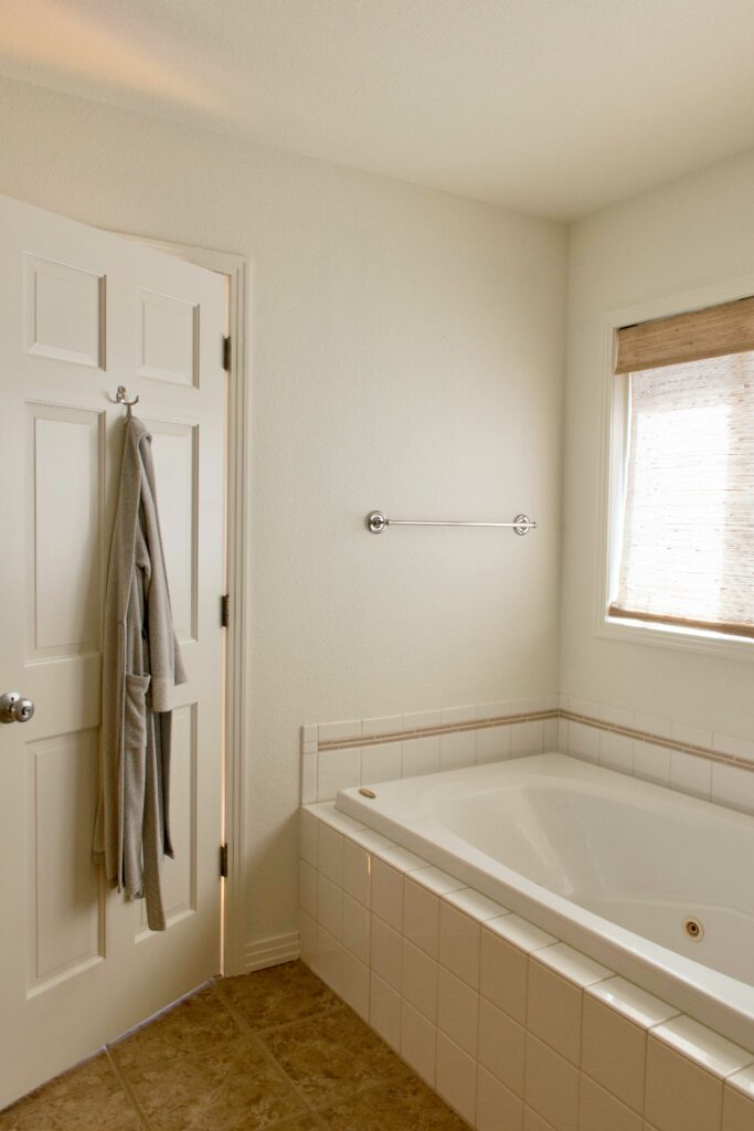
My favorite way to use White Dove is all-white color drenching. I paint the walls, trim and ceiling the same color with shifting sheens: a flat ceiling, satin trim, and eggshell or matte walls. The bathroom below is a great example of White Dove color drenching – this bathroom is transformed into a spa-like space even with its original earthy tile and flooring.
Skip White Dove as a trim or cabinet color next to cool Carrara marble, where its yellow shows. Blue-whites look discordant as trim with White Dove walls, and a darker white like Swiss Coffee will look dingy as the trim or ceiling. White Dove is an excellent backdrop for bolder colors, like dark wood, black, and even bright red, as shown in my client’s entryway below.

5. Benjamin Moore Swiss Coffee (OC-45)
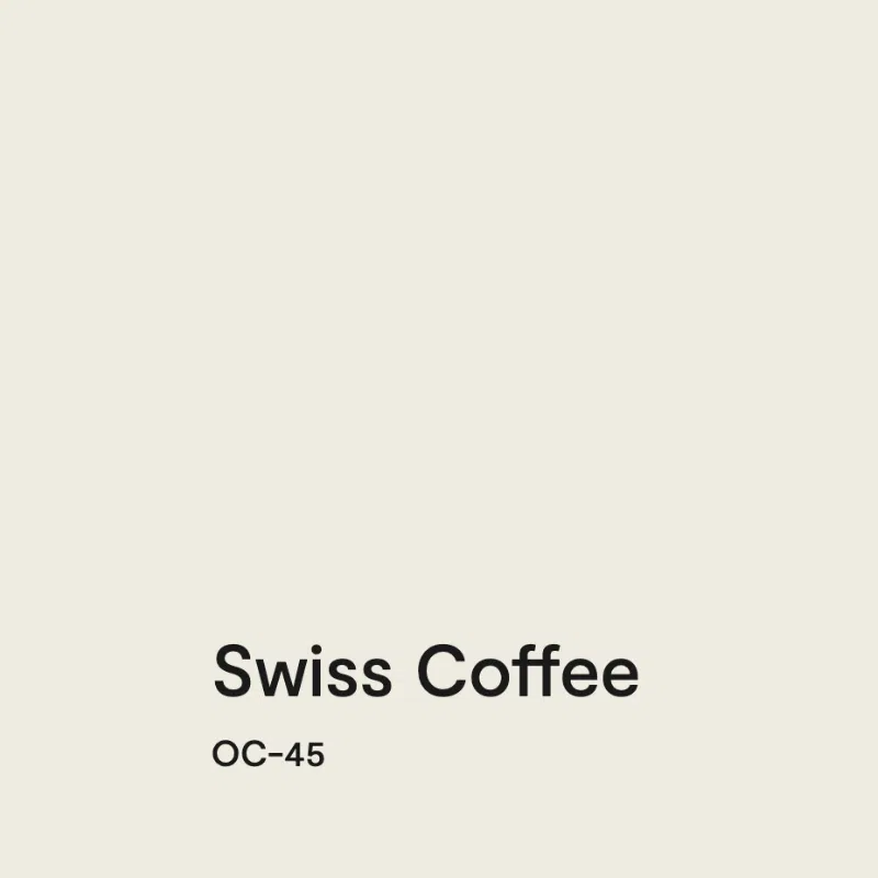
Benjamin Moore Swiss Coffee (OC-45) is a warm, creamy off-white with invisible green undertones that lean toward yellow and an LRV of 82. It has enough depth to be a great white for dark rooms and rooms with cool, north-facing light.
Here’s what surprises people. Colors with yellow undertones, like White Dove, usually look warmer than colors with green undertones. That isn’t the case with these two. Swiss Coffee looks warmer in place because it’s less muted; the yellow it does have is stronger than the yellow in White Dove, and it’s slightly darker.

For one Colorado family’s Tuscan-era home, we tested several whites in rooms with constantly shifting light and lots of shadows. Simply White was too stark and Mascarpone was too yellow. We carefully tested White Dove and Swiss Coffee, and Swiss Coffee won. We used it everywhere, on cabinets, walls, ceilings, and trim in different sheens, and it looked like a different color on every wall. It pairs just as well with natural wood and terracotta tile as it does with warm white subway tile.

Avoid Swiss Coffee with cool whites like Sherwin-Williams Extra White (SW 7006) or Benjamin Moore Decorator’s White (OC-149), and with Carrara marble. It’s also the darkest white I’d usually pick for interior trim.
6. Benjamin Moore Cloud Cover (OC-25)
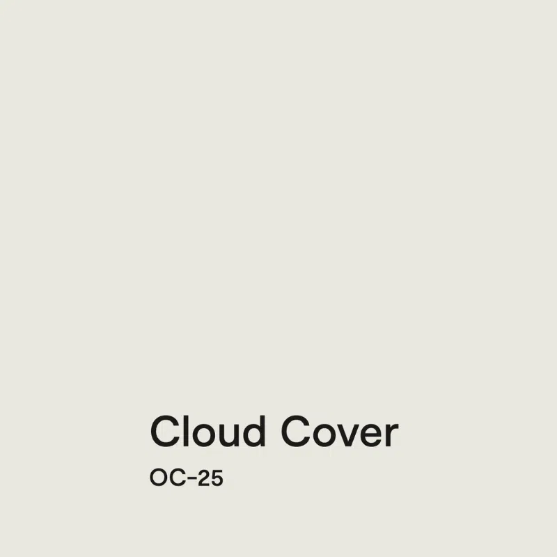
Benjamin Moore Cloud Cover (OC-25) is a soft off-white with invisible violet undertones and an LRV of 80.28, which puts it right on the border of a light greige. It gets its undertones from violet, so it has some red in it, and it has enough pigment that it never looks stark.
For Cloud Cover, warm or cool is a relative answer. It’s cooler than White Dove but warmer than Benjamin Moore Decorator’s White (OC-149) and Chantilly Lace. It looks fantastic in rooms with tons of light, and it also looks great in north-facing rooms and rooms with shadows.

It looks best with modern finishes, especially white quartz, and it’s lovely with taupes and violet-grays like Benjamin Moore Balboa Mist and Benjamin Moore Collingwood. If your home is full of cool violet-gray tones and you want to warm it up without replacing your hard finishes, Cloud Cover is a great option. Cloud Cover doesn’t look great with very warm beiges. Whites with heavy yellow undertones, like White Dove, Simply White and Swiss Coffee, will look very yellow as trim and ceilings with Cloud Cover walls.
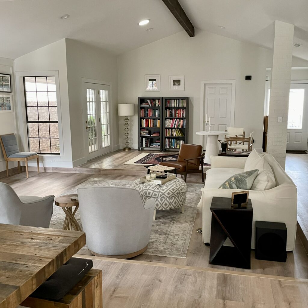
In our Houston client’s home below, Cloud Cover was the whole-house wall color, with Benjamin Moore Oxford White trim and ceilings. For me, Cloud Cover is too dark to use in a wall, ceiling, and trim drench. Instead, use Oxford White or Chantilly Lace for trim and ceilings.
7. Benjamin Moore Dove Wing (960)
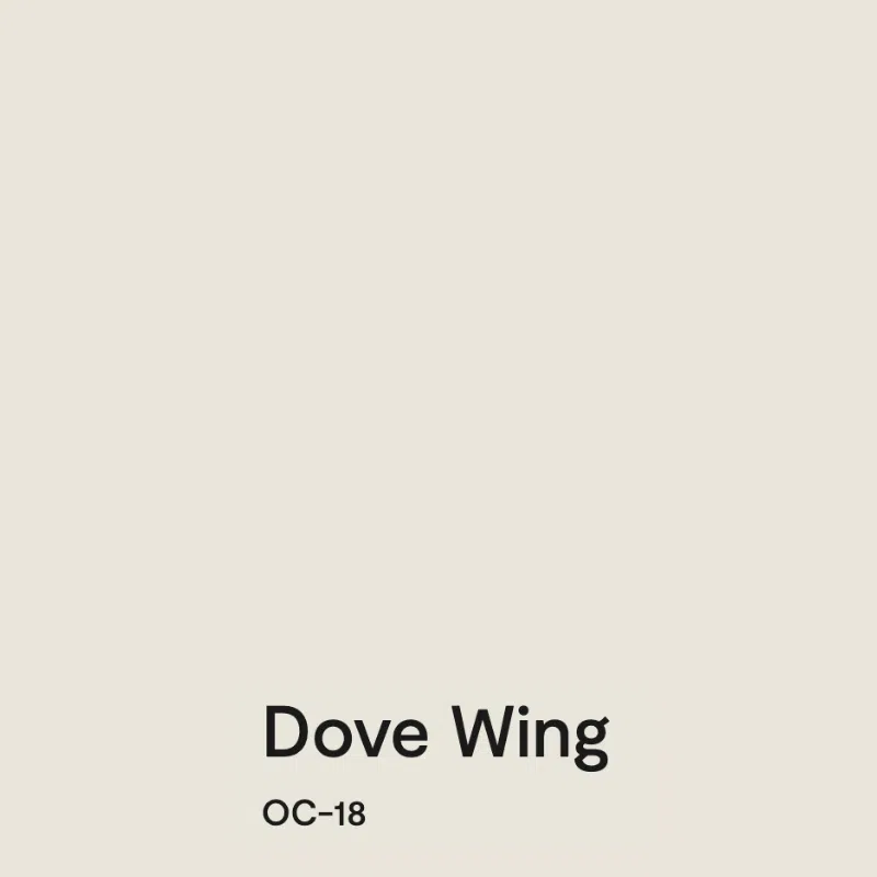
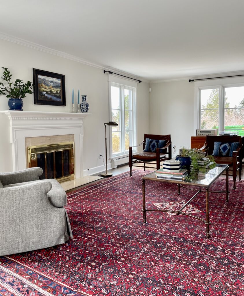
Benjamin Moore Dove Wing (960) is a warm, delicate off-white that falls somewhere between a light beige and a complex cream, with green undertones and an LRV of 77.52. An LRV that low would normally push a color out of the off-white category, but Dove Wing looks surprisingly bright in place because it’s so clean. It’s basically a slightly darker version of Swiss Coffee and a lighter version of Ballet White.
When I walked into one client’s home painted in Dove Wing, my first impression was how very bright it felt, more like an off-white than a light beige. It looked lovely with the natural wood floors, black light fixtures, black stair railing and natural light.

Dove Wing is not my favorite with taupe, however. In another part of this client’s home – in the basement – it clashed with the taupe carpet and brought out the pink. I also wouldn’t use Dove Wing as a trim color or in a color drench, because its LRV is a bit too low and the ceiling may look dingy.

8. Benjamin Moore Classic Gray (OC-23)

Benjamin Moore Classic Gray (OC-23) is a warm light greige that reads white in rooms where white paint looks too stark or cold. It has nearly invisible warm green undertones that can flash violet in cooler light, and an LRV of 74.8. Compared to other light greiges, I still consider Classic Gray fairly warm.

Use Classic Gray instead of white when your room is too dark or when you have lots of greenery outside. White is a mirror: a white wall has little color of its own, so it reflects everything around it, including the grass, your neighbor’s paint color, pink flowers, and even an evergreen tree. Classic Gray has enough pigment to neutralize those reflections. It looks like a glorious soft white in south-facing rooms and holds its own in east- and west-facing rooms any time of day.
Pair Classic Gray with clean whites like Benjamin Moore Chantilly Lace (2121-70) or Benjamin Moore Oxford White for trim and ceilings, or with off-whites like Simply White. Stay away from creamier trim colors like Swiss Coffee. There won’t be enough contrast, and the combination will look like a mistake.
9. Benjamin Moore Ballet White (OC-9)
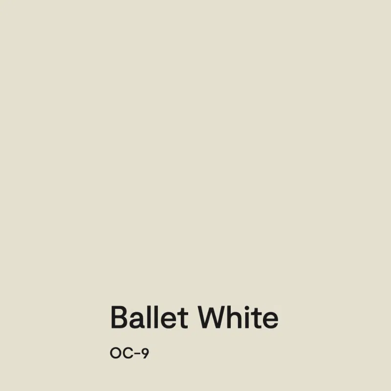
Benjamin Moore Ballet White (OC-9) is a soft, muted, warm, very light beige with green undertones and an LRV of 71.97. It’s the darkest color on this list, sitting right on the line between an off-white and a light warm beige. It’s creamy, but it isn’t as yellow as many creamy colors, and it won’t look yellow even in very warm light.

Ballet White has enough pigment to add depth and warmth and to stand up to dark shadows, so it won’t look dingy in a dimly lit or north-facing room. The client home in our Ballet White review was pretty dark inside, and Ballet White brought it to life. The client first tried Sherwin-Williams Shoji White (SW 7042) in the family room. It looked ok, but Ballet White has a much cleaner base and is slightly less muted. I think of Ballet White as a darker version of Swiss Coffee.

Ballet White is too dark to use as a trim color. In the client’s home pictured above we painted the trim and ceilings Benjamin Moore Oxford White, which gives a crisp contrast.
Which Benjamin Moore Off-White Is Best for Your Light?
Light changes a white more than any other color, so start with the room.
- Dark rooms and basements: Simply White, Snowfall White and White Dove. Their yellow undertones keep them from looking dingy. For more pigment, try Swiss Coffee or Ballet White. See our full list of the best white paint colors for dark rooms.
- North-facing rooms: Swiss Coffee, Cloud Cover and Ballet White all have enough warmth and pigment to balance cool northern light. More ideas in our guide to paint colors for north-facing rooms.
- Bright, sunny rooms where white looks stark: Classic Gray reads as a soft white, and Cloud Cover looks fantastic in rooms with tons of light.
- Lots of greenery outside the windows: Classic Gray, which neutralizes the green a bright white would reflect.
Benjamin Moore Off-White FAQ
Can I paint match Benjamin Moore off-whites at Sherwin-Williams?
No. Benjamin Moore whites matched at another brand tend to come out green. Choose a close Sherwin-Williams color instead: Sherwin-Williams Greek Villa (SW 7551) or Alabaster (SW 7008) for White Dove, Alabaster for Swiss Coffee, Origami White (SW 7636) for Cloud Cover, and Pearly White (SW 7009) for Dove Wing.
Should I lighten a Benjamin Moore off-white by 50%?
We don’t recommend it. Cutting a color like Benjamin Moore Swiss Coffee (OC-45) to 50% creates a custom color, and there’s no formula for it, so the result depends on who mixes it. Pick a lighter color with the same undertones instead. If Benjamin Moore Dove Wing (960) feels too dark, try Swiss Coffee.
Can I use two Benjamin Moore off-whites in the same house?
Yes, if they’re close and you’re careful where they meet. In one Colorado farmhouse, we specified Benjamin Moore Mascarpone (AF-20) for the main level and kept Benjamin Moore White Dove (OC-17) in the stairway and loft. Keep trim and ceilings lighter than the walls, and never pair warm off-whites with blue-whites.
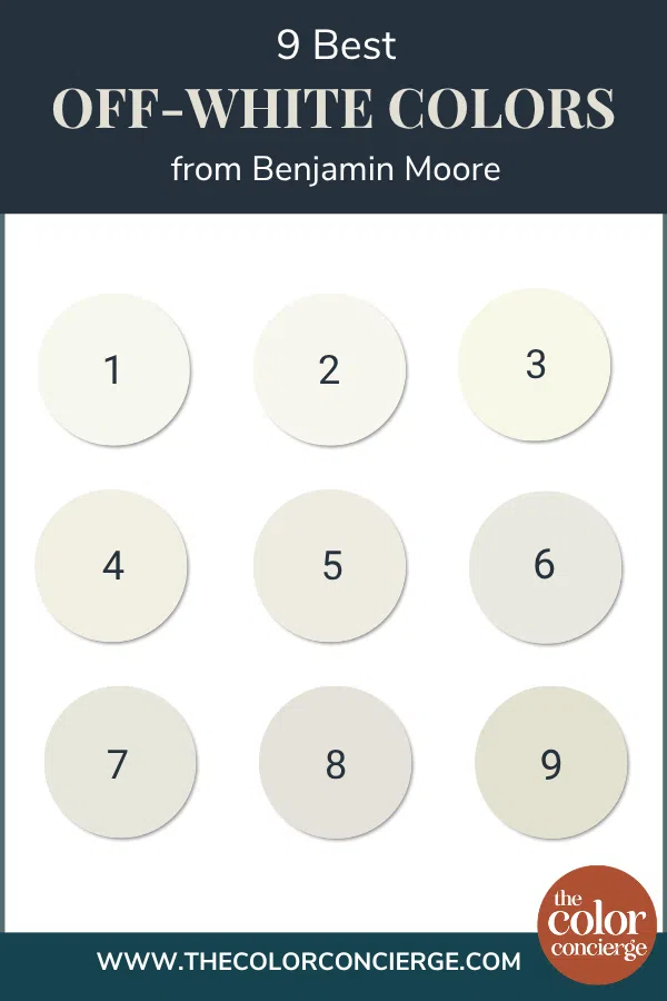
| Paint color | Peel-and-stick sample |
|---|---|
| 1. Benjamin Moore Snowfall White (OC-118) | Sample Snowfall White |
| 2. Benjamin Moore Simply White (OC-117) | Sample Simply White |
| 3. Benjamin Moore Mascarpone (AF-20) | Sample Mascarpone |
| 4. Benjamin Moore White Dove (OC-17) | Sample White Dove |
| 5. Benjamin Moore Swiss Coffee (OC-45) | Sample Swiss Coffee |
| 6. Benjamin Moore Cloud Cover (OC-25) | Sample Cloud Cover |
| 7. Benjamin Moore Dove Wing (960) | Sample Dove Wing |
| 8. Benjamin Moore Classic Gray (OC-23) | Sample Classic Gray |
| 9. Benjamin Moore Ballet White (OC-9) | Sample Ballet White |
Off-whites are where small differences show up the most. Mascarpone can look darker than White Dove despite its higher LRV, and a white that looks perfect on a chip can turn yellow next to Carrara marble or pink next to taupe stone. Put two or three of these side by side on your wall, next to your trim and countertops, and look at them morning and evening.
New to peel-and-stick samples? Samplize sends real manufacturer paint, two coats, in a 9” x 14” sheet, delivered overnight. I use them on every consultation. More on our method here: how to test paint colors.
Key Learning Points
The best Benjamin Moore off-white paint colors are the ones whose undertones suit your light and your hard finishes, not the ones with the highest LRV.
- LRV is a guideline, not a guarantee. Benjamin Moore Mascarpone (AF-20) has an LRV of 89, yet it looks darker on the wall than Benjamin Moore White Dove (OC-17) at 83.16 because of its pigment and strong yellow undertones.
- Let the undertone do the work. Yellow-based off-whites like Simply White cut through the dinge in dark rooms. Green-based ones like Swiss Coffee and Ballet White love earthy finishes and wood. Violet-based Cloud Cover suits cool, modern finishes and white quartz.
- Protect your off-white with the right trim. Keep trim and ceilings lighter than the walls and avoid blue-whites like Sherwin-Williams Extra White (SW 7006).
Remember: NEVER, EVER use paint matches from a different brand than the one specified. Results are poor and there are no standards for the sheens. Even though your painter may truly believe it can be done, don’t do it. See results in our paint matching guide.
No matter what, always test your paint colors. It’s a standard best practice. Whenever I test my paint colors, they are perfect, and when I don’t test they turn out wrong. Learn how to test your paint colors like a pro.
Online Color Consulting
Still need help picking the best paint colors? Discover our Online Color Consulting Packages.

Related Posts
- 11 best off-white paint colors from Sherwin-Williams and Benjamin Moore
- Our favorite Benjamin Moore white paint colors
- Best Benjamin Moore white trim and ceiling colors
- Best white paint colors for dark rooms
- Best white paint colors for kitchen cabinets
- Our full guide to LRV
About the Author

Hi, I’m Michelle Marceny, founder, owner, and Principal Color Designer at The Color Concierge. I believe a fresh coat of paint can completely transform a space. The Color Concierge was born out of my drive to help clients fall back in love with their homes. My clients trust me to help them find the perfect paint color — whether that’s a whole-house color scheme or ideas for a single room.
Since founding The Color Concierge in 2017, my team and I have completed 1,000s of color consultations, online and in person. I’m a Certified Color Expert with nine years of experience creating interior and exterior color palettes throughout North America.
Every color review on this site comes from colors we’ve specified in real homes and photographed on location during our own consultations — not from a fan deck or a manufacturer’s website.
We love your comments! Please note that the blog is meant as general advice, and it is not possible to give out specific answers to your paint questions. If you want more specific advice, our Online Color Consultations will help you pick your paint colors. Thank you for your understanding.