Off-white paint colors are one of our most-requested categories at The Color Concierge – and for good reason.
The right off-white can warm up a room, hide shadows in darker spaces, and work beautifully with everything from modern quartz countertops to earthy Tuscan-era finishes. But the wrong off-white? It can look like primer, go dingy in the corners, or clash horribly with your finishes.
We’ve done deep-dive reviews on dozens of off-white paint colors over the years, and today we’re bringing the best of all that research together in one place. Whether you’re a Sherwin-Williams fan or a Benjamin Moore devotee, this list has you covered.
Here are our paint color consultant picks for the best off-white paint colors, plus real project photos and tips on exactly how to use them.
*This post contains affiliate links for products I use and love. If you click on some links and make a purchase, I will get a small commission at no cost to you. This helps pay for the costs of the blog, so I can continue to offer great content to our readers.
About The Color Concierge
Our Colorado-based paint color consultants make finding the right paint colors for your home easy. Whether you’re painting the exterior or interior of your home, our simple yet effective process lets us get your paint color right the first time. We’ve helped thousands of homeowners transform their homes into a space they love. Learn more about ONLINE COLOR CONSULTATIONS today.
What Is Off-White Paint?
All of the options for light neutral paint colors can be completely overwhelming. Among white, cream, light beige, greige…it’s easy to be unsure about where off-white fits in. The good news is, off-white paint colors generally share a few main attributes.
Off-white paints:
- Are slightly warm (but not so warm that they start to look yellow)
- Often have yellow undertones (but not always)
- Typically have an LRV of 80 and above
Can you use off-white paint for exteriors?
Generally, off-white paint colors are too bright for most exteriors. I don’t like using these for exteriors in most cases because they are so bright that they can look blinding, especially if you live in a very sunny or high-elevation area.
Some of the colors featured today can work. If you’re painting a house with an all-white body, for example, I’d consider using Sherwin-Williams Alabaster, Sherwin-Williams Greek Villa, or Benjamin Moore Swiss Coffee (Articles). You can also use most of the colors in this list as an exterior trim color if the body color of your home is very light.
Read more off-white exterior tips in each of the featured color reviews below.
Sample the Best Off-White Paint Colors
We always recommend that you test paint colors (article) in your home because lighting can completely change a color, both on interiors and exteriors.
In the old days, this meant we painted a large poster board with sample pots and a huge mess.
Now we have a better way to test paint, with Samplize Peel-and-Stick samples!
- Samples pre-painted with 2 coats of real paint from the manufacturer.
- Large 9” x 14” samples to see the color better in the lighting.
- Delivered overnight
- Colors are accurate
- Less expensive than painting a large poster board with sample pots
- No mess, and no toxic paint to dispose of
I use these in my color consulting practice for exact results. Discover Samplize peel-and-stick paint samples via the link below.
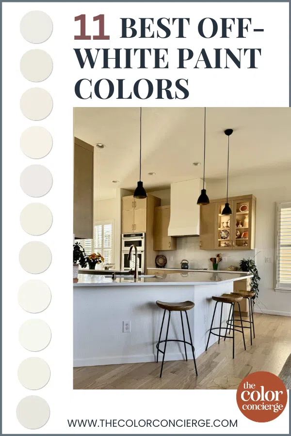
11 Best Off-White Paint Colors & How to Use Them
Explore all the details about our favorite off-white paint colors from Sherwin-Williams and Benjamin Moore and get our best paint color consultant tips on how to use them.
Sherwin-Williams Pure White
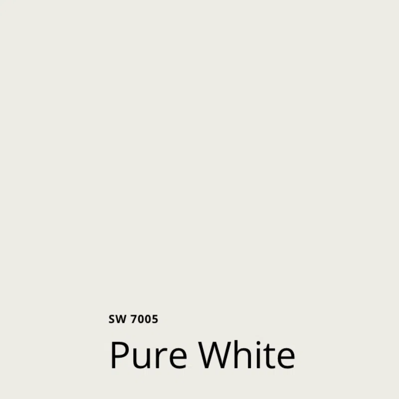
SW Pure White (Article) is one of my favorite white paint colors and one that I recommend to clients often. I’ve also used it in my own home!
Pure White (Sample) has an LRV of 84 and light yellow undertones, which makes it a crisp off-white paint color that won’t look harsh on the wall.
We love using Pure White as a trim and ceiling white. It can also be lovely as an interior or exterior wall color, in certain situations. This is the brightest Sherwin-Williams white paint color that I would specify as an exterior white, although it’s too stark for many exteriors. I wouldn’t use it on an exterior with earthy brick or stone.
SW Pure White Interior Paint Tips and Tricks:
- Use with: Carrara marble counters, light quartz countertops, clean white subway tile, and soft warm Calacatta tile.
- Don’t use with: Rooms with low light or cool, North-facing light, or with earthy brick or stone.
- For exteriors: Beautiful as a whole-house exterior color, especially in the shade for farmhouse or black-and-white schemes. Avoid situations without shade. It can be blinding. Can be too bright as an exterior trim color unless the siding is very light.
- Best ceiling color (flat): Pure White
- Best trim color (satin): White Snow, Pure White
- Best paint matches: Pure White is pretty unique and special, and there isn’t an exact match in the Benjamin Moore world. To get a similar look and feel, I would try Benjamin Moore Oxford White, which is cooler and more of a clean white.
Sherwin-Williams Alabaster
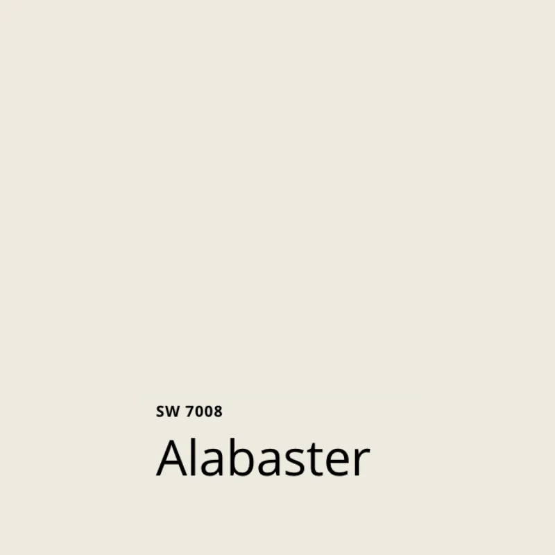
Sherwin-Williams Alabaster (Article) is one of the company’s most famous white paint colors and one of their Top 50 Colors. It is a creamy, muted off-white hue with strong yellow undertones. With an LRV of 82, it’s still a fairly light color but also dark enough to work in some exterior applications.
SW Alabaster (Sample) is one of our favorite white kitchen cabinet paint colors (Article) because it works perfectly with granite countertops and other earthy finishes. It’s also a lovely bedroom paint color and can work even in low light or cool, North-facing light. It looks good with earthy finishes and is a good option if you are updating a kitchen with granite countertops.
SW Alabaster Interior Paint Tips and Tricks:
- Use with: Warm wood floors, granite countertops, earthy finishes, clean white tile, quartz countertops, and colorful accents. Looks great with Taj Mahal stone countertops.
- Don’t use with: Very cool white paint or finishes (Alabaster may look too yellow). Extra White as a trim and ceiling color can work, but is not ideal. Make sure you test.
- For exteriors: Works best on homes surrounded by trees or in the shade. Can look too stark in full bright sunshine. Avoid with very dark siding or earthy red brick.
- Best ceiling color (flat): SW Alabaster, SW White Snow, SW Pure White
- Best trim color (satin): SW Alabaster, SW White Snow, or SW Pure White
- Best paint matches: BM White Dove
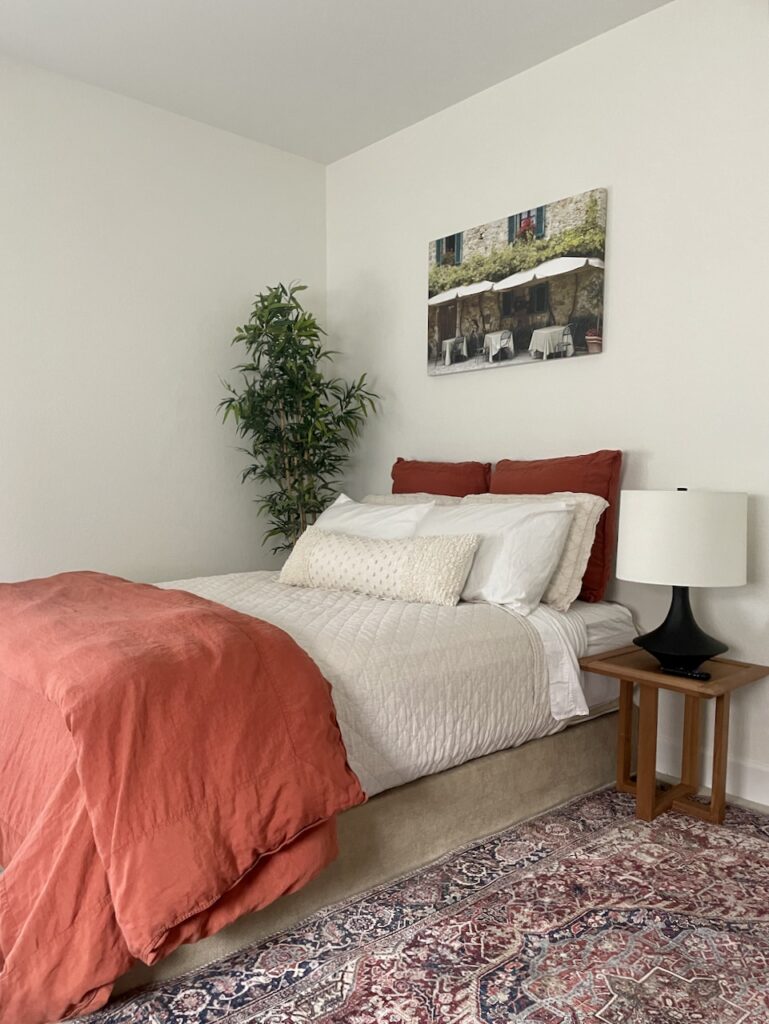
Sherwin-Williams Greek Villa
Sherwin-Williams Greek Villa (Article) is a soft and forgiving off-white paint color with very slight yellow undertones. With an LRV of 84, it sits right in the middle of the off-white range.
Greek Villa (Sample) can work well with clean and crisp finishes, and some brighter granite tiles and countertops. It looks great as a kitchen cabinet color with black granite or quartz countertops.
We also love it as a wall color. It works well in brightly lit and low-light rooms, which makes it very flexible. Greek Villa also pairs beautifully with bold accent walls and furniture.
SW Greek Villa Interior Paint Tips and Tricks:
- Use with: Warm wood floors, quartz countertops, less earthy granite countertops, clean white tile, and colorful accents.
- Don’t use with: Very cool white paint or finishes such as Carrara Marble (Greek Villa may look too yellow). Extra White as a trim and ceiling color can work but not ideal.
- For exteriors: One of our favorite exterior off-whites! Great as a whole-house white color with red brick. Do not use as an exterior accent trim color with a darker siding color – it can look like primer in contrast.
- Best ceiling color (flat): SW Greek Villa, SW Pure White
- Best trim color (satin): SW Greek Villa, SW Pure White, or SW White Snow
- Best paint matches: BM Cloud White
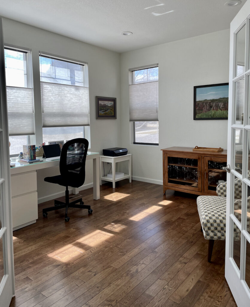
Sherwin-Williams Cheviot
Sherwin-Williams Cheviot (Article) is a newer Sherwin-Williams white paint color (Article), part of their Designer Color Collection. With an LRV of 89 and soft yellow undertones, Cheviot is a bright off-white with a high LRV that still has plenty of warmth.
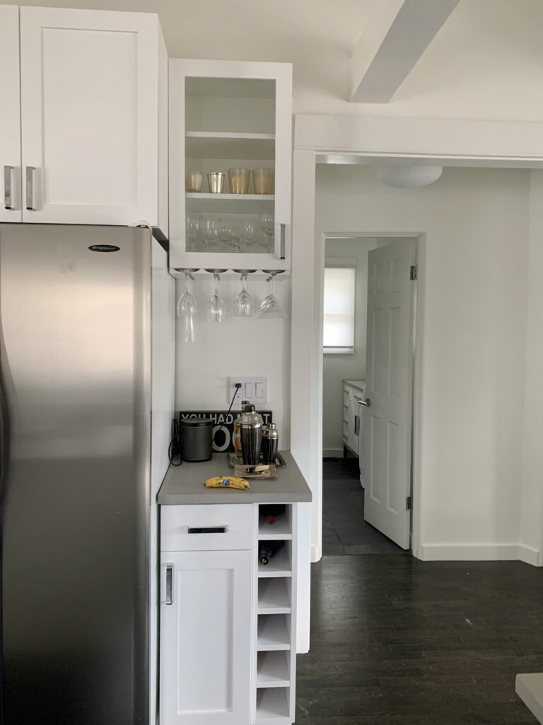
It’s one of the best Sherwin-Williams whites for darker rooms that you want to brighten with white paint. One of the best things about Sherwin-Williams Cheviot (Sample), though, is its coverage. It only took two coats to cover builder-grade Agreeable Gray (Article) in my paint color consulting studio, pictured below.
SW Cheviot Interior Paint Tips and Tricks:
- Use with: Warm wood floors, warm/dark accent wall colors, rooms with low light.
- Don’t use with: Tuscan-look earthy finishes with pink-beige undertones, such as travertine or tile; blue-white trim colors
- For exteriors: Not currently available as exterior body paint. When it becomes available, may be too bright with low pigment for many exterior applications.
- Best ceiling color (flat): SW Cheviot or SW Pure White
- Best trim color (satin): SW Cheviot, White Snow, or SW Pure White
- Extra White will work as a trim and ceiling color, as shown above, but not my first choice.
- Best paint matches: BM Simply White
Sherwin-Williams Snowbound

Sherwin-Williams Snowbound (Article) is one of the most talked-about whites in the design world, and one of the top 50 Sherwin-Williams colors. It’s important to know that it can be a tricky color to work with.
Unlike the majority of off-white paint colors on this list, SW Snowbound (Sample) does not have yellow undertones. Instead, its warmth comes from strong taupe undertones that can flash pink. These tones are what makes it so unique and beautiful, but also what can make it difficult to use in some homes and lighting. Be sure to test it carefully before committing.
One of the applications I like to use it for is when there is a TON of green foliage reflecting into the space. The red/pink in the color seems to neutralize the green. It was perfect for the space below.
SW Snowbound has an LRV of 83, putting it solidly in the off-white paint color category.
Snowbound Tips and Tricks:
- Use with: Clean white finishes, natural wood, cool greens, and spaces with lots of green foliage reflecting in. Use Snowbound walls with Snowbound trim for a cohesive look.
- Don’t use with: Yellow-based whites like SW Alabaster or SW Greek Villa (will look discordant). Tuscan or warm earthy finishes. Do not use as a ceiling-only color — its pink undertones make it very hard to pair with wall colors.
- For exteriors: Can work well as a whole-house exterior color, but be careful — it reads very bright in full sun. Avoid using in neighborhoods with dark, earthy neighboring houses, as the contrast can look stark.
- Best ceiling color (flat): SW High Reflective White or SW White Snow. White Snow isn’t available in ceiling paint at this time, so you would need to use Flat Duration paint at this time.
- Best trim color (satin): SW Snowbound (paired with Snowbound walls). Not recommended as a standalone trim color with other wall colors.
- Best paint matches: BM Atrium White (similar taupe/pink undertones, slightly lighter and cleaner)
Benjamin Moore White Dove
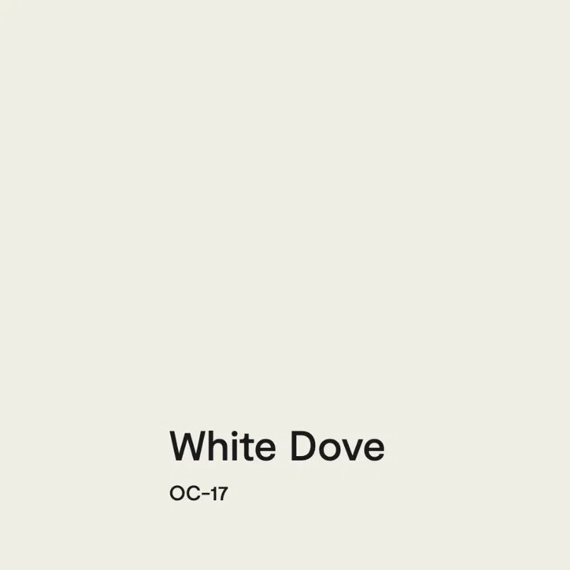
Benjamin Moore White Dove (Article) is a versatile off-white paint color with subtle yellow undertones and an LRV of 85. We love to use White Dove to update a house that has earthy finishes from the Tuscan era, but it also looks great with crisp white modern finishes.
This is also a great white kitchen cabinet color to pair with any quartz or granite countertop. If you have a dark room or a north-facing room with cool light, White Dove (Sample) is a great option.
White Dove Tips and Tricks:
- Use with: Earthy Tuscan colors, muted colors, browns, creamy quartz, or Calacatta marble. Good white for dark rooms or north-facing exposures.
- Don’t use with: Cool whites like BM Decorator’s White, SW Extra White, or finishes such as Carrara marble counters.
- For exteriors: Use with caution – it can look stark in very bright sun. Best for shaded lots or when used as an accent trim with a light body color. For exteriors, BM Swiss Coffee has more pigment and performs similarly.
- Best ceiling color (flat): White Dove, Oxford White, or Chantilly Lace
- Best trim color, same as ceiling (satin): White Dove, Oxford White, or Chantilly Lace
- Best paint matches: SW Alabaster, SW Greek Villa
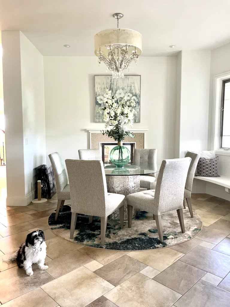
Benjamin Moore Swiss Coffee
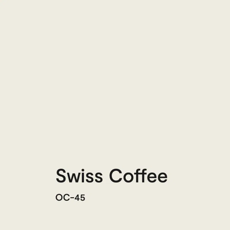
BM Swiss Coffee (Article) is a gorgeous, complex off-white paint color with an LRV of 84 and invisible green undertones that lean a bit toward yellow.
This paint color is fabulous with earthy Tuscan Era finishes. Use it with earthy colors, browns, tans, and warm grays. Swiss Coffee (Sample) also works well for a darker or North-facing room (Article) with cool light.
One important note: make sure that you specify Benjamin Moore for this specific color. There are Swiss Coffee paint colors (Article) in just about every paint brand, and they are all different!
Swiss Coffee Tips and Tricks:
- Use with: Earthy Tuscan colors, muted colors, browns, creamy quartz, or Calacatta marble. Good white for dark rooms or north-facing exposures. Looks great with Taj Mahal countertops as wall and/or cabinet colors.
- Don’t use with: Very Clean whites such as Chantilly Lace. Avoid cooler white paint colors like SW Extra White or BM Decorator’s White. Avoid cool marbles or finishes such as Carrara marble counters.
- For exteriors: Looks like a soft, warm white in the sunshine — performs better outdoors than White Dove because of its extra pigment. Good for shaded spots.
- Best ceiling (flat): Cloud White (with Cloud White trim) or White Dove (with White Dove trim)
- Best trim color (satin): Cloud White or White Dove
- Best paint matches: SW Dover White
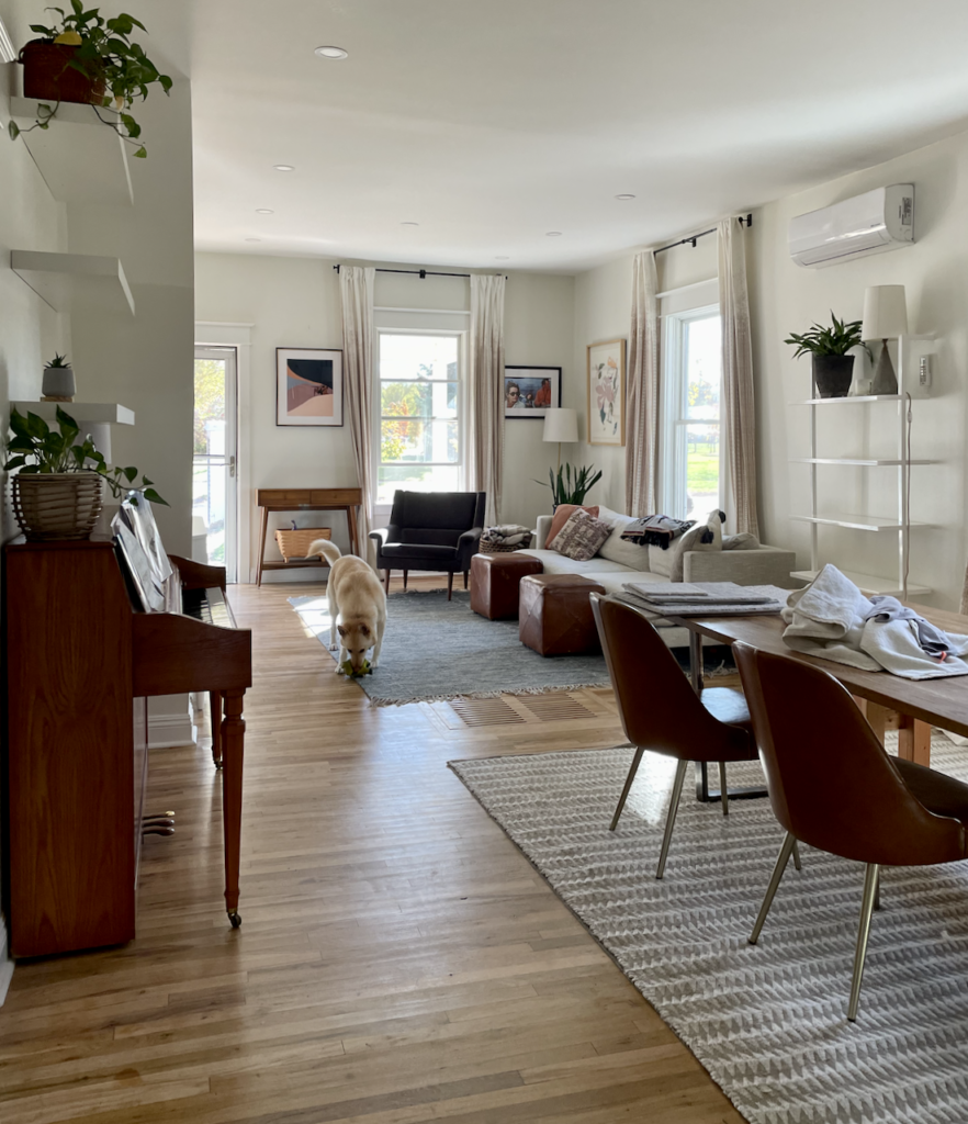
Benjamin Moore Simply White
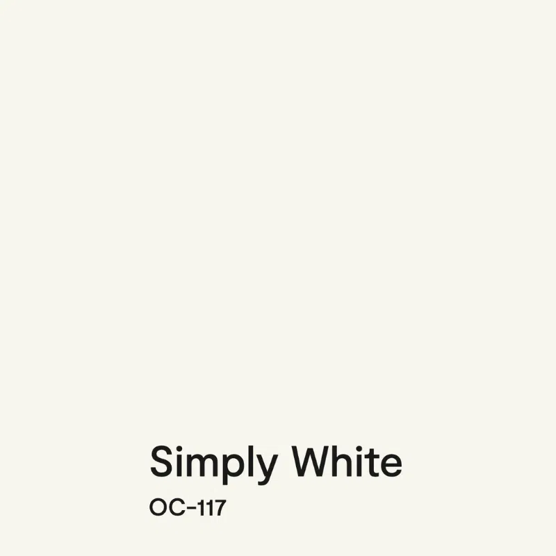
Simply White (Article) is one of Benjamin Moore’s most iconic white paint colors. It is a versatile, bright, and warm off-white hue with yellow undertones and an LRV of 89.5.
Simply White (Sample) looks great just about anywhere, including in darker rooms (LRV=89.5). Use it in a monochromatic paint palette or consider it for cabinets or trim. In a very dark room, I like to use Simply White as a ceiling color with White Dove walls.
Simply White Tips and Tricks:
- Use with: Clean or earthy colors, blacks or browns, Calacatta marble.
- Don’t use with: Cool whites like Extra White or Decorator’s White or finishes such as Carrara marble counters. Avoid darker ream colors for ceilings or trim.
- For exteriors: Can be used, but may look stark in very sunny exposures. Low pigment means more coats needed. Not our first choice for exteriors.
- Best ceiling color (flat): Simply White or Chantilly Lace
- Best trim color (satin): Simply White (with either ceiling color) or Chantilly Lace (with the same ceiling color). Chantilly Lace ceiling and trim look magical with Simply White walls.
- Best paint matches: SW 9503 Cheviot OR Behr PPU18-07 Falling Snow
Benjamin Moore Snowfall White
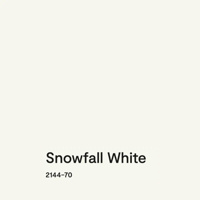
BM Snowfall White (Article) is another beautiful off-white paint color. With an LRV of 89.72, I call it a crisp off-white because it’s too warm to be a clean white despite its high LRV.
Snowfall White (Sample) is near the top of my list of the best white hues for dark rooms. Its very subtle yellow undertones keep it from looking dingy in low-lit spaces.
This color is also a great option for kitchen cabinets. It looks great with most quartz countertops, but may be too warm for cool marbles or cooler quartz.
Snowfall White Tips and Tricks:
- Use with: Clean, crisp finishes like white subway tile, white quartz countertops, and clean neutrals. Good for darker rooms thanks to yellow undertones. Works beautifully as a whole-house color.
- Don’t use with: Tuscan or very earthy interiors with heavy brown granite. Do not use as exterior trim if the siding is a darker color — it can look too stark and overly bright.
- For exteriors: Best used as a whole-house white with trim and siding the same color. Can work as exterior trim if the siding is very light. Low pigment means you’ll need primer or extra coats.
- Best ceiling color (flat): Snowfall White (monochromatic), or Chantilly Lace / Oxford White for more contrast
- Best trim color (satin): Snowfall White (monochromatic). Chantilly Lace and Oxford White also look great.
- Best paint matches: SW Pure White (close, though not exact — never match between brands)
Benjamin Moore Cloud White
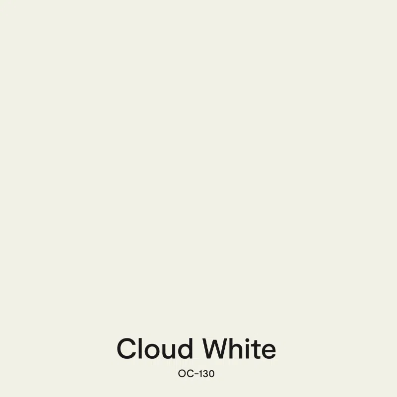
BM Cloud White (Article) is a soft, beautiful off-white paint color that we could use all day long. It has warm, invisible taupe undertones. With an LRV of 85.05, you can use Cloud White (Sample) for your walls in just about every room of the house. It also makes a lovely trim, cabinet, or ceiling white paint color.
Cloud White looks best in rooms with tons of light, but can also work well if you have some shadows. It can start to look dingy in rooms with very cool north-facing lighting.
Cloud White Tips and Tricks:
- Use with: Warm, earthy or crisp colors, muted colors, browns, creamy quartz, or Calacatta marble. Good white for dark rooms or north-facing exposures.
- Don’t use with: Cool whites like BM Decorator’s White or SW Extra White, or finishes such as Carrara marble counters.
- For exteriors: Not recommended. Low pigment means too many coats, and it can look stark in bright sun. Consider SW Greek Villa as an exterior substitute — similar look with better coverage.
- Best ceiling color (flat): Cloud White, Oxford White, or Chantilly Lace
- Best trim color, same as ceiling (satin): Cloud White, Oxford White, or Chantilly Lace
- Best paint matches: SW Greek Villa
Benjamin Moore Cloud Cover

Benjamin Moore Cloud Cover (Article) is a genuinely unique off-white on this list. It’s the only one with cooler violet undertones rather than yellow or taupe. With an LRV of 80.28, it sits right at the boundary between an off-white and a light greige. Its violet undertones give it a subtle, sophisticated quality that reads warm next to cool finishes but cool next to warm ones. It’s a chameleon of an off-white.
Cloud Cover (Sample) looks absolutely stunning in homes with modern, clean finishes. It pairs especially well with white quartz (because many quartz countertops have a similar slight violet tone), light grays, and taupe accents. It also works well in north-facing rooms and rooms with shadows because the violet undertones keep it looking polished rather than dingy.
Cloud Cover Tips and Tricks:
- Use with: White quartz countertops, cool gray and taupe finishes, violet-gray paint colors like Balboa Mist or Collingwood, clean white tile. Works beautifully in north-facing rooms and rooms with shadows.
- Don’t use with: Blue-white trim colors (Decorator’s White, White Diamond) — too cool, will look discordant. Warm yellowy whites like White Dove, Simply White, or Swiss Coffee as trim — they’ll look yellow next to Cloud Cover. Very warm beige finishes.
- For exteriors: Works well as a ‘white’ body color or as a trim for homes with very light body colors. Colors look 4-5x brighter outside, so it will read as a crisp white outdoors.
- Best ceiling color (flat): BM Chantilly Lace, BM Oxford White, or BM Snowfall White
- Best trim color (satin): BM Chantilly Lace or BM Oxford White
- Best paint matches: SW Origami White is the closest Sherwin-Williams match (though darker, with LRV of 76)
Sample The Best Off-White Paint Colors
- Sherwin-Williams Pure White
- Sherwin-Williams Alabaster
- Sherwin-Williams Greek Villa
- Sherwin-Williams Cheviot
- Sherwin-Williams Snowbound
- Benjamin Moore White Dove
- Benjamin Moore Swiss Coffee
- Benjamin Moore Simply White
- Benjamin Moore Snowfall White
- Benjamin Moore Cloud White
- Benjamin Moore Cloud Cover
Key Learning Points
Off-whites are some of today’s most popular interior paint colors because they are warm, versatile and bring much-needed brightness to a space.
- Off-white paint colors typically have an LRV above ~80 and many (but not all!) have warm yellow undertones. Other off-whites have warmth that comes from reds in taupe or violet undertones.
- Off-white hues are great for interiors, but often too light to use as exterior paint. Test carefully and read our guidance if you want to use off-white exterior paint successfully.
- There are many different options for off-white paint colors today, with varying undertones and varying LRVs.
Remember: NEVER, EVER use paint matches from a different brand than the one specified. Results are poor and there are no standards for the sheens. Even though your painter may truly believe it can be done, don’t do it. See results from paint matching here.
No matter what, always test your paint colors. It’s a standard best practice. Whenever I test my paint colors, they are perfect, and when I don’t test they turn out wrong. Learn how to test your paint colors here.
Online Color Consulting
Still need help picking the best paint colors? Discover our Online Color Consulting Packages.

Related Posts:
- Best Sherwin-Williams White Paint Colors
- Best Benjamin Moore White Paint Colors
- Best White Paint Colors for Kitchen Cabinets
- Best White Paint Colors for Dark Rooms
- How to Choose White Paint Colors Like a Pro
About the Author

Hi, I’m Michelle Marceny, founder, owner, and Principal Color Designer at The Color Concierge. I believe a fresh coat of paint can completely transform a space. The Color Concierge was born out of my drive to help clients fall back in love with their homes. My clients trust me to help them find the perfect paint color for their home – whether it’s a whole-house paint color scheme or ideas for a single room.
Since The Color Concierge was founded in 2017, we have completed over 3000 color consultations, both online and in-person. I am a Certified Color Expert with 7 years of experience creating interior and exterior color palettes throughout North America.
We love your comments! Please note that the blog is meant as general advice, and it is not possible to give out specific answers to your paint questions. If you want more specific advice, please consider purchasing a color consultation. Thank you for your understanding.
