I put off writing a guide to paint color LRV for years. Not because LRV is complicated. After all, the definition takes one sentence. I put it off because the definition is the least useful part of the subject, and every “what is LRV” article I have ever read stops right there.
So here is the sentence, and then we can get to the real thing.
Quick answer: what is LRV in paint?
Light Reflectance Value (LRV) measures how much light a paint color reflects, on a scale of 0 to 100. Zero is the complete absence of light (black), 100 is a completely reflective surface (white), and every paint color lives somewhere in between. Above 50 a color reflects more light than it absorbs; below 50 it absorbs more. But LRV cannot tell you how a color will look in your room.
Here is what that definition can’t tell you. It can’t tell you why SW Basil, at an LRV of 15, reads almost black in a client’s north-facing office — while BM Slate Teal, at an LRV of 10, five points darker, looks bright and alive in my basement gym. It also can’t tell you why BM Chantilly Lace, one of the lightest whites made at an LRV of 90, can leave a low-light room looking gray and dingy in the corners while a darker white lights the same room up.
LRV is an intrinsic part of how we pick paint colors. It’s part of our DNA. It’s also a tool with real limits, and I have watched it send people in exactly the wrong direction more times than I can count.
So this is not a definition post. This is almost a decade of specifying paint colors for real houses across the country and what I’ve learned about LRV along the way. I’ll give you my actual recommended LRV ranges by project type at the end, with every caveat they deserve. So keep reading!
Key Takeaways
- LRV runs from 0 (dark/black) to 100 (light/white), and measures reflected light. Above 50 is light-reflecting; below 50 is light-absorbing.
- No paint color is truly 0 or 100. The darkest we specify are SW Black Magic and SW Tricorn Black, both at an LRV of 3.
- Two colors with the same LRV can behave completely differently. Undertone and chroma change everything.
- A high LRV does not guarantee a bright room. A clean, cool white like BM Chantilly Lace (LRV 90) can read gray and dingy in low light, while a warmer white with a lower LRV lights the same room better.
- Below an LRV of 10, a single point makes a visible difference.
- Latitude and altitude move the whole scale. BM Cambridge Green (LRV 21) works as a whole-house color at 10,000 feet in Colorado and would be oppressive in a Fresno ranch house.
- Interior white trim: stay above LRV 80. Exterior white trim: 70 to 75 in most locations.
- Interior foundation wall colors usually land between LRV 63 and 77.
- LRV is never a substitute for testing.
About The Color Concierge
Our Colorado-based paint color consultants make finding the right paint colors for your home easy. Whether you’re painting the exterior or interior of your home, our simple yet effective process lets us get your paint color right the first time. We’ve helped thousands of homeowners transform their homes into a space they love. Learn more about ONLINE COLOR CONSULTATIONS today.
What is LRV?
LRV is a tool, and should be used carefully. It is a fabulous way to discuss depth, or different degrees of light and dark, which we do every day. It is a great way to express whether we should go lighter or darker, but there are other tools that we use along with LRV to determine how a color looks in a room.
The LRV Scale at a Glance
| LRV | What it means | Example from this guide |
|---|---|---|
| 0 | Absolute black. Theoretical — no paint reaches it. | — |
| 3 | The darkest paint colors we specify | SW Black Magic (3), SW Tricorn Black (3)) |
| Under 10 | One point makes a visible difference | BM Slate Teal (10) |
| Under 50 | Light absorbing — reads dark | SW Basil (15), BM Cambridge Green (21) |
| Over 50 | Light reflecting — reads light | SW Accessible Beige (58) |
| 63–77 | Where most whole-house wall colors land | BM Manchester Tan (63), SW Pearly White (77) |
| 80+ | Where I keep interior white trim and ceilings | BM White Dove (83) |
| 90–93 | The lightest whites made | BM Chantilly Lace (90), SW High Reflective White (93), Behr Ultra Pure White (94) |
| 100 | Absolute white. Theoretical — no paint reaches it. | — |
Understanding LRV: Light vs. Dark
One of the best ways to better understand LRV is to look at actual paint colors and how their LRVs impact how they behave in real life.
Darks: What Happens at the Bottom of the LRV Scale
Two of the darkest paint colors out there are Black Magic from Sherwin-Williams and Tricorn Black from Sherwin-Williams. They both have LRVs of 3.
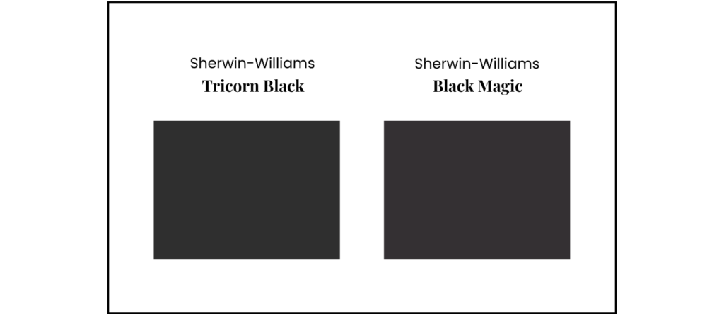
Even though the LRV is the same, these are two fairly different black paint colors that have different properties. We usually use these colors for exteriors, with some limited interior applications. For example, we use them as accents inside, as handrail colors, interior front door colors, or even accent wall or accent room colors.
There are other blacks with higher LRVs, like Wrought Iron (LRV: 8.17) and Iron Ore (LRV: 6), that are lighter and less harsh depending on the light.
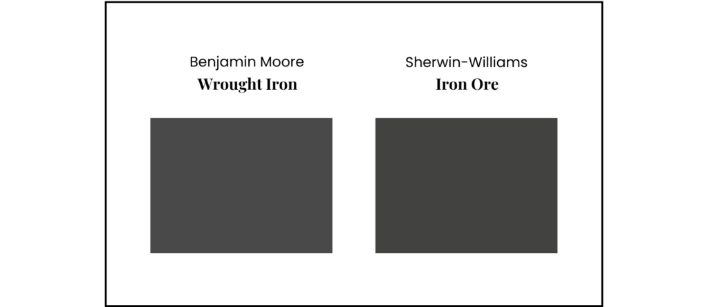
My observation about LRVs for dark paint colors is that as you get in the range lower than 10, one point can make a big difference.
Whites: What Happens at the Top of the LRV Scale
Two of the lightest white paint colors are BM Chantilly Lace (LRV=90) and SW High Reflective White (LRV=93). In this case, both whites are clean whites with no blue or yellow undertones.
I don’t have a real-world example of High Reflective White, but I do have an example of Chantilly Lace, pictured in the white kitchen cabinets below.
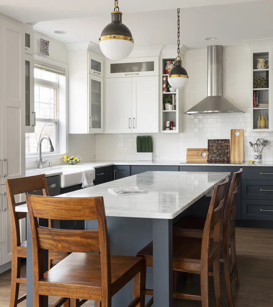
Chantilly Lace is most often used in interiors as a trim and ceiling color, and it looks great as a wall color in rooms flooded with light.
LRV for Exterior Paint Colors
LRV becomes even more complicated when you take it outdoors. A paint color with an LRV in the 80s that looks bright but lovely indoors can look stark and cold as an exterior hue.
When I was starting my career as a color consultant, I once had a painter get extremely cross with me because I’d specified Benjamin Moore Simply White (LRV: 89.52) as an exterior white trim color, and it took him 5 coats to get it to cover completely. He said that Benjamin Moore White Dove (LRV: 83.16) was on the edge, and frankly didn’t recommend whites any lighter than Benjamin Moore Swiss Coffee (LRV: 81.91). This can also happen with SW High Reflective White (LRV: 93) and to a lesser extent, SW Pure White (LRV: 85).
We usually follow that guideline, with some exceptions. The home below, for example, was really far north and about a block away from one of the Great Lakes. The trim was White Dove, and it looked gorgeous. They ended up using primer to keep from needing too many coats.
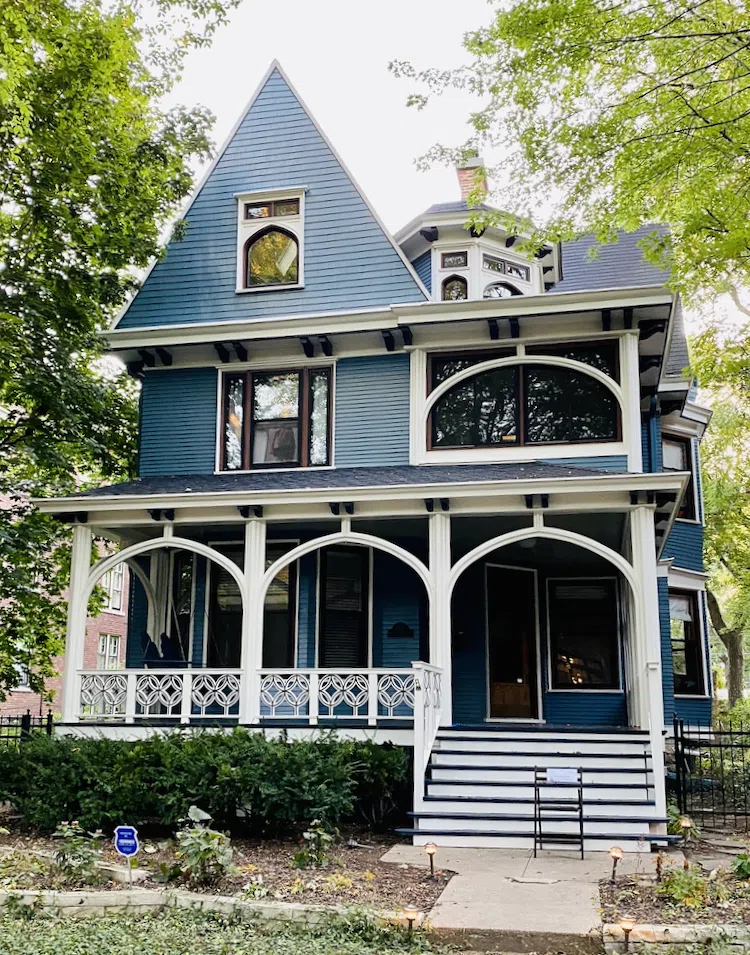
If this house had been in Nebraska or Florida, however, the white may have looked stark or blinding.
It can go the opposite way with dark colors, too. I had another client in Aspen who wanted a black house but couldn’t get a black that was dark enough. I saw all his color tests and finally told him to try SW Black Magic and Tricorn, as they had the lowest LRV I knew of. I don’t have photos, but he was pretty happy with those.
The Denver home below is painted with Sherwin-Williams Iron Ore (LRV: 6). Even though it has such a low LRV, it still does not look overwhelmingly black thanks to the bright sun. A darker black like Tricorn Black or Black Magic would have looked too harsh, and the contrast would have been too low with the brick.
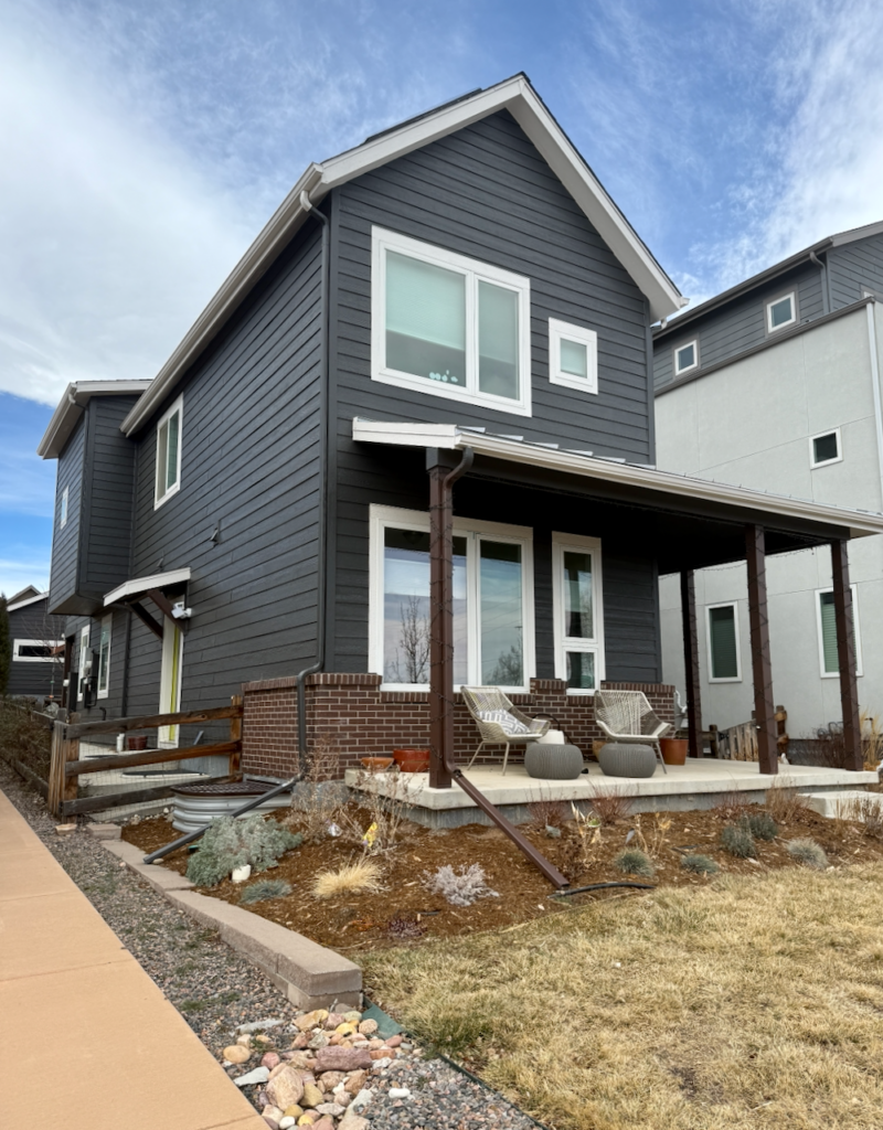

Limitations of LRV: Two Colors Can Share an LRV and Behave Nothing Alike
As I cautioned at the beginning of this post, LRV doesn’t tell the whole story. Just because the LRV is high, doesn’t mean that the white will necessarily light up a room. It just means that it’s light reflecting. In fact, a color like Chantilly Lace with clean or cool undertones can look dingy in a room with medium or low light. What happens is that it creates shade in the corners that end up looking gray and dingy.
It’s counterintuitive, but if you want to light up a room with lower light, you need to use a paint color with a lower LRV and with more yellow undertones, such as BM Simply White or SW Alabaster.
LRV only tells part of the story when you are picking paint colors. You can have two completely different paint colors with the same LRV that behave completely differently in certain light conditions. The amount of color, or chroma, will change a color completely.
The photo below is from our review of Benjamin Moore Cornsilk. Both Cornsilk and Ballet White have LRVs of 72, but the yellow color feels a lot brighter in place.
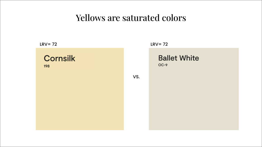
It’s the same story with darker paint colors. I’m sharing two real-life examples below with project photos from my client’s home and my own home.
Project Example: Sherwin-Williams Basil (LRV 15) in a low-light north-facing office
SW Basil has an LRV of 15. Our client wanted a dark color for their North-facing home office, which had low light. We thought Basil (a dark green paint color) could be the perfect fit, but when we tested it in the room, we were surprised by how dark it turned out. This is why it’s so important to test your paint colors.
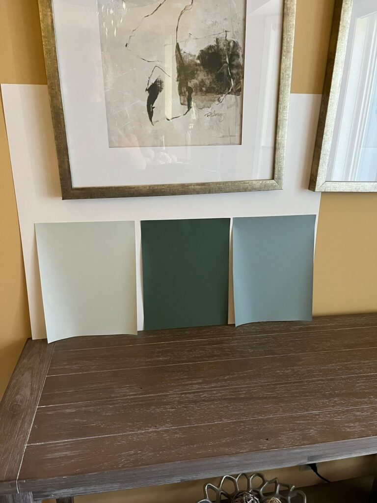
This was a perfect application for a color with a higher LRV. We picked a similar, but lighter color with a higher LRV called Sherwin-Williams Privilege Green (LRV: 23). We don’t have an after photo from this project yet, but we expect it to test much better.
Project Example: BM Slate Teal (LRV 10) in my basement home gym
Below is an example of how a very dark color, Benjamin Moore Slate Teal (LRV: 9.08), even darker than Basil, looks much lighter (even in a basement space!). Sometimes in darker rooms, we end up picking less muted colors when we want a very dark, colorful hue.
This room is my beloved in-home gym. You may not know that I lost 105 lbs in the last two years, and I spent a lot of time in this room. When I first painted it, I looked at about 20 different colors in a 10-15 LRV range, and this one was the best for the room and what I wanted to accomplish. I IMMEDIATELY ruled out any colors that looked black in the room, which was about half of them.
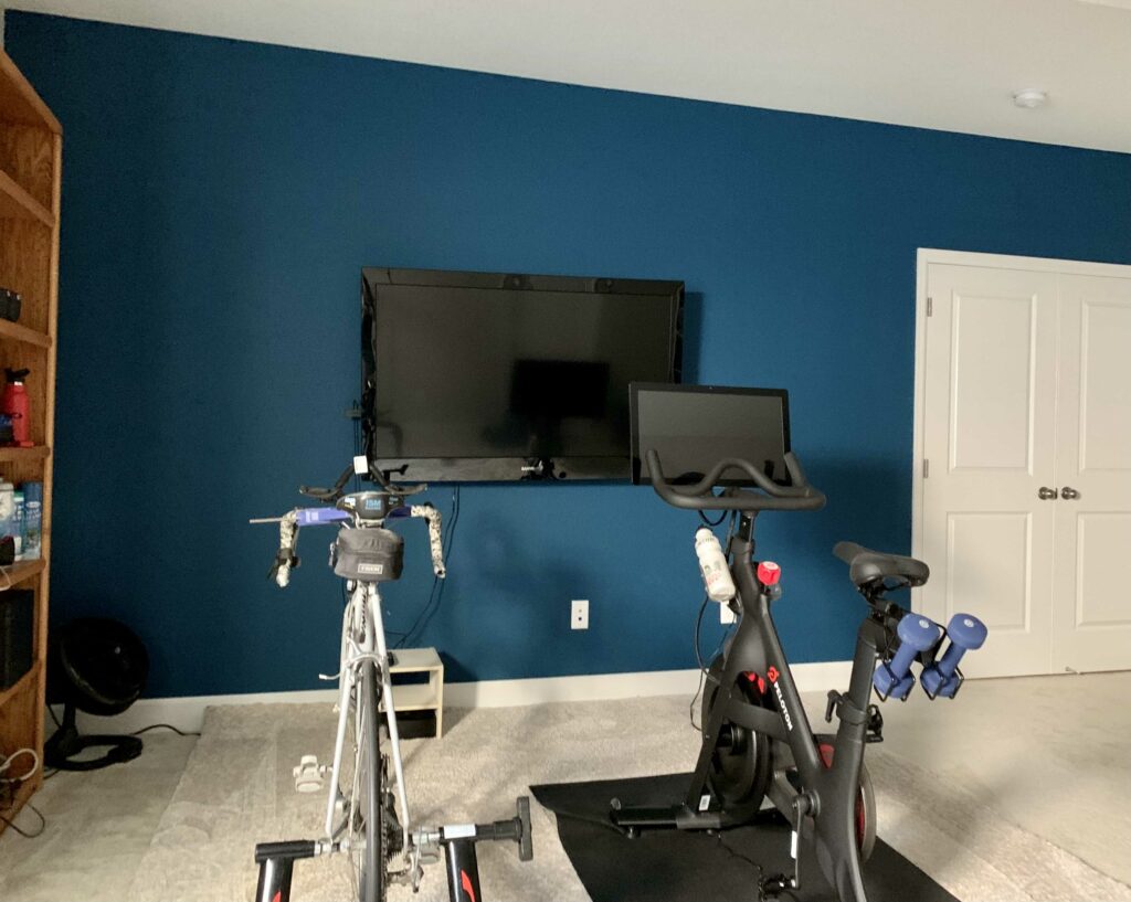
The lighting was similar to my client’s office. This room is in the basement with a tiny window to the outside. And yet, it’s significantly brighter than Basil, even with a lower LRV.
Why I Hesitate to Give LRV “Formulas” or Share the “Best” LRVs
I often get questions on “formulas” for LRV ranges for paint colors. I almost hate to give these out, because it depends so much on light, latitude, and even altitude. My client’s office and my basement gym, shared above, are the perfect examples.
Many other factors influence LRV, too, such as altitude.
For example, Benjamin Moore Cambridge Green has an LRV of 20.99. Maddi Camilli, our Senior Color Consultant, uses this color as a whole-house color in her Colorado mountain home at about 10,000 feet. It is so bright up there, that black paint colors look like charcoal outside. When Maddie said that was the interior color of her new home, I was skeptical. I really thought it would be oppressive because it’s so dark, but it’s GORGEOUS.
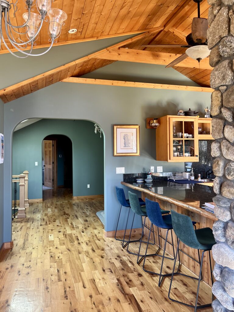
We knew that exterior paint colors looked much lighter outside at altitude, but we never expected interiors to also look that bright from the mountain sun.
Maddie’s home is cozy and beautiful, but I wouldn’t use that color for an entire interior in a ranch house in Fresno, CA. Maybe for a sunny accent room like a dining room, but not for the whole house. LRV is just not that simple.
My LRV Ranges by Project Type
Now that I’ve shared the many caveats to using an LRV formula or strict LRV guide, I will share my typical LRV ranges for different types of projects. But remember: do not take this as an absolute guide. It’s critical to test paint colors in your own home and your own space before deciding on a paint color.
LRVs for Interior White Trim Colors
Keep the trim above an LRV of 80. Otherwise it starts to look dingy. Ceiling whites should be the same color as the white trim.
LRVs for Interior Wall Colors
Based on today’s trends and client requests, most of the foundation wall colors that we used throughout homes range between about 63 (Benjamin Moore Manchester Tan) to 77 (Sherwin-Williams Pearly White). Off-whites, creamy whites and clean whites are in the range over 80 LRV.
LRVS for Exterior White Paint Colors
This one is the hardest of all to quantify. We have worked with homeowners that have HOA LRV limits on the colors that they can use.
For exterior trim colors, my preference is to stick with whites in the 70 to 75 LRV range (such as SW Egret White or SW Natural Choice), with some exceptions for higher altitude cities like Denver, where I use a lot of Sherwin-Williams Accessible Beige (LRV: 58) and Sherwin-Williams Agreeable Gray (LRV: 60) for white trim colors. Those colors also work great with darker siding colors such as blacks or dark blues or dark greens.
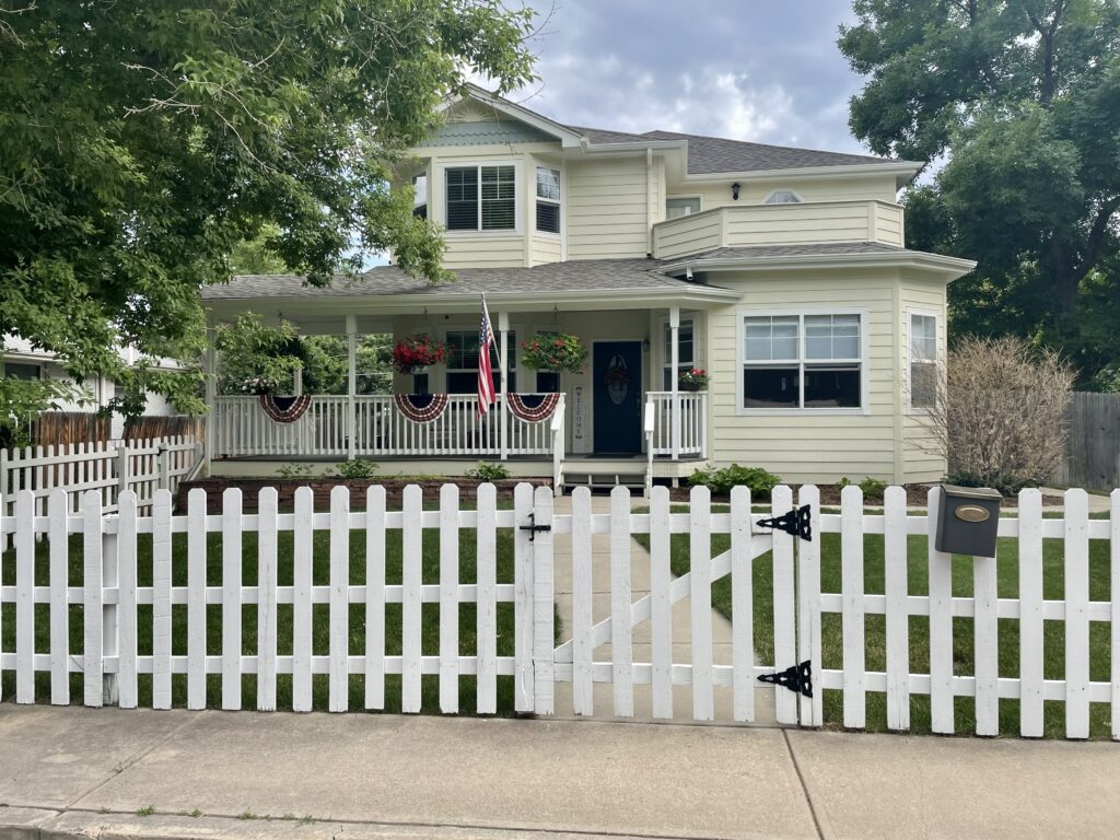
You can use higher LRV white trim colors such as Sherwin-Williams Alabaster or Sherwin-Williams Greek Villa if the contrasting siding color is very light. On the home below, for example, we used Greek Villa trim with Sherwin-Williams Vital Yellow siding.
LRV Quick-Reference Chart
| Application | My LRV range | Colors named in this guide |
|---|---|---|
| Interior white trim | 80+ | Below 80 it starts to look dingy |
| Interior ceilings | 80+ | Same color as the white trim |
| Interior foundation wall colors | ~63–77 | BM Manchester Tan (63) → SW Pearly White (77) |
| Interior off-whites, creamy whites, clean whites | 80+ | BM Simply White (89), BM Swiss Coffee (82) |
| Exterior white trim, most locations | 70–75 | SW Egret White (70), SW Natural Choice (72) |
| Exterior white trim at altitude (Denver) | ~58 | SW Accessible Beige (58), SW Agreeable Gray (60) |
| Exterior trim against very light siding | 75+ | SW Alabaster (82), SW Greek Villa (84) |
| Exterior white often seen on blogs | 83+ | BM White Dove (83) — see the coverage warning above |
| Anywhere with an HOA | Check first | Some HOAs cap LRV outright |
Every range above depends on light, latitude and altitude. Treat them as starting points, not rules.
LRV Questions I Get Asked Constantly
Still have questions about LRV for paint colors? Here are some of the most common questions I get from homeowners.
What is a good LRV for interior paint?
It depends entirely on where the color is going. For interior white trim and ceilings, keep the LRV above 80 — below that, trim starts to look dingy. For the foundation wall colors we use throughout a home, most of what we specify falls between an LRV of about 63 (BM Manchester Tan) and 77 (SW Pearly White). Off-whites, creamy whites and clean whites used on walls sit above 80.
What is a good LRV for exterior paint?
Exterior is the hardest of all to quantify, because latitude and altitude change how a color reads outside. For exterior white trim I prefer the 70 to 75 LRV range in most locations. At higher altitude — Denver, for example — I use a lot of SW Accessible Beige (LRV 58) and SW Agreeable Gray as trim whites, and they work beautifully against dark siding colors like blacks, dark blues and dark greens. If the siding the trim sits against is very light, you can go higher, into SW Alabaster or SW Greek Villa. And check your HOA first — some of them set LRV limits on the colors you are allowed to use.
Does a higher LRV always make a room brighter?
No, and this is the single biggest misconception about LRV. A high LRV only means the color reflects more light. It does not mean the room will feel bright. BM Chantilly Lace has an LRV of 90 and is one of the lightest whites made, but in a room with medium or low light its clean, cool undertone creates shade in the corners that ends up looking gray and dingy. Counterintuitively, if you want to light up a low-light room, a white with more yellow undertone — BM Simply White or SW
Sample the Paint Colors in This Guide
Everything on this page has been one long argument that an LRV number is a starting point, not an answer. The only way to finish the sentence is to put the color on your own wall, in your own light, at the hours you actually use the room. These are peel-and-stick samples — real paint, two coats, large enough to read properly — for the colors named above.
| Paint color | Peel-and-stick sample |
|---|---|
| The blacks: the bottom of the scale | |
| Sherwin-Williams Tricorn Black (SW 6258) | Sample Tricorn Black |
| Sherwin-Williams Iron Ore (SW 7069) | Sample Iron Ore |
| Benjamin Moore Wrought Iron (2124-10) | Sample Wrought Iron |
| The whites: the top of the scale | |
| Benjamin Moore Chantilly Lace (2121-70) | Sample Chantilly Lace |
| Benjamin Moore White Dove (OC-17) | Sample White Dove |
| Benjamin Moore Swiss Coffee (OC-45) | Sample Swiss Coffee |
| Sherwin-Williams Alabaster (SW 7008) | Sample Alabaster |
| Sherwin-Williams Greek Villa (SW 7551) | Sample Greek Villa |
| Sherwin-Williams Agreeable Gray (SW 7029) | Sample Agreeable Gray |
| The project colors | |
| Sherwin-Williams Basil (SW 6194) | Sample Basil |
| Sherwin-Williams Privilege Green (SW 6193) | Sample Privilege Green |
| Benjamin Moore Slate Teal (2058-20) | Sample Slate Teal |
| Benjamin Moore Cornsilk (198) | Sample Cornsilk |
| Sherwin-Williams Vital Yellow (SW 6392) | Sample Vital Yellow |
This section contains affiliate links to Samplize. If you order through them I earn a small commission at no extra cost to you, which helps cover the cost of running this blog. I don’t accept compensation from any paint company for my color reviews.
Key Learning Points on LRV
- LRV is one of the most useful things in my toolkit and one of the most misused numbers on the internet.
- LRV will tell you, reliably, whether one color is lighter or darker than another.
- It will not tell you what a color will do in your room. That answer comes from undertone, chroma, the direction your windows face, your latitude, your altitude, and a sample board large enough to actually read.
- Use LRV to narrow the field. Then test.
Remember: NEVER, EVER use paint matches from a different brand than the one specified. Results are poor and there are no standards for the sheens. Even though your painter may truly believe it can be done, don’t do it. See results in our paint matching guide.
No matter what, always test your paint colors. It’s a standard best practice. Whenever I test my paint colors, they are perfect, and when I don’t test they turn out wrong. Learn how to test your paint colors like a pro.
Online Color Consulting
Still need help picking the best paint colors? Discover our Online Color Consulting Packages.

Related Posts:
- How to Test Paint Colors like a Pro
- How to Choose White Paint Colors
- Choosing Interior Paint Colors
- Choosing Exterior Paint Colors
- 10 Things Color Consultants Want You to Know About Picking Paint Colors
About the Author

Hi, I’m Michelle Marceny, founder, owner, and Principal Color Designer at The Color Concierge. I believe a fresh coat of paint can completely transform a space. The Color Concierge was born out of my drive to help clients fall back in love with their homes. My clients trust me to help them find the perfect paint color — whether that’s a whole-house color scheme or ideas for a single room.
Since founding The Color Concierge in 2017, my team and I have completed 1,000s of color consultations, online and in person. I’m a Certified Color Expert with nine years of experience creating interior and exterior color palettes throughout North America.
Every color review on this site comes from colors we’ve specified in real homes and photographed on location during our own consultations — not from a fan deck or a manufacturer’s website.
We love your comments! Please note that the blog is meant as general advice, and it is not possible to give out specific answers to your paint questions. If you want more specific advice, our Online Color Consultations will help you pick your paint colors. Thank you for your understanding.