Learn all about Benjamin Moore Cambridge Green (468) in this paint color review.
Benjamin Moore Cambridge Green is a dark, warm green paint color that is perfect for accent walls, accent rooms and other spaces within a home. In the right home, it can even be used more broadly – as we’ll see in today’s post.
This is a gorgeous hue for anyone who wants a colorful, bold look for their home. It’s warm, cozy and dark without being too dark, so it won’t feel overbearing even in spaces with low light.
Wondering if BM Cambridge Green is right for your next project? Keep reading for our full paint color consultant review and explore real-world photos of Cambridge Green wall paint in action.
*This post contains affiliate links for products I use and love. If you click on some links and make a purchase, I will get a small commission at no cost to you. This helps pay for the costs of the blog, so I can continue to offer great content to our readers.
About The Color Concierge
Our Colorado-based paint color consultants make finding the right paint colors for your home easy. Whether you’re painting the exterior or interior of your home, our simple yet effective process lets us get your paint color right the first time. We’ve helped thousands of homeowners transform their homes into a space they love. Learn more about ONLINE COLOR CONSULTATIONS today.
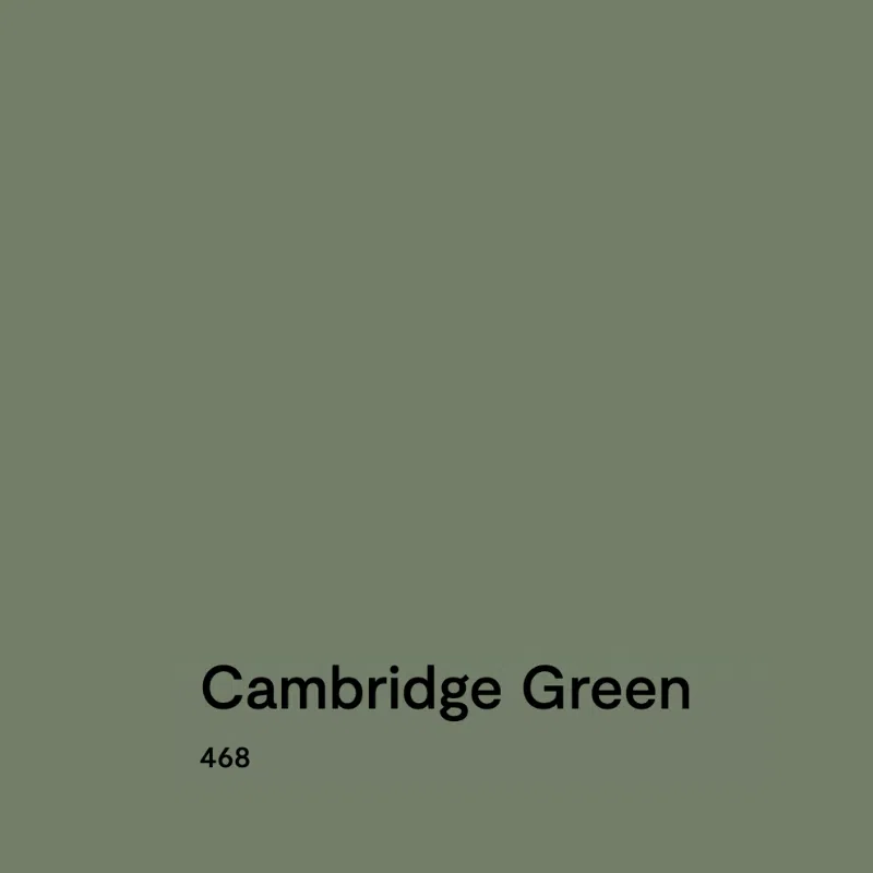
What Color is BM Cambridge Green?
Cambridge Green by Benjamin Moore (Sample) is a deep, warm green. It’s darker than some of the popular sage green paint colors, like SW Evergreen Fog, but not so dark that it risks looking black in low light.
What is the BM Cambridge Green LRV?
The LRV of Cambridge Green is 20.99, which makes it a darker green. LRV, or Light Reflectance Value, is a number from 0 to 100 that measures how much light a paint color reflects or absorbs. A value of 0 means it’s pure black, which absorbs all light, while 100 means it’s pure white, which reflects all light. Most paint colors fall somewhere in between.
For Cambridge Green, its LRV means that when you take it inside, it looks pretty dark, but as an exterior color, it’s more of a mid-tone green.
Is Cambridge Green warm or cool?
Green paint colors (Article) can either be warm, with more yellow in it, or cool, with more blue. Under this classification, Cambridge Green is a warm green paint color.
What are the Benjamin Moore Cambridge Green undertones?
Cambridge Green has warm yellow undertones, which give the color its cozy, inviting look. Still, all greens also contain some blue and Cambridge can look cooler in rooms with low light.
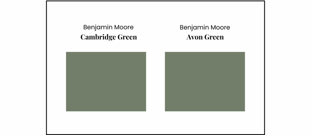
What’s the difference between Cambridge Green vs Avon Green?
Benjamin Moore Cambridge Green (Sample) and Benjamin Moore Avon Green (Samplize) are actually the exact same color. The only difference is that Avon Green is part of Benjamin Moore’s historical paint color collection (with color code HC-126) and Cambridge Green is part of the brand’s classic paint line (with color code 468). In reality, they are the same color with different names.
Sample BM Cambridge Green
We always recommend that you test paint colors on your home because lighting can change a color completely, both with interiors as well as exteriors.
In the old days, this meant we painted a large poster board with sample pots and a huge mess.
Now we have a better way to test paint, with Samplize Peel-and-Stick samples!
- Samples pre-painted with 2 coats of real paint from the manufacturer.
- Large 9” x 14” samples to see the color better in the lighting.
- Delivered overnight
- Colors are accurate
- Less expensive than painting a large poster board with sample pots
- No mess, and no toxic paint to dispose of
I use these in my color consulting practice for exact results. Discover Samplize peel-and-stick paint samples:
Real Home Spotlight: Using BM Cambridge Green Interior Paint
All of the photos used in today’s post are from the home of our senior color consultant, Maddie Camilli. She bought this gorgeous home in the mountains of Colorado.
It’s a very earthy cabin, with lots of natural wood trim, wood floors and even some wood ceilings. It also has gorgeous views of lush, green mountain forests and is filled with the art pieces she creates. Because the home is in the Colorado mountains, it’s also at a pretty high altitude, so the natural light the home gets is stronger than you’d expect – and so beautiful.
When she bought the home in 2024, it had been fixed up to sell and the entire interior had been painted with Benjamin Moore Cambridge Green. It’s not often you find a home painted to sell in anything other than a neutral hue, but in this case Cambridge Green was an absolutely incredible choice.
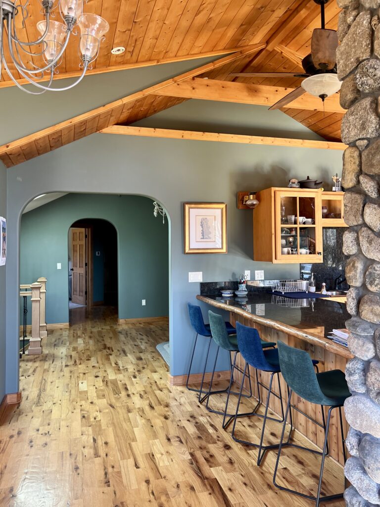
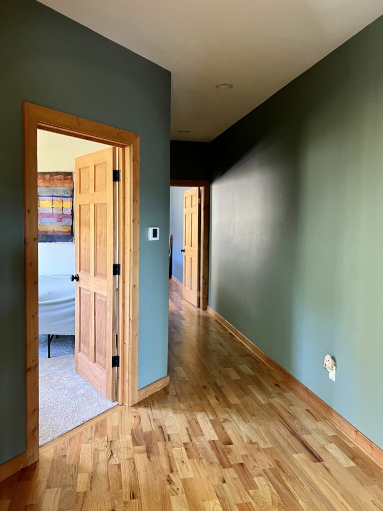
It looks a little different in each space throughout this home, depending on the lighting, decor and finishes in the room. It’s no surprise that Maddie has only repainted a couple of rooms since moving in – the Cambridge Green walls really bring everything to life!
Here’s what Maddie had to say about finding and falling in love with this green-walled home:
I never would have imagined that I would live in a house with primarily green walls. I LOVE green, and I love color, but I have had lived with all white walls my whole life. One day, not planning on moving, I found this house for sale, fell in love with it, and the color blew me away! I had looked at houses for fun on Realtor or Zillow for a long time, but every house had something that wasn’t ideal, whether it was the size, the price, or most importantly to me, the lack of character; which made it all the more fulfilling when I decided to tour this house on a whim and saw how beautiful it was and personal it felt! Contrary to so many times I have seen in my color-consulting career where rich colors don’t work as a primary wall color in a home, somehow this colorful green (with an LRV of 21) does not feel overwhelming or heavy in the space.

Is BM Cambridge Green a good whole-house paint color?
Before we start exploring Maddie’s home, it’s important to answer this question. Should you really use Cambridge Green as a whole-house paint color (Article)? In most cases, I probably wouldn’t do it. It’s too dark and too bold to work in most homes and for most homeowners.
But Maddie has the heart, soul and training of an artist, so being surrounded by color is perfect for her. The home is also a unique space that deserves a unique palette, so it works here.
This home is a great example of what your home can look like when you pick a non-standard color for the foundation of your palette.
Now that she’s lived in the home for about a year, Maddie said she thinks the color works for a few key reasons:
- Light: There is a ton of light in the house. There are windows or skylights on most walls of the rooms where the green is painted, with the exception of the hallway, but that space gets light from the adjoining rooms.
- Space: The space is large and open. There are no doors that separate the green rooms, only oversized arches, an extra-wide stairway, and tall ceilings. This allows light to pour through all the rooms at all times of the day, making it feel open and light.
- Balance: Cambridge Green is perfectly muted. If it were richer it might be overwhelming, and if it were grayer it might look dull, but this color glows JUST the right amount.
- Setting: This is a mountain house with natural wood floors and ceilings, logs running through it vertically, stone fireplaces, and mountain views. It is the perfect application for a green, as it looks gorgeous with the earthy elements and reflects the colors you see outside.
Keep reading to explore all the different spaces painted with Cambridge Green in Maddie’s home and get inspired to use this color in your own house.
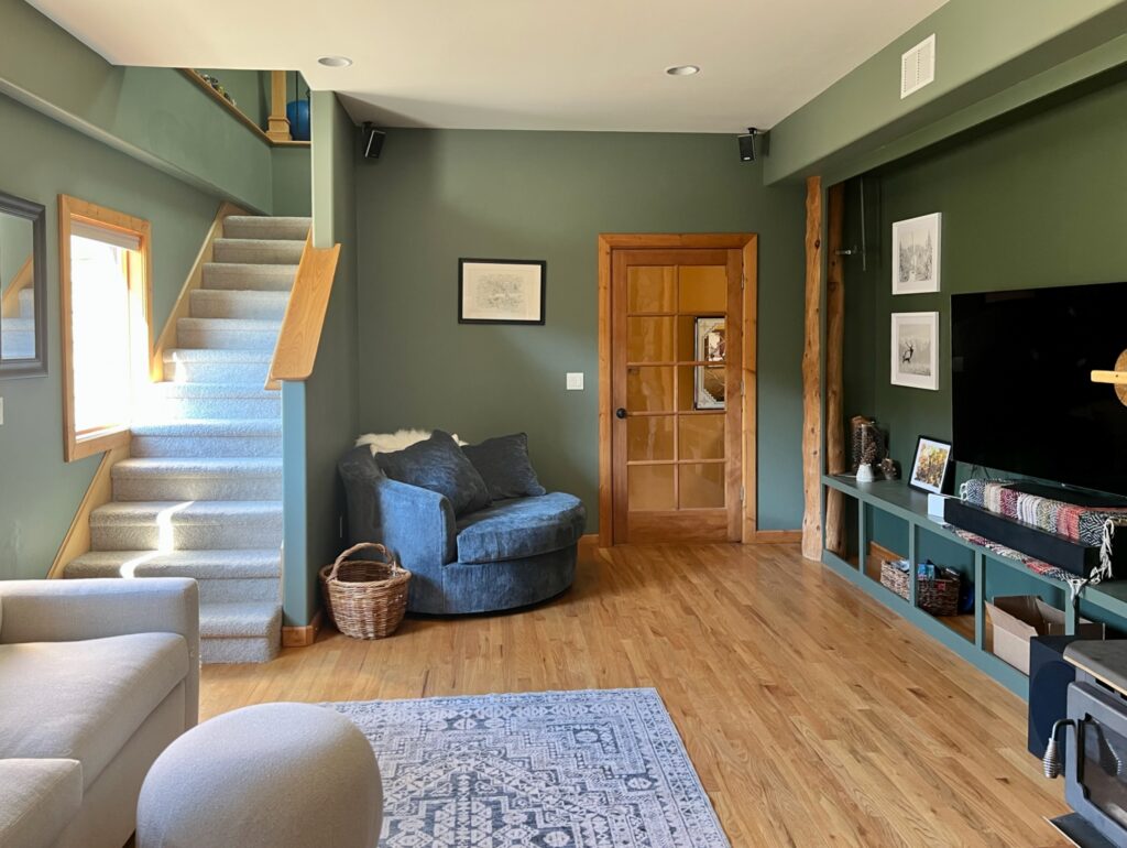
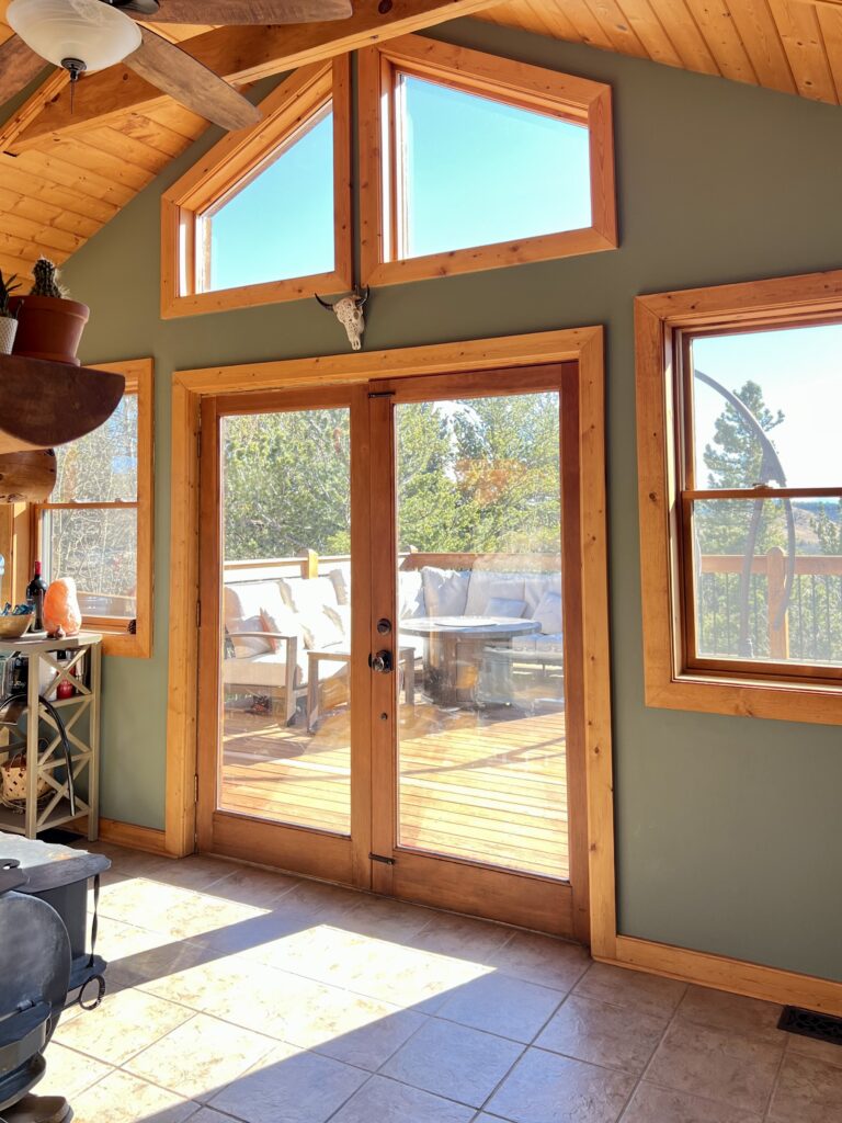
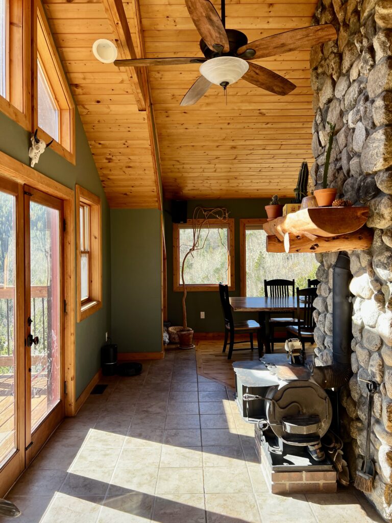
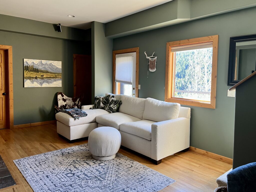
Cambridge Green Living Room
The living room of this mountain home is so beautiful. With huge windows and lots of natural wood trim, it is filled with light and warmth. The Cambridge Green wall paint complements these warm tones so beautifully.
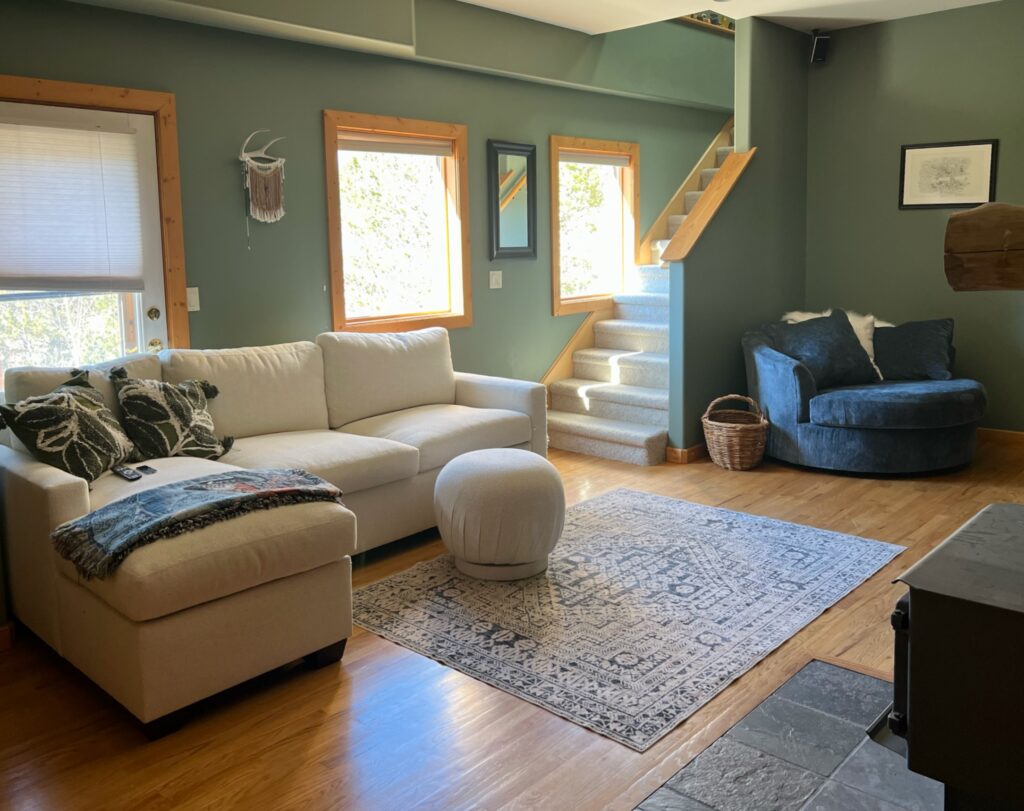
This room has even more dimension thanks to the beautiful back wall with built-ins painted one shade darker than Cambridge Green: Benjamin Moore Backwoods (469) (Sample). Backwoods has an LRV of 12.68 and adds a really beautiful depth to this space.
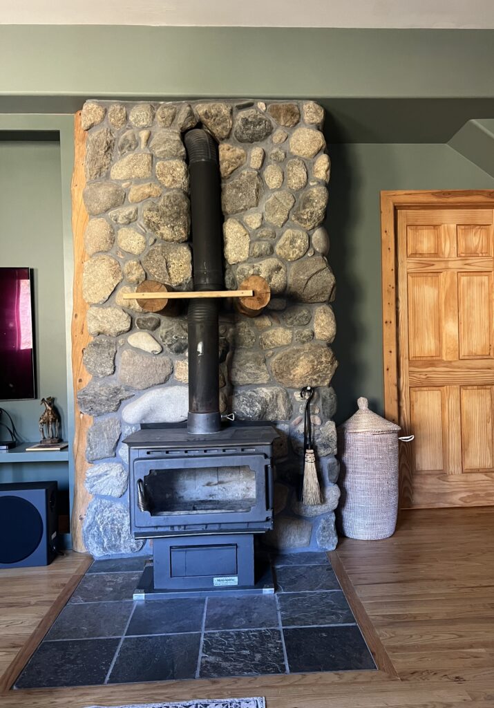
This room also features a gorgeous wood-burning stove with real stone surround. The warm green paint color on the wall helps this beautiful feature stand out even more.
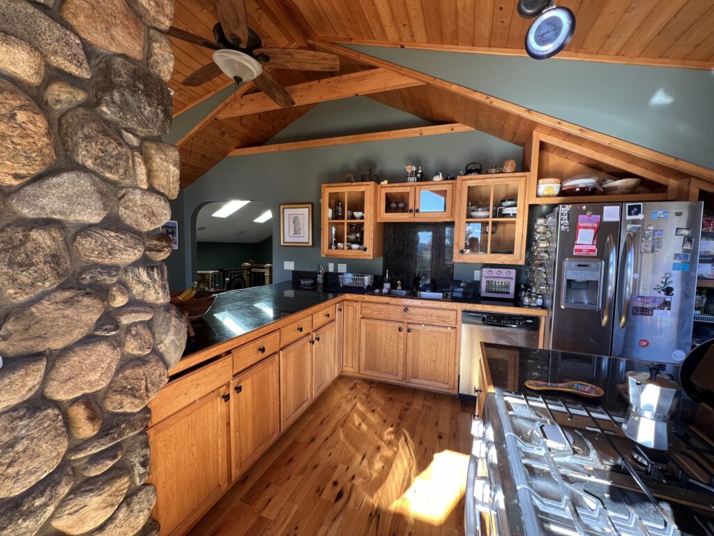
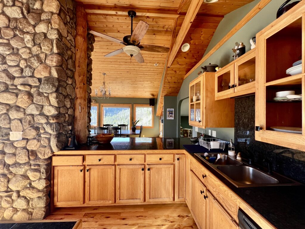
Cambridge Green Kitchen
Green kitchens have been trending for a while now. While it’s typically the cabinets we see painted green, in this home the walls are green and the cabinetry matches the wood trim and flooring throughout the home. This kitchen also features an eye-catching vaulted wood ceiling that makes everything in the space look warmer.
In the dining area, which is positioned right next to some large bay windows, the Cambridge Green walls look lighter and brighter compared to the rest of the space – but still equally beautiful.
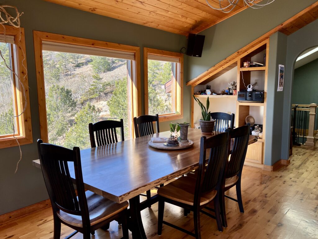
With all of the light and the warm wood tones, this room is like a beam of warm sunshine.
Cambridge Green Loft
Right next to the kitchen is the entrance to a lofted area. This area gets lots of light from skylights, so the Cambridge Green walls look really warm and surprisingly light.
On the opposite side of the hallway from the loft, however, is a great example of how this hue can look darker and cooler in spaces with more shade. It’s amazing how different Cambridge Green looks in the picture below – but still just as beautiful!
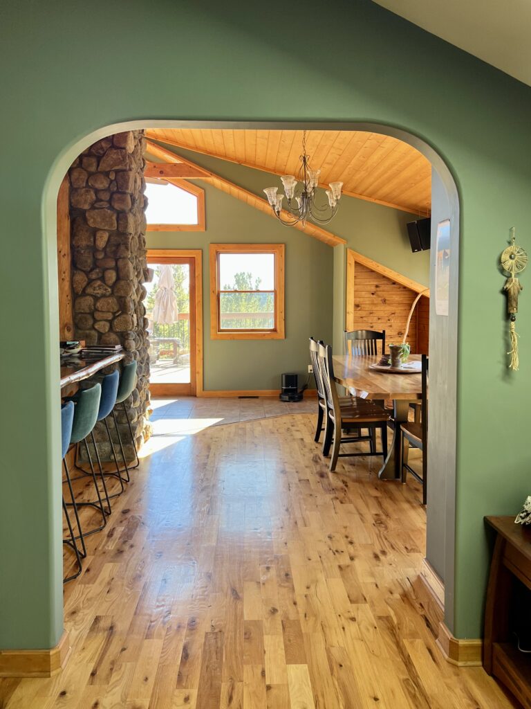
Cambridge Green Archway
One of my favorite views in this home is this look through the archway into the open concept space of the kitchen and dining area. We did not color edit this photo in any way, but look how much greener Cambridge Green looks in this space! This is all just from the amount of warm light pouring into this area of the home.
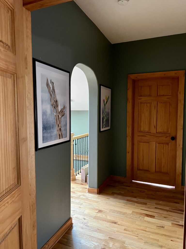
Cambridge Green Entryway
This home’s entryway is another area where the Cambridge Green walls look brighter and more colorful. This home’s entryway is flooded with light and gives a gorgeous view of the wooded area outside.
The wood trim and ceiling in this space work together with the green walls to instantly create a warm coziness as soon as you walk in.
Is BM Cambridge Green good for color drenching?
You could absolutely use Cambridge Green for color drenching (Article) a space, painting the walls, trim and ceiling in this gorgeous color. You could also do a modified color drench and leave the ceiling white.
As you can see in this home’s living room, the Cambridge Green walls are really highlighted next to the contrast of the warm white ceiling.
Using BM Cambridge Green Exterior Paint
We don’t have any photos of Cambridge Green exterior paint, but it would be a gorgeous color to use outside. It would work in a similar way to the home below, which is painted with Sherwin-Williams Rosemary (Article), which has an LRV of 14 and is more muted.
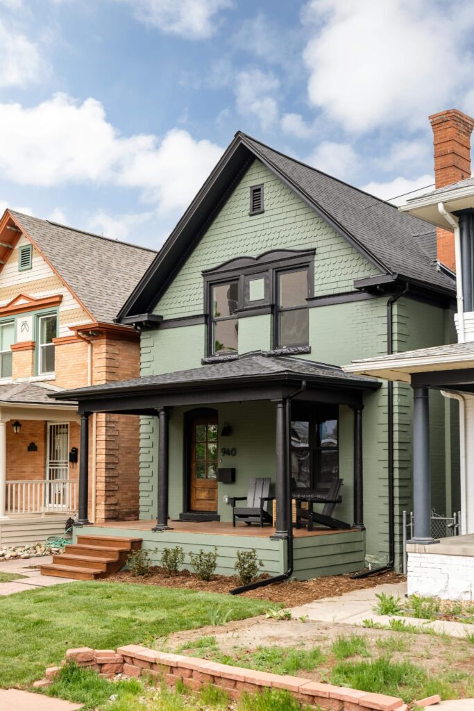
Cambridge Green would look a bit lighter and brighter in the sun thanks to its higher LRV. It would look gorgeous paired with black accents or red brick finishes.
Best Cambridge Green Coordinating Colors
Cambridge Green is a surprisingly versatile color that pairs well with many different hues. Some of our favorite combinations are below.
Does Cambridge Green go with wood?
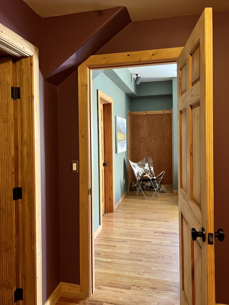
Yes, it does! If Maddie’s house has taught us anything, it’s that Cambridge Green and warm wood tones are an absolutely stunning combination! The warm wood has lots of red tones, which is opposite on the color wheel from green. Because red and green are opposite to each other, they make each other glow.
Another example of why this combination works is this view of a Cambridge Green room in Maddie’s home. You can see that the room it’s taken from is actually painted with a deep maroon-type hue. The colors look gorgeous together!
Does Cambridge Green go with white?
Yes, Cambridge Green looks beautiful alongside white. While Maddie’s home has wood trim and even some wood ceilings, all other ceilings in the home were painted with a warm white paint: Benjamin Moore White Dove (Article).
Because Cambridge Green is dark and so warm, it’s best to use a darker, warm white paint color alongside this hue. In another part of the home, for example, you can see that Maddie painted a side room with Benjamin Moore Ballet White (Sample). The combination with Cambridge Green is gorgeous!
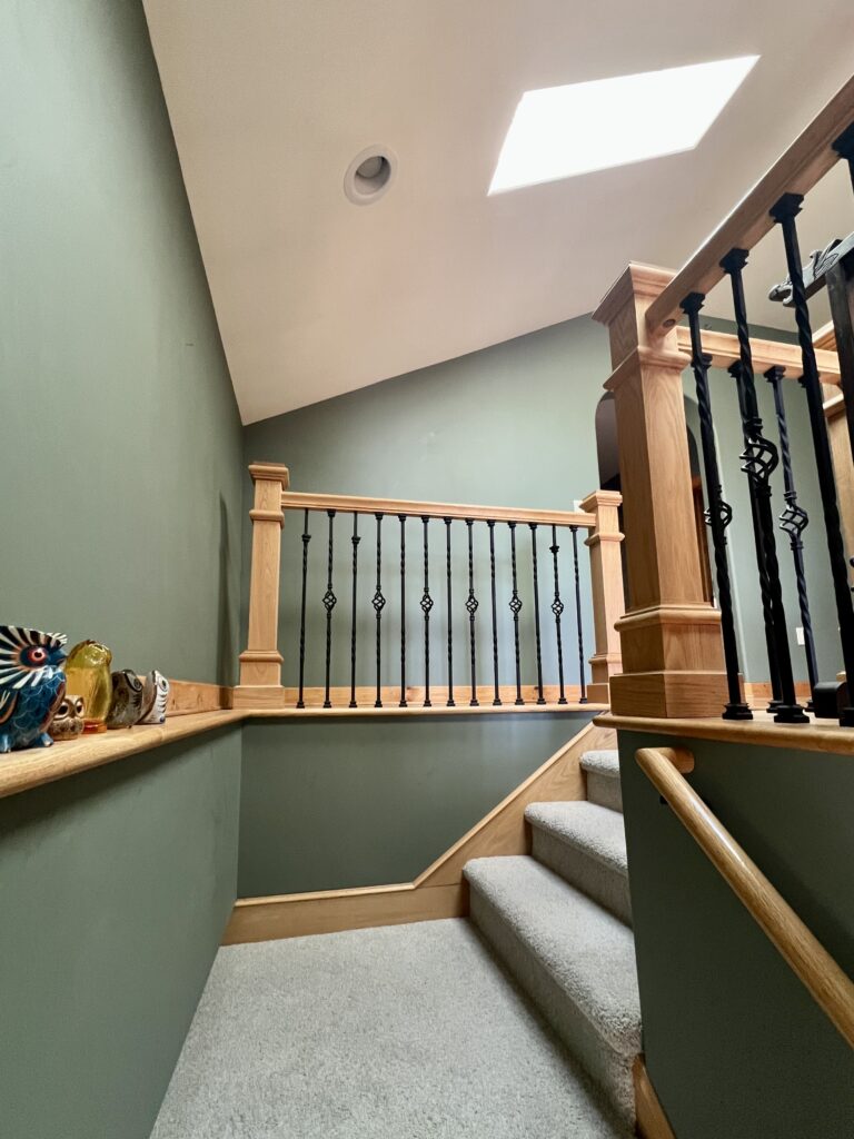
Does Cambridge Green go with gray?
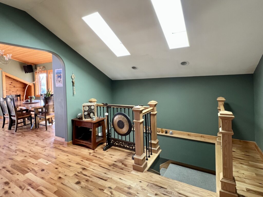
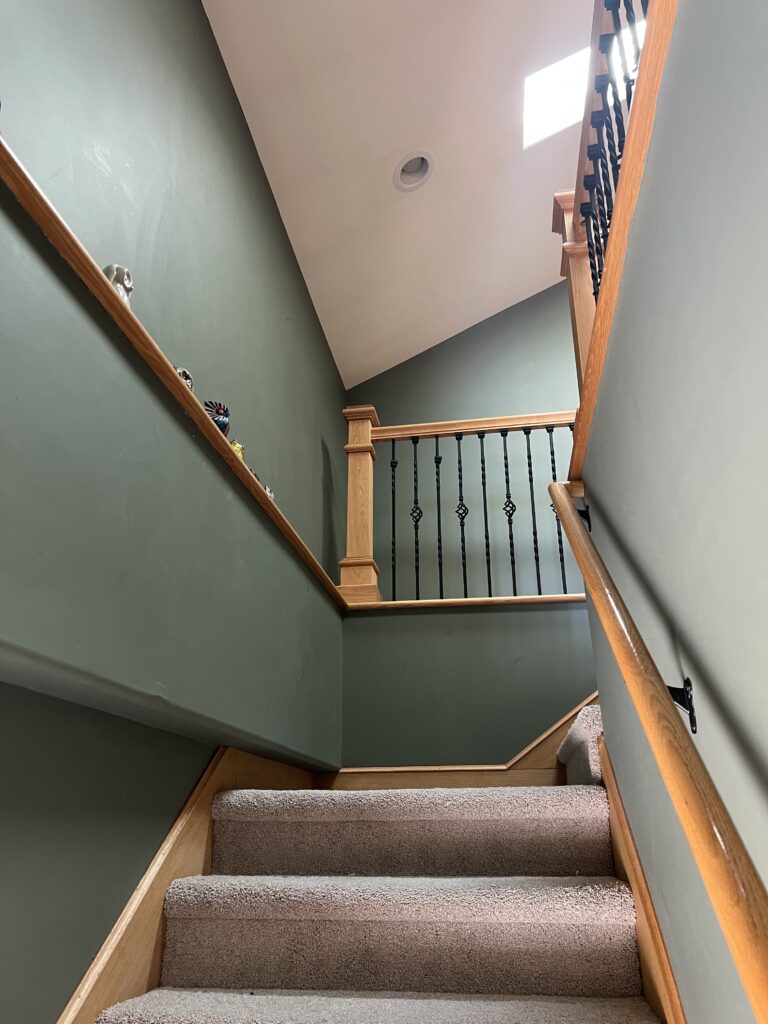
Cambridge Green and gray look really nice together. The stairway in Maddie’s house is a great example of this. The stairs have warm, violet-gray carpeting (violet gray is the color of elephants) that is similar to Benjamin Moore Collingwood (Article) and looks really pretty alongside the Cambridge Green walls.
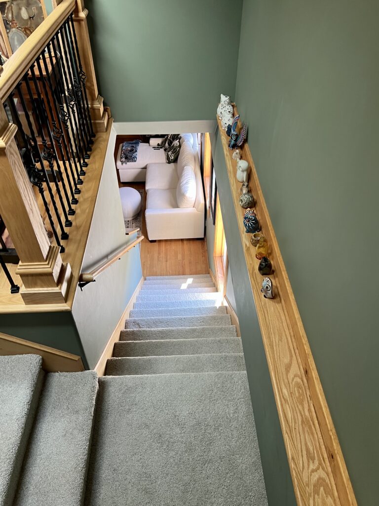
If the carpet had been a warmer color, it might have been a bit too warm when combined with the Cambridge Green paint and warm wood trim.
A piece of art in her living room is another good example of this color combination. The art features beautiful cool gray mountains that look gorgeous with the Cambridge Green walls as a backdrop.
What are the Best Interior Trim and Ceiling Colors For Benjamin Moore Cambridge Green?
Choose a darker, warm white trim color for Cambridge Green walls. The color is dark enough that anything too light or cool will look stark. Benjamin Moore White Dove is a great choice, but you could go even darker with Benjamin Moore Swiss Coffee (Article) or Sherwin-Williams Greek Villa (Article).
Best Benjamin Moore Cambridge Green Alternatives
Not sure if BM Green Cambridge is right for your project? Explore the color comparisons below to see how it compares to other popular blue-green paint colors.
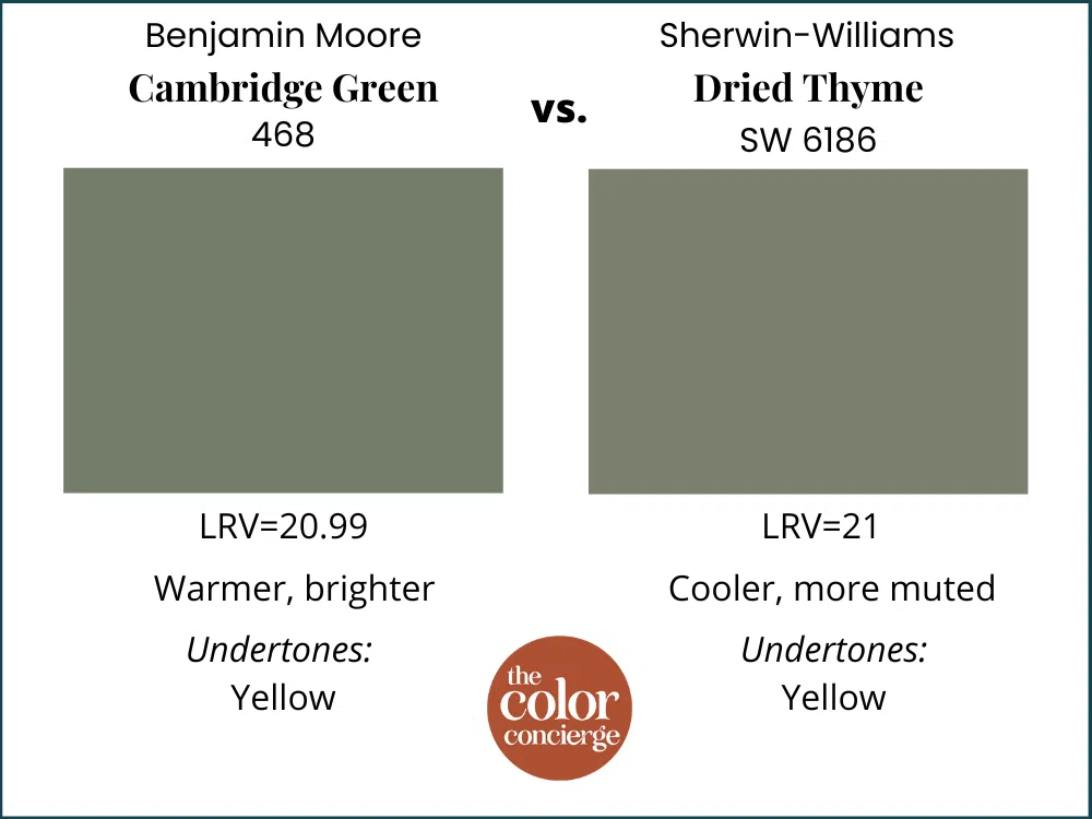
BM Cambridge Green vs SW Dried Thyme
Sherwin-Williams Dried Thyme (Sample) is only slightly lighter than Cambridge Green, with an LRV of 21. But it’s so much more muted than Cambridge Green it actually looks pretty different in place. It’s also slightly cooler than Cambridge Green.
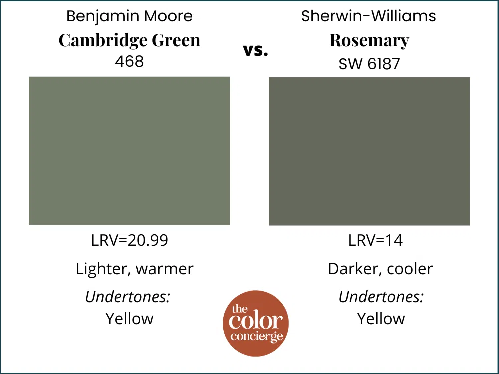
BM Cambridge Green vs SW Rosemary
Sherwin-Williams Rosemary (Sample) is significantly darker than Cambridge Green, with an LRV of 14. It’s also cooler than Cambridge Green despite also leaning more toward yellow than blue.
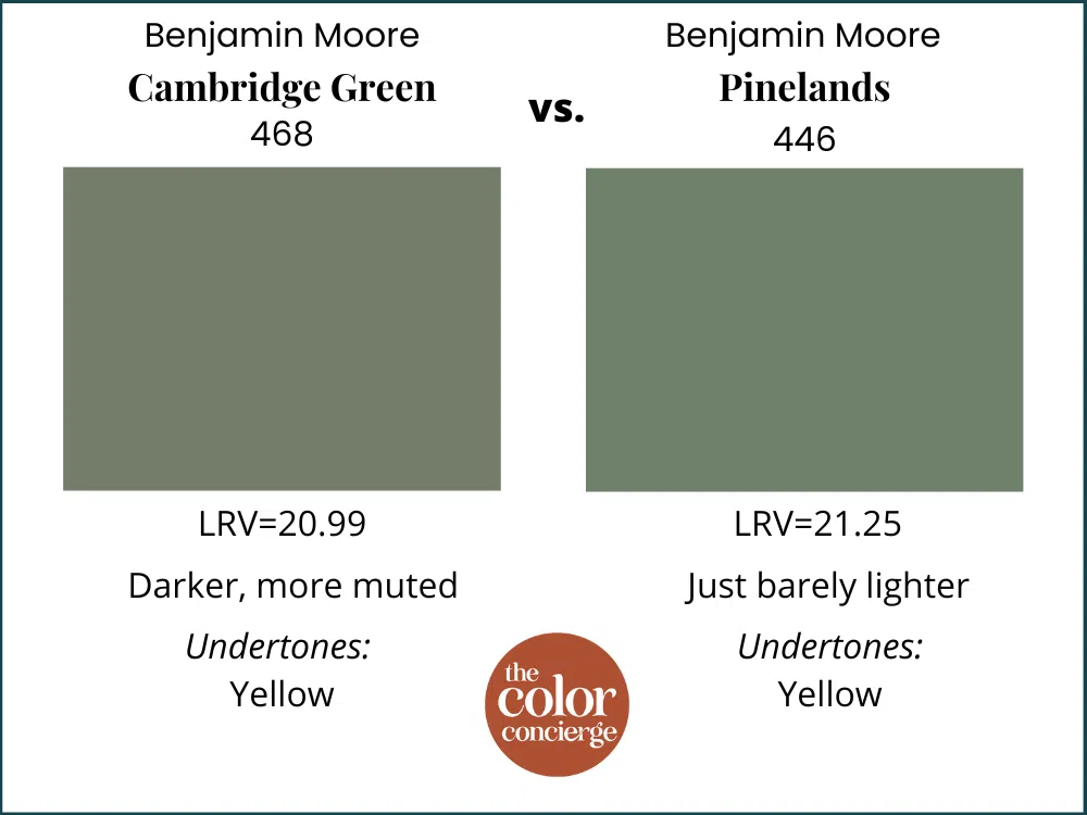
BM Cambridge Green vs BM Pinelands
Benjamin Moore Pinelands (Sample) is incredibly similar to Cambridge Green. It is just slightly lighter than Cambridge Green, with an LRB of 21.25. It’s also less muted and looks more colorful in place.
BM Cambridge Green vs SW Privilege Green
Sherwin-Williams Privilege Green (Sample) is also a close match for Cambridge Green. It is lighter, with an LRV of 23, and a bit cooler on the wall.

Key Learning Points
Benjamin Moore Cambridge Green is a deep, warm green paint color that is one of our favorite green hues for interiors.
- Cambridge Green is dark, but warm enough and colorful enough that it won’t overwhelm most interior spaces, especially if you have plenty of natural light.
- Use Cambridge Green alongside warm wood finishes for a beautiful, inviting color palette.
- Cambridge Green looks brighter than you might expect outdoors and looks more like a mid-tone green than a dark green.
Remember: NEVER, EVER use paint matches from a different brand than the one specified. Results are poor and there are no standards for the sheens. Even though your painter may truly believe it can be done, don’t do it. See results from paint matching here.
No matter what, always test your paint colors. It’s a standard best practice. Whenever I test my paint colors, they are perfect, and when I don’t test they turn out wrong. Learn how to test your paint colors here.
Online Color Consulting
Still need help picking the best paint colors? Discover our Online Color Consulting Package.

Related Posts
- Best Green Paint Colors
- Sherwin-Williams Rosemary Color Review
- Benjamin Moore Blue Spruce Color Review
About the Author

Hi, I’m Michelle Marceny, founder, owner, and Principal Color Designer at The Color Concierge. I believe a fresh coat of paint can completely transform a space. The Color Concierge was born out of my drive to help clients fall back in love with their homes. My clients trust me to help them find the perfect paint color for their home – whether it’s a whole-house paint color scheme or ideas for a single room.
Since The Color Concierge was founded in 2017, we have completed over 3000 color consultations, both online and in-person. I am a Certified Color Expert with 7 years of experience creating interior and exterior color palettes throughout North America.
We love your comments! Please note that the blog is meant as general advice, and it is not possible to give out specific answers to your paint questions. If you want more specific advice, please consider purchasing a color consultation. Thank you for your understanding.
