Learn all about Benjamin Moore Mascarpone paint in this paint color review.
Benjamin Moore Mascarpone is a warm, creamy off-white paint color that truly glows on the wall. Despite being very light, it has tons of warmth and won’t look washed out even in the brightest lighting.
If you’re looking for a cream paint color perfect for open-concept spaces and individual rooms, BM Mascarpone could be right for you.
Keep reading for our complete color consultant review, including photos from our real client’s home so you can picture this hue in your own space.
*This post contains affiliate links for products I use and love. If you click on some links and make a purchase, I will get a small commission at no cost to you. This helps pay for the costs of the blog, so I can continue to offer great content to our readers.
About The Color Concierge
Our Colorado-based paint color consultants make finding the right paint colors for your home easy. Whether you’re painting the exterior or interior of your home, our simple yet effective process lets us get your paint color right the first time. We’ve helped thousands of homeowners transform their homes into a space they love. Learn more about ONLINE COLOR CONSULTATIONS today.
What Color is Benjamin Moore Mascarpone?
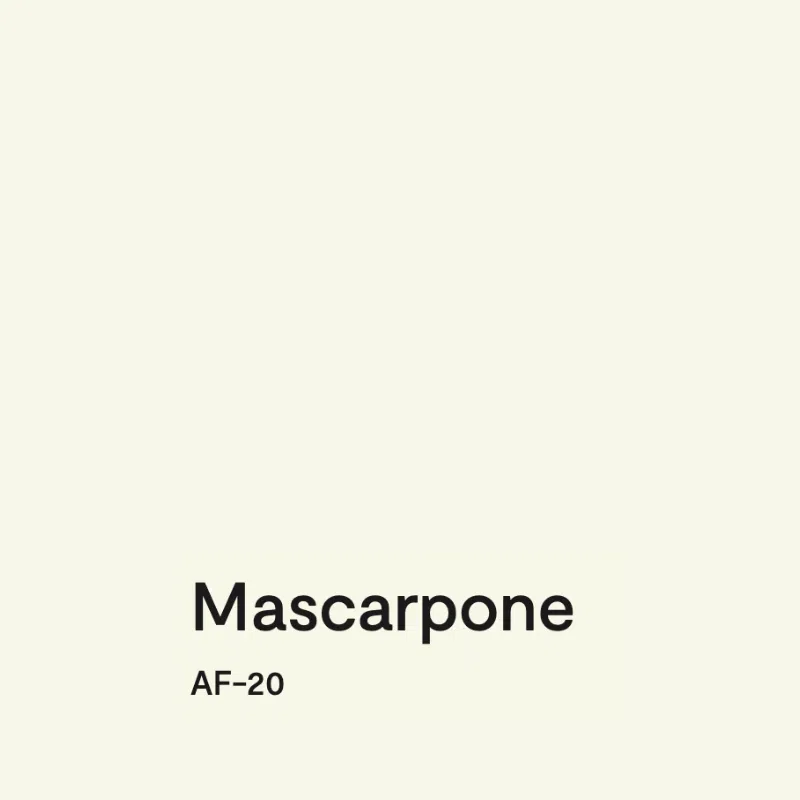
Benjamin Moore Mascarpone (Sample) is a cream paint color. In warm lighting, it almost looks like a very pale butter yellow because it is so creamy.
What is the BM Mascarpone LRV?
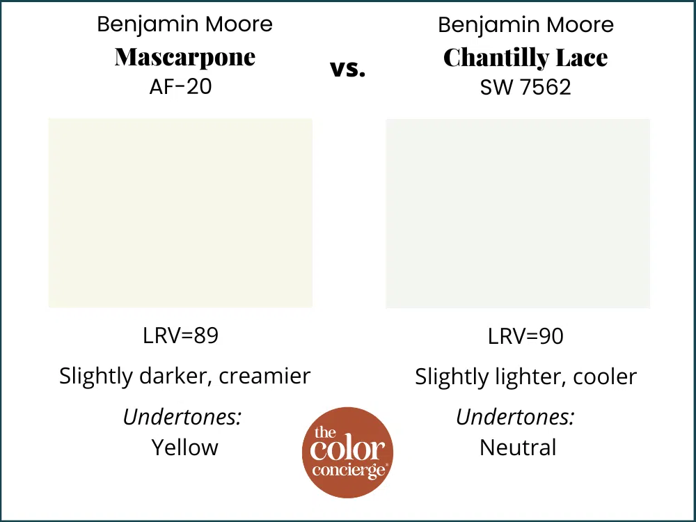
Mascarpone’s LRV is one of the most interesting things about this color. It has an LRV of 89, which means it is very, very bright. It has a slightly lower LRV than Chantilly Lace (Article) – a popular Benjamin Moore clean, crisp white paint color – but appears darker on the wall because of its warmth.
LRV stands for Light Reflectance Value. It’s a measure of how much light a color reflects or absorbs. True white has an LRV of 100, while true black has an LRV of 0. BM Mascarpone is a great example: even colors with high LRV (meaning they are very light-reflecting) can still have a lot of pigment. That’s why LRV is a great guideline, but not always a perfect way to gauge a color.
Is Mascarpone warm or cool?
Mascarpone is definitely a warm paint color. It’s extremely creamy and can help make any space feel warm and cozy while still staying light and bright. It’s perfect for today’s trending warmer palettes.
What are the Mascarpone undertones?
Mascarpone has strong yellow undertones. The tones are so strong, in fact, that in certain lighting and paired with certain finishes, Mascarpone can look almost like a pale yellow paint color rather than a cream.
Marscapone vs. White Dove?
White Dove (Article) is one of the most iconic warm white paint colors from Benjamin Moore, so if you’re considering Mascarpone wall paint, there’s a good chance you’ve considered White Dove too.
White Dove has an LRV of 82, which means it’s darker than Mascarpone. But Mascarpone has such strong yellow undertones and so much pigment that it actually looks darker on the wall.
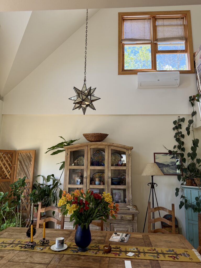
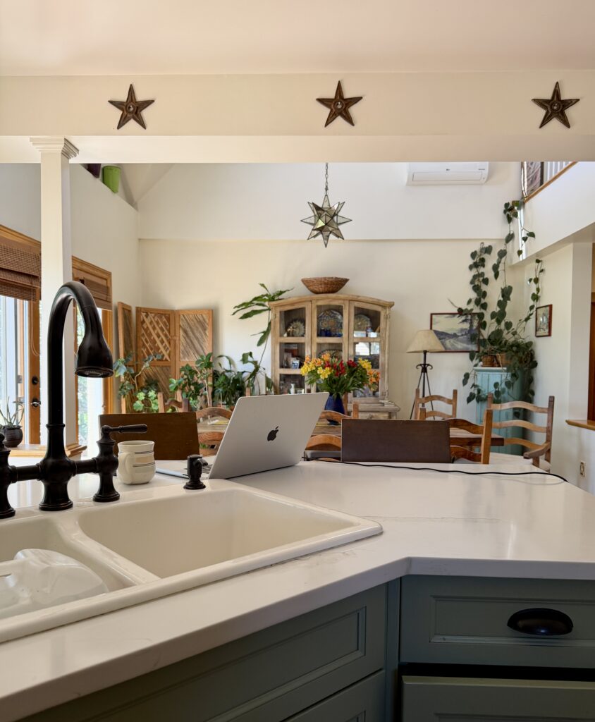
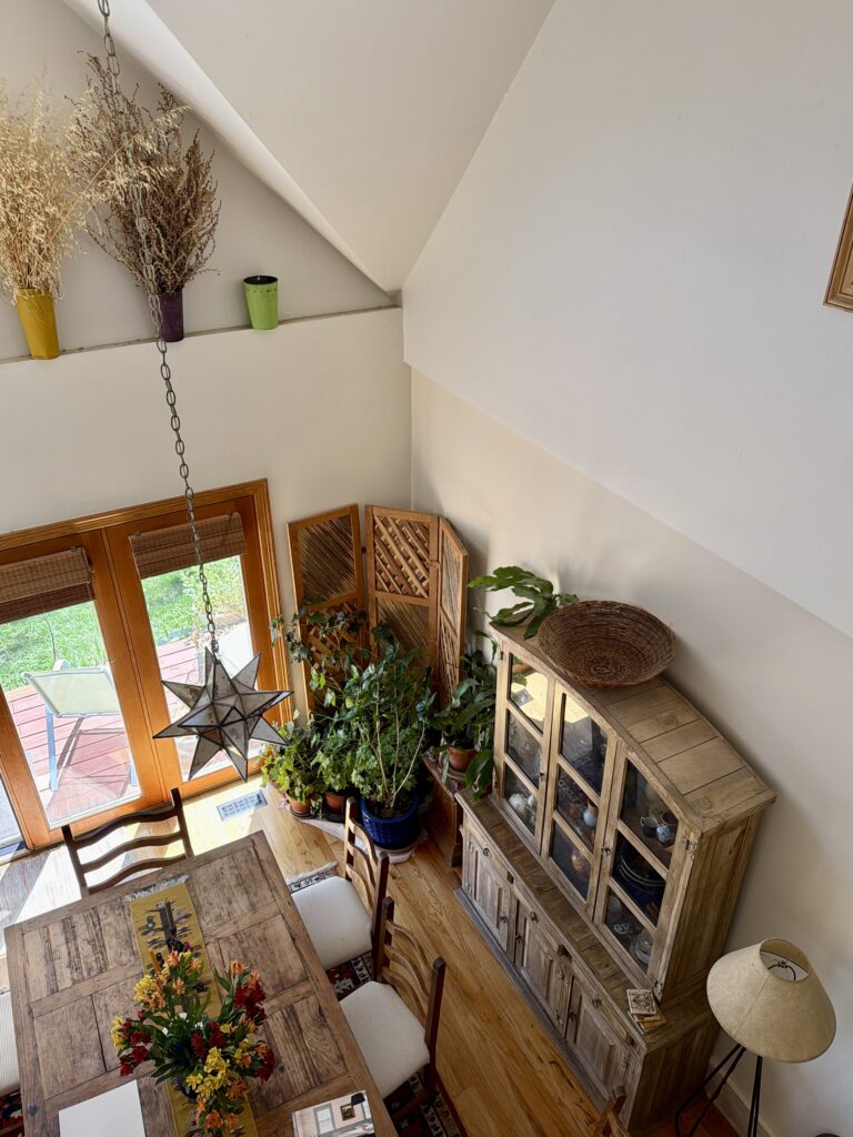
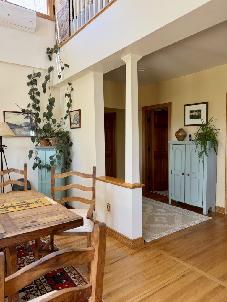
The client’s home, which we’re featuring in this post, is the perfect example of this comparison. In the photo below, you can see that the dining room walls are painted Benjamin Moore Mascarpone. But as the wall extends up into the lofted level above, it is painted White Dove. Mascarpone looks darker despite having a higher LRV.
We decided to keep White Dove in the stairway and upstairs loft landing of the home, and in some other spaces, because it looked great in the lighting, and worked well beside Marscapone.
Sample BM Mascarpone
We always recommend that you test paint colors on your home because lighting can change a color completely, both with interiors and exteriors.
In the old days, this meant we painted a large poster board with sample pots and a huge mess.
Now we have a better way to test paint, with Samplize Peel-and-Stick samples!
- Samples pre-painted with 2 coats of real paint from the manufacturer.
- Large 9” x 14” samples to see the color better in the lighting.
- Delivered overnight
- Colors are accurate
- Less expensive than painting a large poster board with sample pots
- No mess, and no toxic paint to dispose of
I use these in my color consulting practice for exact results. Discover Samplize peel-and-stick paint samples:
Project Spotlight: Using Benjamin Moore Mascarpone Interior Paint
The Benjamin Moore Mascarpone project we’re sharing today took place in a beautiful Colorado farmhouse. The house had been renovated about 20 years ago, and much of the natural wood trim and finishes were still unpainted.
The homeowners were preparing to sell and wanted help choosing the right interior paint colors before listing the home (Article). They had already started testing colors throughout the house, but wanted a professional eye to help evaluate the samples, narrow down the options, and decide where each color should be used.
Our goal was to create a cohesive color plan that worked with the home’s natural wood trim, the soft green kitchen cabinets (SW Coastal Plain), the white appliances, and the home’s soft, muted finishes.
Benjamin Moore Mascarpone was the perfect foundation for this warm cottage home because it offered the right balance: warm and creamy, yet neutral enough to keep the home flexible for resale. Even so, it wasn’t perfect for every surface. In some cases, as we outline below, we shifted to White Dove.
Marscapone is a beautiful color, but due to its very strong yellow undertones, it is not as versatile as White Dove.
Here are some ways we explored using Mascarpone wall paint in this home.
Can I use Mascarpone as an interior trim color?
I would not recommend using Mascarpone as a trim color. It’s way too creamy to pair with most other whites or light neutrals. Although it would look beautiful with the current palette, it limits your future choices because of its strong yellow undertones.
The trim white color is an important choice; most homeowners don’t repaint trim because of the high cost. We opted for Benjamin Moore Snowfall White (Article) trim with Mascarpone walls in the unseen Primary bedroom, where we had white trim paired with Mascarpone walls.
Can I try Mascarpone cabinets?
Yes, you could! If you want light, creamy cabinets that offer the look of a traditional white kitchen but with more warmth, Mascarpone could look really beautiful. Just make sure you test carefully – especially alongside any countertop, backsplash, and flooring. Mascarpone’s yellow undertones can look discordant alongside taupes and beiges with pink undertones.

Is a Mascarpone living room a good idea?
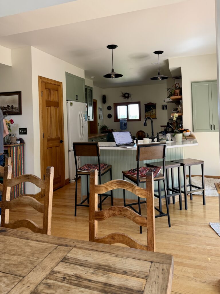
Yes! A living room painted with BM Mascarpone is a gorgeous way to bring warmth and depth to a family space. In our client’s home below, Mascarpone walls help the large, open space below feel cozy and welcoming.
Is Mascarpone a good whole-house color?
It could be! In our client’s home, we will paint most of the lower level in Mascarpone, including the living and dining rooms. In the upstairs loft, the client had tested White Dove, and it looked great, so we decided to keep it.
Whether Mascarpone works as a whole-house paint color (Article) really depends on your lighting, finishes, and the other colors in your furniture and decor. While Mascarpone is certainly light enough to use in just about any space, its yellow undertones could make it feel too creamy or look discordant with certain colors. This is why testing paint colors carefully is so important. A white like White Dove is more flexible, especially if you have taupe or peachy pink-beige finishes, which clash with Marscapone.
When should I avoid Mascarpone?
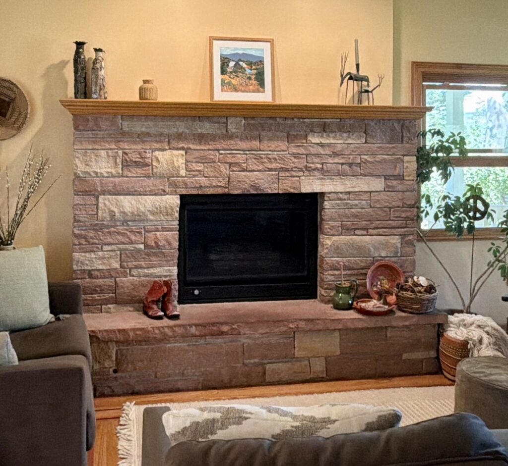
Because Mascarpone is so creamy and yellow, there are some situations where it’s not the best color choice. Although we decided to extend Marscapone throughout most of the house, we replaced it with White Dove in the kitchen and on the fireplace wall because it looked discordant with some of the finishes.
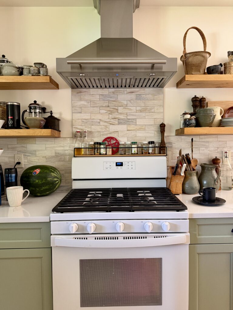
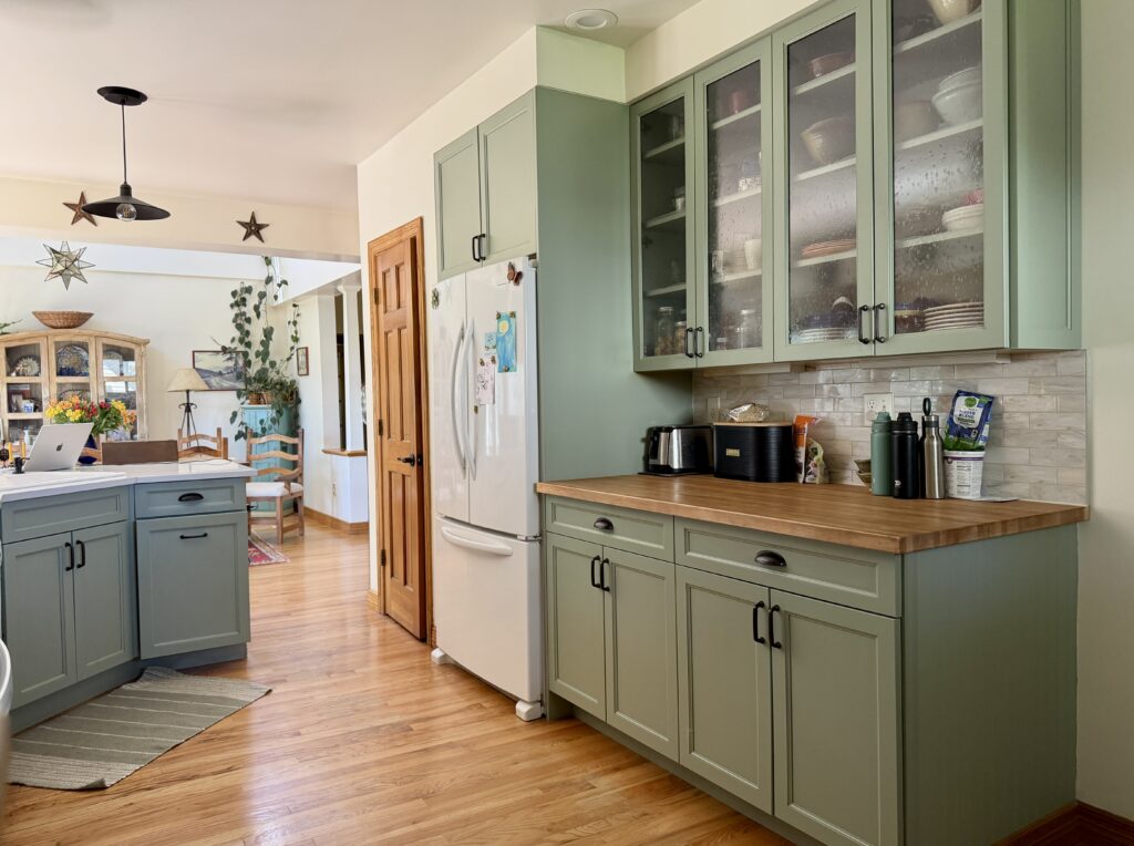
If you have taupe walls or finishes with pink undertones, for example, Mascarpone could look very discordant. You can see this in my client’s kitchen. They tried painting the kitchen walls with Mascarpone, and while the color looked lovely with their soft green cabinets, it did not pair well with their pinkish-taupe backsplash.
There’s another example of this in our client’s living area with a fireplace below. The pairing of creamy yellow walls and fireplace surround with pink-toned stone looks a little better here because the colors are darker, but when we tested Mascarpone with this fireplace, it looked terrible. Our plan is to paint the fireplace wall White Dove and the rest of the walls Marscapone. Since the whites are close enough to each other, and the room has relatively low light, most people won’t notice.
Best Mascarpone Coordinating Colors
Because of its strong yellow undertones, Mascarpone can be limiting. It pairs well with many other white paint colors and neutrals, as well as other warm hues and finishes.
Does Mascarpone go with green?
Mascarpone and green look really beautiful together! Many greens are warm, with yellow undertones, so they pair well with Mascarpone’s creaminess. In our client’s kitchen, for example, sage green (Article) cabinets painted with Sherwin-Williams Coastal Plain (Sample) looked really lovely alongside Mascarpone walls.
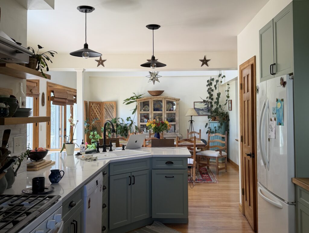
While we eventually decided to paint the kitchen walls White Dove because of the countertop and other finishes in the space, we love the way the view from the kitchen into the living room looks with Mascarpone walls in the background.
Does Mascarpone go with wood?
Yes! This client’s home had a lot of light, warm wood throughout, both in the floors and as trim around the windows and doorways. While we would often paint wooden trim white, in this case, it was in really good shape and looked really nice with the Mascarpone walls.
Our clients are planning to sell the home in 1-2 years. One of the realtors they interviewed said that the trim should all be painted white. My recommendation was NOT to paint the wood in this situation. It was in great shape and flowed nicely with the palette and the rustic cottage theme. I felt that painting the wood would take away the charm of this custom home.
Does Mascarpone go with white?
Absolutely! Mascarpone looks best with other warm whites and off-whites, such as Benjamin Moore White Dove (Article) or Benjamin Moore Simply White (Article), but not necessarily as trim colors. White Dove looks great next to Marscapone, but I’m not crazy about using it as a trim color there.
In the photo below, you can see the BM Mascarpone walls in the kitchen and living room, alongside the upper White Dove walls in the background, which extend into the lofted area above.
What are the Best Trim and Ceiling Colors For Mascarpone?
Snowfall White tested beautifully as a trim color in the primary suite, where we had painted trim. Anything with strong blue undertones, such as stock ceiling paint, SW Extra White, or BM Decorator’s white, will look too cool as ceiling and trim color alongside Mascarpone walls. It will make the ceiling and trim look dirty next to the Marscapone.
Of course, Marscapone trim (satin sheen) and ceilings (flat sheen) would look amazing with Marscapone walls. My only concern is that in the long run, those trim/ceiling colors would be very limiting. Most homeowners leave the trim and ceiling colors when they repaint the walls because of the cost. A cleaner white, such as Snowfall White or Chantilly Lace, is more timeless for trim and ceilings, and a more flexible choice.
Philosophically, I would normally pair a white trim with a higher LRV than the wall color. Since Marscapone has such a high LRV, it leaves very few options. Snowfall White tested beautifully as trim with Marscapone walls in the Primary suite upstairs, as did the high LRV clean white that was in place. Chantilly Lace could look good as trim with Marscapone.
White Dove was tested as the ceiling color with Marscapone on the main floor, but our final recommendation will be Snowfall White. Since the LRV of White Dove is much lower than Marscapone, it may look dingy on the ceiling.
We picked White Dove as a trim color in the stairway, where the walls and ceilings were already White Dove.
Comparing BM Mascarpone Alternatives
Not sure if Mascarpone is the right color for your project? See how it compares to other similar paint colors.
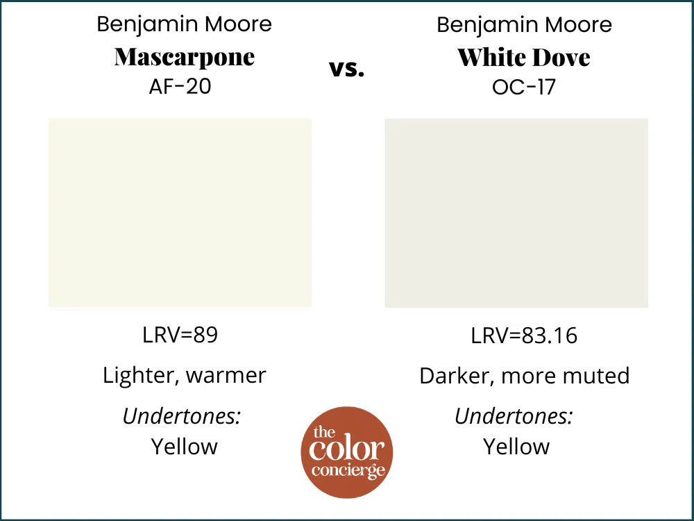
Benjamin Moore Mascarpone vs Benjamin Moore White Dove
With an LRV of 83, White Dove is darker than Mascarpone. While White Dove has similar yellow undertones, it’s much more muted and can actually look lighter in place.
The following photo shows White Dove on the second floor, with Marscapone on the bottom. This is a great real-life example of how the two colors compare.
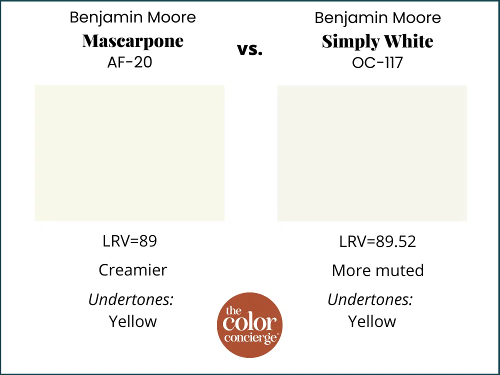
Benjamin Moore Mascarpone vs Benjamin Moore Simply White
Benjamin Moore Simply White is another light off-white paint color with yellow undertones. It has an LRV almost identical to Mascarpone’s, at 89.52, but looks a little less yellow and creamy.
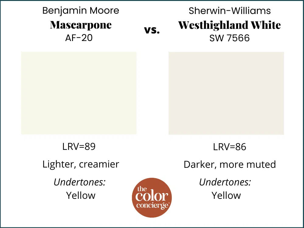
Benjamin Moore Mascarpone vs Sherwin-Williams Westhighland White
Sherwin-Williams Westhighland White is a beautiful warm white with strong yellow undertones. It has an LRV of 86, but looks much more muted than Mascarpone.
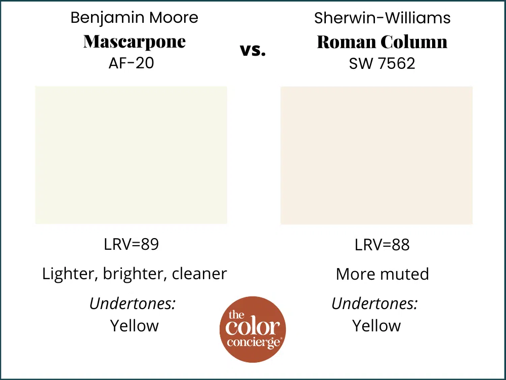
Benjamin Moore Mascarpone vs Sherwin-Williams Roman Column
Sherwin-Williams Roman Column is another color that’s very similar to Mascarpone. It has an LRV of 88, so is just barely darker, and it has strong yellow undertones. It is a bit more muted than Mascarpone, however, which looks brighter.
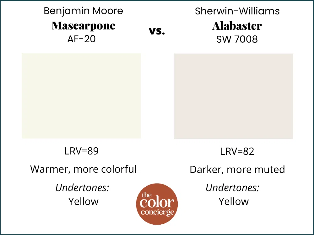
Benjamin Moore Mascarpone vs Sherwin-Williams Alabaster
Sherwin-Williams Alabaster (Article) is one of the most popular warm white paint colors on the market today. It’s darker than Mascarpone, with an LRV of 82. And while this color leans yellow, it looks very muted alongside Mascarpone’s strong yellow undertones. This isn’t good or bad; they are just different colors. Alabaster is quite lovely as well.
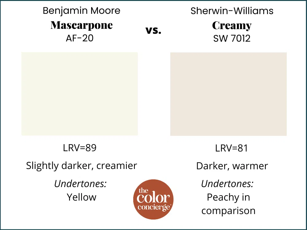
Benjamin Moore Mascarpone vs Sherwin-Williams Creamy
Sherwin-Williams Creamy (Article) is a very popular warm cream color. This was the color I expected to be the closest to Marscapone, because they give the same vibe when you see them. They are completely different colors, though. Creamy is significantly darker than Mascarpone, with an LRV of 81. And while this color leans yellow/peachy, it looks very muted alongside Mascarpone’s clear, strong yellow undertones. They are both beautiful.
I would use Creamy if you are looking for a very creamy vibe, and have lots of foliage reflecting into the home from outside. Since Creamy has more pigment and red tones, it may do a better job of neutralizing that green.
What is the Best Sherwin-Williams Mascarpone Alternative?
SW Roman Column and SW Westhighland white are the closest Sherwin-Williams colors to Mascarpone. While they’re not exact matches, they work in similar spaces and will bring the same cozy, inviting feel to a room.
Key Learning Points
Benjamin Moore Mascarpone is a warm, creamy white that delivers a lot of color despite its lightness.
- BM Mascarpone has strong yellow undertones that make it look warm and cozy on the wall.
- Mascarpone can work as a wall color for living rooms, kitchens, dining rooms and more. It can also work as a whole-house paint color – just make sure to test carefully!
- Avoid using Benjamin Moore Mascarpone paint with beige and taupe colors that have pink undertones, which can look discordant.
- We really loved the way Snowfall White looked as a trim color with Marscapone. Chantilly Lace would also look great.
- Avoid Marscapone as a trim and ceiling color. It may limit your wall color choices in the long term as trends ebb and flow.
Remember: NEVER, EVER use paint matches from a different brand than the one specified. Results are poor, and there are no standards for the sheens. Even though your painter may truly believe it can be done, don’t do it. See results from paint matching in this post about paint matches.
No matter what, always test your paint colors. It’s a standard best practice. Whenever I test my paint colors, they are perfect, and when I don’t test, they turn out wrong. Learn how to test your paint colors in this post.
Online Color Consulting
Still need help picking the best paint colors? Discover our Online Color Consulting Package.

Related Posts
- Benjamin Moore White Dove Color Review
- Sherwin-Williams Alabaster Color Review
- Benjamin Moore Simply White Color Review
About the Author

Hi, I’m Michelle Marceny, founder, owner, and Principal Color Designer at The Color Concierge. I believe a fresh coat of paint can completely transform a space. The Color Concierge was born out of my drive to help clients fall back in love with their homes. My clients trust me to help them find the perfect paint color for their home – whether it’s a whole-house paint color scheme or ideas for a single room.
Since The Color Concierge was founded in 2017, we have completed over 3000 color consultations, both online and in-person. I am a Certified Color Expert with 7 years of experience creating interior and exterior color palettes throughout North America.
We love your comments! Please note that the blog is meant as general advice, and it is not possible to give out specific answers to your paint questions. If you want more specific advice, please consider purchasing a color consultation. Thank you for your understanding.
