Learn all about Benjamin Moore Decorator’s White in this paint color review and discover why our color consultants think it’s one of the limiting white paint colors for your home (despite being so popular).
Decorator’s White has become an iconic Benjamin Moore white paint color over the years, mostly because it has the word “Decorator” in the name. I would argue that if it were called something like “Bluish White” or “Icy White”, it would not be as popular.
There is no such thing as a bad or ugly color; it is just colors that aren’t used in the right place or with the right complementary colors.
I am frustrated with this paint color because homeowners often (and logically) assume that Decorator’s White is a GREAT, GO-TO white paint color because it sounds like something an interior decorator might choose. But the truth is that Decorator’s White is a very limiting color to work with, and I seldom use it when working with our paint color consulting clients.
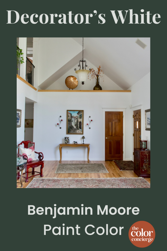
I use it so rarely that I don’t have any client photos of Decorator’s White. Instead, we’ll show a photo of Sherwin-Williams Extra White throughout this blog post, which has the same undertones and similar limitations. Extra White has a higher LRV and is not quite as blue, so it’s more forgiving than Decorator’s White, but it will give a good idea of what Decorator’s White would look like in place.
*This post contains affiliate links for products I use and love. If you click on some links and make a purchase, I will get a small commission at no cost to you. This helps pay for the costs of the blog, so I can continue to offer great content to our readers.
What color is Decorator’s White?
When you see Benjamin Moore Decorator’s White (Sample) on its own as a trim or ceiling color, it looks like a crisp white. It’s only when it’s compared to other paint colors (especially other white paint colors (Article)) that it starts to look different.
Decorator’s White is actually a very light blue-gray paint color (Article), and more blue than white. It pairs well with other blue-whites and very clean whites, but it almost always looks discordant with warmer whites that can skew yellow.
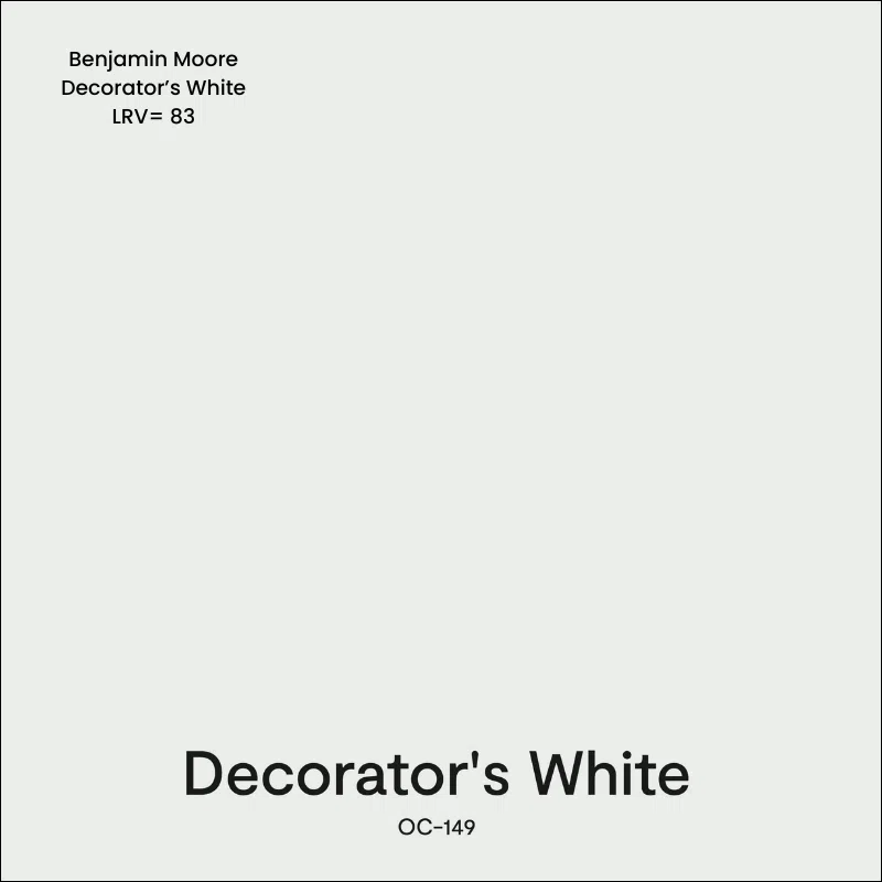
What is the Decorator’s White LRV?
The LRV of Decorator’s White is 82.68, which actually makes it a darker white. LRV is short for Light Reflectance Value, which measures how light (LRV=100) or dark (LRV=0) a color is. This color is very light but still has plenty of pigment.
What are the Decorator’s White undertones?
Decorator’s White has very strong blue undertones. In fact, there’s more blue than white in this color, which becomes especially clear when paired with paint colors with warm undertones (like creamy whites or warm grays).
If you’ve ever painted your room white and later wondered, “Why does my white paint look blue?,” you may have been using BM Decorator’s White. It’s really surprising just how blue this can look on the wall.
Is Decorator’s White cool or warm?
BM Decorator’s White is a very cool paint color thanks to its blue undertones. This color really only works well as a wall color if your home has lots of warm, natural light, or if you’re looking for a blue-white look.
Sample Decorator’s White
We always recommend that you test paint colors (article) in your home because lighting can completely change a color, both on interiors and exteriors.
In the old days, this meant we painted a large poster board with sample pots and a huge mess.
Now we have a better way to test paint, with Samplize Peel-and-Stick samples!
- Samples pre-painted with 2 coats of real paint from the manufacturer.
- Large 9” x 14” samples to see the color better in the lighting.
- Delivered overnight
- Colors are accurate
- Less expensive than painting a large poster board with sample pots
- No mess, and no toxic paint to dispose of
I use these in my color consulting practice for exact results. Discover Samplize peel-and-stick paint samples and sample Decorators White (Sample) via the link below.
Is Decorator’s White a good trim color?
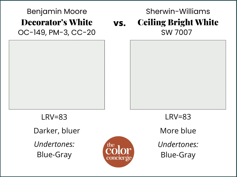
I most often see Benjamin Moore Decorator’s White being recommended as a trim and ceiling color. In fact, Decorator’s White is essentially the same color as Sherwin-Williams Ceiling Bright White (Sample) (a ceiling color that can look good when paired with clean white trim).
Another close Sherwin-Williams alternative to Decorator’s White is Sherwin-Williams Extra White (Sample). Extra White is slightly less colorful than Decorator’s White and a bit lighter, but can be used in similar ways.
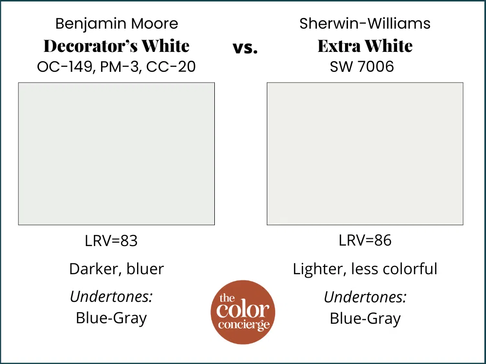
Extra White is one of the most popular trim and ceiling paint colors in the United States, used by many new home builders. In the room pictured below, SW Extra White (Color review article) is used as the wall color and for the trim and ceiling.
Decorator’s White is a bit darker and cooler than Extra White, but they work in similar ways. I’m not completely opposed to using Decorator’s White as a trim and ceiling color, although it will limit you if you choose to paint your walls with warmer whites.
Using BM Decorator’s White Trim
While Decorator’s White trim and ceiling paint can be used successfully, it’s important to understand how its cool, blue undertones look with other paint colors and hard finishes.
For example, we don’t recommend using Decorator’s White with earthy finishes, such as homes built in the Tuscan era. The cool, blue undertones will look dingy and cold when paired with the warm finishes.
Decorator’s White can look great in rooms that are flooded with light, however, and also works well paired with clean white subway backsplashes, Carrara Marble, and other cool finishes.
I prefer to pair Decorator’s White with greens and blues, but not yellows or beiges, which are too warm for this white paint.
To really understand how Decorator’s White works as a trim color (Article), it’s helpful to compare it to other white paint colors.
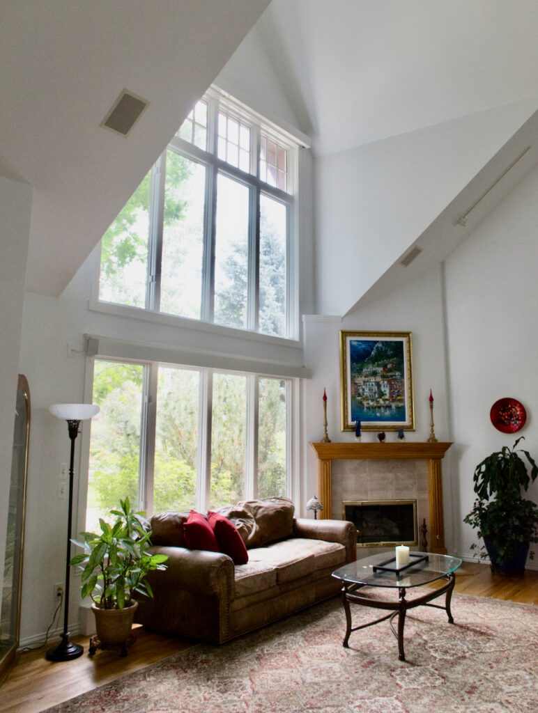
BM Decorator’s White vs. BM Simply White
Benjamin Moore Simply White (Sample) is much warmer than Decorator’s White, with muted yellow undertones. It also has a higher LRV, so it appears lighter than Decorator’s White. I would not use these two colors together as wall and trim because Simply White (Color review article) will make Decorator’s White look muddy.
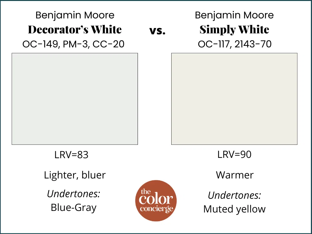
BM Decorator’s White vs. BM Swiss Coffee
Benjamin Moore Swiss Coffee (Sample) has a similar LRV to Decorator’s White but is very warm with muted green undertones that look discordant next to Decorator’s White. I would not pair Decorator’s White trim with creamy tile or countertops, or off-white paint colors like Swiss Coffee (Color review article). These warm hues will look too yellow and make Decorator’s White look dingy in comparison.
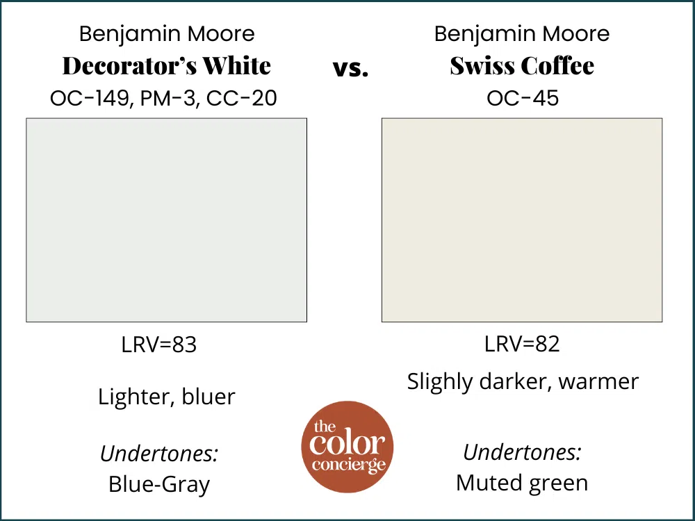
BM Decorator’s White vs. BM White Dove
Benjamin Moore White Dove (Sample) has softer undertones than Swiss Coffee but is still too warm to pair with Decorator’s White successfully. Though it has the same LRV as Decorator’s White, White Dove’s (Color review article) muted yellow undertones clash with Decorator’s White cool blue undertones.
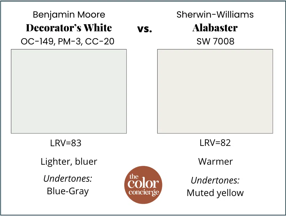
BM Decorator’s White vs. SW Alabaster
Sherwin-Williams Alabaster (Sample) is one of the most popular warm white paint colors on the market. Its muted yellow undertones make Decorator’s White look dingy in comparison. Even though the LRVs are close, these colors couldn’t be more different. This is a great example that LRV doesn’t tell you all. You also need to look at the undertones and warmth.
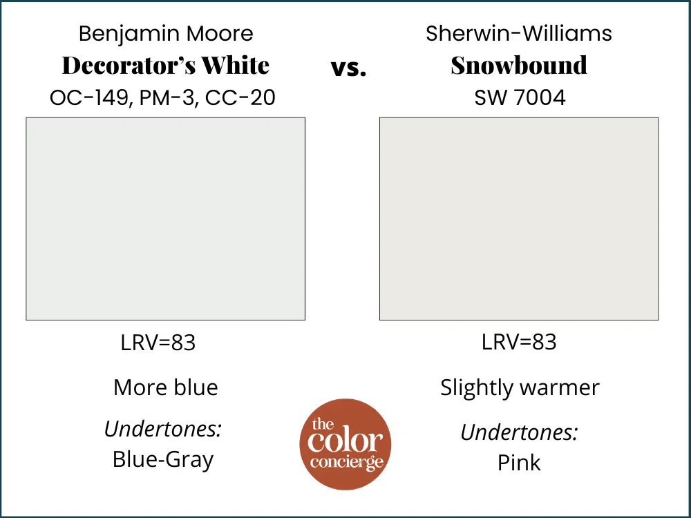
BM Decorator’s White vs. SW Snowbound
Sherwin-Williams Snowbound (Sample) is another warm white paint color. Unlike Alabaster and Simply White, it has pink undertones, so it still doesn’t quite look perfect with Decorator’s White. Test these colors carefully if you plan to use them together.
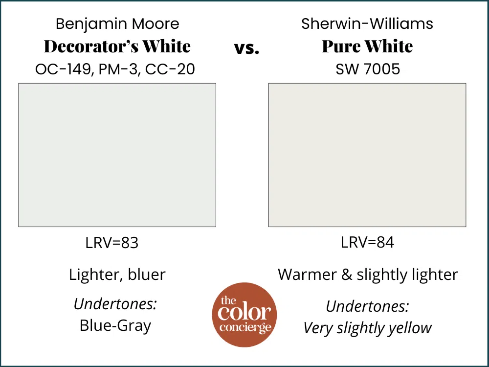
BM Decorator’s White vs SW Pure White
Sherwin-Williams Pure White (Sample) is slightly lighter than Decorator’s White, with an LRV of 84. Pure White (Color review article) is also slightly warmer than Decorator’s White, with slightly yellow undertones. In a perfect world, I wouldn’t use these together, but it’s not that bad.
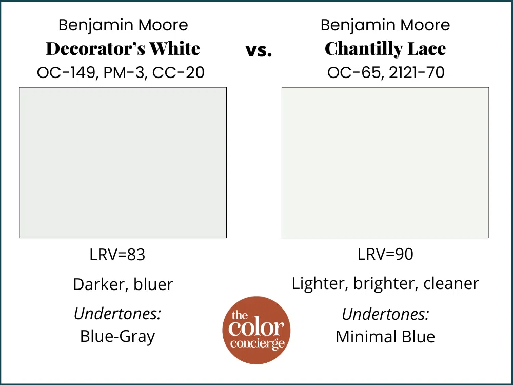
BM Decorator’s White vs. BM Chantilly Lace
If you’re looking for a crisp white trim and ceiling color or a white cabinet paint color, I recommend passing on Decorator’s White and using Benjamin Moore Chantilly Lace (Sample) instead. Chantilly Lace (Color review article) has subtle blue undertones and looks crisp and clean in place.
These two colors work very well together as a wall color (Decorator’s White) and trim color (Chantilly), I prefer Chantilly Lace in just about every setting as a trim and ceiling color. Chantilly Lace is a good option if you don’t want an overly creamy white but also don’t want your walls or trim looking blue in cooler light. If you use Chantilly Lace as a trim color instead of Decorator’s White then you will have more flexibility for the wall colors you choose, now and in the future.
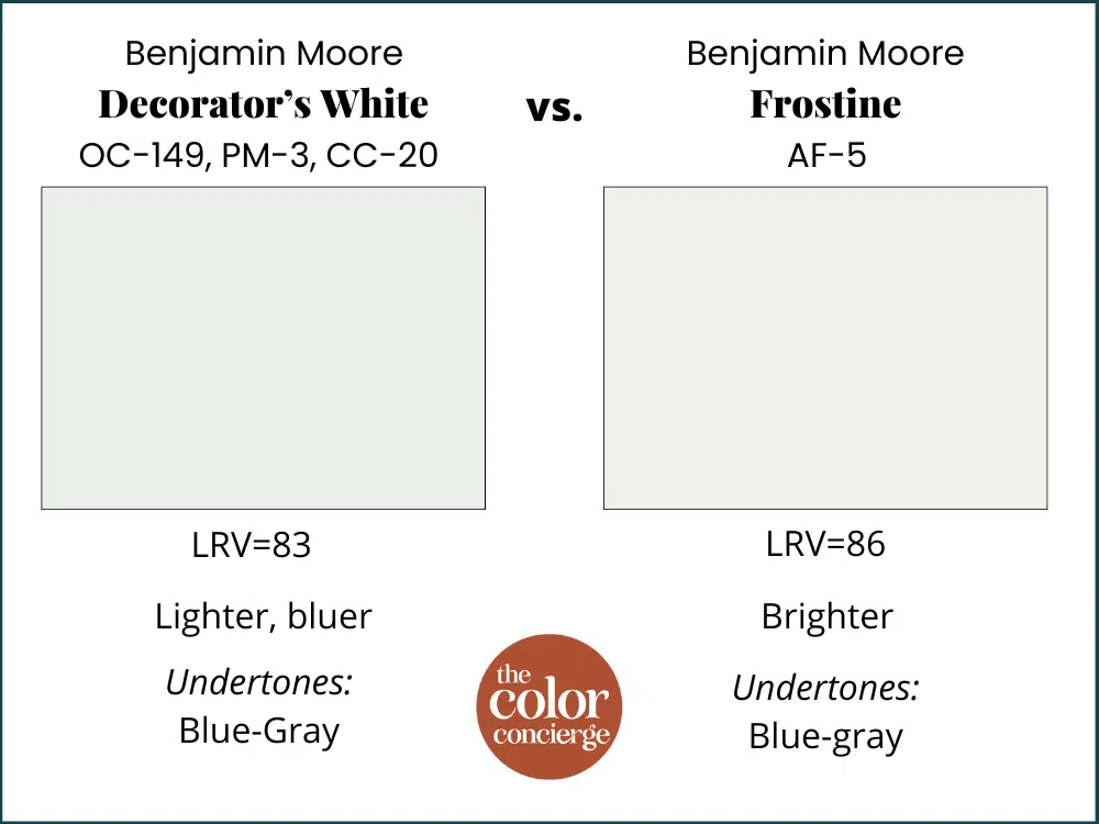
BM Decorator’s White vs. BM Frostine
Benjamin Moore Frostine is a slightly brighter white paint color than Decorator’s White, which also has blue-gray undertones. These two colors are a good pairing when used for walls and trim. Decorator’s White trim adds just enough depth to look crisp and cool but not overly blue compared to Frostine walls.
I would always pick Frostine over Decorator’s White as a trim and ceiling color because it will be more flexible with off-whites and other paint colors, and also because it has a lower LRV.
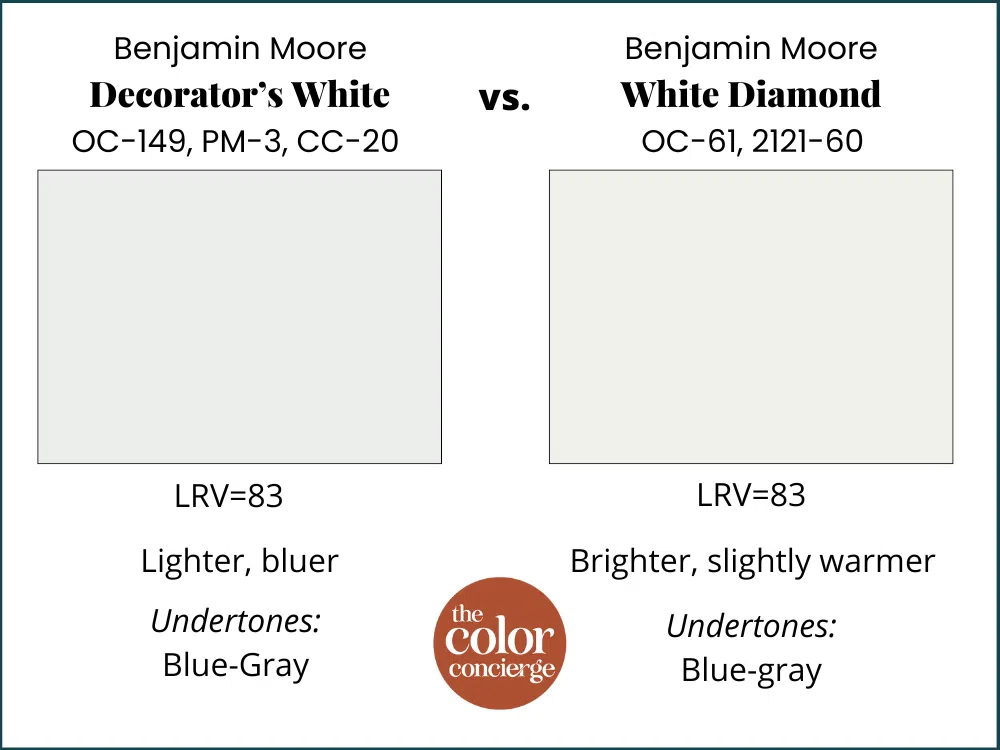
BM Decorator’s White vs. BM White Diamond
Benjamin Moore White Diamond (Sample) is another good pairing with Decorator’s White. This crisp, cool white is very similar to Decorator’s White but is slightly brighter and warmer. It has similar blue-gray undertones.
Is Decorator’s White a good wall color?
While it can be used as a wall color in some spaces, Decorator’s White is so cool and bright that I don’t recommend using it as a whole-house paint color, unless your home is absolutely flooded with natural light. In that case, I would pick either Chantilly Lace or Decorator’s White as the trim and ceiling color.
Don’t use Decorator’s White in a North-facing interior room unless you are looking or a blue-gray (it will look like Decorator’s blue). In rooms with variable exposures like East or West, Decorator’s White walls will still look blue when the sun is in the shade.
Still, there is no such thing as a bad color, or an ugly color, just colors that aren’t used in the right place.
Is Decorator’s White a good exterior paint color?
My answer is only in certain cases. Decorator’s White is too stark to use as a white trim color with most mid-tone to dark siding colors. You could use it as a trim color with a very light siding color, especially if it’s a very light blue or light green.
I wouldn’t use Decorator’s White trim with homes with red brick or earthy stone, but it would look good with some cool stones with blue or violet undertones. Note that the Decorator’s White will look very cool outside, much cooler than the photo below, which is SW Extra White.
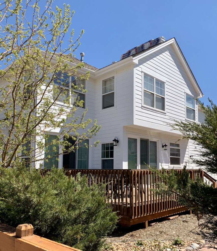
The home above is painted with Sherwin-Williams Extra White, which looks similar to Decorator’s White, only less blue when used outdoors.
You can use it as a whole-house exterior white paint color, but not with earthy red, orange, or yellow brick. Instead, I’d only use it with stone that has blue or violet undertones.
No matter what, be sure to test Decorator’s White carefully. The lighting and surrounding foliage on your property can have a big impact on how this color looks as exterior paint.

Recap: Tips for Using BM Decorator’s White
Now that we’ve explored some of the ins and outs of using Decorator’s White (or not using it), let’s recap the major things to consider when using this paint color.
- Decorator’s White doesn’t look good with earthy finishes, such as Tuscan interiors or earthy brick or stone exteriors.
- It will look dingy in cool or low light because the color will be shady in the corners, and the shady areas will look like a dingy gray. Don’t use it in rooms with North facing or variable light where there is a time of day when the room is in the shade.
- You should only pair Decorator’s White with white paint colors with blue undertones (like SW Extra White, SW Ceiling Bright White, BM Frostine, BM White Diamond) or clean whites such as BM Chantilly Lace.
- Don’t use as a white trim and ceiling color with a white wall color that has a higher LRV (greater than 82) because it will make the ceiling look dingy.
- Don’t use with warmer whites such as BM White Dove, BM Swiss Coffee, BM Simply White because it will look discordant.
What is the easiest way to sample BM Decorator’s White?
You should always sample and test your paint colors, but it’s especially important with a paint like Decorator’s White that can look so different from room to room depending on the time of day or the amount of natural light.
The easiest way to sample Benjamin Moore Decorator’s White (and any paint color for that matter) is via SAMPLIZE. Their peel-and-stick paint samples are easy to use and true to color.
There is no mess, and the cost is less expensive than purchasing a sample and a white poster board. Since you don’t need to dispose of the paint, it’s also environmentally friendly! With Samplize you can easily see how different shades look on your unique wall.
Key Learning Points
Decorator’s White is a cool white paint color with strong blue undertones. While it can be used for trim, ceilings, walls and even exteriors, it’s not a very flexible color and needs to be tested carefully.
- Don’t pair Decorator’s White with warm, earthy finishes or warm stone or brick.
- Decorator’s White can work as a wall color and even whole-house paint color in spaces with tons of warm, natural light. It can look dingy in shadowy spaces or rooms with cool light.
- Don’t use Decorator’s White for trim and ceiling paint with lighter, warmer white paint colors. It will look discordant and dingy.
Remember: NEVER, EVER use paint matches from a different brand than the one specified. Results are poor and there are no standards for the sheens. Even though your painter may truly believe it can be done, don’t do it. See results from paint matching here.
No matter what, always test your paint colors. It’s a standard best practice. Whenever I test my paint colors, they are perfect, and when I don’t test they turn out wrong. Learn how to test your paint colors here.
Online Color Consulting
If you still need help with paint colors, check out our Online Color Consulting Packages.

Related Posts
- Best Benjamin Moore White Paint Colors
- Best White Paint Colors for Dark Rooms
- Best Sherwin-Williams White Paint Colors
- Sherwin-Williams Extra White Paint Color Review
About the Author

Hi, I’m Michelle Marceny, founder, owner, and Principal Color Designer at The Color Concierge. I believe a fresh coat of paint can completely transform a space. The Color Concierge was born out of my drive to help clients fall back in love with their homes. My clients trust me to help them find the perfect paint color for their home – whether it’s a whole-house paint color scheme or ideas for a single room.
Since The Color Concierge was founded in 2017, we have completed over 3000 color consultations, both online and in-person. I am a Certified Color Expert with 7 years of experience creating interior and exterior color palettes throughout North America.
We love your comments! Please note that the blog is meant as general advice, and it is not possible to give out specific answers to your paint questions. If you want more specific advice, our Online Color Consultations will help you pick your paint colours. Thank you for your understanding.

2 Responses
The kitchen cabinets in my condo are melamine Decorator’s White but I have a stone fireplace in the open concept living room that is warm toned (various shades of gray with some golden mustard tones). I also have a golden mustard sofa that backs up to 3 floor to ceiling windows . The entire condo faces SouthWest so there is a lot of natural light. What wall colors would you suggest? I have white appliances, and brass cabinet pulls and hardware accents with some mahogany furniture. I will be replacing countertops, backsplash and flooring. Any and all suggestions are appreciated.
Hi Rose-Marie,
Please consider one of our color consultations so that we can more thoroughly explore your project and make accurate recommendations.
Thank you,
MIchelle