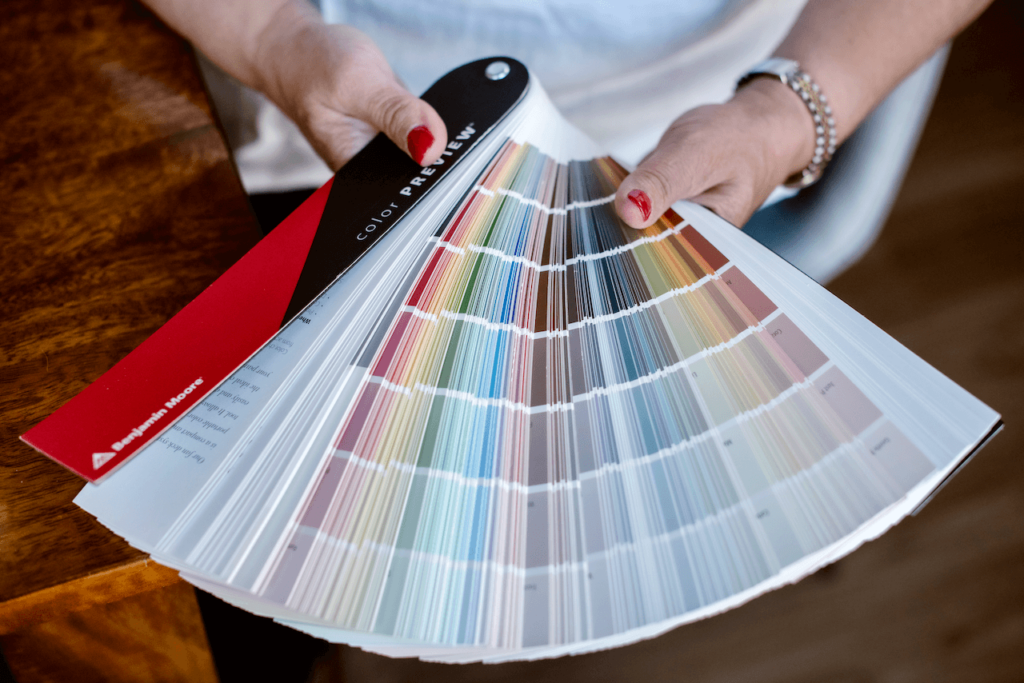
Learn all about 2025 HGTV Home Color of the Year Sherwin-Williams Quietude in this color review from The Color Concierge.
The 2025 Paint Color of the Year (COTY) season has begun, with Behr, Valspar and HGTV Home by Sherwin-Williams launching their new colors. My favorite of the three is HGTV Home’s Quietude, a color that we use often in our practice!
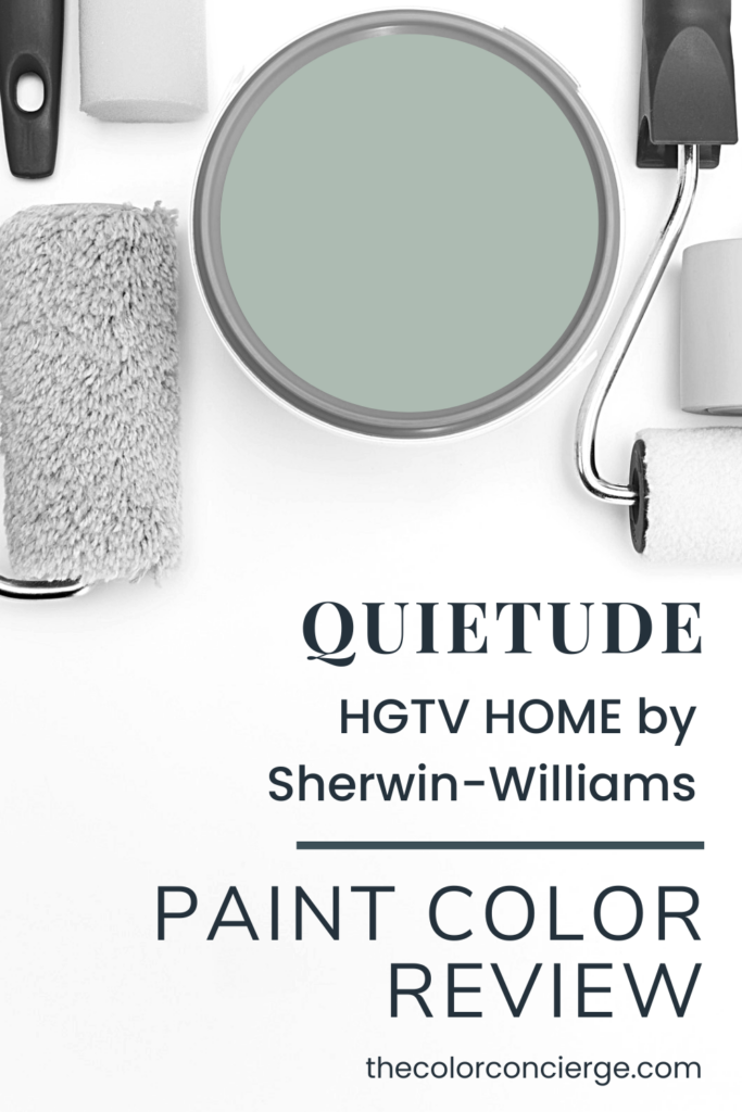
Quietude is the HGTV Home by Sherwin-Williams 2025 Color of the Year, and we love it! It is also part of the Naturally Refined Color Collection of the Year, which includes some really beautiful warm paint colors.
According to HGTV Home by Sherwin-Williams Color Marketing Manager Ashley Banbury: “The ‘Naturally Refined’ Color Collection embraces the desire for simplicity and slower living. Thoughtfully curated with longevity in mind, each shade emanates elements of timeless design and quiet luxury to help support a living space that feels meaningful.
“Within the collection, the softened sage green Quietude stands out as the 2025 Color of the Year and sets the stage for a quiet space to promote relaxation.”
These paint colors are available in the HGTV Home Collection at Lowe’s and the Sherwin-Williams paint store. Keep reading to learn more about how to use Quietude – and the Color of the Year palette – in your home.
Note: We are brand-neutral when it comes to paint companies. We were not compensated by the paint company for this article. In this article, we used photos courtesy of HGTV Home by Sherwin-Williams because we don’t have these in our collection of projects yet.
*This post contains affiliate links for products I use and love. If you click on some links and make a purchase, I will get a small commission at no cost to you. This helps pay for the costs of the blog so I can continue to offer great content to our readers.
About The Color Concierge
Our Colorado-based paint color consultants make finding the right paint colors for your home easy. Whether you’re painting the exterior or interior of your home, our simple yet effective process lets us get your paint color right the first time. We’ve helped thousands of homeowners transform their homes into a space they love. Learn more about ONLINE COLOR CONSULTATIONS today.
What is the difference between HGTV Home by Sherwin-Williams and Sherwin-Williams Paint?
HGTV Home by Sherwin-Williams paints are sold exclusively at Lowe’s and are targeted for DIY homeowners. It’s a convenient way to buy paint as a 1-stop shopping experience at Lowes.
This brand competes with the Behr paint brand at Home Depot. HGTV Home paints are part of the Sherwin-Williams Consumer Brands Group vs. the Paint Stores Group.
Although a large majority of their paint colors are crossovers with the paint colors you buy at Sherwin-Williams stores, they also have some unique paint colors. The crossover paints have the same names, but since they use different bases, the colors and sheens can be slightly different.
The color difference between the two brands of the same color is very slight, but you may not be able to touch up the Lowe’s paint color with the one that comes from the paint store. HGTV Home paint color codes are slightly different ( HGSW6339 vs. SW 6339, for example).
The HGTV Home Paint retail prices are generally lower than the ones you purchase from the Sherwin-Williams paint stores, which are targeted at professional painters.
What is the best way to test the 2025 Color of the Year Quietude?
We always recommend that you test paint colors on your home because lighting can change a color completely, both with interiors as well as exteriors.
In the old days, this meant we painted a large poster board with sample pots and a huge mess.
Now we have a better way to test paint, with Samplize Peel-and-Stick samples!
- Samples pre-painted with 2 coats of real paint from the manufacturer.
- Large 9” x 14” samples to see the color better in the lighting.
- Delivered overnight
- Colors are accurate
- Less expensive than painting a large poster board with sample pots
- No mess, and no toxic paint to dispose of
I use these in my own color consulting practice for exact results. Discover Samplize peel-and-stick paint samples:
Buy 8 samples and get 2 free – no coupon code required. Order today and get samples tomorrow
What color is Sherwin-Williams Quietude?
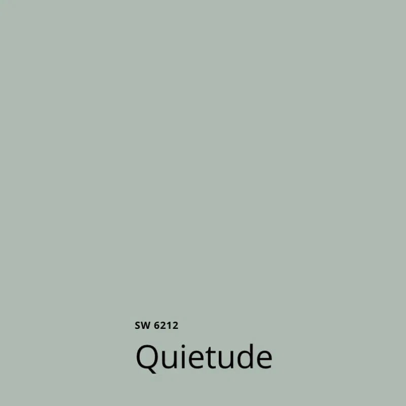
As I mentioned, Quietude (sample) is one of our favorite Sherwin-Williams colors. It is in the family of lighter blue-green colors. It is muted but not quite gray and is very pleasing in the right setting.
Quietude is a darker version of Sherwin-Williams Sea Salt, and can be used anywhere you would use Sea Salt.
I love to use SW Sea Salt (Color review article) in offices, bedrooms and laundry rooms, as pictured below. All of these spaces would also look lovely with Quietude as a darker version that would provide more contrast with white trim.
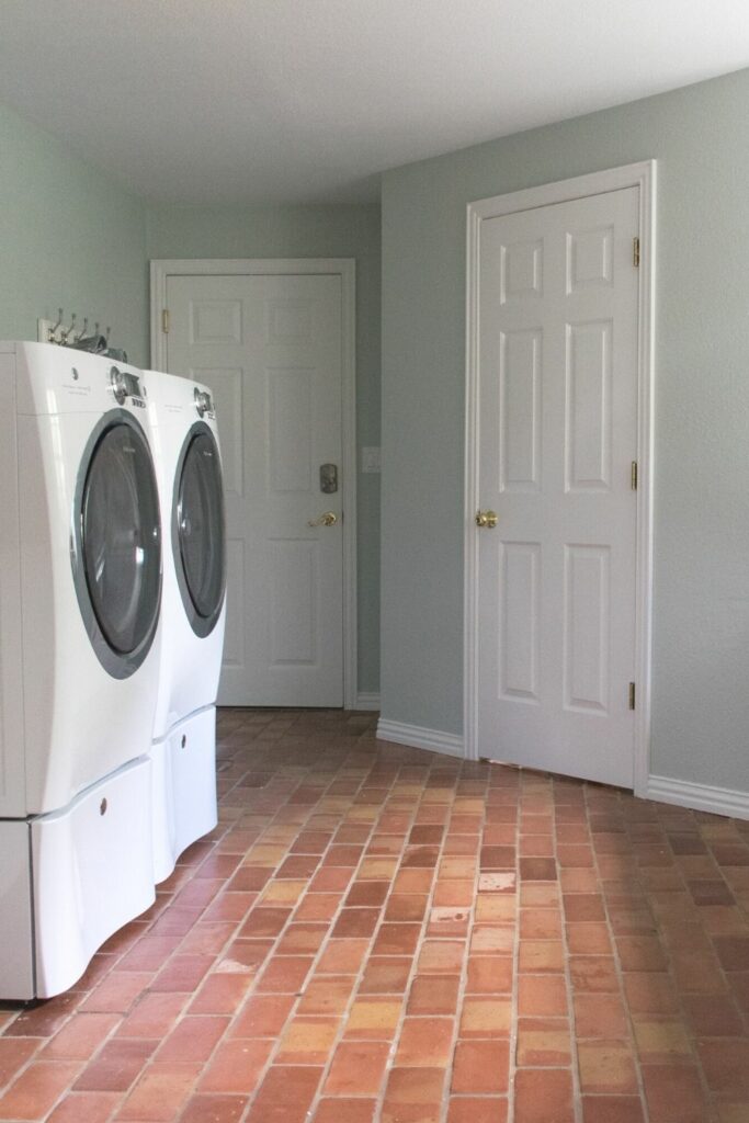
Quietude is also an excellent option for colorful cabinets in a coastal motif with very light or white countertops and backsplashes (but not dark granites). I would consider Quietude a color for lower cabinets when paired with white upper cabinets in a Tuxedo Cabinet kitchen design.
What is the LRV of Quietude?
Quietude has an LRV of 48, which makes it a medium blue-green paint color. LRV is short for Light Reflectance Value, which measures how light (LRV=100) or dark (LRV=0) a color is.
What are the SW Quietude undertones?
Sherwin-Williams Quietude is a blue-green paint color with stronger green undertones. The color is muted with gray tones, but more colorful than a gray paint color. It usually reads as a green paint color.
Is Quietude warm or cool?
Quietude is a warm paint color, although it does have plenty of blue in it. The color leans towards green, which provides warmth.
How can you use SW Quietude paint in your home?
There’s a reason Quietude is the 2025 HGTV Home Color of the Year – there are many different ways to use this gorgeous color in your home.
With an LRV of 48, Quietude is beautiful for a calming bedroom (Color review article), vanity cabinet, or even the lower cabinets in a tuxedo kitchen (Color review article), paired with off-white upper cabinets (Color review article).
Is SW Quietude a good whole-house paint color?
Quietude is great for individual rooms or accents but if you used it as a whole-house color (Color review article), it would be too much. A little bit goes a long way since it’s so colorful.
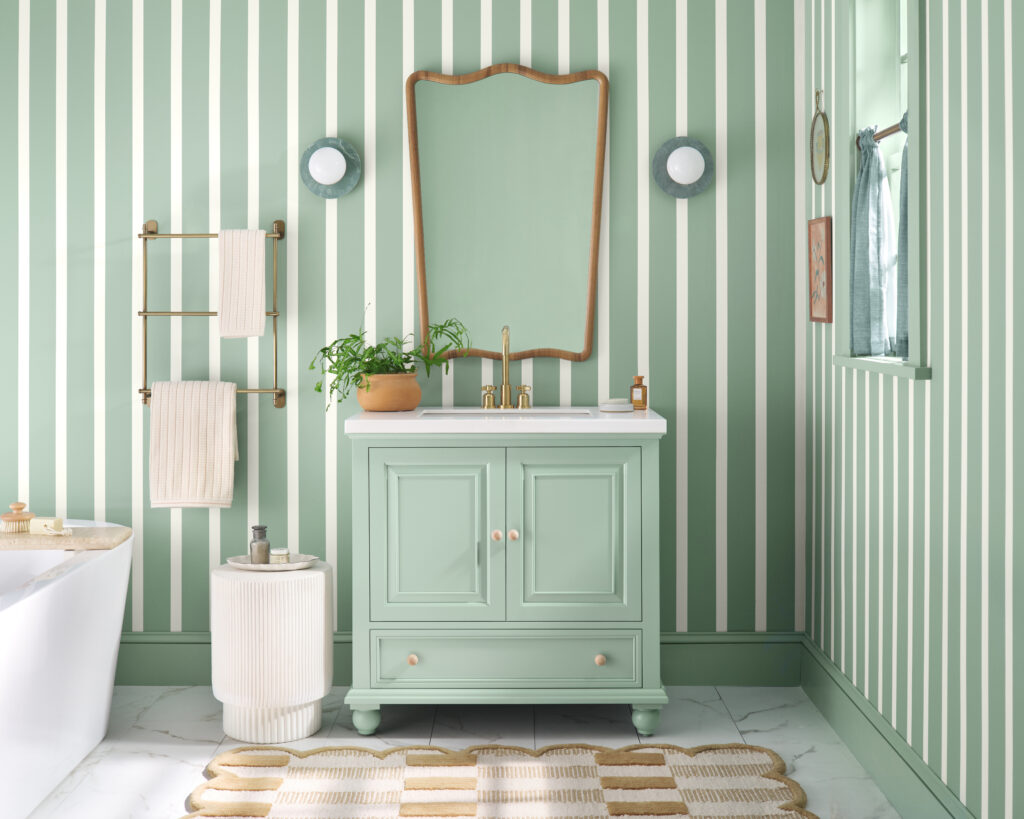
Should I try a Quietude painted vanity?
In the photo from Sherwin-Williams below, a bathroom features a vanity painted with SW Quietude paint. The base molding in the room is painted to match the vanity, a gorgeous polished look!
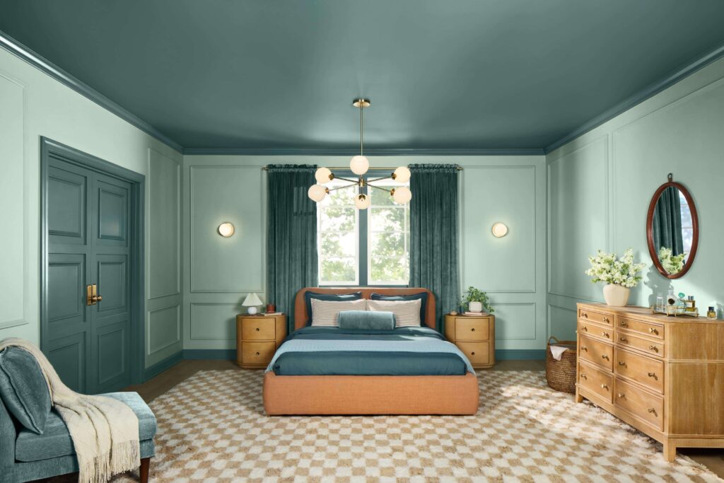
Would a Quietude bedroom work?
Yes, definitely! The bedroom below is a beautiful twist on a color-drenched (Color review article) bedroom, with darker green doors, base molding, and a ceiling balanced with warm wood furniture and gold accents.
This is lovely but you’d need to love light green!
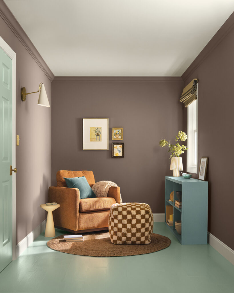
Is SW Quietude a good accent color?
One of my favorite ways to use this color is as an accent wall (Article) or other interior accent. In the photo below, Quietude is featured as the floor and interior door color and is paired with another color from the Naturally Refined palette, Nutshell.
Nutshell is a brown that transitions into a deep mauve purple. The colors contrast nicely, because they are opposites on the color wheel.
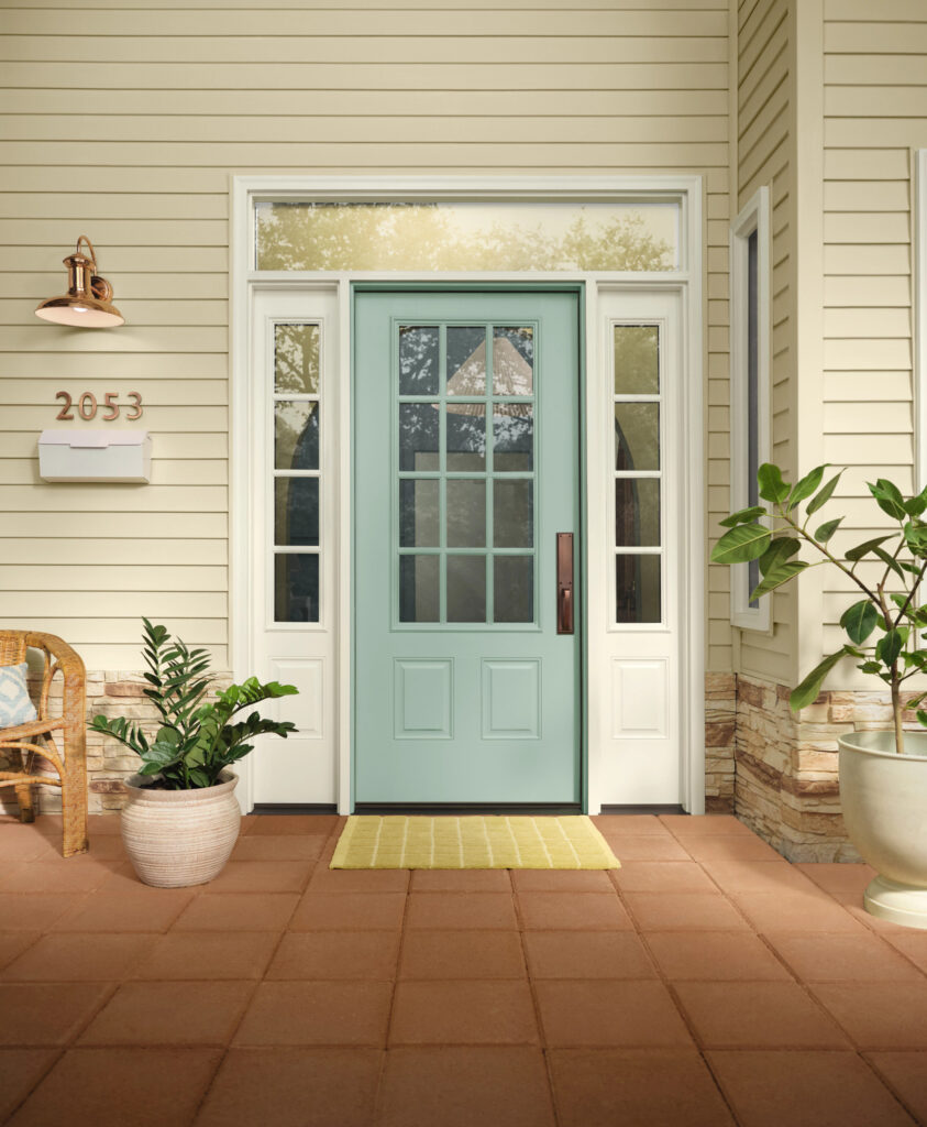
Can you use Sherwin-Williams Quietude exterior paint?
I don’t recommend Quietude for exteriors unless it’s a front door color (Article) under a shady front porch (Article) because it’s very light and can look minty outside.
If you are looking for a light beachy look, then you could use Quietude exterior paint for the body paint with a lighter white for the exterior trim (Article) such as Greek Villa (Article). However, this won’t look good if you have very earthy brick or stone on the house.
What are the best trim and ceiling colors for Quietude?
I like to balance Quietude with lighter off-whites such as Sherwin-Williams Pure White (Article). It’s also nice with SW Extra White (Article), one of the most common trim colors in the United States. The darkest I would go for a white is Greek Villa. A very creamy white like SW Alabaster (Article) might look overly creamy.
SW Quietude Alternatives
Compare the HGTV Home by Sherwin-Williams Color of the Year Quietude to other similar paint colors.
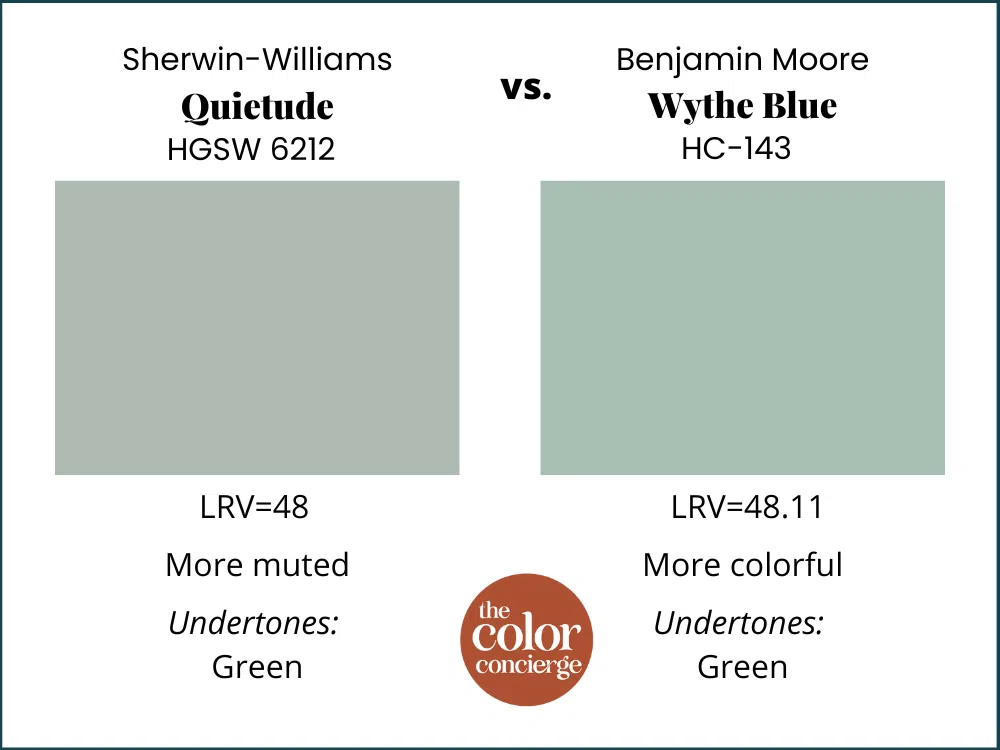
Sherwin-Williams Quietude vs. Benjamin Moore Wythe Blue
Benjamin Moore Wythe Blue (Sample) is a very similar color to Quietude. It has the same LRV, at 48, but is less muted and looks more colorful in place.
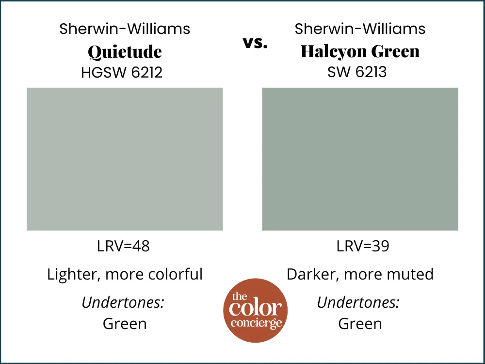
Sherwin-Williams Quietude vs. Sherwin-Williams Halcyon Green
Sherwin-Williams Halcyon Green is a darker version of Quietude, with an LRV of 39. Halcyon Green is also a bit more muted than Quietude, which looks more colorful on the wall.
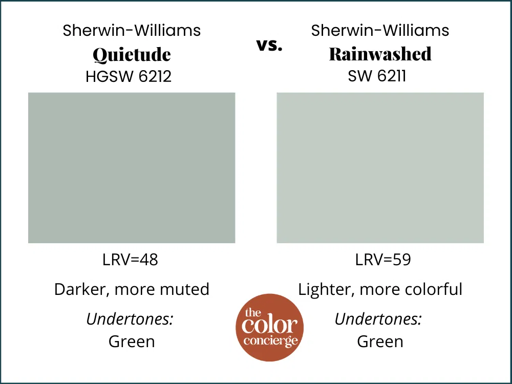
Sherwin-Williams Quietude vs. Sherwin-Williams Rainwashed
Sherwin-Williams Rainwashed is a lighter version of Quietude with an LRV of 59. It is similarly warm but a bit greener on the wall.
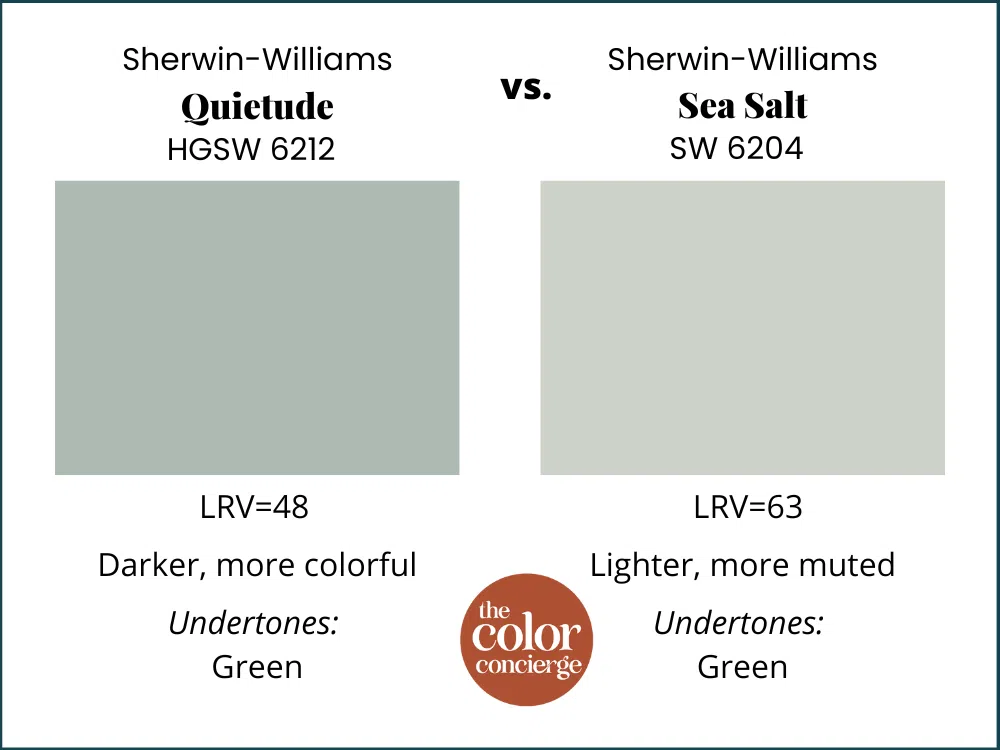
Sherwin-Williams Quietude vs. Sherwin-Williams Sea Salt
Sherwin-Williams Sea Salt is a lighter version of Quietude. It has a lot more gray in it and is much more muted in place. Sea Salt is a great option to keep a space fairly neutral but with a pop of color.
What colors work well in a Sherwin-Williams Quietude color palette?
HGTV Home by Sherwin-Williams curated a gorgeous palette that can be used as a guideline for a whole-house color scheme. Note that the colors in these palettes aren’t just for paint colors, you can use them for decor and other accents.
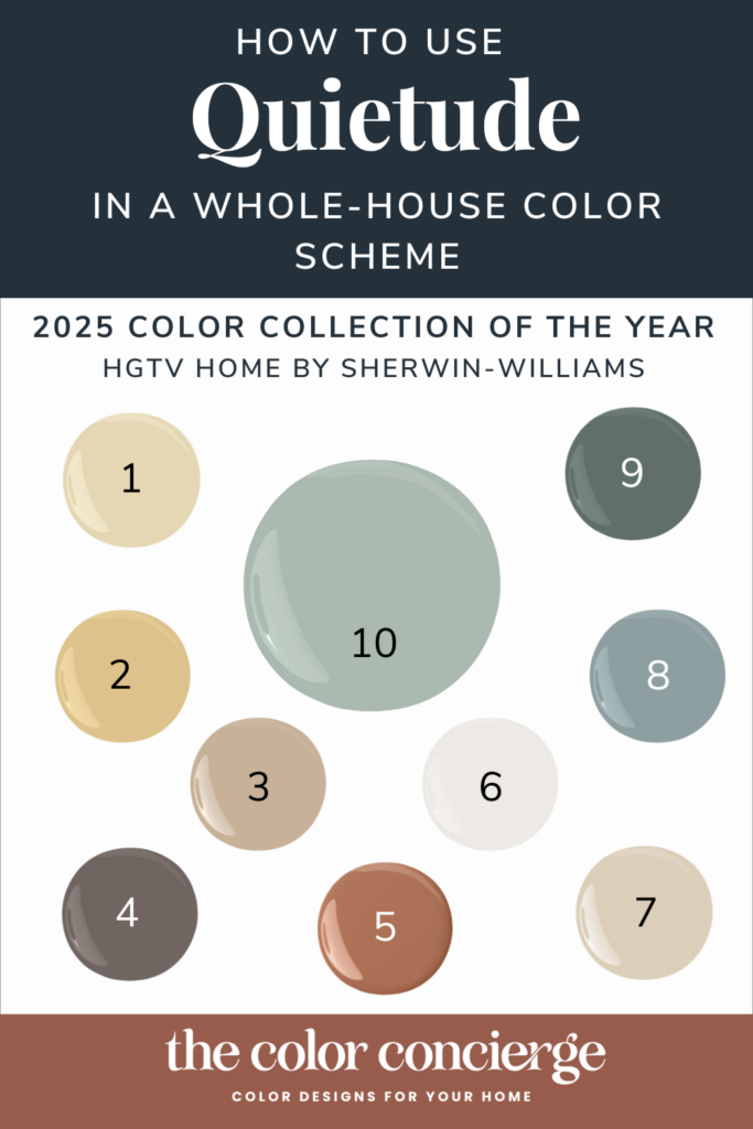
Click on the links below to sample each paint color in this palette. The palette includes:
- Convivial Yellow (HGSW6393)
- Sequin (HGSW6394)
- Nomadic Desert (HGSW6107)
- Nutshell (HGSW6040)
- Spiced Cider (HGSW7702)
- Snowbound (HGSW7004)
- Stucco (HGSW7569)
- Delft (HGSW9134)
- Rocky River (HGSW6215)
- Quietude (HGSW6212)
In the last couple of years, warmer palettes and colors have taken the stage. This “Naturally Refined” color palette falls into the current trend for warmer colors. It is a nice guideline for a total color palette you might use to pick accent colors with a warm white or neutral foundation color.
What I see missing from this paint color palette is a light neutral color, such as Pearly White (Article), that you could use as a foundation wall color throughout the home.
I would use this palette by having Pearly White as the foundation whole-house wall color, with Pure White (Article) as the trim and ceiling color. Then, I’d use the rest of the colors (including Quietude) as room, cabinet, accent, and decor colors.
My other objection to the palette is the use of Snowbound as a white color. Snowbound has very light pink undertones that make it challenging to work with. I don’t think it was a good choice of a white for this palette, as so many of the contrasting greens will make it look even pinker in contrast. I wouldn’t pair Snowbound with most of the colors in this palette.
Instead, consider SW Pure White, which will flow wonderfully as a foundation white for this palette.
Other 2025 Colors of the Year
We look forward to all of the Color of the Year announcement every year. At the time of publication, we saw COTY announcements from HGTV Home, Behr, and Valspar.
Behr’s COTY is Rumors, a mid-toned burgundy color that looks great in color-drenched offices and primary bedrooms. Although gorgeous, it doesn’t have widespread appeal because most people don’t want purple in their homes.

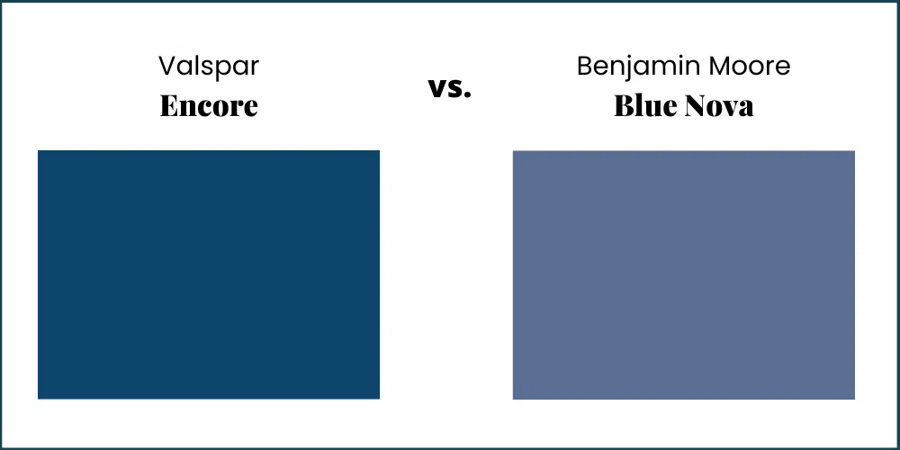
Valspar’s COTY is Encore, a fresh and cool mid-toned blue that looks very similar to Benjamin Moore’s 2024 Color of the Year Blue Nova (Article).
Key Learning Points
HGTV Home by Sherwin-Williams launched their 2025 Color of the Year, Quietude, and we couldn’t be more excited.
- Quietude is a muted blue-green paint color that will look great as an accent or single-room color in a whole-house color palette. Consider it as an exterior front door color (Article).
- The 2025 palette of the year can also be used as a whole-house palette (Article) when paired with a warm neutral foundational wall color like SW Pearly White and SW Pure White trim and ceilings.
- Use Quietude sparingly. It’s beautiful but too colorful to use as a whole-house paint color. Instead, use it for interior doors, accent walls, or accent rooms.
Remember: NEVER, EVER use paint matches from a different brand than the one specified. Results are poor and there are no standards for the sheens. Even though your painter may truly believe it can be done, don’t do it. See results from paint matching.
No matter what, always test your paint colors. It’s a standard best practice. Whenever I test my paint colors, they are perfect, and when I don’t test they turn out wrong. Learn how to test your paint colors.
Online Color Consulting
Still need help picking the best paint colors? Discover our Online Color Consulting Package.

Related Posts:
- 2024 HGTV Home by Sherwin-Williams Color of the Year: Persimmon
- 2024 Benjamin Moore Color of the Year: Blue Nova
- 2024 Sherwin-Williams Color of the Year: Upward
- Sherwin-William Sea Salt Paint Color Review
About the Author
Hi, I’m Michelle Marceny, founder, owner, and Principal Color Designer at The Color Concierge. I believe a fresh coat of paint can completely transform a space. The Color Concierge was born out of my drive to help clients fall back in love with their homes. My clients trust me to help them find the perfect paint color for their home – whether it’s a whole-house paint color scheme or ideas for a single room.
Since The Color Concierge was founded in 2017, we have completed over 3000 color consultations, both online and in-person. I am a Certified Color Expert with 7 years of experience creating interior and exterior color palettes throughout North America.
We love your comments! Please note that the blog is meant as general advice, and it is not possible to give out specific answers to your paint questions. If you want more specific advice, our Online Color Consultations will help you pick your paint colours. Thank you for your understanding.
