The Paint Color of the Year (COTY) season is going strong, and SW Upward is the latest to be announced.
Upward is the Sherwin-Williams 2024 Color of the Year, and it strikes a chord for those looking for a Coastal Palette, balanced with clean whites in the palette.
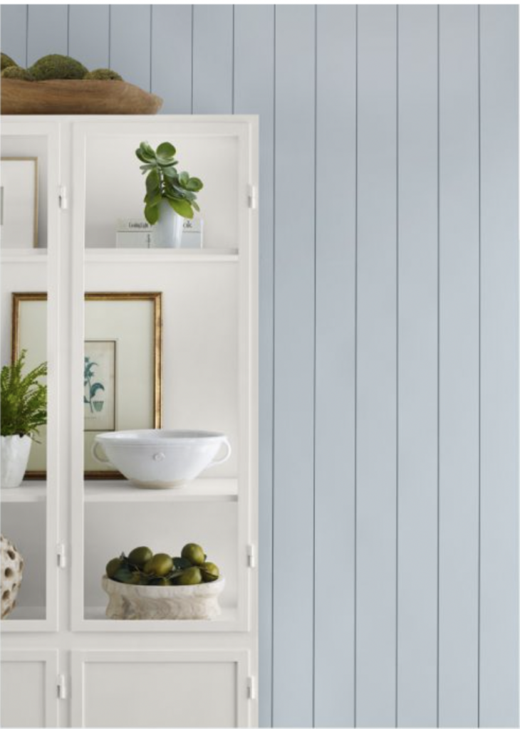
This muted blue paint color is best in homes with crisp white finishes. We don’t recommend it in homes with earthy granite countertops and tiles.
In this post, I’ll review Sherwin-Williams Upward and show how you can use SW Upward and their recommended coordinating colors as a whole-house palette (Article).
All of these paint colors are available in Sherwin-Williams paint stores nationwide.
Note: We are brand-neutral when it comes to paint companies. We were not compensated by the paint company for this article. We used photos courtesy of Sherwin-Williams because we don’t have these in our collection of projects yet.
About The Color Concierge
Our Colorado-based paint color consultants make finding the right paint colors for your home easy. Whether you’re painting the exterior or interior of your home, our simple yet effective process lets us get your paint color right the first time. We’ve helped thousands of homeowners transform their homes into a space they love. Learn more about ONLINE COLOR CONSULTATIONS today.
What is the difference between this Sherwin-Williams COTY and Persimmon?
We recently wrote about Persimmon (Color review article) (pictured below), the HGTV Home by Sherwin-Williams Color of the Year. The difference between the two colors of the year (besides their obvious color differences) is that they are from two different divisions of the Sherwin-Williams brand.

*This post contains affiliate links for products I use and love. If you click on some links and make a purchase, I will get a small commission at no cost to you. This helps pay for the costs of the blog, so I can continue to offer great content to our readers.
Upward is part of the Sherwin-Williams Paint Stores Group. Persimmon is an HGTV Home paint and is part of the Sherwin-Williams Consumer Brands Group. HGTV Home paints are sold exclusively at Lowe’s.
Although a large majority of the HGTV Home paint colors are cross-overs with the paint colors you buy at Sherwin-Williams stores, they also have some unique paint colors. The cross-over paints have the same names, but since they use different bases, the colors and sheens can be slightly different.
Each paint division at Sherwin-Williams releases its own Color of the Year each year.
Sample Upwards
We always recommend that you test paint colors (article) in your home because lighting can completely change a color, both on interiors and exteriors.
In the old days, this meant we painted a large poster board with sample pots and a huge mess.
Now we have a better way to test paint, with Samplize Peel-and-Stick samples!
- Samples pre-painted with 2 coats of real paint from the manufacturer.
- Large 9” x 14” samples to see the color better in the lighting.
- Delivered overnight
- Colors are accurate
- Less expensive than painting a large poster board with sample pots
- No mess, and no toxic paint to dispose of
I use these in my color consulting practice for exact results. Discover Samplize peel-and-stick paint samples and sample Upward (Sample) via the link below.
What does The Color Concierge think about Sherwin-Williams Upward?
Michelle Marceny: Founder, Lead Color Designer:
“I like SW Upward. I wasn’t crazy about it when I first saw the announcement, but it has grown on me. We’ve spent almost a decade in the “white” trend, and we predict that the next ten-year color trend will be full of color. No one was more surprised than me when our recent Fernwood Green Paint (Color review article) went viral and just about broke our website.
I think this will be an incredibly popular color. Since Upwards launched two days ago, I’ve recommended it at least twice to clients. This color is much more usable than Redened Point, the 2023 COTY for Sherwin. I’ve still never seen it recommended it to our clients.
If you are curious to see this color in use, check out serenaandlily.com, which is famous for home goods with a coastal vibe. They’ve been using this color and palette for years.” it is definitely timeless when used appropriately.
Maddie Camilli: Senior Color Designer
“Upward is an all-around pleasing color. Most people love blue, and this shade isn’t too in-your-face. You can use it as a wall color in an entire room and it won’t be overbearing.
As we move through the tail end of the white trend and into more color, it makes perfect sense why Upward is our new Color of the Year, and we are excited about it!
Upward is a beautiful transition shade for our time; it creates the “light and airy” feel we all want (and sought after with crisp whites), but a splash of color is much more comfortable and inviting.
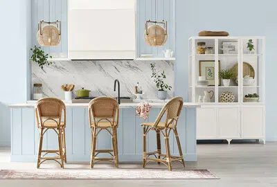
In recent months, we have had lots of requests for a casual-coastal aesthetic. Upward is the perfect shade for this, especially paired with the whites and wickers from our latest design era.
This photo from Sherwin-Williams shows exactly what I was describing.”
Below we have tips for how to use Upward. Let’s go!
What kind of color is Sherwin-Williams Upward?
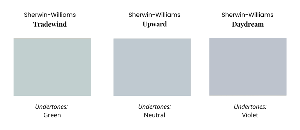
SW Upward is a muted blue, bordering on gray with a slight violet undertone. It has an LRV of 57, which makes it light-reflecting. But it still has enough pigment to look colorful (and not at all neutral) on the wall.
Because this color is a blue-gray paint color, it’s important to understand the types of grays and the types of blues.
Gray paint colors can be blue-gray (the color of clouds), violet-gray (the color of elephants), and green-gray (the color of cement and moss). Blues on the other hand can have green undertones or violet undertones.
Upward is fairly clean, leaning slightly toward violet. You can really see the difference in undertones when comparing Upward to other blue paint colors, such as SW Tradewind (Sample) (more green) and SW Daydream (Sample) (more violet).
Because Upward is muted enough to border on gray, it has more flexibility than some other blue paint colors. We often use a blue-gray when someone asks for a baby blue bedroom (Article) and this is a color we would consider.
Can you use SW Upward as an interior whole-house color?
I wouldn’t recommend it unless you really love baby blue, or if you have a small beachy cottage. It’s bright enough that it may be overwhelming when used in a large, open-concept space or throughout an entire home. I would especially avoid it as a whole-house color if you have earthier or creamier colors and surfaces throughout your home.
How can you use Upward as a paint color in your home?
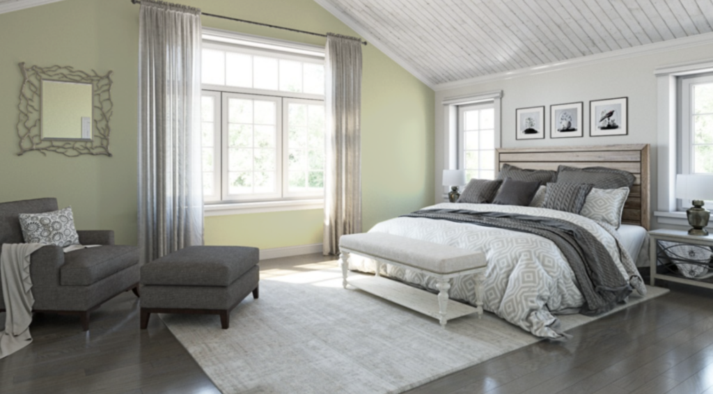
I would use Upward as a wall color in an office (if you really love baby blue) or as a paint color for a bedroom, laundry room, or even dining room. I would not use it as a whole-house color; it would be too much.
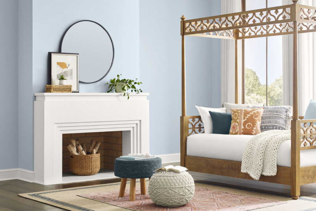
Below is a beautiful bedroom painted with Sherwin-Williams Upward.
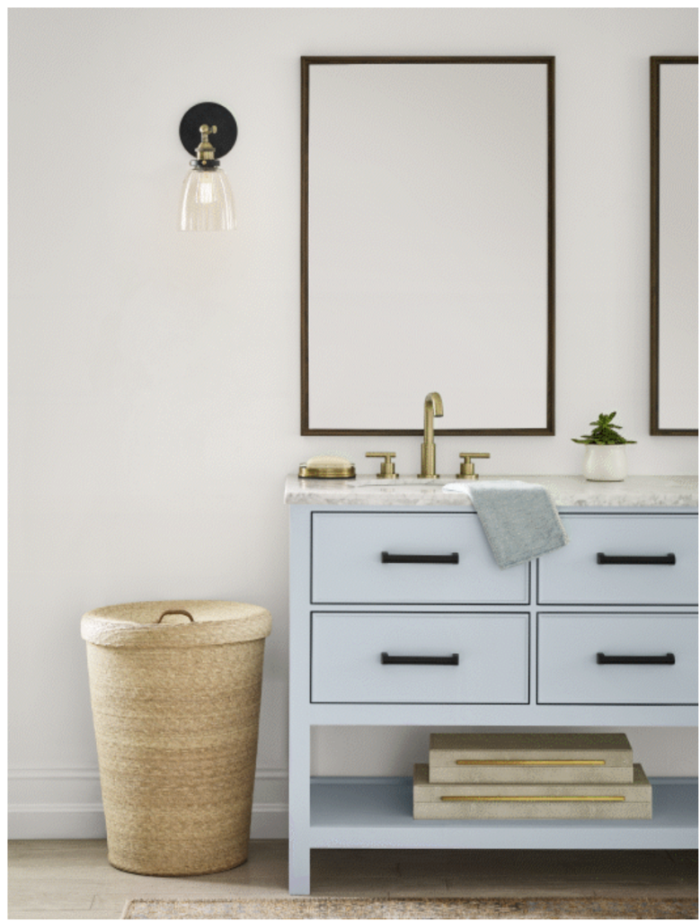
Should I try SW Upward cabinets?
I love the idea of baby blue kitchen cabinets or for a bathroom vanity! Upward would work well especially if the home has tons of crisp white to balance it and a clean white quartz countertop with cool gray veins. It also goes well with cool finishes such as Carrara marble.
I really like the idea of using Upward in a tuxedo kitchen cabinet palette (Article). I would prefer to keep the uppers a compatible white cabinet color (Article). But you could also paint the uppers with Upward and the lowers a darker color like Sherwin-Williams Gale Force (Sample).
Using an Upward vanity would look really beautiful in a modern white bathroom and would add a bit of color to an otherwise stark palette.
Would SW Upward exterior paint work?
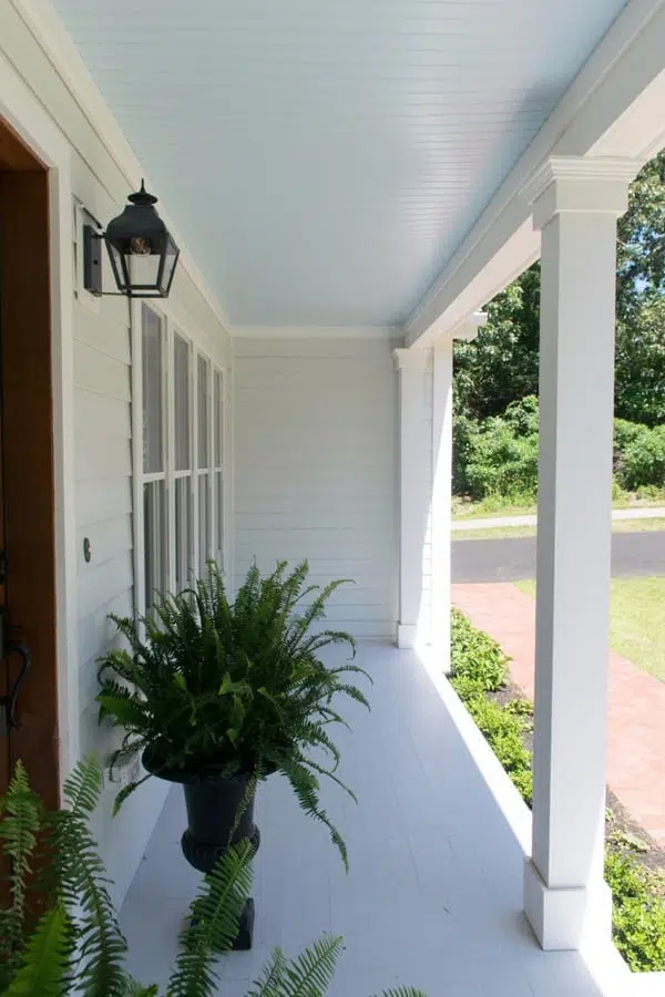
Upward is not the best choice for a siding color. It would be a bit too electric in the bright sunshine. But it could make a really great haint blue front porch ceiling or front door color. In the coastal cottage exterior makeover (Article) pictured below, we used Sherwin-Williams Tradewind (Sample) for a front porch ceiling. Upward would work in a similar application.
What colors work well in a COTY Upward coastal color palette?
The Sherwin-Williams Color of the Year, Upward, is perfect for a beachy, coastal color palette (Article). To help find paint colors that go with Upward, Sherwin-Williams curated a palette of coordinating colors that can be used as a guideline for a whole-house color scheme.
Note that the colors in this palette aren’t just for paint colors, you can use them for decor and other accents. For example, weave the colors in your accent pillows, furniture, and art. If you really like a color scheme, you may find that you already have many of the colors in your home.
Keep reading for a look at the best ways to use all the colors in this SW Upward coastal color palette.
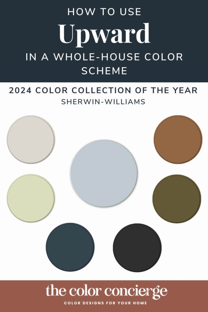
SW Drift of Mist as a whole-house color
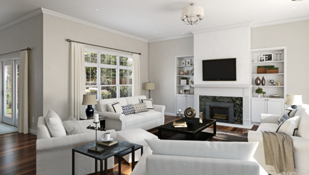
For whole-house color schemes, we like to start with a foundation neutral as the color that you would paint the Open Layout area, other common areas such as staircases and hallways, and even the whole house. We recommend Drift of Mist (Article) as the foundation color in this palette. It is soft, bright, lovely, and neutral. Sherwin-Williams shows Drift of Mist in the great room area with white built-in cabinets. The effect is cozy and warm without being too dark.
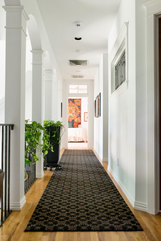
Which trim, doors, and ceiling color are best with SW Upward?
Sherwin-Williams Upward contrasts beautifully with cool and cleaner whites like SW Extra White (Color review article), SW White Snow (Sample), SW High Reflective White (Sample), and SW Pure White (Color review article). Any warmer or creamier isn’t recommended.
In a perfect world, I’d use Extra White as the ceiling and trim color. Fortunately, Extra White is the most common trim color used in the United States.
The client’s hallways pictured below use Extra White for the walls, ceiling, and trim.
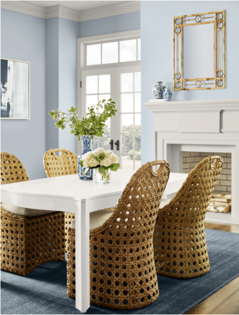
Dining Room Color – Upward
I love the idea of using Upward as a dining room paint color. Light blues can be tricky to use, but this one has enough gray to look muted in place.
It’s a really beautiful color that brightens up a dining room and makes it feel relaxed and inviting.
Office Paint Color – Tricorn Black
Tricorn Black is a great paint color to use as an accent or a wall color in this type of color scheme. I love to use dark paint colors and even black paint colors in an office. Office spaces are generally small enough that black walls don’t feel too overwhelming. They also serve as great accents in an otherwise light color palette. Even better? Black walls can make working on a computer screen easier on the eyes.
The office below is painted with Benjamin Moore Onyx (Color review article), a neutral black that is slightly lighter than Tricorn Black. Tricorn Black (Sample) would work the same in a similar space.
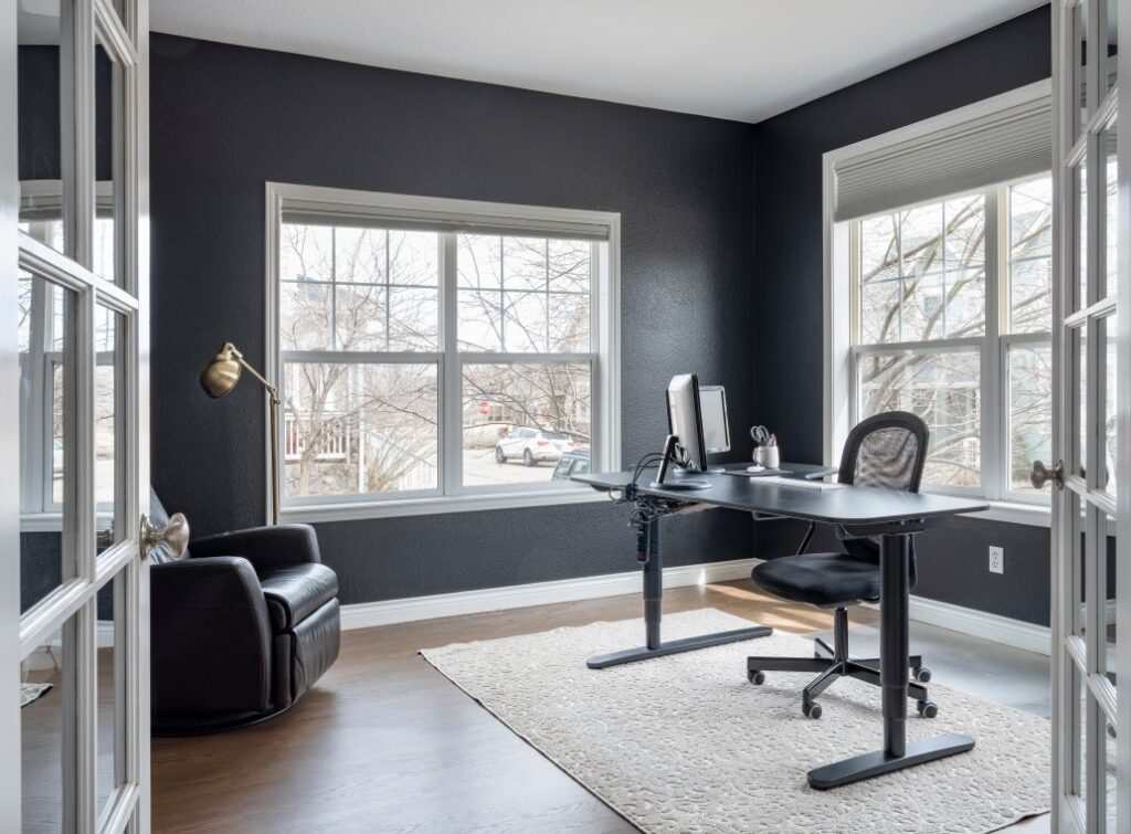
For a totally different look, SW Upward could also work well as an office color. Just make sure you really love baby blue before painting with this hue!
Bedroom Paint Color – Honeydew
Honeydew (Sample) is a soft green paint color that looks really lovely in a bedroom. It would make a beautiful nursery paint color but would also work well as a colorful primary bedroom wall color.
You could paint all of the walls with Honeydew or use it as an accent wall the way Sherwin-Williams shows it below. This color is a lighter version of Fernwood Green (color review), which we recently published
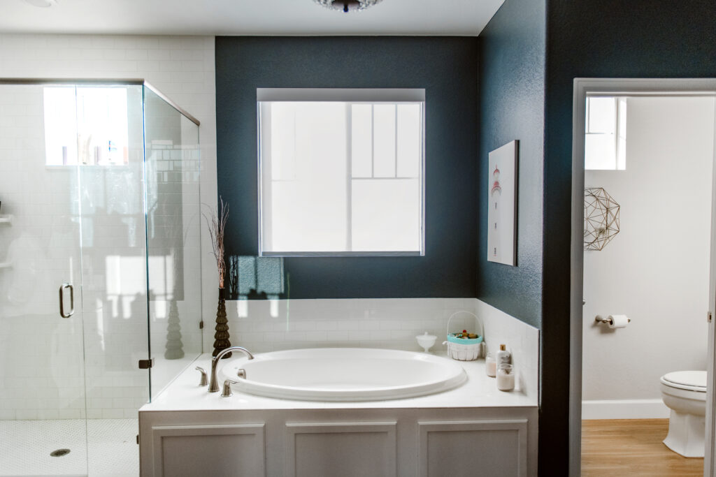
Primary Bathroom Color – Gale Force
Gale Force (sample) is a beautiful, deep blue paint color that would be really lovely as an office color, living room accent color, or (my personal favorite) as a primary bathroom color.
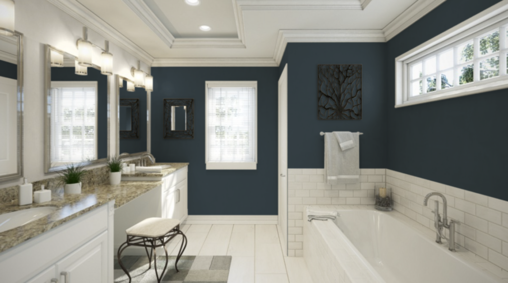
My own master bathroom is painted with a similar deep blue paint color (SW Cyberspace review) and is pictured below. Cyberspace is beautifully balanced by white cabinetry, subway tile, and ceiling. Gale Force would work in a similar manner in a bathroom.
Accent Color for Decor – Palm Leaf
Sherwin-Williams Palm Leaf (Sample) is a deep, warm olive green paint color with yellow undertones. While it could be used as an accent wall paint color or even for a stately office, I prefer to use this color within decor.
Find patterned rugs, throw pillows, and wall art that include this green for a burst of warm, organic color in an otherwise cool palette.
Sofa Color – Antiquarian Brown
SW Antiquarian Brown (Sample) reminds me of a rich leather sofa. So that’s exactly how I’d use this color! Incorporating a warm brown sofa into a living room painted with SW Drift of Mist would work really lovely, and would pair well with Palm Leaf decor. It is also the color of wood. You can also use it as an accent color in wood trays, pillows, or other decor.
What is the best way to test these paint colors?
We always recommend that you test paint colors on your home because lighting can change a color completely, both with interiors as well as exteriors.
In the old days, this meant we painted a large poster board with sample pots and a huge mess.
Now we have a better way to test paint, with Samplize Peel-and-Stick samples!
- Samples pre-painted with 2 coats of real paint from the manufacturer.
- Large 9” x 14” samples to see the color better in the lighting.
- Delivered overnight
- Colors are accurate
- Less expensive than painting a large poster board with sample pots
- No mess, and no toxic paint to dispose of
I use these in my own color consulting practice for exact results. Discover Samplize peel-and-stick paint samples:
Buy 8 samples and get 2 free – no coupon code required. Order today and get samples tomorrow!
- Upward (Sample)
- Drift of Mist (Sample)
- Gale Force (Sample)
- Tricorn Black (Sample)
- Honeydew (Sample)
- Palm Leaf (Sample)
- Antiquarian Brown (Sample)
Is SW Upward a Good Color of the Year?
To answer this question, we need to consider what makes a great Color of the Year. Very simply, when you see the color it should take your breath away. SW Evergreen Fog (Sample) was a great example of this. Within a week, we saw Evergreen Fog everywhere. Even though it was the 2022 COTY, we still see people using this color for cabinets.
As a color geek. I didn’t wake up in the middle of the night wondering how I would use it, but it is growing on me, and sometimes that is how a new color starts. I need to think about it and absorb it.
A good Color of the Year should also automatically inspire you to find places to use the color in your house. It should pair well with both earthy older trends as well as upcoming fresher trends. It should be flexible and should pair well with many types of colors.
At its core, the Color of the Year should start a new trend. I see SW Upward as part of a quickly rising trend.
For me, Upward is a pretty color and easy to use in some spaces. However, it’s fairly limiting. It looks great with a coastal theme and in most bedrooms, but I wouldn’t use it in an older home with earthy granite finishes.
As a color consultant, I’m not sure I would pull it out every single day, though there are definitely good times to use it. From a personal perspective, I’m not really much of a lover of baby blue, but lots of people are and this could hit the mark with many.
Key Learning Points
Sherwin-Williams launched their 2024 Color of the Year, Upward, and we couldn’t be more excited to see where this color goes.
- Upward is a cool baby blue paint color leaning into violet that looks great as a wall color in a dining room or bedroom. You could also consider it as an exterior front door color (Article) or for a front porch ceiling.
- The 2024 Color of the Year palette can also be used as a whole-house palette (Article).
- Balance Upward with clean, bright whites and style it with the other colors in the 2024 palette.
Remember: NEVER, EVER use paint matches from a different brand than the one specified. Results are poor and there are no standards for the sheens. Even though your painter may truly believe it can be done, don’t do it. Learn about the pitfalls of matching paint colors in our post, “Are Paint Color Matches Accurate?“(Article)
No matter what, always test your paint colors. It’s a standard best practice. Whenever I test my paint colors, they are perfect, and when I don’t test they turn out wrong. Read this post to Learn how to test your paint colors like a pro! (Article)
Online Color Consulting
Do you still need help picking the best paint colors? Discover our Online Color Consulting Package.

Related Posts
- How to Create a Whole-House Color Palette (Article)
- COTY Persimmon Paint Color Review (Article)
- Coastal Home Makeover (Article)
About the Author

Hi, I’m Michelle Marceny, founder, owner, and Principal Color Designer at The Color Concierge. I believe a fresh coat of paint can completely transform a space. The Color Concierge was born out of my drive to help clients fall back in love with their homes. My clients trust me to help them find the perfect paint color for their home – whether it’s a whole-house paint color scheme or ideas for a single room.
Since The Color Concierge was founded in 2017, we have completed over 3000 color consultations, both online and in-person. I am a Certified Color Expert with 7 years of experience creating interior and exterior color palettes throughout North America.
If you liked this post, don’t forget to pin it!
We love your comments! Please note that the blog is meant as general advice, and it is not possible to give out specific answers to your paint questions. If you want more specific advice, our Online Color Consultations will help you pick your paint colours. Thank you for your understanding.
