Open-concept homes are wonderful for entertaining, family time, and letting light flow from room to room — but they can make choosing a paint color surprisingly tricky. When your kitchen, living room, and dining area all share one continuous space, a single paint color has to look beautiful in every corner and at every time of day.
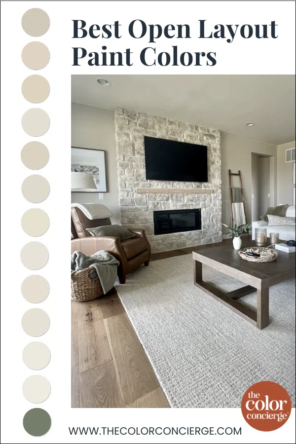
The best open layout paint colors are typically versatile neutrals with enough pigment to hold their own in both bright and shadowy areas.
In today’s post, we’re sharing our favorite paint colors for open-concept spaces, from warm beiges (Article) and greiges (Article) to complex creams, off-whites (Article), and even one unexpected showstopper.
*This post contains affiliate links for products I use and love. If you click on some links and make a purchase, I will get a small commission at no cost to you. This helps pay for the costs of the blog, so I can continue to offer great content to our readers.
About The Color Concierge
Our Colorado-based paint color consultants make finding the right paint colors for your home easy. Whether you’re painting the exterior or interior of your home, our simple yet effective process lets us get your paint color right the first time. We’ve helped thousands of homeowners transform their homes into a space they love. Learn more about ONLINE COLOR CONSULTATIONS today.
How to Choose a Paint Color for an Open Layout
Open floor plans present a unique challenge: one color needs to work across multiple spaces with different lighting conditions, different furniture, and different decor. A color that looks perfect near a sunny bank of windows might look completely different in the shadowy corner by the stairs.
Here’s what we look for when choosing open-concept paint colors:
Consider the LRV.
LRV, or Light Reflectance Value, is a number from 0 to 100 that measures how much light a paint color reflects or absorbs. A value of 0 means pure black, which absorbs all light, while 100 means pure white, which reflects all light.
For open layouts, we love to use lighter paint colors that keep the common areas harmonious and balanced. We love to use off-whites, complex cream (light beige colors), and even light greige colors with undertones that coordinate with all of the hard finishes. We pick lighter colors when there is low light (Article), and darker versions if the natural light conditions are very bright.
Look for muted, complex undertones.
Colors with soft green, taupe, or violet undertones tend to be chameleons that adapt gracefully as light changes throughout the day and across the space. Blue undertones can make a space look blue. Test carefully to ensure that the undertone is harmonious with your finishes.
Test in multiple spots.
Because an open layout has so many lighting conditions, it’s especially important to test your paint colors in several areas of the space — near windows, in corners, and on walls that face different directions. We always recommend testing with peel-and-stick samples from Samplize before committing.
Now, let’s dive into our favorite open layout paint colors.

Best Warm Beige Colors for Open Layouts
These warm beige hues bring instant coziness to an open floor plan without feeling dated or heavy.
Sherwin-Williams Accessible Beige
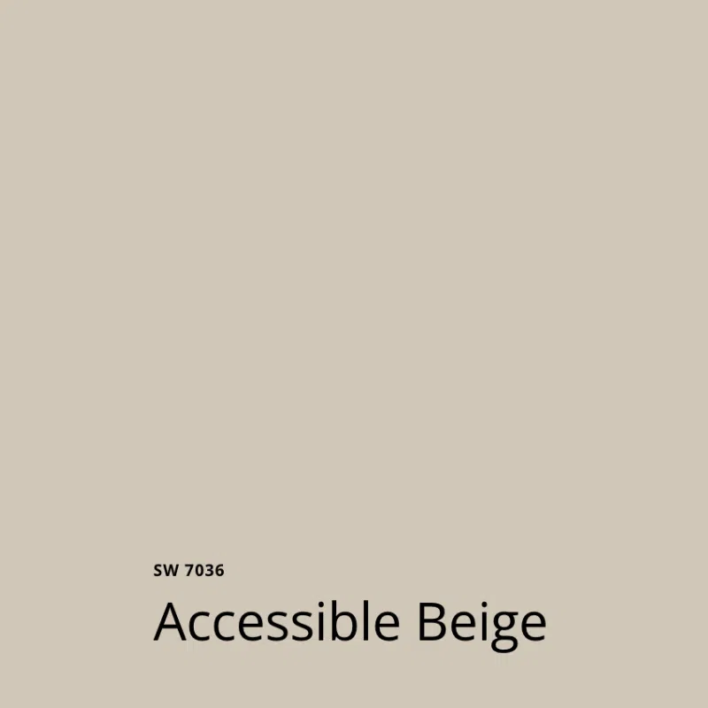
Sherwin-Williams Accessible Beige (Article) is a warm beige paint color with green undertones. This color is technically a greige, but it has a lot of warmth, which helps it lean more toward beige.
This is a great option for someone who wants to move away from cool white and gray tones but isn’t totally ready to go all-in on beige.
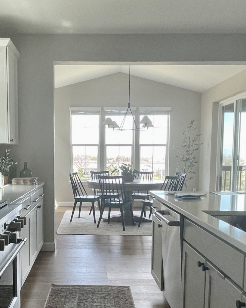
Sherwin-Williams Natural Linen
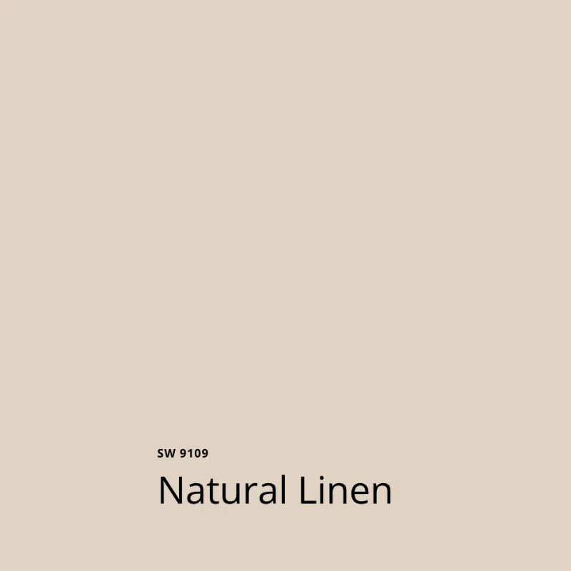
SW Natural Linen (Article) is a really interesting color. It is a warm beige hue with pinkish, peachy undertones, which give it a really unique look on the wall. In some settings, it can look almost pink, so be sure to test this color carefully. We’ve been seeing alot of this color on Instagram lately, but it looks much peachier in person than in the photos.
The LRV of SW Natural Linen is 66. It’s a bit darker than many of the colors we often see homeowners picking for interior projects these days, but it’s still light enough that it won’t overpower a space. This is another paint color that needs lots of natural light.
It has enough pigment that it will never look white (even in very bright light) and brings a cozy, inviting feeling to whatever space it’s used in.
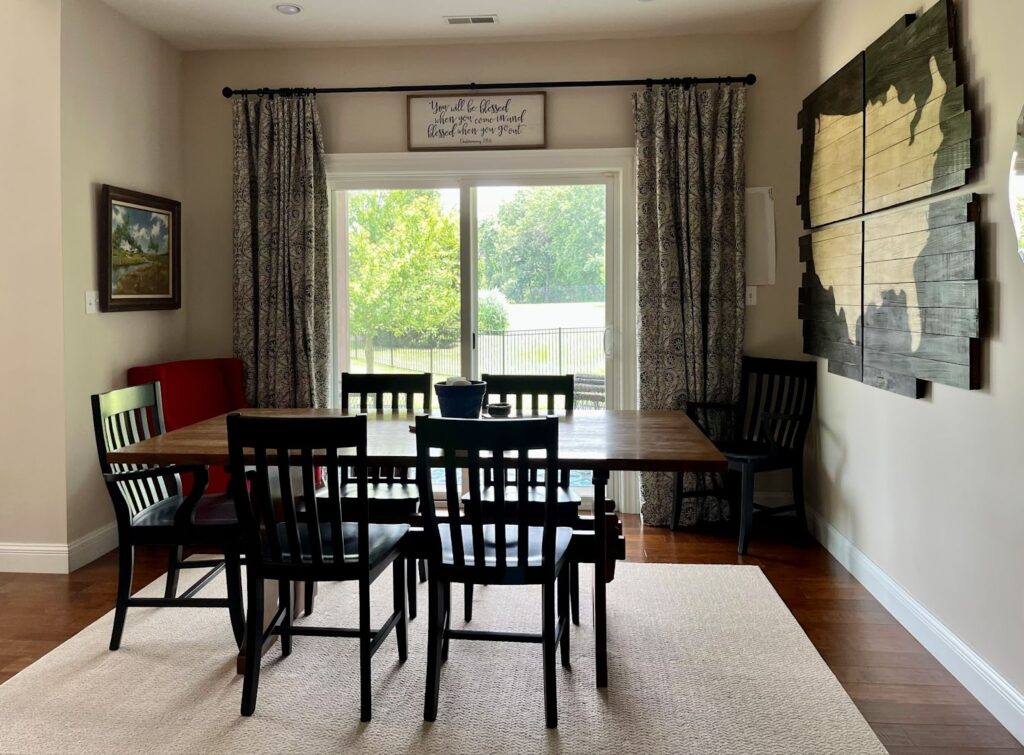
Benjamin Moore Manchester Tan
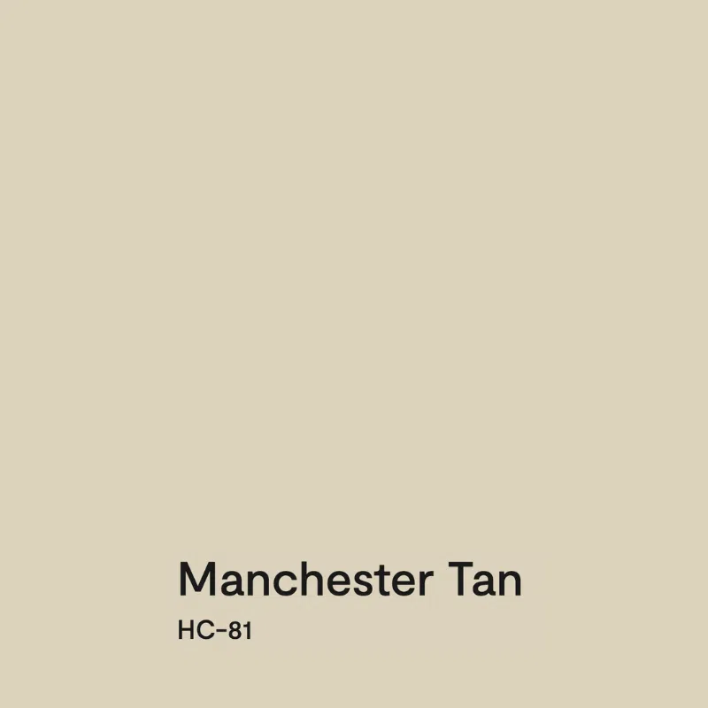
Manchester Tan (Article) by Benjamin Moore is a lovely warm beige paint color that’s versatile enough to work in many spaces throughout a home. It is essentially the same color as Sherwin-Williams Wool Skein (Sample), if you prefer to use SW paints.
With an LRV of 64, Manchester Tan still has a good amount of pigment, but the hue is so clean that it can feel lighter. I love to use it in spaces flooded with light, but it still works in darker rooms. It’s even one of my favorite basement paint colors!
Manchester Tan pairs well with most warm finishes and decor thanks to its warm green undertones. If your home has granite and earthy tile, this hue complements them well.
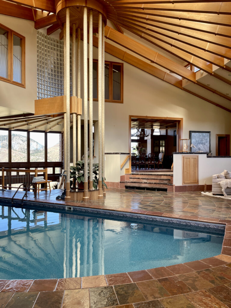
In the home below, it pairs very well with the swimming pool in the living room!
Best Warm Greiges for Open Layouts
Warm greiges strike the perfect balance between gray and beige, making them some of the most versatile open-concept paint colors around.
Benjamin Moore Gray Mist
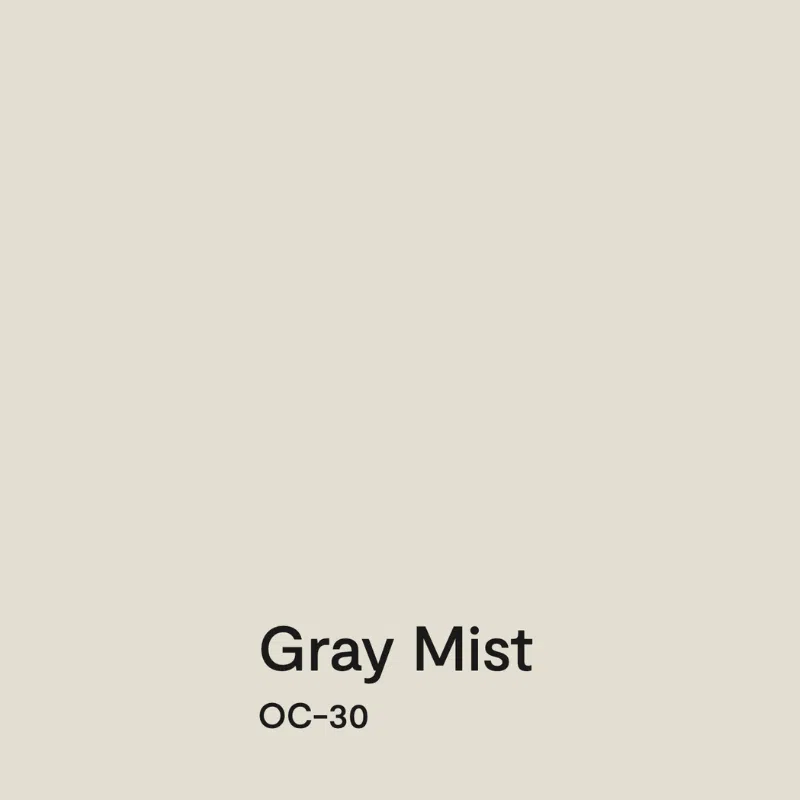
Benjamin Moore Gray Mist (Article) is a warm, very light greige paint color that some consider a darker off-white. It has enough vibrancy to work well in a variety of spaces, including those with lots of natural light and those with less sunlight.
With an LRV of 74, Gray Mist is almost an off-white, but it’s warm thanks to its green undertones. While it is technically a very light gray, it’s a great alternative for a homeowner who wants a warm white wall color but doesn’t want to risk a color looking yellow on the wall or too washed out in a very sunny room.
BM Edgecomb Gray
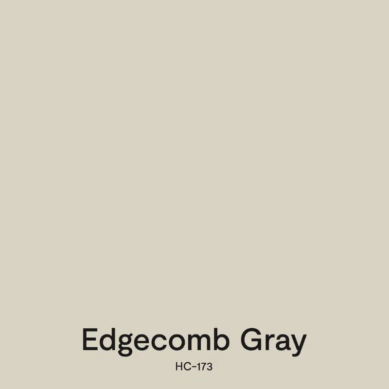
Benjamin Moore Edgecomb Gray (Article) is a color I reach for when I have a client with very earthy Tuscan finishes that need to be updated. It also looks great in modern homes with crisp white countertops and backsplashes.
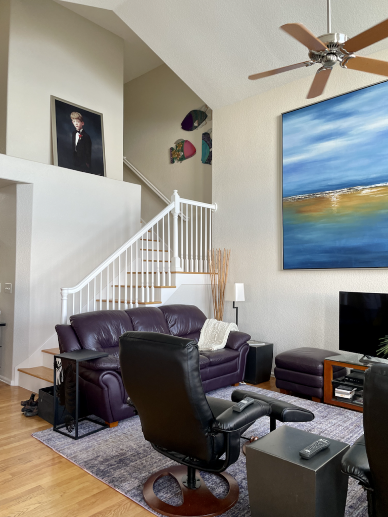
With an LRV of 63, Edgecomb Gray is a versatile neutral that looks great in both brightly lit and low-light rooms. Soft green undertones keep it looking warm and inviting with just about any type of flooring, furniture, and decor. In rooms with lots of light, like the room below, it looks surprisingly light, warm, and lovely!
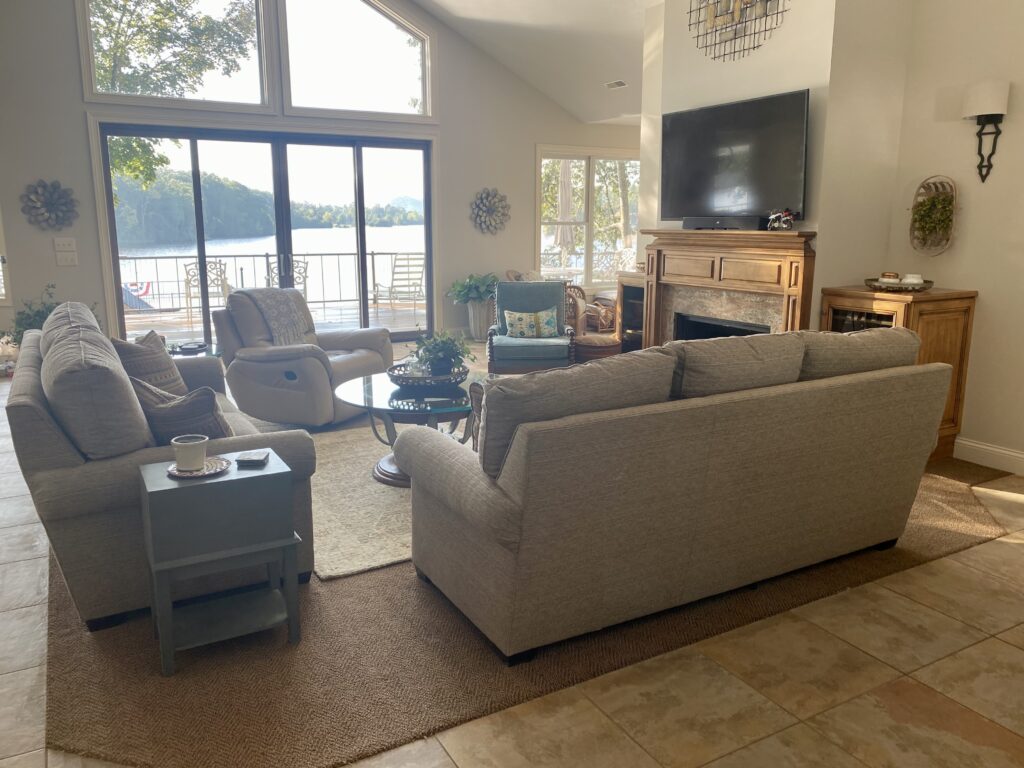
Benjamin Moore Pale Oak
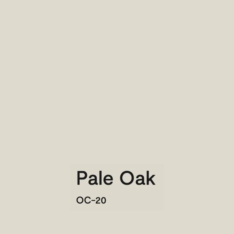
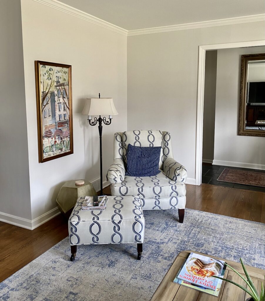
Benjamin Moore Pale Oak (Article) is a light greige color that leans toward taupe. With an LRV of 69, it is a versatile neutral paint color that looks great in a bright or dark room.
I love to pair Pale Oak with warm wood furniture and floors, and it’s another great paint color to brighten a home that was previously painted with dark Tuscan colors. For open-concept spaces with lots of foliage outside, the warm taupe undertones help neutralize the green colors that can reflect through the windows.
Best Complex Cream Paint Colors for Open Layouts
Complex creams are the warm cousins of very light greiges. They have enough pigment to add depth and warmth to an open layout without ever looking stark.
Benjamin Moore Ballet White
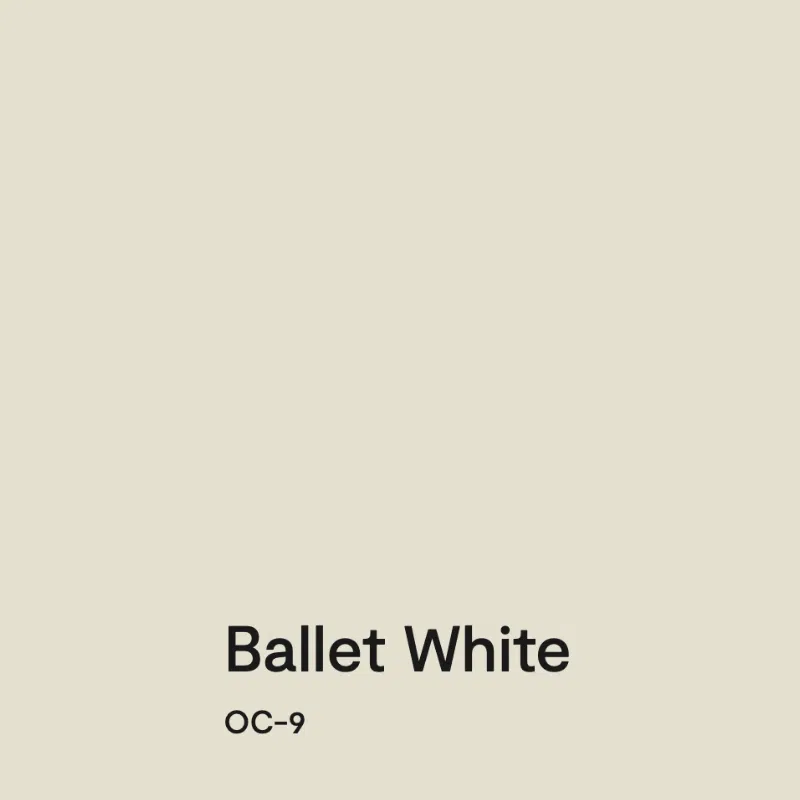
Benjamin Moore Ballet White (Article) is a soft, muted, and warm very light beige paint color with an LRV of 71.97. It’s a creamy hue, but isn’t as yellow as many creamy paint colors. It’s a really lovely choice for the warm beige trends (Article) we’re seeing homeowners look for today.
Ballet White gets its warmth from green undertones, which give this color a unique hue compared to many other creamy paint colors. However, it shouldn’t look green on the wall.
Ballet White has enough pigment to add depth and warmth to a space and works well in dimly lit rooms. It’s a great paint color for North-facing rooms (Article), which get cool light and tend to be darker than some other exposures. It has enough pigment and warmth that it won’t look dingy in these spaces and can help the room feel brighter and cozy.
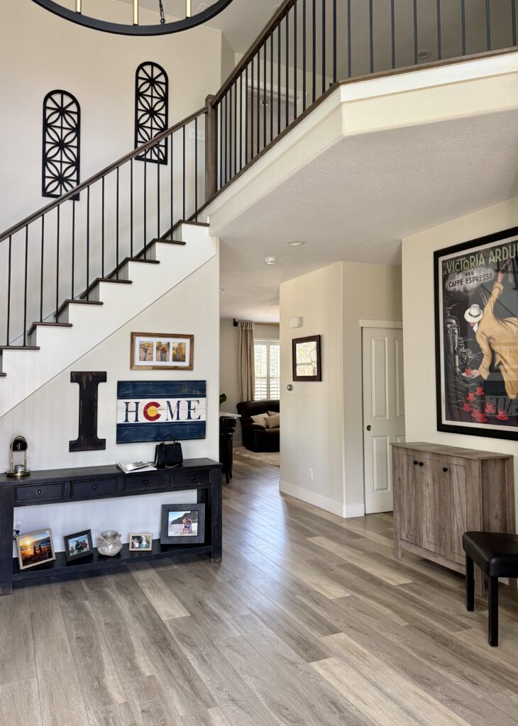
Sherwin-Williams Pearly White
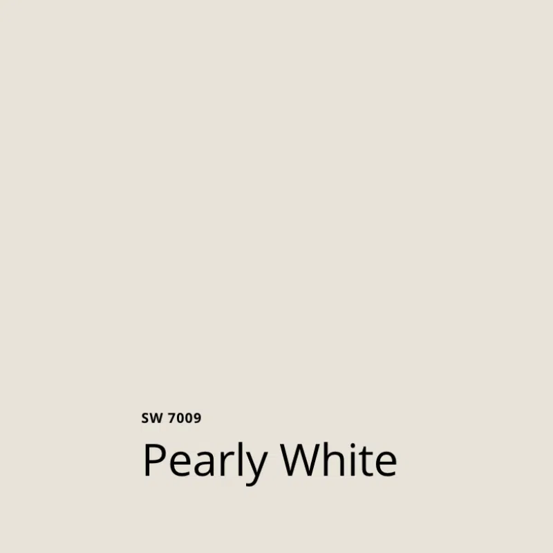
Sherwin-Williams Pearly White (Article) is a darker warm white paint color that reads like a creamy white. With an LRV of 76.5, I refer to it as a complex cream, which is the warm version of a very light greige.
While it’s not as well-known as creamy off-whites like SW Alabaster (Article) or SW Greek Villa (Article), it’s a wonderful color that we recommend to clients frequently.
Pearly White has soft, invisible green undertones that give the color its warmth without looking yellow on the wall. Its undertones also help it pair well with just about any color or finish.
Use Pearly White when you want to update a darker room that has earthy, muted finishes. It crosses the bridge between old and new very well!
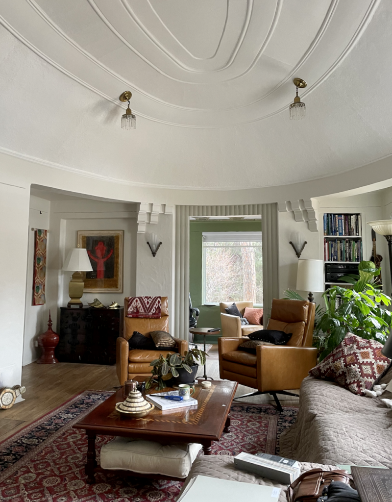
Sherwin-Williams White Duck
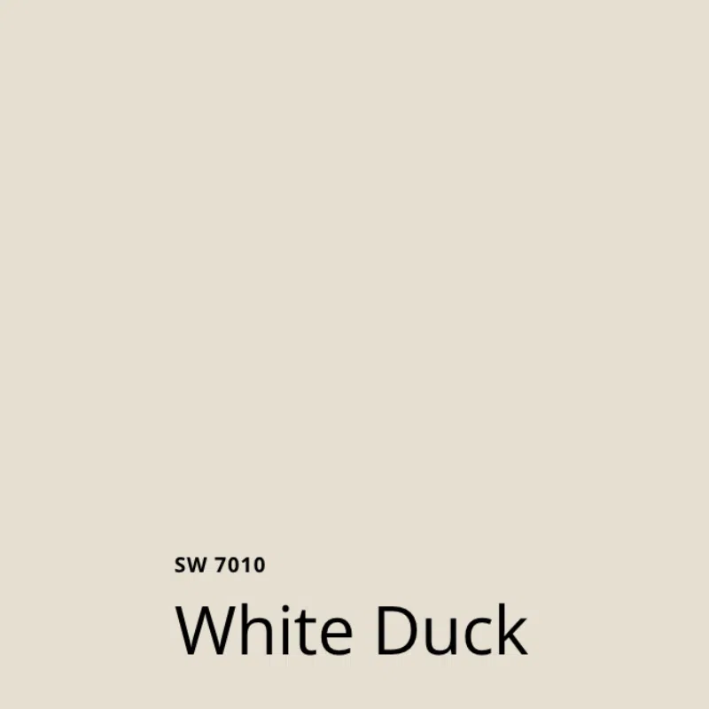
Sherwin-Williams White Duck (Article) is a warm and muted off-white light paint color. With warm, subtle green undertones, we consider it a complex cream. White Duck is the color I pick if I’m looking for a creamy color that won’t shift to yellow.
With an LRV of 74, White Duck is a pretty light paint color. Still, it has enough pigment to look creamy and warm even in low light, such as in the kitchen below.
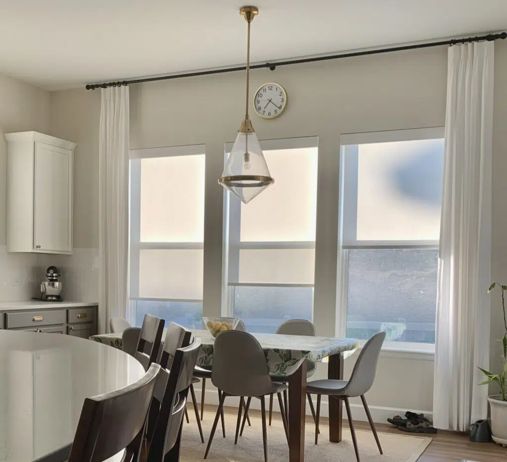
Sherwin-Williams Shoji White
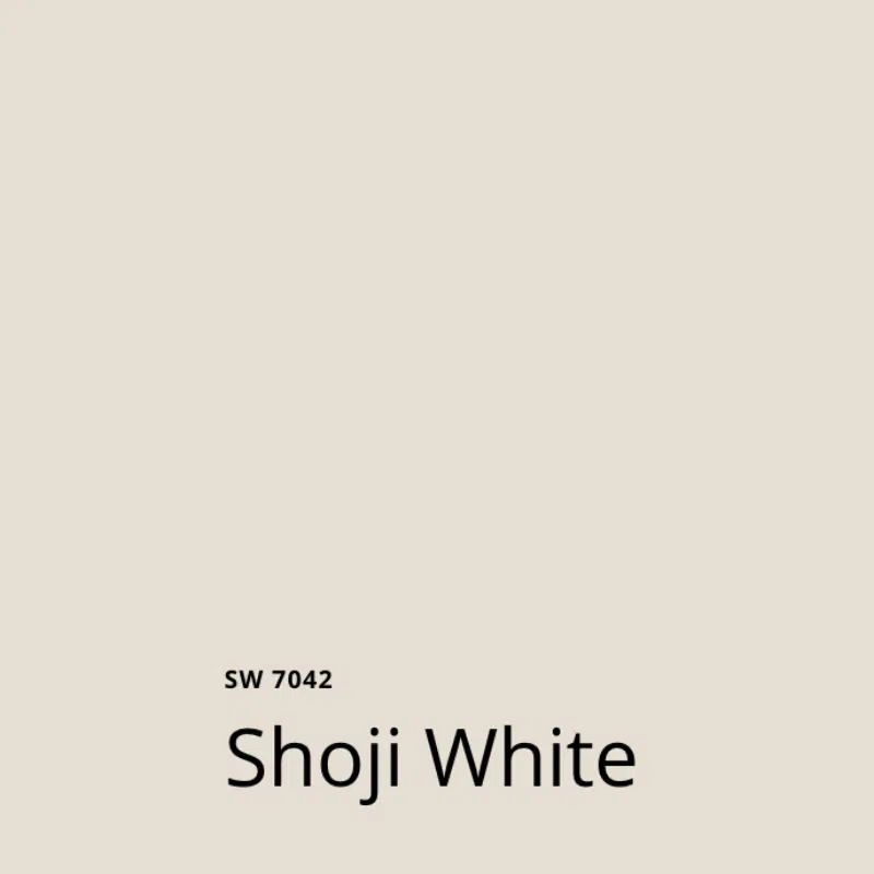
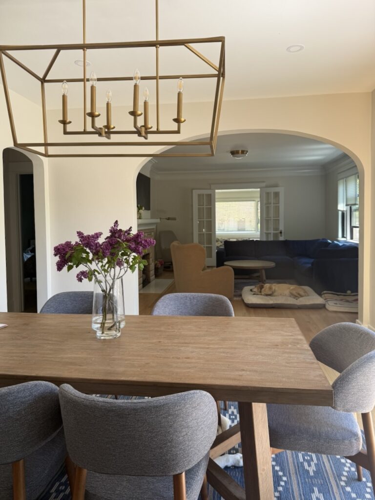
Shoji White (Article) is one of my favorite neutral paint colors (Article). It’s a great foundation for a whole-house color palette because it works well in many different kinds of lighting, including dark rooms.
With an LRV of 74, Shoji White is more saturated than a typical white or off-white paint color, which is part of what makes it such a great hue for low-light spaces. SW Shoji White has green undertones and can sometimes flash taupe. These undertones keep the color looking warm in any condition – perfect for a large, open layout space.
Best Off-White Paint Colors for Open Layouts
If you love a lighter look for your open floor plan, these warm off-whites keep things bright without ever feeling cold or sterile.
Sherwin-Williams Alabaster
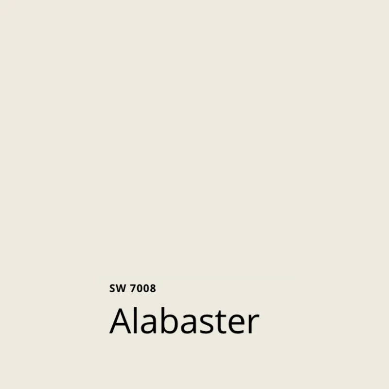
Sherwin-Williams Alabaster (Article) is one of the company’s most famous white paint colors and one of their Top 50 Colors. It is a creamy, muted off-white hue with strong yellow undertones. With an LRV of 82, it’s still a fairly light color but also dark enough to work in some exterior applications.
SW Alabaster can work even in low light or cool, North-facing light, and it’s one of our favorite paint colors for a white kitchen.
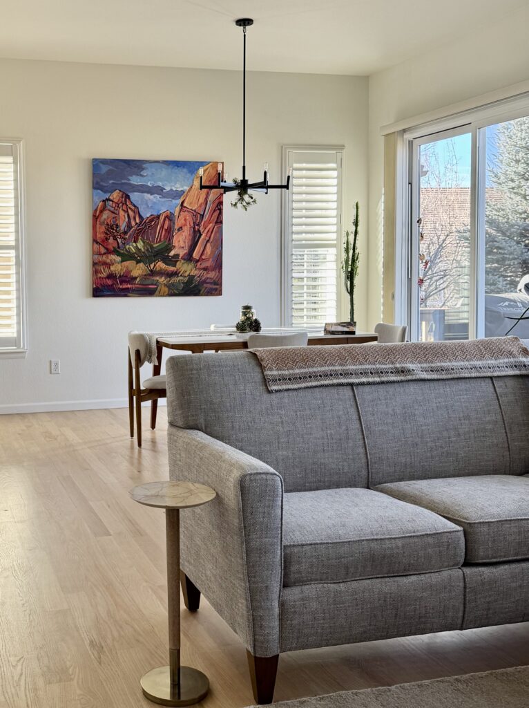
Benjamin Moore Simply White
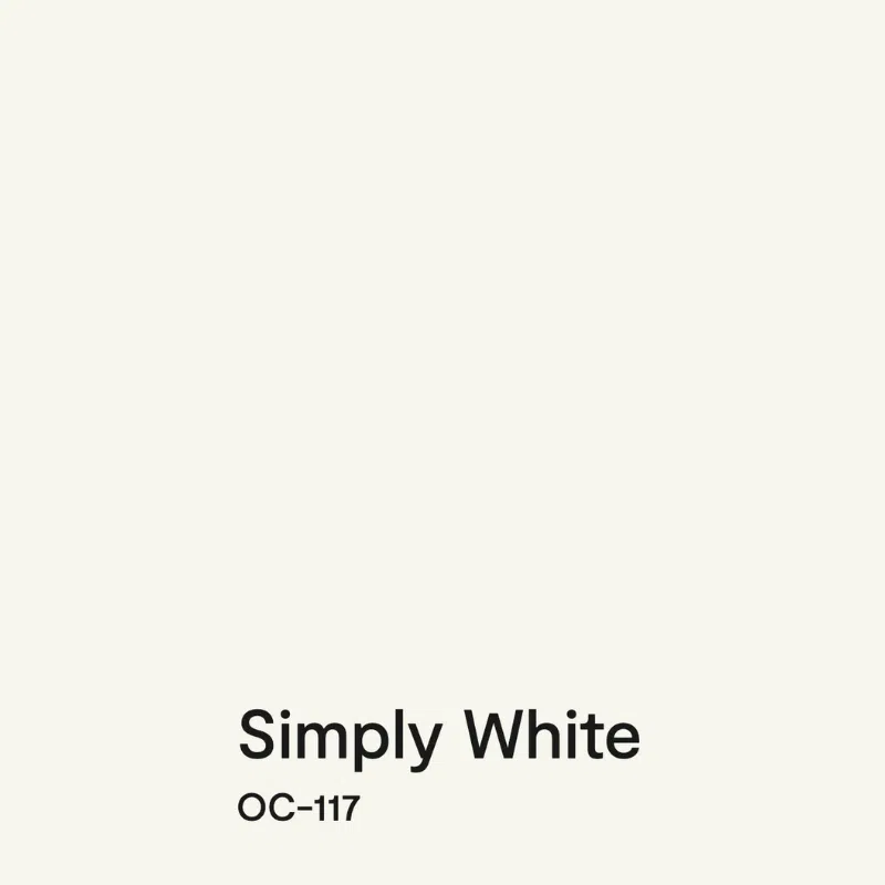
Simply White (Article) is one of Benjamin Moore’s most iconic white paint colors. It is a versatile, bright, and warm off-white hue with yellow undertones and an LRV of 89.5.
Simply White looks great just about anywhere, including in darker rooms. Use it in a monochromatic paint palette or consider it for cabinets or trim. In a very dark room, I like to use Simply White as a ceiling color with White Dove (Article) walls.
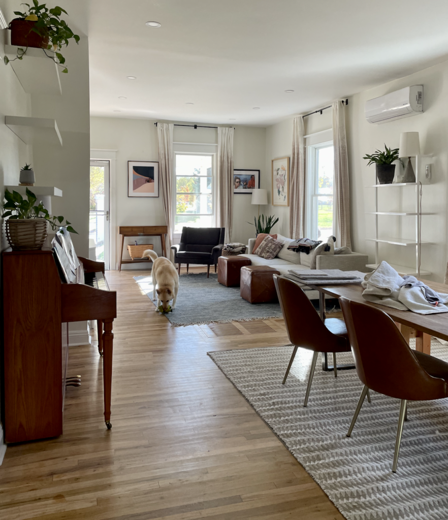
Benjamin Moore Cloud White
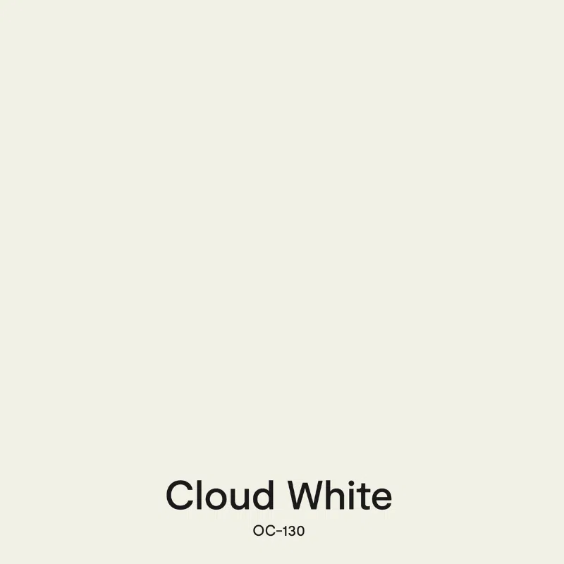
BM Cloud White (Article) is a soft, beautiful off-white paint color that we could use all day long. It has warm, invisible taupe undertones. With an LRV of 85.05, you can use Cloud White on your walls in just about every room of the house. It also makes a lovely trim, ceiling, or cabinet white paint color (Article). And, of course, it’s a great option for an open layout paint color.
Cloud White looks best in rooms with tons of light, but can also work well if you have some shadows. It can start to look dingy in rooms with very cool, North-facing lighting – so be sure to test carefully throughout the day.
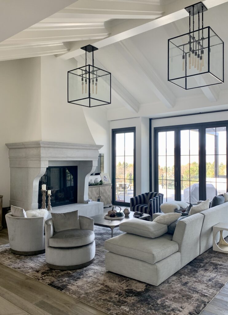
Benjamin Moore Swiss Coffee
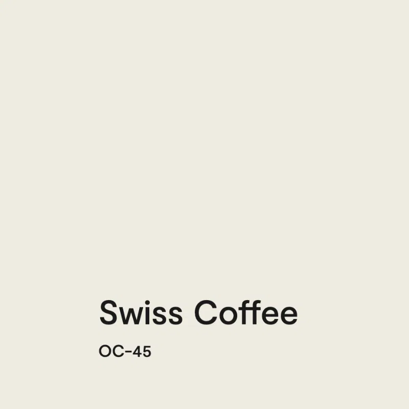
BM Swiss Coffee (Article) is a gorgeous, complex off-white paint color with an LRV of 84 and invisible green undertones that lean a bit toward yellow.
Use it with earthy colors, browns, tans, and warm grays. Swiss Coffee also works well for a darker or North-facing room with cool light.
One important note: make sure that you specify Benjamin Moore for this specific color. There are Swiss Coffee paint colors (Article) in just about every paint brand, and they are all different!
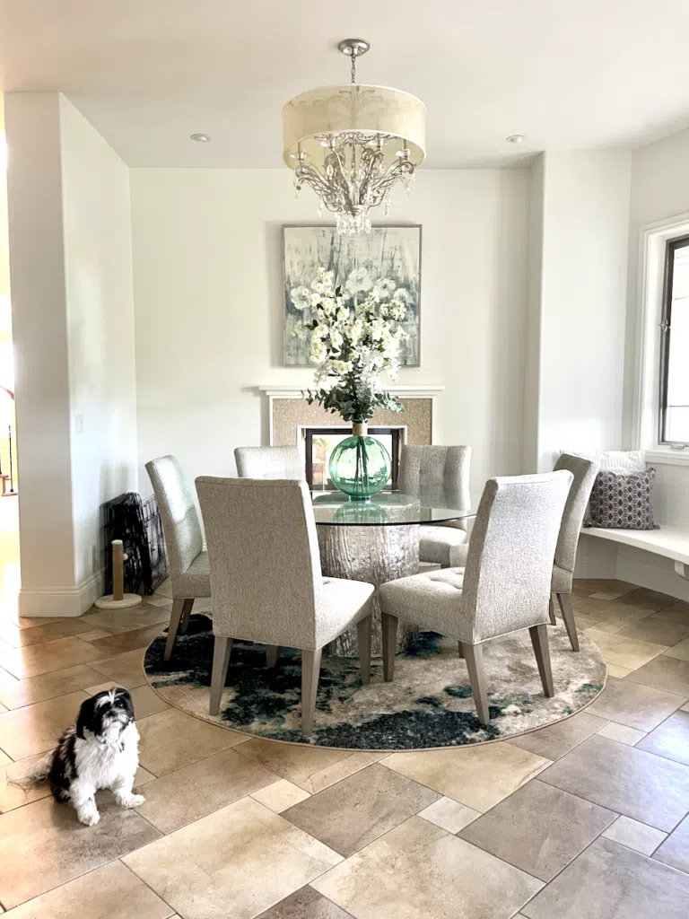
Benjamin Moore Cloud Cover

Benjamin Moore Cloud Cover (Article) is a genuinely unique off-white paint color on this list. It’s the only one with cooler violet undertones rather than yellow or taupe. With an LRV of 80.28, it sits right at the boundary between an off-white and a light greige. Its violet undertones give it a subtle, sophisticated quality that reads warm next to cool finishes but cool next to warm ones. It’s a chameleon of an off-white.
Cloud Cover looks absolutely stunning in homes with modern, clean finishes. It pairs especially well with white quartz (because many quartz countertops have a similar slight violet tone), light grays, and taupe accents. It also works well in North-facing rooms and rooms with shadows because the violet undertones keep it looking polished rather than dingy.
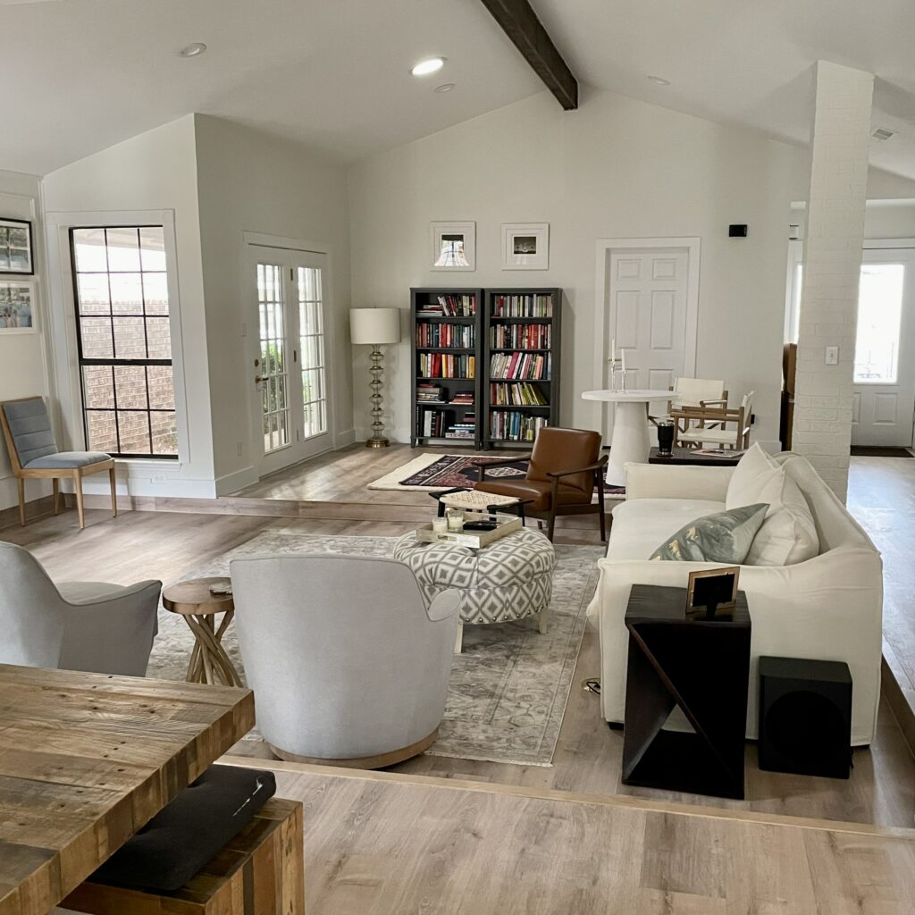
Bonus: Dark & Colorful Open Concept Paint Color
BM Cambridge Green
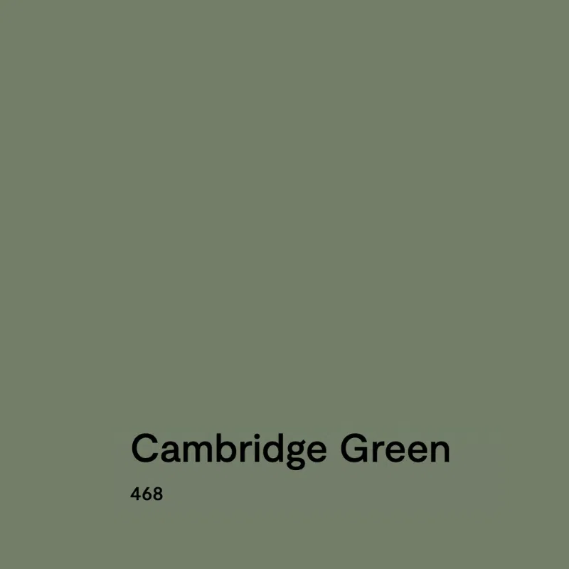
Benjamin Moore Cambridge Green (Article) is a dark, warm green paint color that is perfect for accent walls, accent rooms, and other spaces within a home. In the right home, it can even be used more broadly as an open layout paint color.
The LRV of Cambridge Green is 20.99, which makes it a darker green. Cambridge Green has warm yellow undertones, which give the color its cozy, inviting look. It’s also dark without being too dark, so it won’t feel overbearing even in spaces with low light.
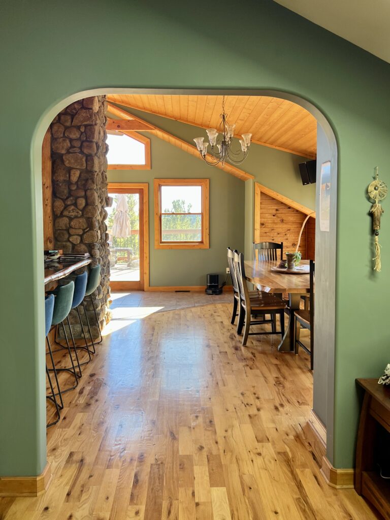
Should you really use Cambridge Green as a whole-house paint color? In most cases, I probably wouldn’t do it. It’s too dark and too bold to work in most homes and for most homeowners. But the home below (belonging to my color consultant Maddie Camilla) is a great example of what your space can look like when you pick a non-standard color for the foundation of your palette.
Sample the Best Open Layout Paint Colors
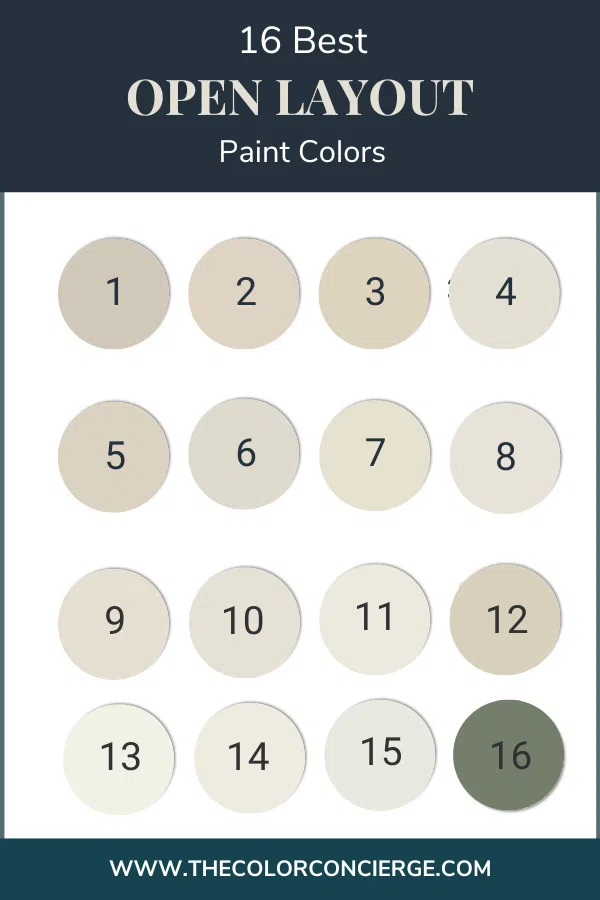
- Sherwin-Williams Accessible Beige
- Sherwin-Williams Natural Linen
- Benjamin Moore Manchester Tan
- Benjamin Moore Gray Mist
- Benjamin Moore Edgecomb Gray
- Benjamin Moore Pale Oak
- Benjamin Moore Ballet White
- Sherwin-Williams Pearly White
- Sherwin-Williams White Duck
- Sherwin-Williams Shoji White
- Sherwin-Williams Alabaster
- Benjamin Moore Simply White
- Benjamin Moore Cloud White
- Benjamin Moore Swiss Coffee
- Benjamin Moore Cloud Cover
- Benjamin Moore Cambridge Green
We always recommend that you test paint colors (Article) in your home because lighting can completely change a color, both on interiors and exteriors.
In the old days, this meant we painted a large poster board with sample pots and a huge mess.
Now we have a better way to test paint, with Samplize Peel-and-Stick samples!
- Samples pre-painted with 2 coats of real paint from the manufacturer.
- Large 9” x 14” samples to see the color better in the lighting.
- Delivered overnight
- Colors are accurate
- Less expensive than painting a large poster board with sample pots
- No mess, and no toxic paint to dispose of
I use these in my color consulting practice for exact results. Discover Samplize peel-and-stick paint samples and sample all your favorite exterior house colors via the link below.
Never skip testing — especially in an open floor plan, where a single color has to perform in so many different lighting conditions. Order peel-and-stick samples from Samplize and place them in several areas of your space: near windows, in shadowy corners, and on walls with different exposures. Check them in the morning, afternoon, and evening before making your final decision.
Key Learning Points
Choosing a paint color for an open layout means finding a hue that looks beautiful across multiple spaces and lighting conditions. Here’s what to remember:
- Look for versatile neutrals with a bit of pigment. Colors like SW Shoji White (LRV 74) and BM Edgecomb Gray (LRV 63) have enough saturation to stay warm in low light without washing out in bright areas.
- Muted, complex undertones are your friend. Soft green, taupe, and even violet undertones help a color adapt gracefully as light shifts throughout an open floor plan.
- Always test before you paint. Sample your top choices in multiple areas of your open space and observe them at different times of day — lighting can dramatically change how a color reads from one end of the room to the other.
Remember: NEVER, EVER use paint matches from a different brand than the one specified. Results are poor and there are no standards for the sheens. Even though your painter may truly believe it can be done, don’t do it. See results in our paint matching guide.
No matter what, always test your paint colors. It’s a standard best practice. Whenever I test my paint colors, they are perfect, and when I don’t test they turn out wrong. Learn how to test your paint colors like a pro.
Online Color Consulting
Still need help picking the best paint colors? Discover our Online Color Consulting Packages.

Related Posts:
- Best Calming Bedroom Paint Colors
- Best Paint Colors for Kitchen Walls
- How to Choose Interior Paint Colors
- How to Choose a White Paint Color
About the Author

Hi, I’m Michelle Marceny, founder, owner, and Principal Color Designer at The Color Concierge. I believe a fresh coat of paint can completely transform a space. The Color Concierge was born out of my drive to help clients fall back in love with their homes. My clients trust me to help them find the perfect paint color — whether that’s a whole-house color scheme or ideas for a single room.
Since founding The Color Concierge in 2017, my team and I have completed 1,000s of color consultations, online and in person. I’m a Certified Color Expert with nine years of experience creating interior and exterior color palettes throughout North America.
Every color review on this site comes from colors we’ve specified in real homes and photographed on location during our own consultations — not from a fan deck or a manufacturer’s website.
We love your comments! Please note that the blog is meant as general advice, and it is not possible to give out specific answers to your paint questions. If you want more specific advice, our Online Color Consultations will help you pick your paint colors. Thank you for your understanding.