Finding the perfect paint colors for South-facing rooms doesn’t have to be complicated. Read on for all our top picks for the best colors for rooms with Southern exposure.
Throughout our years as paint color consultants, we’ve worked in all kinds of spaces with all types of light exposure. While some are more challenging to find paint colors for (like rooms with Northern exposure (Article), others are a bit simpler.
Paint colors for South-facing rooms are some of the easier hues to find, simply because South-facing rooms get warm, consistent light throughout much of the day. Still, it’s important to take your exposure into account when selecting paint colors. In our color consulting business, we ask about the exposure of the room in our questionnaire for every project – that’s how important it is.
Ready to explore our favorite paint colors for South-facing rooms? Keep reading for our expert tips and a list of 15 hues perfect for those warm-lit spaces in your home.
*This post contains affiliate links for products I use and love. If you click on some links and make a purchase, I will get a small commission at no cost to you. This helps pay for the costs of the blog, so I can continue to offer great content to our readers.
About The Color Concierge
Our Colorado-based paint color consultants make finding the right paint colors for your home easy. Whether you’re painting the exterior or interior of your home, our simple yet effective process lets us get your paint color right the first time. We’ve helped thousands of homeowners transform their homes into a space they love. Learn more about ONLINE COLOR CONSULTATIONS today.
Understanding Rooms with Southern Exposure
South-facing exposures, where the windows face the south and there is tons of natural light, are one of the most pleasing light exposures because the light is warm and even throughout the day.
The sun is usually brightest in the middle of the day, so this is the best time to test paint colors (Article). This helps ensure that the strong, warm sun doesn’t wash out your chosen paint color.
Can South-facing rooms have low light?
While rooms with Southern exposure are typically full of natural light, it is possible to have a South-facing room with low light. If your room doesn’t have many windows, for example, I’d just treat it like any other low-light room, or like a North-facing room.
Is a South-facing room warm or cool?
A South-facing room is usually warm and sunny because it gets the most direct sunlight throughout the day, especially in the Northern Hemisphere. This constant exposure to sunlight makes the room feel warmer and brighter, which can also help reduce the need for artificial lighting.
What are the best types of paint colors for South-facing rooms?
You can use almost any kind of paint color in a room with Southern exposure, especially if you have lots of windows. South-facing light is even throughout the day and pretty consistently warm, so it can work well with both light, neutral paint colors and darker, bold hues.
The tricky part can be the depth of the color. For example, if the room is really bright, and you want a light greige color, you may need to pick a darker color than you expect to achieve the results you are looking for. This is why you always need to make sure to test your paint colors throughout the day. In some ways, a sun-filled room is almost like working on an exterior project because the sun can wash out your paint colors.
Neutral colors (Article) can seem lighter and more colorful than you expect in a room flooded with light. For that reason, I prefer to pick muted versions of colors so that the paint colors don’t look as glowy or bright. Cool-toned colors also help balance the warmth of the light. For accent hues, you can get away with darker paint colors than you can in other types of exposure.
Some of my favorite types of paint colors for South-facing rooms include:
- Cool or clean whites
- Cooler Gray paint colors
- Cooler Beige paint colors
- Dark accent colors
- Cooler Blues and greens
What colors should I avoid for South-facing rooms?
I typically avoid paint colors with strong yellow undertones, because the warm South-facing light can make them skew too yellow on the wall.
As you go through the color options shared in today’s post, please keep in mind that you need to test every single paint color to make sure that they are harmonious with your decor and hard finishes. It’s not as simple as choosing a color that’s good for South-facing light. You need to ensure that you pick the perfect color for the decor and the perfect color for the exposure.
How to Sample Colors for South-Facing Rooms
We always recommend that you test paint colors on your home because lighting can change a color completely, both with interiors as well as exteriors.
In the old days, this meant we painted a large poster board with sample pots and a huge mess.
Now we have a better way to test paint, with Samplize Peel-and-Stick samples!
- Samples pre-painted with 2 coats of real paint from the manufacturer.
- Large 9” x 14” samples to see the color better in the lighting.
- Delivered overnight
- Colors are accurate
- Less expensive than painting a large poster board with sample pots
- No mess, and no toxic paint to dispose of
I use these in my color consulting practice for exact results. Discover Samplize peel-and-stick paint samples:
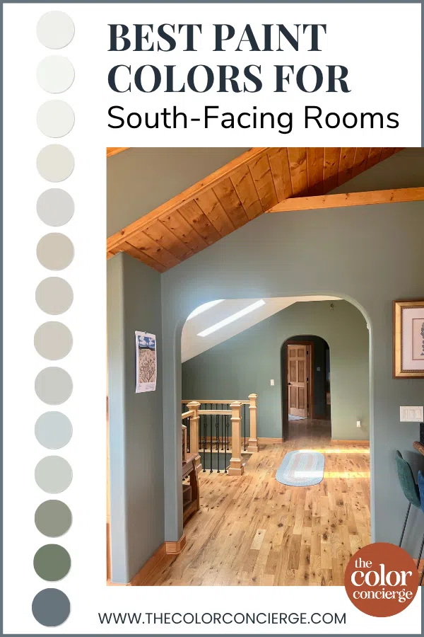
15 Best Paint Colors for South-Facing Rooms
Now that you understand the kinds of colors that work best in Southern light, let’s dive into our color consultant picks for the absolute best Benjamin Moore and Sherwin-Williams paint colors for South-facing rooms.
Best White Paint Colors for South-Facing Rooms
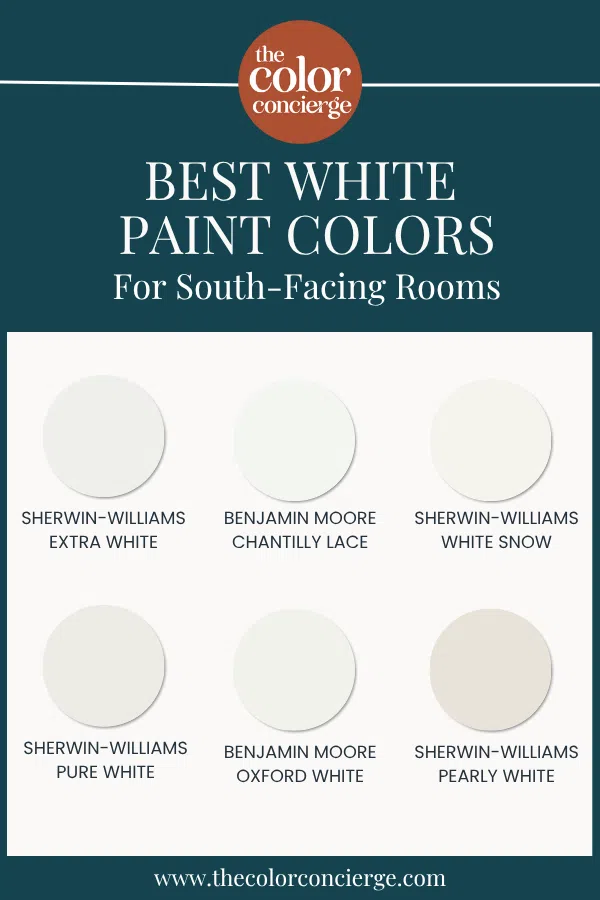
I prefer cooler or clean whites in South-facing rooms. Otherwise, the light can make the color skew yellow. These colors will give you a crisp, clean white that is hard to achieve in any other exposure. In cooler lights, these whites often look dingy because they can leave gray shadows in the corners. But with Southern exposure, they’re perfect.
If you want to paint your home a warm white color, you may need to shift to a light gray, greige, or even a warm light beige (Article) so that the walls don’t look washed out. The same is true if your finishes are very earthy, which typically look better with warm whites and darker whites. In this case, I’d skip white and try a light neutral color.
Here are all our color consultant picks for the best white paint colors for South-facing rooms:
Sherwin-Williams Extra White
Extra White (Article) is a cool blue-white hue and one of Sherwin-Williams’ most popular paint colors. Many houses in North America use Extra White in one form or another, mainly as a white trim color.
Extra White (Sample) looks like a very bright, crisp white thanks to its blue undertones. While it could look stark or even dingy in some lighting, in rooms with Southern exposure it looks soft and lovely, such as in the client’s living room below.
Benjamin Moore Chantilly Lace
Chantilly Lace (Article) is a clean white with barely-there cool undertones. It is so clean that I use this color as the baseline for clean whites. Bluer whites are cool whites and darker whites are warm whites.
Chantilly Lace (Sample) has cool undertones, but they are very subtle. This color won’t look blue on the wall, just crisp and clean. I love using Chantilly Lace for white kitchen cabinets, as pictured below.
Sherwin-Williams White Snow
Sherwin-Williams White Snow (Sample) is a bright, clean white paint color with nearly invisible warm undertones that keep it from looking too stark. It’s not quite a true white but very bright.
White Snow is not overly warm or cool. As a result, it’s a very versatile color that can pair well with both cool and warm paint colors, flooring, and other hard finishes.
Sherwin-Williams Pure White
With a name like “Pure White” (Article), many homeowners expect this paint to be a bright, pure white color. But it’s definitely not Sherwin-Williams’ whitest paint color.
This off-white paint color has light yellow undertones. Pure White (Sample) is almost a clean white, but not quite. The soft yellow undertones keep it from looking harsh, even though it’s crisp.
Benjamin Moore Oxford White
Oxford White (Article) is one of Benjamin Moore’s cleanest white paint colors. It’s soft, clean and crisp. It is truly a neutral paint color – not cool and not warm.
Oxford White (Sample) also has more pigment than some other white colors. This ensures it won’t reflect the colors around it as much as lighter white paint colors.
Sherwin-Williams Pearly White
Warm white paint colors can go yellow in a flash in rooms with South-facing light, but if you want a creamier hue I recommend Sherwin-Williams Pearly White (Article). It’s soft and creamy but still muted, and with invisible green undertones that keep it from skewing yellow.
I refer to Pearly White (Sample) as a complex cream, which is the warm version of a very light greige.
Best Beige Paint Color for South-Facing Rooms
There are warm beiges and cooler beiges, and for South-facing rooms, I’d stay on the cooler side of beige.
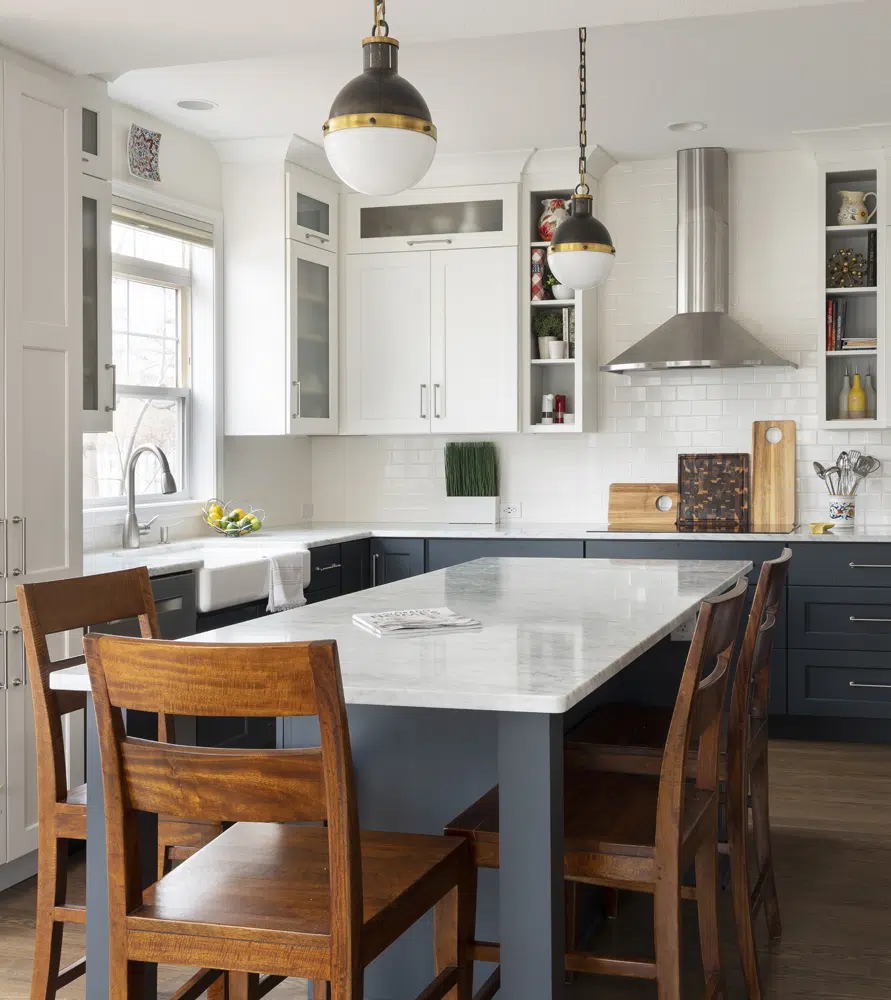
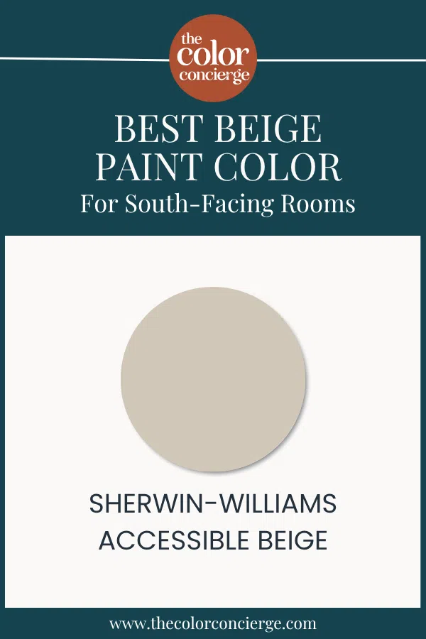
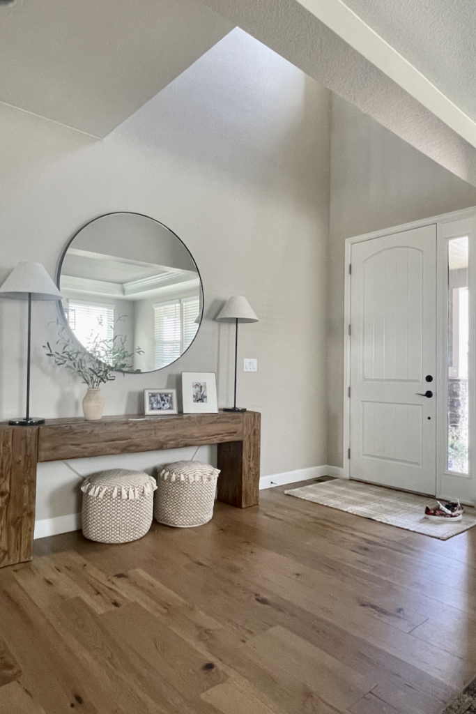
Sherwin-Williams Accessible Beige
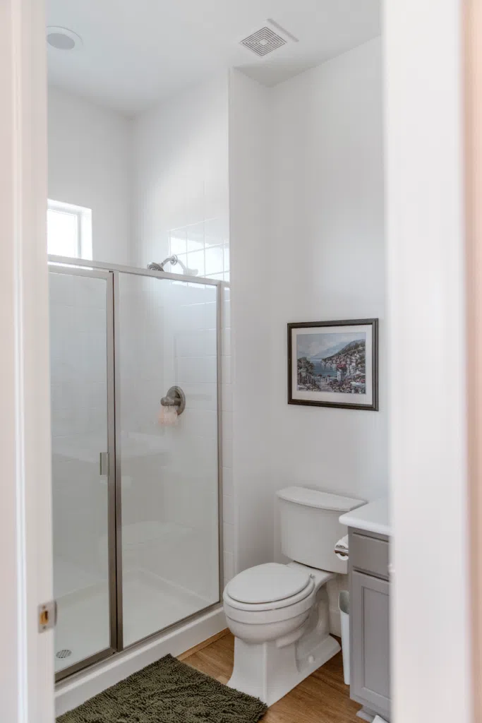
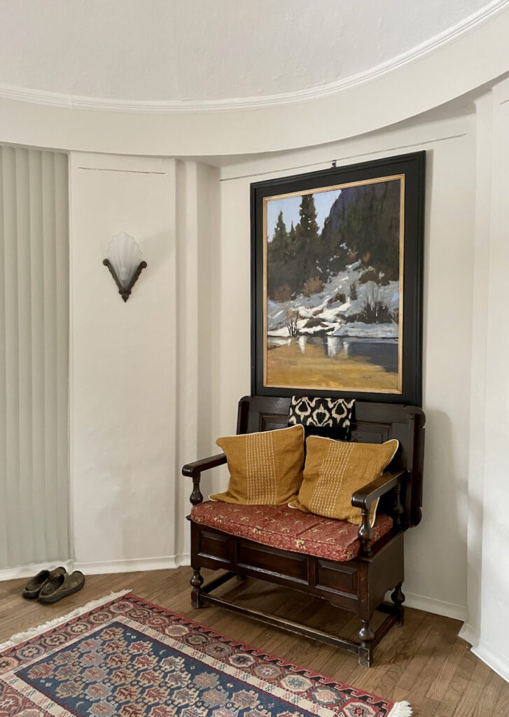
Sherwin-Williams Accessible Beige (Article) is my top pick for South-facing rooms. It’s a warm, muted color but on the cool side for a beige. And it has enough pigment to be able to handle a room flooded with light without washing out. Accessible Beige (Sample) will look like a lighter beige in South-facing rooms, as it does in our client’s entryway below.
Gray Paint Colors for South-Facing Rooms
Generally, grays do very well in a South-facing exposure. We aren’t seeing as much interest in gray paint colors in 2025, but they are a good candidate for this type of lighting. They are intrinsically cooler, and the warm light gives them beautiful life.
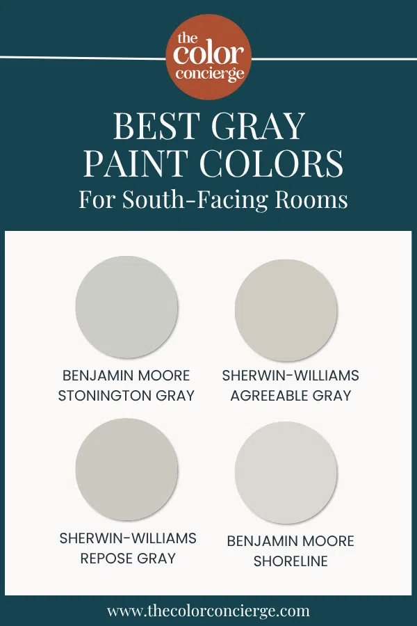
BM Stonington Gray
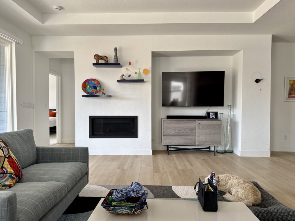
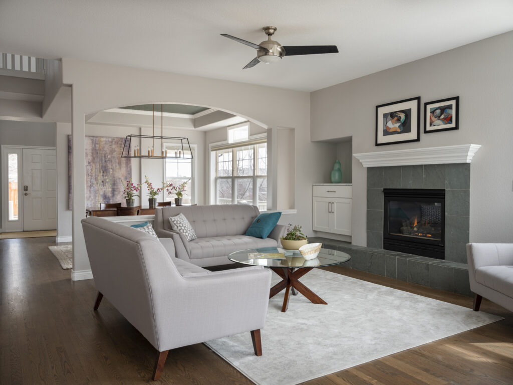
Benjamin Moore Stonington Gray (Article) is a neutral and versatile gray paint color that can be used in just about any space throughout the home. It has strong blue undertones that make it look more like a blue-gray in some lighting.
I’m always very careful about using a color like Stonington Gray (Sample) in a North-facing room, for example, because it can look so icy and light blue. In a South-facing room, however, Stonington will look lovely and neutral, such as in the open-concept living room pictured below.
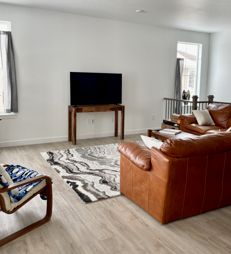
Sherwin-Williams Agreeable Gray
SW Agreeable Gray (Article) is an incredibly iconic color, but I’m NOT one of those people that say Agreeable Gray can be used anywhere. If you use it in a darker room, or a room with cool light, it can look fleshy and grim. My favorite use of this color is in a South-facing room.
In my South-facing primary bedroom, for example, Agreeable Gray (Sample) looks soft, warm and lovely.
Sherwin-Williams Repose Gray
Repose Gray (Article) is slightly cooler than Agreeable Gray, and looks just lovely in a South-facing room.
Repose Gray (Sample) has violet undertones and looks best in a light-filled room. In a room with Southern exposure, its tones are warmed up by the natural light.
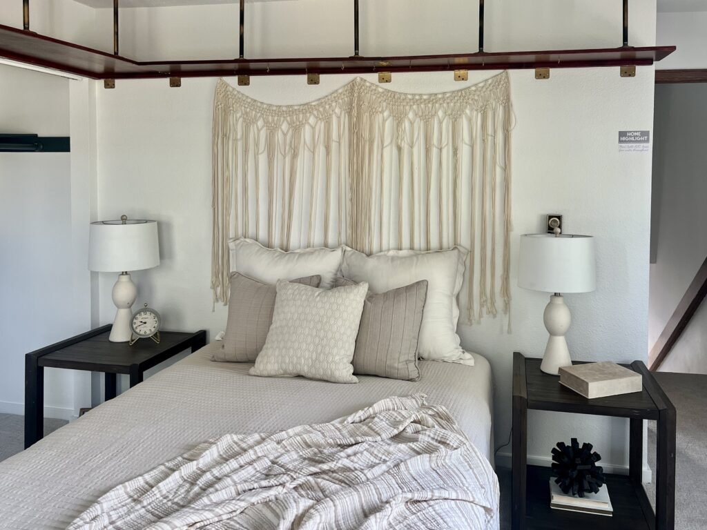
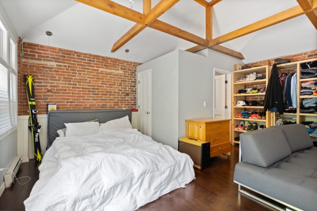
Benjamin Moore Shoreline
Benjamin Moore Shoreline (Sample) is another crisp blue-gray hue that has even stronger blue undertones than Stonington Gray. While the color could look too blue and glowy in a room with cool light, I absolutely love the way it looks in warm, light-filled, South-facing spaces.
The room pictured below, for example, was the guest bedroom (Article) in a historic house that we helped renovate several years ago. Shoreline looks much more neutral than you’d expect in this space.
Dark Paint Colors for South-Facing Rooms
With the warm, even light of Southern exposure, you can get away with much darker paint colors than you can in other spaces. If you’ve been wanting to try a bold accent hue, using it in a South-facing room is a great idea.
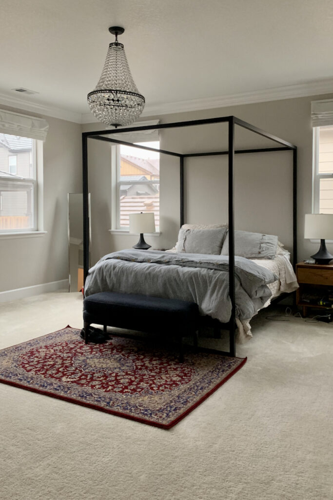
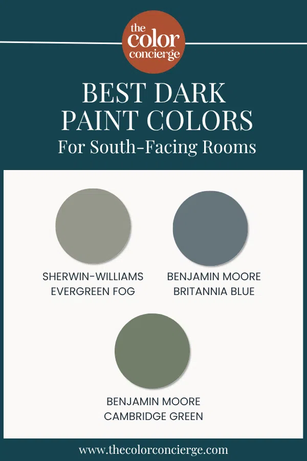
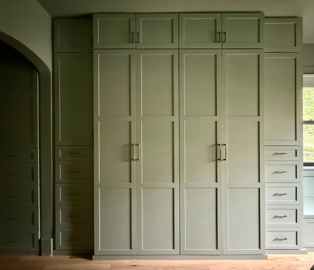
Sherwin-Williams Evergreen Fog
Evergreen Fog (Sample) is one of the most popular green paint colors (Article) on the market today. Evergreen Fog is very muted and on the cooler side, with enough blue in it that it feels fairly cool.
It’s a great cabinet or accent color for a South-facing room. Color drenching (Article) with SW Evergreen Fog is another gorgeous option. My client’s home below features a beautiful color-drenched bedroom painted with this color, including the beautiful built-in wardrobe.
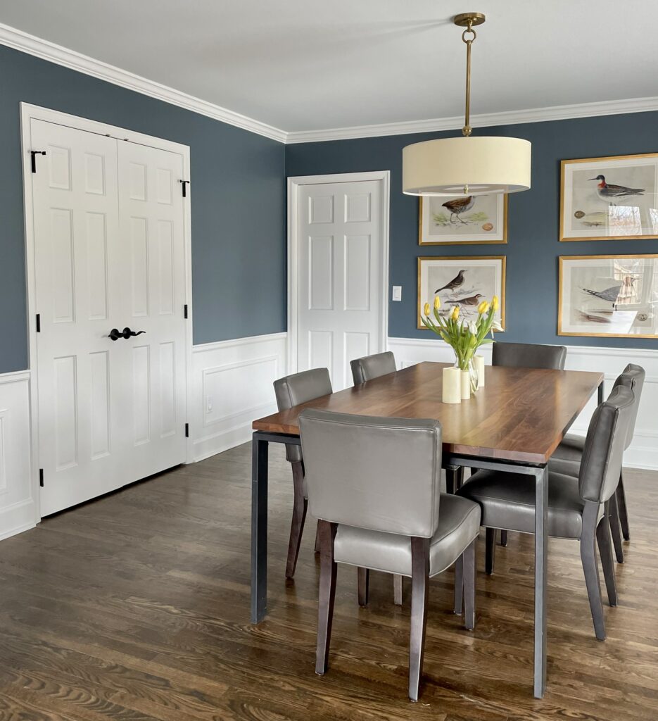
Benjamin Moore Britannia Blue
Britannia Blue (Article) is a cool mid-toned color with the slightest flash of green. It’s a cool blue, silky color – and one of my absolute favorites. Warm South-facing light really brings this color to life.
In the room pictured below, Britannia Blue (Sample) is balanced with Oxford White as a wainscoting color, which is also nice for a South-facing room.
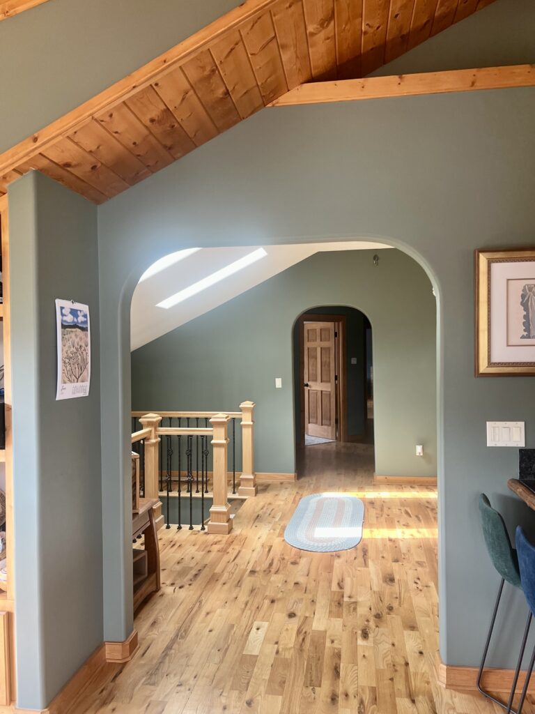
Benjamin Moore Cambridge Green
Believe it or not, Cambridge Green (Sample) is the open layout color in my associate Maddie’s home. It’s absolutely gorgeous and pairs nicely with her home’s warm, earthy woods and finishes.
While this color could look overpowering in most homes as an open concept hue, this home has enough light to be able to carry it off.
Best Light Blue-Green Paint Color for Rooms with South-Facing Light
If you don’t want a neutral hue but don’t want something too dark, blue and green paint colors look really lovely in South-facing light. This is our top pick:
Sherwin-Williams Sea Salt
Sherwin-Williams Sea Salt (Article) is a gorgeous and iconic light blue-green gray that looks perfect in a South-facing room. It is soft and muted and leans more toward green than blue.
In warm, South-facing light, Sea Salt (Sample) really comes alive, like it does in my client’s home office pictured below.
Sample All The Best Paint Colors for Rooms with Southern Light
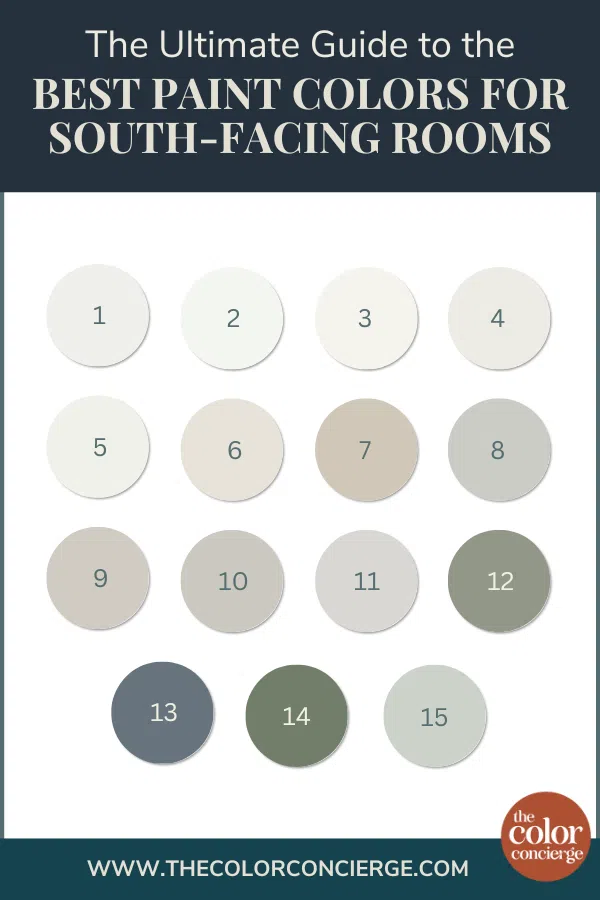
- SW Extra White
- BM Chantilly Lace
- SW White Snow
- SW Pure White
- BM Oxford White
- SW Pearly White
- SW Accessible Beige
- BM Stonington Gray
- SW Agreeable Gray
- SW Repose Gray
- BM Shoreline
- SW Evergreen Fog
- BM Britannia Blue
- BM Cambridge Green
- SW Sea Salt
Key Learning Points
South-facing rooms have warm light that remains pretty even throughout the day. When choosing paint colors for South-facing rooms, it’s important to follow a few key guidelines:
- A South-facing rooms that is flooded with natural light typically has warm lovely natural light.
- A South-facing room with low light should be treated like any other darker room. I always treat low light rooms as if they were North facint
- Crisp, clean and cooler hues look great in South-facing rooms. These will look warmer in the light without skewing too yellow.
- Make sure your chosen paint colors also look good with your furniture, decor and hard finishes.
Remember: NEVER, EVER use paint matches from a different brand than the one specified. Results are poor and there are no standards for the sheens. Even though your painter may truly believe it can be done, don’t do it. See results from paint matching here.
No matter what, always test your paint colors. It’s a standard best practice. Whenever I test my paint colors, they are perfect, and when I don’t test they turn out wrong. Learn how to test your paint colors here.
Online Color Consulting
Still need help picking the best paint colors? Discover our Online Color Consulting Package.

Related Posts:
- Best Paint Colors for Rooms with Northern Exposure
- Best White Paint Colors for Dark Rooms
- Best Sherwin-Williams White Paint Colors
- Best Benjamin Moore White Paint Colors
- Best Green Paint Colors
- Best Blue-Gray Paint Colors
About the Author

Hi, I’m Michelle Marceny, founder, owner, and Principal Color Designer at The Color Concierge. I believe a fresh coat of paint can completely transform a space. The Color Concierge was born out of my drive to help clients fall back in love with their homes. My clients trust me to help them find the perfect paint color for their home – whether it’s a whole-house paint color scheme or ideas for a single room.
Since The Color Concierge was founded in 2017, we have completed over 3000 color consultations, both online and in-person. I am a Certified Color Expert with 7 years of experience creating interior and exterior color palettes throughout North America.
We love your comments! Please note that the blog is meant as general advice, and it is not possible to give out specific answers to your paint questions.
