Light blue paint colors are some of the most calming hues to add to your home. Whether you’re painting a bedroom, bathroom, accent wall, or even kitchen cabinets or front porch ceiling, the right light blue color can make the space feel light and relaxing.
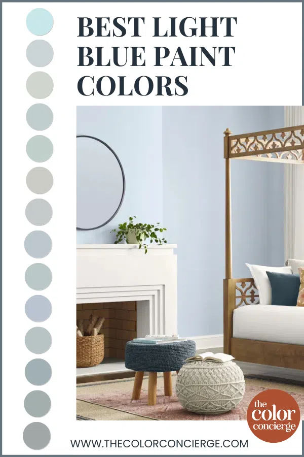
As a paint color consultant, I’ve recommended hundreds of light blue paint colors for my clients. The ones I’m sharing today are my favorites from Benjamin Moore, Sherwin-Williams, and Farrow & Ball – all tested and used within my clients’ real homes.
Keep reading for all the details – and real client photos – of the best light blue paint colors.
*This post contains affiliate links for products I use and love. If you click on some links and make a purchase, I will get a small commission at no cost to you. This helps pay for the costs of the blog, so I can continue to offer great content to our readers.
About The Color Concierge
Our Colorado-based paint color consultants make finding the right paint colors for your home easy. Whether you’re painting the exterior or interior of your home, our simple yet effective process lets us get your paint color right the first time. We’ve helped thousands of homeowners transform their homes into a space they love. Learn more about ONLINE COLOR CONSULTATIONS today.
Understanding Light Blue Paint Colors
Before diving into specific colors, it helps to understand what “light blue” really means and how to choose one that works. A light blue is a soft, airy version of blue.
Most often, the light blue paint colors that look best in place are actually blue-grays (Article) rather than pure, saturated blues. If you reach for an overly bright, clean blue, it can look electric once it’s up on the wall, especially in a sunny room or under cool Northern light.
Light Blue Paint Color Undertones: Warm vs. Cool
While blue is generally considered a cool paint color, blue paint colors can have undertones that make them look warmer (green) or cooler (violet). A blue with green undertones is the warmer, more flexible version of light blue. Blues with violet undertones are cooler, and can even border on a purple or “blurple.”
When you’re comparing light blue paint colors, it’s important to identify the undertone first. The undertone will help determine how a paint color will look with your flooring, hard finishes, and decor.
How To Choose a Light Blue
Before we explore my picks for the best light blue paint colors, it’s important to understand how to narrow down the options and find the light blue hue that’s right for your project. These are the steps I use as a paint color consultant:
Step One: Start with a muted blue-gray rather than a bright, saturated blue, so the color stays soft instead of electric.
Step Two: Pin down the undertone – green for a warmer, more relaxed blue; purple for a cooler one – and make sure it flatters your finishes.
Step Three: Factor in the room’s exposure. Cool North-facing light (Article) pushes any blue bluer, so you may need to lean more muted in such spaces. Bright South-facing light (Article), on the other hand, can wash a pale blue out, so it may need a touch more pigment.
Use LRV as a guide to how light or dark a color is, but remember that a high number doesn’t automatically mean a color will look washed out – a saturated hue can still have a high LRV. And always, always test the color in your own space and light before committing, since the same blue can look like several different colors from room to room.
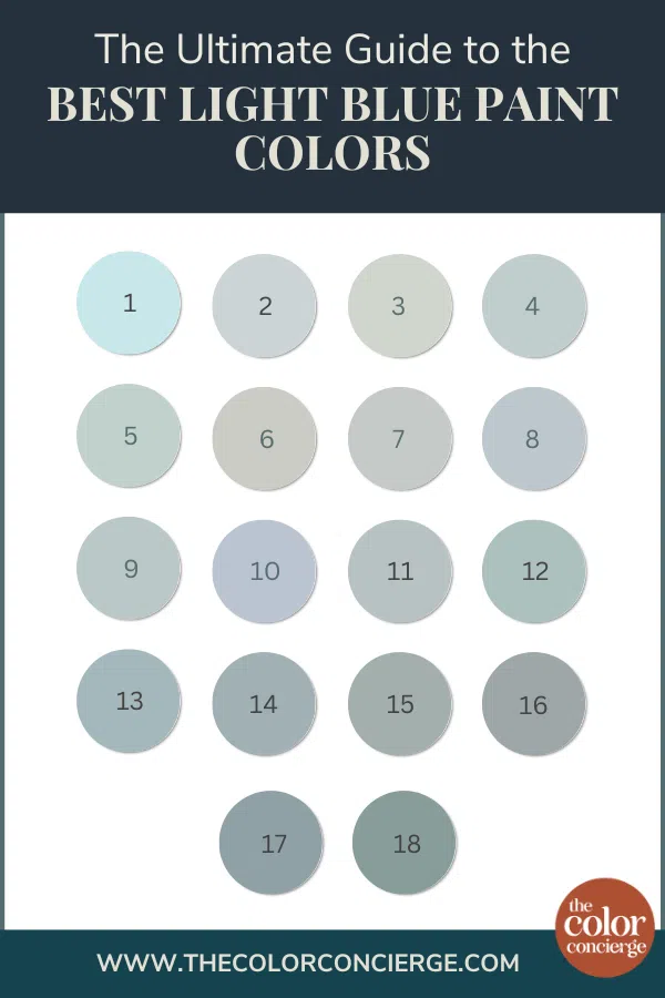
18 Best Light Blue Paint Colors
Now that you know how to analyze and choose a light blue hue, it’s time to explore some of my favorites as a paint color consultant. We’ve listed them below in order from lightest to darkest.
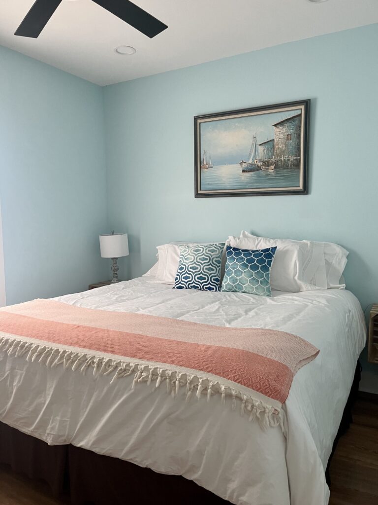
Benjamin Moore Crystal Springs
- LRV: 74.29
- Undertones: Strong green
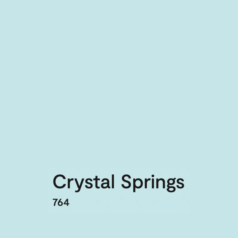
BM Crystal Springs (Article) is one of our favorite light blue paint colors for a rich and colorful bedroom. It’s a light blue with strong green undertones that comes very close to being an aqua paint color. Crystal Springs (Sample) is unique because it has a high LRV but no risk of washing out, even in bright light, thanks to its vivid color. This color can look electric in north-facing light.
Sherwin-Williams Lullaby
- LRV: 65
- Undertones: Green
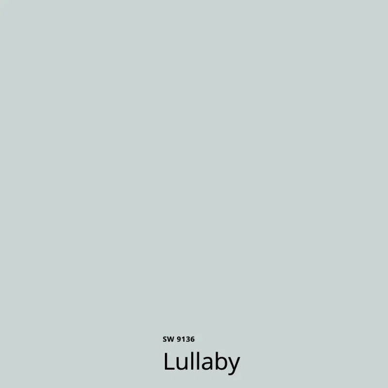
SW Lullaby (Sample) is one of the best light blue paint colors for kids’ rooms and nurseries. On a swatch, it can look almost gray because it is so muted, but its warm blue tones come to life in a light-filled room.
This color is perfect for a young child’s room, one that will grow with them and pair well with many different finishes and decor over the years. In our client’s home, pictured below, we used Lullaby in a bedroom as part of a whole-house SW Pearly White palette (Article).
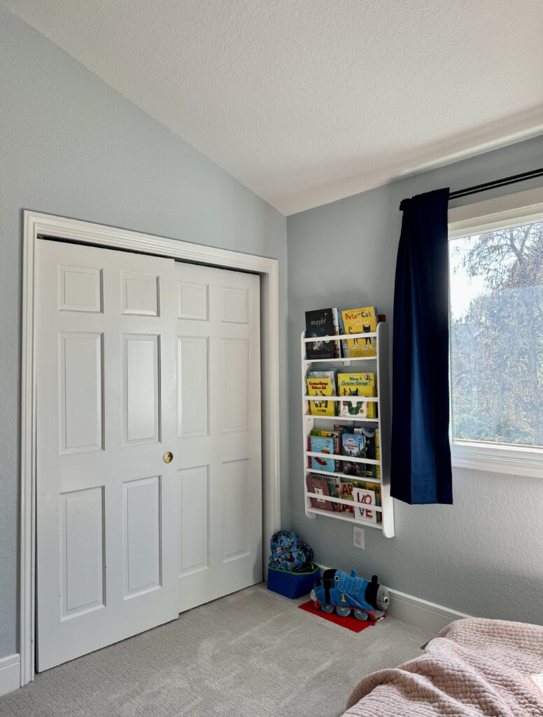
Benjamin Moore Gray Cashmere
- LRV: 64.53
- Undertones: Blue/Green
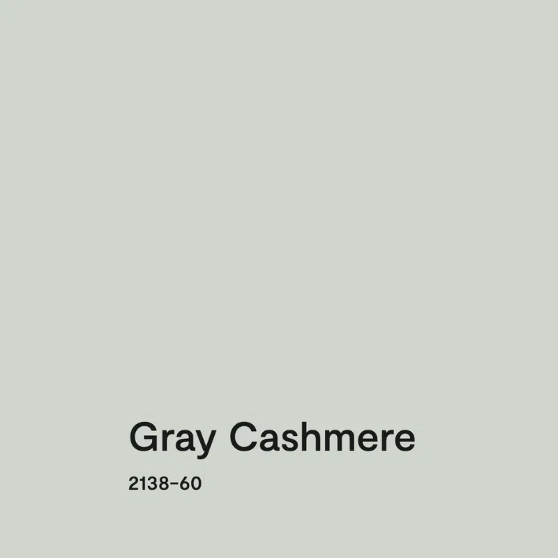
Benjamin Moore Gray Cashmere (Article) is one of the warmest light blue paint colors we’re sharing in this guide. While it’s technically a gray, it has very strong blue-green undertones that make this paint surprisingly colorful, especially in rooms with lots of natural light.
In South-facing rooms with warm light, it can look a bit greener. In rooms with North-facing light, it looks very blue. Gray Cashmere (Sample) is gorgeous in any light!
Sherwin-Williams Tradewind (SW 6218)

- LRV: 62
- Undertones: Green
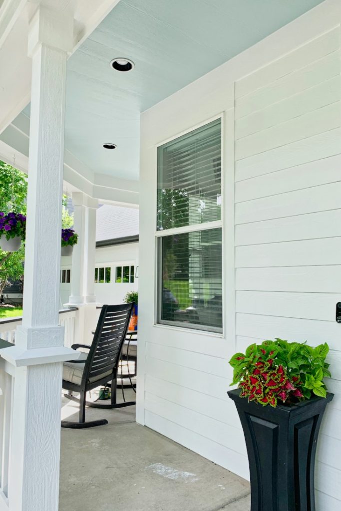
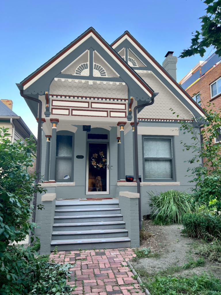
Sherwin-Williams Tradewind (Sample) is one of our favorite light blue paint colors – especially for Haint blue front porch ceilings (Article), a common exterior paint trend in the U.S. South and other parts of the country.
Tradewinds is a warm light blue, with soft green undertones. It pairs especially well with a farmhouse-style white exterior palette (Article), but would also look lovely indoors for a bedroom or bathroom.
Benjamin Moore Woodlawn Blue
- LRV: 60.65
- Undertones: Strong green

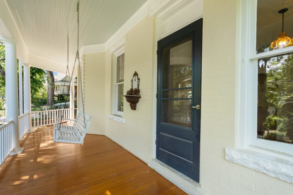
BM Woodlawn Blue (Sample) is a soft, light blue paint color that has strong green undertones. It looks almost like a muted aqua paint color. We love to use this color for haint blue front porch ceilings because it pops even in the shade.
Woodlawn Blue is a soft blue carrying a lot of green, which pushes it almost to an aqua color, though in a muted and beautiful way. We used it on the porch ceiling of the historic home pictured below, where it looked gorgeous against Hepplewhite Ivory (Article) siding and white trim.
Benjamin Moore Stonington Gray
- LRV: 59.36
- Undertones: Strong blue

BM Stonington Gray (Article) is one of our go-to paint colors when clients ask for light blue but don’t want it to look too bright on the wall. It’s a soft gray paint color with strong blue undertones. I consider this the bluest of the blue-gray colors in this list.
In rooms with cool light, such as North-facing rooms or basement rooms (Article), Stonington Gray (Sample) looks especially blue, such as in my former home’s basement below. I painted with this color before I became a color consultant. My first thought after they painted was “it really looks blue!”
Be careful when using this color on exterior siding, and test it carefully. In bright sun, it can look almost white, but in the shade, it looks more neutral blue-gray.
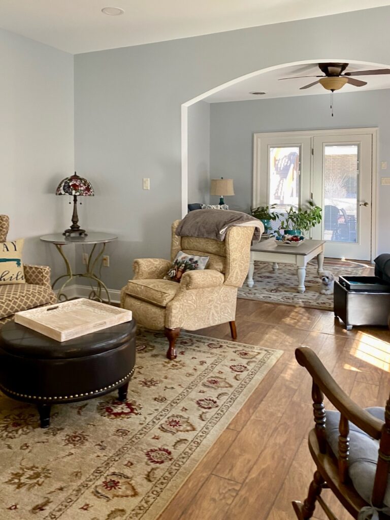
Sherwin-Williams Gray Screen (SW 7071)
- LRV: 59
- Undertones: Blue
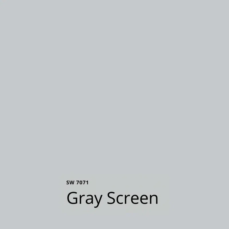
SW Gray Screen (Sample) is a very similar hue to Benjamin Moore Stonington Gray. It has strong blue undertones that give it plenty of color. Especially in rooms with cooler light, Gray Screen will look like a soft blue rather than a gray.
This color looks gorgeous in bedrooms, basements and even main living spaces like my client’s formal living room below.
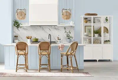
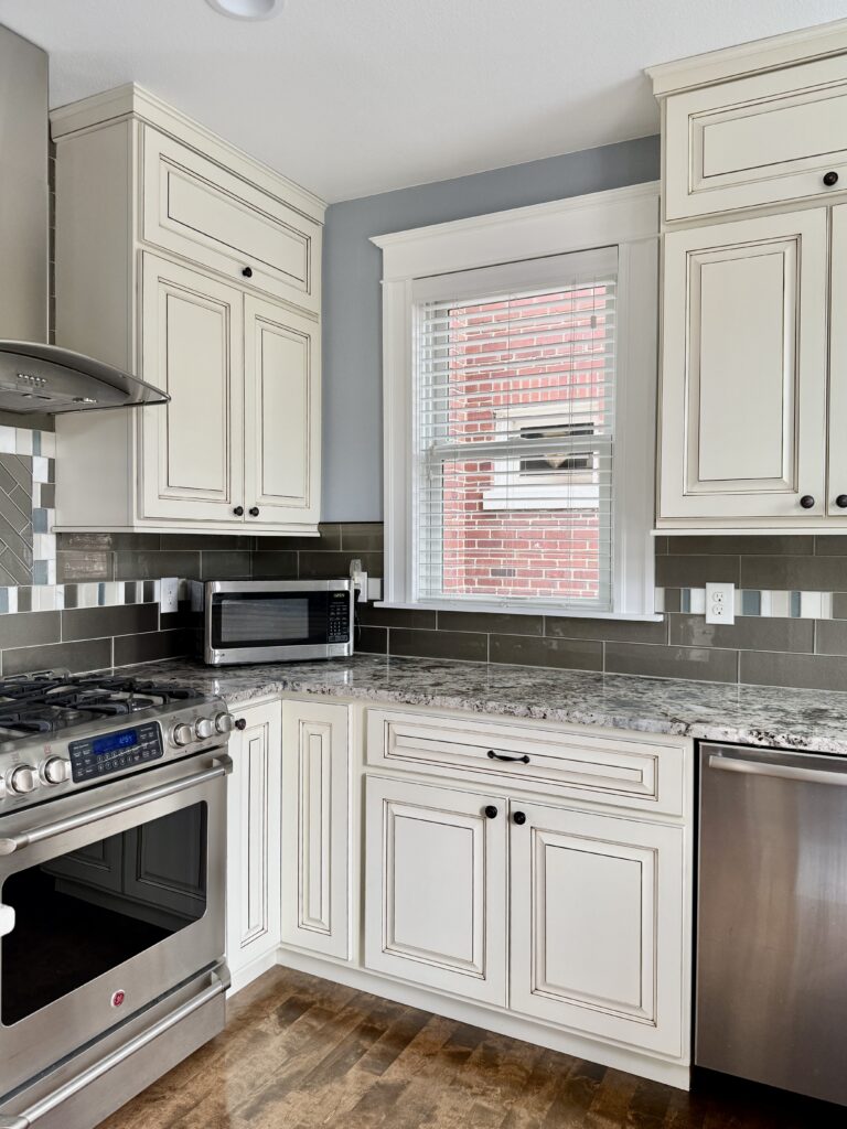
Sherwin-Williams Upward
- LRV: 57
- Undertones: Subtle violet

SW Upward (Sample) was named the Sherwin-Williams’ 2024 Color of the Year (Article), and for good reason! Upward is soft and muted, and a lot cooler than some of the blues featured in this list so far, thanks to its violet undertones.
Upward is dark enough that it can be used outdoors, but light enough to still look soft and lovely indoors. I absolutely love the way this color looks on the kitchen cabinets in the Sherwin-Williams photo below.
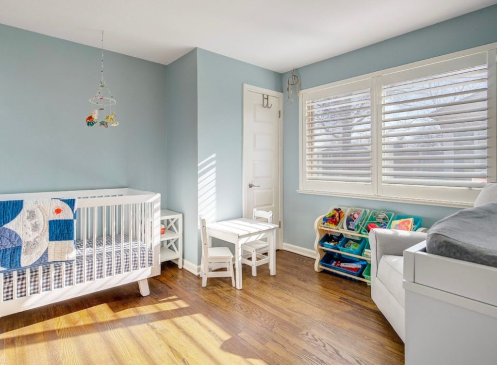
Benjamin Moore Smoke
- LRV: 56.39
- Undertones: Blue
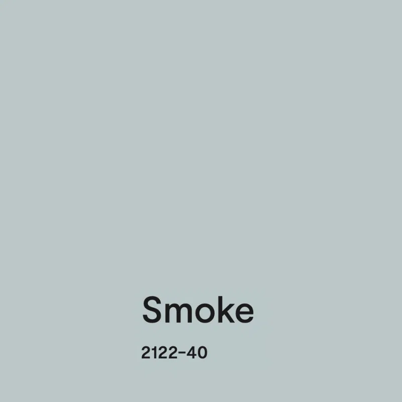
BM Smoke (Sample) is a lovely, muted blue that works almost anywhere. In our color consulting practice, we’ve used it both in a low-light primary bedroom — where its muted tone kept it from falling flat — and in a light-flooded boy’s nursery, each time paired with crisp white trim.
Benjamin Moore Instinct
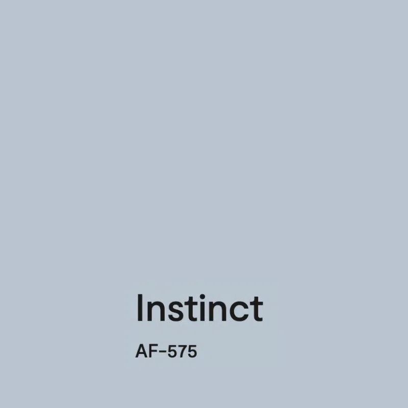
- LRV: 55.12
- Undertones: Violet
Benjamin Moore Instinct (Sample) is a cool light blue paint color with violet undertones. This color would look beautiful as a bedroom paint color, bathroom paint color or accent wall. This would also be a great color for a kid’s bedroom.
Our client’s home (Article), pictured below, used BM Instinct as a kitchen wall paint color (Article). While it would not have been our first choice for this kitchen, we love how fresh it looks.
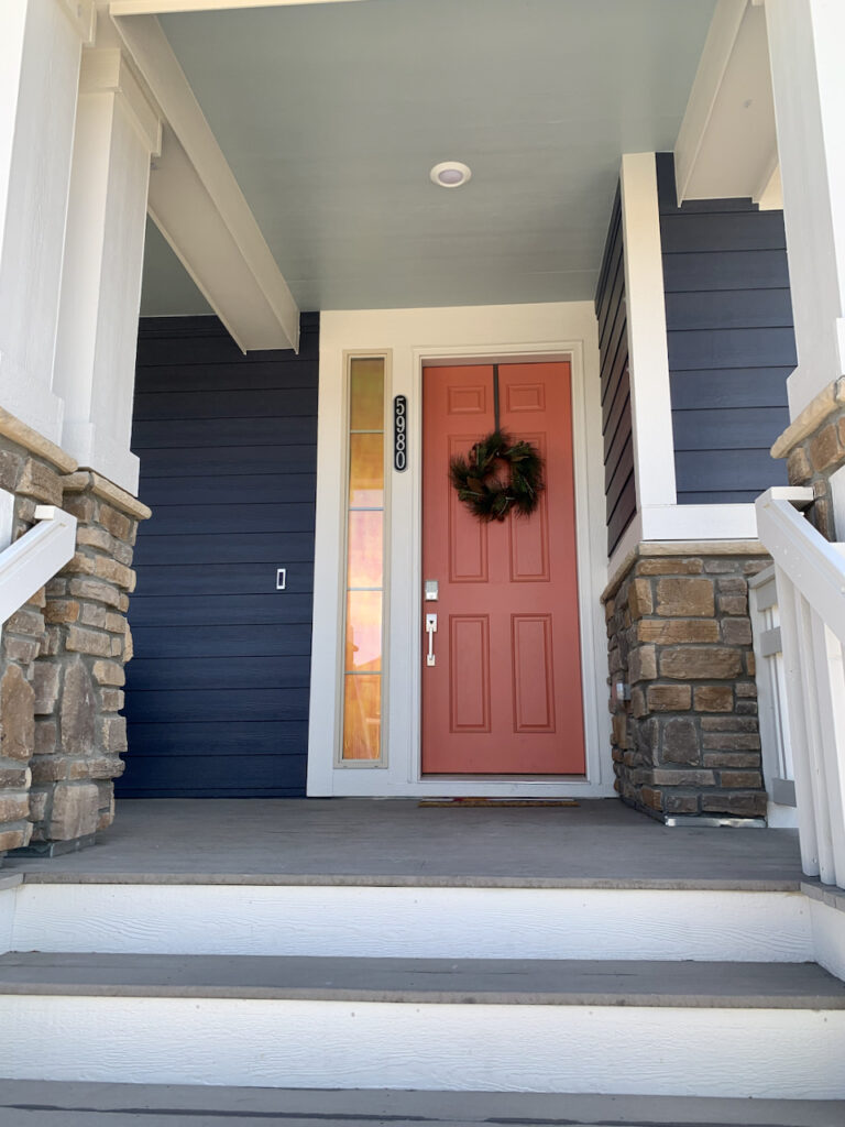
Sherwin-Williams Niebla Azul
- LRV: 53
- Undertones: Blue-green

SW Niebla Azul (Sample) is described as another beautiful light blue paint color. This hue looks gorgeous with other bright colors (like the bright coral front door (Article) shown in the photo below) and has warm, blue-green undertones.

Benjamin Moore Wedgewood Gray (HC-146)
- LRV: 49.5
- Undertones: Strong green

BM Wedgewood Gray (Sample) is a grayed-out blue with strong green undertones. It’s a warm light blue paint color that looks beautiful outdoors but can also work well for indoor placements. The color is more muted and a bit darker than some of the other light blue hues in this list, and it works really well in spaces that get lots of light.
On the home below, we used Wedgewood Gray on the front porch ceiling and front door – a soft but bright pop of color.
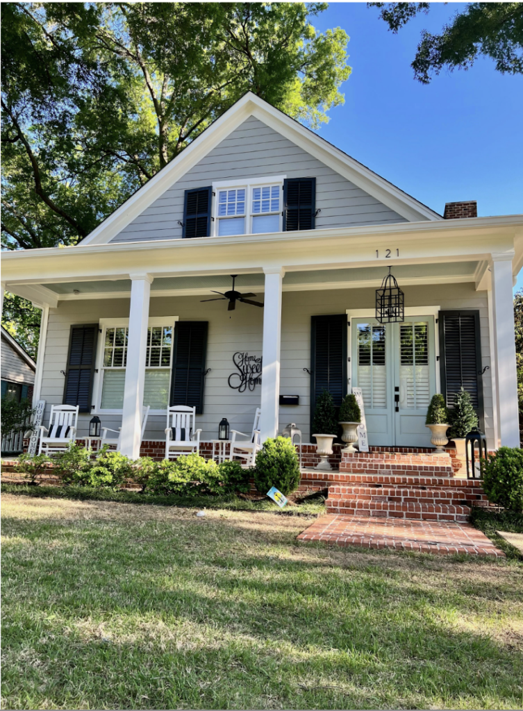
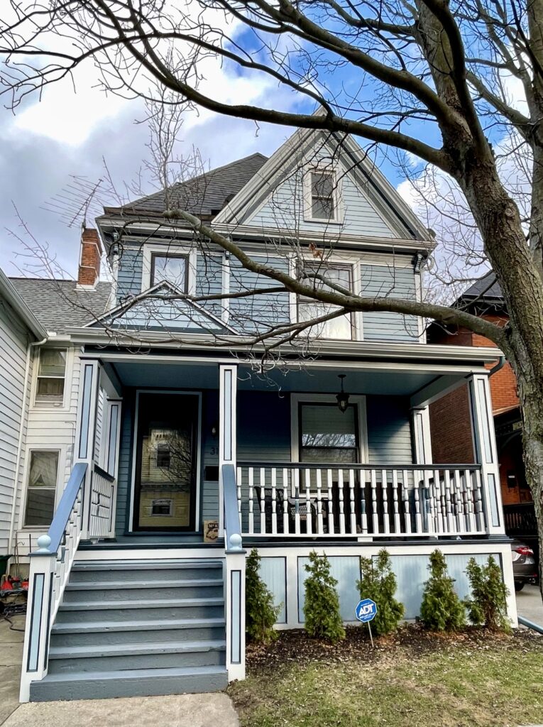
Sherwin-Williams Languid Blue
- LRV: 46
- Undertones: Subtle green
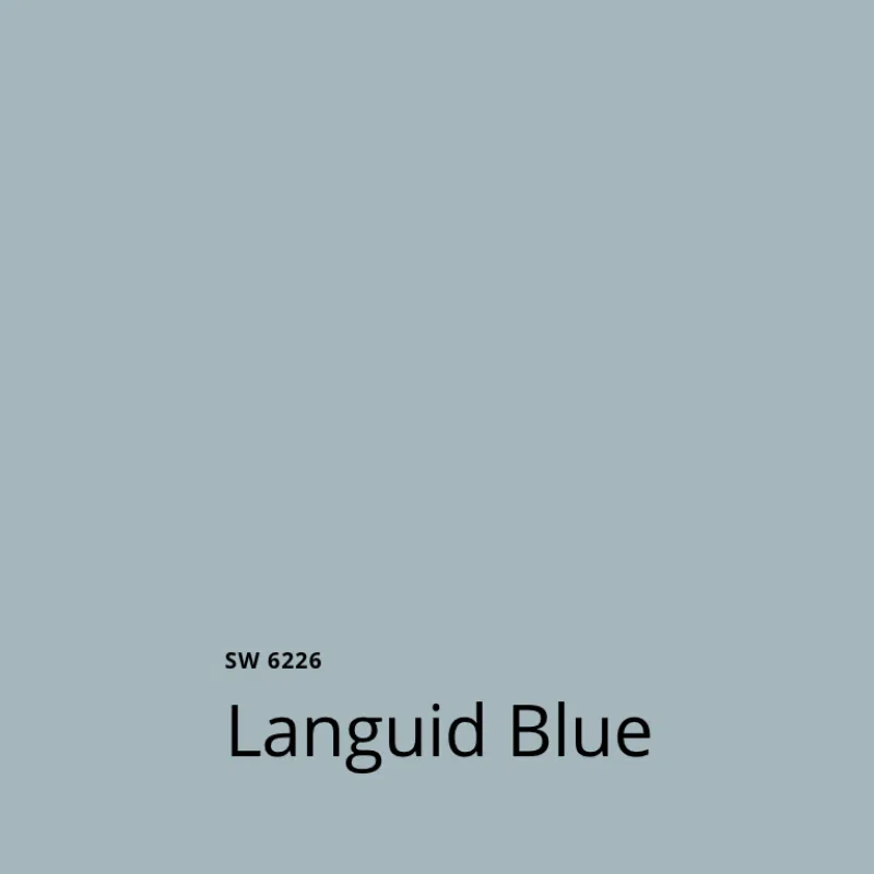
SW Languid Blue (Sample) is one of the best light blue paint colors if you want your space to have a coastal look. It’s muted and warm, with subtle green undertones. We love using this color outside, such as on the coastal Victorian home pictured below, but it would also be a beautiful bedroom paint color (Article) or even a cabinet color for a kitchen or bathroom vanity.
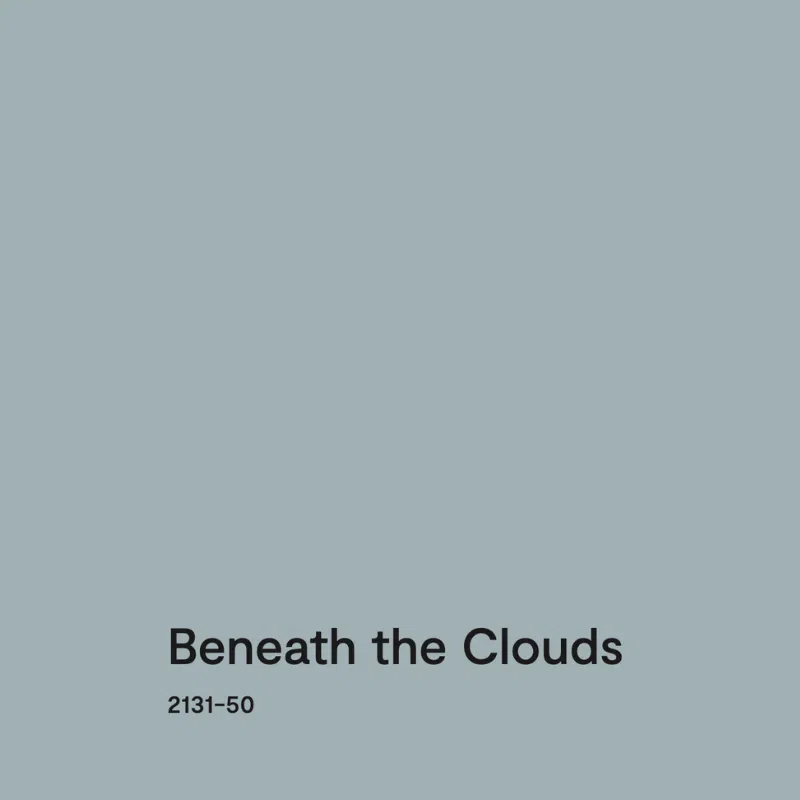
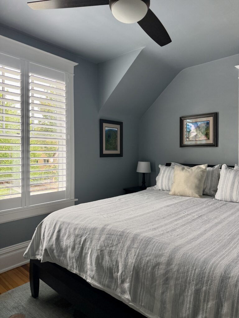
Benjamin Moore Beneath the Clouds
- LRV: 41.78
- Undertones: Strong blue
Benjamin Moore Beneath the Clouds (Sample), formally called Nimbus Gray, is a medium blue-gray with strong blue undertones. It’s soft but still has plenty of pigment, so it won’t look washed out even in bright sunlight. If a client wants a blue room but their space gets very cool light, this is one of our favorite hues to recommend.
Our client’s bedroom (Article) below looks absolutely gorgeous with this light blue paint color on the walls.
Benjamin Moore Mount Saint Anne
- LRV: 41.9
- Undertones: Green
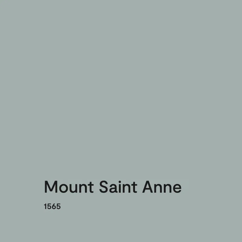
BM Mount Saint Anne (Article) is one of the darker paint colors we’re featuring in this guide. It’s a light blue-gray hue that has warm green undertones. This is the kind of color that makes a statement without overpowering a space.
We love to use Mount Saint Anne (Sample) for bedrooms, offices, and accent walls (Article), such as in the home pictured below.
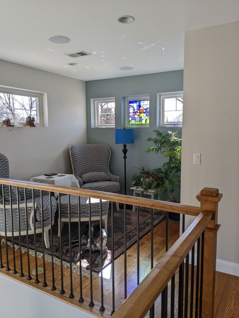
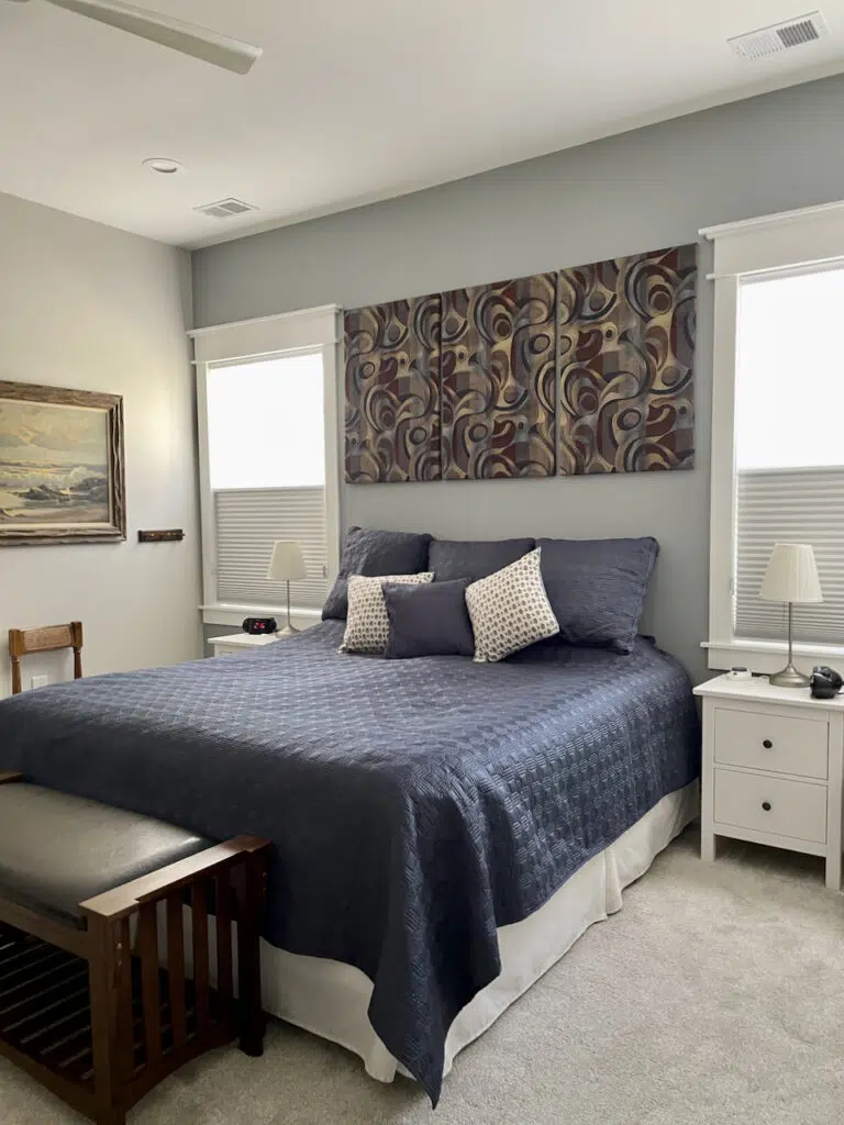
Benjamin Moore Adagio
- LRV: 39.16
- Undertones: Blue
Benjamin Moore Adagio (Sample) is a soft gray with strong blue undertones. It’s colorful enough to use as a gentle blue paint color without overpowering a space. In our client’s home (Article), pictured below, we used Adagio as an accent wall color in the primary bedroom, pairing it with Classic Gray (Article) walls and navy decor.
Sherwin-Williams Debonair (SW 9139)
- LRV: 34
- Undertones: Blue
SW Debonair (Sample) is a gorgeous, cool blue-gray paint color that looks brighter than you’d expect outdoors. But because it is so muted it won’t glow in the sunshine like some other light blue paint colors.
Inside, this color borders on a mid-tone blue, but it looks surprisingly light in bright sunlight, such as on our client’s Victorian home (Article) below.
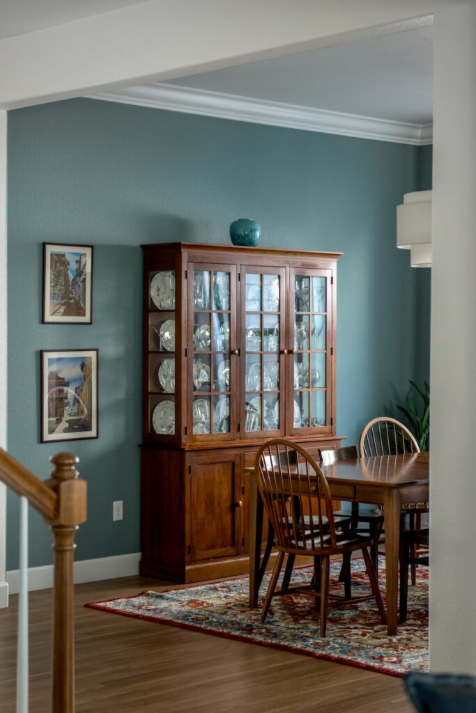
Farrow & Ball Oval Room Blue
- LRV: 33
- Undertones: Green
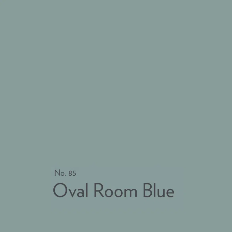
Oval Room Blue by Farrow & Ball (Article) is a luminescent blue-green. While we typically consider this more of a mid-toned teal, it is too beautiful not to include in a list of our favorite light blue paint colors. Oval Room Blue (Sample) paint color glows like an iridescent gem in the most beautiful way. We’ve used it as a dining room paint color and accent wall paint color, but you could use it in many different applications.
Sample The Best Light Blue Paint Colors
We always recommend that you test paint colors (Article) in your home because lighting can completely change a color, both on interiors and exteriors.
In the old days, this meant we painted a large poster board with sample pots and a huge mess.
Now we have a better way to test paint, with Samplize Peel-and-Stick samples!
- Samples pre-painted with 2 coats of real paint from the manufacturer.
- Large 9” x 14” samples to see the color better in the lighting.
- Delivered overnight
- Colors are accurate
- Less expensive than painting a large poster board with sample pots
- No mess, and no toxic paint to dispose of
I use these in my color consulting practice for exact results. Discover Samplize peel-and-stick paint samples and sample all your favorite light blue paint colors via the links below.
- Benjamin Moore Crystal Springs
- Sherwin-Williams Lullaby
- Benjamin Moore Gray Cashmere
- Sherwin-Williams Tradewind
- Benjamin Moore Woodlawn Blue
- Benjamin Moore Stonington Gray
- Sherwin-Williams Gray Screen
- Sherwin-Williams Upward
- Benjamin Moore Smoke
- Benjamin Moore Instinct
- Sherwin-Williams Niebla Azul
- Benjamin Moore Wedgewood Gray
- Sherwin-Williams Languid Blue
- Benjamin Moore Beneath the Clouds
- Benjamin Moore Mount Saint Anne
- Benjamin Moore Adagio
- Sherwin-Williams Debonair
- Farrow & Ball Oval Room Blue
Key Learning Points
Light blue paint colors can bring a calm, airy feel to any room, but the secret to getting them right is choosing the correct undertone and tone for your space and light.
- The best light blues are usually muted blue-grays rather than bright, saturated blues, which can look electric on the wall, especially in sunny or cool, north-facing rooms.
- Always identify the undertone first: green undertones read warmer and more flexible, while violet undertones read cooler and can border on a purple “blurple.”
- Factor in your room’s exposure and use LRV as a guide to lightness, and always test your color in your own space before committing.
Remember: NEVER, EVER use paint matches from a different brand than the one specified. Results are poor and there are no standards for the sheens. Even though your painter may truly believe it can be done, don’t do it. See results from paint matching here.
No matter what, always test your paint colors. It’s a standard best practice. Whenever I test my paint colors, they are perfect, and when I don’t test they turn out wrong. Learn how to test your paint colors here.
Online Color Consulting
Still need help picking the best paint colors? Discover our Online Color Consulting Packages.

Related Posts
About the Author

Hi, I’m Michelle Marceny, founder, owner, and Principal Color Designer at The Color Concierge. I believe a fresh coat of paint can completely transform a space. The Color Concierge was born out of my drive to help clients fall back in love with their homes. My clients trust me to help them find the perfect paint color for their home – whether it’s a whole-house paint color scheme or ideas for a single room.
Since The Color Concierge was founded in 2017, we have completed over 3000 color consultations, both online and in-person. I am a Certified Color Expert with 7 years of experience creating interior and exterior color palettes throughout North America.
We love your comments! Please note that the blog is meant as general advice, and it is not possible to give out specific answers to your paint questions. If you want more specific advice, our Online Color Consultations will help you pick your paint colours. Thank you for your understanding.
