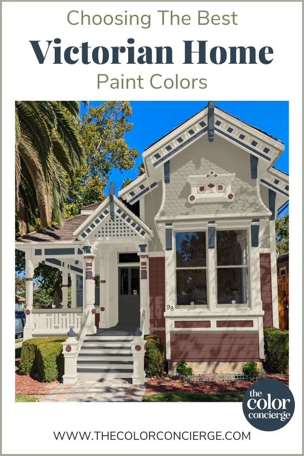
We’ve been lucky to help choose paint colors for some really beautiful homes, from ultra-modern homes to cozy farmhouses and everything in between. But choosing exterior paint colors for Victorian homes is one of the best parts of the job.
Historic homes, especially Victorians, often come with many unique architectural details that can be enhanced with the right exterior paint colors. That is the case in the project we’re featuring today – a gorgeous Victorian home in Florida.
This fall, we worked with the homeowner on a Historic House Exterior consulting package to create a series of Victorian house color palettes and help them find the colors that would truly bring this gorgeous home to life. The project is in Florida, and the palm trees look so unexpected next to this historic house.
Today, I wanted to share the process we use to choose exterior paint colors for Victorian homes and share four of our favorite historic house color combinations to inspire your next project. Just here for color inspiration? Skip right to the color palettes!
*This post contains affiliate links for products I use and love. If you click on some links and make a purchase, I will get a small commission at no cost to you. This helps pay for the costs of the blog, so I can continue to offer great content to our readers.
About The Color Concierge
Our Colorado-based paint color consultants make finding the right paint colors for your home easy. Whether you’re painting the exterior or interior of your home, our simple yet effective process lets us get your paint color right the first time. We’ve helped thousands of homeowners transform their homes into a space they love. Learn more about ONLINE COLOR CONSULTATIONS today.
How to Choose Exterior Paint Colors for Victorian Homes
The homeowners of this beautiful Victorian house came to us because they were ready to bring their home into the modern age while still honoring its history.
The goals for the project were simple: boost the curb appeal of this property, eliminate the gold details of the original exterior, and create a more intentional, cohesive look that is updated but still classic.
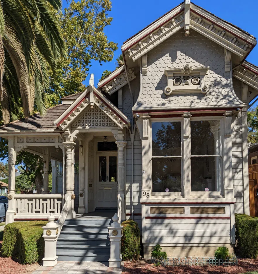
This home started with a simple color palette, especially for a Victorian home. And because the existing palette was too light, it looked thoroughly washed out in the bright Florida sunshine.
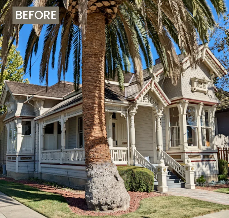
There simply wasn’t enough contrast to showcase this historic home’s unique architectural details! We knew we needed to create a color scheme to help all these little details stand out.
We started by considering some critical details of any paint color consulting project.
Things to Consider When Choosing Exterior Paint Colors
No matter what kind of home we’re working on, there are always a few things we consider when designing exterior paint color palettes. These include:
Location
The location and natural environment around your home can impact your chosen exterior paint colors. Lots of green leaves and trees can change the way some colors (particularly whites and grays) look on your house, for example. And in places like Florida, where the sun is very bright, a paint color that is too light can look very stark. We usually pick paint colors that are darker and more muted than expected for sunny or high-altitude climates.
Architectural Details
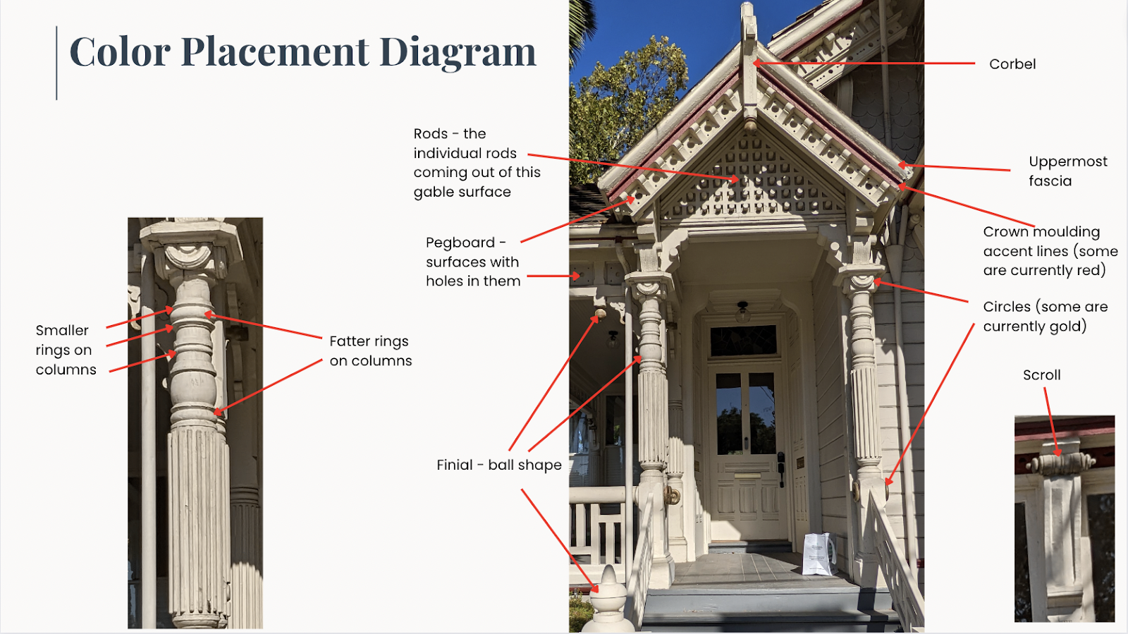
Every home has exterior trim like siding, window trim, fascia, and soffits that must be considered when creating a color palette. But with Victorian and other historic homes, additional elements are considered.
In this particular house, we knew we needed to choose paint colors for the traditional trim pieces and many other small details, including pegboard, scroll accents, columns, and even floral accents.
You can see in this image from our color consultation report just how many details needed to be considered when we chose paint colors.
How many colors should a Victorian house have?
Over the years of working on other Victorian home color palettes (Article), we’ve discovered that when it comes to exterior paint colors …less can be more. Frequently, Victorian homes have too many paint colors. They look too busy and don’t have a cohesive, consistent look. We often find a balance between adding enough colors to highlight features without overwhelming the home with a psychedelic rainbow.
When we choose exterior colors for Victorian homes and other historic properties (Article), we target 6-10 paint colors in each palette. This may seem like a lot, but by the time you include the front door, shutters, fascia, soffits, siding, and one accent color, that’s already six colors! This ensures a simple, cohesive look and keeps painting costs down compared to a palette with many more colors.
Labor is the most significant component of any paint job, and the more paint colors you pick for a historic house, the higher the cost. It’s expensive to tape edges and change paint colors.
Nine Guidelines to select a Victorian Color Scheme
Consider these guidelines and not rules. Painting a Victorian home is art, but these are some elements that we always consider.
✅ Stick with 6-10 paint colors for most complex projects.
✅ Specify one color per feature and shift colors with different surfaces.
✅ If you have many features, consider using one color for two or three features to reduce your number of paint colors. For example, you could paint the scallops and diamonds one color. This can also tie several of the elements together.
✅ End colors on an inside corner.
✅ Avoid highlighting too many small features with different colors. This can look choppy and disjointed. Consider a lighter color to show off the details if a surface has many complicated features.
✅ Start with lighter and darker versions of the same hues to create a palette that doesn’t overwhelm you. Add 1-2 contrasting or complementary colors to add more interest.
✅ Consider painting the darkest colors on the bottom to ground the palette.
✅ If you have a lot of stripes in your design, especially on gables, make sure that they don’t look like a rugby shirt. That would be an excellent place for one or two light colors.
✅ Specify one color for the porch floor and stair treads if you have them.
Sample Colors
We always recommend that you test paint colors (article) in your home because lighting can completely change a color, both on interiors and exteriors.
In the old days, this meant we painted a large poster board with sample pots and a huge mess.
Now we have a better way to test paint, with Samplize Peel-and-Stick samples!
- Samples pre-painted with 2 coats of real paint from the manufacturer.
- Large 9” x 14” samples to see the color better in the lighting.
- Delivered overnight
- Colors are accurate
- Less expensive than painting a large poster board with sample pots
- No mess, and no toxic paint to dispose of
I use these in my color consulting practice for exact results. Discover Samplize peel-and-stick paint samples via the link below.
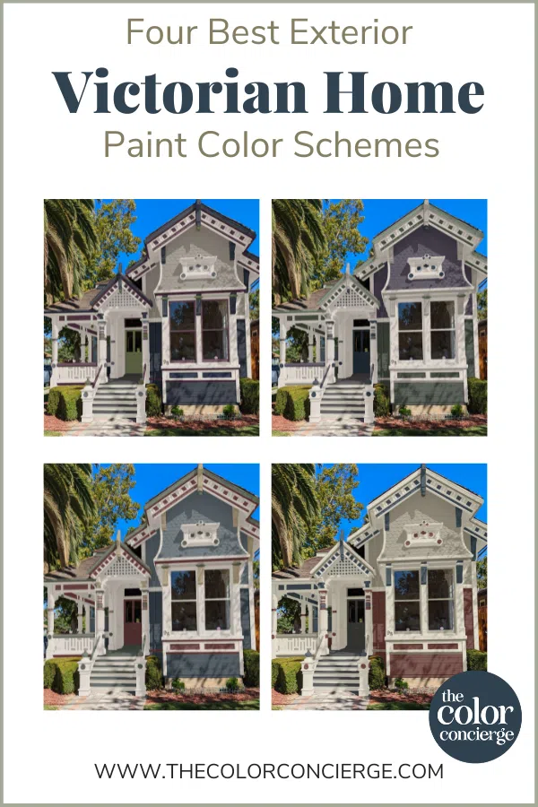
Four Victorian House Exterior Color Schemes We Love
In all of our paint color consultations, we put together a series of paint color palettes for the clients to choose from. We work with our clients to help them test paint colors and adjust them as needed to develop the perfect palette for their homes.
For this project, we designed four beautiful palettes of exterior colors for Victorian homes. All paint colors are Sherwin-Williams.

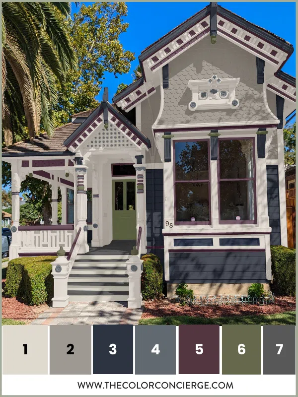
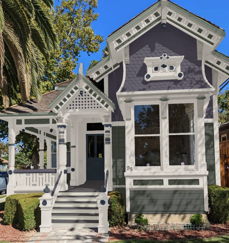
Sherwin Williams Foggy Day & Sea Serpent
This palette uses a light and darker shade of muted blue exterior paint on the body with gorgeous dark green and red accents for a classic historic home color palette.
The palette is simplified because I used mainly white on the woodwork but used accent colors to define specific features like the pegboard, crown molding, and columns.
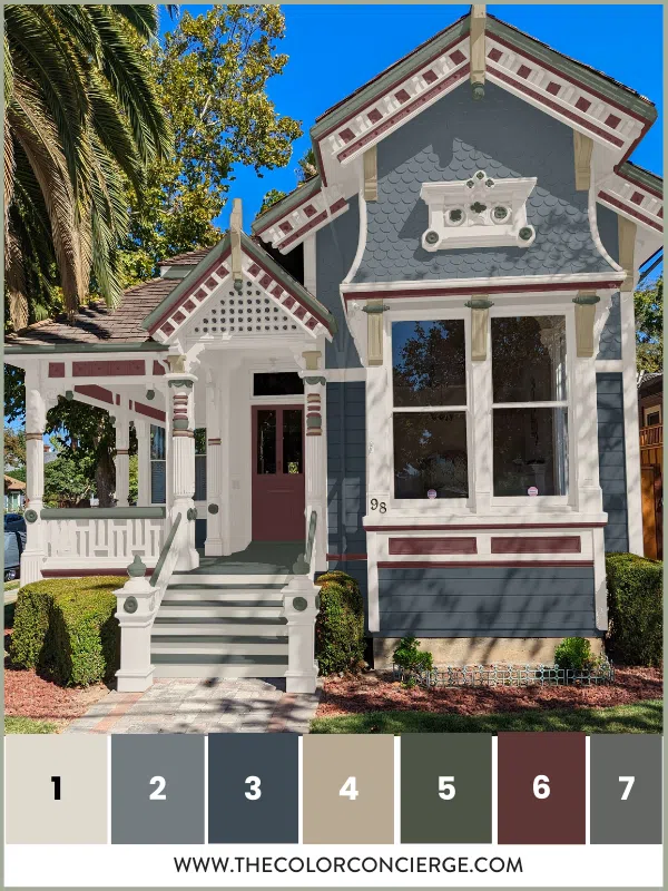
This Victorian house color palette includes the colors below. To order a Samplize test color bundle for this palette, link here.
1. Egret White (SW 7570)(Sample): We chose this darker white exterior paint for the primary white trim color. It is used for the fascia, trim, porch ceiling, columns, caps, corbels, window frames, and stair risers.
2. Foggy Day (SW 6235): This gorgeous, deep gray-blue exterior paint is a charming siding color for a Victorian home. In this palette, it is used on the scalloped siding details.
3. Sea Serpent (SW 7615)(Sample): Sea Serpent paint is a muted navy blue with barely-there green undertones. On this house, it works beautifully as a darker accent to Foggy Day. We used it on the home’s horizontal siding and the dot accents on the entry gable.
4. Universal Khaki (SW 6150)(Sample): A classic neutral paint color, Universal Khaki was the perfect warmer accent to the cool blue grays in this palette. We used it for the fatter rings on the columns and corbels.
5. Forestwood (SW 7730)(Sample): This deep, muted green paint color stands against the blue siding without being too loud or overpowering. We used it for the uppermost fascia and various architectural details, including the circles, flower shapes, finials, corbels, scrolls, and handrails.
6. Sommelier (SW 7595)(Sample): We love to choose one color that pops out from the rest of the palette. In this Victorian house color scheme, Sommelier plays that role. This deep burgundy red paint was used for crown molding accent lines, the smaller rings on the columns, the pegboard, and rectangles under the bay window and doors.
6. Grizzle Gray (SW 7068)(Sample): This beautiful, deep charcoal gray exterior paint is perfect for highlighting small accents on this home, including the porch floor and stair treads.
Order this sample color bundle:
Sherwin-Williams Acier and Anchors Away:
This palette was created after talking with the client about high-contrast exterior paint colors for Victorian homes. I love the deep dark navy paired with a cool gray and the gorgeous dark green and blackberry accents.
The look is unique and very high-end. It will bring new life to an old home!
This Victorian house color palette includes the colors below. To order a Samplize test color bundle for this palette, link here.
1. Egret White (SW 7570)(Sample): We stuck with Egret White in this color palette, this time using it for the fascia, uppermost fascia, trim, porch ceiling, columns, caps, and stair risers.
2. Acier (SW 9170)(Sample): Acier is a really lovely medium gray paint with subtle warm undertones. In this palette, we use it on the scalloped siding to contrast with the home’s horizontal siding.
3. Anchors Aweigh (SW 9179)(Sample): This beautiful blue exterior paint is more saturated than the muted navy of Sea Serpent and looks beautiful with Acier. We used it on the home’s horizontal siding, the rectangles under the bay window, the uppermost facia, and corbels.
4. Gibraltar (SW 6257)(Sample): Gibraltar is a muted blue paint that accents the lighter (and warmer) Acier. We used it for the rods on the entry gable, circles, flower shapes, and the fatter rings on columns.
5. Blackberry (SW 7577)(Sample): Blackberry is a red paint with deep violet undertones. It looks gorgeous on some of this home’s larger trim and architectural details, including the window frames, pegboard, crown molding accent lines, handrails, and the smaller rings on columns.
6. Oakmoss (SW 6180)(Sample): Oakmoss is a saturated, natural green with yellow undertones. It balances this cool palette with a burst of warmth. We used Oakmoss on the scrolls, finials, and doors.
7. Peppercorn (SW 7674)(Sample): A dark charcoal gray, Peppercorn is perfect for the porch floor and stair treads.
Order this sample color bundle:
Sherwin-Williams Honed Soapstone & Carriage Door
This combination of red, green-gray, and creamy white is warm and welcoming. The dark blue and black accents pair nicely with the rest of the palette to balance the color and contrast. My favorite detail is how the window frames match the lighter body color for a harmonious look.
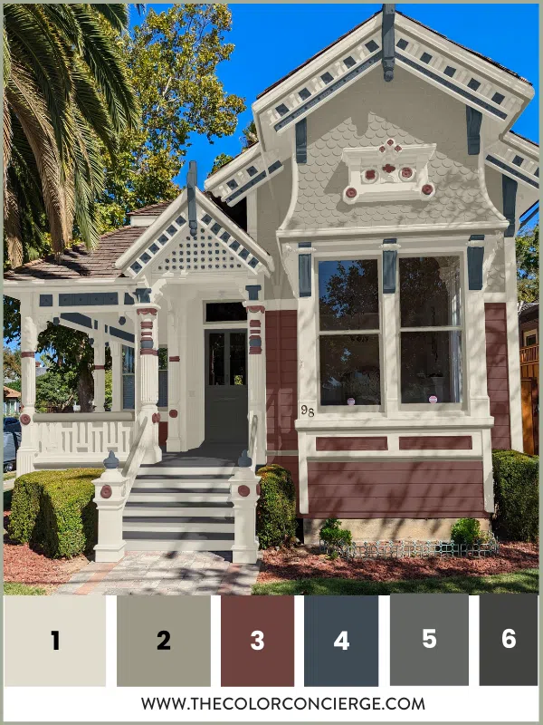
The colors for this palette are included below. To order a Samplize test color bundle for this palette, link here.
1. Oyster White (SW 7637)(Sample): Oyster White is warmer and creamier than Egret White and looks lovely paired with the warmer siding colors in this palette. We used Oyster white on the fascia, uppermost fascia, trim, porch ceiling, columns, caps, scrolls, and stair risers.
2. Honed Soapstone (SW 9126)(Sample): This gorgeous warm gray has warm, yellow undertones and works as a lighter but saturated neutral in this palette. We used it on the scalloped siding, window frames, crown molding accent lines, and handrails.
3. Carriage Door (SW 7594)(Sample): This timeless deep red paint is warmer than the Blackberry used in the last palette and offers a nice contrast to the Honed Soapstone siding. We used Carriage Door on the horizontal siding, circles, flower shapes, rings on columns, and rectangles under the bay windows.
4. Sea Serpent (SW 7615)(Sample): In this historic home exterior color scheme, Sea Serpent is serving as a deep blue accent to accentuate some of this home’s more minor details, including the rods, corbels, finials, and pegboard.
5. Grizzle Gray (SW 7068)(Sample): We used this charcoal gray exterior paint to highlight the porch floor and stair treads and complement the slightly darker Iron Ore front door.
6. Iron Ore (SW 7069)(Sample): Iron Ore is a soft black that works perfectly for a timeless front door.
Order this sample color bundle:
Sherwin-Williams Quixotic Plum & Ripe Olive
We love this Victorian home palette’s dark green and purple color combination. I added light green and navy accents to balance the colors and a soft gray to neutralize the look. The gray makes this look very sophisticated.
Our clients chose this palette from the four options, and we couldn’t be happier with the results!
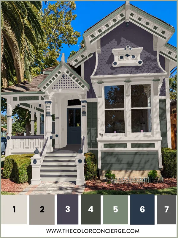
The colors for this palette are included below. To order a Samplize test color bundle for this palette, link here.
1. Pavestone (SW 7642)(Sample): This warm gray looks lovely with the warm greens in this palette. We used Pavestone on this home’s crown molding accent lines, corbels, finials, and the smaller rings on the columns.
2. Quixotic Plum (SW 6265)(Sample): This dark but muted plum color is so beautiful on this home! We used this color on the scalloped siding, handrails, and rods.
3. Ripe Olive (SW 6209)(Sample): This dark green paint has muted blue undertones, offering a good balance of warmth and cooler tones. It looks so beautiful paired with Quixotic Plum. We used this color on the horizontal siding, rectangles under the bay window, and the pegboard.
4. Privilege Green (SW 6193)(Sample): This slightly lighter green hue offers contrast without making the house feel too busy. We used this color on the home’s uppermost fascia and scrolls.
5. c (SW 9178)(Sample): This intense navy blue is a great accent color to pull together small details throughout the house, including the doors, finials, circles, flower shapes, and the fatter rings on the columns.
6. Peppercorn (SW 7674)(Sample): A dark charcoal gray, Peppercorn is perfect for highlighting the porch floor and stair treads.
Order this sample color bundle:
You can see in the before-and-after photos below just how this paint palette transformed this home. Compared to the original color scheme, this palette’s gorgeous exterior paint colors for Victorian homes are genuinely one-of-a-kind.
Key Learning Points
Choosing exterior paint colors for Victorian homes is not much different than building any other exterior paint color palette. Just remember to pay attention to a few key considerations. Details are outlined in the article.
- Don’t choose colors that are too light (even when choosing white paint(Article)). They will look too stark or washed out in the bright sunlight.
- Stick with 6-10 paint colors for most complex projects.
- Specify one color per feature, and shift colors with different surfaces.
- Start with lighter and darker versions of the same hues to create a palette that doesn’t overwhelm you. Add 1-2 contrasting or complementary colors for more interest.
Test Your Paint Colors!!
Testing paint colors is an essential step of the paint color selection process. Don’t skip this step, especially for such a complex project. Learn how to test your paint colors.
When you’re ready to test your paint colors, make it easy with Samplize. Their pre-painted peel-and-stick paint samples can be tested on various parts of your home and moved around as needed to ensure you’re choosing paint colors that work well in your home’s shifting light.
Check out the SAMPLIZE website.
And remember: NEVER, EVER use paint matches from a different brand than the one you will use. Results are poor, and there are no standards for the sheens. Even though your painter may truly believe it can be done, don’t do it. See results from paint matching.
Online Color Consulting for Victorian Homes
Are you still looking for the perfect exterior paint colors for a Victorian home?
Discover our Online Color Consultations. We even offer Victorian house exterior paint consulting packages designed just for houses like yours!
Related Posts:
Project Review: Historic House Project Update – from Spooky to Spectacular (Article)
A Victorian Palette: The Painted Gentleman (Article)
Project Review: Victorian Home Paint Color Palette (Article)
Exterior White Paint Color Palettes (Article)
How to Design a Whole House Interior Paint Color Palette (Article)
Coastal Victorian Exterior Color Palette (Article)
About the Author

Hi, I’m Michelle Marceny, founder, owner, and Principal Color Designer at The Color Concierge. I believe a fresh coat of paint can completely transform a space. The Color Concierge was born out of my drive to help clients fall back in love with their homes. My clients trust me to help them find the perfect paint color for their home – whether it’s a whole-house paint color scheme or ideas for a single room.
Since The Color Concierge was founded in 2017, we have completed over 3000 color consultations, both online and in-person. I am a Certified Color Expert with 7 years of experience creating interior and exterior color palettes throughout North America.
If you like this post, don’t forget to PIN it!
We love your comments! Please note that the blog is meant as general advice, and it is not possible to give specific answers to your paint questions. If you want more specific advice, our Online Color Consultations will help you pick your paint colors. Thank you for your understanding.

4 Responses
Hello!
Thank you for the informative article. The authority in the matter of colors for Victorian homes is the Old House Guy website. See: https://www.oldhouseguy.com/accenting-victorian-house-colors/
I’ve learned a lot from this website and others when it comes to colors and most importantly color placement for Victorian homes.
Continue the good work.
All the best,
Martin
Hello,
I wondered if you would be able to recommend a software I can use to visualize paint colors. I’ve tried using what Sherrington Williams has on their site, but it does not work on Victorians with a lot of detail.
Any suggestions?
Thanks,
Priscilla
I’m currently looking at an 1800 Victorian home for sale. Strangely enough the front of the home seems to look like the backend of the home. The porch is on the side and is narrow. This porch leads to the front door. Pretty much in the middle. I’m hoping the bones of the home are in good shape. This will make me consider an offer to make to the bank.
I love many of the colors you created, and I would think these choices would add value to any Victorian home.
Thank you so much! I’m glad you enjoy our Victorian palettes.