Learn all about Benjamin Moore Seapearl (OC-19) in this paint color review.
As color consultants and color geeks, we continue to see warm white paint colors as a popular trend for interior and exterior paint. With so many warm whites having yellow undertones, it can be hard to find the right creamy color that won’t look yellow on your walls.
That’s where Benjamin Moore Seapearl comes in. BM Seapearl is a very light warm greige paint color that borders on cream. When clients want a creamy look that won’t skew to yellow, this is the color we often recommend.
It’s beautiful for interior and exterior applications and is a fantastic whole-house paint color. It’s an excellent option for people who don’t like gray but also want something with a bit more pigment than a traditional white paint color.
Keep reading to learn more about Benjamin Moore Seapearl and how you can use this greige paint color in your own home.

*This post contains affiliate links for products I use and love. If you click on some links and make a purchase, I will get a small commission at no cost to you. This helps pay for the costs of the blog, so I can continue to offer great content to our readers.
About The Color Concierge
Our Colorado-based paint color consultants make finding the right paint colors for your home easy. Whether you’re painting the exterior or interior of your home, our simple yet effective process lets us get your paint color right the first time. We’ve helped thousands of homeowners transform their homes into a space they love. Learn more about ONLINE COLOR CONSULTATIONS today.
What Color is Benjamin Moore Seapearl?
Benjamin Moore Seapearl is a very light greige paint color. It’s darker than traditional white paint colors and creamy without looking yellow. It’s a seriously gorgeous neutral paint color that works in a variety of spaces.
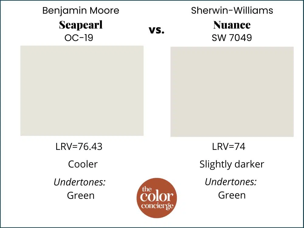
What is the LRV of Benjamin Moore Seapearl?
The LRV of BM Seapearl (Sample) is 76.43. It’s not quite a cream but still soft and light on the wall. It has enough pigment to look warm and inviting even in rooms with cool or low light and is great for clients who want to go lighter without picking a white color.
LRV is short for Light Reflectance Value, which measures how light (LRV=100) or dark (LRV=0) a color is.
What are the Benjamin Moore Seapearl undertones?
Seapearl’s undertones are a very subtle green. This makes this color so unique – it looks like creamy off-white paint on the wall but doesn’t have noticeable yellow undertones.
Is BM Seapearl warm or cool?
Thanks to its green undertones, Seapearl is a warm paint color. It works well in rooms with cool light, but it also looks lovely in rooms with warm light and won’t skew yellow in place.
Sample Seapearl
We always recommend that you test paint colors (article) in your home because lighting can completely change a color, both on interiors and exteriors.
In the old days, this meant we painted a large poster board with sample pots and a huge mess.
Now we have a better way to test paint, with Samplize Peel-and-Stick samples!
- Samples pre-painted with 2 coats of real paint from the manufacturer.
- Large 9” x 14” samples to see the color better in the lighting.
- Delivered overnight
- Colors are accurate
- Less expensive than painting a large poster board with sample pots
- No mess, and no toxic paint to dispose of
I use these in my color consulting practice for exact results. Discover Samplize peel-and-stick paint samples and sample Seapearl (Sample) via the link below.
Using Benjamin Moore Seapearl Interior Paint
Benjamin Moore Seapearl is a lovely, versatile paint color that can be used for many different interior paint projects. It works well in various spaces and can even be used as a whole-house paint color for interiors.
Can I use Seapearl as an interior trim color?
I wouldn’t recommend using Seapearl as an interior trim color for a wall painted with a different color. It’s a bit too dark and too creamy for that.
Even in homes with Seapearl walls, I usually prefer a lighter white trim color to provide some contrast. But color drenching the walls and trim with Seapearl can work.
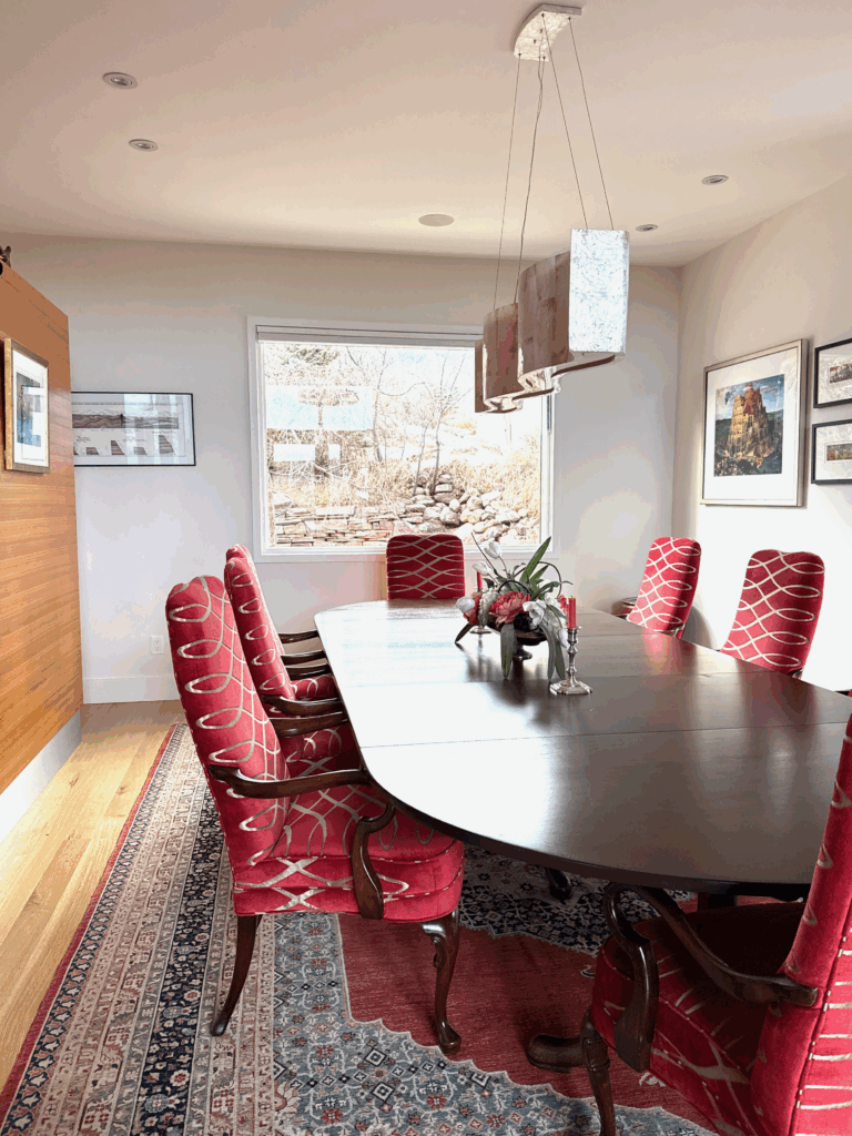
In one of my clients’ homes featured in this post, Seapearl is actually used as the trim color (in a higher sheen like satin) and the ceilings are Seapearl at 50%. In this case, this color combination works – mostly because many of the ceilings are very high and there is a ton of natural light.
This client’s home was actually already painted this way when I met with them, but it was a great example of Seapearl interior paint.
Should I try Benjamin Moore Seapearl kitchen cabinets?
Seapearl cabinets would be really beautiful! If you love the look of traditional white kitchen cabinets (Article) but want something that won’t look too stark or cold, BM Seapearl is a fantastic choice. This color would also look nice as an upper cabinet color in a tuxedo cabinet color scheme (Article).
What about a Seapearl dining room?
A dining room painted with Benjamin Moore Seapearl is a beautiful idea! Our client’s home included a Seapearl dining room and I absolutely love the way this color looks in this space.
The room feels light and bright even though it has fairly low light and dark wood furniture. The Seapearl walls keep the space feeling airy and welcoming.
Can I paint a BM Seapearl living room?
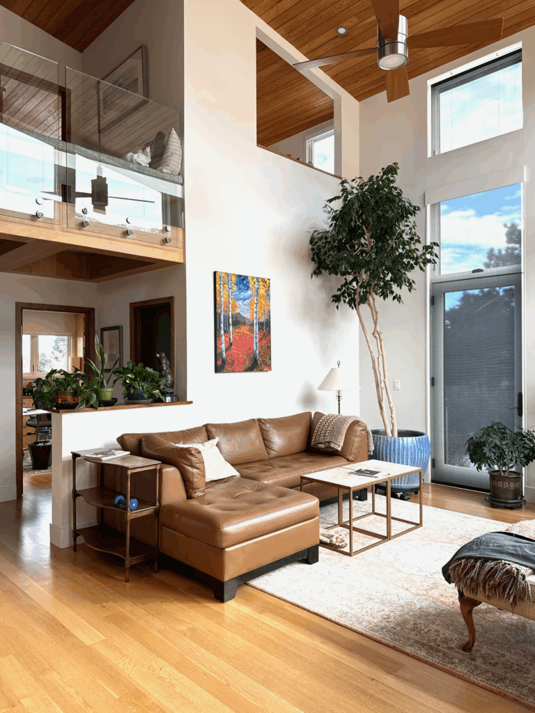
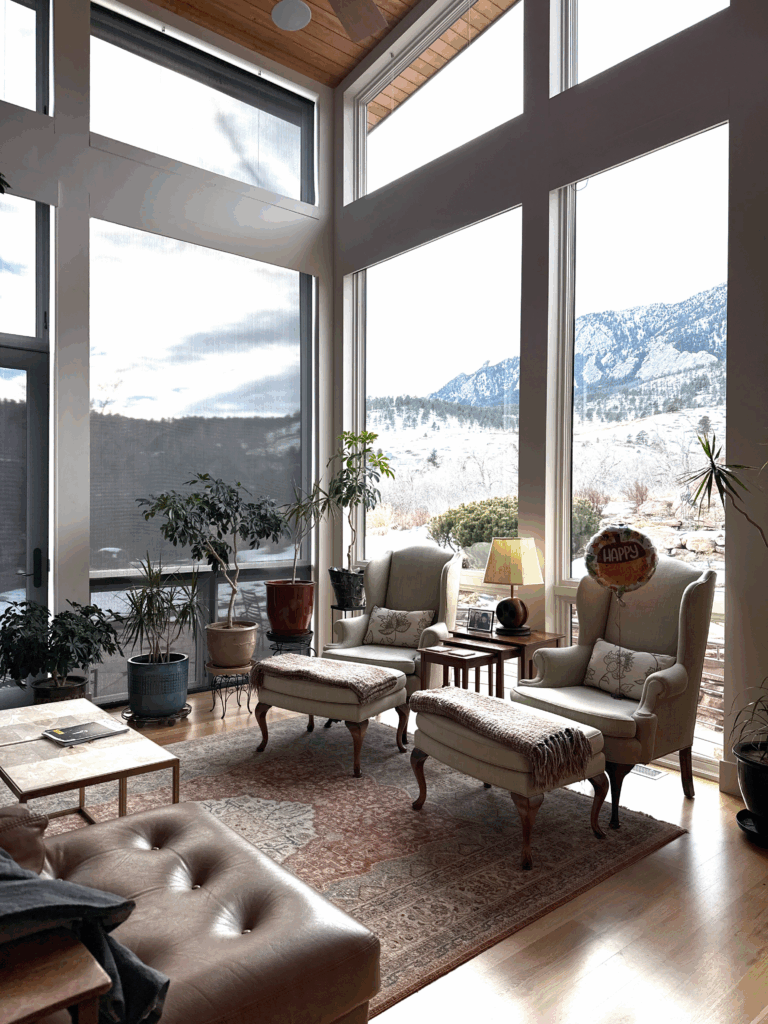
Yes, a Seapearl living room would be beautiful. In our client’s mountain home, we used Seapearl paint in a few different living room spaces throughout the home. While each space is very different, Seapearl looks lovely in all of them.
In the main living room, for example, Seapearl looks soft and light thanks to huge windows and vaulted ceilings.
On the other side of the room, which has less direct light, Seapearl looks much darker and cooler, but still beautiful. It creates a gorgeous frame around the windows that shows off the incredible view outside.
And in a smaller living space within the home, which has lower light, Seapearl still shines on the wall!
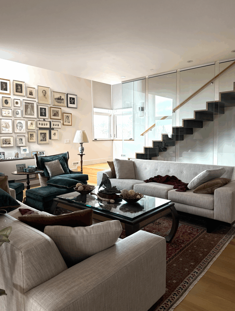
It looks really beautiful with the warm wood floors and colorful art in this space.
Is Seapearl good for North-facing rooms?
Absolutely! Seapearl is one of our go-to light neutrals for interiors, especially in cool North-facing rooms, because of its warmth. I often pick Seapearl if we want a warmer version of Benjamin Moore Classic Gray (Article).

Is Seapearl a good bedroom color?
Seapearl is one of my favorite calming bedroom paint colors (Article). If you’re looking for a neutral, go-with-anything foundational color for your bedroom, Benjamin Moore Seapearl is a fantastic choice.
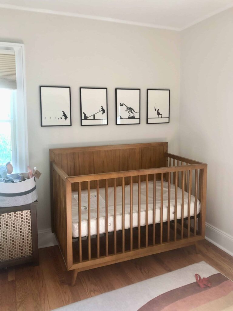
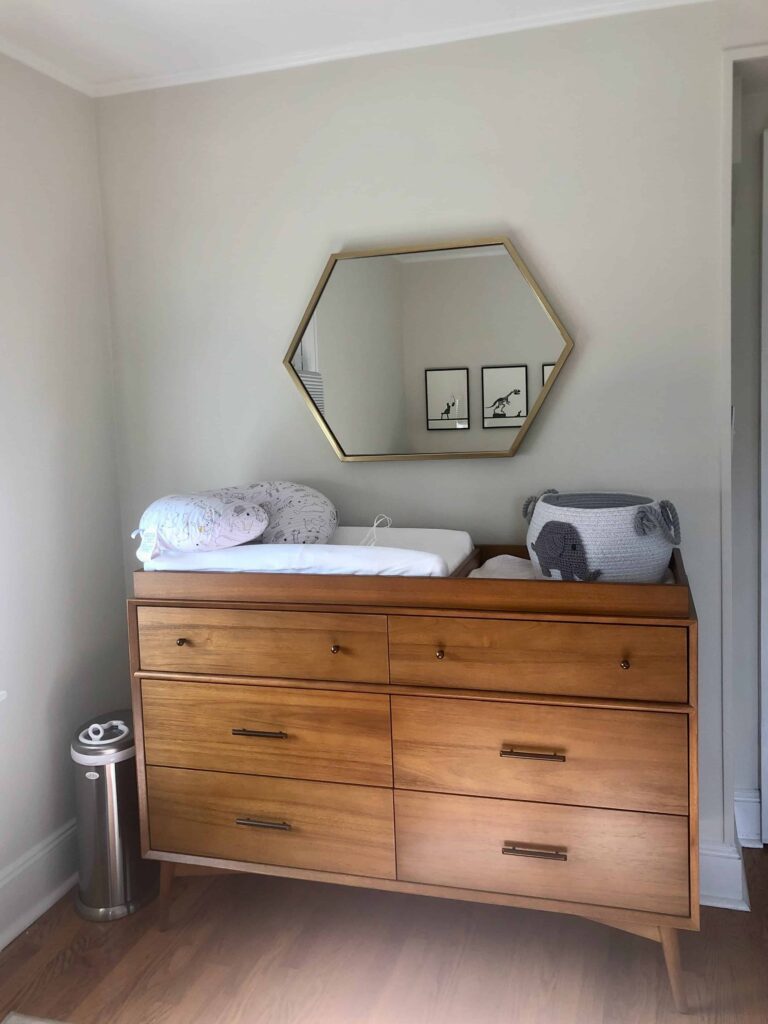
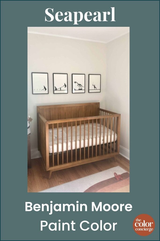
This client painted their child’s nursery with BM Seapearl to create a lovely, gender-neutral look in this space. It looks warm and soft even in the more shadowy parts of the room.
Is BM Seapearl a good whole-house color for interiors?
Seapearl is a fantastic choice for a whole-house paint color. It’s warm enough to look beautiful in rooms with cooler light but can also work in warmer spaces without skewing yellow.
It’s versatile enough for kitchens, bathrooms, bedrooms, and even open-concept spaces. It can also work well for transitional spaces like entryways and hallways, such as in my client’s home below.
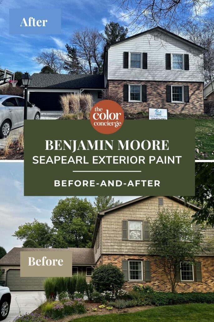
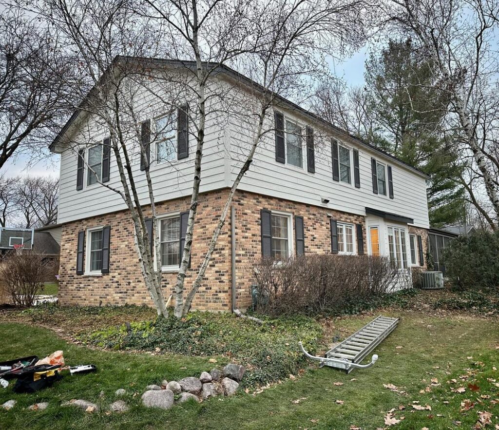
Project Spotlight: Using Benjamin Moore Seapearl Exterior Paint
Benjamin Moore Seapearl is also a wonderful exterior paint color. It works well as a white exterior paint (Article) color because it looks crisp without looking harsh in the bright sunlight.
Paint colors look 4-5x brighter outside than indoors, so picking a light greige paint color is one of the best ways to get a white exterior palette without it looking too stark. BM Seapearl exterior paint looks especially lovely with brick because of its warmth.
BM Seapearl exterior paint completely transformed this client’s home in the upper mid-west.
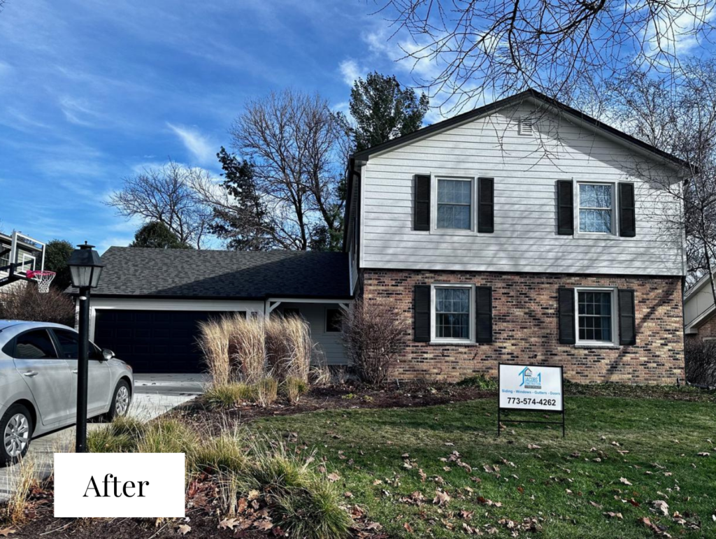
The home looks significantly brighter and more modern than the original color palette, which featured beige shingles and olive green trim.
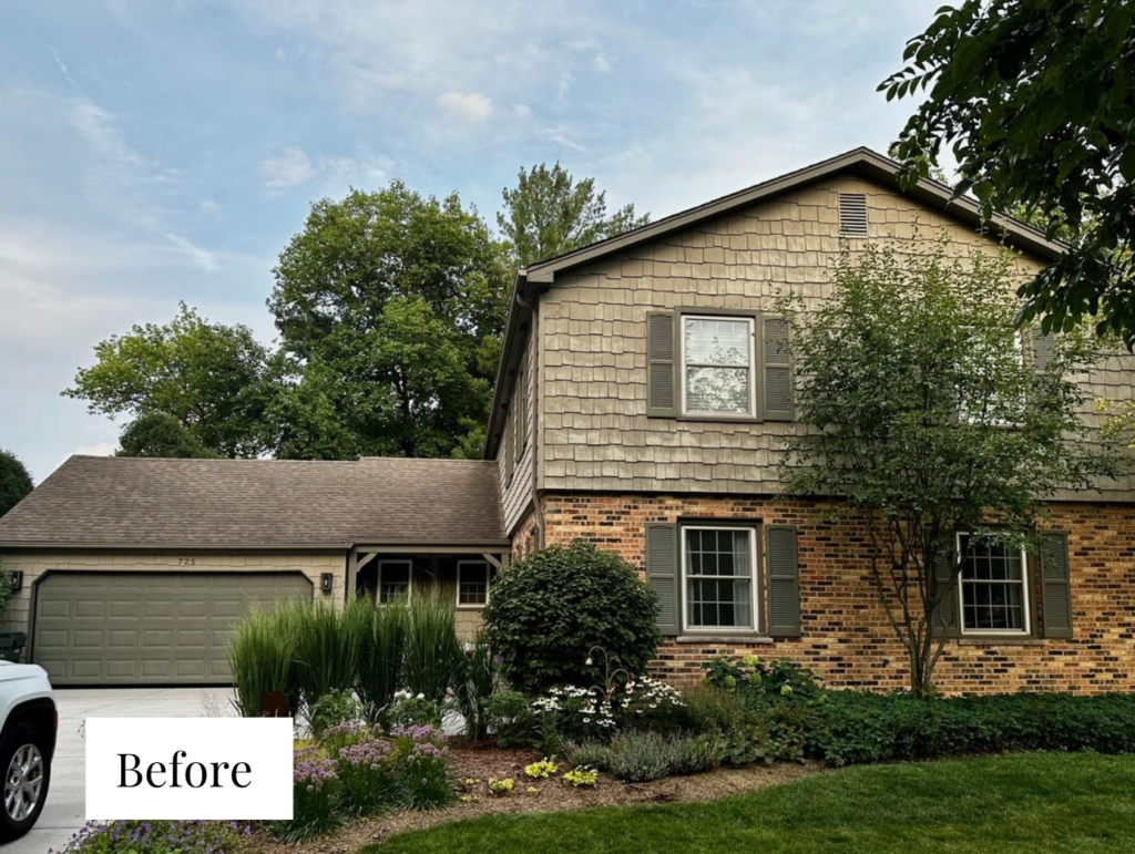
Originally, our client asked us to consider painting the brick, although they didn’t really want to because of the higher project cost. We gave our client color scheme options with and without the brick. We often look at Pinterest for inspiration about current paint trends and lately, we’ve seen the question, “Which colors go best with brick?” skyrocket.
This means that homeowners want to keep their brick more frequently – and we’re seeing that trend among our color consulting clients, too!
It sometimes makes sense to paint your brick – for example, if you hate natural brick, it’s stained, shows signs of age, or if you have brick and stone that don’t match each other.
In this case, the clients decided to stick with the natural brick, and Benjamin Moore Seapearl exterior paint was the perfect complement! Seapearl looks crisp without looking harsh and pairs well with brick (Article) because of its warmth.
The clients replaced the architectural shingles with siding, which we painted with BM Seapearl. We chose Sherwin-Williams Iron Ore (Color review article), a soft black paint color, for the fascia, shutters, front door, and garage door.
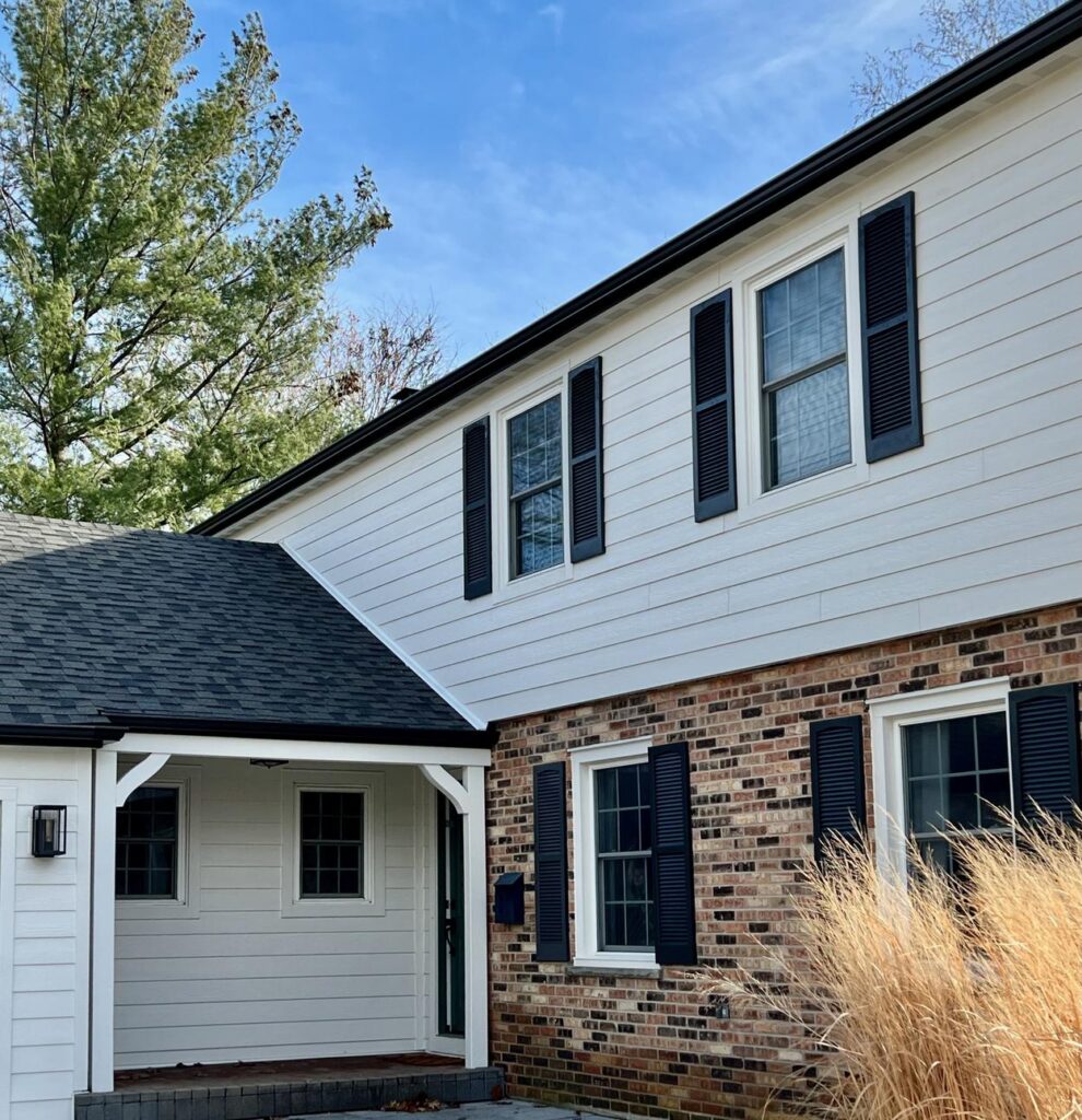
We usually paint the soffits the same color as the fascia, but in this case, we kept them white because the eaves are fairly wide in some places, and I thought it would look too heavy to paint them with Iron Ore.
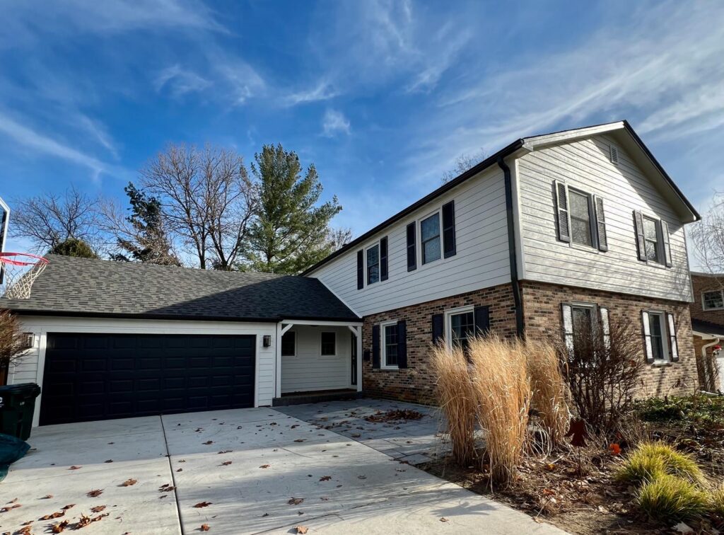
This house looks so classic, timeless, and crisp!
Best Benjamin Moore Seapearl Coordinating Colors
Does BM Seapearl go with green?
Yes, Seapearl pairs well with green paint colors, furniture, and decor. Because it has warm, green undertones, using it alongside a green color pulls out its warmth. I love incorporating houseplants into a room painted with BM Seapearl or using a dark gray-green accent wall (Article) within an open-concept floor plan.
Does BM Seapearl go with black?
While Benjamin Moore Seapearl is not actually a white paint color, it is light enough to be used to create a version of a classic black-and-white color palette. For example, in our client’s exterior project, Seapearl pairs well with SW Iron Ore, a soft black paint color with warm undertones.
Does BM Seapearl go with gray?
Yes, you can use Seapearl paint alongside gray paint colors (Article) or decor. Opt for gray hues that also have green undertones to complement Seapearl best.
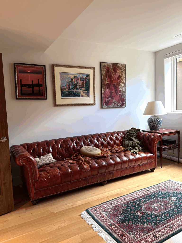
Does BM Seapearl go with red?
It does! In my client’s basement living room below, a rich mahogany leather couch and red decor accents look absolutely gorgeous against the Seapearl walls. The decor includes red and deep pink framed art, a red and black area rug and even a red wood side table.
What are the best interior trim and ceiling colors for BM Seapearl?
My preferred trim color for Benjamin Moore Seapearl is BM Chantilly Lace (Article). It’s a crisp, clean white paint color that works well in just about any light.
Seapearl would also look with SW Extra White (Color review article), which is one of the most common white trim paint colors in the United States. You can also use BM Snowfall White, BM Simply White (Color review article) or BM White Dove (Color review article) as warm white trim colors, but BM Swiss Coffee (Color review article) might be too creamy.
The Best Benjamin Moore Seapearl Alternatives
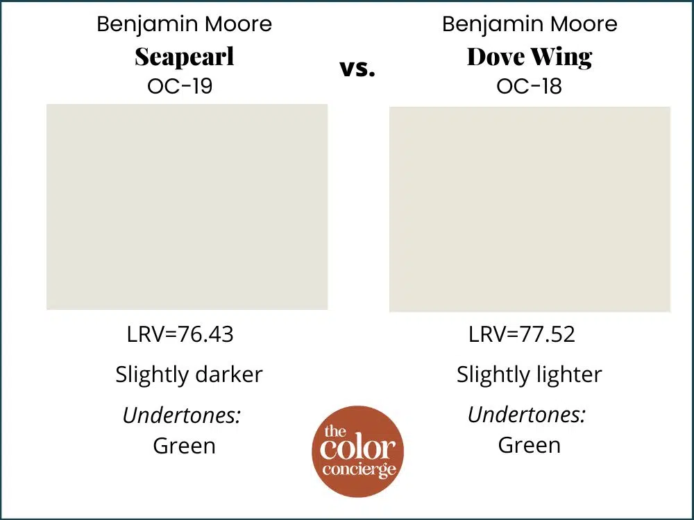
BM Seapearl vs. BM Dove Wing
I often get asked if Benjamin Moore Dove Wing (Sample) is the same color as Seapearl, and they are not, although they are very close. Dove Wing is slightly lighter and a skosh warmer. If you think that Seapearl looks too cool on the wall, then try Dove Wing.
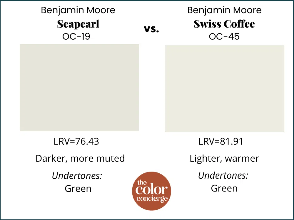
BM Seapearl vs BM Swiss Coffee
Benjamin Moore Swiss Coffee (Sample) can work in similar spaces as BM Seapearl but is a bit lighter and brighter than Seapearl, with an LRV of 81.91. Swiss Coffee’s undertones are also a subtle green, just like Seapearl.
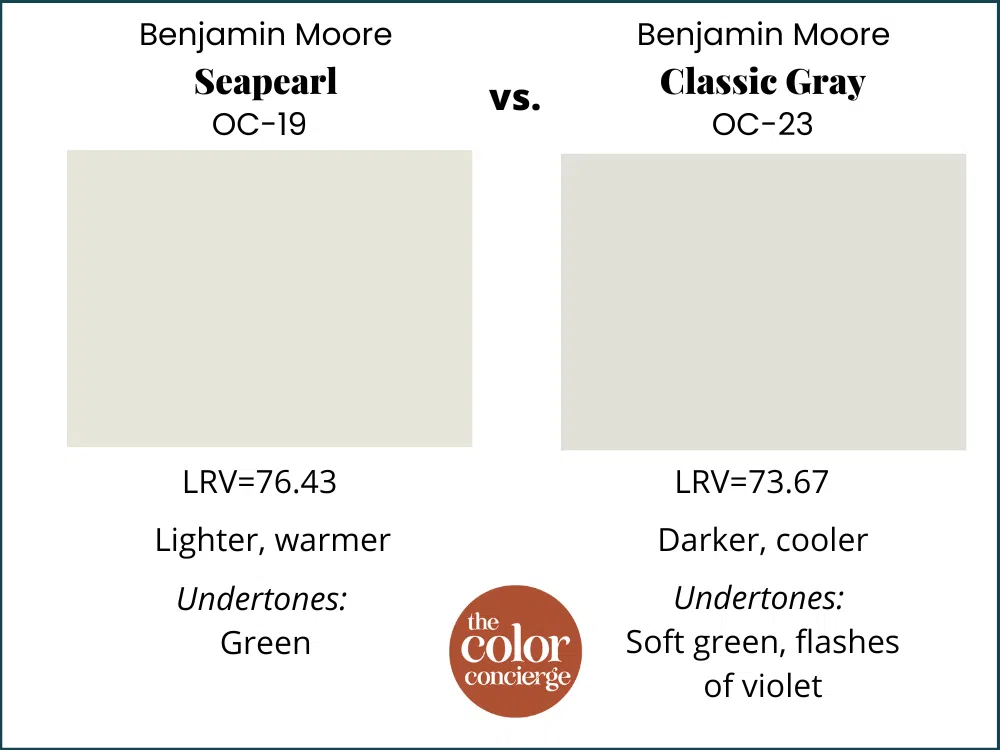
BM Seapearl vs BM Classic Gray
Benjamin Moore Classic Gray (Sample) is another good alternative for BM Seapearl. Classic Gray. Classic Gray is slightly darker than Seapearl, with an LRV of 73.67. While Classic Gray does have green undertones like Seapearl, it also includes flashes of violet, so looks cooler in place.
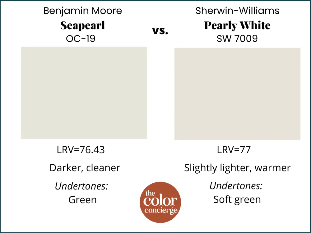
BM Seapearl vs SW Pearly White
Sherwin-Williams Pearly White (Sample) is another good alternative for Seapearl, and also has “Pearl” in the name. With an LRV of 77, it offers a similar amount of pigment as Seapearl. It has soft green undertones and looks warmer than Seapearl in place. Seapearl is crisper and cleaner than Pearly White. I consider Pearly White the closest Sherwin replacement for Seapearl.
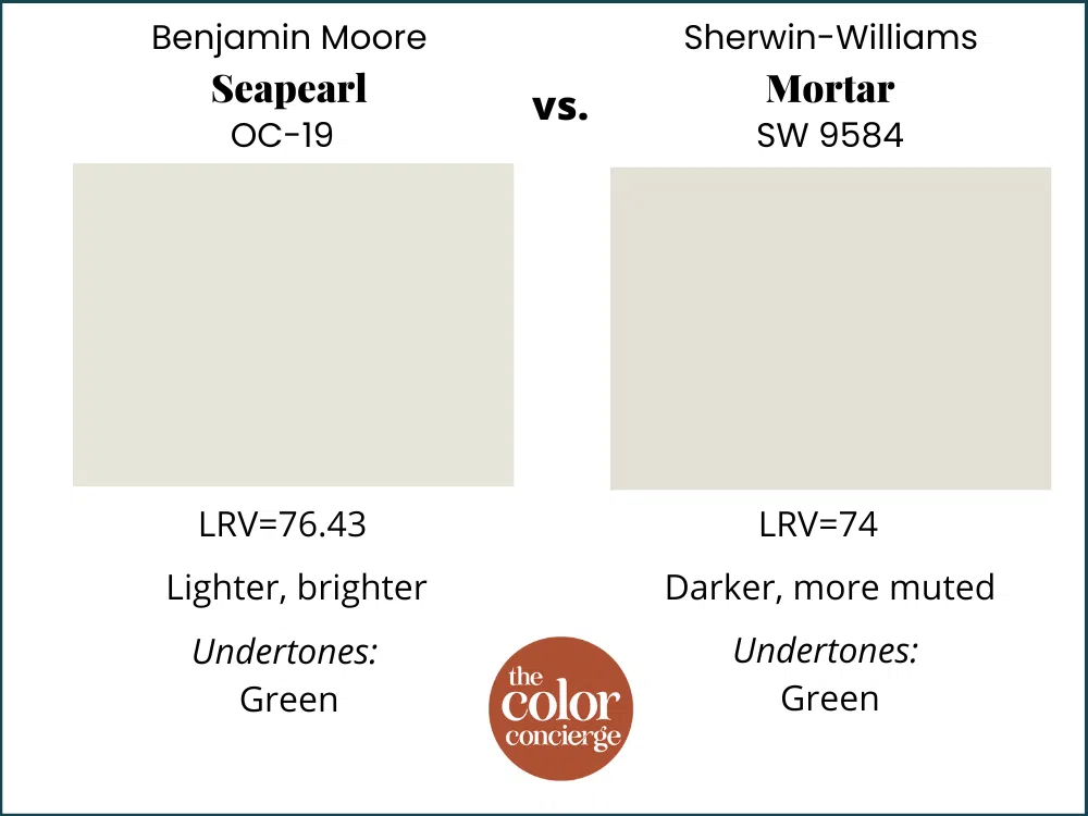
BM Seapearl vs SW Mortar
Sherwin-Williams Mortar (Sample) is a lovely, light neutral paint color that is slightly darker than Seapearl, with an LRV of 74. It is also more muted than Seapearl, with similar green undertones.
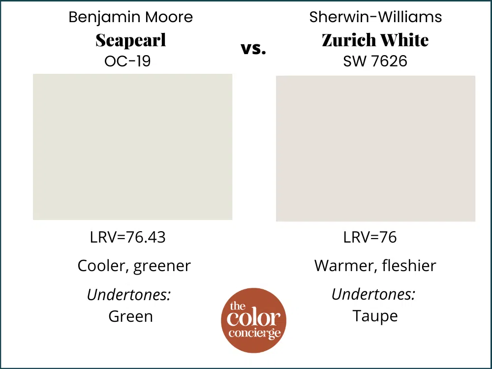
BM Seapearl vs SW Zurich White
Sherwin-Williams Zurich White (Sample) is very similar to Seapearl, with an LRV of 76. Zurich White has more taupe undertones that make it look warmer and sometimes fleshier.
BM Seapearl vs. SW Nuance
As with some of the other options, Nuance is close to Seapearl. Nuance is slightly darker, warmer, and more muted. Seapearl is crisper and cleaner.
What is the closest Sherwin-Williams paint color to Seapearl?
Several existing Sherwin-Williams options will get you close. As you may have read in other posts, we don’t recommend that you match paint colors. If you try to match Seapearl to Sherwin-Williams, there’s a good chance the match may look green. Instead, it’s best to use the closest Sherwin alternative, SW Pearly White. Make sure that you still test Pearly White.
Benjamin Moore Seapearl Pros and Cons
Pros:
- Great if you want a creamy look that won’t skew yellow
- Wonderful option if you don’t like gray but want something with more pigment than a traditional white hue
- Fantastic exterior paint color option, especially when paired with warm brick
Cons:
- Not good for interior trim; it’s too dark and too creamy
- Does not pair well with many popular violet grays or blue grays; use with green grays instead
Key Learning Points
Benjamin Moore Seapearl is a warm, versatile paint color that can work in both interior and exterior applications.
- BM Seapearl has soft green undertones that give the color warmth without skewing yellow.
- Seapearl works well in spaces with cool light, such as north-facing rooms. The green undertones can help warm up a room with cool light.
- Seapearl looks like a crisp white paint color in exterior applications yet has enough warmth to pair well with brick.
- If you try to paint match Seapearl to another brand, such as Sherwin-Williams or Behr, the results can look greener than expected.
- SW Pearly White is an excellent alternative to BM Seapearl if you need an equivalent in the Sherwin-Williams universe, but test first.
Remember: NEVER, EVER use paint matches from a different brand than the one specified. Results are poor, and there are no standards for the sheens. Even though your painter may genuinely believe it can be done, don’t do it. See results from paint matching here.
No matter what, always test your paint colors. It’s a standard best practice. Whenever I test my paint colors, they are perfect, and when I don’t try they turn out wrong. Learn how to test your paint colors here.
Online Color Consulting
Do you still need help picking the best paint colors? Discover our Online Color Consulting Package.

We love your comments! Please note that the blog is meant as general advice, and it is not possible to give out specific answers to your paint questions. If you want more specific advice, please consider purchasing a color consultation. Thank you for your understanding.
Related Posts
- SW Mortar Color Review
- SW Pearly White Color Review
- BM Classic Gray Color Review
- BM Swiss Coffee Color Review
About the Author

Hi, I’m Michelle Marceny, founder, owner, and Principal Color Designer at The Color Concierge. I believe a fresh coat of paint can completely transform a space. The Color Concierge was born out of my drive to help clients fall back in love with their homes. My clients trust me to help them find the perfect paint color for their home – whether it’s a whole-house paint color scheme or ideas for a single room.
Since The Color Concierge was founded in 2017, we have completed over 3000 color consultations, both online and in-person. I am a Certified Color Expert with 7 years of experience creating interior and exterior color palettes throughout North America.
If you liked this post, don’t forget to pin it!
We love your comments! Please note that the blog is meant as general advice, and it is not possible to give out specific answers to your paint questions. If you want more specific advice, our Online Color Consultations will help you pick your paint colours. Thank you for your understanding.

13 Responses
This color was recommended north/south windows. For gray/green/black interior colors.
Would it be to dark then for west/east windows. With interior colors of dark red and cherrywood cabinets?
Would Seapearl work with White Dive cabinets and marble (grey undertones) counters?
Seapearl and White Dove look great together, but there are many undertones to gray marble, so I would just make sure to test your paint colors carefully.
Michelle
Michelle. I painted my kitchen cabinets & trim Dove White. Would SeaPearl work for the walls? I face North I’m having second thoughts about the WD that’s already been painted. Pls help! tyia
Sorry. I mean DW B-Moore, not WD S-Williams. Kitchen cabinets, trim and 4 doors are already painted BM-Dove White.
Painting cabinates in rushing river by bengiman moor would sea pearl go good on my wanescotting in the kitchen if not what color wouls you suggest?
The house is clean and pretty .. it’s hard to find siding and front door pInt outside the old red brick house .. the front door brick is east .. need help
I painted my Josie seapearl. What would you recommend as shutter cikors?
How about semi-gloss Revere Pewter cabinets and eggshellSeapearl on my adjoining walls? Trim and doors would be Revere Pewter.
Match or clash?
Hi Mary,
Please consider one of our color consultations so that we can more thoroughly explore your project and make accurate recommendations.
Thank you,
MIchelle
Do you think that Seapearl would compliment an existing oak floor that is very gold?
I think it might look nice since it has green undertones, but make sure to test, test test!
Michelle
I think it could be very nice, but make sure you test!
Michelle