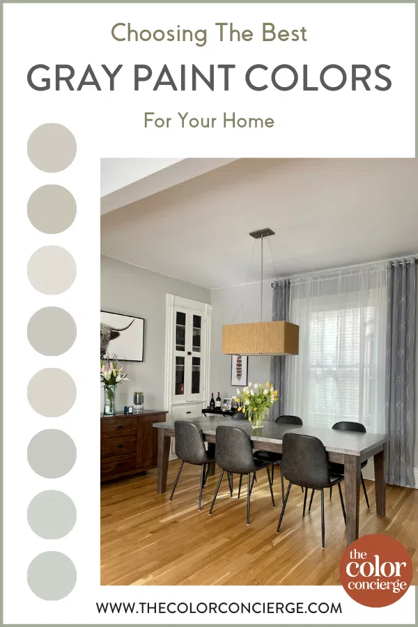
Gray paint colors are beautiful, timeless, and a surprising returning trend. We often get asked about the best gray paint colors for different projects, so we put together a post on our favorites (and how to use them).
*This post contains affiliate links for products I use and love. If you click on some links and make a purchase, I will get a small commission at no cost to you. This helps pay for the costs of the blog so I can continue to offer great content to our readers.
About The Color Concierge
Our Colorado-based paint color consultants make finding the right paint colors for your home easy. Whether you’re painting the exterior or interior of your home, our simple yet effective process lets us get your paint color right the first time. We’ve helped thousands of homeowners transform their homes into a space they love. Learn more about ONLINE COLOR CONSULTATIONS today.
Why Are Gray Paint Colors So Popular?
Beige, greige, and gray paint colors were popular choices for whole-house color palettes for many years. But more recently white paint colors (Article) have been the go-to pick for homes. This would be no surprise to anyone who spends time on Instagram or Pinterest, where all-white and black-and-white color palettes seem to be everywhere.
But in my color consulting business, I’ve been surprised by a shift back to gray paint colors in the last six months or so. My color review for Sherwin-Williams Agreeable Gray (Color review) is regularly the most popular color review blog post on our website. Earlier this month, when I posted a review on BM Revere Pewter (Color review), my web traffic skyrocketed.
Gray paint has always been a favorite of ours. While white paint can be beautiful, it can actually be a bit tricky to use. It’s easy for a home to begin to look too cold or stark. Using gray paint can keep a space feeling light and bright, while also adding warmth.
There are so many gray paint colors to choose from, and today we’ll discuss our favorites. But first, let’s learn more about the different types of gray paint colors to help you choose the best color for your home.
Understanding Gray Paint Colors
Gray paint colors can be warm or cool, depending on their undertones. We don’t see grays as a color, but a muted version of the undertone.
- Green-Grays are the color of mossy stones and cement and are usually warm. They can look beige sometimes.
- Violet-Grays are the color of elephants (this is the color that people most often think of as a typical gray). They are usually warm but can look cool if they have enough blue in them.
- Blue-Grays are the color of the sky, even thunderclouds. Some grays have blue-green undertones as well. They are usually cool.
- Blue-Green Grays are combination colors. They are always warm, and more colorful than you would expect.
You can really see this in the graphic below.
Sample Colors
We always recommend that you test paint colors (article) in your home because lighting can completely change a color, both on interiors and exteriors.
In the old days, this meant we painted a large poster board with sample pots and a huge mess.
Now we have a better way to test paint, with Samplize Peel-and-Stick samples!
- Samples pre-painted with 2 coats of real paint from the manufacturer.
- Large 9” x 14” samples to see the color better in the lighting.
- Delivered overnight
- Colors are accurate
- Less expensive than painting a large poster board with sample pots
- No mess, and no toxic paint to dispose of
I use these in my color consulting practice for exact results. Discover Samplize peel-and-stick paint samples via the link below.
Understanding the undertones of gray paint is critical to choosing the right color for your room. Even the best gray paint colors won’t look right if the undertones don’t work with the lighting, decor or hard finishes in your space.
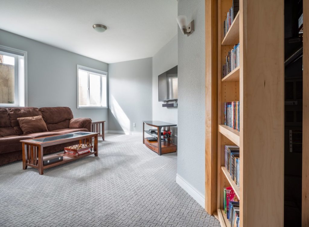
This is exactly what happened to me when I painted my house with Stonington Gray (Color review). I walked in after the painters had left and it looked so blue. You can see in my basement pictured below, just how blue this color can look.
To help you choose the gray paint color that is right for your next project, we’ll be breaking this blog post down by undertones. Keep reading to find the best gray paint color for your home.
What is the difference between Gray and Greige?
Greige has always been a very subjective term and is often interchangeable with gray. Greige was meant to define the bridge between gray and beige, but that’s not necessarily how greige is used today.
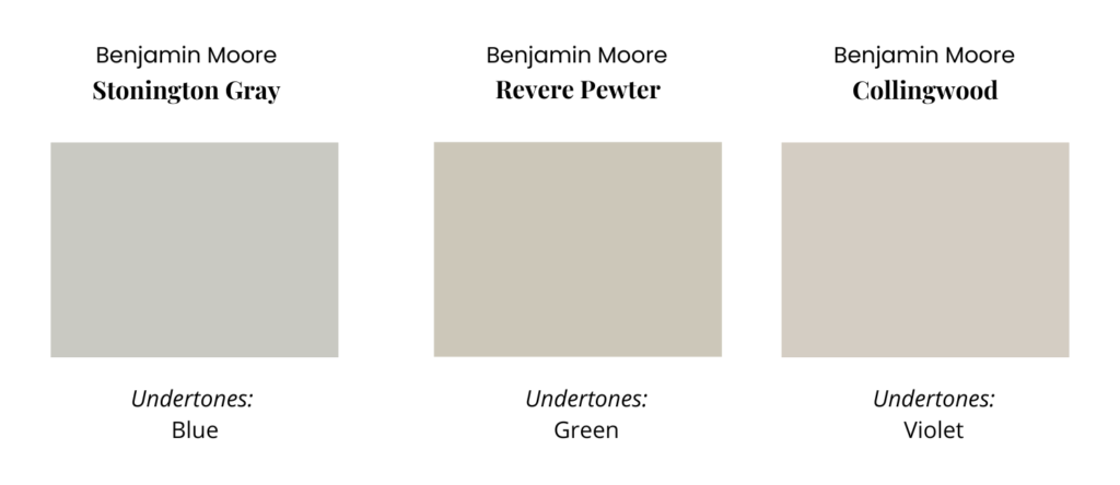
Most commonly, greige colors are very warm grays with green undertones such as Agreeable Gray (Sample), Revere Pewter (Sample), and Edgecomb Gray (Sample). However, some people also consider Repose Gray (Sample) (violet gray) a greige color, and also Balboa Mist (Sample).
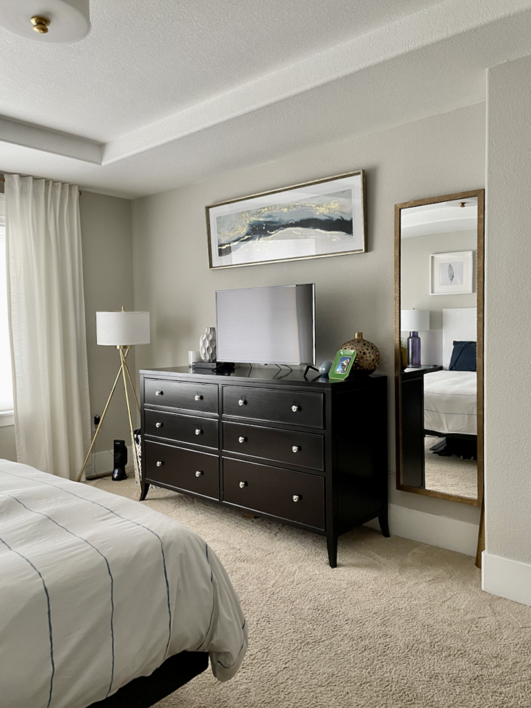
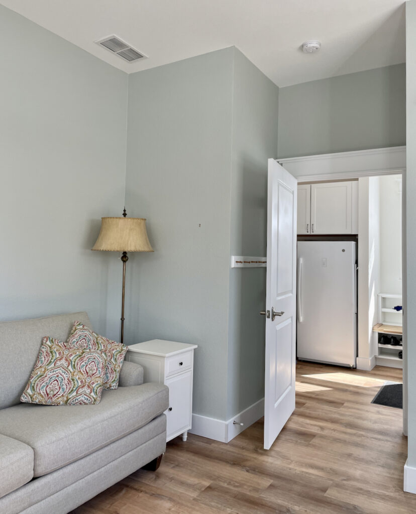
I don’t often hear the public referring to blue-grays such as Stonington Gray (Sample) as greige colors. this master bedroom below with Stonington Gray looks silvery with light coming in from the South (left) and the west (right side of photo).
Maria Killam, a world-famous and master color designer defines greige colors as very light grays such as Classic Gray, Balboa Mist, and Gray Mist.
My personal preference is to think of grays as very muted versions of blues, violets, and greens.
What is the easiest way to test your paint colors?
We always recommend that you test paint colors in your house because lighting and the surrounding colors can completely change the way a color looks on the wall.
In the old days, this meant we painted a large poster board with sample pots and a huge mess.
Now we have 9X14″ Pre-Painted peel-and-stick paint samples from SAMPLIZE. Check out the SAMPLIZE website here.

The Best Gray Paint Colors with Green Undertones
Sherwin-Williams Agreeable Gray (SW 7029 )
Sherwin-Williams Agreeable Gray (SW 7029) (Color review) is an incredibly popular Sherwin-Williams greige paint color. It is an iconic warm gray with green undertones that are almost invisible. It has an LRV of 60, so it’s light but not at risk of looking washed out.
Agreeable Gray is often considered a color that can work in any home and any room, but it’s not automatically the right whole-house paint color (Article). As with any paint color, it should be tested in natural light before deciding if it’s right for your home.
This gray paint color works really well in rooms with lots of natural light (from any direction) or in a room with constant artificial light, such as a basement.
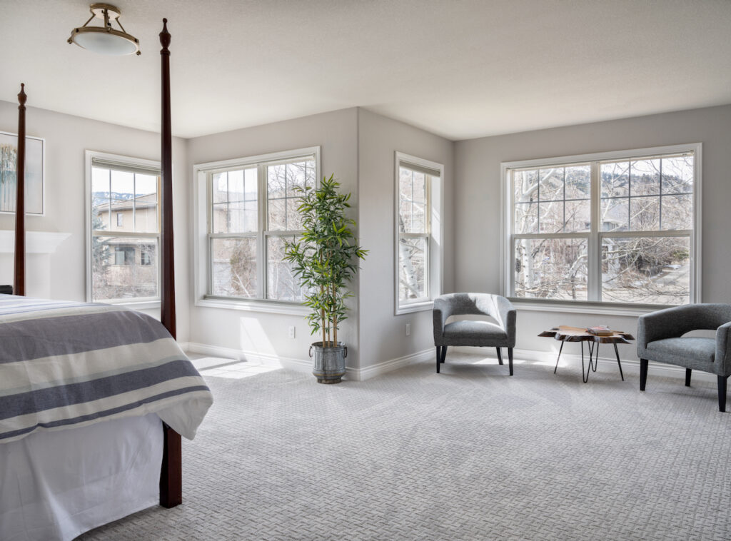
Below is one of the bedrooms in our home, with North and West exposure, in the brightest part of the day. This room is sunny throughout the day. Because the room has tons of light, even with some cool light, Agreeable Gray (Sample) looks warm and inviting in this room.

Tips and Tricks:
- Use with: Rooms with lots of natural light or consistent warm, artificial light (such as a basement); warm wood floors and other warm finishes.
- Don’t use with: Rooms with low natural light; creamy white colors; cool grays with violet undertones, such as Repose Gray.
- Best ceiling color (flat): SW Extra White (Sample), SW Pure White (Sample), or SW Greek Villa (Sample).
- Best trim color (satin or semi-gloss): SW Extra White, SW Pure White, or SW Greek Villa.
- Best Benjamin Moore Match: BM Revere Pewter (Sample) or BM Edgecomb Gray (Sample) are both greige colors with green undertones that I would use in similar situations.
Get your peel-and-stick sample of SW Agreeable Gray here (Sample).
Benjamin Moore Revere Pewter (HC-172 )
BM Revere Pewter (Color review) is one of those colors that has been iconic for many years. It’s very similar to Agreeable Gray, but crisper and cleaner, even though it’s darker.
The LRV of BM Revere Pewter is 55, which makes it a medium gray. This paint color works best in a room with lots of natural or artificial light. It can look a bit gloomy in cool light.
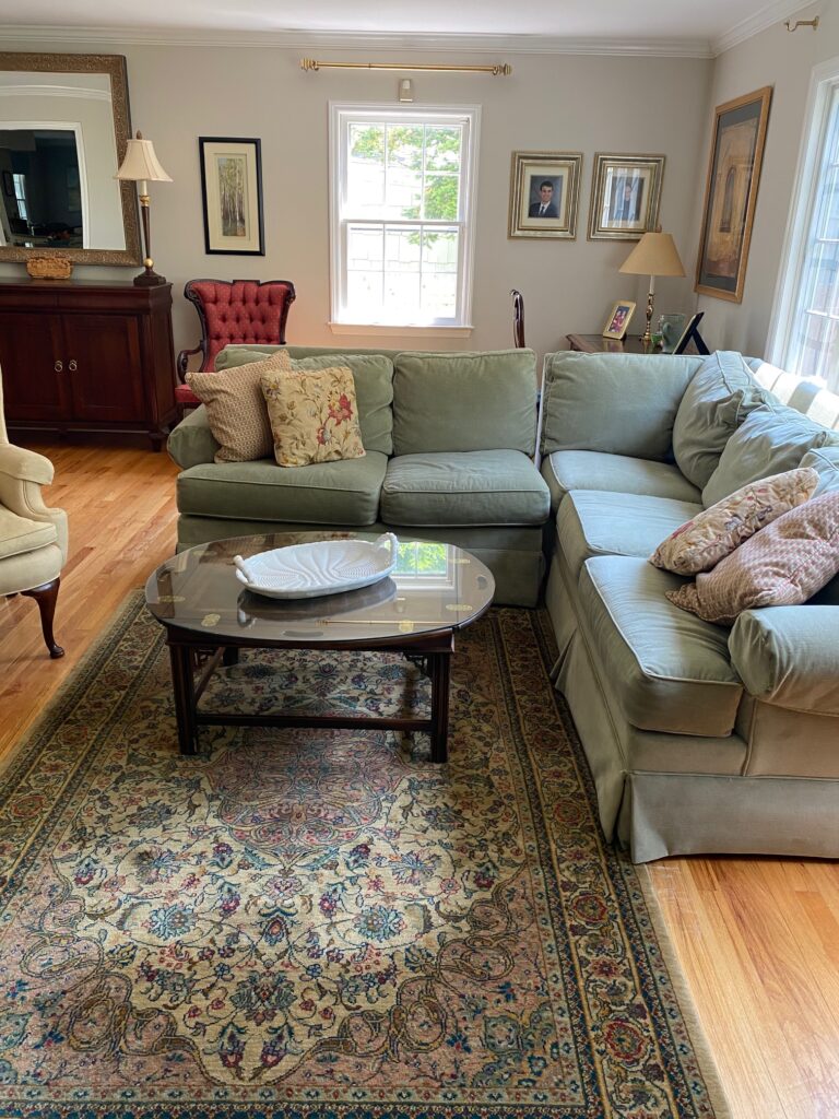
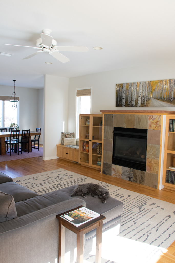
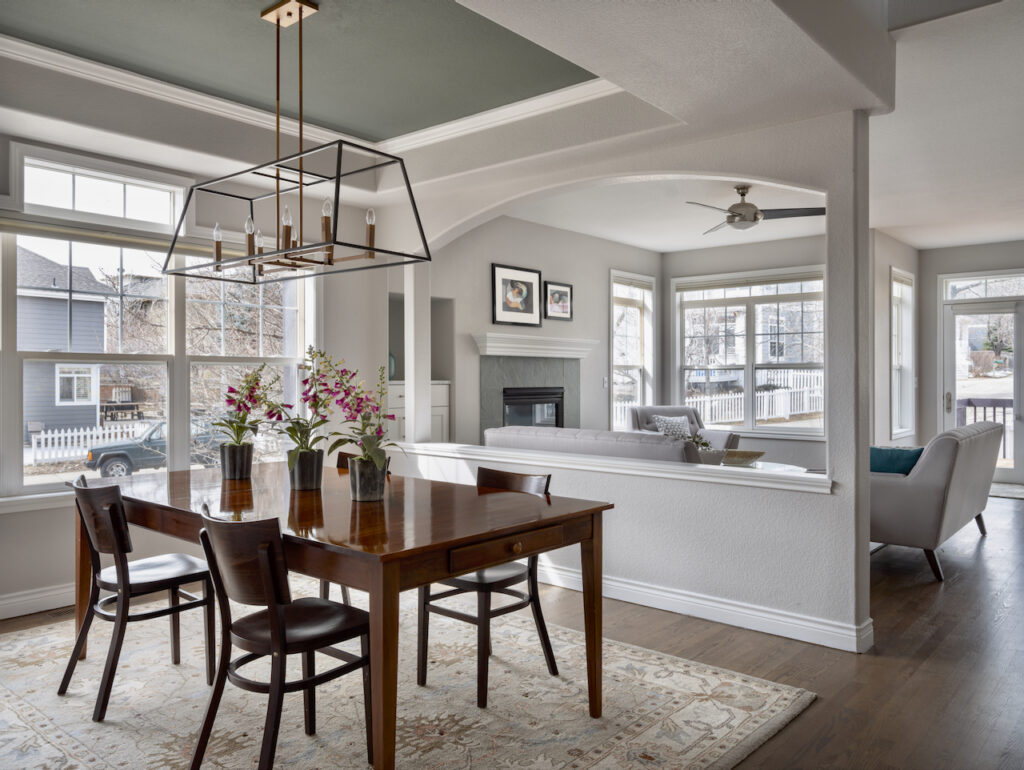
This color pairs beautifully with warm stone, natural wood floors and earthy finishes. In the client’s living room pictured below, Revere Pewter perfectly complements their stone fireplace and keeps the room feeling bright and airy.
Tips and Tricks:
- Use with: Warm stone, natural wood floors, warm granite countertops, earthy tile; dark blues and teals
- Don’t use with: Rooms with very cool light or a lack of light overall; grays with violet undertones such as Collingwood, Repose Gray, and Balboa Mist, unless they are in an adjacent room.
- Best ceiling color (flat): Chantilly Lace, Simply White, Cloud White, and White Dove.
- Best trim color (satin): Chantilly Lace, Simply White, Cloud White, and White Dove.
- Best Sherwin-Williams match: SW Collonade Gray, SW Skyline Steel.
Get your peel-and-stick sample of BM Revere Pewter here (Sample).
Benjamin Moore Classic Gray (OC-23 )
Benjamin Moore Classic Gray (Color review) (OC-23) is a soft gray color that reads white in rooms where white paint colors just don’t look right. It has an LRV of 75 which makes it very light greige or darker off-white.
It is a light warm gray with subtle green undertones. Sometimes it can read so warm that it’s almost beige, and other times it looks like a light warm gray. It can flash violet in low-light situations.
Classic Gray (Sample) paint adds just the right touch of warmth and color and still behaves as a neutral background for any furniture, decor, or accent colors you might want in a room.
You can see in the bedroom below that in rooms with lots of light, it looks almost white.
Tips and Tricks:
- Use with: Clean white trim and ceiling paint, warm metals, wood floors and clean white subway tile.
- Don’t use with: Dark earthy colors or granite countertops; creamy trim colors; creamy quartz countertops.
- Best ceiling color (flat): BM Chantilly Lace (Sample), BM Oxford White (Sample), BM Cloud White (Sample), BM White Dove (Sample)
- Best trim color (satin or semi-gloss): Chantilly Lace (BM OC-65) Oxford White (BM 869), BM Cloud White or BM White Dove
- Best Sherwin-Williams Match: SW Zurich White, SW Mortar
Get your peel-and-stick sample of BM Classic Gray here (Sample).
The Best Gray Paint Colors with Violet Undertones
Sherwin-Williams Repose Gray (SW 7015 )
SW Repose Gray (Color review) (SW 7015) has violet undertones that can look warm in brighter light conditions but often appear cooler. The LRV of Repose Gray is 58, which makes it darker than some of the other grays we’ve featured so far.
Repose Gray works really well if you have lots of green foliage outside. The warm, violet undertones help neutralize the greener colors so they don’t reflect on your walls.
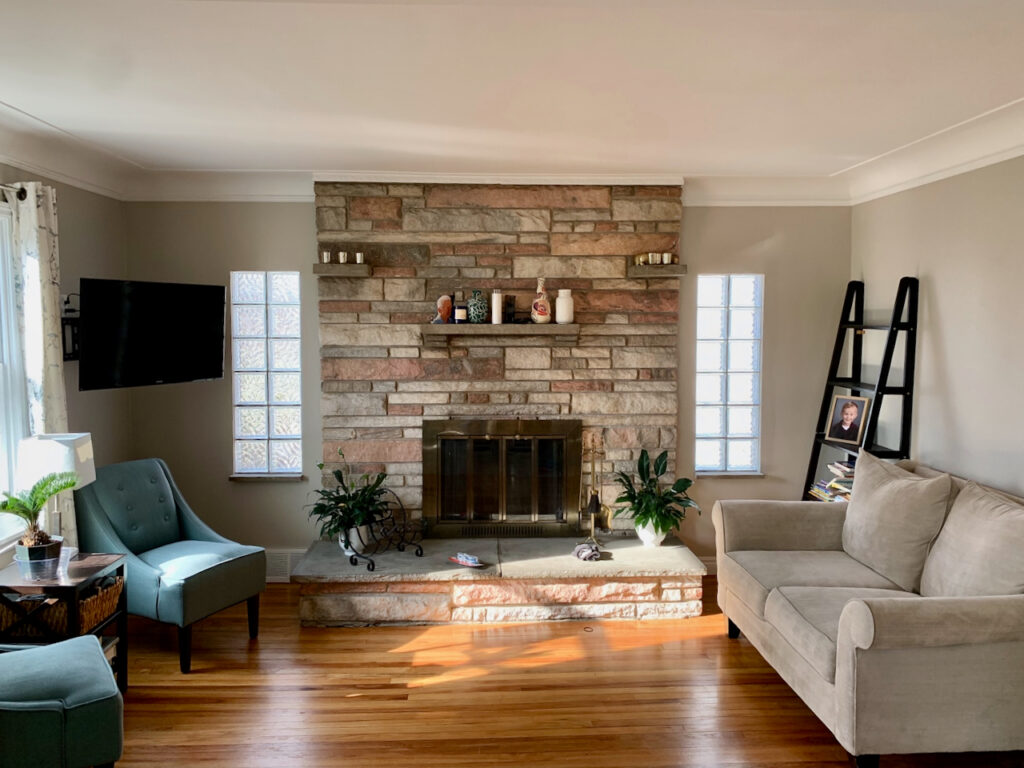
Repose Gray (Sample) pairs well with a variety of colors, but looks especially beautiful with bright and slightly creamy whites, such as in a client’s dining room in the photo below. We painted the walls Repose Gray and painted the trim, doors and built-in china hutch SW Westhighland White.
Tips and Tricks:
- Use with: Rooms with lots of light; warm wood finishes; crisp whites and matching stone or quartz countertops
- Don’t use with: Yellow paint colors or creamy yellowish whites can look dingy.
- Best ceiling color (flat): SW Extra White (Sample), SW Pure White (Sample),
- Best trim color (satin): SW Extra White, SW Pure White, SW Greek Villa, SW Westhighland White
- Best Benjamin Moore Match: Benjamin Moore Collingwood (Article)
Get your peel-and-stick sample of SW Repose Gray here (Sample).
Benjamin Moore Balboa Mist (OC-27)
BM Balboa Mist (Clor review) (OC-27) is one of the best gray paint colors if you want to use white without a room looking too stark. The LRV of Balboa Mist is 67, which makes it very light greige, leaning toward white.
In a bright room, this color can look like a soft white. In darker rooms or rooms with cooler light, it looks like a greige color. This color is so versatile that it can work well in just about any room of the house and serve as the foundation for a whole-house color scheme (Article).
It’s a fantastic backdrop for colorful accents, such as in the client’s kitchen nook pictured below. It keeps the room looking bright and airy and looks gorgeous paired with the warm wood cabinet and gallery wall.
Tips and Tricks:
- Use with: Warm wood finishes; crisp whites; saturated blue colors, blue-grays and saturated greens; matching stone or quartz countertops.
- Don’t use with: Yellow paint colors or creamy yellowish whites; green-gray paint colors such as BM Revere Pewter, BM Edgecomb Gray or SW Agreeable Gray.
- Best ceiling color (flat): BM Chantilly Lace (Sample), BM Oxford White (Sample) or SW Pure White (Sample)
- Best trim color (satin or semi-gloss): BM Chantilly Lace, BM Oxford White or SW Pure White
- Best Sherwin-Williams match: SW Gray Heron (Sample), SW City Loft (Sample)
Get your peel-and-stick sample of BM Balboa Mist here (Sample).
The Best Gray Paint Colors with Blue Undertones
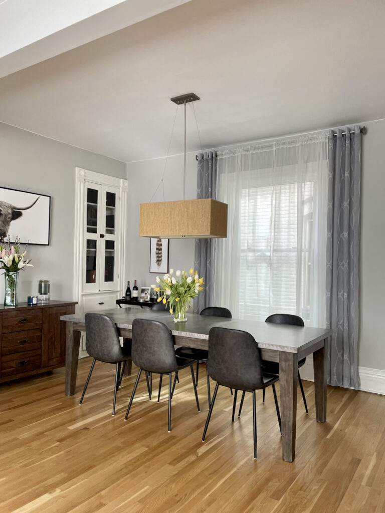
Benjamin Moore Stonington Gray (HC-170)
Stonington Gray (Color review) is a neutral and versatile blue-gray paint color that can be used in just about any space throughout the home. It has an LRV of 59, which makes it pretty light while still having a good amount of pigment.
Stonington Gray can change significantly in different lighting. In cool lighting, Stonington Gray appears very blue. It can even be used in place of blue paint when you want a softer, muted blue color that won’t glow on the walls.
The neutral gray also pairs well with just about any furniture or home decor you might have in your living room because of its versatile blue undertones.
You can see in the photo of my previous home below, Stonington Gray (Sample) pairs just as well with the other gray accents in my open-concept living room and dining room as it does with the warm wood floors and other wood elements.
Tips and Tricks:
- Use with: Navy and other blue colors; Carrara marble; clean white subway tiles; darker green-grays; colorful accents.
- Don’t use with: Rooms with cool light (if you don’t want it to appear blue)
- Best ceiling color (flat): BM Chantilly Lace (Sample), BM Oxford White (Sample)
- Best trim color (satin or semi-gloss): BM Chantilly Lace, BM Oxford White
- Best Sherwin-Williams match: SW Passive
Get your peel-and-stick sample of BM Stonington Gray here (Sample).
The Best Gray Paint Colors with Blue-Green Undertones
Sherwin-Williams Sea Salt (SW 6204)
Sherwin-Williams Sea Salt (SW 6204) (Article) is an iconic blue-green paint color that is soft and muted, but still colorful. It has an LRV of 63 and leans more toward green vs. blue. I consider it more of a color than a neutral, but I included it because many consider it gray.
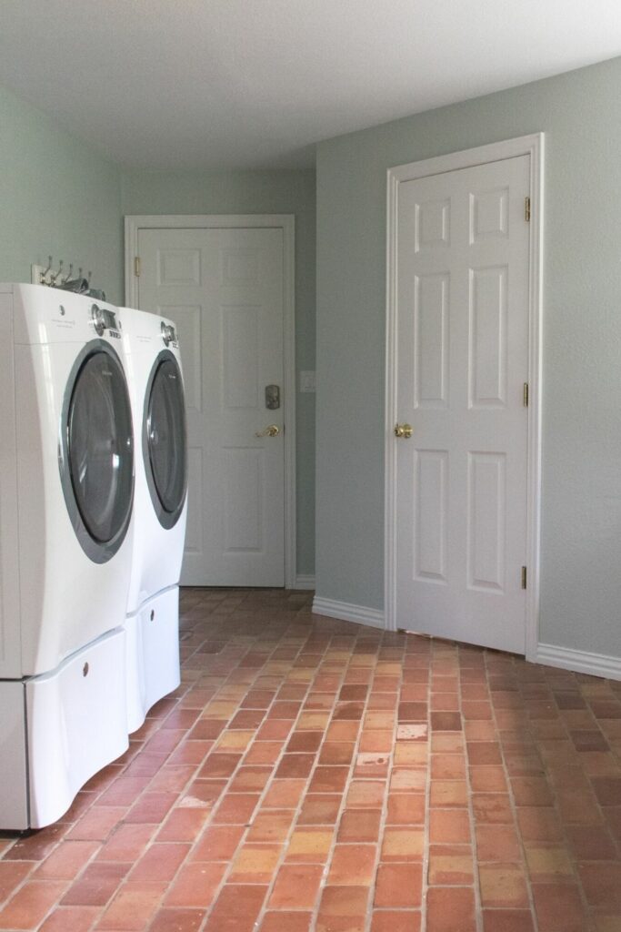
Use Sea Salt when you want a gray but with a splash of color. I love to use this color in mud rooms, laundry rooms (such as the one pictured below) as well as calm and peaceful bedrooms (Article).
It can be used in larger spaces, but only if you really love the color. In my opinion, a little bit goes a long way.
Tips and Tricks:
- Use with: Muted terracotta floors; wood floors; crisp white accents, dark blue colors, white quartz, Carrara or Calacatta marble
- Don’t use with: Large rooms or open-concept spaces (unless you really love the color)
- Best ceiling color (flat): SW Extra White (Sample), SW Pure White (Sample)
- Best trim color (satin or semi-gloss): SW Extra White, SW Pure White and SW Greek Villa
- Best Benjamin Moore Match: BM Gray Cashmere (Sample)
Get your peel-and-stick sample of SW Sea Salt here (Sample).
Benjamin Moore Gray Cashmere (2128-60)
Gray Cashmere (Sample) is the Benjamin Moore counterpart to SW Sea Salt. They’re both lovely colors but are often used in different ways throughout the home.
Gray Cashmere is more muted and has a little bit more blue than SW Sea Salt. While it won’t look gray on the wall, the muted shade does make it better for larger rooms like bedrooms, offices, or even living spaces where you want a touch of color.
Gray Cashmere has an LRV of 65, making it among the lightest of the best gray paint colors we’ve recommended in this post.
What is the best way to test your paint color?
As always, don’t forget to test your paint colors! The easiest way to sample any paint color for that is via SAMPLIZE. Their peel-and-stick paint samples are easy to use and true to color. With Samplize you can easily see how different shades look on your unique wall.
If you’d like to test the colors that we mentioned in this post, link below for the Samplize samples:
Agreeable Gray (Sample)
Revere pewter (Sample)
Classic Grey (Sample)
Repose Gray (Sample)
Balboa Mist (Sample)
Stonington Gray (Sample)
Sea Salt (Sample)
Gray Cashmere (Sample)
Key Learning Points
Gray paint colors can be gorgeous in any interior, but if you don’t choose the right one for your space you could end up with a room that looks off. When choosing gray paint, it’s important to keep in mind:
- The undertones of gray paint are an important part of choosing the right color for your space. Gray paint colors have either green undertones, violet undertones, blue undertones, or sometimes blue-green undertones.
- Pay attention to the hard finishes, decor, and other paint colors in your space when choosing a gray paint color.
- The kind of light you have in a room can impact the way gray paint (and any other paint colors) look in your space. While the colors we shared today are some of the best gray paint colors out there, we always recommend that you test your paint colors in natural light.
Online Color Consulting
Do you still need help picking the best paint colors? Discover our Online Color Consulting Package.

Related Posts:
- SW Agreeable Gray Color Review
- BM Revere Pewter Color Review
- BM Classic Gray Color Review
- SW Repose Gray Color Review
- BM Balboa Mist Color Review
- BM Stonington Gray Color Review
- SW Sea Salt Color Review
About the Author

Hi, I’m Michelle Marceny, founder, owner, and Principal Color Designer at The Color Concierge. I believe a fresh coat of paint can completely transform a space. The Color Concierge was born out of my drive to help clients fall back in love with their homes. My clients trust me to help them find the perfect paint color for their home – whether it’s a whole-house paint color scheme or ideas for a single room.
Since The Color Concierge was founded in 2017, we have completed over 3000 color consultations, both online and in-person. I am a Certified Color Expert with 7 years of experience creating interior and exterior color palettes throughout North America.
If you liked this post, don’t forget to pin it!
We love your comments! Please note that the blog is meant as general advice, and it is not possible to give specific answers to your paint questions. If you want more specific advice, our Online Color Consultations will help you pick your paint colors. Thank you for your understanding.
