The best and fastest way to transform a bedroom is with the perfect paint color. We can’t wait to show you some of our favorite calming bedroom paint colors. Find color inspiration from your comforter, window coverings, area rugs, tile floors, carpets, or art, and turn your bedroom into an oasis in your home!
Ready to get started? Keep reading for our best advice on how to choose paint colors for bedrooms and our favorite paint colors for your sleep space.
*This post contains affiliate links for products I use and love. If you click on some links and make a purchase, I will get a small commission at no cost to you. This helps pay for the costs of the blog, so I can continue to offer great content to our readers.
About The Color Concierge
Our Colorado-based paint color consultants make finding the right paint colors for your home easy. Whether you’re painting the exterior or interior of your home, our simple yet effective process lets us get your paint color right the first time. We’ve helped thousands of homeowners transform their homes into a space they love. Learn more about ONLINE COLOR CONSULTATIONS today.
What Is a Calming Bedroom Paint Color?
A calming bedroom paint color is any hue that helps you take a deep breath and feel relaxed when you enter your bedroom. It’s the kind of color that makes you want to get under the covers and cozy up with a good book and a cup of tea – or maybe just take a long nap!
Colors in this category tend to have lower saturation, soft undertones and be more muted. Some examples of this include light blues for a cool touch, muted greens that bring in a bit of nature, airy neutrals that feel warm and comforting, and subtle grays that feel serene without going cold or dreary.
The right calming color creates a backdrop that settles your mind at the end of the day and looks beautiful in your specific lighting and with your finishes.
Calming Bedroom Paint Color Trends for 2026
For 2026, the trend is clear: calm, cozy bedrooms are in, but with more warmth and color than many of the cool-gray bedrooms of years past.
We’re seeing many homeowners reach for warm, earthy colors and many others still look for cool, light blues. We work with several high-end interior designers and they are actually combining these two trends: choosing warm beiges and taupes with splashes of cooler light blues as a contrast.
Of course, we still see gray bedroom paint colors (and cooler blues), but we see the majority of homeowners who want gray choosing greige and gray-green variations that feel more modern.
Sample Colors
We always recommend that you test paint colors (article) in your home because lighting can completely change a color, both on interiors and exteriors.
In the old days, this meant we painted a large poster board with sample pots and a huge mess.
Now we have a better way to test paint, with Samplize Peel-and-Stick samples!
- Samples pre-painted with 2 coats of real paint from the manufacturer.
- Large 9” x 14” samples to see the color better in the lighting.
- Delivered overnight
- Colors are accurate
- Less expensive than painting a large poster board with sample pots
- No mess, and no toxic paint to dispose of
I use these in my color consulting practice for exact results. Discover Samplize peel-and-stick paint samples via the link below.
White Paint Colors for Bedrooms
Let’s start with the current hottest trend – white paint colors for everything. Don’t try to paint match these white colors (learn more here). Use the specified manufacturer or find a similar color on easyrgb.com.Let’s start a long-time classic: white paint colors. Don’t try to paint-match these white colors using different paint brands (learn why here). Use the specified manufacturer or find a similar color on easyrgb.com.
Even better: contact us for an in-person or online paint color consult and we’ll help you choose the perfect calming white paint color for your bedroom.
Benjamin Moore White Dove
This serene bedroom was painted with Benjamin Moore White Dove OC-17 (Sample), a gorgeous off-white paint color with a nice soft glow. Learn more about this color in our White Dove Color Review.
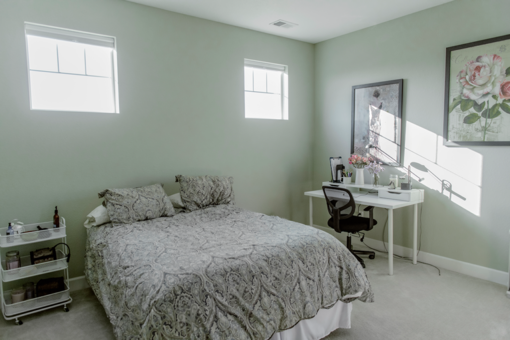
Sherwin-Williams Extra White
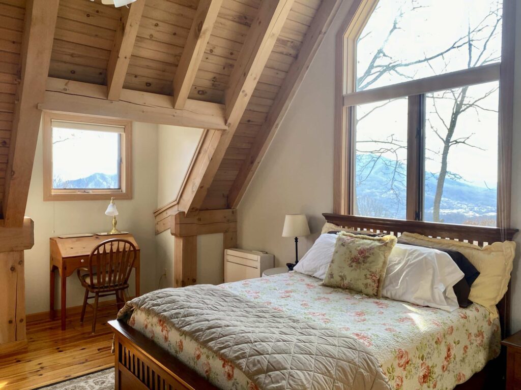
Sherwin Williams Extra White 7006 (Sample) is a crisp white paint color, perfect for a bedroom with tons of southern exposure. We don’t recommend this color for rooms with windows that face North or low light. We added Gentleman’s Gray 2062-20 (Sample) as an accent on the headboard wall and it was gorgeous. The walls and ceiling are both painted Extra White (Article) to highlight the architectural features of the room.
Benjamin Moore Ballet White
Ballet White OC-9 (Sample) is a cream color with warm pink undertones. We picked it because there was an evergreen tree outside the window that reflected green into the room. The pink undertones in Ballet White countered the green and made it go away. Read more about this Zen bedroom makeover here (Article). Trim and ceiling were painted with Benjamin Moore Chantilly Lace OC-65 (Sample).
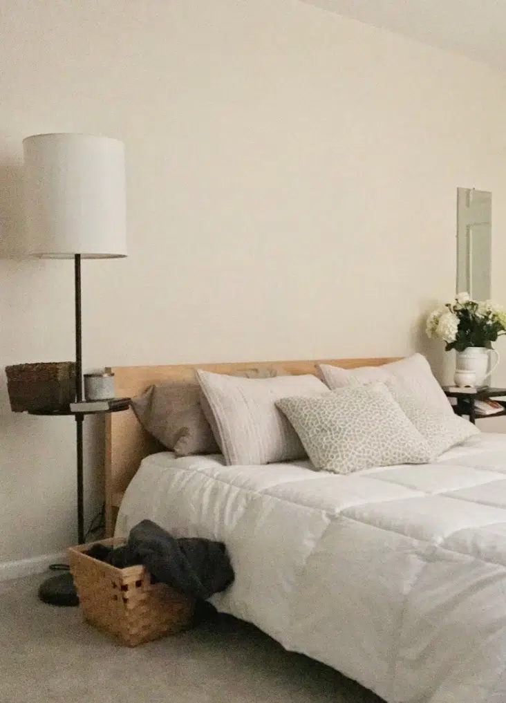
Sherwin-Williams White Duck
Sherwin-Williams White Duck (Sample) is warm and muted and one of our favorite Sherwin-Williams light neutrals. We consider it a complex cream.
White Duck (Article) is the color I pick if I’m looking for a creamy color that won’t shift to yellow thanks to soft, barely-there green undertones.
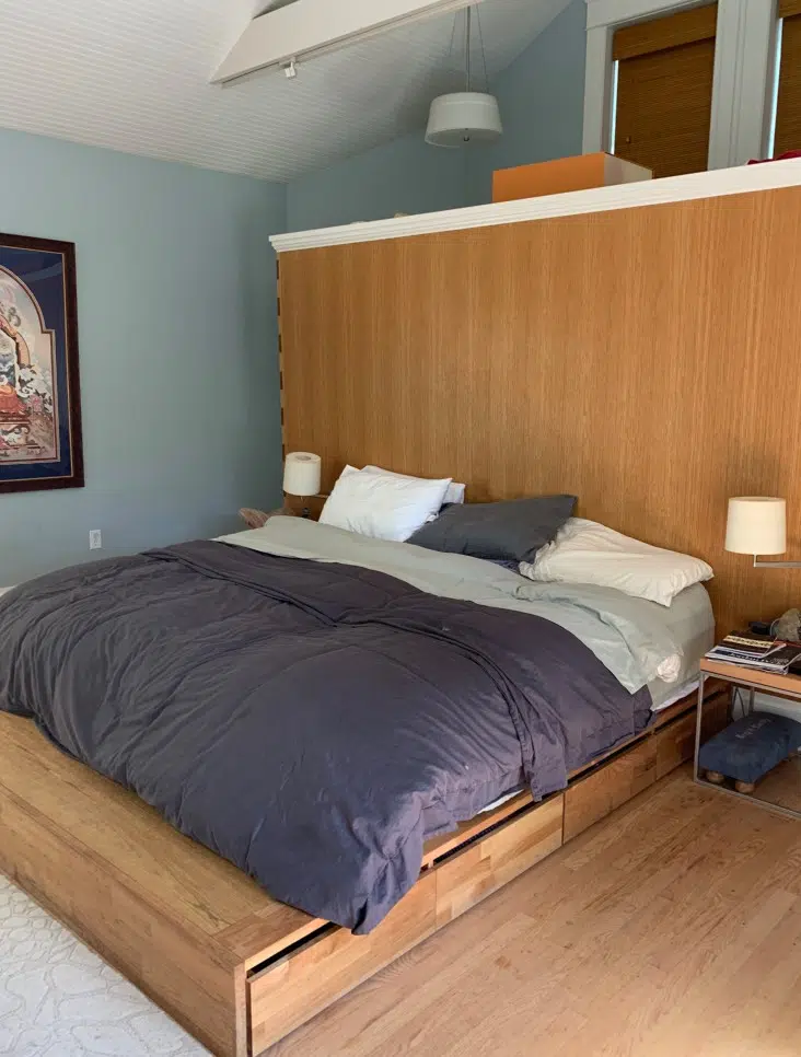
The LRV of White Duck is 74, which makes it a pretty light paint color. It looks lovely and creamy on the wall, even in rooms with low light or cool light.
My SEO specialist Danielle painted her primary bedroom with SW White Duck paint, including a millwork accent wall behind the headboard. The hue combines with organic green colors for a peaceful, earthy feel.
Benjamin Moore Pale Oak
This beautiful Miami master bedroom was transformed (from red) with an online color consult and Benjamin Moore Pale Oak OC-20 (Sample). The trim and ceiling are a creamy white similar to BM Swiss Coffee that complements the beige tile floor with soft pink undertones. We love Pale Oak – it’s like a warm hug for your soul! Explore our full Pale Oak color review.
For trim and ceilings we prefer crisp whites such as Benjamin Moore Chantilly Lace (Color Review) or soft whites such as BM White Dove (Color Review), but BM Swiss Coffee (Color Review) looked lovely here.

Benjamin Moore Classic Gray
This is one of our favorite paint colors. Classic Gray OC-23 (Sample) soft light greige that will look white. You can use it in a darker room, and I’ve had great results with this color in basements. Read more about Classic Gray in our color review (Article). Trim is painted with Chantilly Lace (Sample).
Neutral Calming Paint Colors for the Bedroom
We love soft neutrals for a restful night’s sleep, but they need to tie into your existing design elements.
Manchester Tan
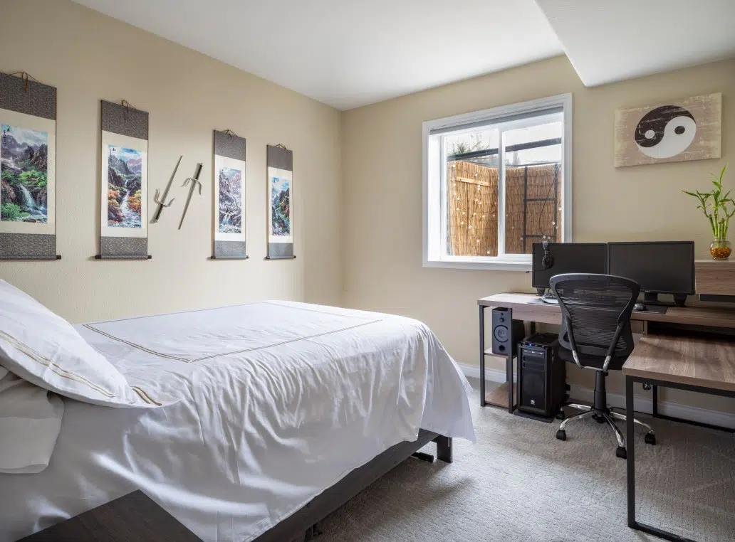
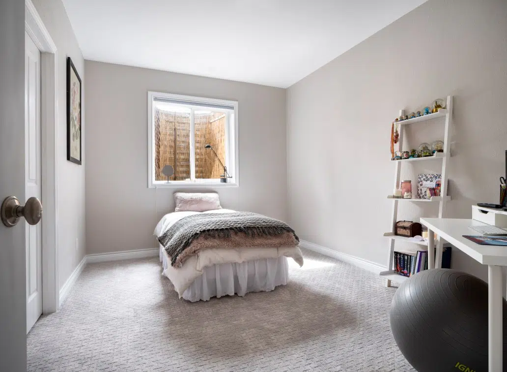
Manchester Tan (Sample) HC-81 is a Benjamin Moore light beige with slight green undertones. In this case, it tied in with the art and the Zen vibe for a teenage boy. It’s a basement room with a window that faces East. Check out the bamboo lining in the window well, just like the Abalone room.
Manchester Tan (Article) is a color that we often use to update Tuscan-era hard finishes, and it was perfect here!
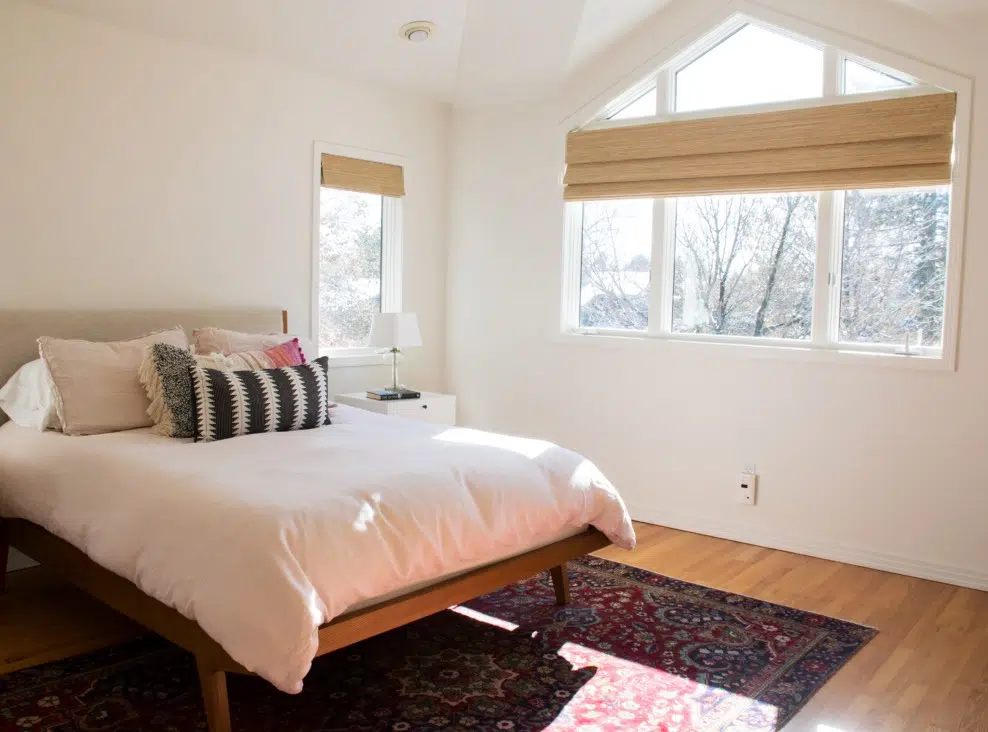
Benjamin Moore Maritime White
Maritime White (Sample) is a warm, creamy light beige paint color that feels so cozy.
Maritime White’s (Article) LRV is 71.6. This color is light-reflecting but also has enough pigment that it won’t look white on the wall and has plenty of warmth.
Maritime White’s undertones are part of what makes this color so unique. While many warm white and beige paint colors have yellow undertones, Maritime White has warm pinkish-apricot undertones. This is great if you want a warm, light bedroom paint color that won’t look yellow in place.
Sherwin-Williams Natural Linen
Natural Linen by Sherwin-Williams (Sample) is a warm, peachy beige paint color. With an LRV of 66, it’s a bit darker than many of the colors we often see homeowners picking for interior projects today. But it’s still light enough that it won’t overpower a space.
SW Natural Linen (Article) is also lovely and warm. It has peachy undertones that make it look almost pink in some settings, so it’s important to make sure that it works with your hard finishes and bedroom decor.
In our client’s bedroom below, Natural Linen walls look really beautiful as the foundation for the space’s neutral color palette, and keep the room feeling warm and inviting.
Benjamin Moore Natural Linen
Benjamin Moore Natural Linen (Article) is a neutral, beige paint color we love using for bedrooms!
BM Natural Linen has an LRV of 59.8, which is light-reflecting but still slightly darker than we would typically use for a whole-house neutral. It has green undertones that sometimes flash peachy and looks lovely and warm on the wall.
In the primary bedroom below, we paired BM Natural Linen walls with SW Alabaster ceilings, trim and doors. The warm hues flow beautifully together and create a warm, inviting space that still feels light and airy.
Sherwin-Williams Gossamer Veil
Gossamer Veil (Article) is a warm greige paint color that looks gorgeous in a peaceful, earthy bedroom color scheme.
The LRV (Light Reflectance Value) is 62, which makes it a great, light-reflecting color for many residential rooms.
Gossamer Veil has primarily green undertones that sometimes flash violet in certain lighting. It’s these undertones that make Gossamer Veil so lovely and inviting. In the bedroom below, SW Gossamer Veil walls look beautiful alongside all of the natural wood in this space.
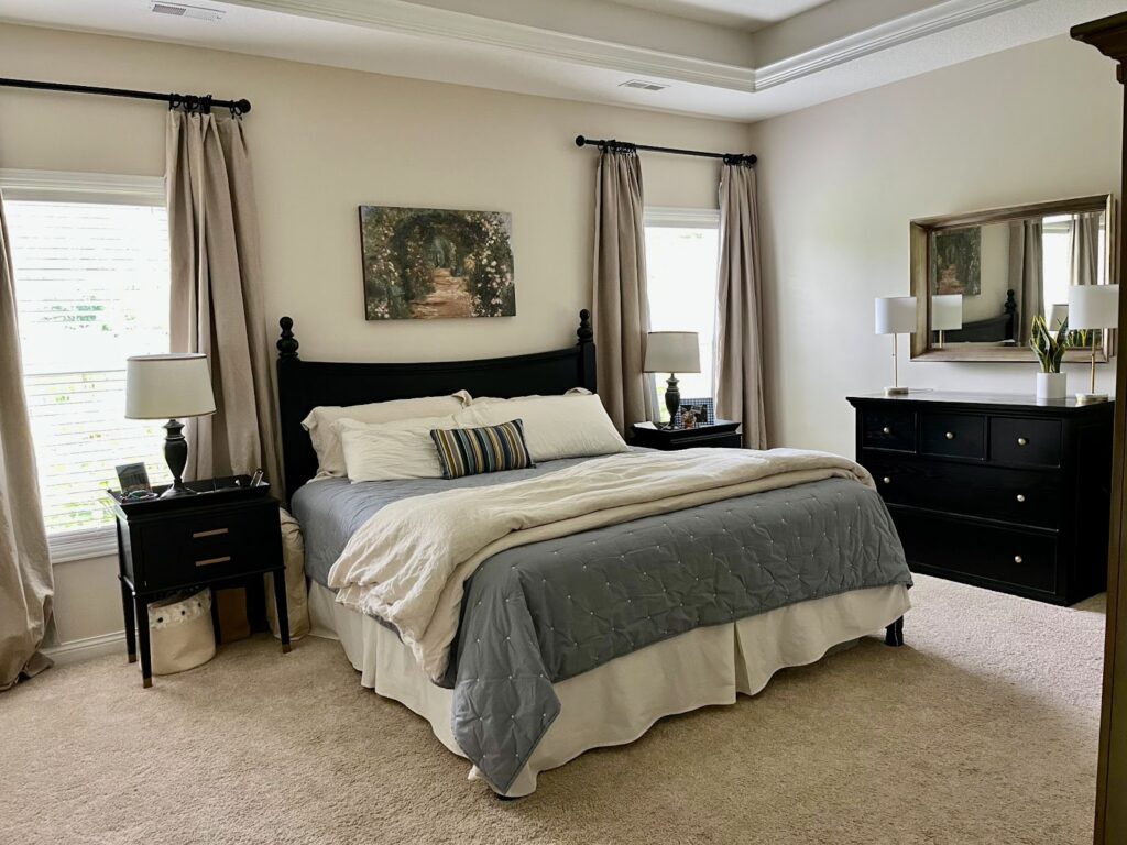
Sherwin-Williams Agreeable Gray
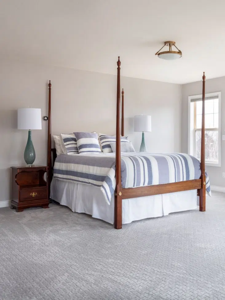
We used Sherwin-Williams Agreeable Gray (Sample) 7029 for the master bedroom in our new house. This color is a gray with green undertones that sometimes flash a bit violet.
I love Agreeable Gray (Article) in my bedroom paired with a beige carpet with green undertones. It is such a lovely combination! The trim and ceiling are painted with Sherwin Williams Extra White 7006 (Sample), a crisp blue-white. I love waking up to that gorgeous Pottery Barn Mia Chandelier.
Bloggers across the internet love this color, and this was the whole-house paint color when we bought our house. Long story short, I love it in sunny rooms such as this bedroom and basements with lots of artificial light. Avoid using Agreeable Gray in poorly lit rooms where it can look like grim prison cell gray.

Benjamin Moore Collingwood
Collingwood OC-28 (Sample) is a Benjamin Moore warm gray color with subtle violet undertones. I love to use this color in rooms with low light or windows that face North.
This bedroom belongs to a brilliant student at Florida State in Tallahassee who was looking for a timeless gray paint color. She needed a calm space for her online courses as she sheltered in place in Tallahassee.
We offered three paint colors through our online color consulting service and she picked Collingwood. We love the way it ties in with her chair and contrasts with her creamy trim. Collingwood is so seamless with her décor that it looks like a monochromatic study in whites!
Collingwood (Article) looks great with crisp white colors (Article) such as Benjamin Moore Chantilly Lace, soft off-whites such as BM White Dove, and even creamy whites like BM Swiss Coffee.
Benjamin Moore Stonington Gray
When you think of a crisp pure gray, Benjamin Moore Stonington Gray HC-170 (Sample) is the one. It has subtle blue undertones with a flash of green. I like to use it in rooms flooded with light. It can glow blue in rooms with north-facing light.
This was the Stonington Gray (Article) master bedroom in our old home. It had two walls of windows and was flooded with light. We picked a blue-gray carpet for a lovely monochromatic look. The trim was Benjamin Moore Chantilly Lace (Sample).
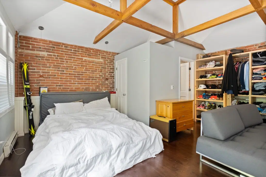
Benjamin Moore Shoreline
Benjamin Moore Shoreline (Sample) 1471 is another crisp blue-gray with more blue than Stonington. This was the guest room in a historic house that we helped renovate last summer. Shoreline (Article) looked so perfect with the red brick that we decided to keep the color. Trim is painted with a clean white like Benjamin Moore Chantilly Lace.
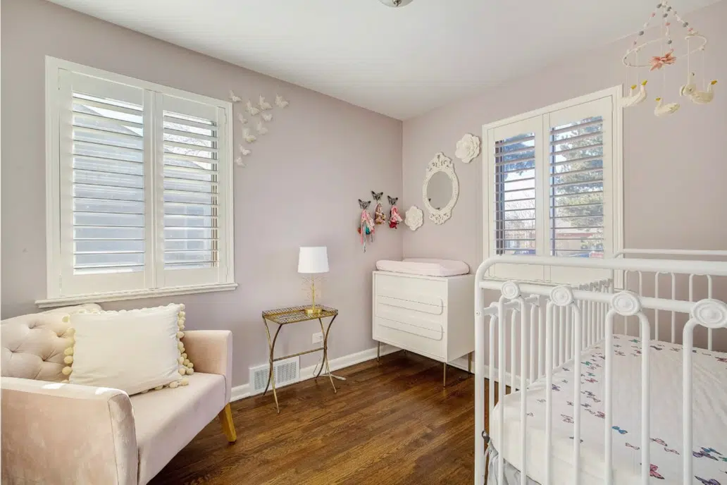
Benjamin Moore Portland Gray
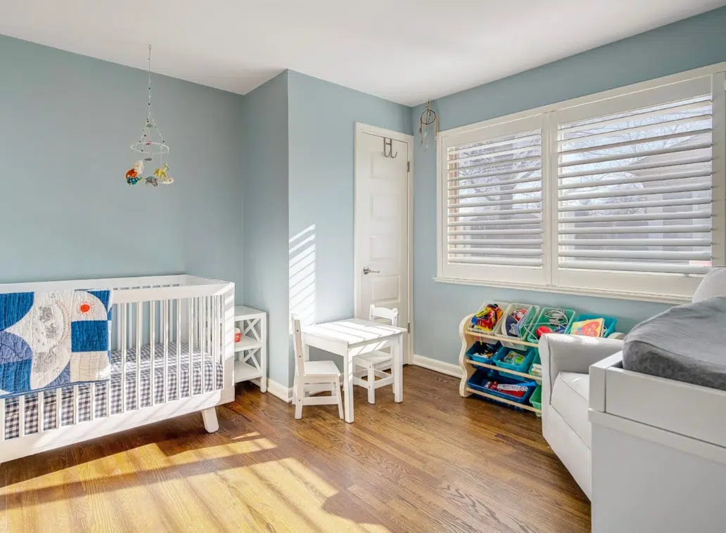
If you are looking for a sophisticated version of pink, Benjamin Moore Portland Gray (Sample) 2109-60 is the color for you. We love to use this color for a girl’s nursery, a pre-teen hangout, or a teenage refuge. It has heavy purple undertones and reads a subtle pink that changes all day long with the light. The trim and ceiling were painted with Chantilly Lace (Sample).
We don’t always use this color, but in the right space, it can be magical.
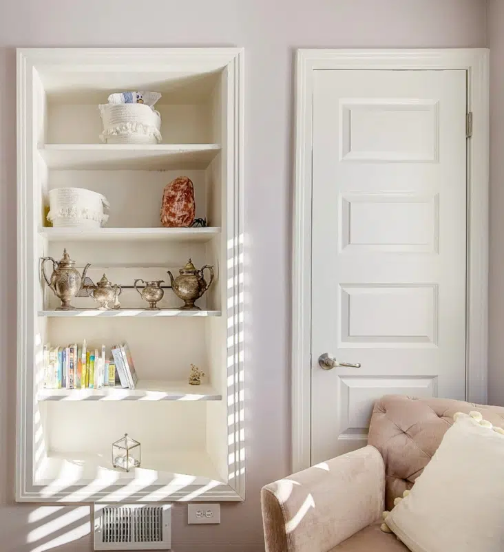
Benjamin Moore Abalone
Abalone (Sample) 2108-60 is another iconic Benjamin Moore gray color with subtle violet undertones. We have used it in offices, bedrooms, and living rooms. It is beautiful in a bedroom with windows that face South and warms up a room with Northern light and lots of windows. I would avoid rooms with low light.
The color is shown here in a basement bedroom with a large window that faces South. The trim and ceiling are Chantilly Lace (Sample). We love the bamboo lining in the window well.
Blue Paint Colors for Bedrooms
We’ve often heard that blue is the best paint color for a bedroom, and it’s true. A UK Travelodge study found that Britons sleep the longest when their bedrooms are blue, an average of 7:52 hours a night. According to the study, purple rooms had the shortest average sleep time and was found to provoke nightmares. It’s too bad, my favorite color is purple!
Benjamin Moore Smoke
Smoke 2122-40 (Sample) is a lovely muted blue that looks great almost anywhere, as long as you find other blue elements in the room to tie into.
This gorgeous master bedroom was in one of our favorite projects last summer. This was the original color and it stayed the same because it matched the colors in the art. Smoke has the perfect tone and hue for this low-light bedroom. Trim was a crisp white similar to Benjamin Moore Chantilly Lace (Sample).
This gorgeous boy’s nursery was from another project with an awesome family. We found Smoke (Sample) 2122-40 in the colors of his comforter and area rug (not shown). This beautiful room was flooded with light from south-facing windows. The trim and ceiling were painted with Benjamin Moore Chantilly Lace (Sample).
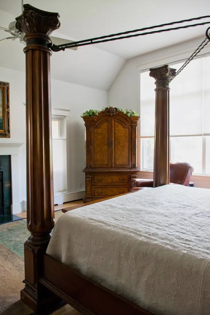
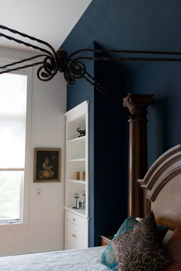
Benjamin Moore Nimbus Gray
Nimbus Gray 2131-50 (Sample) is a darker gray with strong blue undertones. We frequently pick a gray with blue undertones for a client that wants a blue room. This is especially important if the room has cool blue northern or east facing windows that will intensify the blues in a color. If we had picked a regular blue, it would glow in a bad way.
This room had lots of architectural interest, so we painted the ceiling and walls the same color. The trim is a crisp white similar to Benjamin Moore Chantilly Lace.
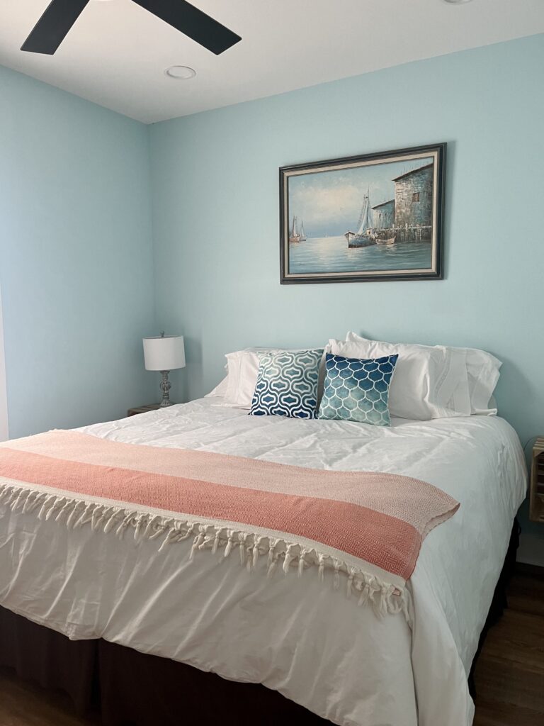
Benjamin Moore Crystal Springs
Benjamin Moore Crystal Springs (Sample) is a lighter blue with strong green undertones that keep it warm. It’s a warm blue, but not quite an aqua color.
The LRV of Benjamin Moore Crystal Springs (Article) is 74.29. Sometimes, people think that just because a color has a high LRV, it’s close to being a white color. But nothing could be further from the truth with this hue! It’s so saturated.
In my client’s bedroom below, Crystal Springs is paired with clean, white linen and simple decor to create a happy yet calming space.
Calming Green Bedroom Paint Colors
When you’re craving a serene, grounded space, soft green paint colors are one of the most reliable ways to make a bedroom feel instantly calmer.
Farrow & Ball Cromarty
After I painted my daughter’s bedroom with Farrow & Ball’s Cromarty (Sample), I couldn’t resist updating this post with a BONUS 15th calming bedroom paint color. Cromarty (Article) is a truly unique neutral – a soft green-gray that is colorful but still muted.
It’s just as versatile as a more traditional gray like Agreeable Gray or Stonington Gray, but adds more interest and freshness to a space thanks to its pale green hue. You can read more about this paint color in our full Cromarty paint color review (Article).
Farrow & Ball Green-Blue
Green Blue (Sample) by Farrow & Ball is exactly what it sounds like: a very even mix of green and blue hues.
The LRV of Green Blue (Article) is approximately 49. I would consider Green Blue a cooler green, but it can really shift depending on the light in a space, and other colors in the room.
In a west-facing room with warm, afternoon sunlight, for example, the color will appear greener and warmer. In a north- or south-facing room with more indirect sunlight, the color will appear bluer and cooler.
In the bedroom below, I love the way the Green-Blue walls look next to the cool, wood ceiling.
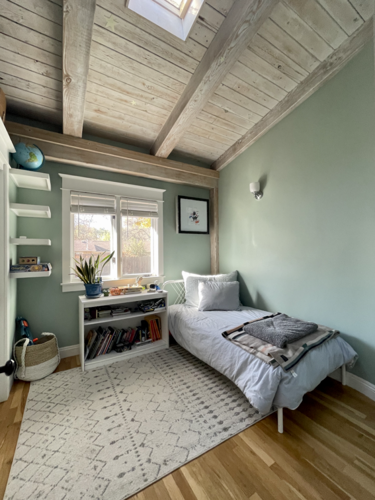
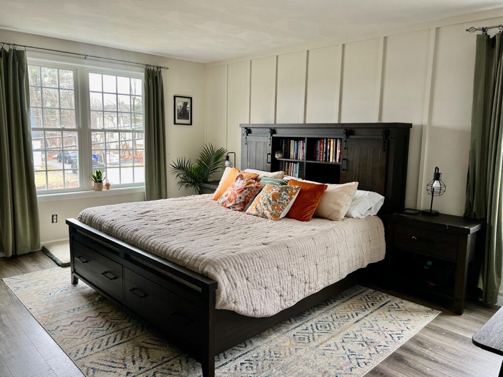
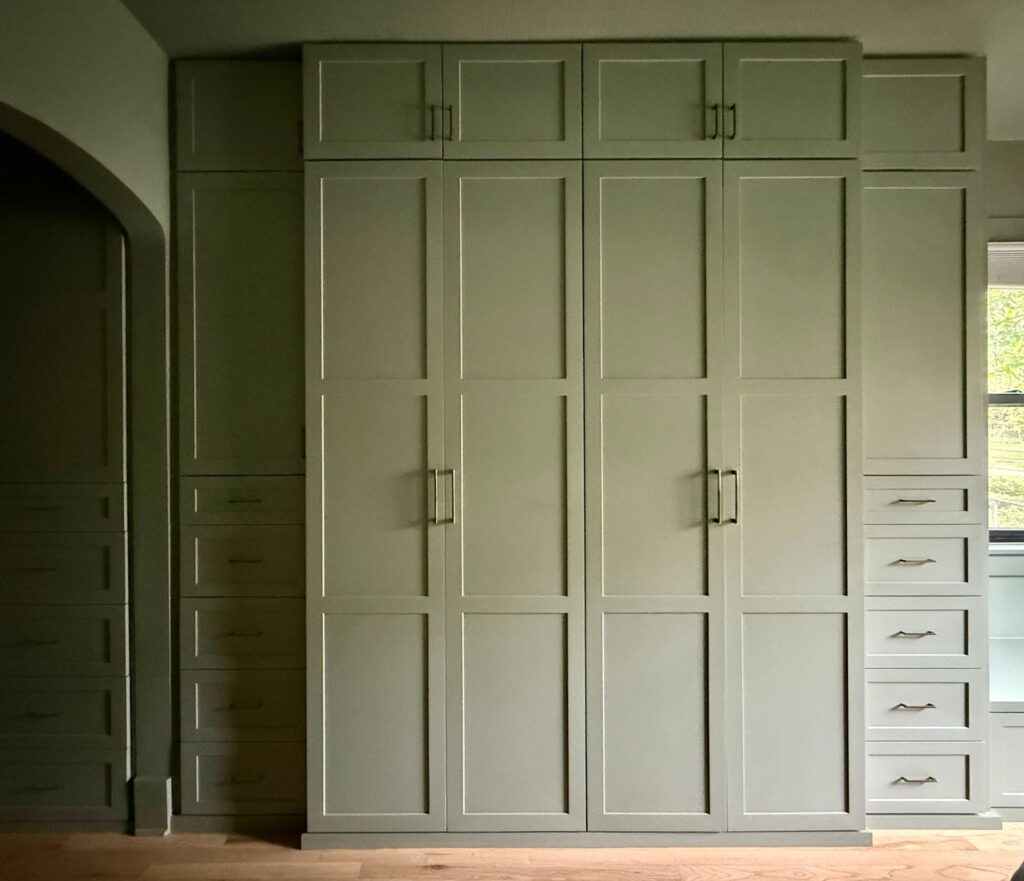
Sherwin-Williams Evergreen Fog
SW Evergreen Fog (Sample) is one of the most popular green paint colors (Article) on the market today and it’s a great choice for a calming bedroom paint color.
Evergreen Fog is warm and inviting but also has a hint of blue that keeps it very versatile. Color drenching (Article) with SW Evergreen Fog is one of our favorite ways to use this color in a bedroom.
My client’s home below features a beautiful color-drenched bedroom painted with this color, including the beautiful built-in wardrobe pictured below.
Bonus: Farrow & Ball Setting Plaster
There wasn’t a great category to fit this color in, but it deserved a mention! Farrow & Ball Setting Plaster (Article) is a beautiful pink blush paint color with highly saturated pigment. It’s not as soft or muted as most of the other colors in this list, but I absolutely love it for a bedroom!
You can use Setting Plaster (Sample) as a wall color in any room in your house, but it looks especially lovely in a bedroom. I love it paired with warm woods such as Cherry or Mahogany.
The room below was the guest bedroom in our home (a few iterations ago). This paint color is more intense than anyone would expect, but still muted and really nice to wake up to.
How to Pick Bedroom Paint Colors
Whether you’re working on your own bedroom or planning a kid’s room or nursery, choosing a paint color can feel like a big commitment! After all, paint color is really the foundation of a good room design. And given the fact that your bedroom is the place where you sleep each night, you want to make a good choice when picking your paint colors.
When choosing calming bedroom paint colors, consider the following factors:
- Lighting: Does your space have a lot of natural light? Or is it fairly dark? Do you get cooler morning and midday light in a north- or east-facing bedroom? Or is your bedroom west-facing with lots of warm, late afternoon sunlight? All of these factors will be important to think about as you choose paint colors for a bedroom.
- Existing Furniture and Fixtures: Unless you plan on making a complete bedroom renovation, you’ll want to take your existing furniture and other bedroom fixtures into consideration when choosing your paint colors. Especially pay attention to your carpet or flooring, curtain colors, and the finish of your bed frame and any other furniture.
- Your Ideal Vibe: This one may seem a little out there, but when it comes to painting your bedroom, it’s actually really important! How do you want your bedroom to feel? What do you want your space to feel like as you’re falling asleep or relaxing? A deep, dark color like Hague Blue (Color Review) would make a cozy, dreamy space for a bedroom. At the same time, a very light neutral paint color could create an almost spa-like feel.
- The Undertone: A paint color is never just the color you see. Every hue has undertones that change how it looks on the wall. A gray color might have blue, green, or purple undertones for example, while a warm white might lean toward yellow, green or even pink. Make sure the undertone of your bedroom paint colors coordinates with the undertones of your flooring and other hard finishes.
- Ceiling & Trim Color: While you could repaint your trim and ceiling (Article) to coordinate with your new bedroom hue, most of the time you’re likely looking for a wall color that will work with what you already have. Look for colors that provide enough contrast between the walls and trim, but have similar undertones so they don’t look discordant.
So, what are good colors for bedrooms?
There’s definitely a lot of room for personalization when it comes to choosing paint colors for bedrooms. But there are some colors that work particularly well.
I recommend specifically looking for calming paint colors for the bedroom, like soft blues or grays with blue undertones. Gray or beige paint colors with pink or purple undertones can also look beautiful in a bedroom, especially a young girl’s room or nursery.
What color should not be used in a bedroom?
When you’re choosing paint colors for a bedroom, it will be important to ensure that it’s a color you’ll enjoy falling asleep to and waking up to each day. As such, we usually recommend staying away from any color that is too bright or saturated.
Blues can be beautiful for a bedroom, but a bright blue will likely feel overpowering pretty quickly. A deep, dark blue, on the other hand, could work really well but could feel claustrophobic in the wrong space.
Avoid any colors that are too “trendy” or bold, too, unless you want to be repainting your bedroom every few years as you get tired of the current look.
Key Learning Points
The perfect paint color can update a bedroom in a flash! Pick bedroom paint colors with inspiration from comforters, art, window coverings, tile, or carpet colors. If you need help with choosing paint colors for a single room, we can help.
Whether your paint color is matched or true, don’t forget to test your paint colors. It’s a standard best practice. Whenever I test my paint colors, they are perfect, and when I don’t test they turn out wrong.
We recommend using Samplize to easily test paint colors in your bedroom and any room of the house! Click here to visit the Samplize website.
NEVER, EVER use paint matches from a different brand than the one you will use. Results are poor and there are no standards for the sheens. Even though your painter may truly believe it can be done, don’t do it. See results from paint matching here.
Online Color Consulting
If you still need help with paint colors, check out our Online Color Consulting packages.

Related Posts:
The Best White Paint Colors for Dark Rooms (Article)
All About Classic Gray (Article)
Our Five Favorite Benjamin Moore Whites (and how to use them) (Article)
About the Author

Hi, I’m Michelle Marceny, founder, owner, and Principal Color Designer at The Color Concierge. I believe a fresh coat of paint can completely transform a space. The Color Concierge was born out of my drive to help clients fall back in love with their homes. My clients trust me to help them find the perfect paint color for their home – whether it’s a whole-house paint color scheme or ideas for a single room.
Since The Color Concierge was founded in 2017, we have completed over 3000 color consultations, both online and in-person. I am a Certified Color Expert with 7 years of experience creating interior and exterior color palettes throughout North America.
We love your comments! Please note that the blog is meant as general advice, and it is not possible to give specific answers to your paint questions. If you want more specific advice, our Online Color Consultations will help you pick your paint colors. Thank you for your understanding.

6 Responses
Does Sherwin Williams have a color similar to Ballet White, that will offset the green reflection from the yard? Our contractor will only use SW colors and I know “matching” doesn’t always work well.
We’re also considering SW Creamy for a different space, because we like the yellow undertone – thoughts on that color in a north facing, low light room?
It’s so much harder to find SW recs, but we’re kind of stuck with this guy for now, and he’s the second SW only contractor we’ve worked with. Something about this area, maybe? They’ll get SW to color match, but the colors just aren’t the same .
Thanks!
Hi Sarah,
Instead of Ballet White (which has warm red undertones), the most similar Sherwin-Williams colors are Pacer White and Natural Choice. Creamy has strong yellow undertones, and could look good in a low light room. But beware if you have very earthy tile or countertops with pink beige undertones. Pink beige and yellow beige are discordant/clashing with each other, and Creamy will not be a good choice for that type of a room. If you want more details, don’t hesitate to purchase one of our online color consulting packages.
The reason painters like Sherwin-Williams so much is that they generally get better discounts than from Benjamin Moore. If you offer to buy your own paint they may reconsider.
Michelle
I love every one of these bedroom colors! Simply beautiful! ?
Thanks, Angelle! So nice to hear from you!
Michelle
Re Nimbus Gray.
I’m debating what color to paint a basement bedroom with an east facing window. It’s a dark room and I’d like to paint it blue. I’m worried that Nimbus Gray would be too dark. LRV is only 41.7.
I am planning on painting a small bedroom in the basement. It has a large window, low ceilings and dark paneling on the bottom. Looking for color idea. I like blue or beige colors. Can you suggest some ideas? Thank you.