If you’re looking for a timeless interior color scheme, this Benjamin Moore Classic Gray color palette could be the perfect fit. Explore all the beautiful paint colors in this Colorado home.
This Colorado home was one of my favorite projects I’ve ever worked on. The homeowners are a really nice family that purchased this home, which had great bones but needed renovation.
When they came to The Color Concierge, their goal was a classic, timeless home in which they could raise their beautiful family. We were lucky enough to create a whole-house color palette (Article) for the interior and exterior of the home. The palette we ended up with is soft, muted, neutral, and elegant. Even the saturated blue colors are muted. The palette is a great backdrop for the homeowner’s beautiful art and calm, peaceful aesthetic.
We designed the palette with Benjamin Moore Classic Gray (OC-23) as the foundation of the main living area. We kept the rest of the palette mostly monochromatic with some subtle pops of color. Keep reading to learn more about this BM Classic Gray color scheme and how to design a whole-house palette for your home.
*This post contains affiliate links for products I use and love. If you click on some links and make a purchase, I will get a small commission at no cost to you. This helps pay for the costs of the blog, so I can continue to offer great content to our readers.
About The Color Concierge
Our Colorado-based paint color consultants make finding the right paint colors for your home easy. Whether you’re painting the exterior or interior of your home, our simple yet effective process lets us get your paint color right the first time. We’ve helped thousands of homeowners transform their homes into a space they love. Learn more about ONLINE COLOR CONSULTATIONS today.
How to Design a Whole-House Palette
Our design guidelines for whole-house color schemes are detailed in the post How to Create a Whole House Color Palette (With Real-Life Examples)(Article), and Why A Whole-House Color Scheme Matters.
But before I share our clients’ Benjamin Moore Classic Gray (Color review article) color palette, I wanted to briefly review our method.
1. Pick your foundation color for the common areas. A foundation color is typically a light neutral, such as a white, gray, beige or greige. In this case, we used BM Classic Gray, BM Edgecomb Gray (Color review article), and BM White Dove (Color review artice), which are all warm neutral paint colors.
I like to start with the lightest wall color at the entry, and then use darker neutrals as you go deeper into the home, with splashes of color interspersed as accents.
2. Select a white paint color for the trim and ceiling. Every good color palette needs great white paint (Article) for trim and ceilings. This should be used throughout the home on all the trim, window frames, and doors. In this home, we used BM Oxford White as our trim color throughout the home.
3. Pick paint colors for the secondary living spaces. Next, we move to the dining rooms, offices, bathrooms, and bedrooms. Blues, greens, and neutral paint colors with colorful undertones are perfect for this kind of space.
4. Select accent colors last. If you’re planning for accent walls, make sure to consider the other paint colors in your palette and the colors in your furniture, decor and hard finishes.
5. Pay attention to undertones. When designing a color palette, choose paint colors that have similar undertones. For example, since Classic Gray has warm, green undertones, I picked other neutrals with green undertones to complete the palette I’m sharing today. I kept all of the other colors in the palette warm too, including warm blues with green undertones and warm whites.
Sample Classic Gray
We always recommend that you test paint colors (article) in your home because lighting can completely change a color, both on interiors and exteriors.
In the old days, this meant we painted a large poster board with sample pots and a huge mess.
Now we have a better way to test paint, with Samplize Peel-and-Stick samples!
- Samples pre-painted with 2 coats of real paint from the manufacturer.
- Large 9” x 14” samples to see the color better in the lighting.
- Delivered overnight
- Colors are accurate
- Less expensive than painting a large poster board with sample pots
- No mess, and no toxic paint to dispose of
I use these in my color consulting practice for exact results. Discover Samplize peel-and-stick paint samples and sample Classic Gray (Sample) via the link below.
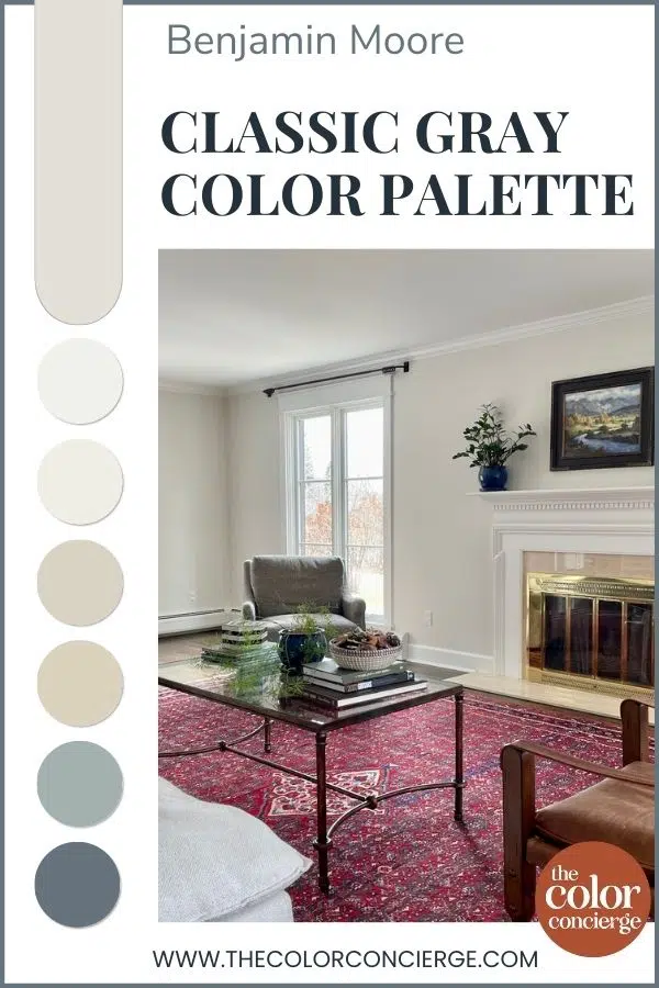
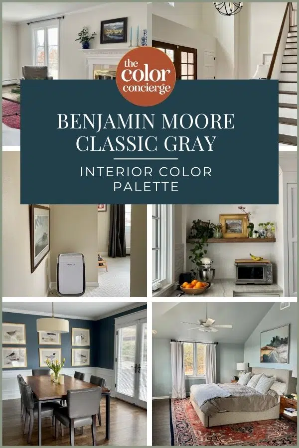
Benjamin Moore Classic Gray Interior Color Palette
The home featured in today’s post is a wonderful example of a timeless whole-house color palette. This home has so many beautiful rooms and living spaces, so we wanted to build a color palette that would highlight the unique architectural details and make the space feel warm and inviting.
We kept the palette simple and mostly monochromatic, which gives the homeowners flexibility with their furniture, decor, and hard finishes for years to come.
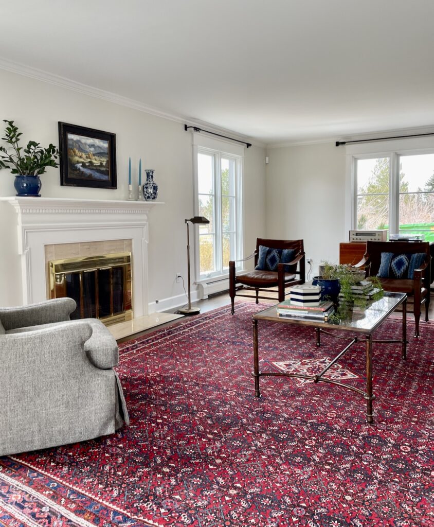
BM Classic Gray Living Room
The living room is connected to both the entryway and the dining room of this home, so it’s one of the first spaces you see when you enter the house.
We chose BM Classic Gray (color review article) because it felt light and bright in the space but still provided plenty of warmth.

BM Classic Gray is very versatile and shifts depending on the natural light. It has subtle green undertones and can flash purple in cooler light. Sometimes it can read so warm that it’s almost beige, and other times it can read a light warm gray. Classic Gray has an LRV of 76, and is fairly light, so In a room flooded with light like this one, it looks like a creamy white that doesn’t shift into yellow.
In any light, it’s a wonderful neutral foundation for pops of color in your decor and finishes. I love the way the Classic Gray walls look with this bright and colorful area rug!
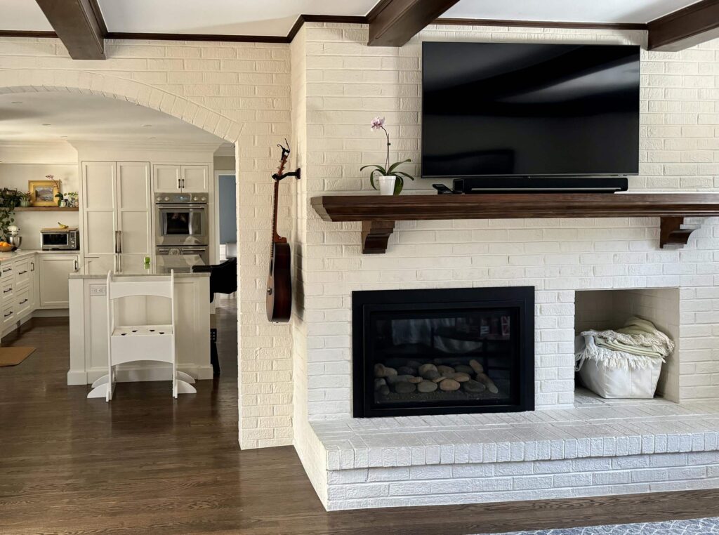
We continued the BM Classic Gray walls in the family room, pairing them with a brick fireplace painted with Benjamin Moore Edgecomb Gray. (Color review article) The fireplace and brick arch – both painted with Edgecomb Gray – are a lovely transition into the home’s kitchen, which features warm white kitchen cabinets (Article) and Edgecomb Gray walls.
Sample Benjamin Moore Classic Gray.
BM Edgecomb Gray Kitchen
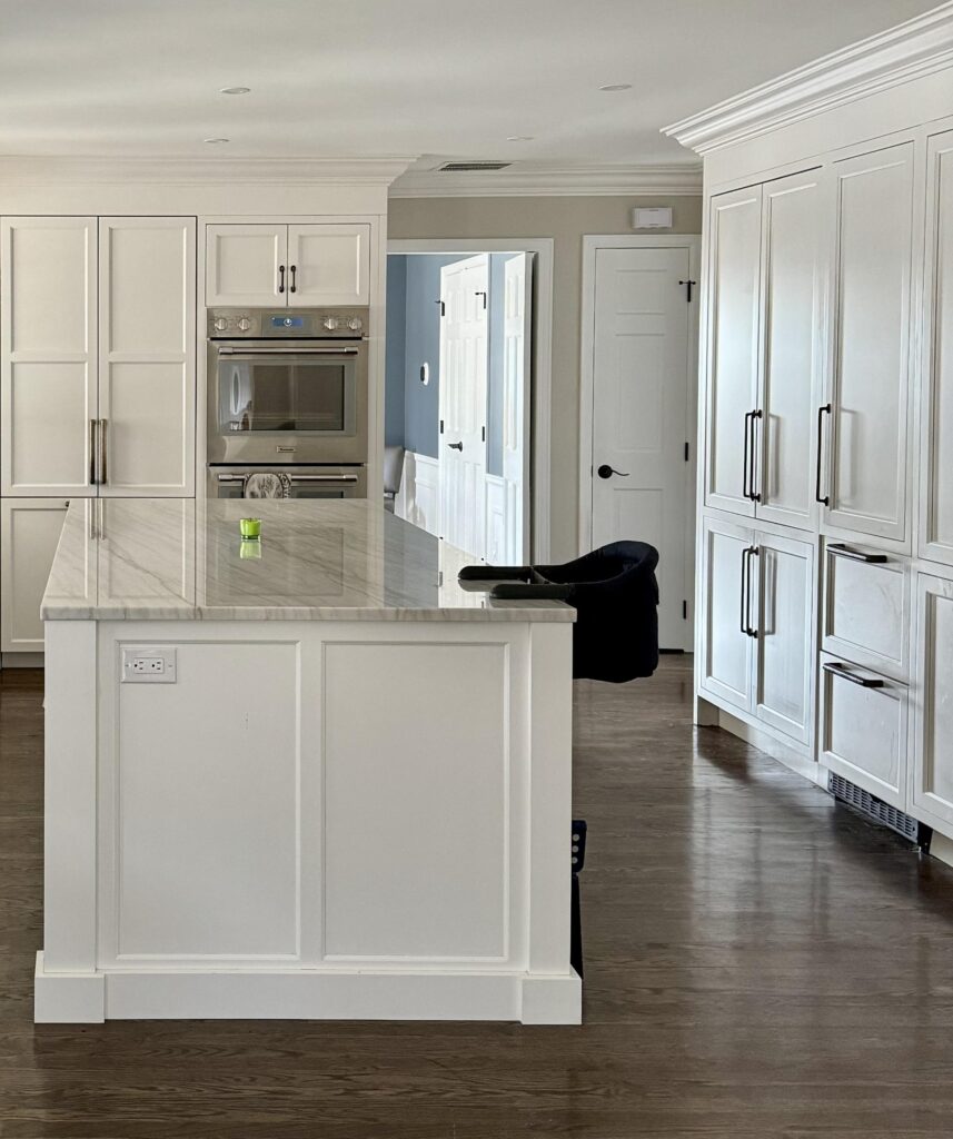
The kitchen is truly the heart of any home, so we always spend a lot of our time planning the colors for this room. This client’s kitchen renovation (Article) had just been completed and featured a Chamonix Quartzite countertop, which we paired with Benjamin Moore Edgecomb Gray (color review) walls.
Edgecomb Gray has an LR of 63, and is a darker version of Classic Gray, perfect for this tonal and neutral palette.

The veins of the quartzite matched BM Edgecomb Gray exactly, so that was the perfect choice for the walls in this space! Quartzite is a wonderful countertop material because it’s even stronger than granite. You can see the beautiful veining in the image below, and the tinge of red warmth in the cabinets. We used the veins in the quartzite as a reference to select the Edgecomb Gray.
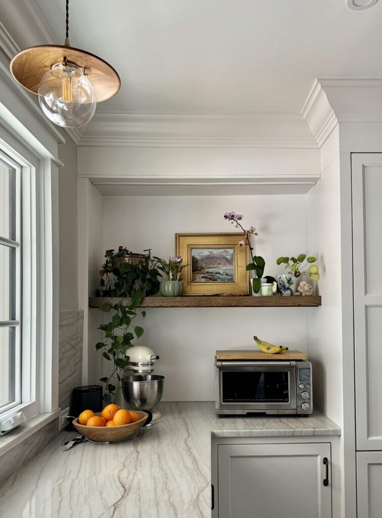
This kitchen is mostly cabinets, but you can see the Edgecomb Gray on the walls that lead into the dining room and on the walls above the stone flanking the hood.
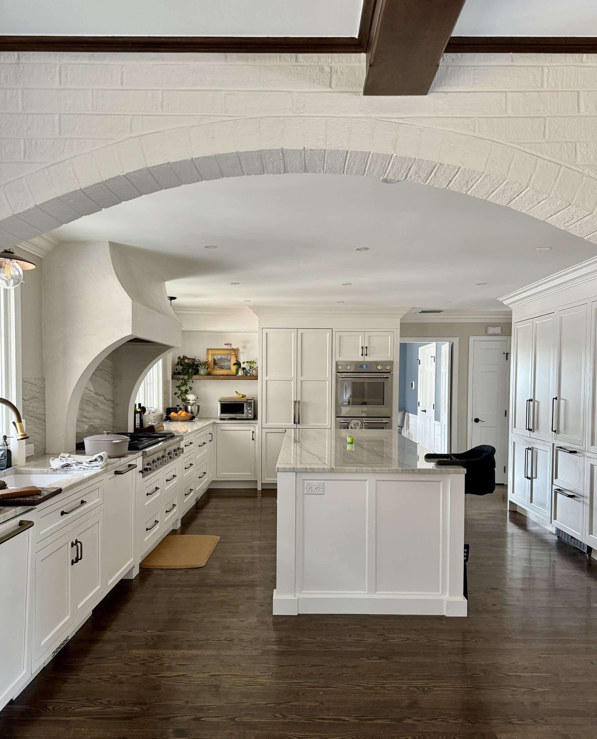
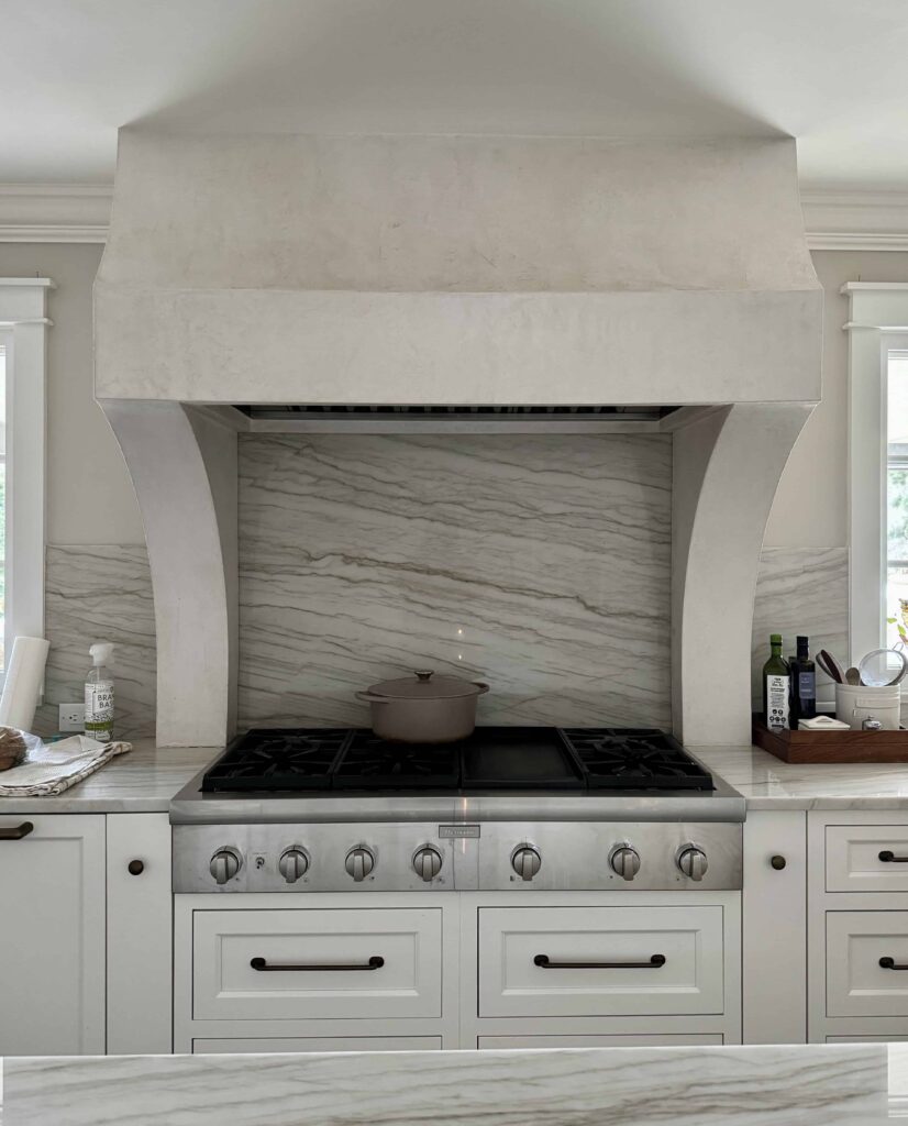
The warmth of the Edgecomb Gray walls looks beautiful with the warm white cabinets and the warm gray veining of the Quartzite counters.
Sample Benjamin Moore Edgecomb Gray.
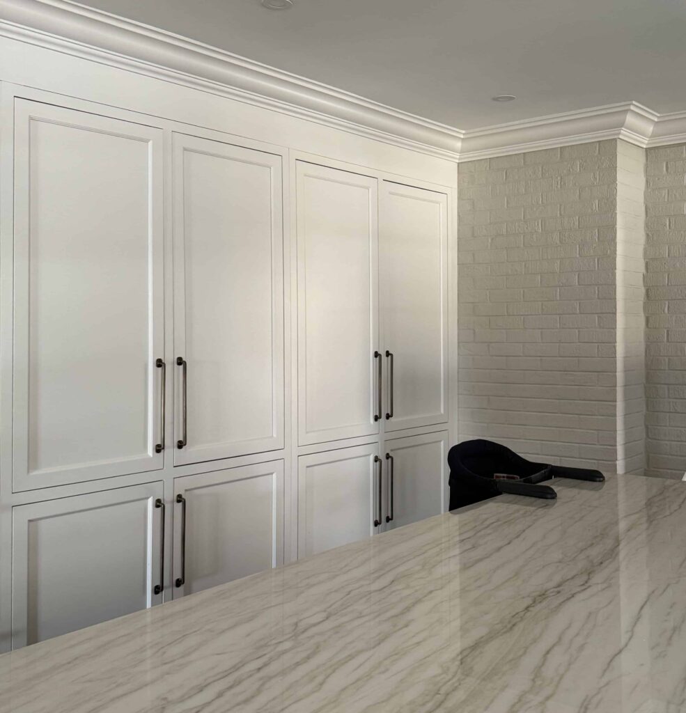
Benjamin Moore Oxford White Trim
When designing whole-house color palettes we often pick a white trim and ceiling paint that is the same color as the cabinets. Instead, we picked Oxford White for the whole-house trim color, which is a clean white that leans into warmth.

The white cabinets were a gorgeous off-white with really warm tones that wouldn’t have looked right as trim in this type of home. Oxford White, though not the same, was still close enough to harmonize nicely. You can always pair a clean white with an off-white. Oxford White has an LRV of 87, and is very bright. It is the same as Benjamin Moore White Heron.
Sample Benjamin Moore Oxford White.
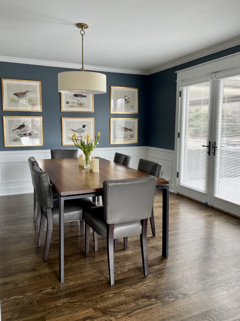
BM Britannia Blue Dining Room
The dining room, painted with BM Britannia Blue (color review), is one of our favorite rooms in the house, and even though it’s formal, the family uses it frequently. Britannia Blue has an LRV of 18 and is a mid-toned blue-gray. I love it because it looks so silky when you paint it on the walls.

We wanted to treat this room like an accent (Article) but also ensure it tied in well with the Classic Gray color palette, especially because the room is visible from the living room and the kitchen.
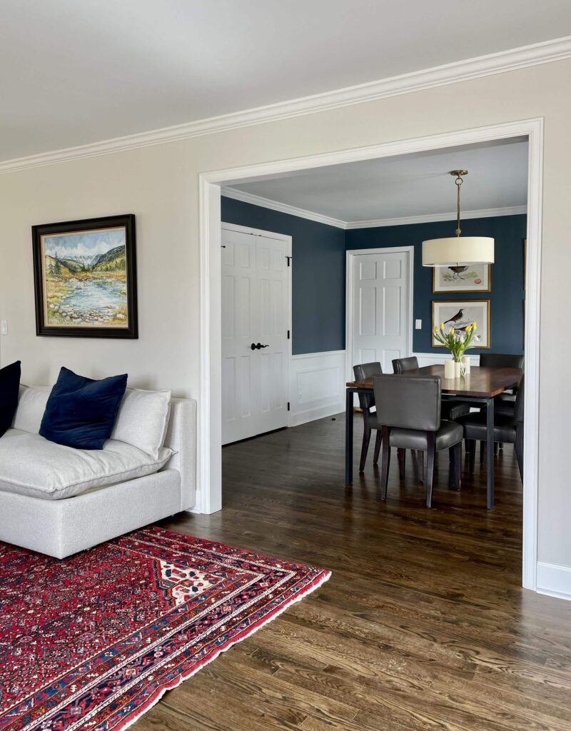
The walls above the wainscoting were painted Benjamin Moore Britannia Blue, with traditional trim white for the wainscoting (we used Oxford White here). You can learn more about Britannia Blue in our color review article.
Sample Benjamin Moore Britannia Blue.
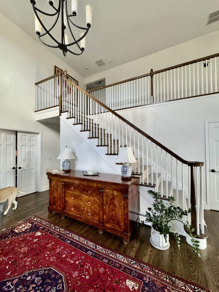
Benjamin Moore White Dove Entryway and Hallway
This home’s entry is a beautiful welcoming area. We decided to paint the walls lighter than Classic Gray and went with BM White Dove (color review).

White Dove is a slightly creamy, yet muted white paint that works well in rooms with lots of light like the entryway, but also looks pretty in dimmer areas, like this home’s upstairs hallway. White Dove has an LRV of 83, similar to SW Alabaster.
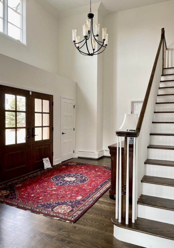
The homeowner chose a traditional, classic and timeless staircase that would look current today or in 20 years. Trim and ceiling are painted with Oxford White.
Sample Benjamin Moore White Dove.
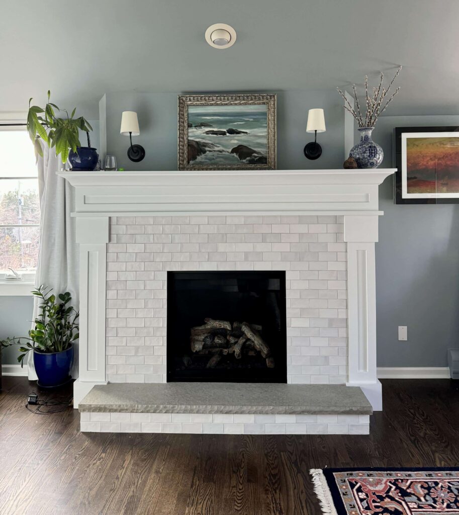
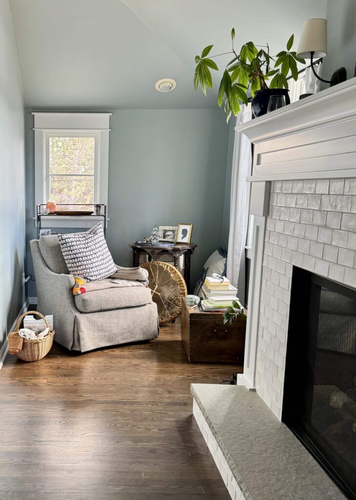
Benjamin Moore Mount Saint Anne Primary Bedroom
Bedrooms are a great place to play with color within a whole-house palette. For these clients, we painted the cathedral ceilings and walls of the primary bedroom with Benjamin Moore Mount Saint Anne (Color review article).

Mount Saint Anne is a gorgeous blue-gray paint color (Color review article) that has a touch of green added in, offering warmth that is perfect for a cozy, calming bedroom (Article) . It looks lighter in this room than you might expect because of all the windows that face south and west.
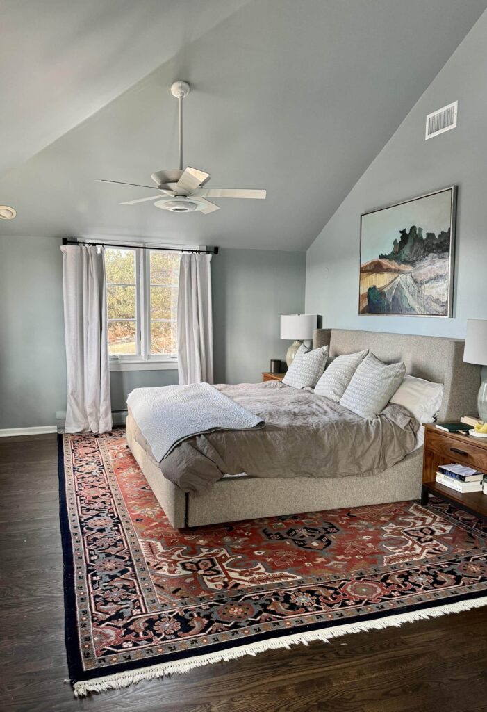
The trim and fireplace mantle are painted with BM Oxford White.
I love the way this color looks in this room’s cozy nook. It’s a great area for peace and tranquility for our homeowner.
Sample Benjamin Moore Mount Saint Anne.
Benjamin Moore Manchester Tan Kids Bedrooms
We painted the kids’ rooms Benjamin Moore Manchester Tan (color review), a warm, friendly neutral that is a great foundation for a variety of decor styles. This color is very similar to Edgecomb Gray. It has a similar LRV. but when you compare the two colors, Manchester Tan is warmer and more beige than Edgecomb Gray.

Manchester Tan walls can grow with their kids, remaining classic even as their interests and decor preferences change.
Sample Benjamin Moore Manchester Tan.
Exterior Color Palette for the BM Classic Gray Home
We also picked the exterior paint colors for this home. While we knew we weren’t going to use a BM Classic Gray color palette for the exterior, we still wanted colors that would coordinate with the look inside the home.
We resisted using a very bright white because of the Colorado sunshine. Instead, we painted the house a very light greige called SW City Loft (Sample). City Loft is a balanced greige on the warm side. It has an LRV of 70, which makes it light-reflecting.
The exterior palette was completed with Sherwin-Williams Fawn Brindle, a darker greige than City Loft that was the perfect color for the window trim.
We used Sherwin-Williams Black Fox for the garage doors, fascia, gutters, downspouts and crown molding between the soffits and the body of the house.
Together, the three hues create a simple and truly timeless exterior color palette that transforms this house into a Modern French Chateau. Read our full breakdown of this painted brick exterior palette (Article).
Explore all the colors in this Benjamin Moore Classic Gray Color Palette
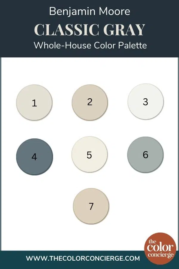
- Benjamin Moore Classic Gray (OC-23) (sample)
- Benjamin Moore Edgecomb Gray (HC-173) (sample)
- Benjamin Moore Oxford White (CC-30) (sample)
- Benjamin Moore Britannia Blue (1623) (sample)
- Benjamin Moore White Dove (OC-17) (sample)
- Benjamin Moore Mount Saint Anne (1565) (sample)
- Benjamin Moore Manchester Tan (HC-81) (sample)
Don’t Forget to Sample Your Paint Colors
We always recommend that you test paint colors on your home because lighting can change a color completely, both with interiors as well as exteriors.
In the old days, this meant we painted a large poster board with sample pots and a huge mess.
Now we have a better way to test paint, with Samplize Peel-and-Stick samples!
- Samples pre-painted with 2 coats of real paint from the manufacturer.
- Large 9” x 14” samples to see the color better in the lighting.
- Delivered overnight
- Colors are accurate
- Less expensive than painting a large poster board with sample pots
- No mess, and no toxic paint to dispose of
I use these in my own color consulting practice for exact results. Discover Samplize peel-and-stick paint samples:
Buy 8 samples and get 2 free – no coupon code required. Order today and get samples tomorrow!
Online Color Consulting
Don’t want to create a color palette by yourself? Discover our Online Color Consulting Packages.

Related Posts:
- Benjamin Moore Classic Gray Paint Color Review
- Benjamin Moore Edgecomb Gray Paint Color Review
- Benjamin Moore Britannia Blue Paint Color Review
- Benjamin Moore White Dove Paint Color Review
- Benjamin Moore Mount Saint Anne Paint Color Review
- White Painted Brick Exterior Color Palette
- Whole-House Color Palette with Real-World Examples
- Why a Whole House Color Scheme Matters
About the Author

Hi, I’m Michelle Marceny, founder, owner, and Principal Color Designer at The Color Concierge. I believe a fresh coat of paint can completely transform a space. The Color Concierge was born out of my drive to help clients fall back in love with their homes. My clients trust me to help them find the perfect paint color for their home – whether it’s a whole-house paint color scheme or ideas for a single room.
Since The Color Concierge was founded in 2017, we have completed over 3000 color consultations, both online and in-person. I am a Certified Color Expert with 7 years of experience creating interior and exterior color palettes throughout North America.
We love your comments! Please note that the blog is meant as general advice, and it is not possible to give out specific answers to your paint questions. If you want more specific advice, our Online Color Consultations will help you pick your paint colours. Thank you for your understanding.

One Response
Lovely colour palette. Could I use Oxford white as a ceiling and trim paint with cloud white kitchen cupboards and den built ins? We have classic gray and collingwood on the walls.
Would Britannia blue as an accent wall in a small windowless powder room along with classic grey work. Cabinet is cloud white as well.
Neutral countertop and flooring. Your advice would be appreciated! Thank you