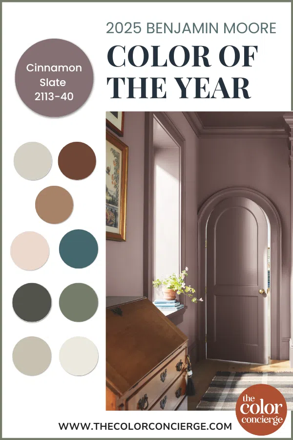
The Benjamin Moore Paint Color of the Year 2025 Cinnamon Slate has officially been announced, and its corresponding Color Trends 2025 palette is on track to start trending.
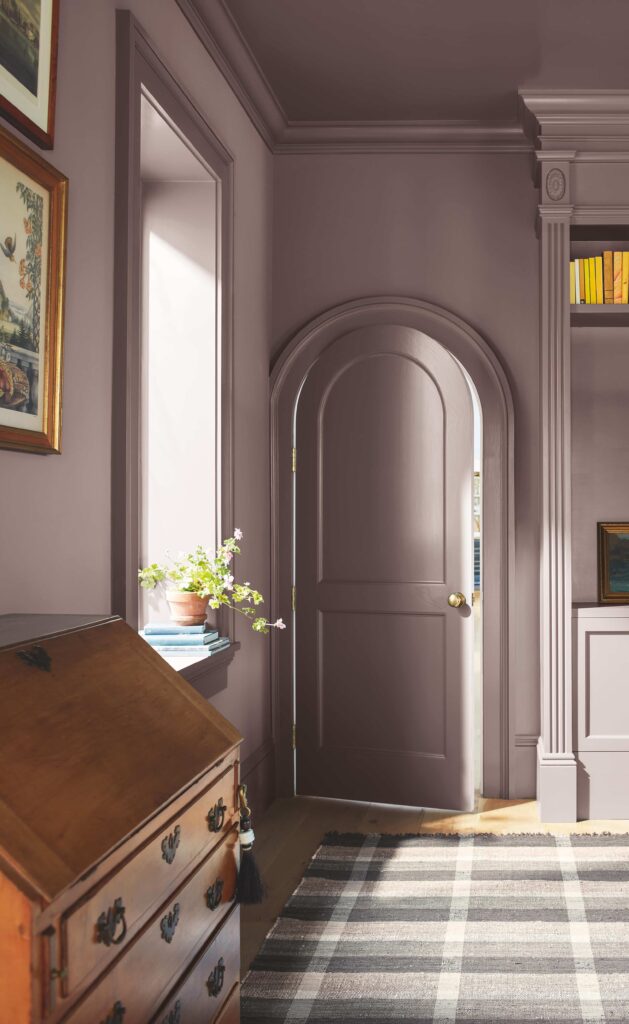
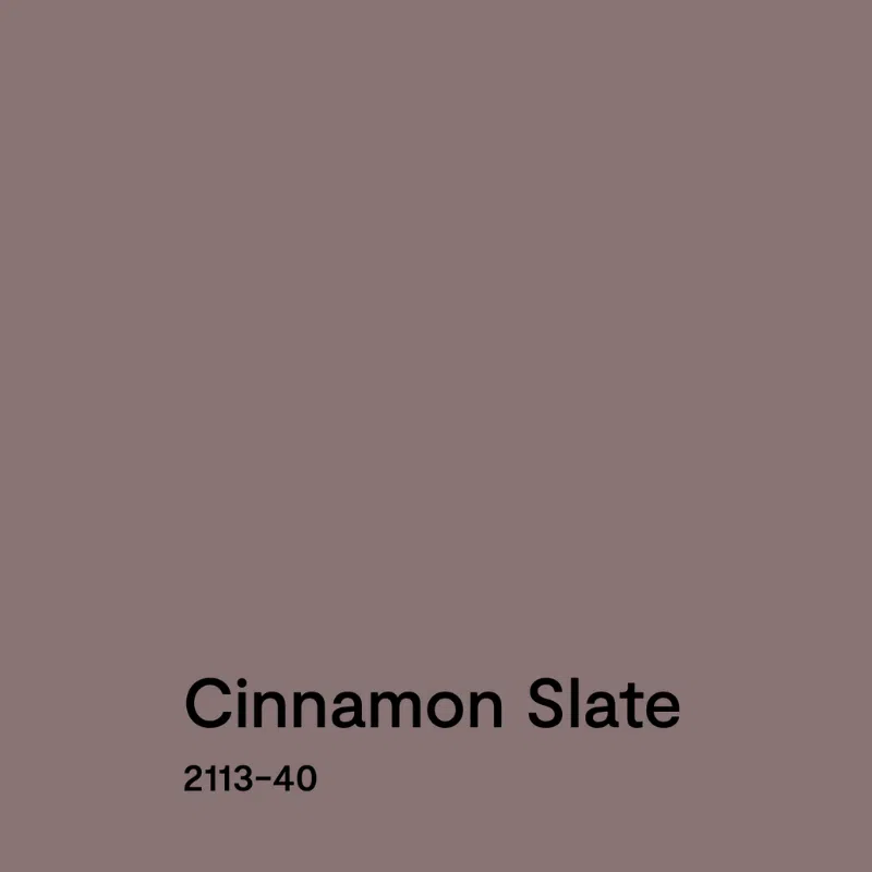
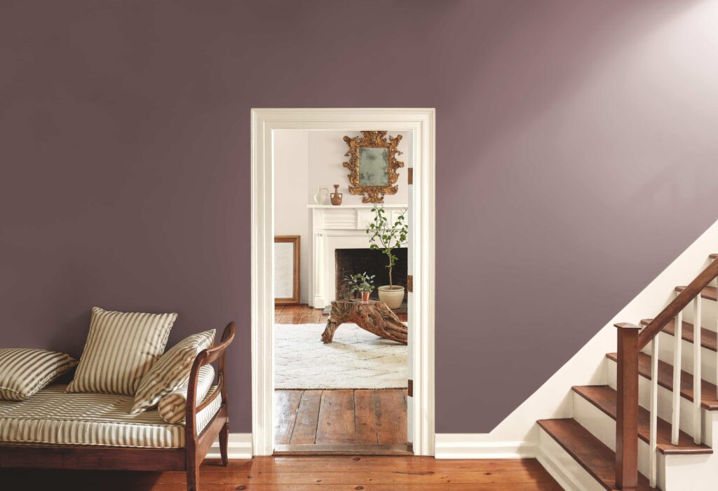
Cinnamon Slate is the Benjamin Moore 2025 Color of the Year, and it’s a muted yet striking violet hue perfect for anyone looking to add moody color to their home this year.
According to Benjamin Moore, Color Marketing and Design Director Andrea Magno, “Cinnamon Slate is an inviting hue that offers enduring style and modern sensibility. Its depth and richness bring an air of approachability and sense of comfort throughout the home, making it a new favorite for years to come.”
Cinnamon Slate is a beautiful, nuanced color for homeowners who want to try adding more color into their homes but aren’t ready for some of the more saturated, bold hues we’ve seen trending in recent years.
I could see this color paired with gorgeous wallpaper in a powder room or used for color drenching in a bedroom, home library, or dining room.
In this post, I’ll review Benjamin Moore Cinnamon Slate and show how you can use the entire BM Color Trends 2025 palette throughout your home.
All of these paint colors are available in Benjamin Moore paint stores nationwide.
Note: We used photos courtesy of Benjamin Moore because we don’t have most of these in our collection of projects yet, but aren’t compensated by them.
*This post contains affiliate links for Samplize products. If you click on some links and make a purchase, I will get a small commission at no cost to you. This helps pay for the costs of the blog, so I can continue to offer great content to our readers.
About The Color Concierge
Our Colorado-based paint color consultants make finding the right paint colors for your home easy. Whether you’re painting the exterior or interior of your home, our simple yet effective process lets us get your paint color right the first time. We’ve helped thousands of homeowners transform their homes into a space they love. Learn more about ONLINE COLOR CONSULTATIONS today.
What does The Color Concierge think about Benjamin Moore Cinnamon Slate?
Here are our first impressions of the 2025 Color of the Year:
Michelle Marceny: Founder, Lead Color Designer:
Purple is my favorite color, and I have loved it since I was little. When I met my husband, he was wearing a purple shirt, and he is a keeper! The exterior of my last house (and first color project) had purple accents.
So, from a visceral standpoint, I love, love, love this color, and I see so much potential in it. Sadly, when I give my clients a list of colors as options to paint their homes, they almost always say no to purple. But sometimes, my clients go for purple paint colors with great success.
This will be a much more successful paint color than anyone suspects. Purples usually aren’t very mainstream, but this year, they are having a moment, especially warm purples.
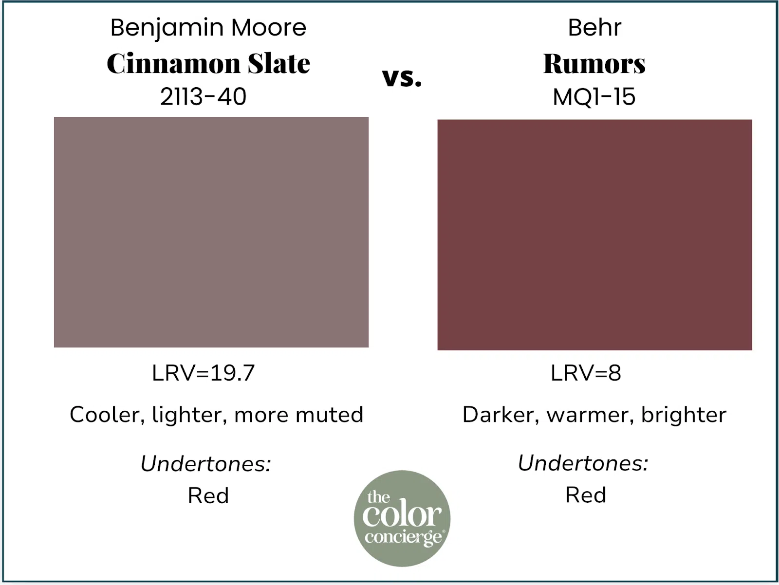
One hint that it would be a huge success is that Behr’s 2025 COTY was Rumors, a dark, warm violet. It has been a big hit, especially with the color-drenching crowd! Even though Cinnamon Slate is a warm purple, color is all about comparison, and in this case, Cinnamon Slate looks cool next to Rumors. They are completely different colors, both beautiful.
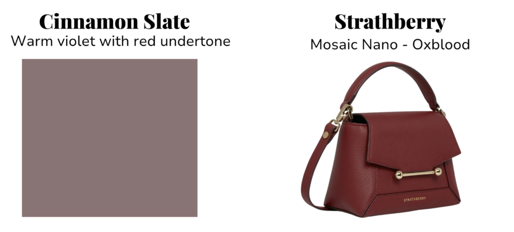
Sometimes, we also see the same color trends in the fashion industry. This year, the color trend is for a rich, purply burgundy.
These gorgeous Strathberry purses launched this fall in a color called Oxblood. I’m pretty obsessed. This warm burgundy-purple color is everywhere in the clothing fashion world this season.
The total palette is a fan favorite at The Color Concierge. We have used several of these colors in different projects.
Maddie Camilli: Senior Color Designer
When we look at the color trends over the last five years, Benjamin Moore gave us rich, colorful, often vibrant hues that added a splash of color and life to the white paint color trend. Especially after the gray trend, we needed more color!

As we move into a warmer, more balanced era, the new color of the year, Cinnamon Slate, is the perfect way to add color, depth, and richness to a palette without needing a bold punch of color. We notice how much EARTHIER and more muted this shade is compared to previous years, which can indicate where the next color trends are headed.
And it’s not just the color forecasters that control our desires for what we want to see. Lately, we have noticed clients want to move into a much more cozy and organic palette. We see fewer requests for “crisp and clean” and more requests for “warm and cozy.” We think that Cinnamon Slate came at the perfect time!
Below, we have tips for how to use Cinnamon Slate. Let’s go!
What kind of color is Benjamin Moore Cinnamon Slate?
Cinnamon Slate is a muted, warm violet with a red undertone. It’s the opposite color of Blue Nova last year, which was a blue-purple or purple-blue, depending on how you see it.
Purples can be warm or cool. Warm purples have red undertones (like burgundy), and cool purples have blue undertones, which we call blurples.
Cinnamon Slate is a relatively dark color, with an LRV of almost 20. It is muted and moody, and so very sophisticated. I believe it would be a great candidate for color-drenching a bedroom, which I plan to do in my own primary bedroom. My husband and I both love purple!
What is the closest Sherwin-Williams paint color?
Sherwin-Williams Patchwork Plum is a pretty close Cinnamon Slate alternative. We have used that color before as an exterior door color.
Can you use BM Cinnamon Slate as an interior whole-house color?
No, Cinnamon Slate would not be a good interior whole-house color. It’s too dark and too bold for an entire home. It may become overwhelming in a large, open-concept space or throughout an entire home.
However, it is a beautiful paint color for single rooms, accent walls, and other details throughout a home, including home decor.
How can you use Cinnamon Slate as a paint color in your home?
There are so many different uses for this color. Use it as a rich, beautiful wainscoting in a dining room, or color drench a bedroom or office. The color is dark enough to be moody, and light enough so that it doesn’t make the room oppressive.
Should I try BM Cinnamon Slate cabinets?
I would love Cinnamon Slate as a lower cabinet color in a tuxedo cabinet color scheme, with light quartz countertops and backsplash and a light-colored floor. If the floors were mid-toned to darker wood, there would not be enough contrast with the cabinet color.
Would BM Cinnamon Slate exterior paint work?
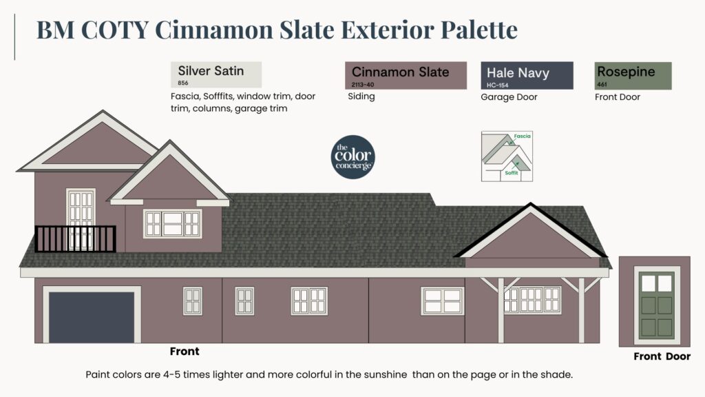
This is a great color for an exterior color scheme! You can use it as siding, a secondary accent color, or a front door color. It is muted enough to look elegant and not garish outside. It’s definitely not mainstream, but this could be the one if you have ever considered purple for an exterior paint color.
I used Rosepine as a front door color, with a blue Hale Navy Garage Door to add depth and interest. Glacier White was too stark for the white trim, so I replaced it with Silver Satin, which is a lighter version of BM Sea Salt.
What colors work well in a COTY Cinnamon Slate color palette?
In addition to naming Cinnamon Slate its 2025 Color of the Year, Benjamin Moore also released a coordinating Color Trends palette featuring nine other gorgeous paint colors.
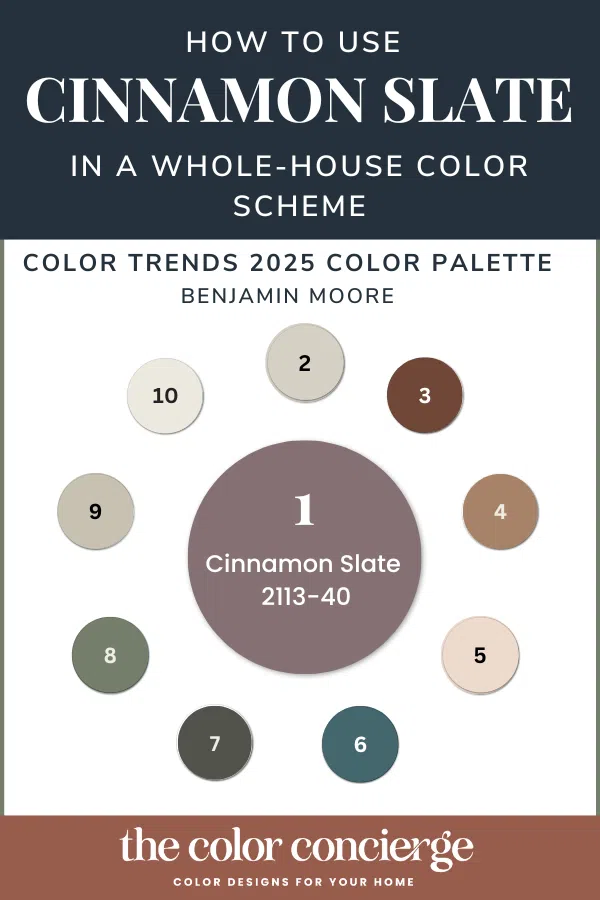
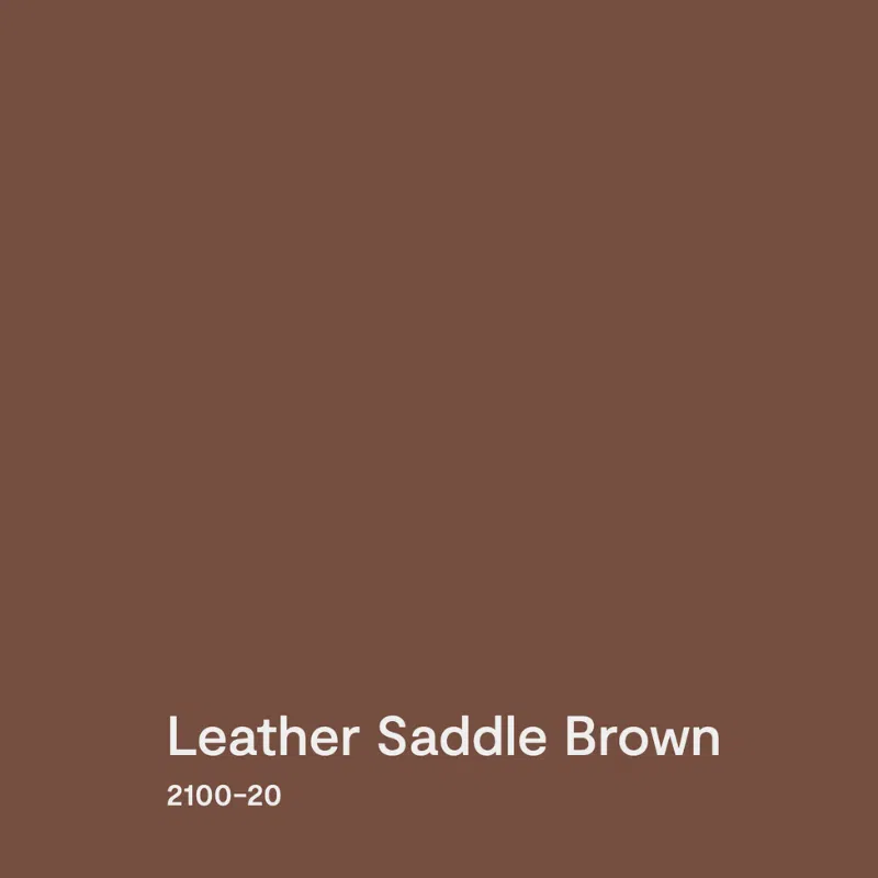
- Cinnamon Slate (2113-40)
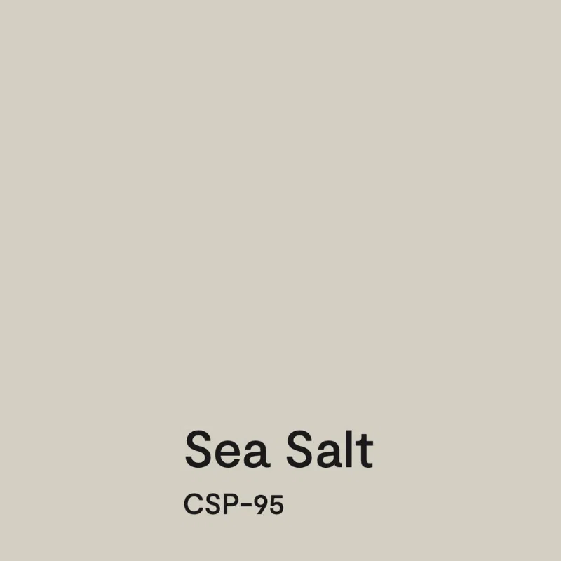
- Sea Salt (CSP-95)
- Leather Saddle Brown (2100-20)
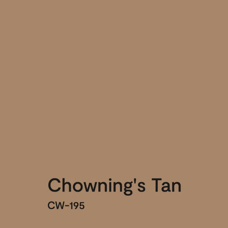
- Chowning’s Tan (CW-195)
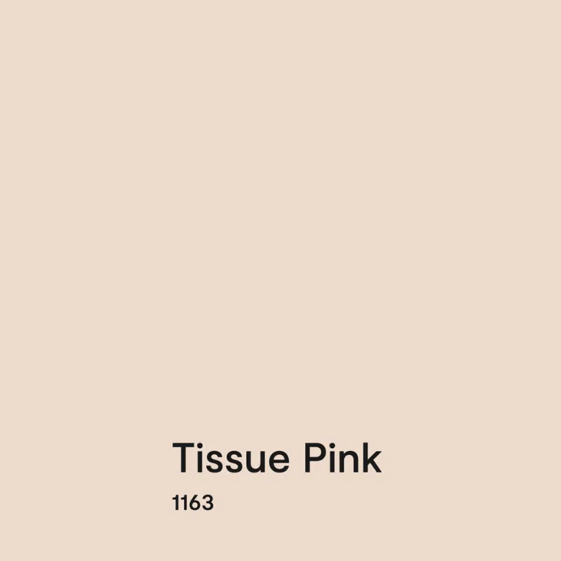
- Tissue Pink (1163)
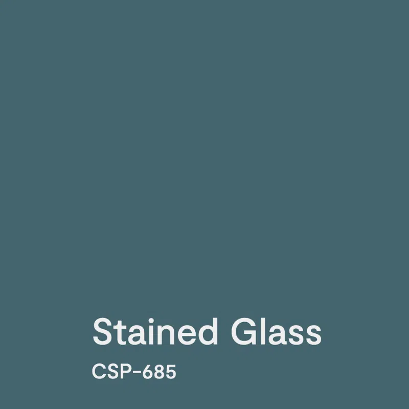
- Stained Glass (CSP-685)
- Ashwood Moss (1484)
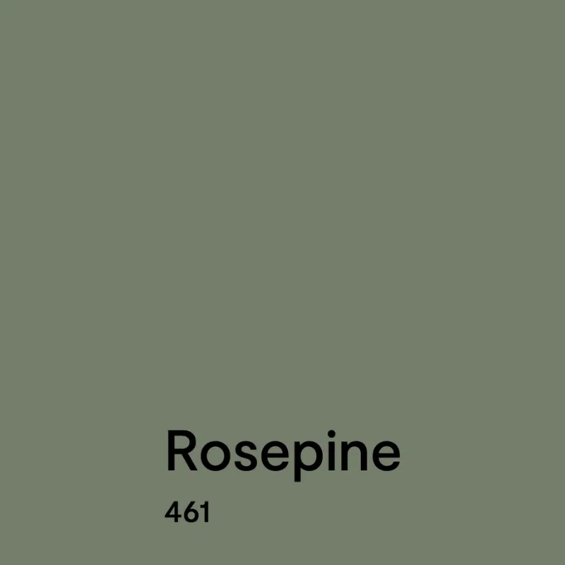
- Rosepine (461)
- Paris Rain (1501)
- Glacier White (OC-37)
The Color Trends 2025 palette can be used as a guideline for a whole-house color scheme.
Overall, this palette features lots of moody, earthy paint colors that are bold without being bright. The palette is very warm and creates a cozy, inviting atmosphere in a home.
I LOVE greens with purples, and Benjamin Moore didn’t miss that trick. They specified Rosepine and Ashwood Moss as part of the palette. We’ve used both colors in client projects, which we’ll show you later in the article.
Grays with violet undertones, like BM Sea Salt, also pair nicely with violet colors, which is logical.
Warm pinks (like BM Tissue Pink) and terracottas (like BM Chowning’s Tan) will also complement Cinnamon Slate, especially since they have the same level of mutedness. And I love a purple with a teal, like BM Stained Glass.
As you explore the 2025 Color Trends, note that the colors in this palette aren’t just for paint colors. You can also use them for decor and other accents. Weave the colors into your accent pillows, furniture, rugs, and art. You might even discover you already have many colors in your home.
Keep reading to see the best ways to use all the colors in this BM Cinnamon Slate color palette.
BM Sea Salt – Whole House Paint Color
For whole-house color schemes, we like to start with a foundation neutral as the color that you would paint the Open Layout area, other common areas such as staircases and hallways, and even the whole house.
Don’t mistake BM Sea Salt for SW Sea Salt, an iconic Sherwin blue-green color (SW Sea Salt Color Review).
We recommend Benjamin Moore Sea Salt for this purpose. Sea Salt is a gray with soft violet undertones similar to Collingwood (see our Color Review Article) or Balboa Mist (see our Color Review Article). It has an LRV of 61, but it is on the slightly darker side for a whole-house color.
Still, it would be gorgeous, especially if you have tons of light in the home. We like to use a neutral lighter color as the foundation color.
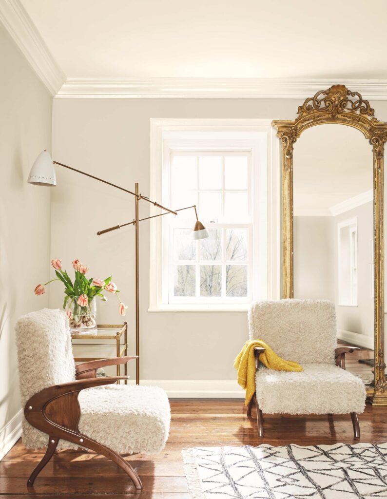
BM Glacier White – Trim & Ceilings
This is a fantastic color for trim and ceilings, especially with this earthier palette. You could also use it as a foundation color for the common areas, like the entry, open layout, kitchen, living room or even the primary bedroom.
I really love a bright entryway as a cheerful way to enter your home. If you use it as a trim color, it makes sense to consider it as your kitchen cabinet color too.
This is a color we have had great success using when a room has lots of green foliage outside that reflects green into it. The warm undertones seem to absorb the green nicely. Try testing it to see if it does this job in your home.
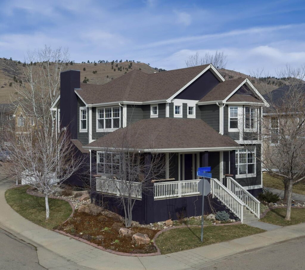
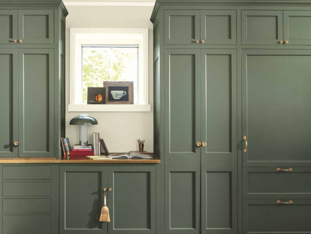
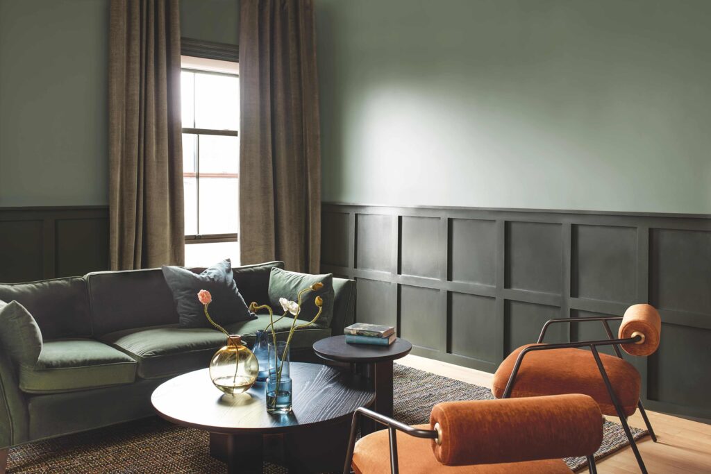
BM Ashwood Moss – Accent Rooms & Color Drenching
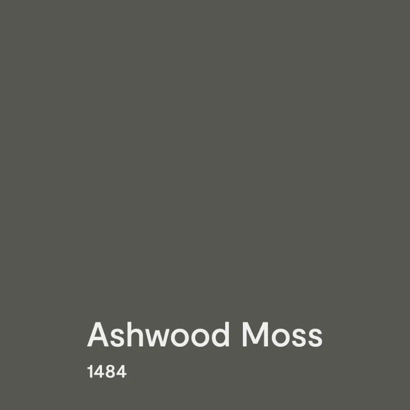
This color is one of my favorites, especially for exteriors. It’s a deep green that is almost gray. It can be used to color-drench a bedroom, office or living room. It really comes to life when you balance it with purples, terracottas, and other warm colors.
Check out this color-drenched library with Ashwood Moss. This color looks fantastic with warm woods such as cherry and walnut as furniture.
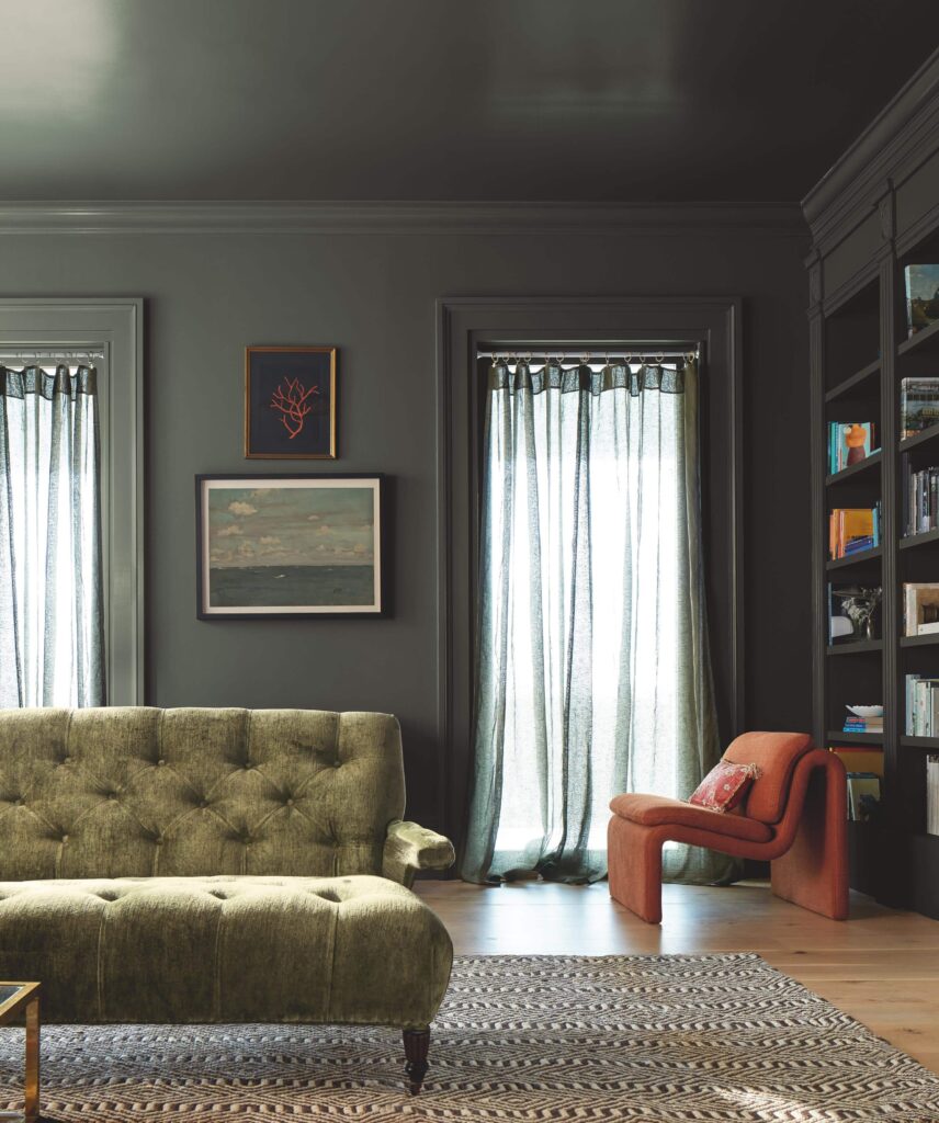
The photos below are of my previous home. The siding was Ashwood Moss with BM Tulsa Twilight on the stucco and front door. Tulsa Twilight is a very dark, cool purple. It looks great with a green garden too.

BM Rosepine – Accent Walls & Cabinets
We have mad love for this color! Here you see it as an accent wall behind a bathroom vanity with BM Balboa Mist as the wall color. It’s one of our favorite accent wall colors.
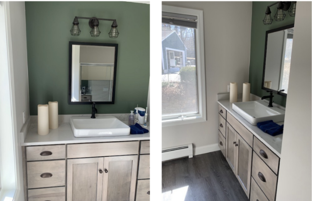
If you are partial to green, it would also make an incredible kitchen cabinet color, wainscoting color, or gorgeous color drench.
It has slight blue undertones, and is really well balanced.
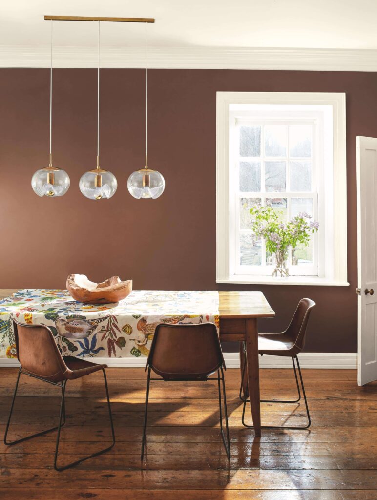
BM Leather Saddle Brown – Dining Room Paint Color
Who would think a brown color would be so rich and lovely in a home? It has a ton of warmth that complements the green and purple in the house.
Note how it picks up the color of leather on the chairs. The tablecloth with lots of jeweled-toned colors brings it to life. To me, this is the color of garnets.
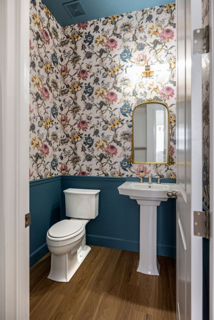
BM Stained Glass – Powder Room Paint Color
This color could be used in a bathroom or even a powder room. It would also be gorgeous in an office as an accent wall or a color for built-in cabinets.
I often call this family of mid-toned teal colors “Airbnb blue” because so many short-term rentals use this color as a rich accent wall. It’s because it is so pretty!
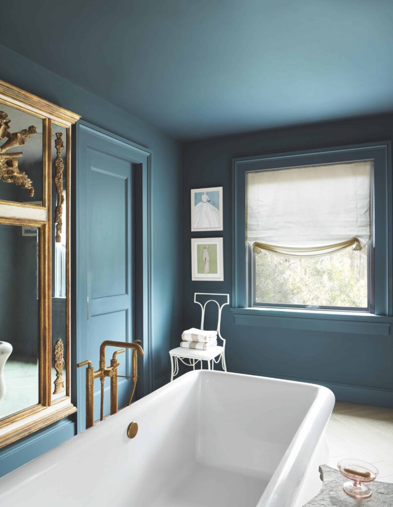
This color resembles one of our favorite mid-toned teals, Benjamin Moore Bella Blue. You can see Bella Blue in my own powder room, pictured below and featured in our Bella Blue color review article. I love how it ties in with this House of Hackney wallpaper, too.
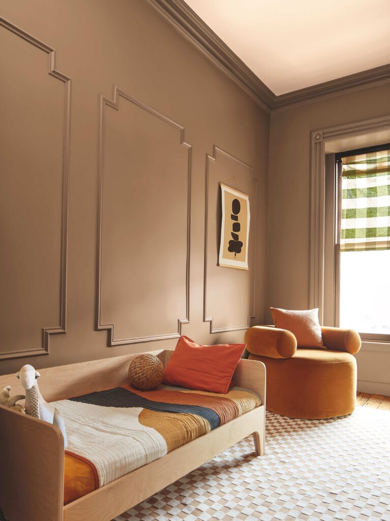
BM Chowning’s Tan – Bedroom Paint Color
This would make a fabulous color for a bedroom, whether it’s a primary bedroom, kid’s bedroom, or even a grown-up room for a teenager. It’s a beautiful terra cotta color that will look great with any of the colors in the palette as accents.
In the photo below, the crown molding and window trim are all painted this color. The ceilings are left white, which is an excellent choice to give the room some extra light. We might call it a partial drench.
BM Tissue Pink – Children’s Bedroom Paint Color
We use this color all the time as a kids’ bedroom color. I wish we had a photo of it, but I couldn’t find one. Here is one from Benjamin Moore:
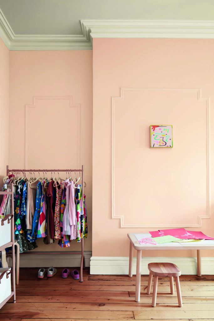
The peachy undertones add a special touch to the color. It’s not just any kind of pink. Below, it’s shown with Rosepine trim, doors, and a lower accent wall. I love this combination!
What is the best way to test the Benjamin Moore 2024 Color Trend paint colors?
We always recommend testing paint colors in your home because lighting can completely change how a color looks, both in interiors and exteriors.
In the old days, this meant we painted a large poster board with sample pots and a huge mess.
Now we have a better way to test paint, with Samplize Peel-and-Stick samples!
- Samples pre-painted with two coats of real paint from the manufacturer.
- Large 9” x 14” samples to see the color better in the lighting.
- Delivered overnight
- Colors are accurate
- Less expensive than painting a large poster board with sample pots
- No mess, and no toxic paint to dispose of
I use these in my own color consulting practice for exact results. Discover Samplize peel-and-stick paint samples.
Sample the individual paint colors in this BM Cinnamon Slate color scheme by linking to the colors below:
- Cinnamon Slate (2113-40)
- Sea Salt (CSP-95)
- Leather Saddle Brown (2100-20)
- Chowning’s Tan (CW-195)
- Tissue Pink (1163)
- Stained Glass (CSP-685)
- Ashwood Moss (1484)
- Rosepine (461)
- Paris Rain (1501)
- Glacier White (OC-37)
Or, use the link below to get a Samplize bundle of the entire 2025 Color of the Year palette! With code BMCOTY, you can save 15% on all Benjamin Moore samples!
Is BM Cinnamon Slate a Good Color of the Year?
To answer this question, we need to consider what makes a good Color of the Year. A good Color of the Year should inspire you to find places to use the color in your house. It should pair well with both earthy older trends as well as upcoming fresher trends. It should be flexible and should pair well with many types of colors.
At its core, the Color of the Year should start a new trend. And Cinnamon Slate definitely has the potential to do that!
We think Cinnamon Slate is just what today’s homeowners are looking for. It’s a gorgeous way to add color but is still warm and muted, and cozy. It pairs well with the much-loved, warm neutrals already on the walls in so many homes.
For people interested in trying some bold trends like color drenching, Cinnamon Slate is an incredible option that won’t overpower a space.
Cinnamon Slate is a great step toward more colorful homes, and we look forward to using it with our clients!
Key Learning Points
Benjamin Moore launched their 2025 Color of the Year, Cinnamon Slate, and we couldn’t be more excited to see where this color goes.
- Cinnamon Slate is a darker, muted purple with warm undertones that add depth and interest to this color.
- The 2025 Color of the Year palette can also be used as a whole-house palette.
- Balance Cinnamon Slate with soft whites (like BM Glacier White) and style it with the other colors in the 2025 palette.
Remember: NEVER, EVER use paint matches from a different brand than the one specified. Results are poor and there are no standards for the sheens. Even though your painter may truly believe it can be done, don’t do it. See results in our paint matching guide.
No matter what, always test your paint colors. It’s a standard best practice. Whenever I test my paint colors, they are perfect, and when I don’t test they turn out wrong. Learn how to test your paint colors like a pro.
Online Color Consulting
If you still need help with paint colors, check out our Online Color Consulting packages or an In-Person Color Consultation in the Denver Metro area.
If you liked this post, don’t forget to pin!
Related Posts
- Benjamin Moore 2024 Color of the Year
- HGTV by Sherwin-Williams 2025 Color of the Year
- Sherwin-Williams 2024 Color of the Year
- HGTV Home by Sherwin-Williams 2024 Color of the Year
- Color Drenching 101
About the Author

Hi, I’m Michelle Marceny, founder, owner, and Principal Color Designer at The Color Concierge. I believe a fresh coat of paint can completely transform a space. The Color Concierge was born out of my drive to help clients fall back in love with their homes. My clients trust me to help them find the perfect paint color for their home – whether it’s a whole-house paint color scheme or ideas for a single room.
Since The Color Concierge was founded in 2017, we have completed over 3000 color consultations, both online and in-person. I am a Certified Color Expert with 7 years of experience creating interior and exterior color palettes throughout North America.
We love your comments! Please note that the blog is meant as general advice, and it is impossible to give specific answers to your paint questions. If you want more specific advice, please consider purchasing a color consultation. Thank you for your understanding.
