We have the most amazing home office paint colors to maximize your productivity! Pick office paint colors with inspiration from art, window coverings, tile, or carpet colors in place.
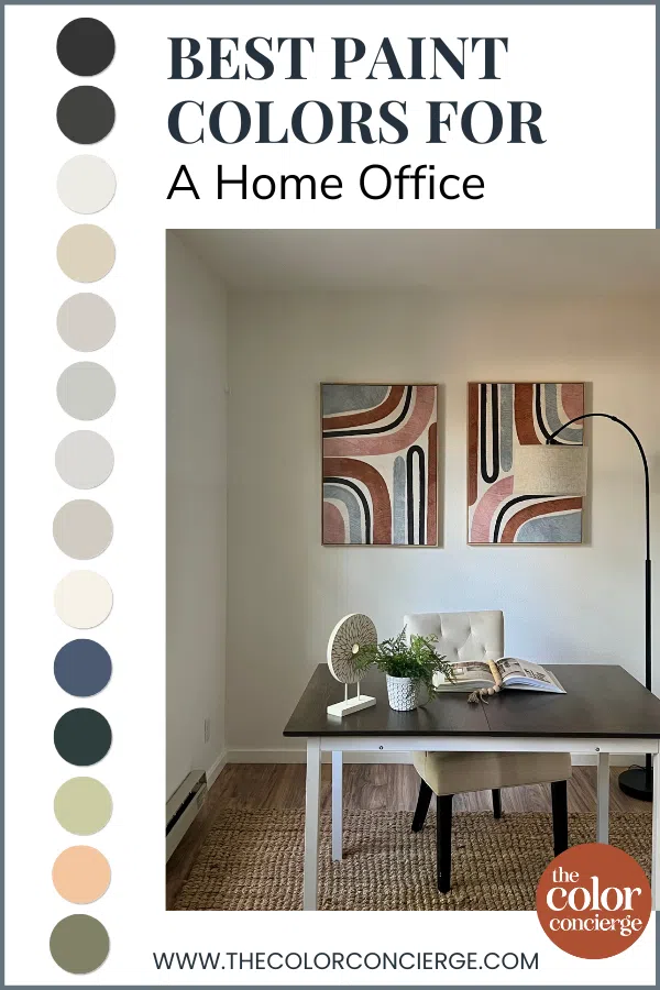
In this post, we’re sharing some of our favorite office wall colors. Some of the photos were sent to us from family and friends showing off their home workspaces. Others were taken from client projects.
*This post contains affiliate links for products I use and love. If you click on some links and make a purchase, I will get a small commission at no cost to you. This helps pay for the costs of the blog, so I can continue to offer great content to our readers.
About The Color Concierge
Our Colorado-based paint color consultants make finding the right paint colors for your home easy. Whether you’re painting the exterior or interior of your home, our simple yet effective process lets us get your paint color right the first time. We’ve helped thousands of homeowners transform their homes into a space they love. Learn more about ONLINE COLOR CONSULTATIONS today.
How to Choose a Home Office Paint Color
When choosing a paint color for an office, it’s important to consider a few key factors. These include:
Office Use
If you’ll be on your computer all day staring at the screen, a dark office wall color can be easier on your eyes. If you’ll be on Zoom meetings, a neutral hue provides a go-with-everything backdrop.
Lighting
Like any other space in your home, the amount and type of natural light in your office have an impact on the colors that will work best.
Very dark wall colors look beautiful in rooms with lots of warm light but may feel oppressive in dimly lit rooms. White paint colors, on the other hand, can look dingy in rooms with low light or cool Northern light. Cream hues may look yellow in rooms with very warm Southern light.
Trim and Ceiling Colors
Unless you’re starting a home office from scratch, there’s a good chance you already have trim and ceiling paint colors in this space. In most cases, it’s easier to pick an office paint color that works with your existing trim and ceiling rather than repaint it (which can be very costly).
Furniture and Decor
If you have existing office furniture, you’ll want to make sure any paint color you choose works with the colors and undertones of these items. Be sure to test your paint color not only on the wall but also alongside your desk, chair, flooring and any other hard finishes.
Your Whole-House Color Palette
While an office is typically a separate space, it’s still a good idea to make sure the color you choose flows with the other colors in your home.
Personal Style
It is very important to style your workspace to WANT to be in it for the most productive results. Great ideas are inspirational art pieces, photos, and plants to add life to the room.
One of the best parts of working from home is that you have all your favorite things with you. Set up coffee, a sweater, slippers, and noise-canceling headphones to maximize your comfort!

Sample the Best Office Paint Colors
We always recommend that you test paint colors (article) in your home because lighting can completely change a color, both on interiors and exteriors.
In the old days, this meant we painted a large poster board with sample pots and a huge mess.
Now we have a better way to test paint, with Samplize Peel-and-Stick samples!
- Samples pre-painted with 2 coats of real paint from the manufacturer.
- Large 9” x 14” samples to see the color better in the lighting.
- Delivered overnight
- Colors are accurate
- Less expensive than painting a large poster board with sample pots
- No mess, and no toxic paint to dispose of
I use these in my color consulting practice for exact results. Discover Samplize peel-and-stick paint samples via the link below.
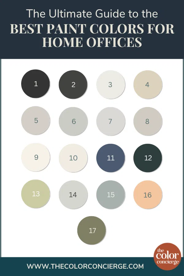
17 Best Home Office Paint Colors
There are so many options when it comes to choosing a paint color for your home office. Here are some of our favorites – all with real-world examples.
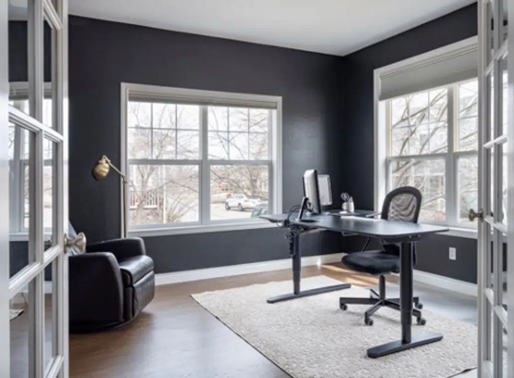
Benjamin Moore Onyx
BM Onyx (Article) is a dark, true black paint color with minimal undertones. If you’re committed to having black office walls – and you have lots of natural light – Onyx is a gorgeous hue.
Black Onyx is a truly neutral dark black that can work well with both cool and warm colors and finishes.
The room below is my office from my former home in Boulder, Colorado. I loved having a black office because, as a color consultant, I am constantly looking at colors. A black backdrop helps me read colors without extra visual interference. I also enjoyed the way the black set off the greenery outside. The black walls are painted with Benjamin Moore Onyx (2133-10) (Sample). The Trim and ceiling were painted with Chantilly Lace (OC-65)(Sample).
Sherwin-Williams Iron Ore
This soft black paint color is surprisingly versatile, thanks to its invisible green undertones that give it warmth. Iron
I love Iron Ore in an office because it’s so restful to your eyes as you are on a computer. I have it as an accent wall in my loft studio, where it is restful and lovely and repeats the color of the black chandelier.
I’m on my computer all day long. Before I added this dark wall to my loft office studio, the room was too bright and I often ended up with a headache after a long day. Adding this dark, neutral accent wall really helped.
Sherwin-Williams Pure White
Sherwin-Williams Pure White (Article) is a very specific paint color; there is no equivalent in any other paint brand. With a name like “Pure White,” many homeowners expect this paint to be a bright, pure white color. But it’s definitely not Sherwin-Williams’ whitest paint color.
It’s more of an off-white paint color, with light yellow undertones. It is almost a clean white, but not quite. The soft yellow undertones keep it from looking harsh, even though it’s crisp.
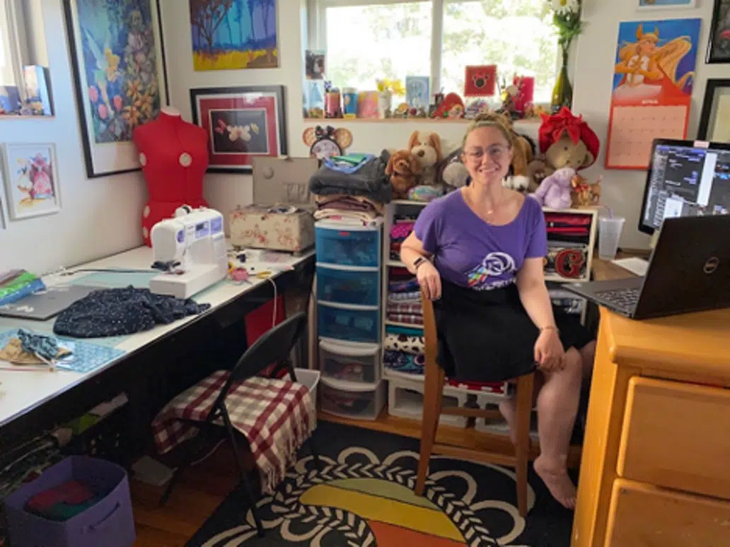
Kathryn from Boulder is an avid seamstress and a white room helps her see her fabrics in true color. Her office, pictured below, is painted with Sherwin Williams Pure White (SW 7005) (Sample).
Benjamin Moore Manchester Tan
Manchester Tan (Article) by Benjamin Moore is a lovely warm beige paint color that’s versatile enough to work in many spaces throughout a home. It is also known as Berber White (955).
While it looks beautiful in spaces flooded with lots of light, it still works in darker rooms – even the basement! Manchester Tan paint has green undertones, which give it warmth.
Liz is a Denver math tutor. Her warm beige office, painted with Manchester Tan (HC-81) (Sample), is pleasant to work in, not to mention it casts a flattering light on screen!
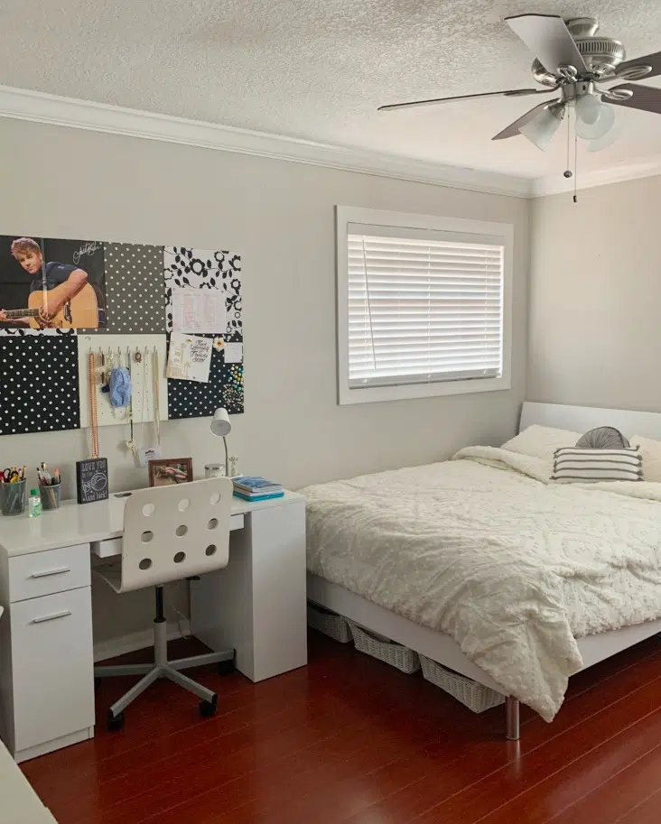
Benjamin Moore Abalone
Benjamin Moore Abalone (Sample) is a quiet gray with violet undertones. In certain lighting, the violet undertones can become very clear, so be sure to test this color carefully to make sure it’s the look you want.
This bedroom study space below belongs to a teenager – perfect for online learning. Her space is painted with Benjamin Moore Abalone (2108) (Sample). Abalone is an iconic Benjamin Moore paint color! For more photos of this bedroom check out 14 Fabulous Bedroom Paint Colors.
Benjamin Moore Stonington Gray
Stonington Gray is a neutral and versatile gray paint color that can be used in just about any space throughout the home.
Stonington Gray has strong blue undertones. In fact, I like to describe Stonington Gray paint as a blue-gray color. In cool light, these undertones are especially clear. In warmer light, such as in the office pictured below, it looks more like a crisp gray.
The owner of this office, Betty, is a kindergarten teacher in Tacoma. During the pandemic while teaching from home, she preferred to face the wall to minimize distractions. Her walls are painted with one of our favorite blue-grays, Benjamin Moore Stonington Gray HC-170.
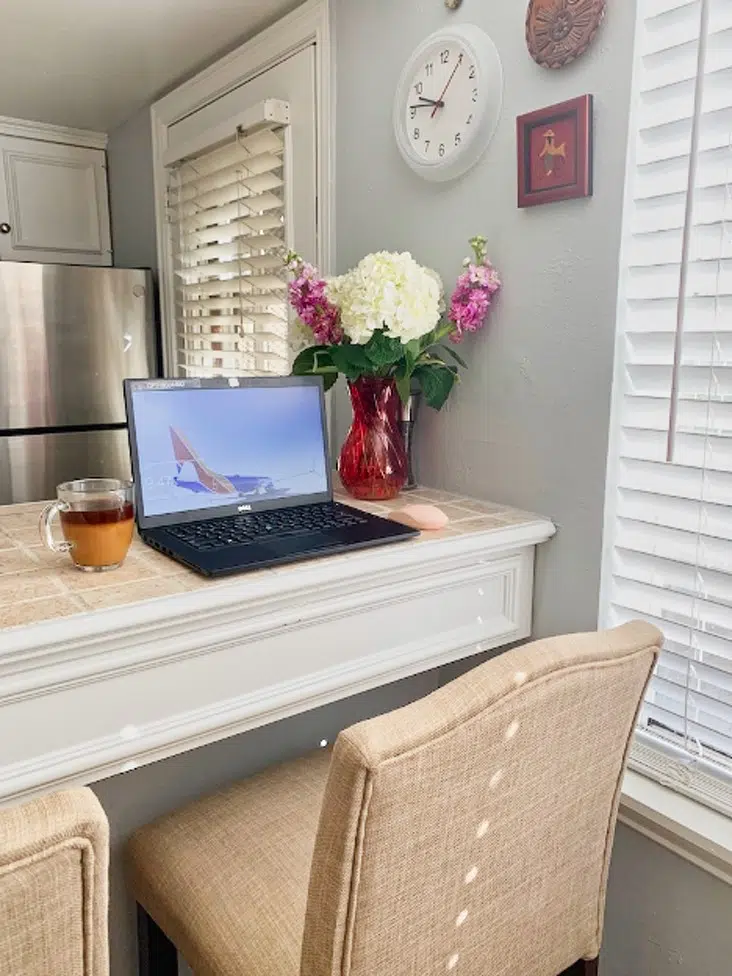
Benjamin Moore Shoreline
Benjamin Moore Shoreline (Sample) is another crisp blue-gray hue that has even stronger blue undertones than Stonington Gray. While the color could look too blue and glowy in a room with cool light, I absolutely love the way it looks in warm, light-filled, South-facing spaces.
Rebeca is a technical writer for an airline. She loves this peaceful blue hue in her home that keeps her calm and motivated all day long.
We often pick gray with blue undertones, like Shoreline, instead of light blue paint colors to keep the blues from going electric. We love the way Shoreline looks with her beige tile and counter stools with pink undertones. Check out her gorgeous fresh flowers!
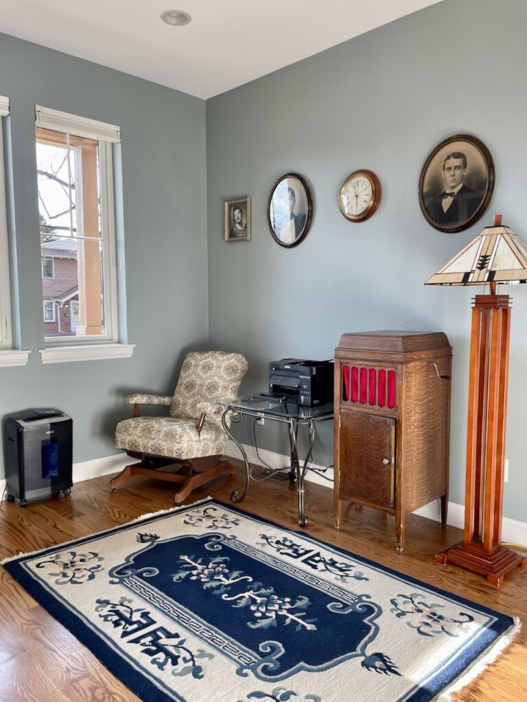
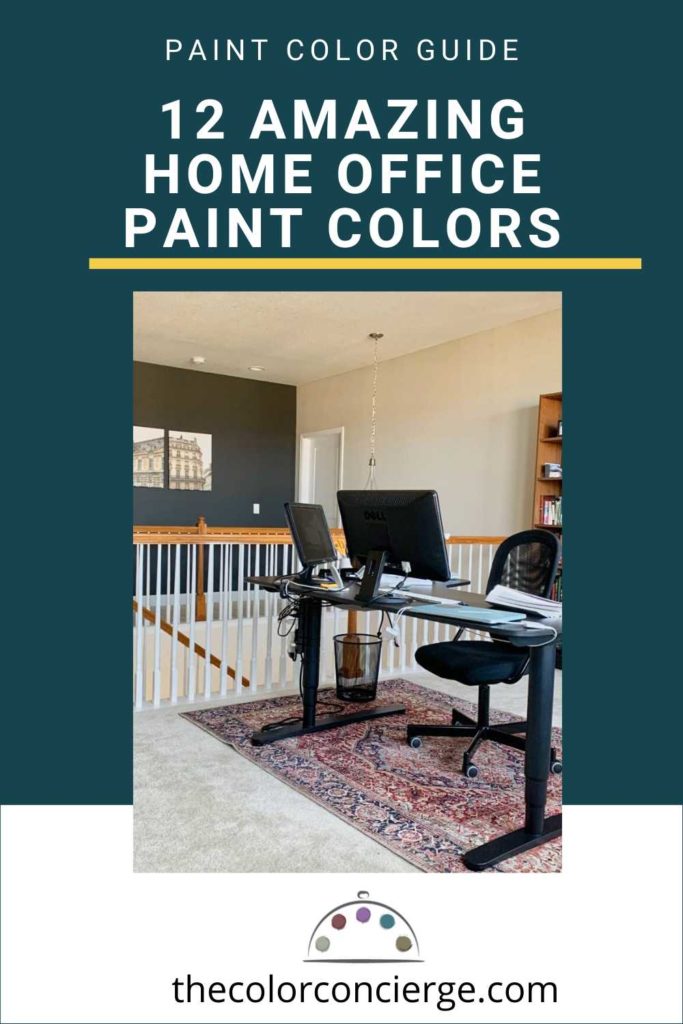
Sherwin-Williams Agreeable Gray
Sherwin-Williams Agreeable Gray (SW 7029) (Sample) is an IMMENSELY popular Sherwin-Williams greige paint color. It has warm green undertones with flashes of violet in certain light. For this reason, I often describe Agreeable Gray as a “fleshy” gray.
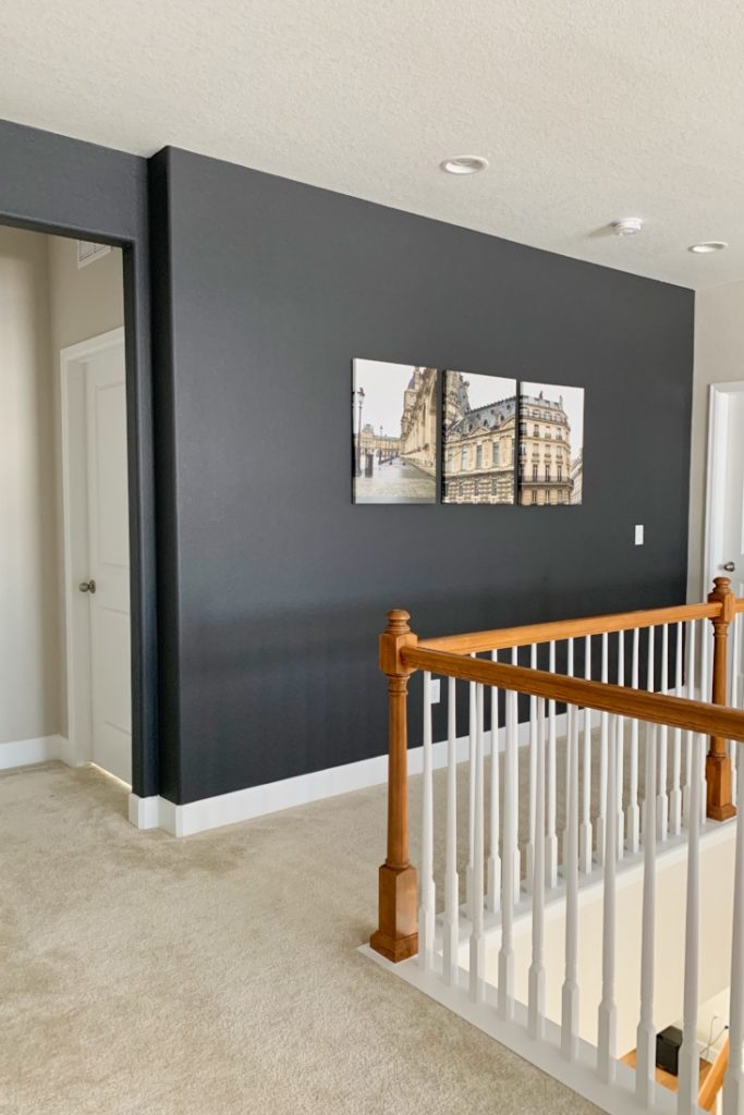
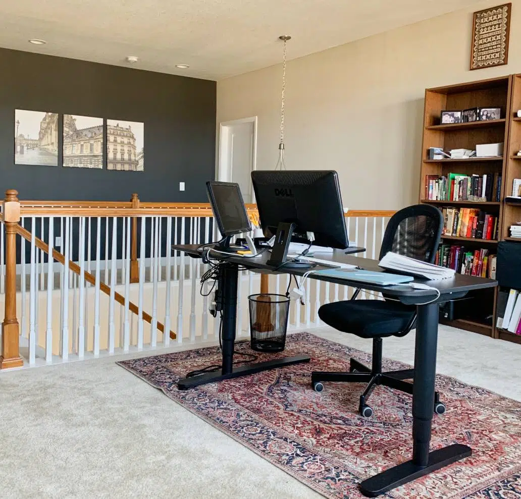
My current home office is in a stairway loft. When I originally designed the space, I painted the walls Sherwin Williams Agreeable Gray (SW 7029) (Sample) and used Sherwin-Williams Iron Ore (SW 7069) for the accent wall.
The Paris photos on the accent wall tie into the color of the walls and carpet add warmth to the room without becoming distracting. A beautiful rug under the desk pulls it all together.
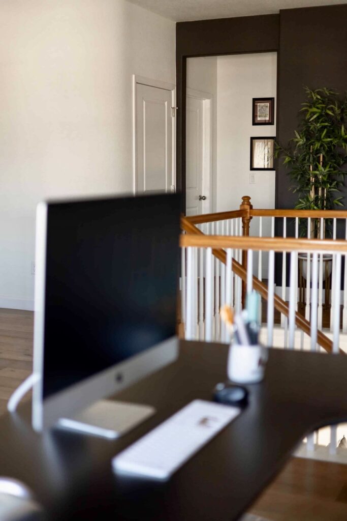
Sherwin-Williams Cheviot
I loved the way my office looked with Iron Ore and Agreeable Gray. But in more recent years, I painted my loft office a lighter hue: Sherwin-Williams Cheviot (Article).
Cheviot is very similar to Benjamin Moore Simply White (Article). It is clean, crisp and luminous on the wall and looks beautiful in many different spaces.
Cheviot is a warm white paint color with minimal yellow undertones. It’s soft enough to be crisp and clean on the wall, but warm enough to keep corners from looking dingy in low light. I love the way it looks even in the darkest corners of my office.
Sherwin-Williams Greek Villa
Greek Villa is a warm off-white paint color that looks creamy and gorgeous in most lighting. Greek Villa (Sample) has very subtle yellow undertones. The undertones help this color look warm and velvety on the wall, without looking too yellow.
In our project spotlight today, the home office had north-facing light, and SW Greek Villa (Sample) has enough yellow in it to look warm and lovely.
Because North-facing rooms have cool light, Greek Villa paint is a fantastic way to add warmth. The slight yellow tint to this paint helps neutralize the cool Northern light.
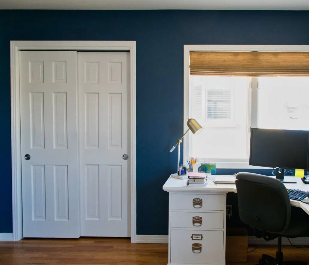
Benjamin Moore Kensington Blue
Benjamin Moore Kensington Blue is a great paint color if you want a darker hue in your office but want something more colorful than black. It has warm, green undertones that look gorgeous in rooms with lots of natural light.
This restful dark hue keeps your eyes focused on your computer but won’t risk looking black. The lovely office below has Benjamin Moore Kensington Blue 840 (Sample) walls.
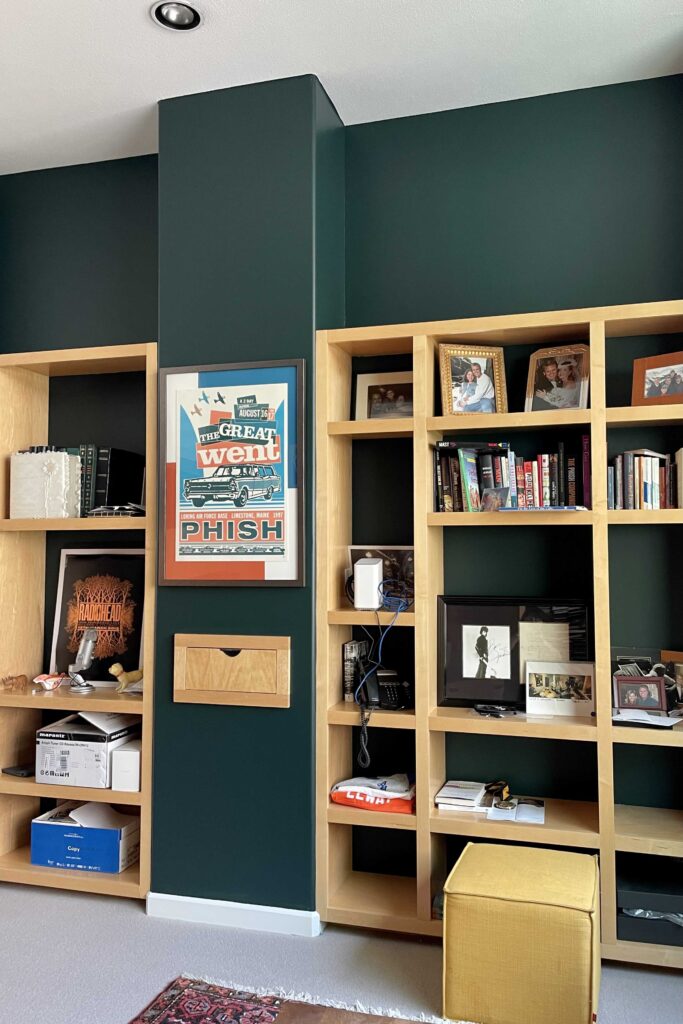
Benjamin Moore Salamander
Benjamin Moore Salamander is another gorgeous, rich dark paint color that is easy on the eyes. It’s so dark it is nearly black, so it works best in a room with lots of natural or artificial light to help bring out its green hue.
Salamander is green with blue undertones. These undertones help create a strong green color on the wall, despite being so dark. In the office below, the Salamander walls look gorgeous alongside light wood built-in shelves.
Benjamin Moore Fernwood Green
This bright green paint color is a great choice for accent walls, bedrooms and offices. Any place where you want to feel relaxed and happy, Benjamin Moore Fernwood Green is a great choice.
Fernwood Green gets its warmth from yellow undertones. These keep it looking bright and happy on the wall but aren’t overpowering. This color will look like a vibrant leafy green.
We used Fernwood Green in the client’s office featured below and it completely transformed the space! Fernwood Green looks rich and bright on the wall and gives a very mid-century modern feel to the room.
Benjamin Moore Gray Cashmere
BM Gray Cashmere (Article) is a warm, muted blue-green paint color that looks warm and soft and colorful in rooms flooded with light, especially South-facing rooms (Article). It starts to skew blue in a color with lower light or cool North-facing light (Article). It can change colors from green to blue throughout the day and then gets grayer at night.
Gray Cashmere is classified as a cool color because of its blue component, but I see it as a warm color because it’s so much warmer than blue-gray or violet-gray.
In the home office below, which has West-facing light partially blocked by a neighboring building, the cooler light makes this hue look more blue than green.
Benjamin Moore Mount Saint Anne
Mount Saint Anne (Article) from Benjamin Moore is a gorgeous mid-toned blue-gray paint color that is really flexible.
This is a really unique color that is truly a blend of three hues: blue, green and gray. I consider Mount Saint Anne to be a muted blue-gray, which means it is truly a gray paint with strong blue undertones.
Mount Saint Anne looks beautiful in bright sunlight. In my client’s office below, the Mount Saint Anne walls hold their own in the bright, West-facing afternoon light.
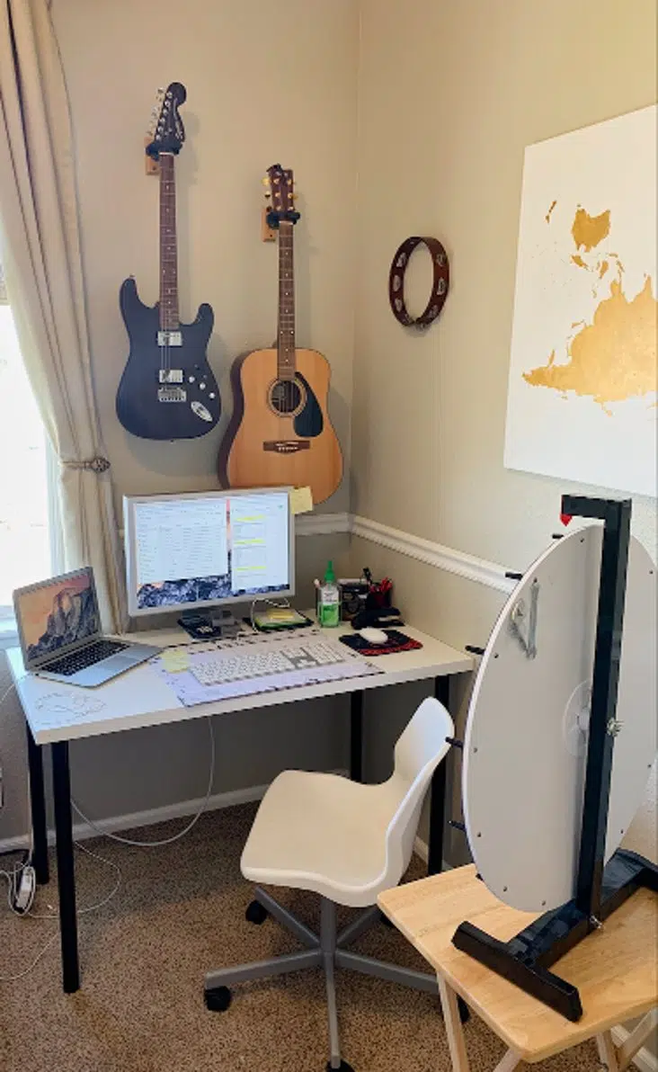
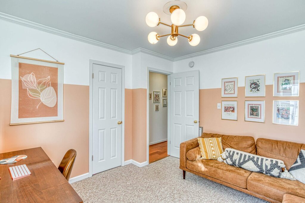
Sherwin-Williams Avid Apricot
If you want an office that feels playful and colorful, then SW Avid Apricot (Article) walls could be a great fit. Avid Apricot is a beautiful, warm peach paint color with orange undertones muted with grays and lightened with white.
Although I consider it a relatively “fresh” color, it’s muted enough to look sophisticated and has enough saturation for the color to look rich. It’s the kind of room color that makes a house a home.
My web designer, Karima Neghmouche of Karima Creative, has this color in her office and it’s so beautiful! I absolutely love the way it looks with the warm wood desk and leather furniture.
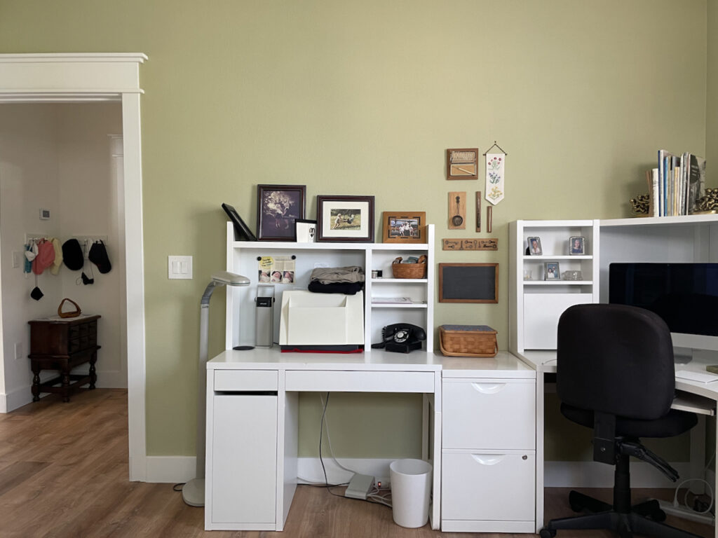
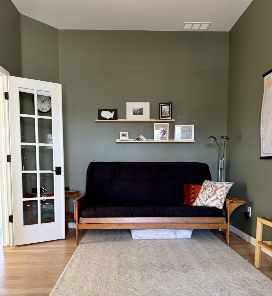
Benjamin Moore Tate Olive
Benjamin Moore Tate Olive (Article) is a dark, warm paint color perfect for an accent room like a dining room, office or study. It’s colorful enough to add depth to a space, but dark enough to give your eyes a rest when you’re working on a computer all day in an office.
BM Tate Olive has subtle yellow undertones that keep it feeling cozy and inviting. It’s muted enough that it can look almost gray in a dark room but saturated enough to stay colorful.
In my client’s office below, Tate Olive looks warm and lovely balanced out with white trim and light wood furniture.
Sample The Best Home Office Paint Colors
Still trying to decide which color to paint your office? Sample all of the colors featured in this post with peel-and-stick samples from Samplize.
- Benjamin Moore Onyx
- Sherwin-Williams Iron Ore
- Sherwin-Williams Pure White
- Benjamin Moore Manchester Tan
- Benjamin Moore Abalone
- Benjamin Moore Stonington Gray
- Benjamin Moore Shoreline
- Sherwin-Williams Agreeable Gray
- Sherwin-Williams Cheviot
- Sherwin-Williams Greek Villa
- Benjamin Moore Kensington Blue
- Benjamin Moore Salamander
- Benjamin Moore Fernwood Green
- Benjamin Moore Gray Cashmere
- Benjamin Moore Mount Saint Anne
- Sherwin-Williams Avid Apricot
- Benjamin Moore Tate Olive
Key Learning Points
The best way to be productive in a home office is to pick a designated space and keep it clutter-free. A comfortable chair, lots of light and your favorite things will make it a happy place you are glad to spend time in. The perfect paint color will update an office in a flash!
No matter what, don’t forget to test your paint colors. It’s a standard best practice. Whenever I test my paint colors, they are perfect, and when I don’t test they turn out wrong.
NEVER, EVER use paint matches from a different brand than the one you will use. Results are poor and there are no standards for the sheens. Even though your painter may truly believe it can be done, don’t do it. See results from paint matching here.
Online Color Consulting
If you still need help with paint colors, check out our Online Color Consulting packages or an in the Denver Metro area.

Don’t Forget To PIN!
Related Posts:
The Best White Paint Colors for Dark Rooms
Our Five Favorite Benjamin Moore Whites (and how to use them)
About the Author

Hi, I’m Michelle Marceny, founder, owner, and Principal Color Designer at The Color Concierge. I believe a fresh coat of paint can completely transform a space. The Color Concierge was born out of my drive to help clients fall back in love with their homes. My clients trust me to help them find the perfect paint color for their home – whether it’s a whole-house paint color scheme or ideas for a single room.
Since The Color Concierge was founded in 2017, we have completed over 3000 color consultations, both online and in-person. I am a Certified Color Expert with 7 years of experience creating interior and exterior color palettes throughout North America.
We love your comments! Please note that the blog is meant as general advice, and it is not possible to give out specific answers to your paint questions. If you want more specific advice, our Online Color Consultations will help you pick your paint colors. Thank you for your understanding.
