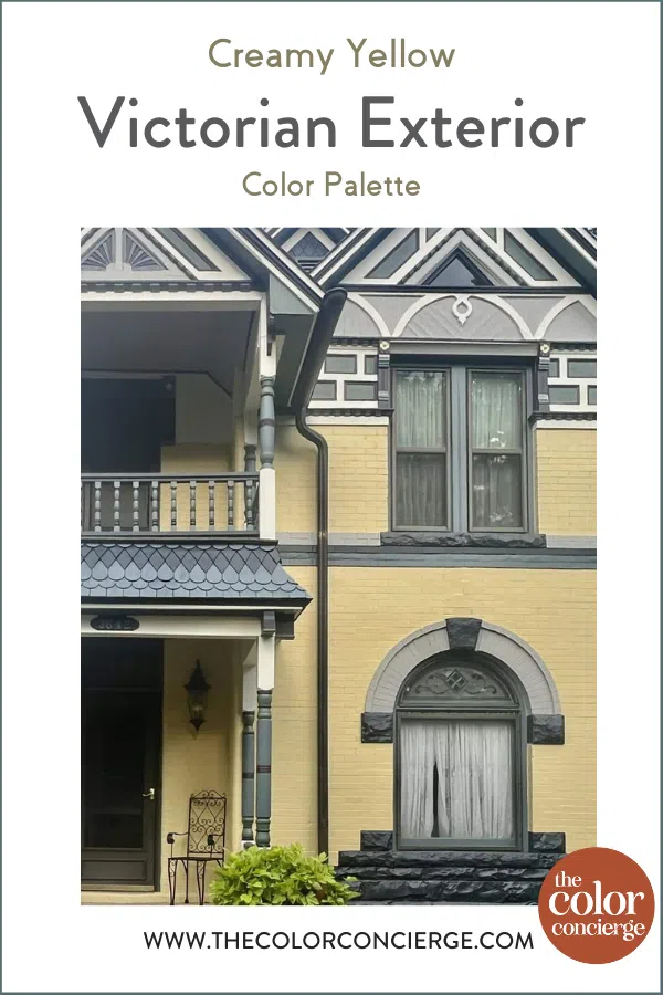
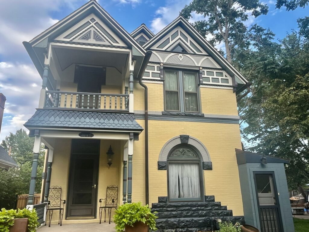
A yellow Victorian exterior color scheme featuring Benjamin Moore Waterbury Cream completely transformed our client’s older home. Keep reading to learn more about the color scheme and the process of selecting the best Victorian exterior colors.
We always love when we get the opportunity to work on a Victorian home. These gorgeous homes feature some really unique architectural features. But while those features are part of what make Victorian homes so beautiful, they can also make it difficult when choosing Victorian exterior paint colors (Article).
The Denver area home we’re featuring in today’s post was built in 1889. The home was beautiful, featuring original red brick (Article) and dark, earthy accent colors. But it was also showing its age and the homeowner was interested in breathing new life into the exterior, especially because they plan on this being their forever home.
We were especially moved by what the client wrote in their original questionnaire at the start of the project:
Her imperfections are part of her history, so we don’t feel it is necessary to cover or fix them all, but would like to make her into a stately beauty again. We love this house and plan to spend the rest of our lives here.
We went into this Victorian exterior color consultation project with this goal in mind and are so happy with how it turned out! Keep reading to explore the full yellow Victorian home exterior palette and learn more about BM Waterbury Cream (Sample) and the other paint colors used.
*This post contains affiliate links for products I use and love. If you click on some links and make a purchase, I will get a small commission at no cost to you. This helps pay for the costs of the blog, so I can continue to offer great content to our readers.
About The Color Concierge
Our Colorado-based paint color consultants make finding the right paint colors for your home easy. Whether you’re painting the exterior or interior of your home, our simple yet effective process lets us get your paint color right the first time. We’ve helped thousands of homeowners transform their homes into a space they love. Learn more about ONLINE COLOR CONSULTATIONS today.
Sample Benjamin Moore Waterbury Cream
We always recommend that you test paint colors in your home because lighting can completely change a color, both on interiors and exteriors.
In the old days, this meant we painted a large poster board with sample pots and a huge mess.
Now we have a better way to test paint, with Samplize Peel-and-Stick samples!
- Samples pre-painted with 2 coats of real paint from the manufacturer.
- Large 9” x 14” samples to see the color better in the lighting.
- Delivered overnight
- Colors are accurate
- Less expensive than painting a large poster board with sample pots
- No mess, and no toxic paint to dispose of
I use these in my color consulting practice for exact results. Discover Samplize peel-and-stick paint samples and sample Benjamin Moore Waterbury Cream via the link below.
Designing the Yellow Victorian Palette
To paint this Victorian exterior, we knew that we needed to design a palette that would coordinate with the home’s existing roof, landscaping and other hard finishes on the property. We also wanted to select colors that would help the home’s beautiful details and features stand out.
When the client first bought this home, they hoped they’d be able to keep the original brick. After all, there are many beautiful paint colors that go with red brick (Article), including dark colors (Article) and white paint colors (Article).
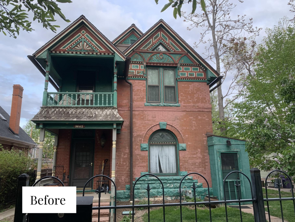
But as they lived in the house, they realized that the previous owners painted a lot of brick the exact color of the original brick. That paint was fading to pink and then looked blotchy, as pictured in the before photo below. For that reason, we felt that the only way to fix it was to paint the brick (Article).
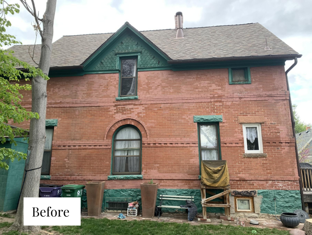
At some point in the home’s history, someone put concrete in some of the decorative brickwork just below the upper story windows. The homeowners couldnt remove it so they asked us to try to minimize the effect.
This house also has half-round solid copper gutters aged to a dark brown. We wanted to keep these genuine gutters, they were gorgeous! As you can imagine, this project was expensive due to the detail in the design. The copper gutters alone cost $4,000 to remove before painting, and replace after.
The Original Victorian Color Palette
The original Victorian exterior palette for this home was very dark and earthy. Red brick was paired with dark green, brick red and creamy white accents.
The palette was actually fairly simple. While this can be a good thing for Victorian homes, which often risk looking too busy, it didn’t do anything to highlight all of the different features of this home’s architecture.
Three Victorian Color Palette Options
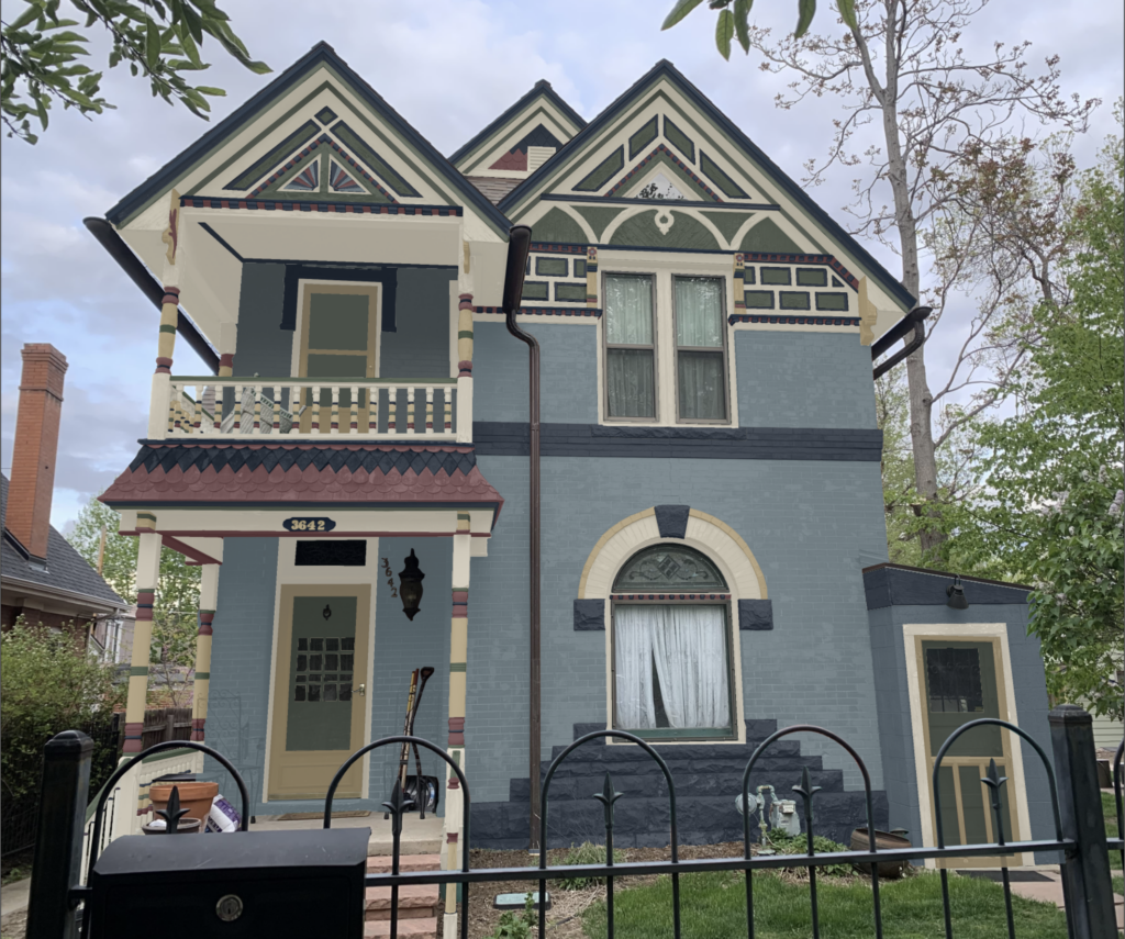
We presented the client with three Photoshop renderings (pictured below) of possible Victorian color palettes for this home. Two of the palettes featured darker body colors while the final palette – and the one that the clients chose – featured a yellow-painted brick body.
One of the palettes featured a Benjamin Moore Montpelier (Sample) blue exterior. Accent colors included greens, earthy reds and creamy neutrals.
The other darker palette featured Benjamin Moore Alligator Alley (Sample) green body paint with warm red, yellow and beige accents.
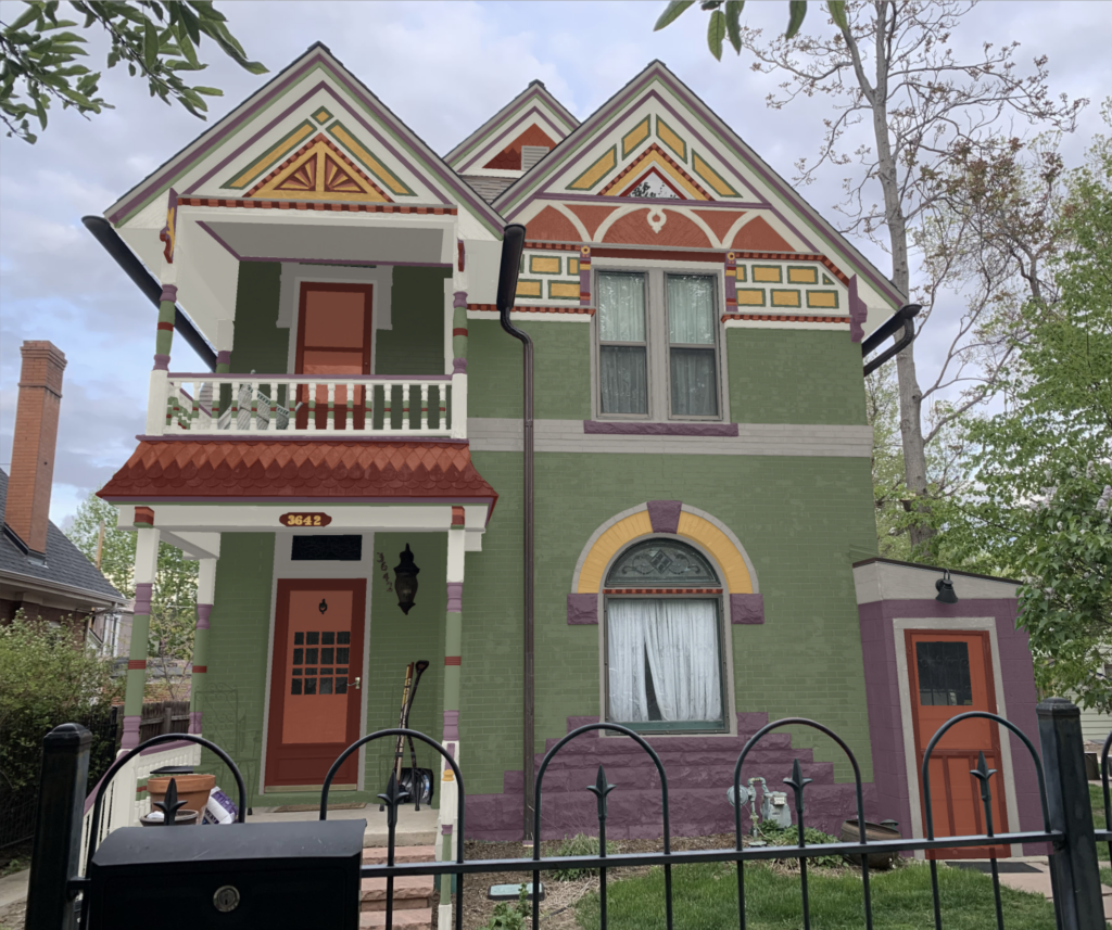
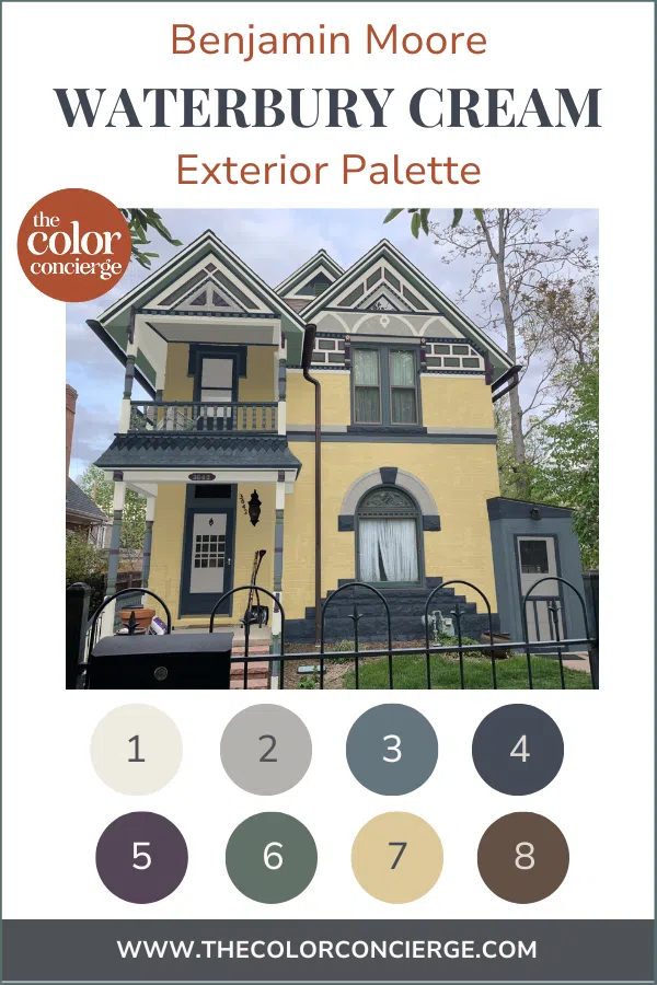
The final palette is the one the client chose, which featured Benjamin Moore Waterbury Cream (Sample) body paint and colorful, blue-gray accent paint colors as well as some warm, earthy tones.
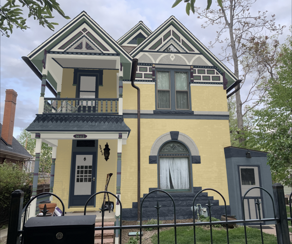
We were so pleased the clients chose this bright and cheerful color palette. While all of the options would have looked gorgeous, this one really gave new life to this older home.

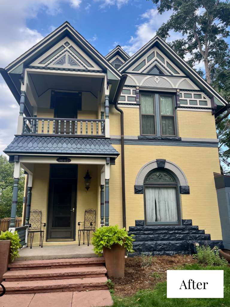
The Final Look: Benjamin Moore Waterbury Cream Exterior Color Palette
The home’s new exterior color palette is truly a complete transformation! The sunny exterior keeps this home looking cozy and welcoming even in the middle of a Colorado winter.
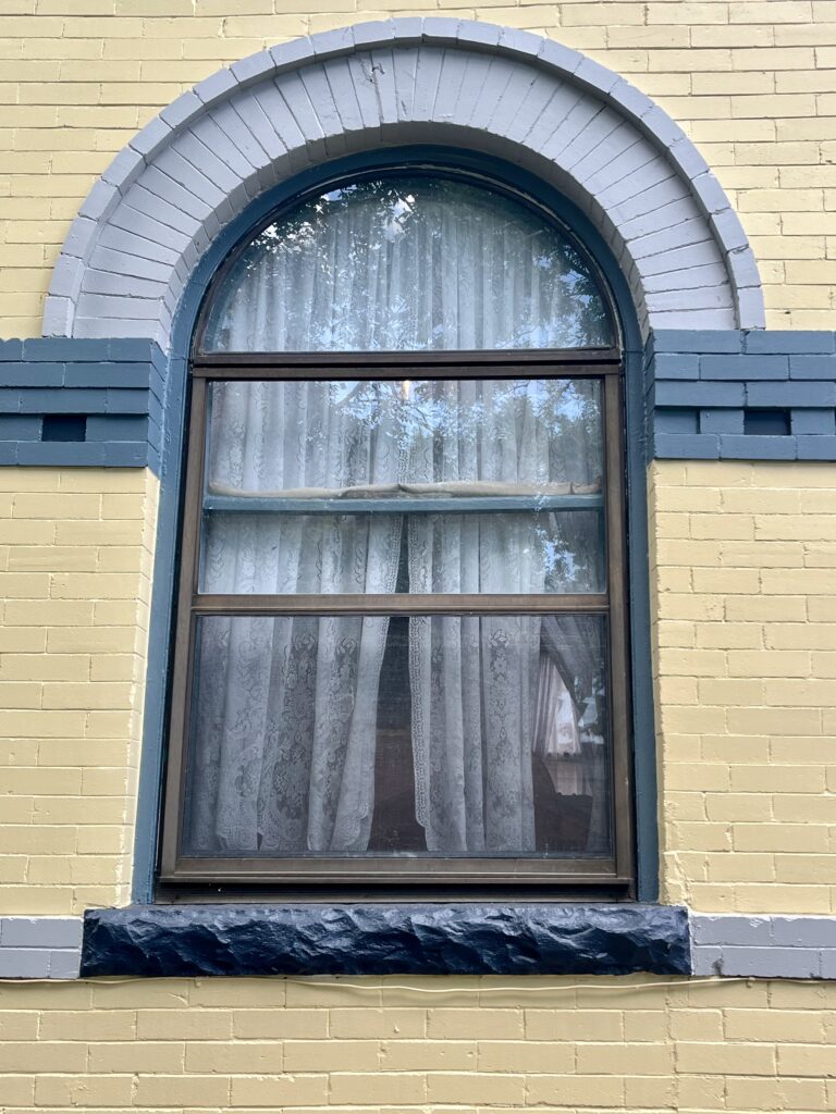
Yellow Painted Brick
The home’s main body color is Benjamin Moore Waterbury Cream (Sample). This warm, muted yellow paint color looks much brighter outdoors than it does indoors. With an LRV of 57.79, it has plenty of pigment that it won’t risk washing out in the bright sun.
We used the same yellow paint color on the flower petal details on the front door, tying the whole palette together.
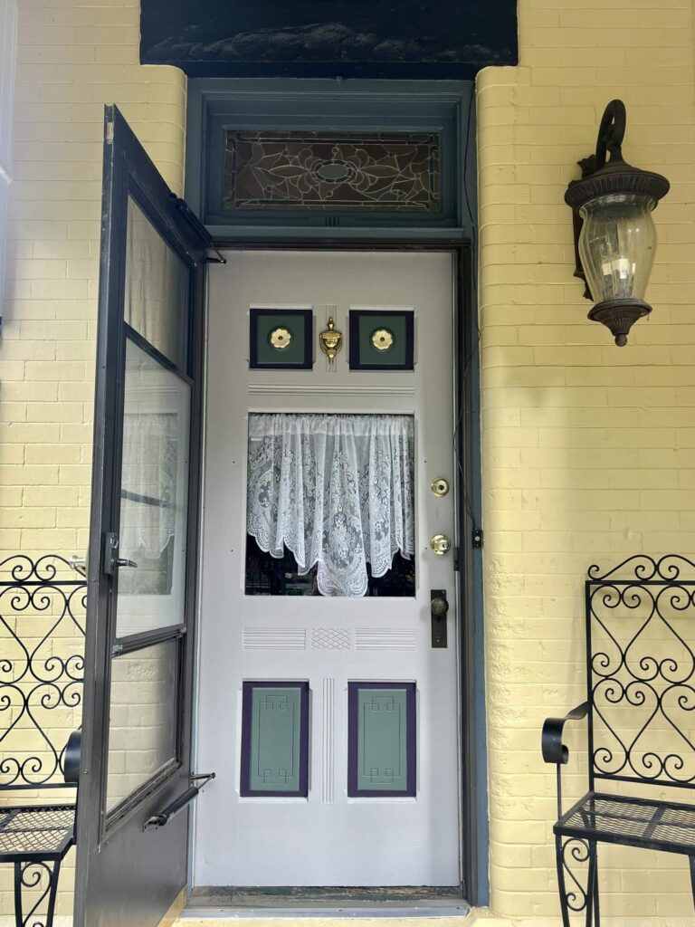
Colorful Front Door
The home’s front door (Article) was one of my favorite parts of the entire house. It featured beautiful flower details and inset panels with unique designs.
We painted all of the exterior doors with Benjamin Moore Baltic Gray (Sample), a cool blue-gray paint color. We added deep blue, yellow and green accents along with earthy purple accents painted with Benjamin Moore Grappa (Sample).
Victorian Home Architectural Details
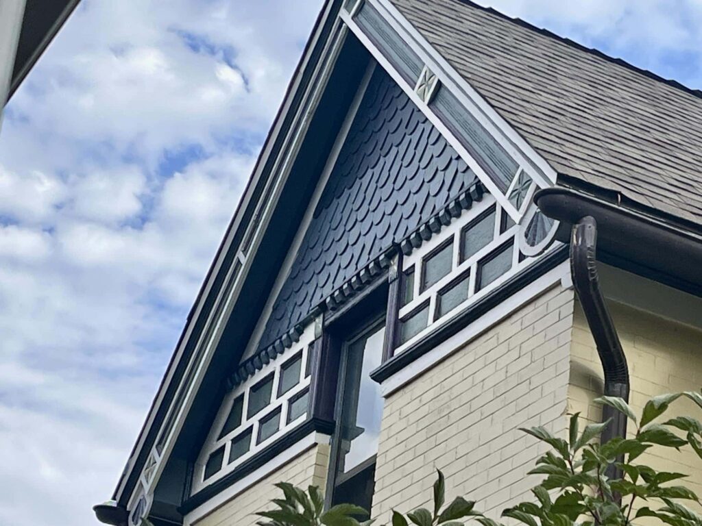
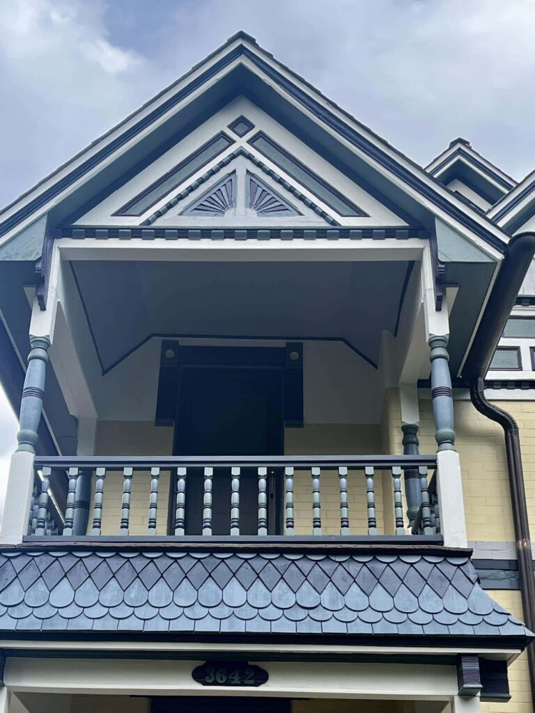
This home also featured a variety of other architectural details that had to be considered when creating the exterior palette, including columns, gable trim and arches, sunbeam trim, diamond shingles, crown molding and other trim.
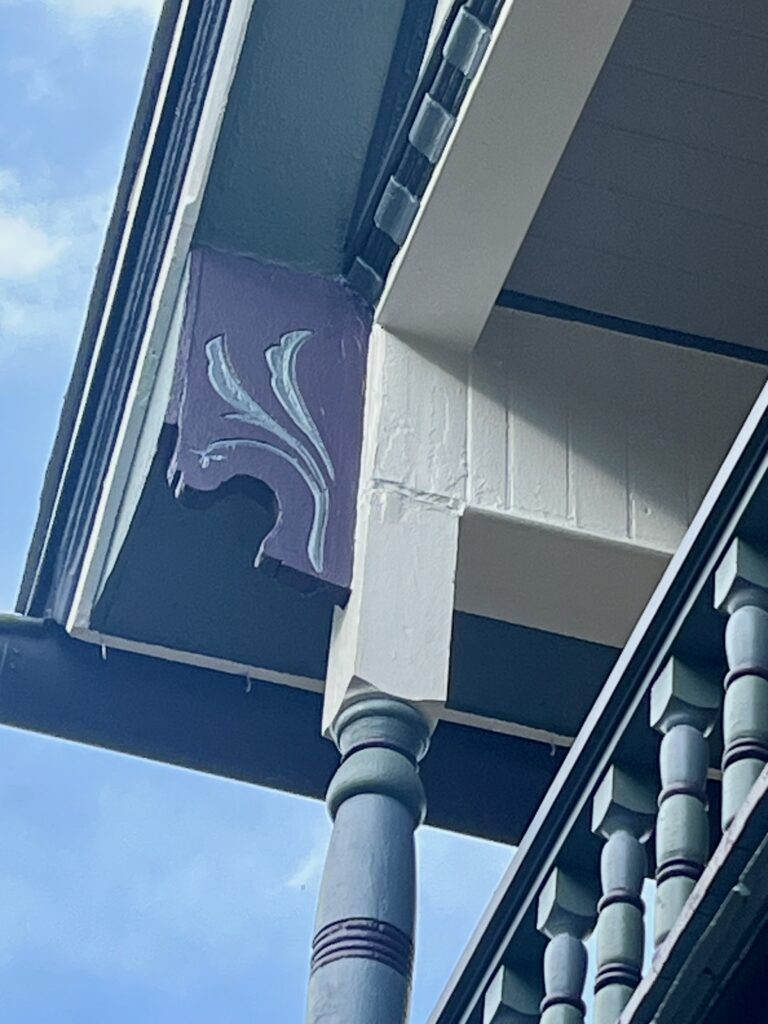
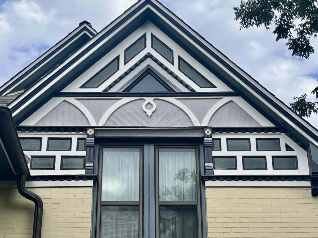
We used a combination of deep blue paint colors like BM Britannia Blue (Color Review Article) and BM Hale Navy (Color Review Article) and earthy paint colors like BM Grappa (Sample) and BM Caldwell Green (Sample) to highlight these details.
The home’s windows featured many different types of molding and trim and honed stone window sills. We kept the windows from looking too busy by painting all of the trim with BM Baltic Gray and BM Britannia Blue.
Exterior White Trim
We almost always choose an exterior white trim (Article) paint for our exterior color palettes. In this case, we needed a white that would provide enough contrast with the yellow-painted brick but also wouldn’t wash out in the Colorado sun.
Benjamin Moore Swiss Coffee (Color Review Article) was the perfect choice! This warm white paint color features creamy invisible green undertones and has an LRV of 89.
Sample This Yellow Victorian Color Palette
Use the links below to sample every paint color in this palette and to see exactly how we used each color on this home.
- Benjamin Moore Swiss Coffee: Fascia, flashing, frieze boards and horizontal body trim, gable trim outline, gable triple arch w/ keyhole, porch surrounding beam, column top and bottom sections, deck fascia
- Benjamin Moore Baltic Gray: Porch ceiling, porch surrounding beam cap, molding above window (currently with leaves), triangle window outer trim, gable inner double triangle and suns, gable triple arch w/ keyhole paneling, bracket stripes, upper brick stripe (top), lower brick stripe (side of house), outer and inner brick arch, doors, garage door, square shingles (side of house)
- Benjamin Moore Britannia Blue: Extension brick, upper brick stripe (bottom), middle brick stripe (side of house), scalloped shingles, window and door trim, corbel filigree, dentils, sunbeams, center of flower, bracket stripes, block corbel stacked rings, column middle sections, spindle upper bulbs, siding
- Benjamin Moore Hale Navy: Crown molding, triangle window inner trim, bead molding, fillets, dentil base, sunrays, front deck door surround, stone blocks, storm doors, handrails, spindle lower bulbs, back deck upper and lower rail, upper stripe (middle), middle stripe inner bricks (side of house), diamond shingles
- Benjamin Moore Grappa: Shape outlines, corbels, block corbels, brackets, side of house window surround, sunrays, column stacked rings, column rounded and flat rings, spindle rings, finials, plaque
- Benjamin Moore Caldwell Green: Soffits, gable corners, inner panels of shapes, bracket stripes, vents, columns bulbs, spindles, house numbers on plaque, corner squares on window surround, back deck spindles
- Benjamin Moore Waterbury Cream: Petals on squares, flower petals, brick
- Benjamin Moore Falcon Brown: Deck floor
Pro Tip for Painting Victorian Homes
When it comes to painting Victorian home exteriors, I highly recommend hiring pros. Not only should you come to The Color Concierge for an online Victorian exterior paint color consultation, but I also recommend hiring a painter experienced with Victorian homes.
This is the type of project that not just any painter can (or wants) to do. It involves a lot of delicate details that can only be painted by hand. This client’s project was painted by Ireland’s Finest Painting in Denver.
It took them a month to paint the house, and they carried around the printed color report, which looked really ragged at the end of the project!
Key Learning Points
Designing a paint color palette for a Victorian home requires careful thought and planning, but the right paint colors can bring a home back to life!
- This yellow Victorian exterior featured Benjamin Moore Waterbury Cream body paint, a yellow hue that is dark and muted but looks bright outdoors.
- Use accent colors to feature architectural details. We used a variety of blue, gray, green and even purple paint colors to highlight all of the accents that make this home so special.
- Test all of your paint colors carefully. Remember that paint colors can look 4-5x brighter outdoors than they do indoors, so be sure to test each color in the natural sunlight. Read our guide to testing paint like a pro (Article).
Remember: NEVER, EVER use paint matches from a different brand than the one specified. Results are poor and there are no standards for the sheens. Even though your painter may truly believe it can be done, don’t do it. Read our full guide to results from paint matching (Article).
Online Color Consulting
Still need help picking the best paint colors? Discover our Online Color Consulting Package.

Related Posts
- How to Choose a Victorian Exterior Color Palette
- Coastal Victorian Exterior Color Palettes
- Best Paint Colors for Victorian Home Exteriors
- Painted Lady Victorian Exterior Palette
- Painted Gentleman Victorian Exterior Palette
About the Author

Hi, I’m Michelle Marceny, founder, owner, and Principal Color Designer at The Color Concierge. I believe a fresh coat of paint can completely transform a space. The Color Concierge was born out of my drive to help clients fall back in love with their homes. My clients trust me to help them find the perfect paint color for their home – whether it’s a whole-house paint color scheme or ideas for a single room.
Since The Color Concierge was founded in 2017, we have completed over 3000 color consultations, both online and in-person. I am a Certified Color Expert with 7 years of experience creating interior and exterior color palettes throughout North America.
We love your comments! Please note that the blog is meant as general advice, and it is not possible to give specific answers to your paint questions. If you want more specific advice, our Online Color Consultations will help you pick your paint colors. Thank you for your understanding.

One Response
I don’t care for it….I think because I’m over grey as it h a s been overused lately and we are now heading back to Beige for “neutral” color