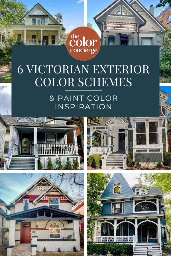
Learn how to design beautiful Victorian house color schemes with the best exterior paints from Sherwin-Williams and Benjamin Moore.
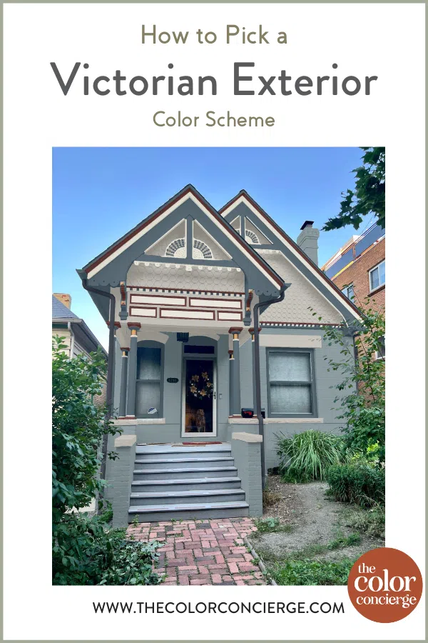
Choosing exterior paint colors for Victorian homes can be a daunting process. These and other historical homes often include many unique architectural details that come alive with the right paint colors. But these features also mean choosing more paint colors than a typical exterior color palette.
We work with homeowners regularly on Victorian House Exterior consulting packages, choosing the best Victorian exterior paint color combinations to bring our clients’ homes to life.
Today, we’re sharing our best tips to choose Victorian exterior color palettes easier – and sharing some real-world inspiration in the form of our favorite client projects.
About The Color Concierge
Our Colorado-based paint color consultants make finding the right paint colors for your home easy. Whether you’re painting a complex Victorian color scheme or the interior of your home, our simple yet effective process lets us get your paint color right the first time. We’ve helped thousands of homeowners transform their homes into a space they love. Learn more about ONLINE COLOR CONSULTATIONS today.
Understanding Victorian Exterior Paint Colors
Victorian homes are as unique as they are beautiful. The exterior paint colors we use on them should be unique too! Before we learn how to pick Victorian paint colors, let’s learn more about the history of Victorian color palettes.
Why are Victorian houses so colorful?
Victorian houses are known for their vibrant colors, which became popular during the Victorian era (1837-1901). There are several reasons these colorful palettes became so popular during this time.
For one, there were many advancements in manufacturing during the Victorian era, including the mass production of paint. This made paint more affordable and accessible to homeowners.
Still, house colors were used to reflect the owners’ wealth and status. Bold colors were seen as a sign of prosperity since they were more expensive than simple, muted palettes.
Victorian homes also traditionally feature many ornate architectural details, such as gingerbread trim, decorative brackets and intricate moldings. It was common to paint these in different colors to help them stand out.
What were the colors used in Victorian homes?
Victorian homes featured a wide array of colors – and still do to this day. While there are no strict rules when it comes to color choice, there are some traditional trends for Victorian color schemes.
These include:
- Earthy Tones: Colors inspired by nature were popular, including olive green, mustard yellow and terracotta.
- Bold Reds and Blues: Vibrant shades of red and bold blue hues were popular choices for highlighting architectural features.
- Pastel Hues: Soft pastel colors, such as pale pink, baby blue, mint green, and lavender, were also common in Victorian homes.
- Gold and Metallic Accents: Gold and metallic accents were used to add a touch of luxury and sophistication to Victorian homes.
- White or Cream: While Victorian homes were known for their colorful exteriors, many homeowners opted for neutral colors as a backdrop for architectural details.
What is the best color scheme for a Victorian house?
There is no one-size-fits-all Victorian exterior color scheme. Instead, it’s important to examine your home, its location and architectural details before choosing paint colors. Even better? Work with a Victorian home paint color consultant to make the process easier!
How many colors should a Victorian house have?
Over the years of working on other Victorian home color palettes, (Article) we’ve discovered that when it comes to exterior paint colors …less can be more. Frequently, Victorian homes have too many paint colors. They look too busy and don’t have a cohesive, consistent look. We often find a balance between adding enough colors to highlight features without overwhelming the home with a psychedelic rainbow.
When we choose exterior colors for Victorian homes and other historic properties (Article), we target 6-10 paint colors in each palette. This may seem like a lot, but by the time you include the front door, shutters, fascia, soffits, siding, and one accent color, that’s already six colors!
Sample Colors
We always recommend that you test paint colors (article) in your home because lighting can completely change a color, both on interiors and exteriors.
In the old days, this meant we painted a large poster board with sample pots and a huge mess.
Now we have a better way to test paint, with Samplize Peel-and-Stick samples!
- Samples pre-painted with 2 coats of real paint from the manufacturer.
- Large 9” x 14” samples to see the color better in the lighting.
- Delivered overnight
- Colors are accurate
- Less expensive than painting a large poster board with sample pots
- No mess, and no toxic paint to dispose of
I use these in my color consulting practice for exact results. Discover Samplize peel-and-stick paint samples via the link below.
How to Choose Exterior Paint Colors for Victorian Homes
When you’re building a Victorian exterior color palette, it’s important to take a few key factors into consideration. These include:
Location
The location and natural environment around your home can impact your chosen exterior paint colors. Lots of green leaves and trees can change the way some colors (particularly whites and grays) look on your house, for example. And in places where the sun is very bright, a paint color that is very light can look too stark.
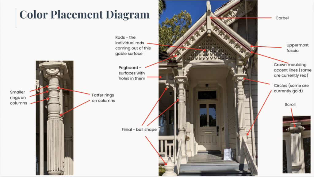
Architectural Details
Every home has exterior trim like siding, window trim, fascia, and soffits that must be considered when creating a color palette. But with Victorian homes, additional elements are considered.
Take inventory of your home’s unique architectural features before choosing paint colors. Some features a Victorian home may have include:
- Brick
- Siding
- Scalloped siding
- Window trim
- Fascia
- Soffits
- Downspouts
- Pegboard
- Scroll accents
- Columns
- Floral accents
- Stripes and patterns
- Corbels
- Rods
- Crown molding
- Finials
- Gabels
Body Shape & Color
Victorian homes are often split into different levels or sections. Sometimes, these sections also have different types of siding, such as brick, traditional wood siding or scalloped siding. We love to use more than one body color to highlight these design features.

Victorian Exterior Painting Tips
Once you’ve gotten clear on the architectural details of your home, it’s time to start building your Victorian exterior color palette. Consider these guidelines and not rules. Painting a Victorian home is art, but these are some elements that we always consider.
- Stick with 6-10 paint colors for most complex projects.
- Specify one color per feature and shift colors with different surfaces.
- If you have many features, consider using one color for two or three features to reduce your number of paint colors. For example, you could paint the scallops and diamonds in one color. This can also tie several of the elements together.
- End colors on an inside corner.
- Avoid highlighting too many small features with different colors. This can look choppy and disjointed. Consider a lighter color to show off the details if a surface has many complicated features.
- Start with lighter and darker versions of the same hues to create a palette that doesn’t overwhelm you. Add 1-2 contrasting or complementary colors to add more interest.
- Consider painting the darkest colors on the bottom to ground the palette.
- If you have a lot of stripes in your design, especially on gables, make sure that they don’t look like a rugby shirt. That would be an excellent place for one or two light colors.
- Specify one color for the porch floor and stair treads if you have them.
If you need help picking a beautiful color scheme for your Victorian home, check out our Victorian House Exterior Color Consultation Package. It’s Ideal for historic houses with intricate color schemes, providing 3 complex custom color schemes. A life-like Photoshop rendering from a photo of your home is included.
6 Victorian Exterior Paint Color Combinations We Love
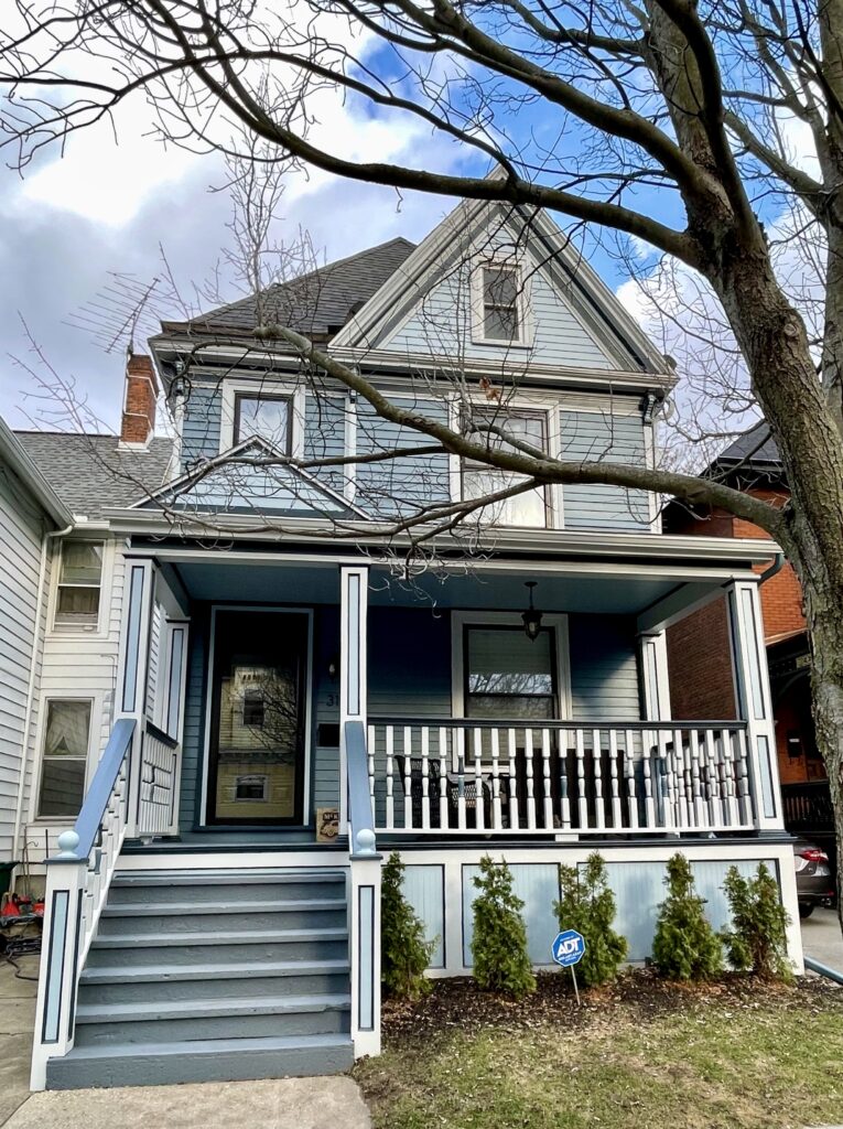
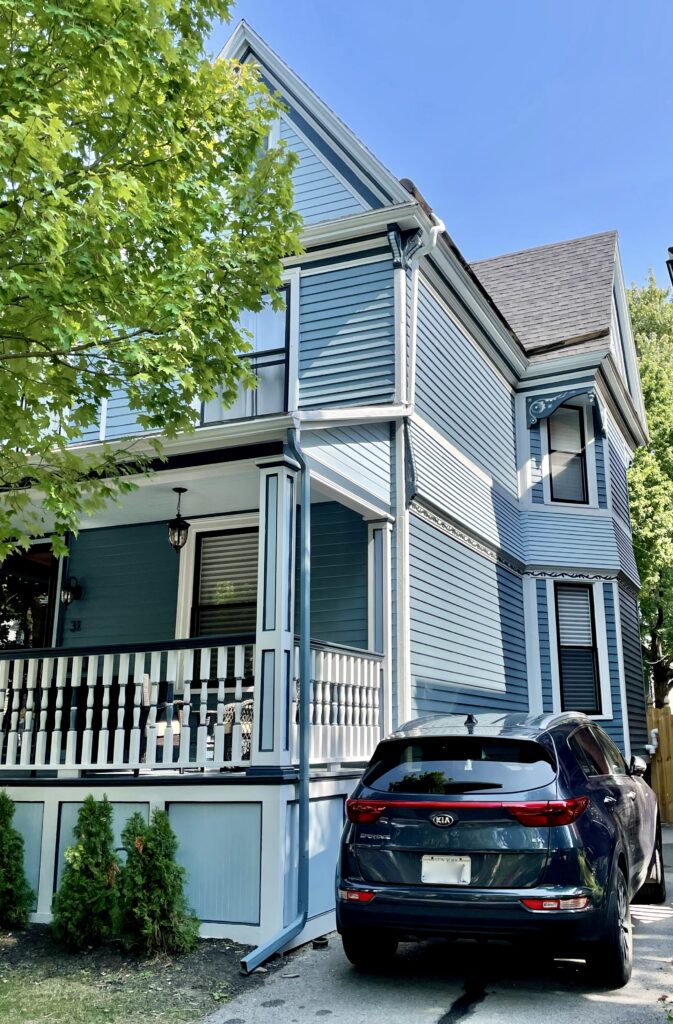
1. Benjamin Moore Thousand Oceans Blue Victorian Exterior Color Palette
This beautiful house was built in 1897 within a historic district. It’s a Queen Anne Victorian with unique architectural features that really make it stand out.
The new owners were looking for a more elegant and sophisticated design that felt more contemporary but also blended in with their historic neighborhood. They asked for bright bold colors that would also pair well with their neighbors’ red brick houses (Article) on the left and right.
Their overall goal was to simplify the color palette with fewer colors. The end result was a gorgeous exterior color palette featuring mid-toned BM Thousand Oceans for the siding. This warm blue pairs perfectly with the Forest Brown and Hale Navy (Color review article) accents and the White Dove (Color review article) trim. It also looks lovely alongside the brick homes next door.
Explore the Victorian Color Scheme:
- Benjamin Moore Hale Navy (Sample) – Beams, porch floor, stair treads, window mullion/frames, front railing accent, back deck railing posts, lattice under deck
- Benjamin Moore Forest Brown (Sample) – Accent Color: Front railing detail, inner window trim, doors
- Benjamin Moore White Dove (Sample)– Fascia, soffits, columns, railings, stair risers, window trim, door trim, front porch ceiling
- Benjamin Moore Thousand Oceans (Sample) – Siding
Order samples of this color bundle by clicking below:
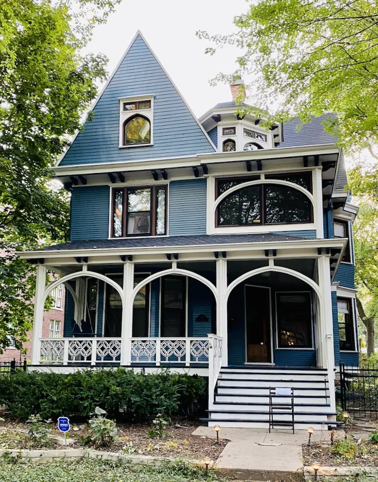
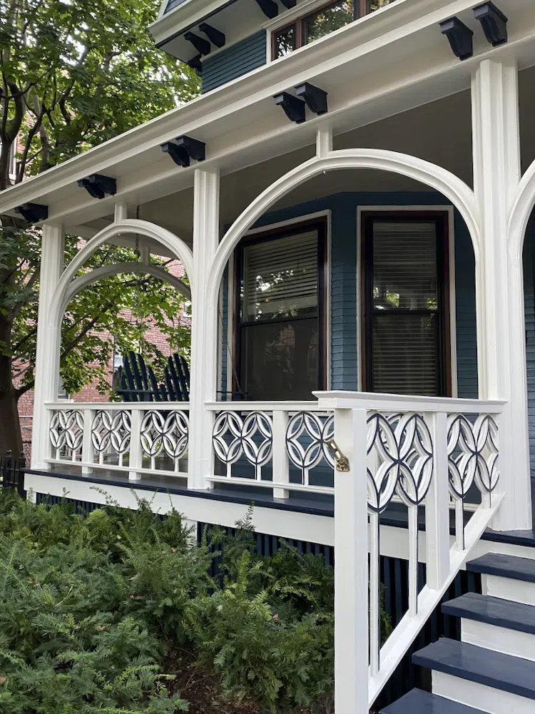
2. Coastal Victorian Exterior Color Palette
This gorgeous Victorian home is in Upstate New York. Because this home is not far from the Great Lakes, we decided to try out a coastal Victorian color palette (Article) inspired by water and the sky.
By sticking with a continuum of blues and grays throughout the color scheme, we’re able to bring a happy yet calm tone to this house. We were also able to better highlight all of the home’s unique architectural details and really let its natural beauty shine!
In this palette, SW Languid Blue (Sample) and SW Labradorite (Sample) provide a beautiful combination of coastal colors. They’re both fairly muted, so they work well outdoors in the bright sunshine.
Explore the Victorian Color Scheme:
- Sherwin-Williams Tinsmith (SW 7657) (Sample) – Trim, soffits, details on corbels, spindles, upper and lower porch rails, large and small columns, deck fascia, crown molding (inner or lower fascia)
- Sherwin-Williams Languid Blue (SW 6226) (Sample) – Middle body color, bump-dentils above vine, column caps and collar, finials
- Sherwin-Williams Labradorite (SW 7619) (Sample) – Lower body color and gables, lattice, fascia detail
- Sherwin-Williams Sea Serpent (SW 7615) (Sample) – Front door, side doors, corbels, vines, knobs, handrails, gutters, downspouts, vertical beveled edge of columns, window frames
- SW Westchester Gray (SW 2849) (Sample) – Porch floor, stair treads
Order samples of this color bundle by clicking below:
3. Sherwin-Williams Quixotic Plum Victorian Color Scheme
We love a dark and moody Victorian color palette and this Florida Victorian was a great canvas to use one on! Even though we’re using a darker palette, the bright sunshine, greenery and white trim keep this palette looking colorful.
This Victorian palette (Article) features a combination of dark green and deep purple. We added light green and navy accents to balance the colors and a soft gray to neutralize the look. The gray makes this look very sophisticated.
Explore the Victorian Color Scheme:
- Sherwin-Williams Pavestone (SW 7642) (Sample): Crown molding accent lines, corbels, finials, and the smaller rings on the columns.
- Sherwin-Williams Quixotic Plum (SW 6265) (Sample): Scalloped siding, handrails, and rods.
- Sherwin-Williams Ripe Olive (SW 6209) (Sample): Horizontal siding, rectangles under the bay window, and the pegboard.
- Sherwin-Williams Privilege Green (SW 6193) (Sample): Uppermost fascia and scrolls.
- Sherwin-Williams In the Navy (SW 9178) (Sample): Doors, finials, circles, flower shapes, and the fatter rings on the columns.
- Sherwin-Williams Peppercorn (SW 7674) (Sample): Porch floor and stair treads.
To order a Samplize test color bundle for this palette, click below:
4. Red, White & Blue Victorian Paint Color Scheme
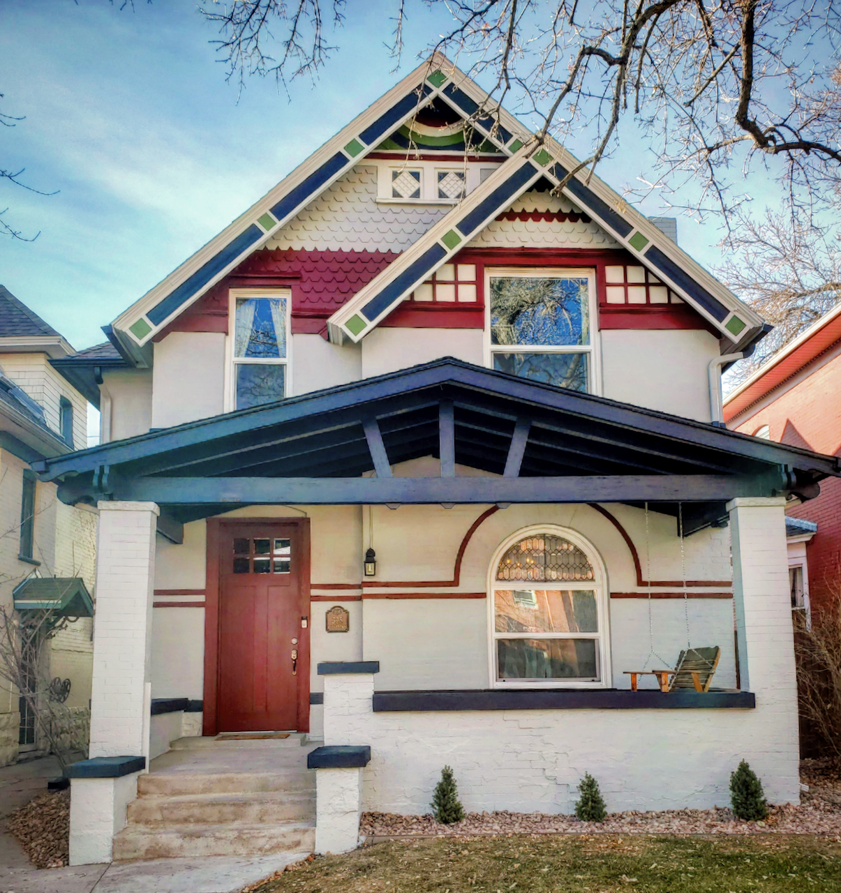
This beautiful Victorian house was built in a historic district in the Denver area. The owners had a very specific palette in mind: red accents, white trim and a light blue-gray body color.
As with many other historic palettes, we simplified the palette with fewer colors and a brighter palette for a modern twist on a traditional Victorian color scheme.
This house features really interesting accents on the roofline and gables at the peaks of the roof. We used a rich green paint color for these accents, offering a pop of unexpected color within the palette.
We kept the roofline light and bright to create a beautiful contrast with the blue-gray body color and the rest of the colors.
Explore the Victorian Color Scheme:
- Sherwin-Williams Anchors Aweigh (Sample)– Front porch ceiling, beams and accents
- Sherwin-Williams Gray Clouds (Sample) – Siding Color
- Sherwin-Williams Greenfield (Sample) – Gable accents
- Sherwin-Williams City Loft (Sample) – Trim color, fascia and soffits
- Sherwin-Williams Sundried Tomato (Sample) – Front Door and Accents
To order a sample bundle of this Victorian palette, click the link below:
5. Benjamin Moore Hepplewhite Ivory Victorian Color Scheme
For this project, the homeowners wanted to show off the architectural features of the house but still keep the palette light and bright.
We used a Hepplewhite Ivory (Sample) exterior paint across most of the outside of this home, including the shake siding and scalloped siding accents. It was light, bright and happy!
Warm white trim (Benjamin Moore Simply White (Sample)) for the trim and accents kept the palette looking bright without being too stark. Black window frames offered a lovely accent.
A Hale Navy (HC-154) front door and added a splash of blue with Woodlawn Blue (HC-147) (Sample) to the front porch ceiling rounded out this palette.
Explore the Victorian Color Scheme:
- Benjamin Moore Hepplewhite Ivory (Sample) – Shake siding and scalloped siding
- Benjamin Moore Simply White (Sample) – Gable peaks, trim, gutters, fascia, trim, soffits, garage doors and downspouts
- Benjamin Moore Carbon Copy (Sample) – Window frames
- Benjamin Moore Hale Navy (Sample) – Exterior doors
- Benjamin Moore Woodlawn Blue (Sample) – Front porch ceiling
To order a Samplize bundle of this entire color palette, click below:
6. Neutral Victorian Exterior Color Palette
For this home, built in the Denver area in 1891, the client wanted a neutral Victorian color palette. We explored a variety of color schemes, but in the end, we picked the one with cool gray paint colors and gray-blue accents. This looked great in a very wooded lot with lots of foliage.
We used touches of gold metal paint at the top of the columns, which was a great way to add bling and depth to a neutral palette. Deep maroon trim and navy blue accents add a lovely pop of color.
Explore the Victorian Color Scheme:
- Sherwin-Williams Sommelier (Sample) – Front door, accent trim, fascia
- Sherwin-Williams Needlepoint Navy (Sample) – Columns, windows, railing handrails, posts
- Sherwin-Williams Debonair (Sample) – Brick siding
- Sherwin-Williams Acier (Sample) – Shingles, accent
- Sherwin-Williams Egret White (Sample) – White accents, stair risers
- Sherwin-Williams Anchors Aweigh (Sample) – Deck floor, gutters, downspouts, stair treads
Key Learning Points
Designing a Victorian home exterior color palette can feel daunting, but by following a few simple guidelines (and reviewing beautiful inspiration!) it doesn’t have to be hard.
- Consider your home’s architectural details when choosing paint colors. Make sure to choose enough colors that these unique accents will stand out.
- Don’t over complicate your palette. While it’s common to have about six paint colors in a Victorian color scheme, going much beyond that can make your exterior a bit too busy.
- Remember that paint colors look 4-5x brighter outside than they do inside. This is especially important for white exterior paint colors and other light hues.
Remember: NEVER, EVER use paint matches from a different brand than the one specified. Results are poor and there are no standards for the sheens. Even though your painter may truly believe it can be done, don’t do it. See results from paint matching here.
No matter what, always test your paint colors. It’s a standard best practice. Whenever I test my paint colors, they are perfect, and when I don’t test they turn out wrong. Learn how to test your paint colors here.
Online Color Consulting
Don’t want to create a color palette by yourself? Discover our Online Color Consulting Packages.

Related Posts
About the Author

Hi, I’m Michelle Marceny, founder, owner, and Principal Color Designer at The Color Concierge. I believe a fresh coat of paint can completely transform a space. The Color Concierge was born out of my drive to help clients fall back in love with their homes. My clients trust me to help them find the perfect paint color for their home – whether it’s a whole-house paint color scheme or ideas for a single room.
Since The Color Concierge was founded in 2017, we have completed over 3000 color consultations, both online and in-person. I am a Certified Color Expert with 7 years of experience creating interior and exterior color palettes throughout North America.
We love your comments! Please note that the blog is meant as general advice, and it is not possible to give out specific answers to your paint questions. If you want more specific advice, our Online Color Consultations will help you pick your paint colours. Thank you for your understanding.
