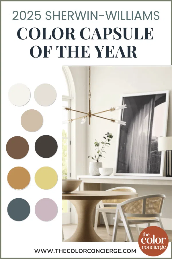
The Sherwin-Williams 2025 Color of the Year Capsule has officially been announced, offering not just one color but a whole collection of hues for your home.
Instead of making its typical Color of the Year announcement this fall, Sherwin-Williams released its first-ever Color Capsule of the Year. The nine colors were chosen from across the company’s full paint color collection and selected to reflect upcoming color trends. It’s interesting to note that none of these are mainstream colors that we see online or in the design world commonly.
I always think its interesting that Sherwin-Williams has over 1700 paint colors, but we only read about 200 colors or so on the Internet. They basically introduced the world to nine new colors!
“It’s very special to commemorate our 15th Color of the Year anniversary by expanding to an entire capsule that is a modern, fresh take on color, with a balanced and usable assortment of shades,” said Sue Wadden, director of color marketing at Sherwin-Williams.
The collection shows that architectural and home design trends are following clothing fashion trends, both in terms of color and the concept of a capsule.
This year, we see architectural paint color trends following clothing fashion trends, down to the concept of a capsule.
In the clothing industry, we have been hearing about capsule wardrobes a lot in recent years as the minimalist movement has grown. A capsule wardrobe is a collection of mix-and-match clothing and accessories that you can group as different, interchangeable outfits.
The beauty of the capsule wardrobe is that it makes it simple for the consumer to buy a collection of pieces that they know will work well together. That is the concept of the Color Capsule of The Year. These paint colors flow seamlessly together and give us an idea of the upcoming trends.
Note: We used photos courtesy of Sherwin-Williams because we don’t have most of these in our collection of projects yet, but aren’t compensated by them.
*This post contains affiliate links for Samplize products. If you click on some links and make a purchase, I will get a small commission at no cost to you. This helps pay for the costs of the blog, so I can continue to offer great content to our readers.
About The Color Concierge
Our Colorado-based paint color consultants make finding the right paint colors for your home easy. Whether you’re painting the exterior or interior of your home, our simple yet effective process lets us get your paint color right the first time. We’ve helped thousands of homeowners transform their homes into a space they love. Learn more about ONLINE COLOR CONSULTATIONS today.
What Is Sherwin Williams’ Color of the Year 2025?
In 2025, there is not just one Sherwin-Williams Color of the Year. Instead of a single paint color, the company has released a full collection called the 2025 Color Capsule of the Year.
Other brands, including Benjamin Moore (Color Review Article) and HGTV Home by Sherwin-Williams (Color Review Article), have already released their traditional Color of the Year in 2025.
Is a Color of the Year Capsule a Good Idea?
I have to say that I really miss the traditional color of the year announcement as opposed to a palette. The color of the year tells us what to expect. Sherwin-Williams Evergreen Fog, for example, has become an iconic staple since it was the 2022 Color of the Year.
Even though Sherwin-Williams Redend Point (Color of the Year 2023) was minimized at the time, if you look at it today, it is right in line with color trends. Last year’s 2024 Color of the Year SW Upward (Color Review Article) wasn’t a personal favorite for me, but it still spoke to an immediate trend of cool light blue beachy colors that we saw at the time.
Put simply, Sherwin-Williams’ COTY hues are usually a great forecast of things to come. Although the COTY color palette is definitely on trend, I prefer a single COTY with an accompanying palette.
Exploring The Sherwin-Williams 2025 Colors of the Year
While I’m not a huge fan of the idea of a Color Capsule of the Year, the 2025 Color Capsule does have some really beautiful colors.
This palette reminds me of the color schemes that we saw in the 2000’s in the Tuscan era of home decor. The colors are warm, muted and darker than you would expect.
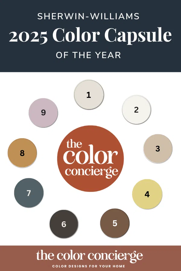
- SW Sunbleached
- SW White Snow
- SW Malabar
- SW Chartreuse
- SW Grounded
- SW Clove
- SW Rain Cloud
- SW Bosc Pear
- SW Mauve Finery
There are several colors that would be beautiful for color drenching (Article), which is a practice that has become popular today. We usually recommend color drenching with rich, darker colors.
You could color drench using SW Rain Cloud, SW Bosc Pear, or even SW Chartreuse if you had the perfect wallpaper to pair it with. Mauve Finery would look great as a drench in a children’s room.
All of the paint colors (except for Chartreuse) pair well with Limestone floors and warm kitchen countertops such as Taj Mahal quartzite, which are very popular in new kitchens today.
This palette has moments of brilliance with the dark and muted colors, but I’m not a fan of Chartreuse. And although purple is my favorite color, and the mauve hue flows well with the palette, it’s not very versatile. I can only see using it in a children’s bedroom.
How to Use a Sherwin-Williams 2025 Color of the Year Capsule Whole House Color Palette
Interested in trying the Sherwin-Williams 2025 Color Capsule in your home? Explore our expert tips for using this whole-house color palette (Article).
Sherwin-Williams Sunbleached
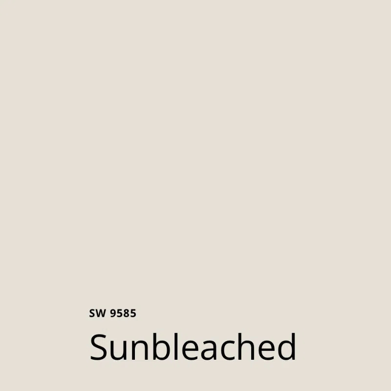
SW Sunbleached (Sample) would make a beautiful whole-house foundation color. It is a light, warm neutral with green undertones that is perfectly on-trend. Sunbleached has an LRV of 75, with makes it light and bright.
I love the SW Designer collection colors (like Sunbleached) because they are crisp and clean and light, unlike many other Sherwin light neutral colors with the traditional base.
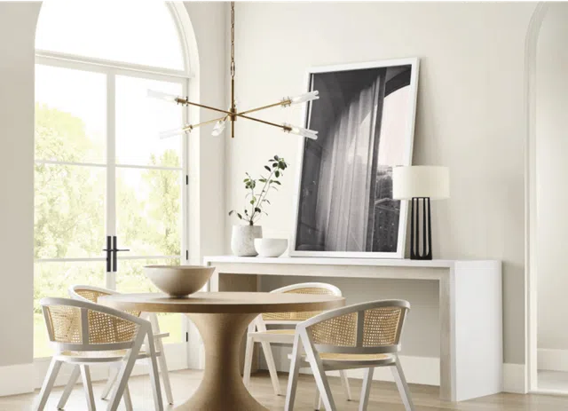
Sunbleached is very similar to Benjamin Moore Seapearl – a color we’ve seen growing in popularity. I predict Sunbleached will become a new classic as we go forward in the future, especially as a foundation color for an entire house.
Sherwin-Williams White Snow
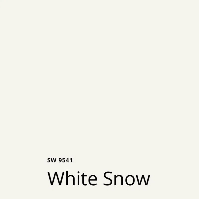
Sherwin-Williams White Snow (Sample) is another color from the Sherwin Designer Collection and has a clean Ultra-White base. It really fills in a gap in the Sherwin-Williams white portfolio.
White Snow is a clean white like SW High Reflective White, but will cover very well unlike HRW.
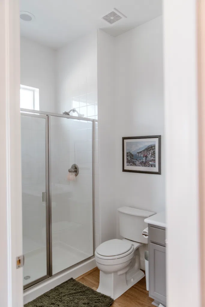
I’ve tested this color in my own house and absolutely love it, as pictured above, as a wall color. This is the trim, door and ceiling color (Article) I would recommend with this palette.
Sherwin-Williams Malabar
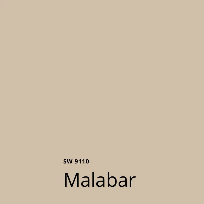
Sherwin-Williams Malabar (Sample) is a gorgeous warm beige with green undertones. I can see using it as a kitchen wall color with SW White Snow cabinets and Taj Mahal countertops and backsplash or using it as a wall color for a bathroom with black and white accents, as pictured below.
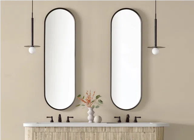
This warm, neutral color combination would be a beautiful take on the popular white kitchen (Article) and bathroom trend that would feel cozy instead of stark.
Sherwin-Williams Chartreuse
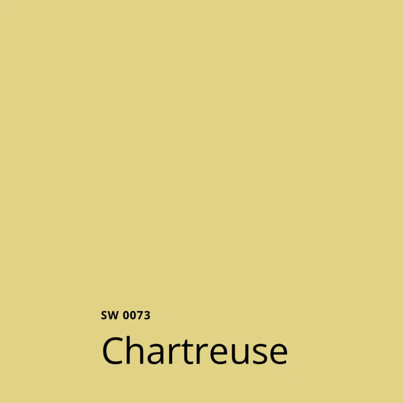
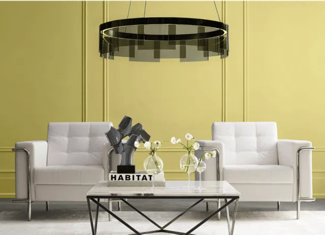
Sherwin-Williams Chartreuse (Sample) is an interesting color. I have a dress this color, but it looks terrible on me. This could be a lovely, bright accent color within a palette.
I could see using this as an exterior front door color (Article) or maybe an accent wall in a bathroom. I’m not sure that I would use this as a full-room color (as pictured below). It’s pretty, and if you have the right decor it could look good. But it’s definitely not mainstream.
Sherwin-Williams Grounded
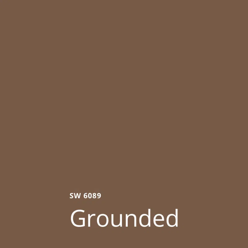
Sherwin-Williams Grounded (Sample) is a rich, warm, dark brown paint color. When you see this type of a hue in a color palette, it’s important to remember that you don’t necessarily need to use it as a paint color.
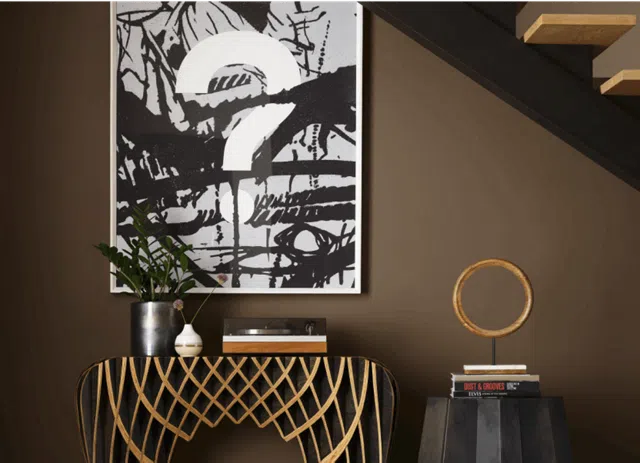
I can’t imagine using this for wall colors for a room, but it could make a nice accent as a leather sofa, dark wood furniture or as an accent wall background for organic decor such as wicker or bamboo. You could also pick this color for cabinets in a kitchen.
Sherwin-Williams Clove
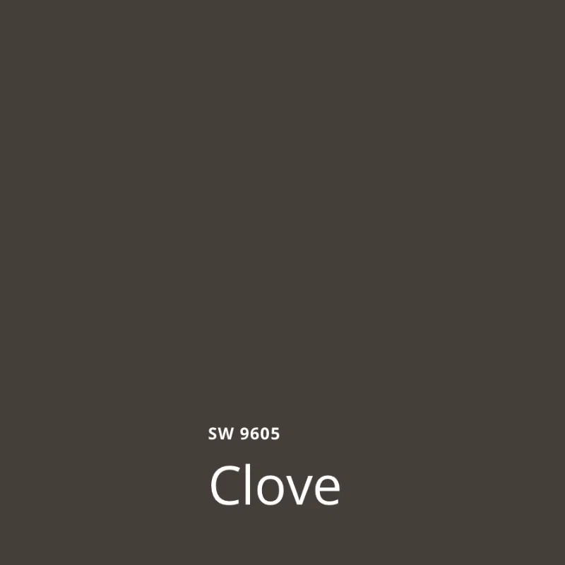
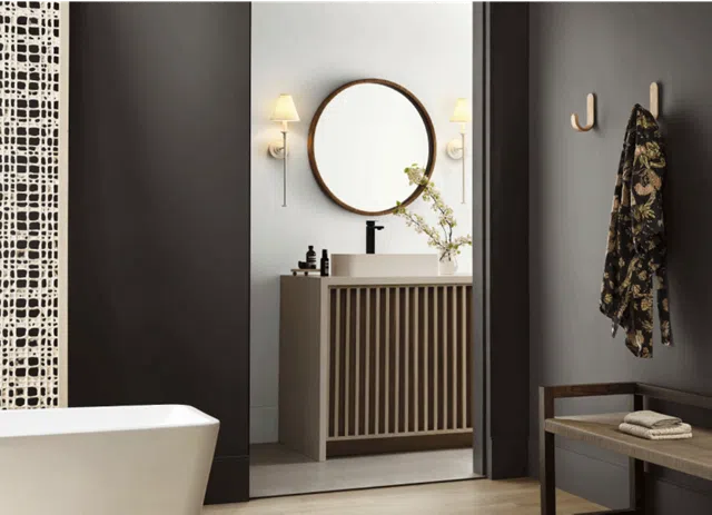
For interiors, I see Sherwin-Williams Clove (Sample) as a very warm black color. Note that this is not an exterior paint color. You could use this as an interior front door, or an accent color on stair railings and posts.
Sherwin-Williams Rain Cloud
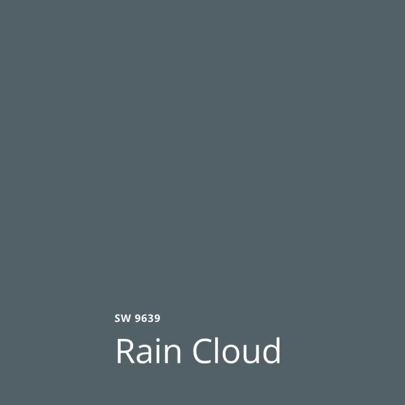
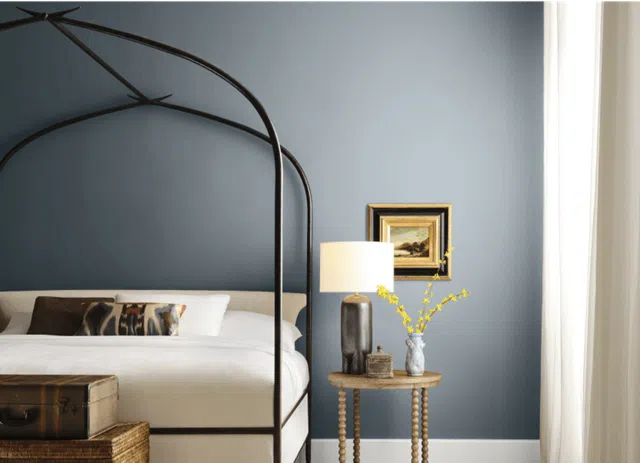
Sherwin-Williams Rain Cloud (Sample) is one of my favorite hues in this capsule. It’s also another Designer Collection color.
A warm, muted blue-gray paint color (Article), this would be a perfect option to color drench a primary bedroom, office, or dining room.
Sherwin-Williams Bosc Pear
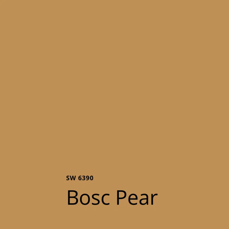
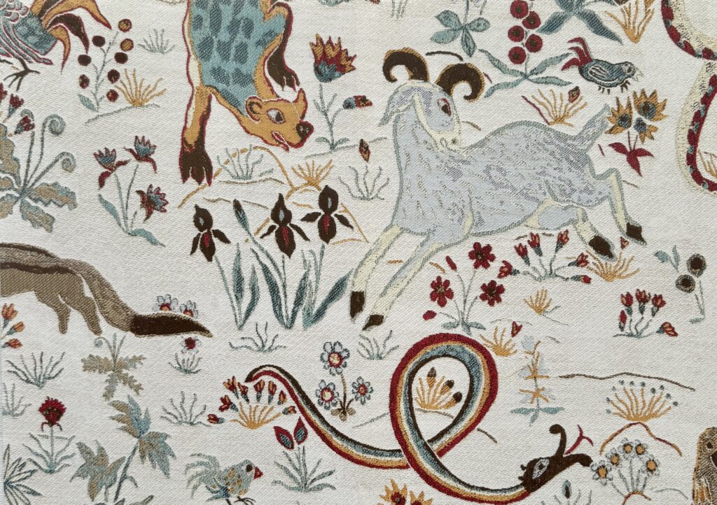
SW Bosc Pear (Sample) is another really unique color. This could be incorporated into a whole-house color palette as a textile, such as curtains, pillows or upholstery. But I could also see pairing it with a coordinating wallpaper. We’ve used this color a an exterior stucco paint color, and also as an exterior front door color.
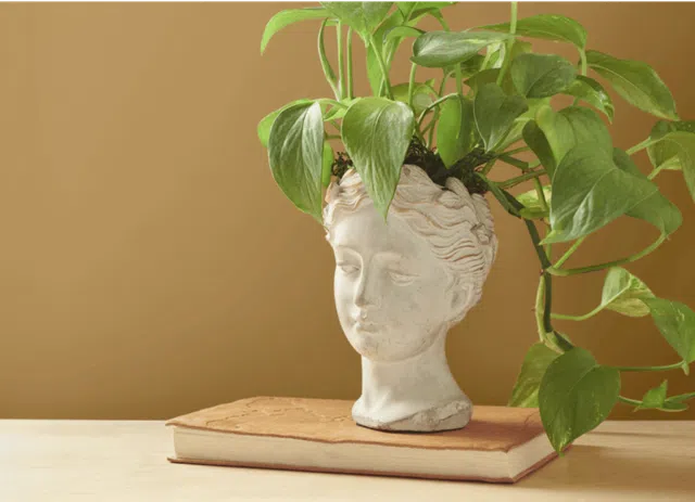
This color would work really well with some House of Hackney wallpaper pairings (Article), for example. House of Hackney’s unique designs and warm color options, such as in the sample below, would look beautiful alongside SW Bosc Pear paint.
Sherwin-Williams Mauve Finery

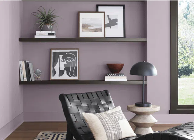
In the photo from Sherwin-Williams below, Mauve Finery (Sample) is used as the walls of an office or sitting room paired with dark brown trim. This is a lovely combination, but you’d have to really love purple! I love the idea of using Mauve Finery for a kids’ bedroom or playroom.
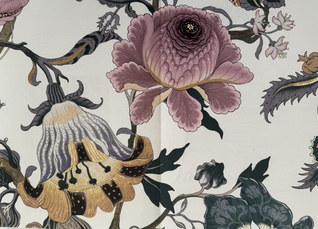
SW Mauve Finery is another example of an accent color that would pair beautifully with wallpaper. The House of Hackney wallpaper (Article) sample below, for example, would complement Mauve Finery walls perfectly.
Used in this way, Mauve Finery could potentially be used in a powder room (Article) or other accent space. But for the most part I really only see using this paint color in a kids’ room. This would make a beautiful color-drenched little girls’ room!
What is the best way to test the Benjamin Moore 2024 Color Trend paint colors?
We always recommend testing paint colors in your home because lighting can completely change how a color looks, both in interiors and exteriors.
In the old days, this meant we painted a large poster board with sample pots and a huge mess.
Now we have a better way to test paint, with Samplize Peel-and-Stick samples!
- Samples pre-painted with two coats of real paint from the manufacturer.
- Large 9” x 14” samples to see the color better in the lighting.
- Delivered overnight
- Colors are accurate
- Less expensive than painting a large poster board with sample pots
- No mess, and no toxic paint to dispose of
I use these in my own color consulting practice for exact results. Discover Samplize peel-and-stick paint samples.
Sample the individual paint colors in this Sherwin-Williams 2025 Color Capsule of the Year by linking to the colors below:
- SW Sunbleached
- SW White Snow
- SW Malabar
- SW Chartreuse
- SW Grounded
- SW Clove
- SW Rain Cloud
- SW Bosc Pear
- SW Mauve Finery
Key Learning Points
The Sherwin-Williams 2025 Color of the Year capsule collection features 9 paint colors selected from the company’s full collection.
- The colors include many warm, earthy tones and are darker than you might expect. This can give us a glimpse into what Sherwin-Williams expect color trends to look like in the year ahead, and beyond.
- There are a few options within the palette to use for color-drenching, an increasingly popular trend.
- The Color Capsule as a whole can be used a whole-house color palette, with options for foundation neutrals, rich accents and bright pops of color.
Remember: NEVER, EVER use paint matches from a different brand than the one specified. Results are poor and there are no standards for the sheens. Even though your painter may truly believe it can be done, don’t do it. See results in our paint matching guide (Article).
No matter what, always test your paint colors. It’s a standard best practice. Whenever I test my paint colors, they are perfect, and when I don’t test they turn out wrong. Learn how to test your paint colors like a pro (Article).
Online Color Consulting
If you still need help with paint colors, check out our Online Color Consulting packages or an In-Person Color Consultation in the Denver Metro area.

Related Posts
- Benjamin Moore 2025 Color of the Year
- Benjamin Moore 2024 Color of the Year
- HGTV by Sherwin-Williams 2025 Color of the Year
- Sherwin-Williams 2024 Color of the Year
- HGTV Home by Sherwin-Williams 2024 Color of the Year
- Color Drenching 101
About the Author
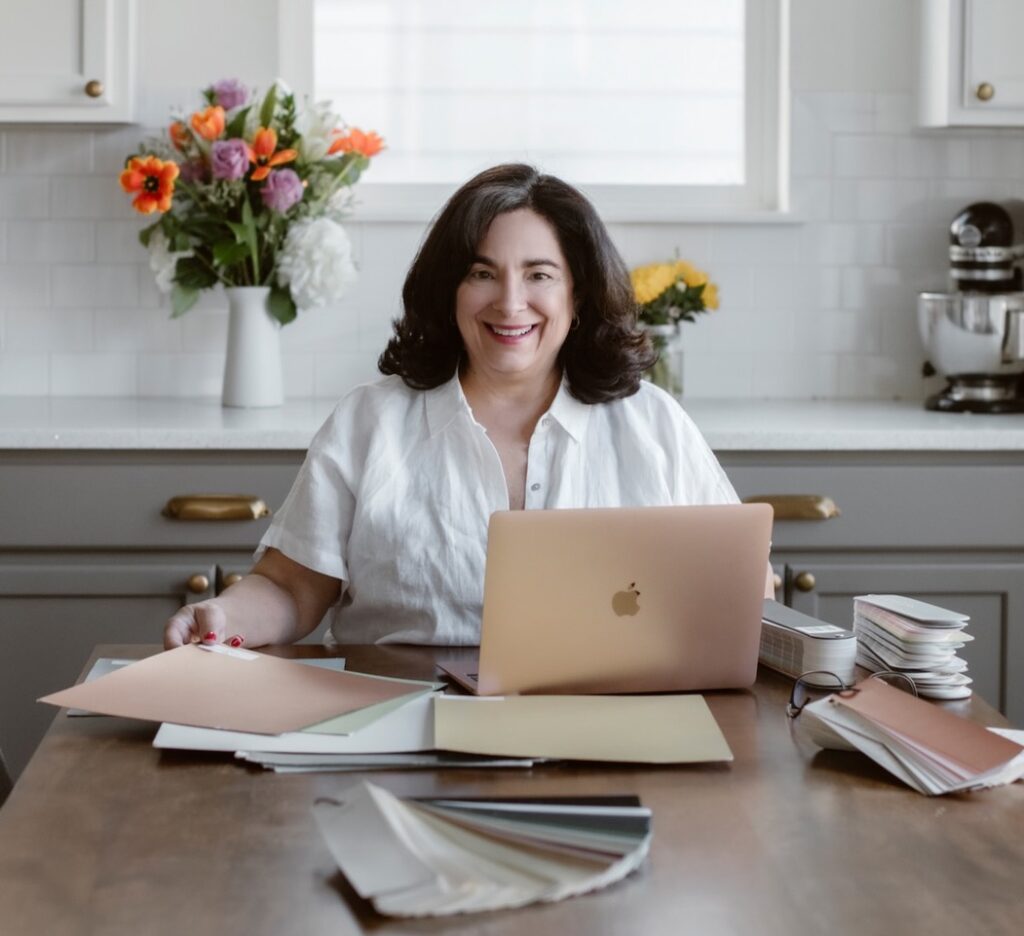
Hi, I’m Michelle Marceny, founder, owner, and Principal Color Designer at The Color Concierge. I believe a fresh coat of paint can completely transform a space. The Color Concierge was born out of my drive to help clients fall back in love with their homes. My clients trust me to help them find the perfect paint color for their home – whether it’s a whole-house paint color scheme or ideas for a single room.
Since The Color Concierge was founded in 2017, we have completed over 3000 color consultations, both online and in-person. I am a Certified Color Expert with 7 years of experience creating interior and exterior color palettes throughout North America.
We love your comments! Please note that the blog is meant as general advice, and it is impossible to give specific answers to your paint questions. If you want more specific advice, please consider purchasing a color consultation. Thank you for your understanding.
