The best Sherwin-Williams warm whites are Sherwin-Williams Cheviot (SW 9503) for a bright,
luminous white, Sherwin-Williams Alabaster (SW 7008) for a versatile creamy white, and
Sherwin-Williams White Duck (SW 7010) for a darker, muted white that won’t turn yellow.
Sherwin-Williams Creamy (SW 7012) is the creamiest. LRV tells you how light a white is, but
not how warm it looks.
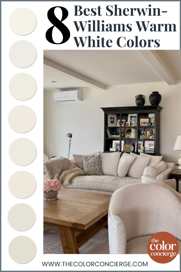
White paint is never just white, and that’s especially true of warm whites. As paint color consultants, we use warm whites more than any other whites in our clients’ homes. They feel soft and welcoming, they look great with warm wood tones and brass fixtures, and they don’t look stark in bright light.
These are the Sherwin-Williams warm whites I recommend most, ranked from lightest to darkest by LRV. One interesting thing you’ll notice right away: the lightest color on this list isn’t the coolest, and the darkest isn’t the creamiest. LRV and warmth are two different things, and understanding the difference will help you pick the right white the first time.
*This post contains affiliate links for products I use and love. If you click on some links and make a purchase, I will get a small commission at no cost to you. This helps pay for the costs of the blog, so I can continue to offer great content to our readers.
About The Color Concierge
Our Colorado-based paint color consultants make finding the right paint colors for your home easy. Whether you’re painting the exterior or interior of your home, our simple yet effective process lets us get your paint color right the first time. We’ve helped thousands of homeowners transform their homes into a space they love. Learn more about ONLINE COLOR CONSULTATIONS today.
What Makes a White Paint Color Warm?
A white paint color is warm when it has a little yellow, red or green mixed into it. Those undertones keep a white from looking stark or cold. Cool whites, like Sherwin-Williams Extra White (SW 7006), get their crispness from blue.
Where the warmth comes from changes how the white looks on your wall:
- Yellow undertones read creamy. I define “creamy” as a white with a yellow undertone. Sherwin-Williams Alabaster and Sherwin-Williams Creamy are good examples.
- Red undertones read warm, but not creamy. Whites that get their warmth from red are warm but not creamy, and they can flash pink, especially in warm light.
- Green undertones read warm without looking yellow. Sherwin-Williams Pearly White and Sherwin-Williams White Duck get their warmth from soft, almost invisible green undertones. That’s why they look creamy on the wall but never turn yellow.
Does LRV Tell You How Warm a White Is?
No. LRV (Light Reflectance Value) measures how light or dark a color is, from 0 (black) to 100 (pure white). It doesn’t measure warmth or creaminess.
Sherwin-Williams Cheviot is the perfect example. With an LRV of 89, it’s the lightest and brightest white in this group, but it still has a lot of yellow in it. Sherwin-Williams Creamy (LRV 81) and Sherwin-Williams Alabaster (LRV 82) are almost the same lightness. But Alabaster is much less saturated with color, so Creamy looks much warmer on the wall.
So when you compare warm whites, look at two things: the LRV tells you how bright the white will feel, and the undertone tells you how creamy it will look.

8 Best Sherwin-Williams Warm White Paint Colors
These are the warm whites we recommend to clients most, ranked from lightest to darkest.
1. Sherwin-Williams Cheviot (SW 9503): Lightest and Brightest Warm White
Sherwin-Williams Cheviot (SW 9503) is a newer Sherwin-Williams white, and I absolutely love it. I believe it will become one of Sherwin-Williams’ most iconic whites. I think of Cheviot as Sherwin-Williams’ answer to Benjamin Moore Simply White, since the two are almost identical. Cheviot is clean, crisp and luminous on the wall.
With an LRV of 89, Cheviot is the lightest and brightest white in this group, and very light for a Sherwin-Williams white. But don’t let that fool you into thinking it’s cool. Its soft yellow undertones keep it warm. Cheviot has enough yellow to brighten a room with low light, but it stands up to bright sunshine without washing out or looking too yellow.
Good to know: Cheviot is an interior color. It’s part of the Emerald Designer Edition line, and it can also be ordered in Duration Home interior paint.

2. Sherwin-Williams Pure White (SW 7005): Best Warm White for Trim and Ceilings
Sherwin-Williams Pure White (SW 7005) is one of my favorite white paint colors. I recommend it to clients often, and I’ve used it in my own home! Pure White is a very specific color, and there’s no equivalent in any other paint brand.
Pure White has an LRV of 84 and light yellow undertones. It’s almost a clean white, but not quite. Those soft yellow undertones keep it from looking harsh, even though it’s crisp. That makes it the coolest white on this list, and the one we love most as a trim and ceiling white. It can also be lovely as an interior or exterior wall color in the right situation.
3. Sherwin-Williams Greek Villa (SW 7551): Best Warm White for Whole-House Palettes
Sherwin-Williams Greek Villa (SW 7551) is a warm off-white that looks creamy and gorgeous in most lighting. It’s versatile enough for just about any room, indoors and out, and it makes a great foundation for a whole-house color palette.
Greek Villa has the same LRV as Pure White (84), but it looks warmer and creamier on the wall. Its very subtle yellow undertones make it look warm and velvety without looking too yellow. It works well in brightly lit rooms and even in shadier ones. If a room is too shady, though, you’ll need to add artificial light to help it look its best.

4. Sherwin-Williams Cotton (SW 9581): Sherwin-Williams’ Answer to White Dove
Sherwin-Williams Cotton (SW 9581) is a quite muted warm white with an LRV of 83, and it’s Sherwin-Williams’ closest match to Benjamin Moore White Dove. The colors look a little different on the chip, but when my primary bedroom was painted Cotton, it just felt like White Dove.
Cotton’s undertones are yellow, but they lean almost peachy or orange. That’s what gives it a soft, warm glow on the wall without reading as a true cream.
If you love White Dove but your painter or project calls for Sherwin-Williams, Cotton is where I’d start. It also plays better than expected with Sherwin-Williams Extra White (SW 7006), a cool blue-white that is often used as builder-grade trim paint. That’s unusual for a warm white, and it makes Cotton a good option if you already have bright white trim you don’t want to repaint.
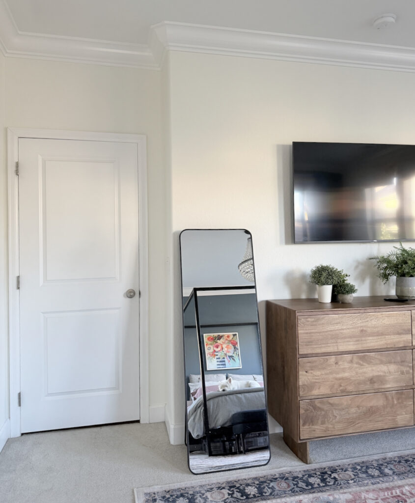
5. Sherwin-Williams Alabaster (SW 7008): Most Versatile Warm White
Sherwin-Williams Alabaster (SW 7008) is one of Sherwin-Williams’ most famous whites. For years, I resisted it because its yellow tones are so strong. But I’m here to say that Alabaster lives up to the hype, and I was wrong!
Once I started using it more with clients and in my own home, I realized why people love it so much: it’s just so versatile. Alabaster is warm but still muted, and creamy without skewing too yellow. It’s light and bright, but it has enough pigment that it won’t look dingy in rooms with low light. In fact, it’s one of the best white paint colors for dark rooms.
Alabaster has an LRV of 82 and strong yellow undertones. It’s a bit grayed out, which reminds me of Benjamin Moore White Dove, though it’s not as grayed out as White Dove. It works on walls, trim, cabinets and even exteriors, but it can read brighter than you expect in blazing sunshine.

6. Sherwin-Williams Creamy (SW 7012): Creamiest Sherwin-Williams Warm White
Sherwin-Williams Creamy (SW 7012) is the creamiest white in this group. It gets talked about a lot, but for a long time I didn’t use it much in my consulting projects, because it always felt too yellow for many of them.
Creamy has an LRV of 81, almost identical to Alabaster (82). But Creamy is much more saturated with yellow, so it looks much warmer in place. It’s actually quite muted, but it’s warm enough to make a space feel cozy and sunny, and it has enough color to hold its own in both very bright and dark rooms.
Choose Creamy when you want a white that clearly reads as cream. If you want warmth without that much yellow, Alabaster is the better all-around choice.
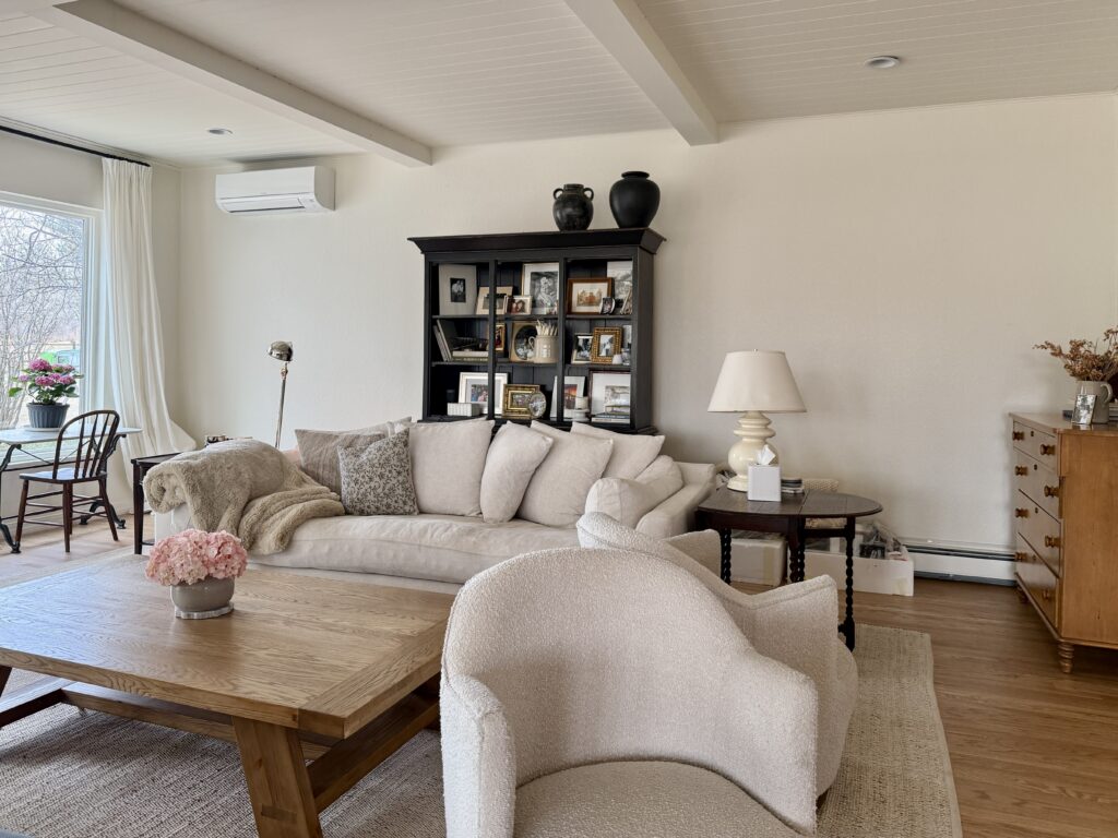
7. Sherwin-Williams Pearly White (SW 7009): Creamy White That Won’t Look Yellow
Sherwin-Williams Pearly White (SW 7009) is a muted creamy white that doesn’t look yellow. Slightly darker whites like Pearly White are really popular right now.
Pearly White is actually a very light beige. It isn’t quite a white, but it reads like a creamy white on the wall. I call it a complex cream, the warm version of a very light greige. With an LRV of 76.5, it’s noticeably darker than Alabaster or Greek Villa, and it looks great in both bright and dark rooms.
Its soft, invisible green undertones give it warmth without looking yellow, and they help it pair with just about any color or finish. It looks especially nice with earthy finishes and can help bring a space into the modern era.
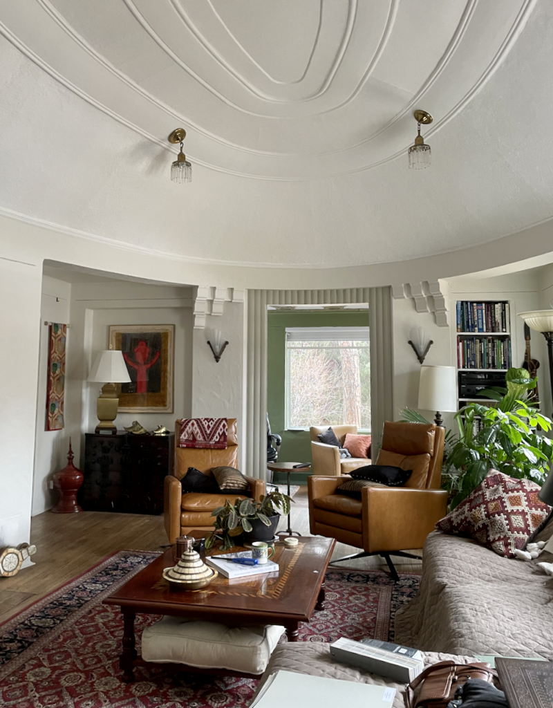
8. Sherwin-Williams White Duck (SW 7010): Best Darker Warm White
Sherwin-Williams White Duck (SW 7010) is the darkest white on this list, and it’s very popular right now. It’s the color I pick when I want a creamy color that won’t shift to yellow.
With an LRV of 74, White Duck is too muted to be a cream and too dark to be an off-white, but I’d consider it a darker white. It’s a cross between a very light beige and a greige. Like Pearly White, it’s a complex cream: muted but not gray, and perfectly balanced.
White Duck gets its warmth from soft, barely-there green undertones, and that’s what makes it so special. It looks creamy and warm on the wall, even in rooms with low or cool light, but it shouldn’t look overtly yellow. It’s a very pleasant, warm, homey color for walls, cabinets and even exteriors.
Sample These Sherwin-Williams Warm Whites
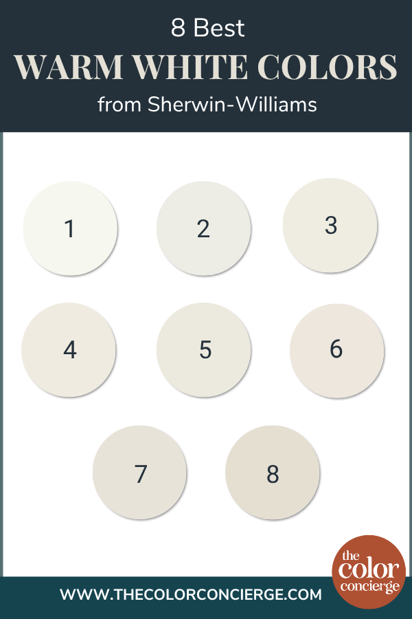
| Paint color | Peel-and-stick sample |
|---|---|
| Sherwin-Williams Cheviot (SW 9503) | Sample Cheviot |
| Sherwin-Williams Pure White (SW 7005) | Sample Pure White |
| Sherwin-Williams Greek Villa (SW 7551) | Sample Greek Villa |
| Sherwin-Williams Cotton (SW 9581) | Sample Cotton |
| Sherwin-Williams Alabaster (SW 7008) | Sample Alabaster |
| Sherwin-Williams Creamy (SW 7012) | Sample Creamy |
| Sherwin-Williams Pearly White (SW 7009) | Sample Pearly White |
| Sherwin-Williams White Duck (SW 7010) | Sample White Duck |
Warm whites are the hardest colors to judge on a screen. The difference between creamy, warm and pink is subtle, and it changes with the light in every room — Cheviot and Creamy can look nearly the same in a photo and completely different on your wall. Put two or three of these side by side on your actual walls, and check them in the morning and the evening before you commit. New to peel-and-stick samples? Samplize sends real manufacturer paint, two coats, in a 9” x 14” sheet, delivered overnight. I use them on every consultation. More on our method here: how to test paint colors.
How to Choose a Warm White Paint Color
Warm whites shift a lot with your lighting, your finishes, and the other whites in your home. Here’s what we’ve learned using them in real clients’ homes.
Warm White Paint Tips and Tricks
- North-facing rooms: A white with slight yellow undertones, like Sherwin-Williams Greek Villa (SW 7551), balances out cool northern light. In south-facing rooms, the same color looks warmer and brighter.
- Dark rooms: Choose a warm white with enough pigment that it won’t look dingy. Sherwin-Williams Alabaster (SW 7008) has enough pigment and warmth to still look light and bright with very little natural light. See our best white paint for dark rooms.
- Very warm light and finishes: In a room with very warm lighting and hard finishes that clash with yellow, a strongly yellow white like Sherwin-Williams Creamy (SW 7012) can look too yellow. A green-undertoned white like Sherwin-Williams White Duck (SW 7010) stays creamy without shifting yellow.
- If your white looks pink: Its warmth is coming from red. Switch to a white that gets its warmth from yellow or green.
- Trim and ceilings: Sherwin-Williams Pure White (SW 7005) is our favorite trim and ceiling white with warmer wall whites. Sherwin-Williams Cotton (SW 9581) also plays better than expected with Sherwin-Williams Extra White (SW 7006), a cool blue-white.
- Test them side by side: Warmth is relative. A white that looks creamy on its own can look gray next to a brighter one, so test your samples together on your actual walls. More on our method here: how to test paint colors.
Sherwin-Williams Warm White FAQ
What is the warmest Sherwin-Williams white?
Sherwin-Williams Creamy (SW 7012) is the warmest and creamiest of the popular Sherwin-Williams whites. It has very strong yellow undertones and is more saturated than Sherwin-Williams Alabaster (SW 7008), even though their LRVs are almost the same (81 vs. 82). Choose Creamy when you want a white that clearly reads as cream.
Which Sherwin-Williams warm white doesn’t look yellow?
Sherwin-Williams Pearly White (SW 7009) and Sherwin-Williams White Duck (SW 7010) are warm without looking yellow. Both get their warmth from soft green undertones instead of yellow ones, so they read creamy on the wall without shifting yellow, even in rooms with warm light. Both are slightly darker whites, with LRVs of 76.5 and 74.
What is the Sherwin-Williams equivalent of Benjamin Moore White Dove?
Sherwin-Williams Cotton (SW 9581) is the closest Sherwin-Williams match to Benjamin Moore White Dove (OC-17). The chips look a little different, but on the wall Cotton feels like White Dove, and color databases show the two are almost identical. Cotton is a muted warm white with an LRV of 83 and yellow undertones that lean almost peachy.
What is the Sherwin-Williams equivalent of Benjamin Moore Simply White?
Sherwin-Williams Cheviot (SW 9503) is almost identical to Benjamin Moore Simply White (2143-70). With an LRV of 89, Cheviot is one of the lightest, brightest Sherwin-Williams whites, but its soft yellow undertones keep it warm. It is an interior color, available in Emerald Designer Edition and Duration Home interior paint.
Key Learning Points
The best Sherwin-Williams warm white for your home depends on two things: how light it is (LRV) and where its warmth comes from (undertone).
- LRV doesn’t measure warmth. Sherwin-Williams Cheviot (SW 9503) is the lightest white in this group at LRV 89, but it still has a lot of yellow. Sherwin-Williams Creamy (LRV 81) and Sherwin-Williams Alabaster (LRV 82) are almost the same lightness, but Creamy looks much warmer.
- Creamy and warm aren’t the same thing. A creamy white gets its warmth from yellow. A white that gets its warmth from red is warm but not creamy, and it can flash pink.
- Green undertones give warmth without yellow. Sherwin-Williams Pearly White (SW 7009) and Sherwin-Williams White Duck (SW 7010) are slightly darker warm whites that look creamy but never yellow, which is why they’re so popular right now.
Choosing a warm white comes down to your light, your finishes, and how much creaminess you really want. The right one makes a home feel soft and welcoming, and the wrong one can look yellow, pink or dingy. If you’re stuck between two or three of these, you’re not alone. Picking the right white is one of the most common reasons clients come to us.
Remember: NEVER, EVER use paint matches from a different brand than the one specified. Results are poor and there are no standards for the sheens. Even though your painter may truly believe it can be done, don’t do it. See results in our paint matching guide.
No matter what, always test your paint colors. It’s a standard best practice. Whenever I test my paint colors, they are perfect, and when I don’t test they turn out wrong. Learn how to test your paint colors like a pro.
Online Color Consulting
Still need help picking the best paint colors? Discover our Online Color Consulting Packages.

Related Posts:
- 8 best Sherwin-Williams white paint colors
- Best Sherwin-Williams white trim colors
- Best white paint for dark rooms
- Sherwin-Williams Alabaster color review
- Sherwin-Williams White Duck color review
- Benjamin Moore White Dove color review
About the Author

Hi, I’m Michelle Marceny, founder, owner, and Principal Color Designer at The Color Concierge. I believe a fresh coat of paint can completely transform a space. The Color Concierge was born out of my drive to help clients fall back in love with their homes. My clients trust me to help them find the perfect paint color — whether that’s a whole-house color scheme or ideas for a single room.
Since founding The Color Concierge in 2017, my team and I have completed 1,000s of color consultations, online and in person. I’m a Certified Color Expert with nine years of experience creating interior and exterior color palettes throughout North America.
Every color review on this site comes from colors we’ve specified in real homes and photographed on location during our own consultations — not from a fan deck or a manufacturer’s website.
We love your comments! Please note that the blog is meant as general advice, and it is not possible to give out specific answers to your paint questions. If you want more specific advice, our Online Color Consultations will help you pick your paint colors. Thank you for your understanding.