Sherwin-Williams Cotton (SW 9581) is a soft, muted warm white with yellow undertones and an LRV of 83. It looks clean and luminous without feeling stark, and is the closest Sherwin-Williams match to Benjamin Moore White Dove (OC-17). Cotton is beautiful with navy blue, warm wood tones, and a clean white or off-white trim color.
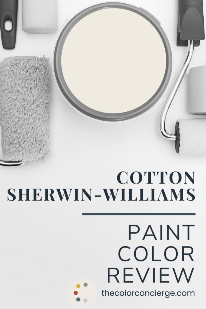
I’ve wanted to paint my bedroom for about three years, and in that time my walls became a revolving gallery of paint swatches. It’s so easy for me to pick paint colors for someone else’s bedroom. But when it’s your own bedroom, you go back and forth.
In the end, I picked a white, which is what I wanted from the very beginning: Sherwin-Williams Cotton (SW 9581), one of Sherwin-Williams’ designer colors. I was really curious about Cotton because it’s one of those soft, warm off-whites that looks so clean and lovely. I love this off-white so much. Every morning when I wake up it makes me so happy, and I open the windows as soon as I can.
After the room was painted and everything was dry, I walked in, looked around and thought, “It’s exactly like White Dove.” For years, people have asked me which Sherwin-Williams color is most like Benjamin Moore White Dove. Now I have my answer: it’s Cotton.
Below, I’ll show you Cotton in every corner of my primary bedroom and at different times of day, how it looks with the Sherwin-Williams Needlepoint Navy accent wall and bathroom we painted at the same time, and how it compares to the whites I’m asked about most.
*This post contains affiliate links for products I use and love. If you click on some links and make a purchase, I will get a small commission at no cost to you. This helps pay for the costs of the blog, so I can continue to offer great content to our readers.
Sherwin-Williams Cotton at a Glance
| Color | Sherwin-Williams Cotton |
|---|---|
| Color number | SW 9581 |
| LRV | 83 (Light Reflectance Value, on a scale of 0 to 100) |
| Undertones | Yellow, softly muted so it reads as a clean warm white rather than a cream |
| Color family | Warm off-white; one of Sherwin-Williams’ designer colors |
| Best for | Bedrooms and living spaces where you want a soft, luminous white with quiet warmth |
| Best trim & ceiling | Sherwin-Williams Cotton (SW 9581) itself, or Sherwin-Williams Pure White (SW 7005) |
| Avoid pairing with | Very cool paint colors or neutrals with pink undertones |
| Closest Benjamin Moore match | Benjamin Moore White Dove (OC-17) |
What Color Is Sherwin-Williams Cotton?
Sherwin-Williams Cotton (SW 9581) is a soft, warm off-white with muted yellow undertones and an LRV of 83. It looks clean and lovely on the wall, and by clean, I don’t mean it has no undertones. Cotton definitely has a yellow undertone, and that yellow leans almost peachy. But it’s so muted that Cotton reads as a soft, warm white rather than a cream.
The words I keep coming back to are soft and luminous. Those are the same qualities that make White Dove so popular. In some ways, I think Cotton is even better than White Dove, though I can’t quite describe why. It has a depth and glow that many off-whites don’t.
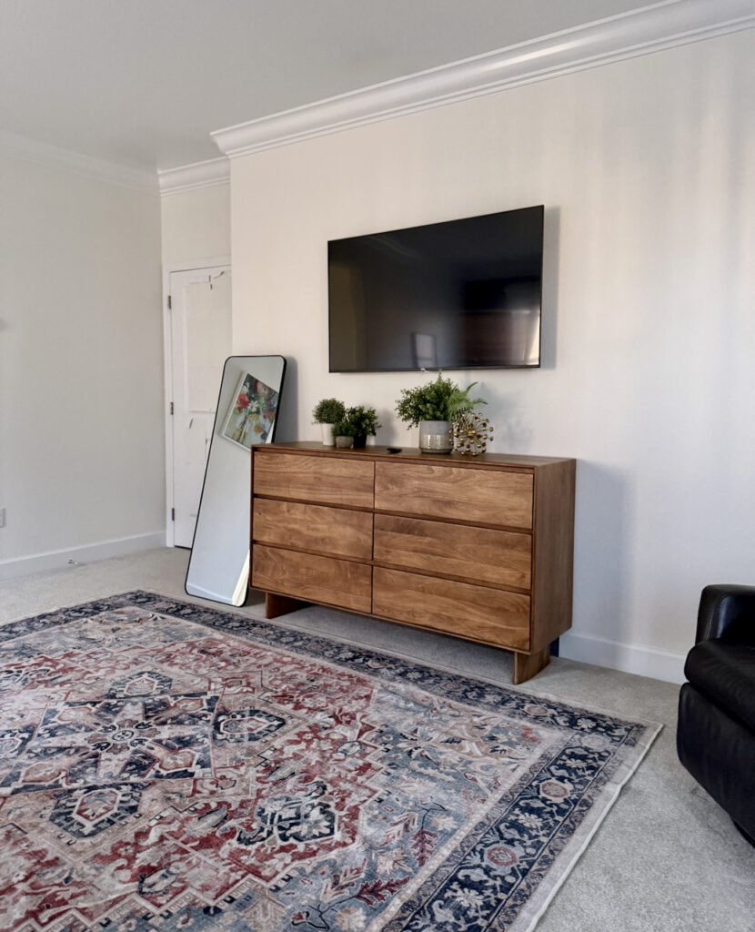
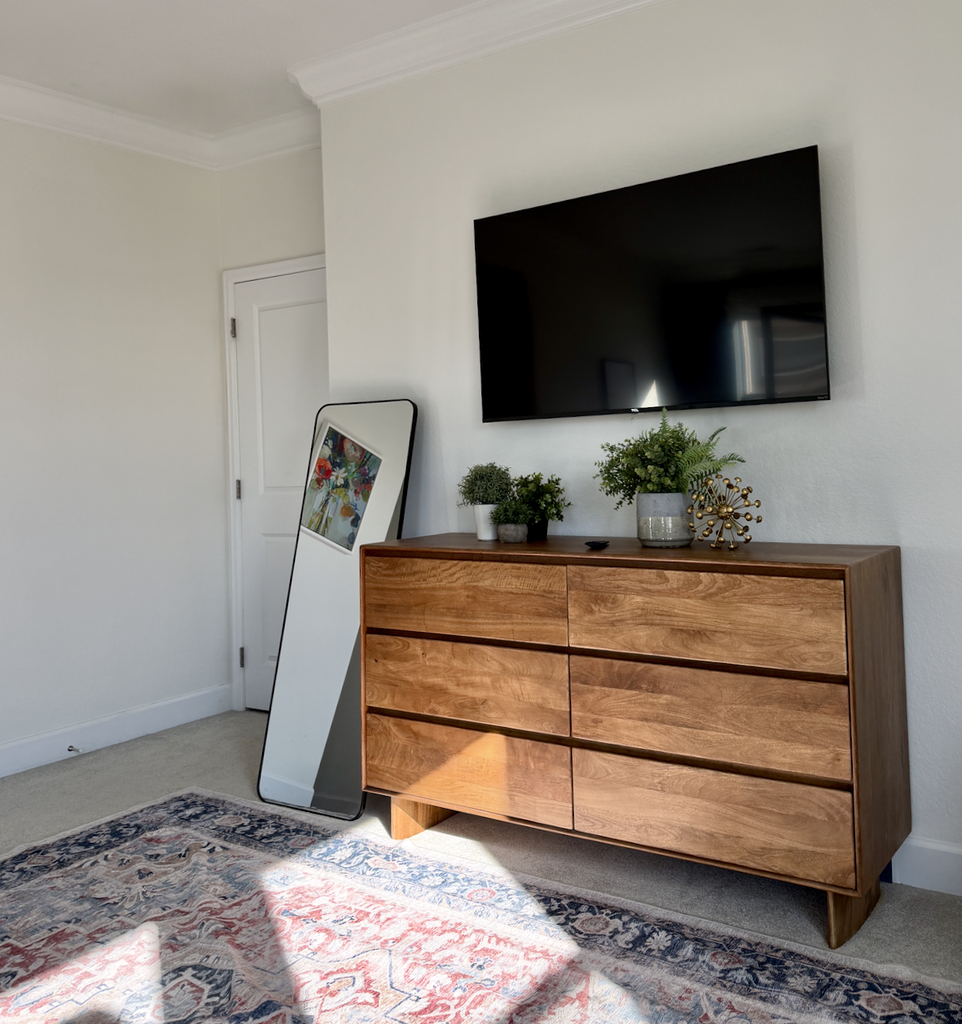
Below is a photo taken in the morning at 9:25 AM that looks more muted and less yellow.
Does Sherwin-Williams Cotton Look Yellow?
Usually, no. Sherwin-Williams Cotton (SW 9581) has a yellow undertone, but it’s muted enough to read as a soft, clean white on most walls. It only looks yellow when it reflects warm light, either from warm artificial lighting or late-day sun. White is always a mirror, and Cotton picks up the tones around it.
You can see this in the photo below. I was standing in the primary bathroom, looking down the hallway into the bedroom toward the end of the day. The hallway itself was dark, but a lot of west-facing light came from behind me. That light picked up warm tones from the sunset and made the walls look yellow. Even so, notice how light Cotton stays in the dark corners. I took this photo around 3:30 PM.
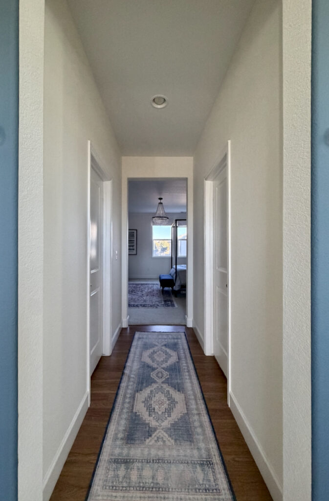
The photo below shows the same view taken at 10:00 AM a couple of days later. You can see how different the light is in the morning. It is less yellow, and the bedroom itself, which has more east-facing light, is fully lit with natural light. I love it.
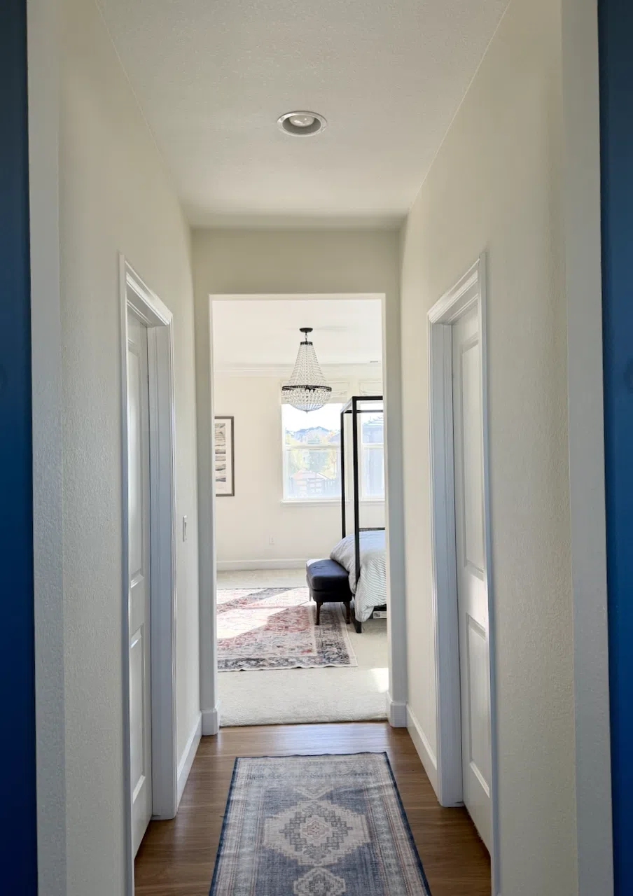
Here’s the same effect from the other direction. The warm light coming through the hallway that connects the west-facing bathroom window to the bedroom makes the wall by the doorway look yellow. Normally, that wall doesn’t look yellow at all. You can see the light from the window reflecting off the wall on the right.
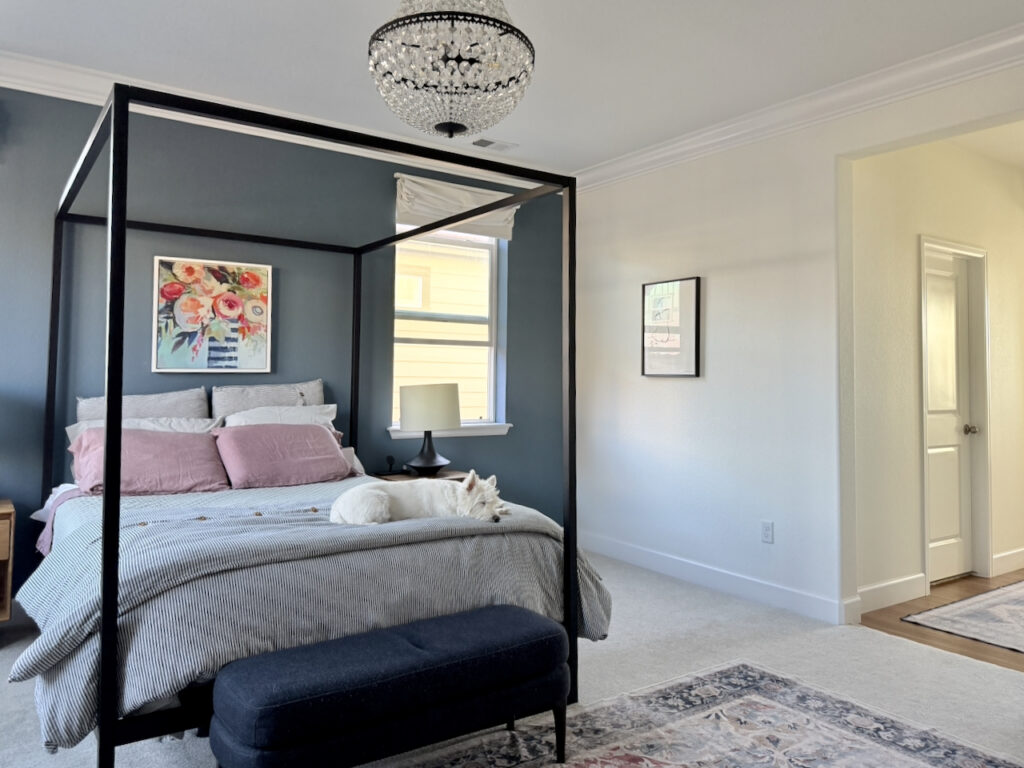
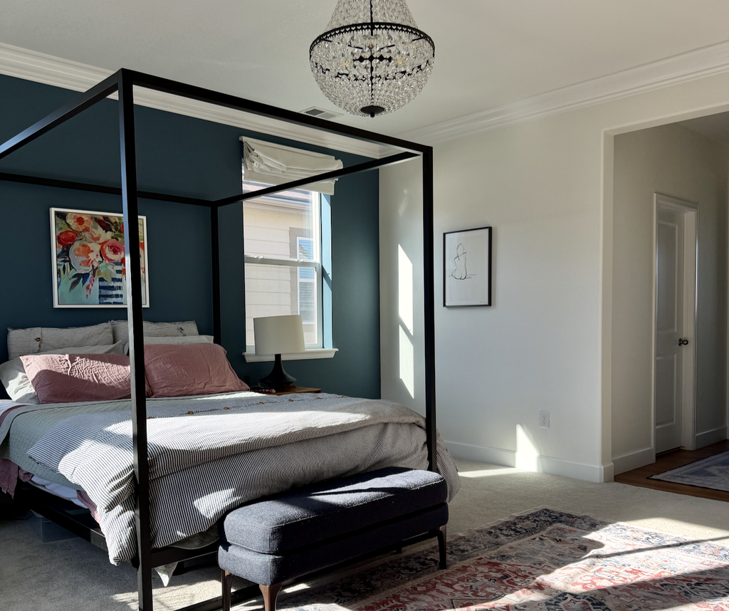
The photo below was taken at 9:20 Am a few days later. The light makes the room look completely different. It’s really luminescent. You can see the shade and the sun in this photo.
If you want to understand how light changes a white, it helps to know how light the color is to begin with. Our guide to LRV explains what that number means.
How to Use Sherwin-Williams Cotton
Here’s what I learned living with Cotton in my own bedroom and bathroom.
Sherwin-Williams Cotton Tips and Tricks
- Use with: deep navy like Sherwin-Williams Needlepoint Navy (SW 0032), warm wood furniture, and art and textiles with rosy pinks and soft greens. Navy and off-white always look good together.
- Don’t use with: very warm light, if you never want to see yellow. Light is always a mirror, and Cotton picks up whatever is around it. Late-day west sun and warm bulbs pull out its yellow undertone; the rest of the time, it reads as a soft, clean white.
- Accent walls: Cotton makes a calm counterpoint to balance a dark accent wall behind the bed. Avoid putting the accent color on a brightly lit window wall unless something outside, like a neighboring house, cuts the glare.
- Best trim color (satin): Sherwin-Williams Cotton (SW 9581) for a seamless look, or Sherwin-Williams Pure White (SW 7005) for a slightly lighter, cooler contrast.
- Best ceiling color (flat): Sherwin-Williams Cotton (SW 9581). Sherwin-Williams Pure White (SW 7005) also works.
- Best paint matches: Benjamin Moore White Dove (OC-17) is nearly identical. Sherwin-Williams Alabaster (SW 7008) is the next closest Sherwin-Williams white, but it’s creamier.
- Exterior Uses: We don’t recommend using it as an exterior trim color unless your exterior body is very light. It can look stark in the bright sunshine, especially in the Deep South and high-altitude states such as Colorado and Utah. If you use it on the exterior, consider it a whole-house color. It would work better in New England, the Pacific Northwest, or even the Great Lakes states up North, where the lighting is softer and less harsh.
My Primary Bedroom in Sherwin-Williams Cotton
This project is my own primary bedroom and bathroom, so I got to see Cotton in every light, every day, before I wrote a word about it.
Before: Sherwin-Williams Agreeable Gray
Before Cotton, our bedroom was Sherwin-Williams Agreeable Gray (SW 7029). You can see it in my Sherwin-Williams Agreeable Gray review. Our builder gave us Agreeable Gray, and I always felt it looked a bit muddy. From the start, I envisioned some sort of white, and Cotton finally delivered. The dark blue Needlepoint Navy accent wall added depth.

After: Cotton in Every Corner
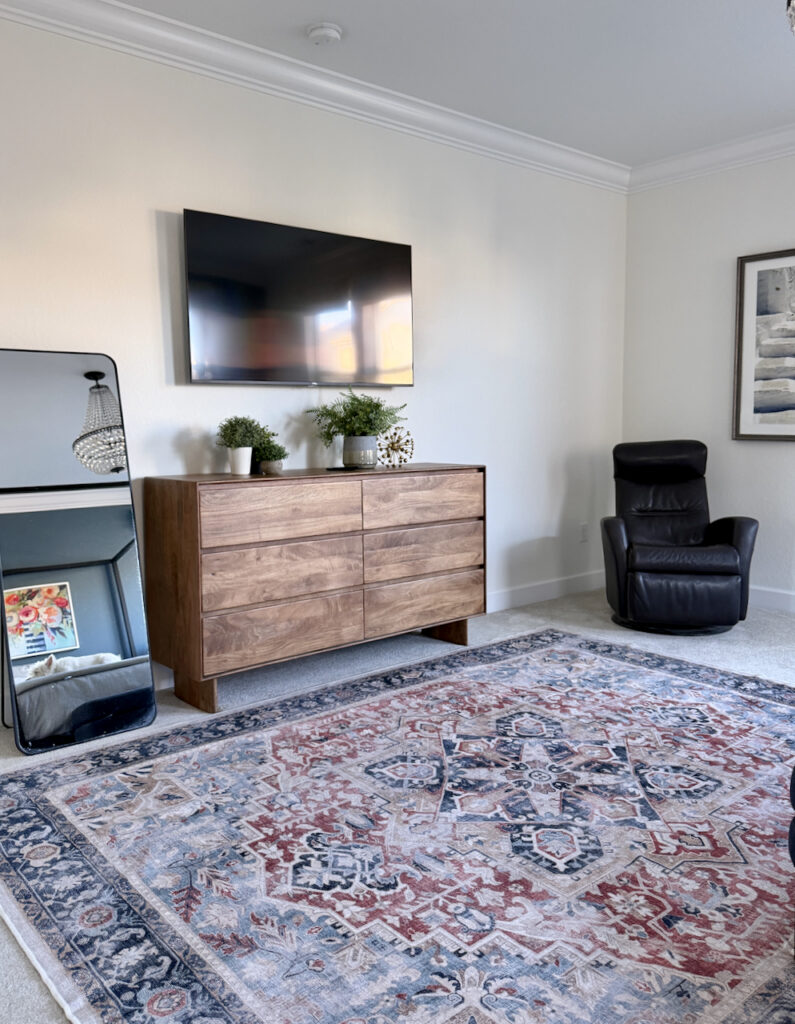
I photographed each corner of the room so you can see how Cotton behaves in different light. Some walls get light from the windows, and some don’t, and Cotton varies very well across all of them. It stays soft on the shaded walls and doesn’t wash out next to the windows.
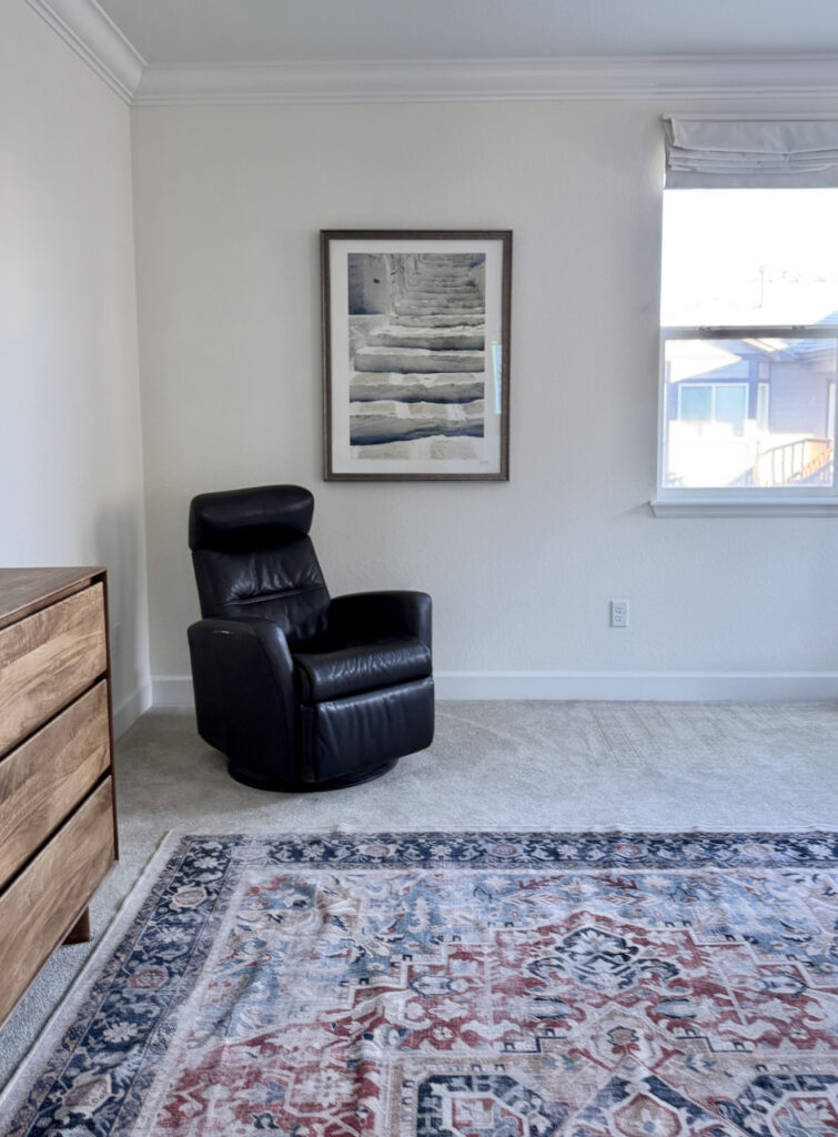
It was an absolute smash. Even my husband likes it, and he always has opinions about the colors we use in our home. His big rule, for example, is no green paint colors (which is such a tough one to follow!).
Cotton With Extra White Trim and Ceilings
For the record, the trim and ceilings in my bedroom are Sherwin-Williams Extra White (SW 7006). Ideally, I probably wouldn’t have specified Extra White with Cotton, but it’s what we already had throughout the house. I was too thrifty to repaint it, because repainting trim and ceilings can pretty much double the price of a paint job.
You can see in some of the photos how much cooler the ceiling looks, since Extra White has blue undertones. But Cotton does very well with Extra White trim. If I were starting fresh, I’d paint the trim and ceilings Cotton itself, or use Sherwin-Williams Pure White (SW 7005), which is lovely with it. Pure White is slightly lighter and also an off-white, but a little cooler than Cotton.
Needlepoint Navy Accent Wall
We added an accent wall behind the bed in Sherwin-Williams Needlepoint Navy (SW 0032), and I went against one of my own rules to do it. I usually tell clients not to put an accent wall on a wall with windows, because the light coming through can make the color hard to see.
In our bedroom, though, the house next door blocks the windows, so the light coming in isn’t as bright. That made me comfortable breaking the rule. I also love an accent wall behind the bed in a bedroom. Here, it looks spectacular.
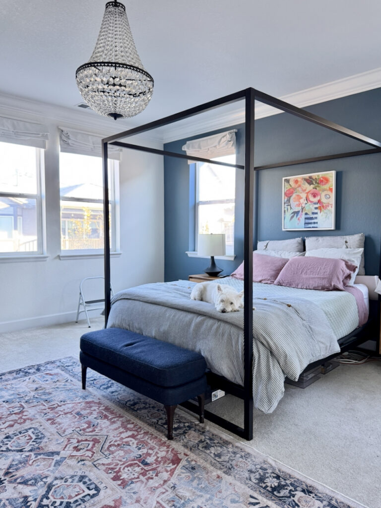
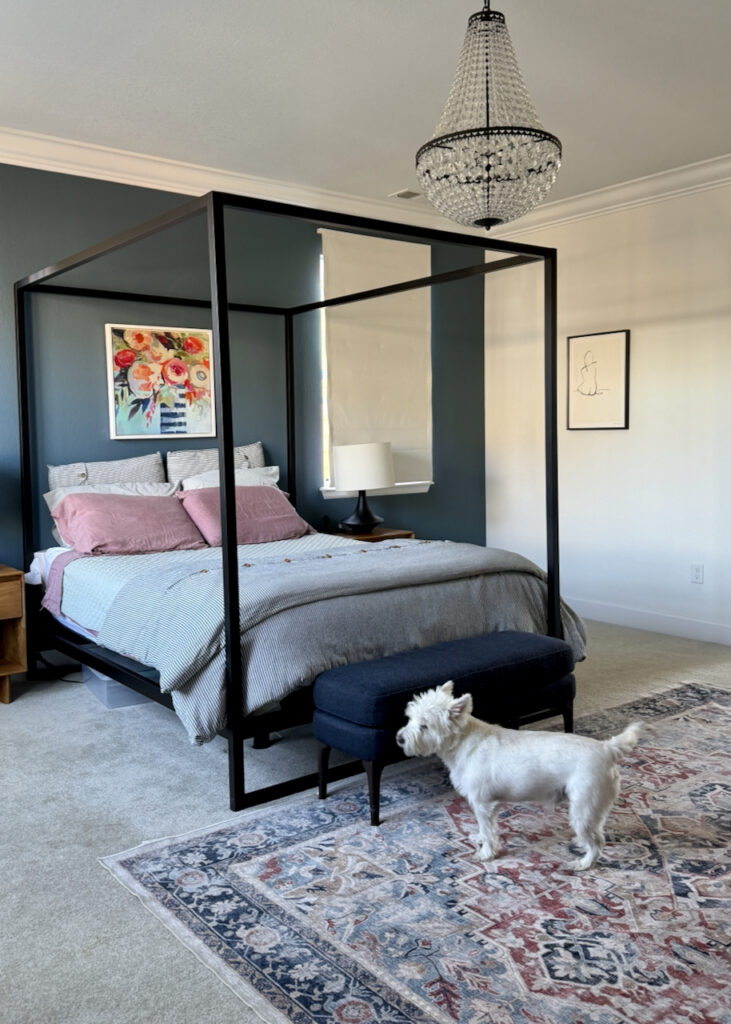
We picked Needlepoint Navy because it matched the blue from the vase in the painting behind the bed. The bedding picks up the other colors in the art: the dark rosy pink, the green, and a striped blue comforter. Add the warm wood dresser and our classic-looking Ruggable rug, and the room has a lot of complexity and dimension.
Navy and off-white always look good together, and Cotton gives Needlepoint Navy a soft, warm counterpoint. For more navy options, see our best navy blue paint colors.
The Primary Bathroom: Needlepoint Navy and Cotton
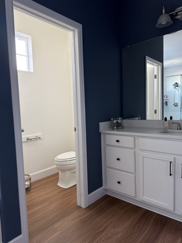
We painted the primary bathroom Needlepoint Navy, too. It used to be a much darker blue, Sherwin-Williams Cyberspace (SW 7076), which you can see in my Sherwin-Williams Cyberspace review. The water closet is Cotton, so the color goes from navy to off-white and back. I have to say, I absolutely love this combination.
The hallway runner connecting the bedroom and bathroom ties everything together. It’s really, really beautiful with both colors.

Can we use SW Cotton as an Exterior Color?
As with BM White Dove, we don’t recommend using this white as an exterior white trim color unless your exterior body is very light. It can look stark in the bright sunshine, especially in the Deep South and high-altitude states such as Colorado and Utah.
If you use it for an exterior, I’d recommend testing it as a whole-house color. It would work better in New England, the Pacific Northwest, or even the Great Lakes states up North, where the lighting is softer and less harsh.
Sherwin-Williams Cotton vs Benjamin Moore White Dove
Sherwin-Williams Cotton (SW 9581) is the closest Sherwin-Williams match to Benjamin Moore White Dove (OC-17) I’ve found. When my bedroom looked so much like White Dove, I compared the two on EasyRGB.com, the tool I use to compare paint colors across brands. Sure enough, they came up as extremely close across every one of White Dove’s color numbers.
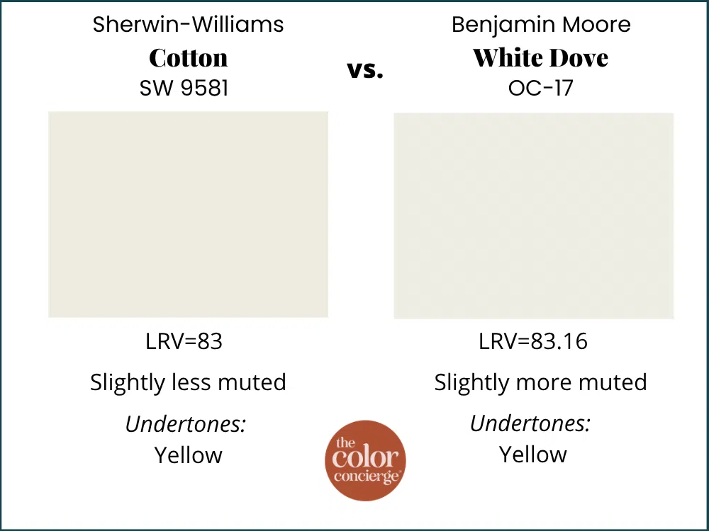
Their LRVs are nearly identical: 83 for Cotton and 83.16 for White Dove. Even their color hex codes are identical: #EDEBE2. We don’t usually publish RGB values, but here they are side by side so you can see just how close these two whites are.
| Paint color | RGB values and LRV |
|---|---|
| Sherwin-Williams Cotton (SW 9581) | RGB 238, 235.3, 226.2 · LRV 83 |
| Benjamin Moore White Dove (OC-17) | RGB 237.8, 235.6, 226.1 · LRV 83.16 |
On the wall, they do the same work. Both are soft, luminous, and a little muted, and both have a yellow undertone that’s grayed out enough to rarely show. If you love White Dove but your painter uses Sherwin-Williams, I’d choose Cotton. It’s a better option than having White Dove color-matched in Sherwin-Williams paint, because in our experience those matches tend to come out a smurfy light green.
Sherwin-Williams Cotton vs Other Popular Whites
These are the other whites I’d compare with Cotton, from the closest match to the best trim partner.
Sherwin-Williams Cotton vs Sherwin-Williams Alabaster
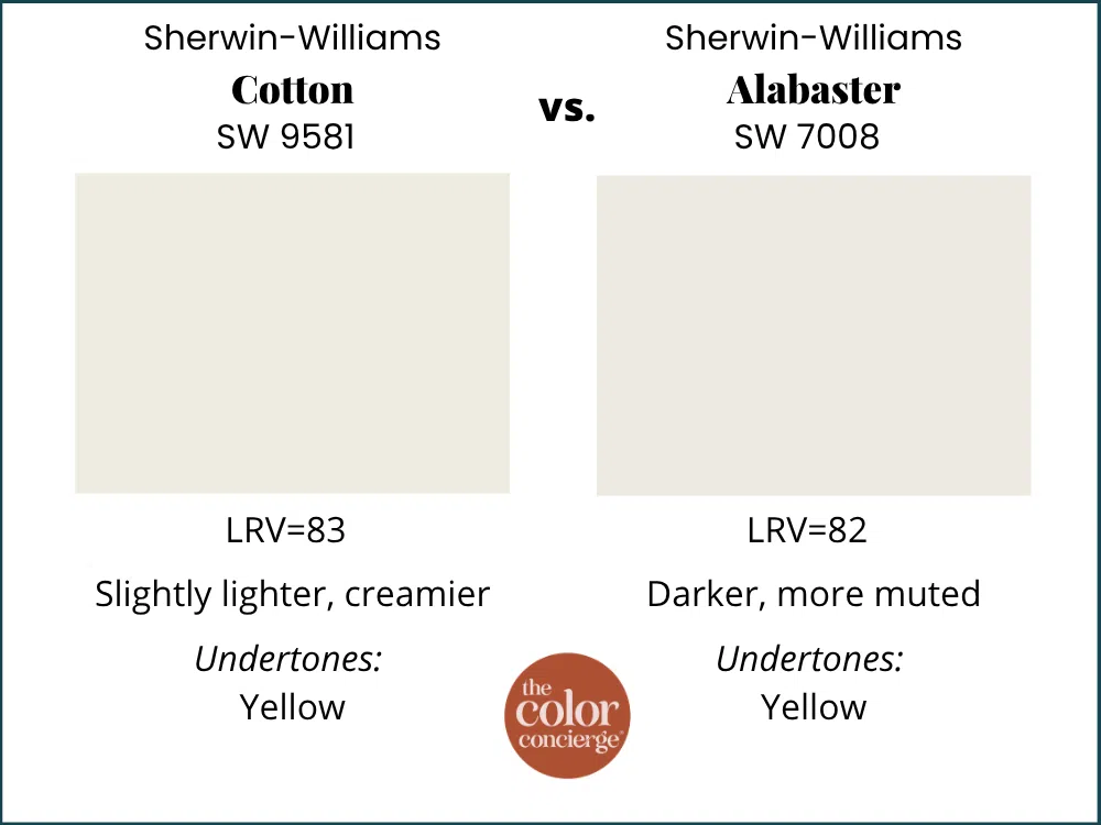
Sherwin-Williams Alabaster (SW 7008) is about the closest Sherwin-Williams color to Cotton. Alabaster is a beautiful color, but it doesn’t have the depth and luminosity of Cotton. With an LRV of 82, it’s a touch darker, and its strong yellow undertones make it look creamier. Cotton feels a little cleaner than Alabaster.
Sherwin-Williams Cotton vs Benjamin Moore Swiss Coffee
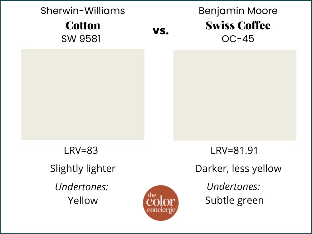
Benjamin Moore Swiss Coffee (OC-45) is warmer and a little darker than Cotton, with an LRV of 82. Swiss Coffee gets its warmth from invisible green undertones that lean yellow, so it reads cozier. Choose Cotton if you want a white that feels a bit crisper.
Sherwin-Williams Cotton vs Benjamin Moore Cloud White
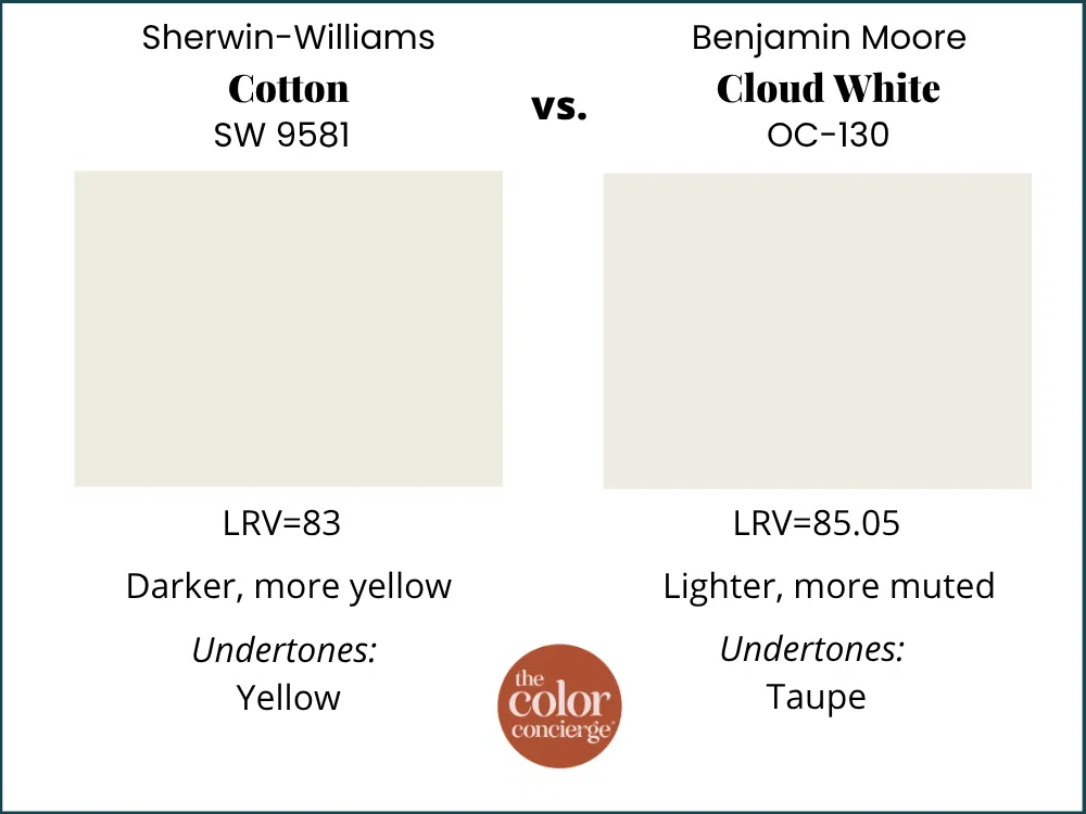
Benjamin Moore Cloud White (OC-130) is lighter and brighter than Cotton, with an LRV of 85 and warm, invisible taupe undertones. White Dove, Cotton’s near-twin, reads darker, more muted, and cooler than Cloud White, so expect the same difference between Cloud White and Cotton.
Sherwin-Williams Cotton vs Sherwin-Williams Greek Villa
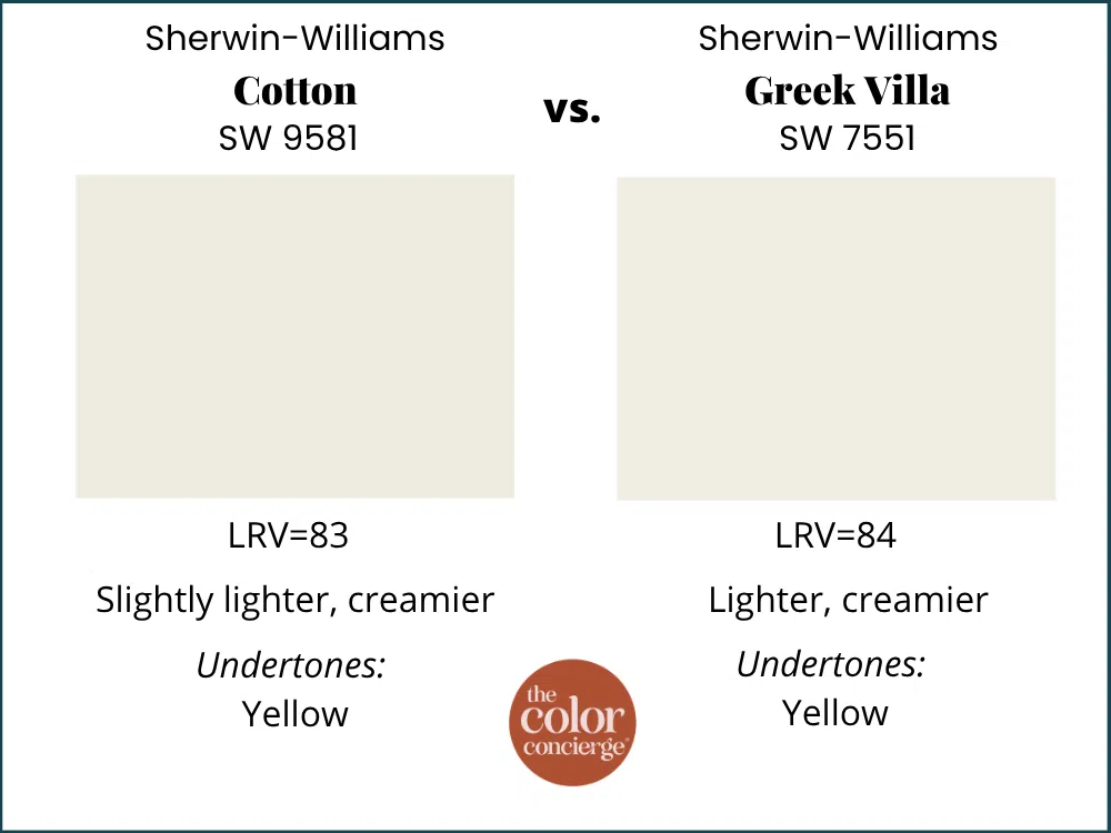
Sherwin-Williams Greek Villa (SW 7551) is slightly lighter than Cotton, with an LRV of 84. Its very subtle yellow undertones make it look warm and velvety. Next to White Dove, Greek Villa looks a little creamier, and White Dove looks more muted, which is the same way Cotton compares to Greek Villa.
Sherwin-Williams Cotton vs Sherwin-Williams Pure White
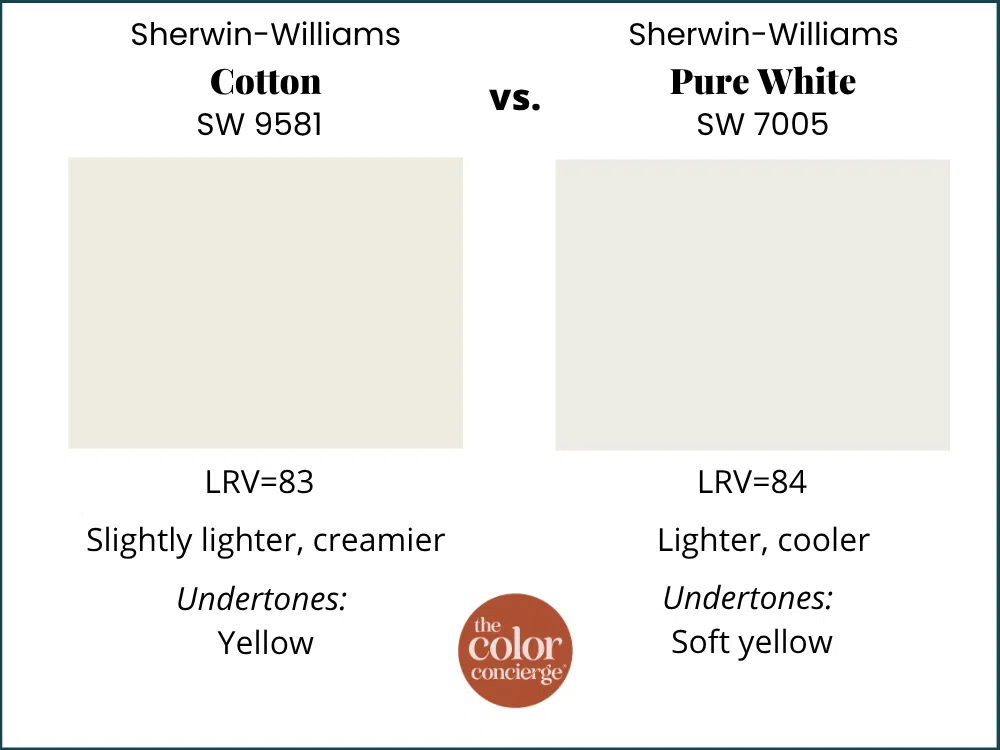
Sherwin-Williams Pure White (SW 7005) is slightly lighter (LRV 84) and a little cooler than Cotton, with light yellow undertones. These two look good together, which is why I recommend Pure White for trim and ceilings with Cotton walls.
Want to see Cotton alongside more Sherwin-Williams whites? See our best Sherwin-Williams warm white paint colors.
| Paint color | Peel-and-stick sample |
|---|---|
| Sherwin-Williams Cotton (SW 9581) | Sample Cotton |
| Sherwin-Williams Needlepoint Navy (SW 0032) | Sample Needlepoint Navy |
| Benjamin Moore White Dove (OC-17) | Sample White Dove |
| Sherwin-Williams Alabaster (SW 7008) | Sample Alabaster |
| Benjamin Moore Swiss Coffee (OC-45) | Sample Swiss Coffee |
| Benjamin Moore Cloud White (OC-130) | Sample Cloud White |
| Sherwin-Williams Greek Villa (SW 7551) | Sample Greek Villa |
| Sherwin-Williams Pure White (SW 7005) | Sample Pure White |
| Sherwin-Williams Extra White (SW 7006) | Sample Extra White |
Cotton is a white you have to see in your own light. In my bedroom, the same color looks crisp and clean on the shaded wall by the dresser and turns golden in late-day west light by the bathroom door. Hang a Cotton sample right next to your trim, and if you’re deciding between Cotton, White Dove and Alabaster, put all three side by side and check them in the morning and again at sunset.
New to peel-and-stick samples? Samplize sends real manufacturer paint, two coats, in a 9” x 14” sheet, delivered overnight. I use them on every consultation. More on our method here: how to test paint colors.
Sherwin-Williams Cotton FAQ
Is Sherwin-Williams Cotton the same as Sherwin-Williams Cotton White?
No. Sherwin-Williams Cotton (SW 9581) and Sherwin-Williams Cotton White (SW 7104) are two different colors with different color numbers. Cotton (SW 9581) is the soft, muted warm white with an LRV of 83 that we painted in my own bedroom. Always order paint by the color number so you get the right white.
What accent colors go with Sherwin-Williams Cotton?
Deep navy is my favorite pairing. In my primary bedroom, Sherwin-Williams Cotton (SW 9581) walls surround a Sherwin-Williams Needlepoint Navy (SW 0032) accent wall, and the same navy continues into the primary bathroom. Cotton’s muted warmth also looks lovely with warm wood, dusty rose pinks and soft greens.
What is the best trim color for Sherwin-Williams Cotton?
For a seamless look, paint the trim and ceilings Sherwin-Williams Cotton (SW 9581) itself. For a little contrast, Sherwin-Williams Pure White (SW 7005) is slightly lighter and a bit cooler. Although it’s not perfect, you can pair Cotton with Sherwin-Williams Extra White (SW 7006), a crisp blue-white, the trim color in my own home. In a perfect world, I would prefer to pair SW Cotton walls (flat or matte) with SW Cotton ceilings (flat) and trim (satin).
Key Learning Points
Sherwin-Williams Cotton (SW 9581) is a soft, muted warm white that does its best work in bedrooms and living spaces where you want warmth without cream.
- Cotton is Sherwin-Williams’ White Dove. Sherwin-Williams Cotton (SW 9581) and Benjamin Moore White Dove (OC-17) share the same hex code (
#EDEBE2) and a Delta E of just 0.3, and on the wall they do the same work: soft, luminous and a little muted. - Its yellow only shows in warm light. Cotton’s yellow undertone is muted. In my own bedroom, it reads yellow only in late-day west light or under warm artificial light; most of the time, it looks like a clean, warm, soft white.
- It’s an easy partner for trim and accent colors. Cotton works with its own trim, with Sherwin-Williams Pure White (SW 7005), and even with blue-white Sherwin-Williams Extra White (SW 7006), and it’s a beautiful counterpoint to navy like Sherwin-Williams Needlepoint Navy (SW 0032).
Picking a white for your own home is harder than it looks, and I say that as someone who spent three years staring at swatches on my own bedroom walls. If you’ve been going back and forth, Cotton is a soft, warm white that’s very hard to get wrong.
Remember: NEVER, EVER use paint matches from a different brand than the one specified. Results are poor and there are no standards for the sheens. Even though your painter may truly believe it can be done, don’t do it. See results in our paint matching guide.
No matter what, always test your paint colors. It’s a standard best practice. Whenever I test my paint colors, they are perfect, and when I don’t test they turn out wrong. Learn how to test your paint colors like a pro.
Online Color Consulting
Still need help picking the best paint colors? Discover our Online Color Consulting Packages.

Related Posts
- Benjamin Moore White Dove color review
- Sherwin-Williams Alabaster color review
- Sherwin-Williams Extra White color review
- Best navy blue paint colors
- Best white paint for dark rooms
- How to test paint colors
About the Author

Hi, I’m Michelle Marceny, founder, owner, and Principal Color Designer at The Color Concierge. I believe a fresh coat of paint can completely transform a space. The Color Concierge was born out of my drive to help clients fall back in love with their homes. My clients trust me to help them find the perfect paint color — whether that’s a whole-house color scheme or ideas for a single room.
Since founding The Color Concierge in 2017, my team and I have completed 1,000s of color consultations, online and in person. I’m a Certified Color Expert with nine years of experience creating interior and exterior color palettes throughout North America.
Every color review on this site comes from colors we’ve specified in real homes and photographed on location during our own consultations — not from a fan deck or a manufacturer’s website.
We love your comments! Please note that the blog is meant as general advice, and it is not possible to give out specific answers to your paint questions. If you want more specific advice, our Online Color Consultations will help you pick your paint colors. Thank you for your understanding.