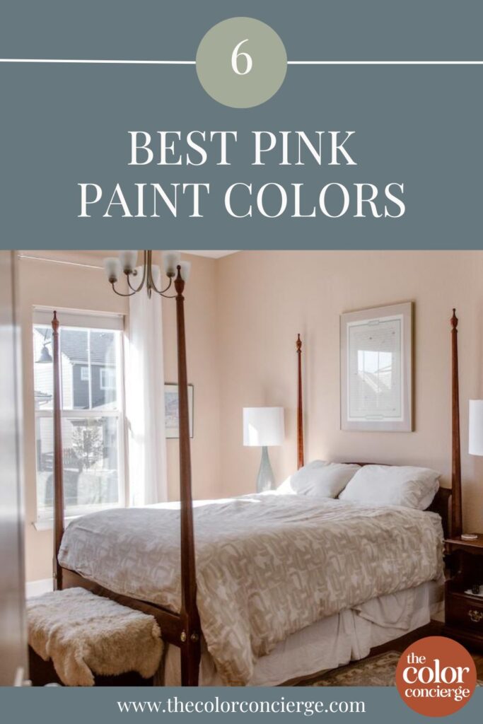
Explore the best pink paint colors from Sherwin-Williams, Benjamin Moore, and Farrow & Ball, whether you want to paint a bedroom, bathroom, living room, or exterior.
Gone are the days when pink wall paint was only used in nurseries and little girls’ rooms. We’re seeing pink paint colors grace the pages of magazines and grow in popularity among our clients for bedrooms (Article), bathrooms, living rooms, and even kitchens (Article)!
If you want to try a pop of pink in your home, keep reading to explore the best pink paint colors and learn more about how to use pink in home design.
*This post contains affiliate links for products I use and love. If you click on some links and purchase, I will get a small commission at no cost to you. This helps pay for the costs of the blog so I can continue to offer great content to our readers.
Understanding Pink Paint Colors
Like most paint colors, pinks can be warm or cool based on their undertones. Pinks with orange undertones are warm, while pinks with violet undertones are cool. My personal preference is to use warm pink colors because they are much more flexible than cool pinks.
Warm pinks transition from peachy pinks to warm browns as they darken, and cool pinks transition from blue pinks to fuchsia as they get darker.
The type of pink paint you use in your home will depend on your hard finishes, such as flooring, the color of your trim, and the type of lighting in your room.
For example, I recommend using pink paint with warm orange undertones if your home has warm colors or earthy finishes. You can also use these warm pinks with cool marble, such as Carrara marble, if it’s earthy. An example is in the kitchen photo further down in this post. It’s easier to use a warm pink with a cool finish than a cool pink with a warm finish.
Avoid using warm pink paint colors with taupes, which are cool muted versions of pink. Combining cool and warm pink colors will make them suck the life out of each other.
Also avoid pairing beiges with pink undertones and beiges with yellow undertones because they can be discordant.
Is pink a good interior color?
Absolutely! There are so many applications for pink paint colors. You can use them in almost any room – they’re not just for little girls’ bedrooms! Throughout the rest of this post, you’ll see how we’ve helped our clients create gorgeous pink bedrooms, bathrooms, laundry rooms, and even kitchens.
No matter what pop of pink you dream of, there’s a color for you. Keep reading to explore the best pink paint colors from our favorite brands.
Sample colors
We always recommend that you test paint colors (article) in your home because lighting can completely change a color, both on interiors and exteriors.
In the old days, this meant we painted a large poster board with sample pots and a huge mess.
Now we have a better way to test paint, with Samplize Peel-and-Stick samples!
- Samples pre-painted with 2 coats of real paint from the manufacturer.
- Large 9” x 14” samples to see the color better in the lighting.
- Delivered overnight
- Colors are accurate
- Less expensive than painting a large poster board with sample pots
- No mess, and no toxic paint to dispose of
I use these in my color consulting practice for exact results. Discover Samplize peel-and-stick paint samples via the link below.
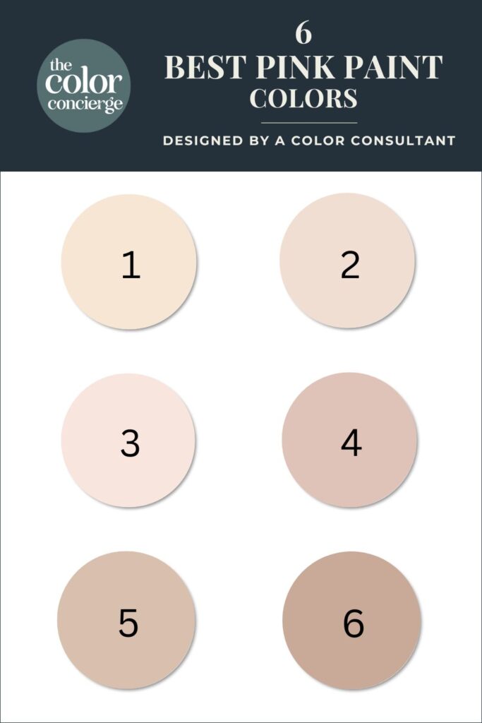
10 Best Warm Pink Paint Colors
Warm pink paint colors have an orange or peachy undertone and sometimes look almost like beige, even pushing into brown or terra cotta. These gorgeous warm pinks pair beautifully with natural wood floors and white trim. I think of these as a “ballet-slipper” pink.
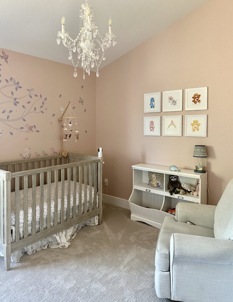
Sherwin-Williams Pink Shadow

This gorgeous pink paint color is warm and cozy. It has an LRV of 58 and strong orange undertones. With an LRV above 50, the color reflects light and will be light and airy. It is dark (and saturated) enough that it won’t wash out when the room is flooded with light.
We used Pink Shadow (Sample) for a little girl’s nursery as part of a whole-house color palette (Article) for a client. I love this color for a nursery because it’s such a sophisticated pink paint color it will grow with the child!
In a nursery, contrast with other rich colors, as shown in the photo below. I was amazed at how beautiful this pink looked with the violet mural on the left and rich, saturated blues and yellows.
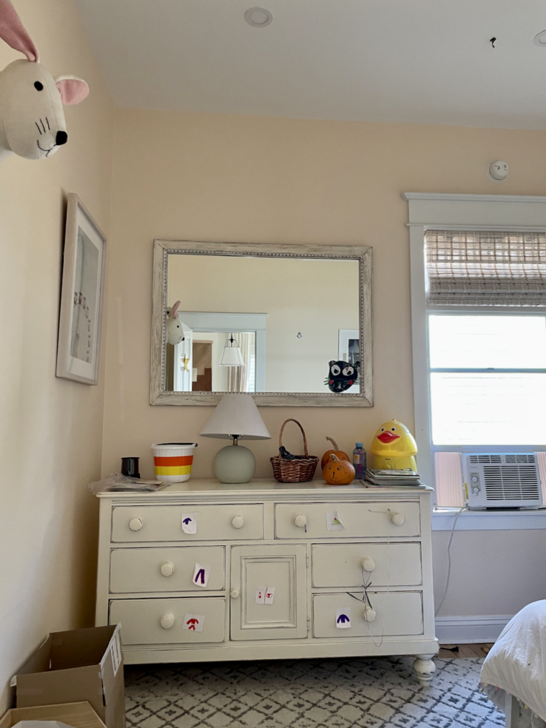
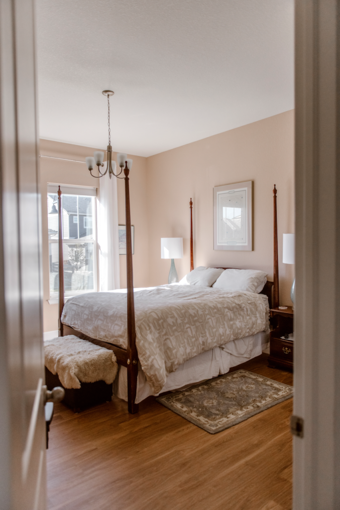
Benjamin Moore Parchment

BM Parchment (Sample) is a very warm, pale pink, bordering a peach color that makes a calming bedroom paint color. It would also look beautiful in a spa-like pink bathroom. With an LRV of 79, Parchment is light and bright, and light reflective. Because of the warm tones, it will look great in a room with Northern exposure, or in this case, next to the wall of a house. Since this room has low light, there is very little chance of it getting flooded with light, so I wouldn’t expect it to wash out.
It looks great with a clean, crisp ceiling and trim colors, such as BM Chantilly Lace (Color review article) or BM Snowfall White (Color review article). If you decide to pair it with a creamy white, make sure that it’s very light, as with the dresser below.
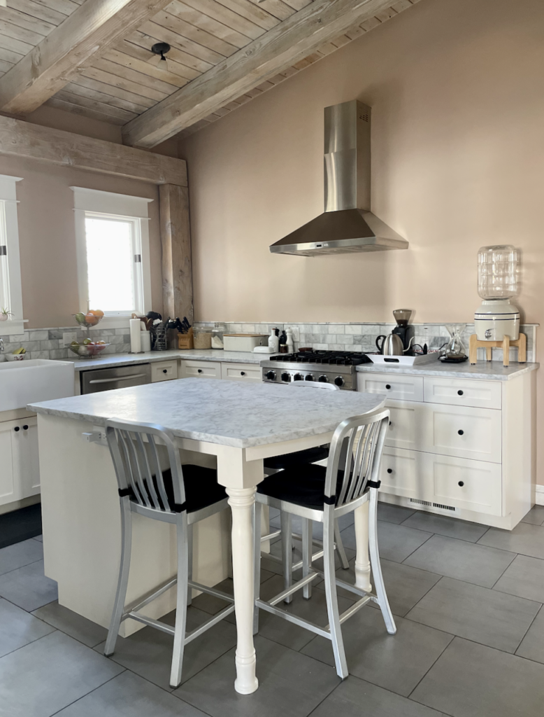
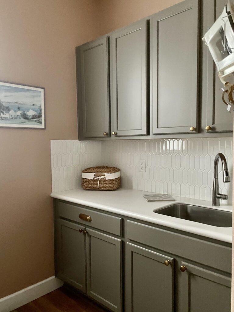
Farrow & Ball Setting Plaster

Setting Plaster (Color review article) might be the most gorgeous pink paint color ever! It’s a warm, earthy pink with orange undertones that looks beautiful in various types of spaces. It’s light enough to keep a space feeling bright but still has plenty of pigment.
We used Setting Plaster in this kitchen for the walls and paired it with cool, earthy Carrara marble counters. The cabinets were painted with Farrow & Ball Dimity, which is a very light warm pinkish white. In the photo below it looks white because it is in the same room as Setting Plaster (Sample), another pink.
We also used Setting Plaster in my guest bedroom, and I loved it. It looked much lighter in the room than on the swatch when paired with SW Extra White on the ceiling and trim, a crisp white.
Sherwin-Williams Pinky Beige

SW Pinky Beige (Sample) is another very earthy pink, bordering on terra cotta. It’s one of the darker pinks featured in this post, with an LRV of 43.
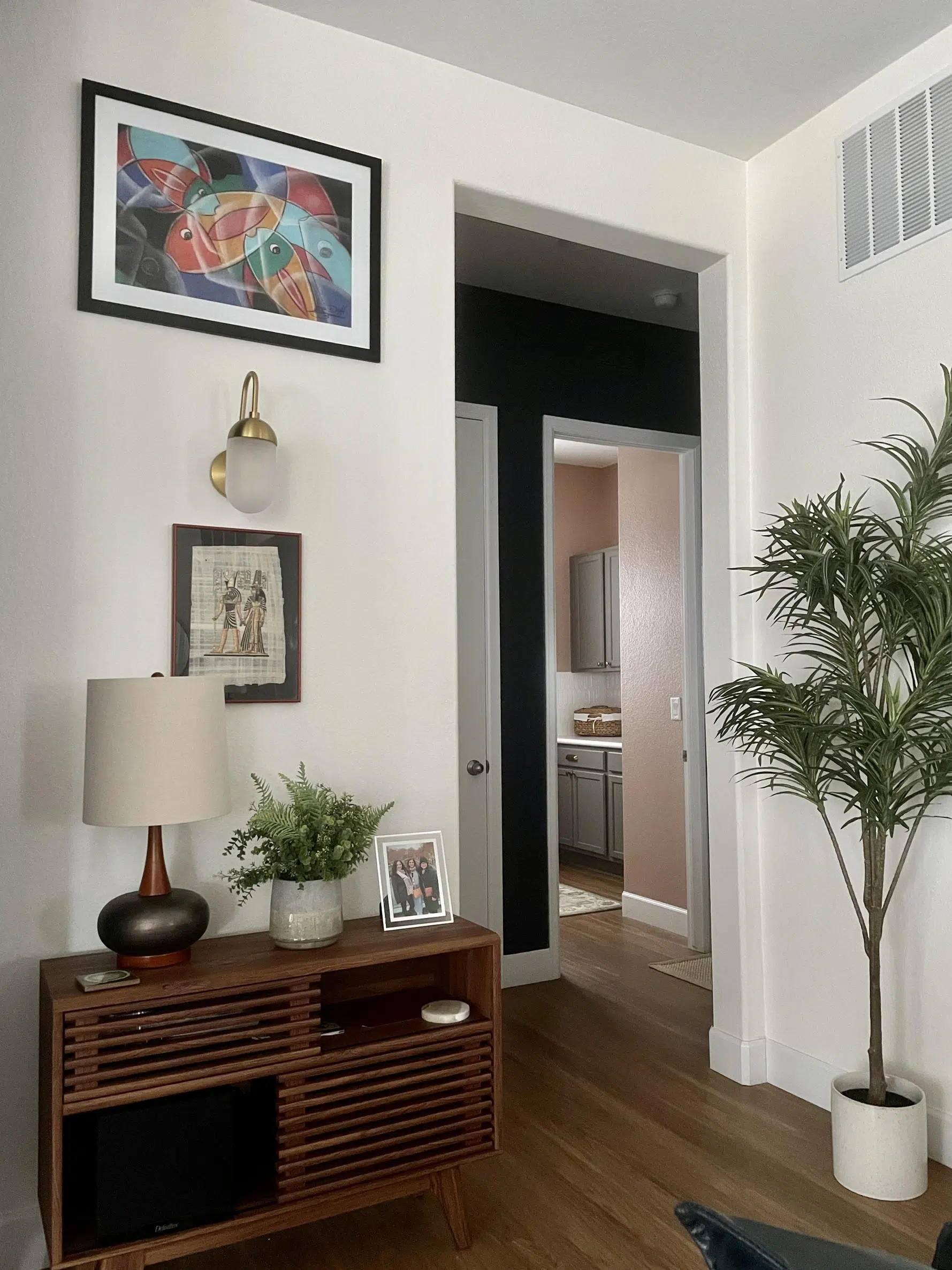
I love contrasting pinks with greens or green-grays. They are complementary and make each other glow. I picked Pinky Beige for my laundry room to see how it would look compared to the green-gray cabinets (similar to SW Attitude Gray or BM Chelsea Gray (Color review article)).
It worked out well, although our household was split as to whether they liked it or not. Look at how the salmon pink walls bring out the green undertones in the cabinets!
I always like to think of the composition of the colors as you walk through the rooms. In the photo below, the Pinky Beige laundry room is framed by Cyberspace (Color review article) in the adjacent hallway. The room at the forefront is the living room, painted with Simply White paint. This combination of colors is beautiful!
Other Warm Pink Paint Colors We Love
Benjamin Moore Head Over Heels

Head over Heels by Benjamin Moore is a light and lovely warm pink, ideal for any nursery. With an LRV of 73, it is light-reflecting. This color will look amazing in a north-facing room, or a room with low light. In a room that is flooded with south-facing light, the color might get washed out.
Pair Head Over Heels with a clean white or off-white trim and ceiling colors. For trim and ceilings, consider SW Extra White, SW Pure White, BM Chantilly Lace, BM Simply White, BM White Dove. You could also use this color to color-drench a nursery. Lately, with color drench projects, I’ve been recommending one sheen for all surfaces. Matte sheen works very well! This is the method that Farrow & Ball uses when they drench with their Dead Flat sheen.
Benjamin Moore Pink Cloud

This is the lightest of the paint colors in this post, with an LRV of 80. Pink Cloud reminds me of a sweet ballet-slipper-pink, and is lovely in any nursery.
It behaves much like BM Head Over Heels, and performs very well in a north-facing room. Pair the color with clean, crisp whites with LRVs over 80 such as BM Chantilly Lace, BM Snowfall White, and BM Simply White. Don’t use this color with a darker off-white trim and ceiling color like White Dove because you won’t see the interface between Pink Cloud and White Dove.
This color might be too light to use as a color-drenching candidate.
Can You Use Pink Exterior Paint?
Every once in a while, I see a beautiful exterior painted pink, but most homeowners in my practice prefer not to use pink as an exterior paint color. It doesn’t mean it can’t be done well, though! Warm pink exteriors can look warm and cozy on a beachy, coastal home (Article).
If you want to try a pop of pink without painting your entire home exterior, a pink front door (Article) is a great choice! We love Sherwin-Williams Roycroft Rose (Sample) for pink exterior doors.

How to Choose the Right Pink Paint Color
Consider Your Hard Finishes
If your home is full of warm, earthy finishes, then a cool pink paint color won’t look right in most cases. Warm pinks are much more flexible. You can balance a warm pink with a cool blue color, but only if it has the same level of mutedness. An exaggerated example is that you wouldn’t use a Day-Glo blue with earthy brick.
Consider Your Natural Light
The lighting in your space also impacts the way pink paint colors look. Warm pink paint in a room with very warm light could look too orange. However, cool pink paint in a room with cool light could look more purple than pink. This is why it’s important always to test your paint colors throughout the day to see how the light and the wall color shift.
Is Pink a Good Interior Whole-House Paint Color?
I wouldn’t use pink as the foundation for a whole-house palette unless you really, really love pink. I also wouldn’t use pink as an interior front door color if you have a white wall on the opposite side. I tried that once, and the pink was reflected on the white wall like a slide projector. Very interesting!
Be careful when using pink as an accent wall with white paint colors. If the light is just right, the pink accent can reflect onto the opposite white wall.
What Colors Go Best With Pink Wall Paint?
While pink may seem like a rather polarizing color, it’s actually very versatile! Pink looks fantastic paired with green paint colors and decor, like the BM Carolina Gull accent wall in the image below.
Pink paint colors also pair well with blues, teals, and yellows. Remember that these can look very Easter-eggy when paired so that they may work better for a nursery than a living room.
The visualizer below shows how beautiful a teal accent (BM Bella Blue) combines with BM Odessa Pink.
Pinks also look great with neutrals such as beiges and greens with gray undertones, such as BM Manchester Tan (Color review article) (beige) or SW Agreeable Gray (Color review article) (gray).
Sample All Our Favorite Warm Pink Paint Colors
Link below to sample these warm pink paint colors:
- BM Parchment (Sample)
- BM Head Over Heels (Sample)
- BM Pink Cloud (Sample)
- SW Pink Shadow (Sample)
- FB Setting Plaster (Sample)
- SW Pinky Beige (Sample)
Key Learning Points
If you dream of using pink paint in your home, now is the time! This trending color is beautiful for just about any room in the house. Here are a few things to remember about using pink wall paint in your home:
- Pinks can be warm (with orange undertones) or cool (with violet undertones).
- Generally, warm pinks are paired with other warm colors and finishes, and cool pinks with other cool colors and finishes. You can pair a warm pink with a cool finish if they are both “earthy” or both “fresh.”
- Pinks pair well with green, teal, and green-gray paint colors. They can also look beautiful next to blue paint colors and neutrals like beige and gray.
Remember: NEVER, EVER use paint matches from a different brand than the one specified. Results are poor and there are no standards for the sheens. Even though your painter may truly believe it can be done, don’t do it. See results from paint matching here.
No matter what, always test your paint colors. It’s a standard best practice. Whenever I test my paint colors, they are perfect, and when I don’t test them, they turn out wrong. Learn how to test your paint colors here.
Online Color Consulting
Still need help picking the best paint colors? We can help! Discover our Online Color Consultations.

Related Posts
- BM First Light Paint Color Review (Article)
- Farrow & Ball Setting Plaster Paint Color Review (Article)
- BM Chantilly Lace Paint Color Review (Article)
- BM Pearly White Whole House Color Palette (Article)
- Best Front Door Paint Colors (Article)
About the Author

Hi, I’m Michelle Marceny, founder, owner, and Principal Color Designer at The Color Concierge. I believe a fresh coat of paint can completely transform a space. The Color Concierge was born out of my drive to help clients fall back in love with their homes. My clients trust me to help them find the perfect paint color for their home – whether it’s a whole-house paint color scheme or ideas for a single room.
Since The Color Concierge was founded in 2017, we have completed over 3000 color consultations, both online and in-person. I am a Certified Color Expert with 7 years of experience creating interior and exterior color palettes throughout North America.
We love your comments! Please note that the blog is meant as general advice, and it is not possible to give out specific answers to your paint questions. If you want more specific advice, our Online Color Consultations will help you pick your paint colours. Thank you for your understanding.

One Response
What paint color would be compatible with fiberglass beige tub and shower surround the flooring has purple undertones. Cabinet was painted a creamy color. Carpet in next room is beige pink undertones. Am willing to repaint cabinet and flooring. Problem is the beige tub, but I want some color in room. North facing room. Was thinking about the Parchment sample mentioned but would that be too draining next to beige tub? Thank you.