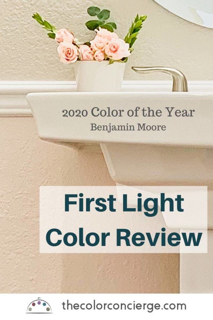
This post is a First Light color review for Benjamin Moore’s 2020 Color Of The Year. It is beautiful luminescent pink that sometimes looks cool and others warm. This paint color review shows how we used First Light and what we learned. This positive review is a big deal coming from me because I hate pink. We talked about First Light in our Paint Color Trends for 2020 post.
I love to experiment with colors in my house to see how they behave. As with any color, you need to pick the right placement. Even the most beautiful color can look heinous in the wrong place. The first place I tried First Light was on the inside of my front door. It reflected pink onto the facing wall in a really bad way. The color still looked gorgeous, so I didn’t give up.
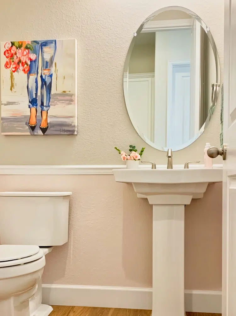
Next, I tried it on the lower half of my powder room walls, and it was just as gorgeous as I had expected! Lower walls are painted with First Light (2102-70) (Sample), upper walls are SW Agreeable Gray (SW7029) (Sample), and the trim and doors are painted Extra White.
About The Color Concierge
Our Colorado-based paint color consultants make finding the right paint colors for your home easy. Whether you’re painting the exterior or interior of your home, our simple yet effective process lets us get your paint color right the first time. We’ve helped thousands of homeowners transform their homes into a space they love. Learn more about ONLINE COLOR CONSULTATIONS today.
*This post contains affiliate links for products I use and love. If you click on some links and make a purchase, I will get a small commission at no cost to you. This helps pay for the costs of the blog, so I can continue to offer great content to our readers.
First Light is beautiful, but contrary to what I’ve seen in some other reviews, it is not a color that goes everywhere. This is what I learned about First Light and how to use it:
Use clean and crisp whites or off-whites for trim and ceiling color.
Excellent trim color choices are Oxford White (CC-30) (Sample), Chantilly Lace (OC-65) (Sample), Simply White (OC-117) (Sample), Snowfall White (OC-118) (Sample), or Extra White (SW7006) (Sample).
Sample Colors
We always recommend that you test paint colors (article) in your home because lighting can completely change a color, both on interiors and exteriors.
In the old days, this meant we painted a large poster board with sample pots and a huge mess.
Now we have a better way to test paint, with Samplize Peel-and-Stick samples!
- Samples pre-painted with 2 coats of real paint from the manufacturer.
- Large 9” x 14” samples to see the color better in the lighting.
- Delivered overnight
- Colors are accurate
- Less expensive than painting a large poster board with sample pots
- No mess, and no toxic paint to dispose of
I use these in my color consulting practice for exact results. Discover Samplize peel-and-stick paint samples via the link below.
Don’t use darker whites or cream colors for trim and ceiling colors.
First Light is so light (LRV=77) that it won’t contrast well with darker off-whites or creams such as White Dove, Swiss Coffee. Also, creams that have a lot of yellow in them look discordant with pink. The combination just looks as if you made a mistake.
Consider pairing it with complementary colors.
Soft greens and blue-greens with a similar intensity such as Benjamin Moore Mt. Saint Anne and Sherwin-Williams Sea Salt look great. First Light also looks great with grays that have green undertones such as Agreeable Gray (our powder room) and Thunder (Benjamin Moore’s example photo).
Repeat the paint color with your decor so that it looks put together.
Add a throw pillow, art, a soap dispenser or a towel that has a similar color.

Don’t use First Light as an accent wall or door, especially in a white room.
With an LRV of 77, it reflects light and will reflect onto the opposite wall like a movie projector. I learned this the hard way when I painted the inside of my front door with First Light. It didn’t look good. If you are going to use First Light, commit to it. paint all four walls, or as in my case, pick the walls under a chair molding.
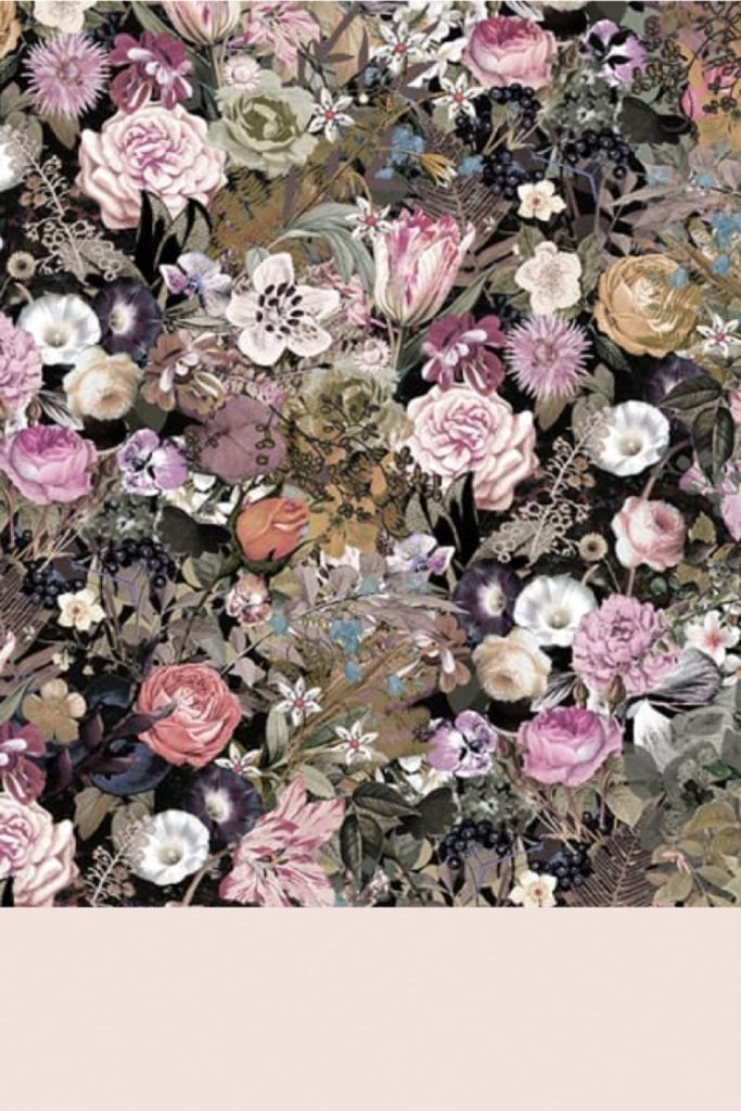
Pair with wallpaper.
First Light looks sharp when the color is repeated in the wallpaper. Install the wallpaper above or below a chair rail, or on the headboard wall. Here is a mood board with a gorgeous wallpaper from Rebel Walls.
Use First Light in rooms with any exposure (north, south, east or west).
It has enough warmth for north-facing rooms, and will glow in a South facing room. It won’t appear dingy when the light is low in rooms with East or West exposures. Looks great in a windowless room as long as it has warm lighting.
The Verdict
First Light is a beautiful color (even though it is pink!), and if you love pink, this will be a fan favorite. Pair it with white or off-white trim, and complimentary greens, green-grays and blue-greens in the same room. Avoid use as an accent wall, especially with adjoining white walls.
Always test your paint colors before you paint! Learn how here.
Online Color Consulting
If you still need help with paint colors, check out our Online Color Consulting packages or an In-Person Color Consultation in the Denver Metro area.

If you liked this post, don’t forget to pin!
About the Author

Hi, I’m Michelle Marceny, founder, owner, and Principal Color Designer at The Color Concierge. I believe a fresh coat of paint can completely transform a space. The Color Concierge was born out of my drive to help clients fall back in love with their homes. My clients trust me to help them find the perfect paint color for their home – whether it’s a whole-house paint color scheme or ideas for a single room.
Since The Color Concierge was founded in 2017, we have completed over 3000 color consultations, both online and in-person. I am a Certified Color Expert with 7 years of experience creating interior and exterior color palettes throughout North America.
We love your comments! Please note that the blog is meant as general advice, and it is not possible to give out specific answers to your paint questions. If you want more specific advice, our Online Color Consultations will help you pick your paint colors. Thank you for your understanding.

26 Responses
I couldn’t tell if this was a two piece bathroom or a full sized bathroom. I would rather have the complete wall in one colour rather than break it up with two. Or do tile on the bottom part of the wall.
And I was disappointed in BM picking this shade of pink as their Colour if the Year. It doesn’t work with a lot of recent decor trends. But I guess that’s the point. The industry has to shake things up every couple of years in order to sell more products.
Hi Barbara,
This was a powder room – a two piece bath. Thanks for weighing in!
Michelle
I actually love the two colour idea. It looks gorgeous to me. I am thrilled that BM picked this colour. It’s absolutely sexy and gorgeous.
I used First light as an accent wall in my bedroom with the suggested BM color Heron.Came out gorgeous. I have Hunter Douglass Pirouettes on the same wall in white..In my opinion First lights works well as an accent wall.The room has Southern exposure.
Hi Ray,
That sounds amazing! I love First Light!
Michelle
I just painted my bedroom of my new
House in first light. I also painted it in my office. I love the color! I have also used a grey in my bathroom and living room off of my bedroom. I can’t wait to decorate and find bedding to compliment this cheery color!
Thank you so much for letting us know! I love First Light, and I bet it looks lovely in your office too.
Michelle
I wanted to use first light as an accent wall with alabaster white (SW) but you said first light wouldn’t work well with that. Any recommendations on a blush pink accent wall color you can use with white walls?
Hi Becky,
Alabaster is a very warm off-white with lots of yellow in it, which will fight with a bluish pink. If you want to use a pink, I’d recommend a warmer pink color such as Benjamin Moor Bride to Be or Benjamin Moore Odessa Pink. If you want to use a bluish pink then you would need a white with less yellow in it, and that is crisper such as Chantilly Lace or even Cloud White.
Thanks,
Michelle
I’ve been debating between First Light and Pink Ground (Farrow & Ball.). Now I really can’t make up my mind.
Hi Donna,
Pink Ground is more saturated and peachy, the darker color. First Light is a cooler pink, and lighter.
Hope that helps!
Michelle
I just painted my bedroom First Light and the trim/ceiling/doors Simply White. so far I have mixed feelings on the color. I will continue to finish the room with my furnishings and etc. then make a final decision. Oh a happy note the weather has been very dreary lately, but when I walk in the room First Light makes me feel like there’s light at the end of the tunnel. Keeping my fingers crossed! 🙂
I have simply white trim and was just thinking of painting the walls in First Light. What don’t you like? Just curious. I have a south facing room and it’s currently painted a wheat color neutral, with a very yellow cast. I’m so tired of it!
The reason is that yellow beige and pink beige are discordant with each other, which is a nice way of saying they just look off. The wheat color neutral would probably look lovely with Simply White.
Hope that helps!
we are thinking of painting our girls bathroom vanity First Light…but are a bit nervous to commit. The walls will be Decorators White, can you advise if that will work? Not sure if that white is the right kind. We are doing black pulls and accents, the floors are white/grey marble herringbone. just wanting to get a vote of confidence that this will work. thanks!
Hi Tara,
Decorators white is a very cool white with blue undertones and First Light also has some blue in it, so it could be really lovely together. If the undertones in the marble floor are blue and cool like a Carrara marble, it could look great, but if its a warm marble like Calacatta, I would pick a warmer white and a warmer pink. Either way, make sure that you test the paint colors in the room.
Thanks,
Michelle
Hello, I was thinking almost the same thing for my young girls bathroom. It would be white subway tile on the bottom and this color on top and then black and white floors (mosaic style) Would this work with the floors? And If you have pictures of that bathroom with this color I would love to see it! Thank you
That sounds absolutely beautiful, but I don’t have a photo of that design. The powder room in this blog had a wood-look LVP floor.
Michelle
My 19 year old decided to paint our bathroom First Light. She chose to use it as an accent behind a large mirror. So only a strip will show. It is a small inner hall bath. I wish she would do the whole bathroom! She painted the rest with Behr Ultra Pure White in eggshell.
We were surprised that BM First Light has so much purple in it.
Now we are wondering the best way to go as far as a shower curtain. I had thought something botanical or tropical with pretty shades of green, but the purple hue is throwing me off.
Love pink as a neutral. But this is not really pink.
Hi Michelle,
I just found this review after searching for a paint color to paint my cabinets and small wall to go with my crema marfil marble tile. My painter is in the middle of painting my bathroom cabinets Simply White which I am not loving next to the beige tone marble, it just looks too white. My cabinets were Dove White with a chocolate glaze. My countertop is similar to crema marfil but has some pink in it. Would you recommend First Light as a paint color for the wall of the cabinets? Or two colors that you think could work well with crema marfil snd a trim color? I do like this pink but I’m just not sure how to make it work. The bathroom is small and the tub, sink, etc are a bisque color, not a pure white. My kitchen cabinets, trim, etc are Chantilly Lace. Any recommendations you can make would be appreciated. Thanks!!
I would not recommend First Light for a crema marfil marble because it is too crisp a color compared to the earthier crema marfil marble. It’s hard for me to make more specific recommendations without seeing photos. Please consider an online color consultation.
What is the cost for an online color consultation?
Please check our online store for detailed pricing.
Hi Michelle, I am stuck I have painted my living room October Mist Love the color but my hardwood floor is deep cherry I went way too dark. I just love blush but I want it where it doesn’t look like a bedroom. But here is where the big problem is. I have a medium taupe sofa so if I go safe and use taupe paint your not going to see the sofa. Is there a matured blush or a taupe with pink undertones thank you for your help.
Thank you
Yvonne
Hi was hoping g for advice, all my hallway walls are painted in first light now i’m entering into a spare bedroom and i want to paint it may a gray shade cause i have gray furniture any suggestions on a gray i want it to blend when u come out into them hall from bedroom i want it to look nice
thanks Denise