Sherwin-Williams Needlepoint Navy (SW 0032) is a warm, muted navy blue with green undertones and an LRV of 13. Needlepoint Navy is light enough to read as blue instead of black in dark corners, so it works for interior accent walls, bathrooms, cabinets, built-ins and exteriors. The closest Benjamin Moore color is Blue Spruce (1637).
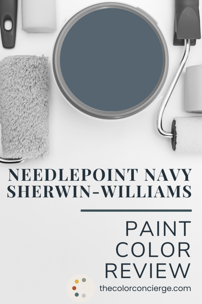
When I went looking for project photos of Sherwin-Williams Needlepoint Navy (SW 0032), I could not believe how many I had. This is definitely one of those sleeper colors. We end up using it more often than you’d think, and it’s just beautiful.
We’ve used Needlepoint Navy on a historic exterior, on dining room walls, and on office built-ins. Most recently, I painted it in my own primary bathroom and bedroom. It’s one of my favorite blues to use for interiors because it’s not too dark. It’s light enough that you see the color without it going too black.
Below, I’ll show you Needlepoint Navy in every one of those spaces, including my bathroom before and after, and how it compares to the navy blues I’m asked about most.
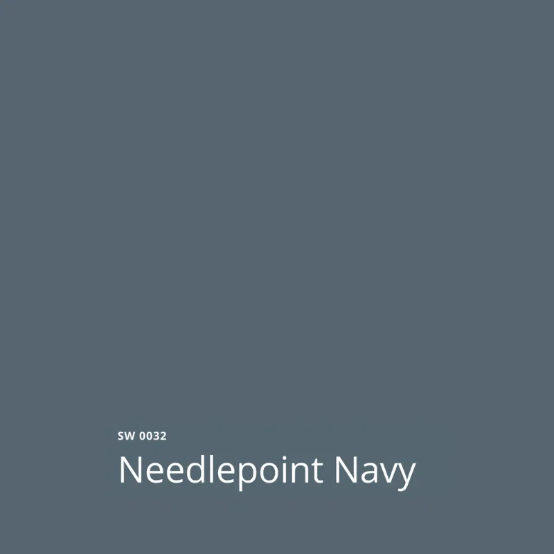
| Color | Sherwin-Williams Needlepoint Navy |
|---|---|
| Color number | SW 0032 |
| LRV | 13 (Light Reflectance Value, on a scale of 0 to 100) |
| Undertones | Green, which makes Needlepoint Navy a warm navy blue |
| Color family | Warm, muted navy blue |
| Best for | Accent walls, bathrooms, cabinets and built-ins, color drenching a small room, and exterior siding |
| Best trim & ceiling | Sherwin-Williams Pure White (SW 7005), Extra White (SW 70067), or Alabaster (SW 7008) for interior trim; Sherwin-Williams Oyster White (SW 7637) or Egret White (SW 7570) for exterior trim |
| Avoid using as | A whole-house interior wall color – it’s too dark. |
| Closest Benjamin Moore match | Benjamin Moore Blue Spruce (1637), which is close but not exactly the same |
*This post contains affiliate links for products I use and love. If you click on some links and make a purchase, I will get a small commission at no cost to you. This helps pay for the costs of the blog, so I can continue to offer great content to our readers.
About The Color Concierge
Our Colorado-based paint color consultants make finding the right paint colors for your home easy. Whether you’re painting the exterior or interior of your home, our simple yet effective process lets us get your paint color right the first time. We’ve helped thousands of homeowners transform their homes into a space they love. Learn more about ONLINE COLOR CONSULTATIONS today.
What Color Is Sherwin-Williams Needlepoint Navy?
Sherwin-Williams Needlepoint Navy (SW 0032) is a warm, muted navy blue with green undertones and an LRV of 13. It’s lighter and warmer than a classic dark navy like Benjamin Moore Hale Navy (HC-154), which has an LRV of 8. On the wall, that difference means you always see blue, not black.
LRV, or Light Reflectance Value, runs from 0 (black) to 100 (white). At 13, Needlepoint Navy is a dark color, but it reflects more than twice as much light as Sherwin-Williams Cyberspace (SW 7076), the blue-black with an LRV of 6 that it replaced in my bathroom. Our guide to LRV explains what that number can and can’t tell you.
Needlepoint Navy doesn’t look like a mid-tone on the swatch, but take it outside or into a bright room, and it can look much lighter.
What Undertones Does Sherwin-Williams Needlepoint Navy Have?
Sherwin-Williams Needlepoint Navy (SW 0032) has green undertones, and that touch of green is what makes it a warm navy. That’s also why Needlepoint Navy was so pretty in my bathroom with the tempered shower glass.
One thing to note: anytime you have tempered glass in a shower, the glass is always going to have green undertones. I tested one blue paint color in this bathroom that didn’t have any green in it, and I’m not even going to show you the photo. It was horrific. Then we tested Needlepoint Navy, and it was absolutely stupendous.
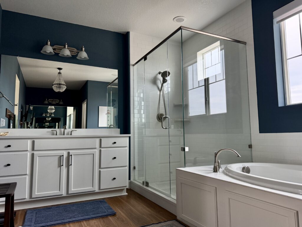
How to Use Sherwin-Williams Needlepoint Navy
Here’s what we’ve learned from using Needlepoint Navy in client homes and in my own.
Sherwin-Williams Needlepoint Navy Tips and Tricks
- Use with: white tile and tempered shower glass, white wainscoting, warm wood, and warm off-whites like Sherwin-Williams Cotton (SW 9581) and Sherwin-Williams Greek Villa (SW 7551).
- Don’t use with: Sherwin-Williams Needlepoint Navy (SW 0032) is not a good whole-house interior color. Keep it to an accent wall, a bathroom, cabinets, or one drenched room. In a shadowy corner, it will look much darker than it does near a window, so test it in both spots before you commit.
- For exteriors: Needlepoint Navy reads as a mid-tone blue outside, even though it doesn’t look mid-toned on the swatch. It has enough color to be pretty and is muted enough that it won’t be harsh.
- Accent walls and color drenching: Use it on a headboard wall, or color-drench a bedroom, office, or other small room as an accent color. It’s light enough to look gorgeous as a drench.
- Best trim color (satin): Sherwin-Williams Pure White (SW 7005) inside. For exterior trim, Sherwin-Williams Oyster White (SW 7637).
- Best ceiling color (flat): Sherwin-Williams Pure White (SW 7005).
- Best paint matches: Benjamin Moore Blue Spruce (1637) is the closest Benjamin Moore color. It isn’t exactly the same.
My Primary Bathroom: From Cyberspace to Needlepoint Navy
My latest Sherwin-Williams Needlepoint Navy (SW 0032) project is my own primary bathroom. For years it was painted Sherwin-Williams Cyberspace (SW 7076), a super dark blue-black. I got kind of tired of it and decided to soften things up.
After: Needlepoint Navy Bathroom Walls
I was actually going to go a lot lighter than Needlepoint Navy. But once we tested it against the white tile and the shower glass, that was it. With Cyberspace, the walls read as more of a dark black. Now you can actually see the color.
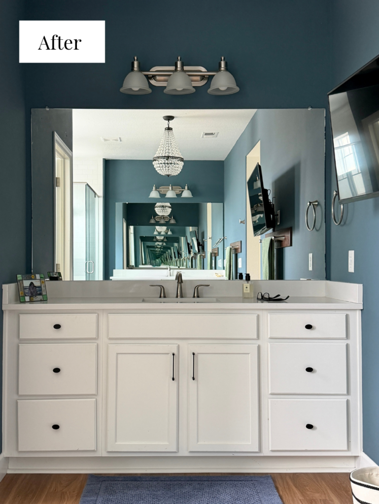
Nothing else in the room changed. The tile is still a clean white, the vanity cabinets are Sherwin-Williams Pure White (SW 7005), and the trim and ceiling are Sherwin-Williams Extra White (SW 7006). But you can see how much more colorful the bathroom appears compared to its original color, Sherwin-Williams Cyberspace (pictured below).
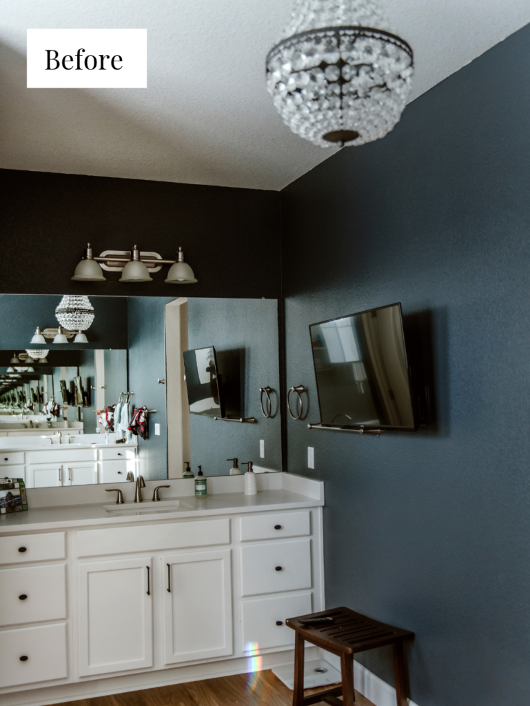
How Needlepoint Navy Changes in the Shadows
When you look in the shadows with a color like Needlepoint Navy, it’s always going to look darker, a lot like Cyberspace did. In the photo below, the tub wall is backlit by the window and in shadow, and it looks pretty dark.
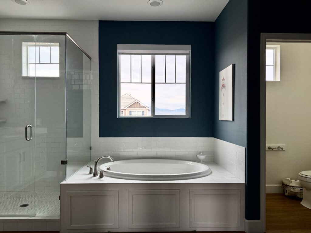
Then you move into a brighter part of the bathroom, and it’s really much, much lighter and quite beautiful. Needlepoint Navy keeps changing as you move around a room and the lighting conditions shift. That’s a big part of why I love it.
A Needlepoint Navy Accent Wall in My Primary Bedroom
In my bedroom, I painted the headboard wall Sherwin-Williams Needlepoint Navy (SW 0032) to complement the primary bathroom. The rest of the bedroom is Sherwin-Williams Cotton (SW 9581), which you can see in my Sherwin-Williams Cotton review.
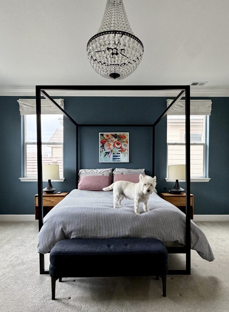
We picked Needlepoint Navy for the bedroom because it matched the blue in the painting behind the bed. It’s much lighter than Cyberspace was, and still really, really beautiful. If you’re planning a dark wall of your own, here’s our guide to choosing an accent wall.
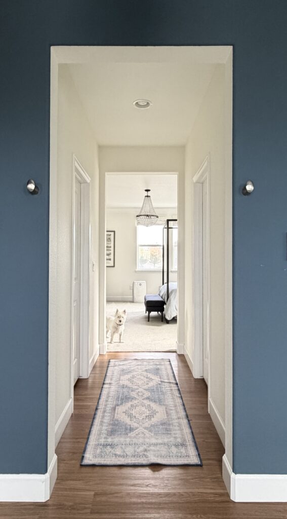
We’ve got the primary bathroom on one side and the primary bedroom on the other, separated by a Cotton hallway. I wanted to weave that color through the whole suite, and it ended up just beautiful. From the bathroom, you look between two Needlepoint Navy walls, down the Cotton hallway and into the bedroom.
Needlepoint Navy in a Client’s Dining Room and Office
Sherwin-Williams Needlepoint Navy (SW 0032) is also the accent color in a Colorado client’s home where the main walls are Sherwin-Williams Pearly White (SW 7009). You may have seen this house in our Sherwin-Williams Pearly White whole-house color palette.
Dining Room Walls With Pure White Shiplap
In the dining room, we used Needlepoint Navy as the wall color above shiplap wainscoting painted Sherwin-Williams Pure White (SW 7005) in a satin sheen. The room had been dark gray, and we wanted to bring in more warmth. The windows face south and east, so the room is flooded with light and Needlepoint Navy looks lighter than you’d expect.

Office Built-Ins With Greek Villa Walls
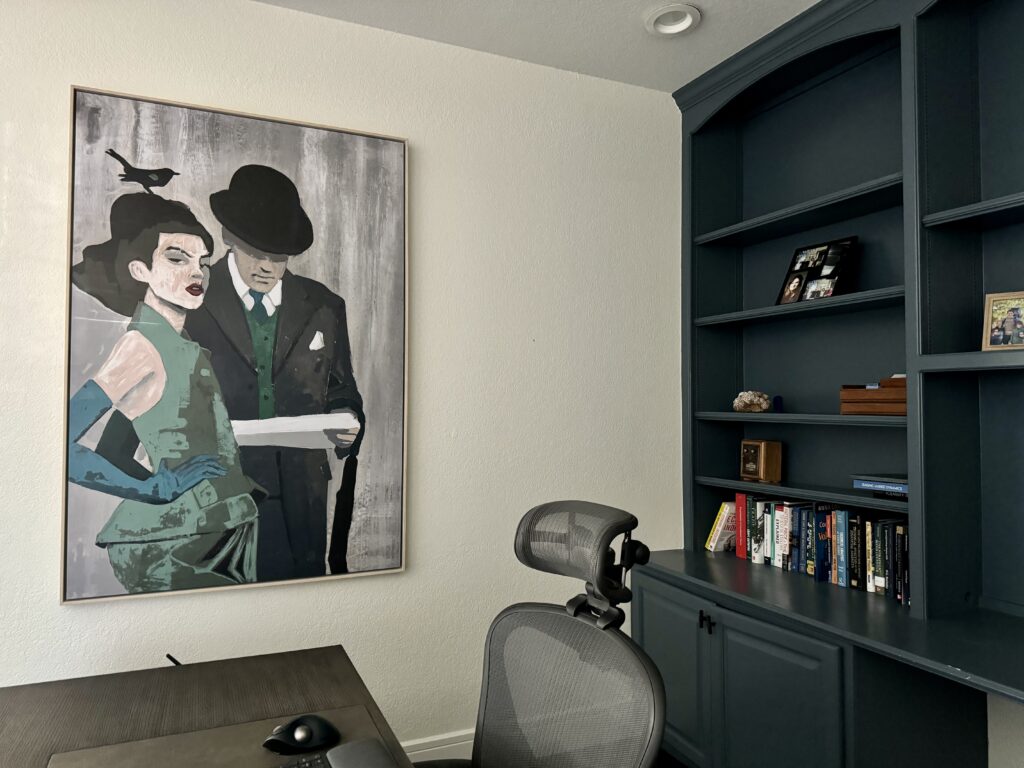
In the office, we painted the built-ins Needlepoint Navy, with Sherwin-Williams Greek Villa (SW 7551) on the walls and Sherwin-Williams Pure White (SW 7005) on the ceiling. This room has smaller, north-facing windows, so the same paint looks like a truer navy here. It just looked so elegant, timeless and perfect.
What Does Needlepoint Navy Look Like on an Exterior?
Sherwin-Williams Needlepoint Navy (SW 0032) is beautiful outside, where it reads as a mid-tone blue. If you’re looking for a mid-tone blue exterior paint color, don’t judge this one by the swatch. It doesn’t look mid-toned on the card, but outside, it is. It has enough color to look pretty, and it’s muted enough that it won’t be too harsh.
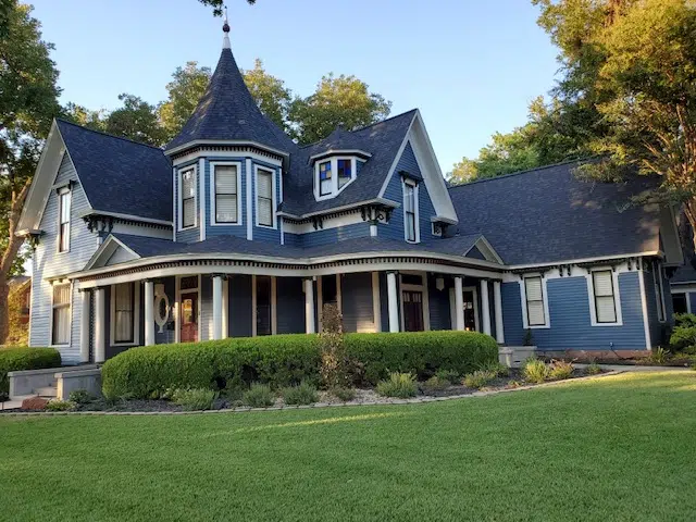
The home above is a historic house that we painted in a relatively simple way: Needlepoint Navy siding, Sherwin-Williams Oyster White (SW 7637) trim and a Sherwin-Williams Sommelier (SW 7595) front door. It turned out quite beautiful.

Sherwin-Williams Needlepoint Navy vs Other Navy Blues
If I were thinking about Sherwin-Williams Needlepoint Navy (SW 0032), these are the other colors I’d test next to it.
Sherwin-Williams Needlepoint Navy vs Benjamin Moore Blue Spruce
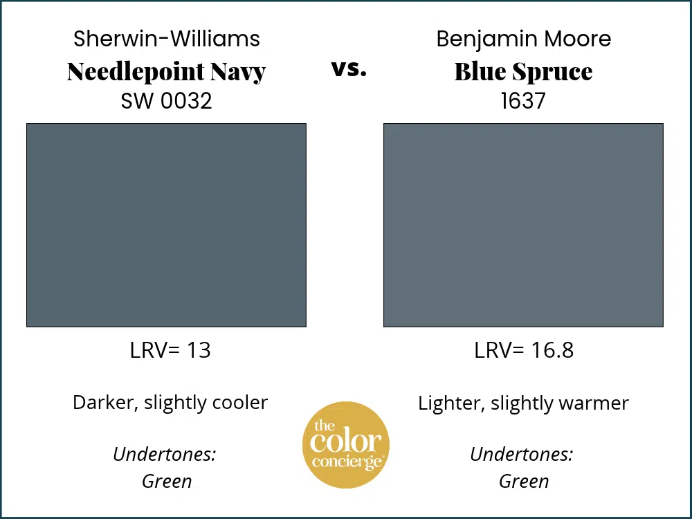
Benjamin Moore Blue Spruce (1637) is the closest Benjamin Moore color to Needlepoint Navy, but it isn’t exactly the same. Blue Spruce is a little lighter, with an LRV of 16.81 next to Needlepoint Navy’s 13. We love both. If your painter uses Benjamin Moore, test Blue Spruce rather than having Needlepoint Navy color-matched.
Sherwin-Williams Needlepoint Navy vs Sherwin-Williams Granite Peak
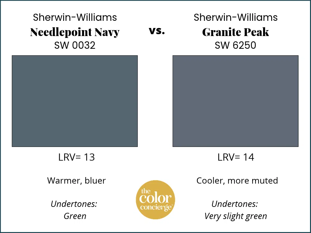
Sherwin-Williams Granite Peak (SW 6250) is cooler than Needlepoint Navy. With an LRV of 14, it’s almost the same depth, but it has only the softest green undertones, so it reads less warm.
Sherwin-Williams Needlepoint Navy vs Sherwin-Williams Smoky Blue
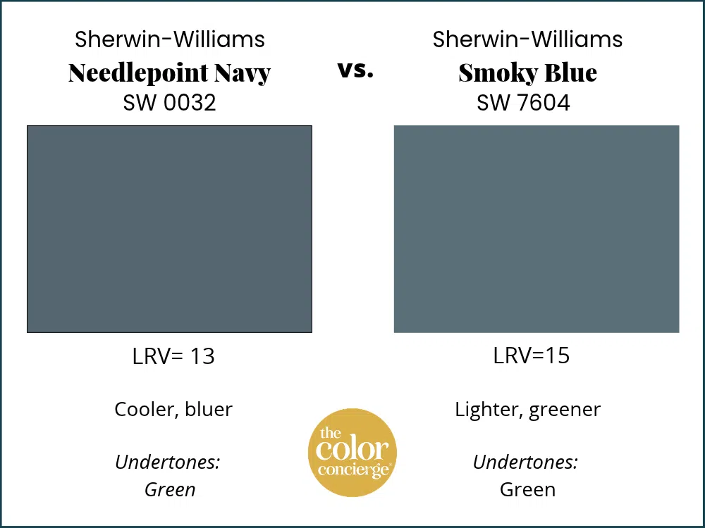
Sherwin-Williams Smoky Blue (SW 7604) is the one I’d test if you want something warmer than Needlepoint Navy. Smoky Blue has stronger green undertones that keep it feeling cozy.
Sherwin-Williams Needlepoint Navy vs Sherwin-Williams Waterloo
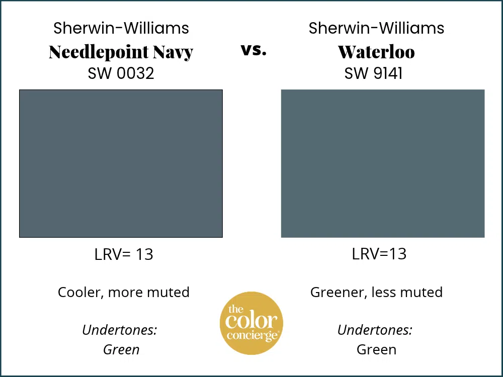
Sherwin-Williams Waterloo (SW 9141) is more colorful than Needlepoint Navy and a bit warmer. The two share an LRV of 13, but Waterloo is a jewel-toned blue-green, while Needlepoint Navy is more muted.
Sherwin-Williams Needlepoint Navy vs Benjamin Moore Hale Navy
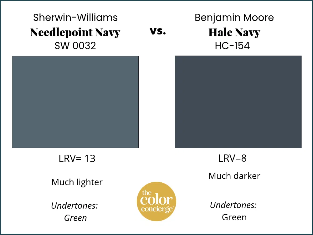
A lot of people love a dark blue like Benjamin Moore Hale Navy (HC-154) inside, and it can be beautiful. With an LRV of 8, though, Hale Navy can look almost black indoors. I prefer a color like Needlepoint Navy for interiors because it’s light enough to show some color.
Want to see more options? Here are our best navy blue paint colors.
Sample Sherwin-Williams Needlepoint Navy
| Paint color | Peel-and-stick sample |
|---|---|
| Sherwin-Williams Needlepoint Navy (SW 0032) | Sample Needlepoint Navy |
| Benjamin Moore Blue Spruce (1637) | Sample Blue Spruce |
| Sherwin-Williams Granite Peak (SW 6250) | Sample Granite Peak |
| Sherwin-Williams Smoky Blue (SW 7604) | Sample Smoky Blue |
| Sherwin-Williams Waterloo (SW 9141) | Sample Waterloo |
| Benjamin Moore Hale Navy (HC-154) | Sample Hale Navy |
| Sherwin-Williams Cyberspace (SW 7076) | Sample Cyberspace |
| Sherwin-Williams Cotton (SW 9581) | Sample Cotton |
| Sherwin-Williams Pure White (SW 7005) | Sample Pure White |
| Sherwin-Williams Greek Villa (SW 7551) | Sample Greek Villa |
| Sherwin-Williams Oyster White (SW 7637) | Sample Oyster White |
| Sherwin-Williams Sommelier (SW 7595) | Sample Sommelier |
Needlepoint Navy changes with the light more than almost any blue we use. In my bathroom, the same wall looks nearly as dark as Cyberspace when it’s backlit and a clear, pretty blue a few steps away. Stick a Needlepoint Navy sample in your darkest corner and again next to the window, and if it’s going in a bathroom, hold it right up against the shower glass. New to peel-and-stick samples? Samplize sends real manufacturer paint, two coats, in a 9” x 14” sheet, delivered overnight. I use them on every consultation. More on our method here: how to test paint colors.
Sherwin-Williams Needlepoint Navy FAQ
Is Sherwin-Williams Needlepoint Navy a good interior whole-house color?
No. Sherwin-Williams Needlepoint Navy (SW 0032) is not a good interior whole-house color. With an LRV of 13, it works best as an accent: one wall, a bathroom, cabinets, built-ins or a single drenched room. In my own home, Needlepoint Navy is on the bathroom walls and one bedroom wall, with Sherwin-Williams Cotton (SW 9581) everywhere else.
Can you color drench a room in Sherwin-Williams Needlepoint Navy?
Yes. Sherwin-Williams Needlepoint Navy (SW 0032) is light enough to look gorgeous as a color drench in a bedroom, office or other small room, especially with an accent color. Because Needlepoint Navy looks much darker in the shadows, make sure the room has enough natural or artificial light before painting every surface. Don’t forget to test your paint colors!
Is Sherwin-Williams Needlepoint Navy a good cabinet color?
Yes. Sherwin-Williams Needlepoint Navy (SW 0032) is a beautiful cabinet and built-in color. We painted a client’s office built-ins Needlepoint Navy with Sherwin-Williams Greek Villa (SW 7551) walls and a Sherwin-Williams Pure White (SW 7005) ceiling, and the room looks elegant and timeless.
What white trim goes with Sherwin-Williams Needlepoint Navy?
Inside, we pair Sherwin-Williams Needlepoint Navy (SW 0032) with Sherwin-Williams Pure White (SW 7005) trim and wainscoting in a satin sheen. Needlepoint Navy also works with the Sherwin-Williams Extra White (SW 7006) trim in my own home. For exterior trim, we used Sherwin-Williams Oyster White (SW 7637) on a historic house.
Key Learning Points
Sherwin-Williams Needlepoint Navy (SW 0032) is a warm, muted navy that earns its place as an accent color inside and as a mid-tone blue outside.
- It’s a navy you can actually see. With an LRV of 13, Sherwin-Williams Needlepoint Navy (SW 0032) is light enough to read as blue indoors, where darker navies like Benjamin Moore Hale Navy (HC-154, LRV 8) and Sherwin-Williams Cyberspace (SW 7076, LRV 6) can look almost black.
- Its green undertones love shower glass. Tempered shower glass always has green undertones. In my bathroom, a light blue with no green in it looked horrific next to the glass, and Needlepoint Navy looked stupendous.
- It changes with the light, so use it as an accent. Needlepoint Navy looks much darker in the shadows and much lighter near a window. Use it on an accent wall, cabinets, a bathroom, a drenched small room or an exterior, not as a whole-house color.
Needlepoint Navy has been quietly doing beautiful work in our projects for years. If you want a navy with some life in it, one that still looks like blue when the sun goes down, this is the sleeper I’d test first.
Remember: NEVER, EVER use paint matches from a different brand than the one specified. Results are poor and there are no standards for the sheens. Even though your painter may truly believe it can be done, don’t do it. See results in our paint matching guide.
No matter what, always test your paint colors. It’s a standard best practice. Whenever I test my paint colors, they are perfect, and when I don’t test they turn out wrong. Learn how to test your paint colors like a pro.
Online Color Consulting
Still need help picking the best paint colors? Discover our Online Color Consulting Packages.

Related Posts
- Best navy blue paint colors
- Sherwin-Williams Cotton color review
- Sherwin-Williams Cyberspace color review
- Benjamin Moore Blue Spruce color review
- Sherwin-Williams Pearly White whole-house color palette
- Color drenching 101
About the Author

Hi, I’m Michelle Marceny, founder, owner, and Principal Color Designer at The Color Concierge. I believe a fresh coat of paint can completely transform a space. The Color Concierge was born out of my drive to help clients fall back in love with their homes. My clients trust me to help them find the perfect paint color — whether that’s a whole-house color scheme or ideas for a single room.
Since founding The Color Concierge in 2017, my team and I have completed 1,000s of color consultations, online and in person. I’m a Certified Color Expert with nine years of experience creating interior and exterior color palettes throughout North America.
Every color review on this site comes from colors we’ve specified in real homes and photographed on location during our own consultations — not from a fan deck or a manufacturer’s website.
We love your comments! Please note that the blog is meant as general advice, and it is not possible to give out specific answers to your paint questions. If you want more specific advice, our Online Color Consultations will help you pick your paint colors. Thank you for your understanding.