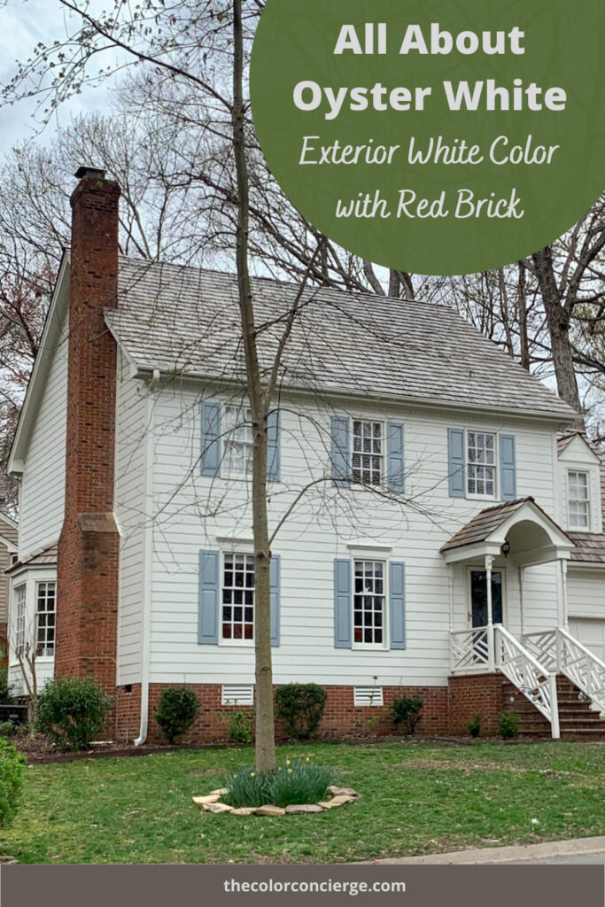
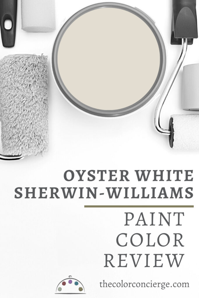
Learn all about Sherwin-Williams Oyster white in this color review (Sample Here). This warm, muted, very light beige paint color is a gorgeous option as an exterior white paint color or a light, warm neutral for interiors.
As you can see from the color above, Oyster White will look much brighter outside than inside or on the computer screen. SW Oyster White is a very light beige or very warm greige with green undertones. It will look like a soft white outside.
While we prefer to use Oyster White for exteriors, it’s also a versatile interior paint color that can work well in many different spaces.
Please note that all the photos in this post are from Color Concierge projects.

*This post contains affiliate links for products I use and love. If you click on some links and make a purchase, I will get a small commission at no cost to you. This helps pay for the costs of the blog, so I can continue to offer great content to our readers.
About The Color Concierge
Our Colorado-based paint color consultants make finding the right paint colors for your home easy. Whether you’re painting the exterior or interior of your home, our simple yet effective process lets us get your paint color right the first time. We’ve helped thousands of homeowners transform their homes into a space they love. Learn more about ONLINE COLOR CONSULTATIONS today.
What Color is Oyster White?
Oyster White is not really a white paint color at all. Instead, it’s more of a warm, muted light beige hue. Its green undertones can lean into yellow, especially in warm light, so it’s important to test this color anywhere you plan to use it.
What is the Oyster White LRV?
The LRV of Oyster White is 72, which makes it a warm white for exteriors or a light muted beige for interior wall colors. LRV (Light Reflectance Value) is a measurement used to identify how light or dark a color is. The scale goes from 1 (pure black) to 100 (pure white) and indicates how dark or light a color is.
What are the Oyster White undertones?
Oyster White has green undertones, which keep the color warm and inviting. I think of this hue as a complex cream or very light beige with green undertones. Its undertones can lean toward yellow in certain light, so keep an eye out for this when you’re testing the color (especially if you’re trying to avoid yellow tones).
The room below is painted with Sherwin-Williams White Duck. While not exactly the same, White Duck is very similar to Oyster White because it has a similar LRV and warm green undertones.
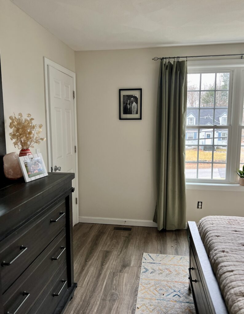
Sample SW Oyster White
We always recommend that you test paint colors (article) in your home because lighting can completely change a color, both on interiors and exteriors.
In the old days, this meant we painted a large poster board with sample pots and a huge mess.
Now we have a better way to test paint, with Samplize Peel-and-Stick samples!
- Samples pre-painted with 2 coats of real paint from the manufacturer.
- Large 9” x 14” samples to see the color better in the lighting.
- Delivered overnight
- Colors are accurate
- Less expensive than painting a large poster board with sample pots
- No mess, and no toxic paint to dispose of
I use these in my color consulting practice for exact results. Discover Samplize peel-and-stick paint samples and sample Sherwin-Williams Oyster White (Sample) via the link below.
Using Oyster White Interior Paint
While we usually prefer using Oyster White as exterior paint, it can be a wonderful option for interior paint as well.
Are Oyster White cabinets a good idea?
Oyster White is a great cabinet color, especially if you’re contrasting it with lighter colored walls such as Sherwin-Williams Pearly White or even Sherwin-Williams Alabaster. If you want a light kitchen but don’t want to choose a white kitchen cabinet color, then Oyster White could be a great fit.
Is Oyster White a good whole-house paint color?
It can be! Oyster White looks especially lovely in a home with very earthy colors and finishes. If you’re going to use it as a whole-house color, be sure to test carefully in every unique space and alongside all decor and furniture to ensure it doesn’t look discordant.
This can be a great color if you have earthy Tuscan finishes in your house, it can look very pretty with limestone, depending on the color. Test carefully to make sure it’s not too yellow.
What are the best Oyster White coordinating colors?
I love to pair Oyster White with other muted paint colors, particularly greens and blues. Sherwin-Williams Rosemary and Sherwin-Williams Dried Thyme are two of my favorite color combinations with Oyster White. It also looks absolutely gorgeous paired with mid-toned blues like Sherwin-Williams Blustery Sky or Sherwin-Williams Debonair.
When it comes to neutral paint colors, Oyster White works well with warm, darker beige paint colors, such Sherwin-Williams Malabar Beige or Benjamin Moore Manchester Tan.
I don’t recommend pairing Oyster White with very dark paint colors for interiors, such as Sherwin-Williams Sea Serpent or Sherwin-Williams Cyberspace, because it doesn’t provide quite enough contrast and lightness to balance out the deep hues.
What are the best trim and ceiling colors for Oyster White interior paint?
Oyster White really looks its best when it’s contrasted with lighter trim and ceilings. Sherwin-Williams Pure White and Sherwin-Williams White Snow are both beautiful options!
I wouldn’t go much lighter than SW Pure White, unless you absolutely have to, and I would avoid using SW Extra White paint for trim and ceilings, which will look too cool and blue compared to the warmth of Oyster White. It can look nice with Alabaster or Greek Villa.
Avoid using Oyster White as an interior trim color.
Using Oyster White Exterior Paint
Oyster White is one of my favorite paint colors for white exteriors with red brick or warm stone colors. It looks like a soft white outside – much brighter than inside or on the computer screen. This is a great all-around exterior white paint color. It looks fabulous as a crisp white in the bright sunshine, Southern United States, California, Arizona, or high altitude Mountain states. It is soft, creamy, and fabulous in the shade or up North.
At The Color Concierge, we are always very careful about using exterior white paint colors that are too stark. When we need to pick a darker white, we don’t look at cream colors because they lean toward yellow. Instead, we pick light greige and beige colors that might look like light grays inside. This prevents an unwanted yellow edge that some creamy whites might give in the warm sunshine.
We select colors that are compatible with the exterior lighting conditions. The closer you get to the sun, the more paint colors get washed out. For example, when we pick a white for the Southern United States, or high altitude locations such as Denver or Salt Lake City, we pick warmer and darker whites. We pick brighter whites for shady areas, or locations that are further North such as Michigan, Wisconsin, Seattle, New York, or Canada.

Project Spotlight: SW Oyster White Painted Brick Exterior
The client’s home featured below was originally built in 1927 in Denver and has a Tudor-like design style. The home originally had some really beautiful red brick, which would have looked lovely with Oyster White, but at some point someone added a very discordant-looking stone with green undertones.
When the homeowners had trouble selling this property, we decided to update the exterior to improve the home’s curb appeal. We repainted the brick with Oyster White to ensure it wouldn’t clash with the stone. The transformation was incredible!

This is what the home looked like before:

We used Sherwin-Williams Portico as the darker Tudor-style trim color and Sherwin-Williams Sealskin, a deep, muted brown, as the fascia and soffit color to match the home’s metal window trims.
The painted brick simplified this exterior color palette and made the whole home feel more cohesive. This home is also a great example of how much lighter Oyster White appears outdoors than indoors. For some high sun conditions, Oyster can even be too bright.

Sherwin-Williams Oyster White Exterior Color Palettes
Need more inspiration for using Sherwin-Williams Oyster White exterior paint? Explore these color consultant-picked color schemes to inspire your home makeover.
Classic Oyster White with light blue shutters
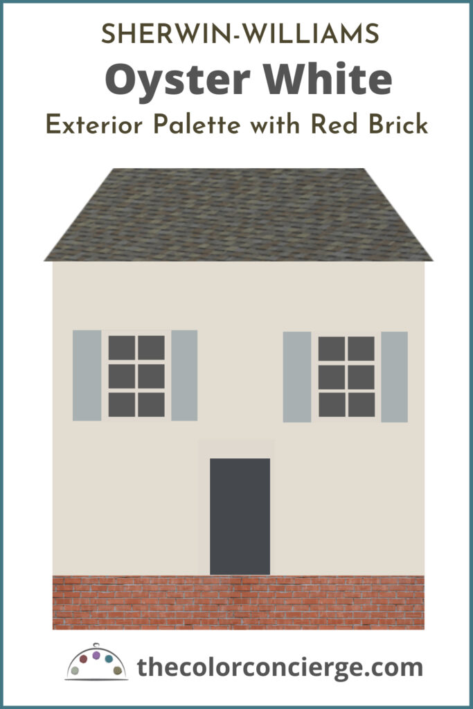
This palette looks fabulous with classic red brick. It is soft and lovely, and the colorful shutters help shift this unexpected palette from “Farmhouse White” to a colorful cottage!
The shutters are SW Uncertain Gray (Sample Here) and the front door is SW Cyberspace (Sample here).
This house is in North Carolina and is shown in the winter with overcast light. Oyster White is still soft and beautiful – much lighter than you would expect. The blue shutters are our favorite feature, and it’s amazing how much bluer they look outside than the sample!

The “before” photo is shown below. In the new palette, we lightened the body color and removed the darker trim. We usually prefer white trim with white vinyl windows, and in this case, it looks much brighter, current, and even classic. It’s counterintuitive, but simplicity can help show architectural features better than a lot of complicated color shifts.

Oyster White exterior with warm light brick and gray shutters
This house is in South Louisiana, near the water, where the conditions are pretty bright. We kept the light warm brick, and it looked amazing with Oyster White’s more muted tones. Had we picked a brighter white, it would have looked discordant and harsh next to the brick and all of the surfaces. We picked light gray shutters to keep the palette harmonious and light.
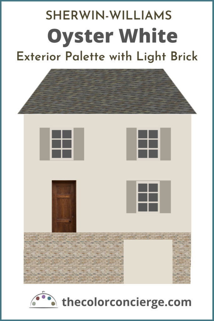
The shutters are SW Fawn Brindle (Sample Here)
Entry details of the final home are shown here. The wood front door adds warmth and depth.
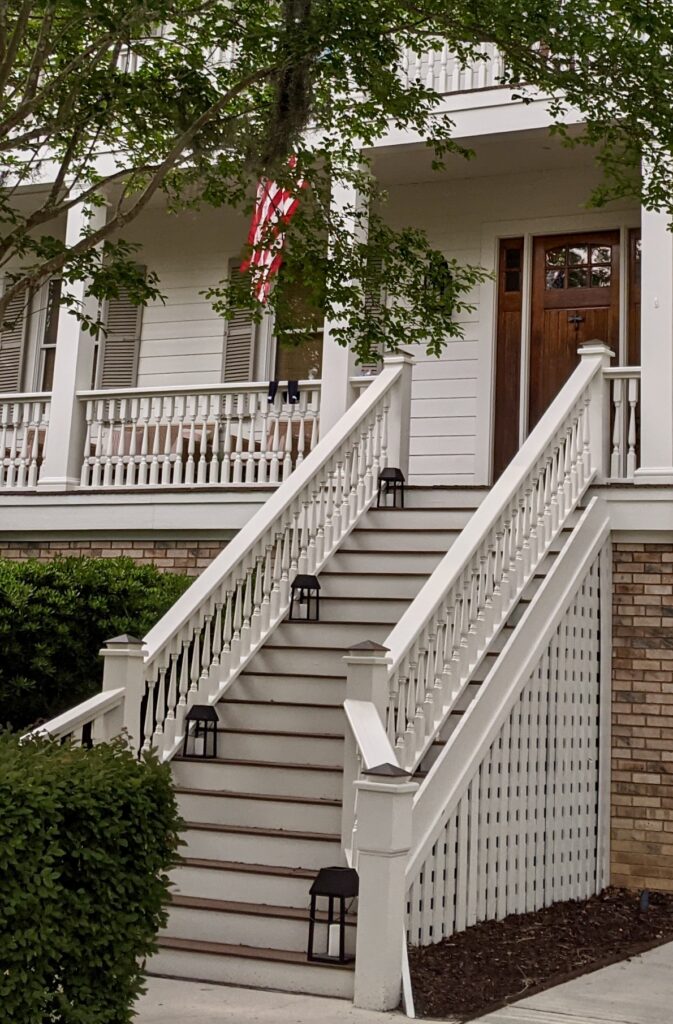
Here is the final photo. It looks soft, lovely, gracious, and classic.
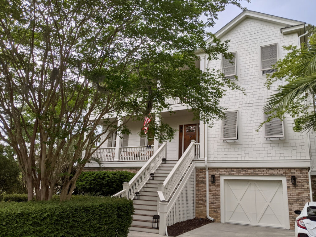
And check out the house before it was painted! Our homeowner was really brave to trust us with this transformation. The light brick looked dingy before, and now it is a beautiful warm feature.

Is Oyster White a good exterior trim color?
Yes, absolutely! This paint color is FABULOUS as an exterior white trim color (Article), especially with dark and mid-toned colors. I would not use Oyster White with very light siding colors such as yellows. It looks great with earthier siding colors. We really like it both on the fascia and the soffits, as you can see in the photo below.
This is a photo of an apartment building in Colorado with Oyster White trim taken during a snowstorm with low light conditions. It still looks lovely. In the sunshine it will look like a crisp white. We paired Oyster white with SW Retreat and SW Universal Khaki. When you can see the mountains, it is harmonious and perfect.

Best SW Oyster White Alternatives
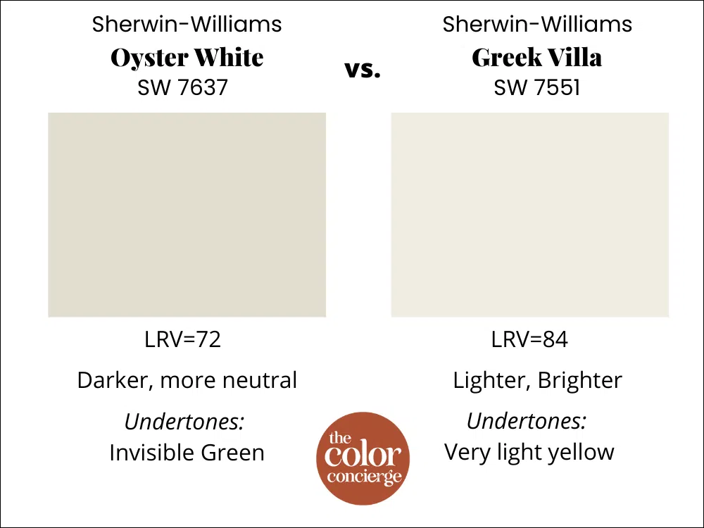
Greek Villa vs. Oyster White
Oyster white is much darker and warmer than Greek Villa (Sample), but don’t pick the Greek Villa for bright light conditions. Oyster will look dingy next to Greek Villa, but it could still be the better choice.
Both colors could look great as interior wall colors; it just depends on the look you are going for. I would usually prefer Greek Villa as an interior trim and ceiling color. Learn more about Greek Villa in our color review here.
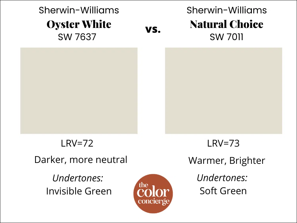
Natural Choice vs. Oyster White
Both these colors could look great in similar bright light conditions. Natural Choice (Sample) is warmer but lighter and might look better if you have a ton of green foliage near your house.
For interiors, I’d prefer Oyster white because it’s crisper but always test to make sure.
Alabaster vs. Oyster White
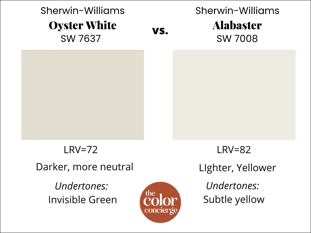
Oyster white is much darker and warmer than Alabaster (Sample), and lighter than Greek Villa. It will also make Oyster White look dingy when you test them side by side but don’t pick Alabaster for bright light conditions. Oyster White could still be the better choice.
Both colors could look great as interior wall colors; it just depends on the look you are going for. I would usually prefer Alabaster to Oyster as an interior trim and ceiling color.
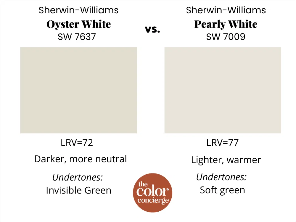
Pearly White vs. Oyster White
When you take these colors outside, Pearly White (Sample) will be much brighter than Oyster because of its much higher LRV of 77. They look very similar on the page, but believe me, Pearly is lighter. They have the same undertones, so if you are looking for a brighter crisper white and you have earthy finishes, Pearly White would be a great choice.
Pearly White is lovely as an interior paint color. Learn more about Pearly White in this color review.
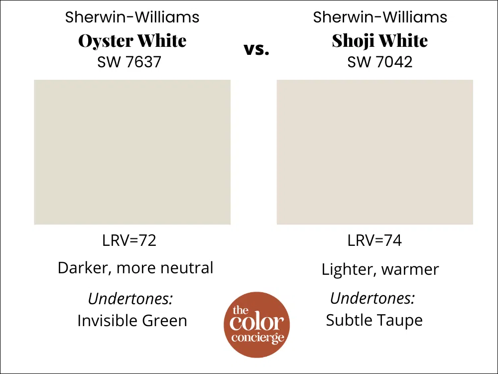
Shoji White vs. Oyster White
Shoji White (Sample) has taupe undertones and is much warmer and fleshier when you see it inside. As an exterior paint color, if you have a lot of exterior green foliage, it can make a better white paint color than Oyster White because those warm tones will neutralize all the green.
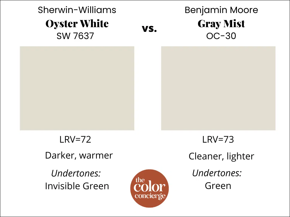
Which Benjamin Moore Color is most like Sherwin-Williams Oyster White?
I would say Benjamin Moore Gray Mist (Sample), because it gives a similar effect, and it’s pretty darn close! It’s not quite as warm but will look very similar outside or inside. We never recommend paint matching unless you are willing to spend a lot of time going back and forth with the paint company. Learn more about matching paint colors here.
Sherwin-Williams Oyster White Pros and Cons
Pros:
- Gorgeous option as an exterior white paint color
- Works really well with warm brick or stone exterior finishes
- Beautful, modern kitchen cabinet color
- Fabulous for an exterior white trim color
Cons:
- Don’t let the name fool you – this won’t look white indoors! It will look light beige.
- Doesn’t pair as exterior trim with very light siding colors (such as yellows).
- Extra White, which is a commonly used interior trim color can look discordant with Oyster White.
- Don’t use as a “white” interior trim and ceiling color
Key Learning Points
Sherwin-Williams Oyster White is a light warm beige with soft green undertones. It looks fantastic as an exterior white paint color, or as an interior light greige. The most similar Benjamin Moore color is BM Gray Mist.
No matter what, don’t forget to test your paint colors. It’s a standard best practice. Whenever I test my paint colors, they are perfect, and when I don’t test they turn out wrong. We love to test with SAMPLIZE peel-and-stick samples. Check out the SAMPLIZE website HERE.
NEVER, EVER use paint matches from a different brand than the one specified. Results are poor and there are no standards for the sheens. Even though your painter may truly believe it can be done, don’t do it. See results from paint matching here.
Online Color Consulting
Still looking for the perfect paint color? Discover our Online Color Consulting Package.

Related Posts
Pearly White Paint Color Review
SW Natural Linen Paint Color Review
Best Farmhouse White Paint Colors (Article)
Greek Villa Paint Color Review
About the Author

Hi, I’m Michelle Marceny, founder, owner, and Principal Color Designer at The Color Concierge. I believe a fresh coat of paint can completely transform a space. The Color Concierge was born out of my drive to help clients fall back in love with their homes. My clients trust me to help them find the perfect paint color for their home – whether it’s a whole-house paint color scheme or ideas for a single room.
Since The Color Concierge was founded in 2017, we have completed over 3000 color consultations, both online and in-person. I am a Certified Color Expert with 7 years of experience creating interior and exterior color palettes throughout North America.
If you liked this post, don’t forget to pin it!
We love your comments! Please note that the blog is meant as general advice, and it is not possible to give specific answers to your paint questions. If you want more specific advice, our Online Color Consultations will help you pick your paint colors. Thank you for your understanding.


35 Responses
A good BM match to SW Oyster White 7637 is BM OC-42 Old Prairie.
But you’re right (continued from my comment above) BM Gray Mist may be just a touch better match to SW Oyster White than BM Old Prairie.
I love this post! A year ago I painted my interior Oyster White. It was so hard to find information on the color plus I did not know much about paint but I love it!! Oyster white needs more love 🙂
Thank you! Oyster is one of our favorites.
Michelle
I just painted the exterior of my house Oyster White and I love it!! I can’t decide on a trim color. What color do you recommend? My roof is brown with red undertones. I am debating to use Pure White or just use Oyster White in a different sheen.
I would just paint the trim Oyster White! Pure White is too cold, and the same color will look classic and timeless in the ame sheen.
Hi I’m intetested in Oyster White for my exterior, light brown roof with small amount if red brick. My question is, what direction does the front of your face? Mine faces north and they say it matters. Thank you!
Hi! What beautiful transformations! For the house in South Carolina, was everything painted Oyster White (including the trim, porch railing, and hand rails)? Thank you!
Hi! I have a home in sunny Southern California and I am wondering if you would recommend Oyster White for my northern facing home. I’m currently torn between Oyster White and Shoji White for the exterior of my home. I am sampling, but I wanted to get your opinion as far as what to consider when I have a north-facing home that I’d like to paint white. Thank you!
Hi Sarah,
Those are both colors that we would recommend for a North Facing home in Southern California. If you have lots of trees, Shoji has some pink that might counteract them. Either could be lovely. Just test, test, test as you have been.
Michelle
Either Oyster or Shoji would look fabulous as a soft white in Southern California.
Michelle
Either Oyster or Shoji would look fabulous as a soft white in Southern California.
Michelle
Hi ! I’m currently in the process of painting my red/orange brick home Oyster White I live in Savannah Ga. with an east facing home. I thought about black window trim but it may be a little much for me so I decided on painting my front facing side entry garage black it looks amazing. My question is what should I do with the porch steps paint Oyster white or leave it exposed? Any suggestions would help.
Shannon
Great post, thank you! What brand/colour would you suggest for eaves? It looks like you have a good match in the pictures above – I am leaning towards Kaycan Linen?
The eaves were also Oyster White.
This post is so informative! We have a red/orange (can resemble a tericcata color) brick house, with a lighter gray roof and light gray siding in the side. The brick is in the front with cream colored shutters and cream colored keystones above the windows.
We are trying to work with the brick color and siding unsure of what we can do. What colors would you recommend?
If we used oyster white for the keystones what color shutters would look good with the brick and siding?
Thanks!
The number you’ve listed for Oyster White SW 7015, is actually for Repurpose Gray? Oyster White code is SW 7637. Did SW change their paint codes or was this just a typo? Just want to make sure I’m getting the right paint color. 😊
Hi Michelle,
The number was a typo and has been fixed.
Thanks for bringing it to our attention!
Michelle
Loved this post! We are in Chicago – it is so grey here half the year. Faux stone is beige with some yellow/copper pieces. Do you think oyster would be a good color :-).
Hello! I have a west facing open concept living room (with smaller east facing windows in the same space) and I can’t decide between oyster white or pearly white. Most of my furniture is light beige, dark wood and my floors are a cream tile. If someone knows what could be best I would really appreciate it!
Hi. My space is the same as yours. What did you decide and how did it work?
Hello🌺
I live on a very sunny corner in Southern California. The south side faces a street. I have about 20 white paint samples on that wall. I’ve been working my way down the LRV’s in an attempt to find an off white that isn’t blinding. Don’t want taupe or grey though. I want the classic Spanish look. We have a 100 year old Spanish home. Red tile roof, Saltillo tile patios, wrought iron, olive trees, Mexican stair risers. A lot of nice elements in place. Shoji White looks nice on the shady sides. But turns stark white on the south wall. Any suggestions ? PLEASE HELP🙏🏽
What is the best earth tone color for shutters with oyster white exterior?
Hi Marcie,
This can depend on many variables, including your roof, stone, brick, landscaping and hardscaping.
Michelle
I am sprucing up a sunroom/pantry adjacent to our kitchen. It has windows on 3 walls, north, east and south, but lots of evergreen trees filtering the sunlight. The floors and ceiling are medium brown with very dark brown beams. I keep a lot of plants in there so I want to keep it bright and warm. I was thinking of painting most of the cabinets a creamy color like White Duck or Oyster, and the walls a brighter warm white. We are adding a glass door cabinet and some open shelving along an expanse of wall, and were thinking we’d make them dark brown to match the beams and wood returns on the windows. Counter tops will be tiled, possibly in a light blue-green or soft green color with wood trim edging. I will order Samplize paint samples, but I’m overwhelmed by all the color choices. What white(s) would you use with White Duck or Oyster to provide some contrast? Would Pearly White be a good choice?
How about Alabaster or Greek Villa?
Hello! This last house has very similar brick color to mine and I’m going with the Oyster white body/fawn brindle shutters combo. I only have 2 sets of shutters on the house and a painted front door which I was thinking of using Evergreen fog on. If the house in your project didn’t have a wooden door, what color would you have chosen to paint it? Thank you!
For this type of a house you can use just about any front door color that you want! Evergreen Fog coule be very nice.
Michelle
What color blue are the shutters? Thank you!!
Thanks for writing about Oyster White! I picked it as one of my top colors. I have a SW facing condo. I tend to warm colors but the last color was way to yellow. I have some red rock type accent colors. I’m hoping this will be a good choice! I am also looking at Origami White.
Hi. My space is the same as yours. What did you decide and how did it work?
Can’t decide between Oyster white vs Egret white for outside trim of south facing brick (repurposed brick with different tones) ranch house in Augusta, Georgia. The 70s house has 4 columns and peak in center of front porch. I am painting the peak in pewter tankard and I was thinking tricorn black for the shutters. I love your aesthetic. Any thoughts on trim color, egret white or oyster white?
I’m looking for a color for my mobile home it’s a 1972. I want the body of my mobile home oyster white with dirty brown trim. What do you think about what color trim would look nice.
Hi Irene,
It’s hard for me to say without seeing the home. Try testing Rookwood Dark Brown or Rookwood Medium Brown.
Mcihelle
Had a consult to puck colours for interior and not sure i like it.. ive only done the one colour so far because of yellow oaky colour floors and cupboards i need to reflect right. My kitchen and nook area she chose oyster white … my living/ dining room wall extends to upstairs loft and down stairway so half townhouse is continuous.. enough light from windows in liv/ din but obviously darker upstairs and down stairway.. struggling that its such a big surface what colour is i should go very light. Still unsure the kitchen colour is right depending what rest is 🙁
Not big townhouse so don’t want too dark