Choosing exterior paint colors for Victorian homes is one of our very favorite things to do — and this historic beauty was no exception. Keep reading to see how we took this home from tired brown and beige to a rich blue-and-yellow Victorian exterior color palette that shows off every ornate detail.
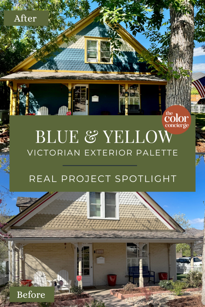
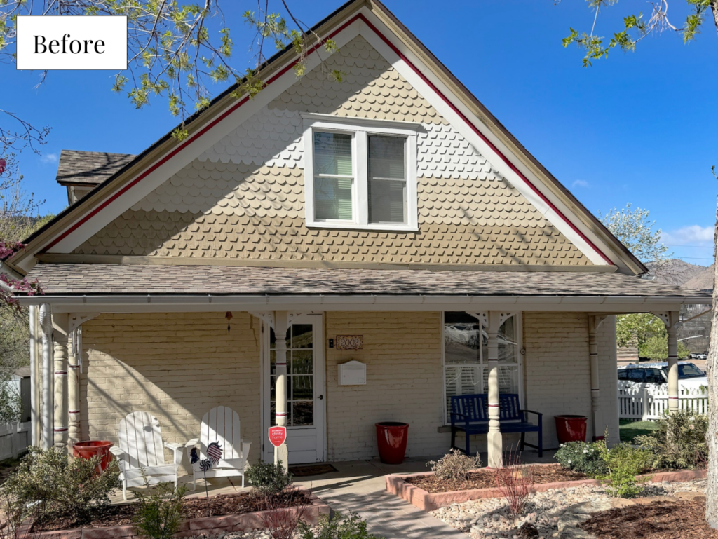
This charming historic Victorian had gorgeous bones and incredible architecture, but its faded brown-and-beige color scheme left it all hidden. The homeowner wanted to bring the exterior into a new era and let the home’s unique details shine with a brighter, happier color palette.
Working from the homeowner’s color preferences and inspiration photos, our senior color designer Maddie created several fresh palettes and mapped out exactly where each color should go. After reviewing Photoshop renderings of each palette and testing paint colors on their home, the client landed on a colorful, yet sophisticated palette of deep blue-gray paired with warm yellow and golds.
The transformation is the kind of Victorian exterior palette (Article) that makes people slow down as they walk by! Keep reading to explore all of the Sherwin-Williams exterior colors (Article) we used and exactly how we placed them on this historic home.
*This post contains affiliate links for products we use and love. If you click on some links and make a purchase, we will get a small commission at no cost to you. This helps pay for the costs of the blog, so we can continue to offer great content to our readers.
About The Color Concierge
Our Colorado-based paint color consultants make finding the right paint colors for your home easy. Whether you’re painting the exterior or interior of your home, our simple yet effective process lets us get your paint color right the first time. We’ve helped thousands of homeowners transform their homes into a space they love. Learn more about ONLINE COLOR CONSULTATIONS today.
Sample The Best Victorian Exterior Paint Colors
We always recommend that you test paint colors (Article) in your home because lighting can completely change a color, both on interiors and exteriors.
In the old days, this meant we painted a large poster board with sample pots and a huge mess.
Now we have a better way to test paint, with Samplize Peel-and-Stick samples!
- Samples pre-painted with 2 coats of real paint from the manufacturer.
- Large 9” x 14” samples to see the color better in the lighting.
- Delivered overnight
- Colors are accurate
- Less expensive than painting a large poster board with sample pots
- No mess, and no toxic paint to dispose of
I use these in my color consulting practice for exact results. Discover Samplize peel-and-stick paint samples and sample all your favorite exterior house colors via the link below.
Tips for Choosing Exterior Paint Colors for a Historic Victorian Home
Before we explore this blue and yellow Victorian exterior color palette (Article), let’s take a moment to explore how to choose paint colors for historic homes, because it’s about more than picking pretty colors. The right palette should highlight the home’s architectural details, coordinate with the existing finishes, and still feel timeless years from now.
1. Start With the Fixed Finishes
Before choosing any paint colors, look at the elements that are not changing. On this home, that included the roof, stone foundation, flagstone, and surrounding landscaping.
Your exterior paint colors should work with those permanent finishes, not compete with them. When the palette coordinates with the hardscape and landscape, the whole property feels more intentional and cohesive.
2. Use Contrast to Highlight the Details
Victorian homes are known for their beautiful millwork, trim, brackets, columns, gables, and decorative shingles. But if the colors are too similar, those details can disappear.
This home originally had a low-contrast palette of browns and beiges, which made the exterior feel flat. Adding more contrast helped bring the architecture back to life without making the palette feel too busy.
3. Keep the Palette Cohesive
Historic homes can handle more color than many newer homes, but that does not mean every detail needs a different paint color. In many cases, less is more.
A focused palette with thoughtful placement will feel more timeless and polished than too many competing colors.
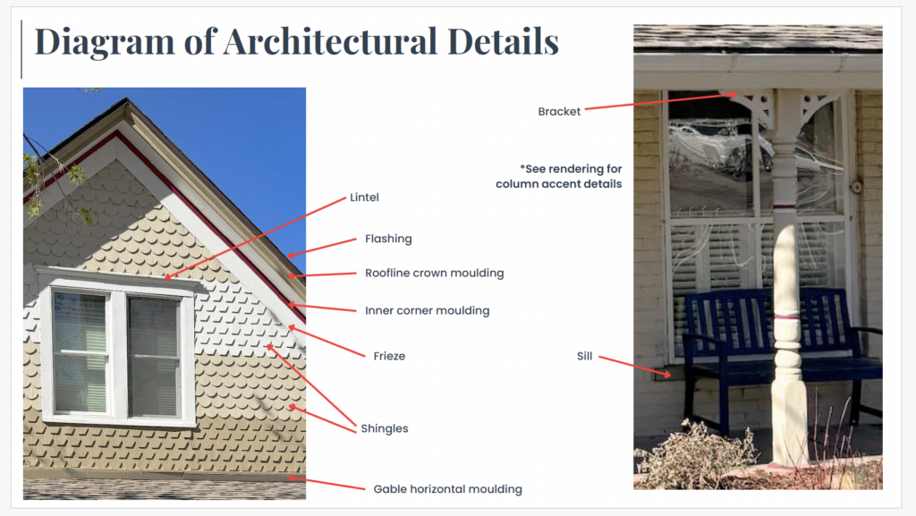
4. Map Out Every Architectural Detail
Victorian exteriors (Article) often have many different elements (Article) to consider, including siding, window trim, fascia, soffits, moulding, brackets, columns, porch details, vents, and decorative shingles.
Before painting, create a clear plan for where each color will go. For this project, we included a labeled diagram so the homeowner and painter could both understand the exact color placement. This step helps prevent confusion and ensures the finished exterior looks balanced, intentional, and true to the home’s architecture. An example of this is below:

Project Spotlight: Blue and Yellow Victorian Color Palette
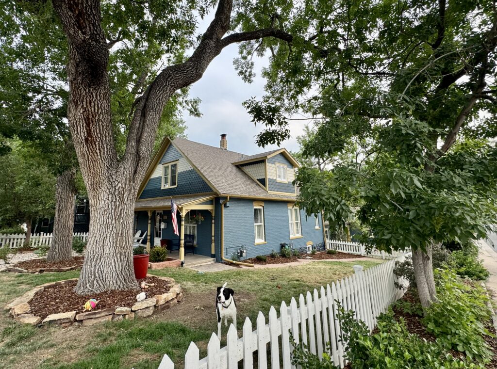
The home we’re featuring today is a sprawling historic property in the Denver Foothills. The home was added onto over the years and each renovation was very nicely integrated into the original design.
When our clients reached out to us, they were ready to bring the Victorian home into the modern age – while still staying true to the property’s history and charm.
We put together a few palettes for this home, creating Photoshop renderings for each one so the client could envision the colors on their home. All of the palettes were beautiful (and shared in more detail toward the end of this post!), but we couldn’t be happier with the blue and yellow Victorian color scheme the clients chose.
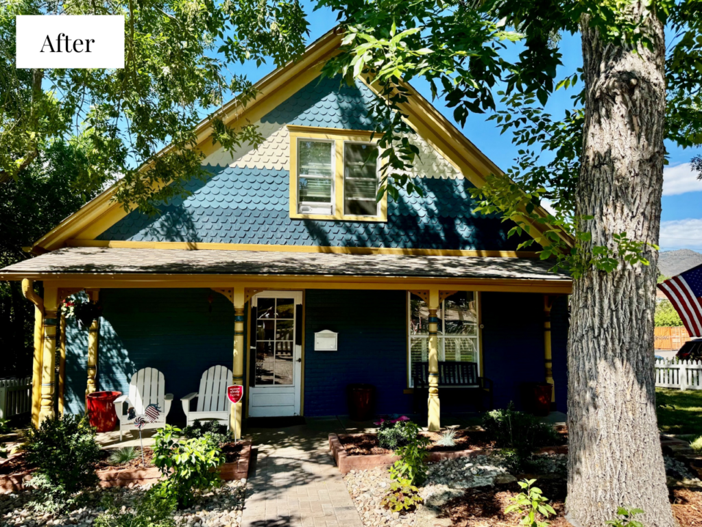
The deep blue-gray body grounds the home while the layered golds warm it up and make every architectural detail pop. The color changes completely transformed this house from the monochromatic beige palette it started with.
Keep reading for all the details on every Victorian exterior paint color we used on this home.
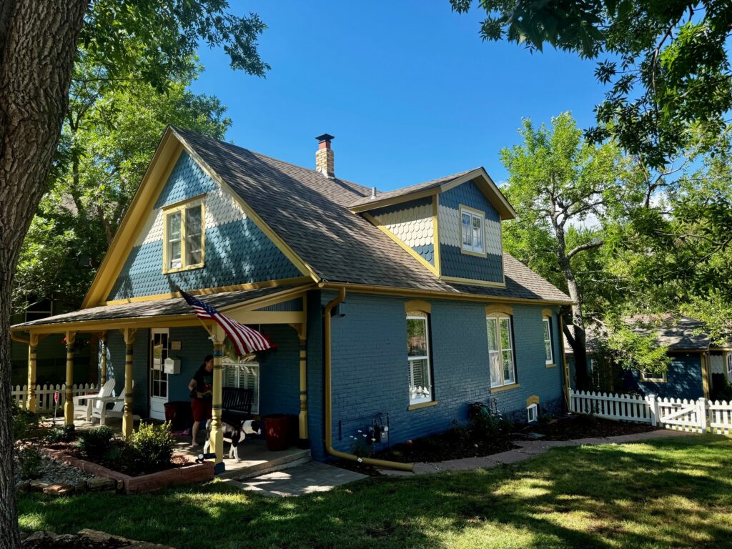
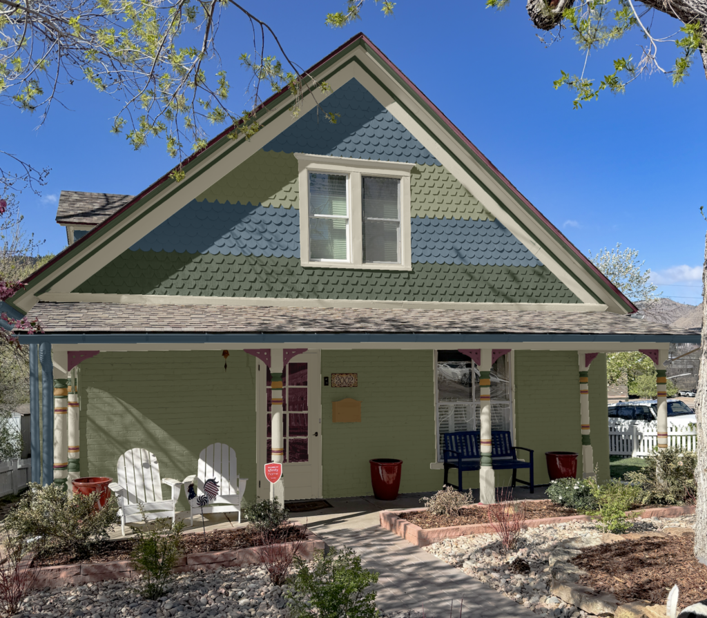
Sherwin-Williams Waterloo Body Color
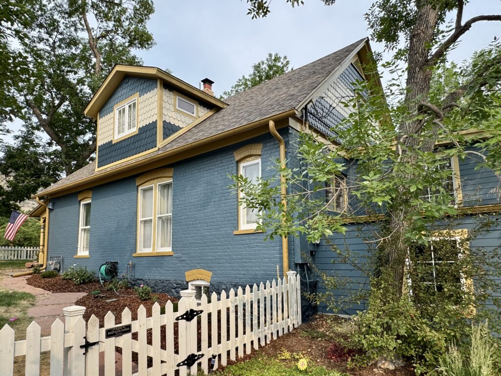
The star of this palette is Sherwin-Williams Waterloo (Article), a gorgeous deep blue-gray that we used across the home’s painted brick, the horizontal siding, and the porch beadboard. It’s muted enough to feel timeless and works beautifully in bright sun, exactly what you want for a color that covers most of the home. This gorgeous body color instantly moved the house away from its faded beige past.
Sherwin-Williams Sea Serpent Shingles & Stone
This home’s scalloped gable shingles are one of its signature Victorian features, so we treated them as their own feature in the palette. Rather than using a single color, we combined SW Waterloo and Sherwin-Williams Sea Serpent (Article), a deeper, muted blue-green paint color we absolutely love for exteriors.
We also used SW Sea Serpent to paint the home’s foundation stone around the base of the house, which is very grounding for the property.
Sherwin-Williams Wool Skein Shingles & Porch Ceiling
To highlight the scalloped shingles even further, we also used a lighter band of Sherwin-Williams Wool Skein to create depth and a subtle striped effect in the gables.
Sherwin-Williams Downing Straw & Rookwood Antique Gold Trim and Accents
Instead of the expected white trim, we layered two warm gold paint colors to create this blue and yellow Victorian exterior palette. Sherwin-Williams Downing Straw was used on the fascia, soffits, frieze, trim, sills, columns, and the gable peak vent, giving the whole home a warm, sunlit glow.
We used the deeper Sherwin-Williams Rookwood Antique Gold for the home’s more decorative trim elements, including the roofline crown moulding, inner corner moulding, gutters and downspouts, lintels, brick eyebrows, brackets, and mailbox.
By using two similar gold hues, we were able to highlight the home’s fine millwork without adding a jarring new color or making the palette feel too busy.
We continued five of these historic home hues throughout the rest of the property’s unique details, creating a palette that is cohesive but still helps all the small features stand out.
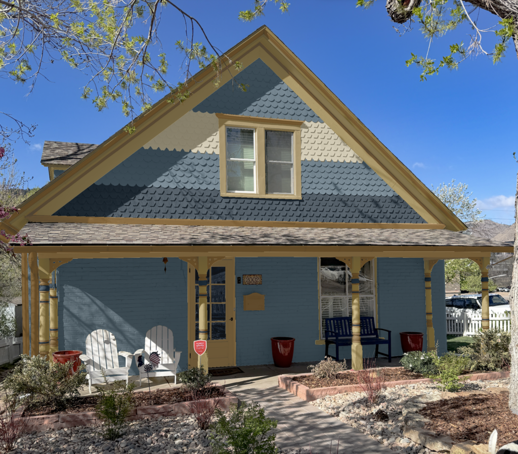
Front Door and Entry
We used this home’s full exterior color palette on the front porch and entryway, which helped to tie the whole space together.
For the home’s front door, we chose Sea Serpent – the same rich navy used on the garage doors, foundation stone and scalloped shingles – to tie the darkest accents together around the home.
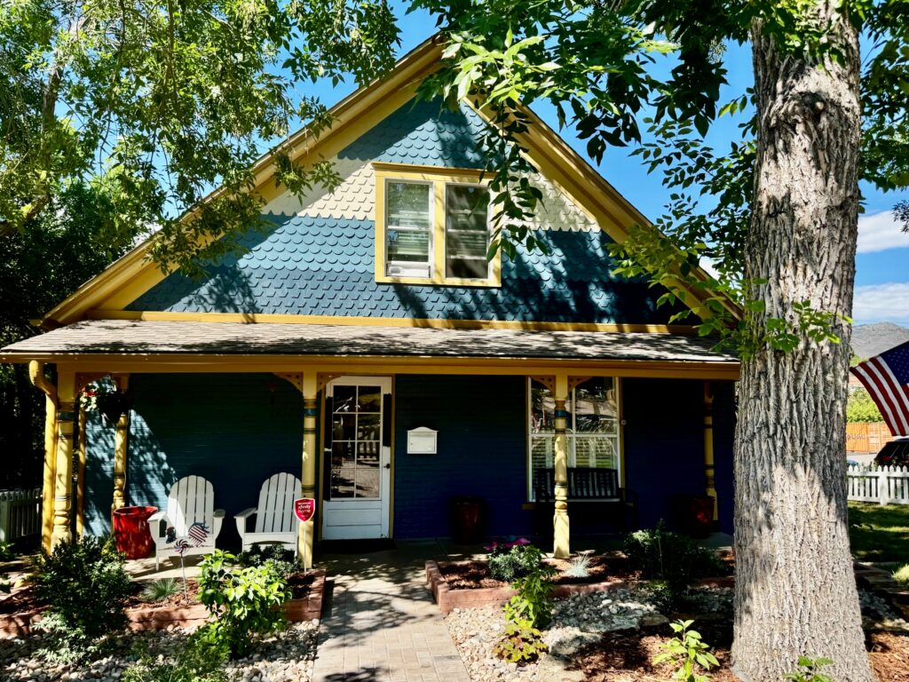
The porch ceiling (Article) is painted Wool Skein for a soft, warm overhead glow, the columns are Downing Straw with Sea Serpent column accents, the beadboard picks up the Waterloo body color, and the inner porch walls are painted with Downing Straw. The result is layered and inviting without feeling overwhelming.
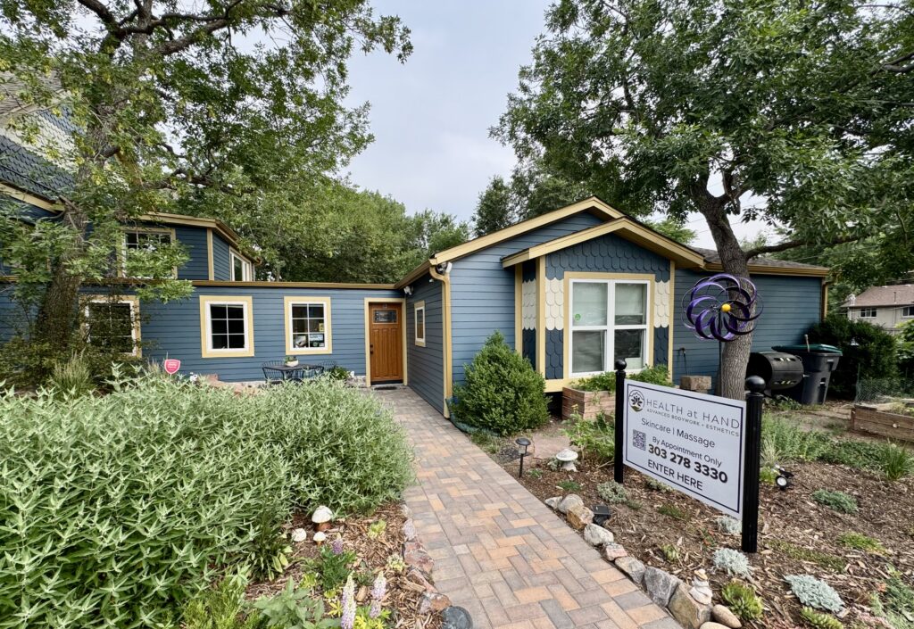
On the side of the home, a separate entry door for our client’s home-based business is painted in Rookwood Antique Gold for a warm, welcoming pop.
Paintable Window Trim
This home has a mix of vinyl and paintable windows. To keep everything looking consistent, we recommended making the paintable windows white to match the existing vinyl windows. Sherwin-Williams Pure White (Article) or Sherwin-Williams Pearly White (Article) would both be good options for this.
The inner brick eyebrows above the windows are painted the trim color so those pretty arched details stand out against the body of the home.
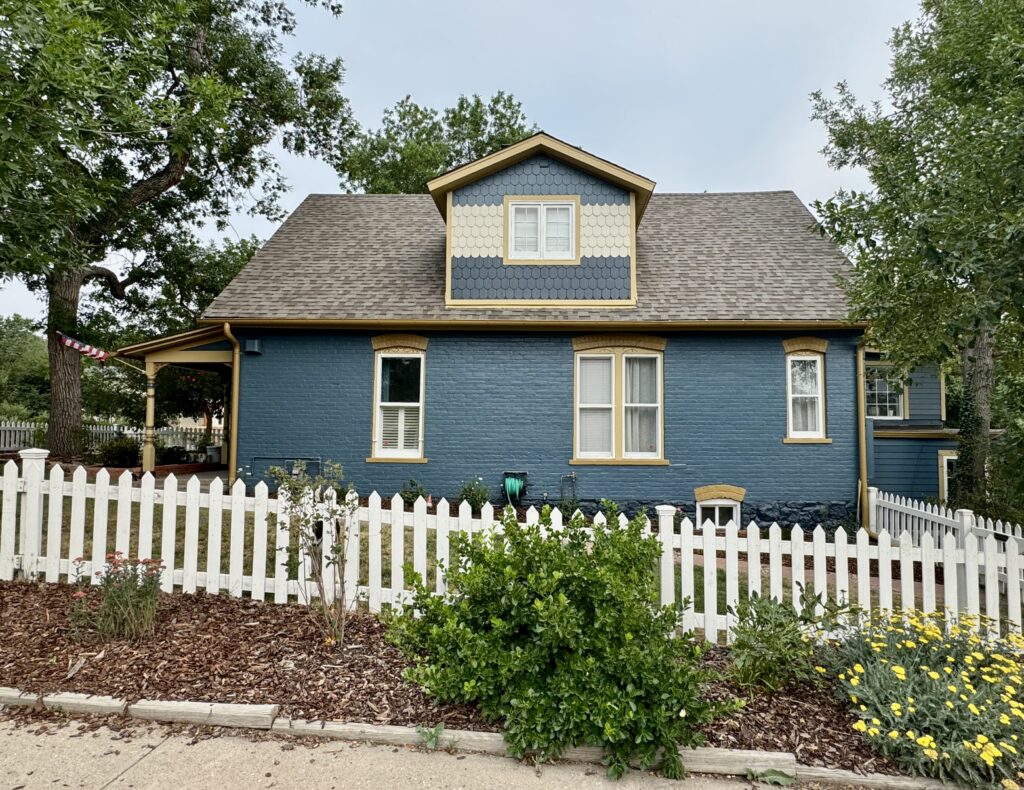
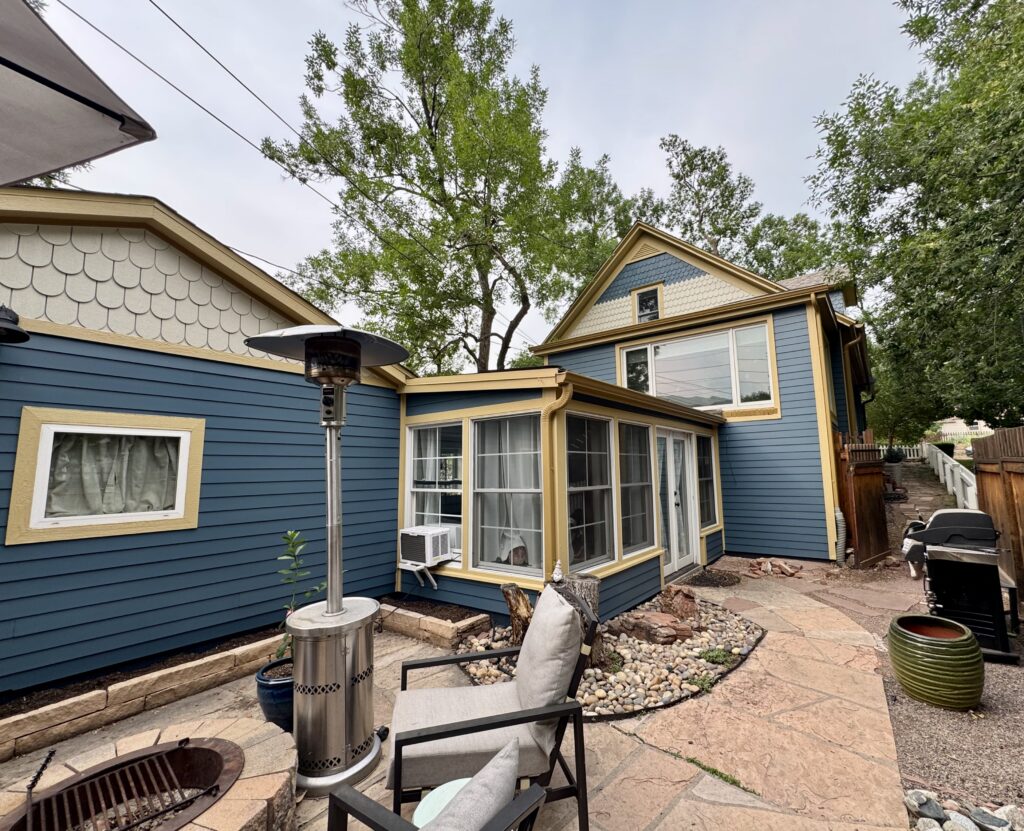
Back of House and Garage
We continued the palette at the back of the house, with the goal of keeping things simple but cohesive. The back gable is painted to match the dormers in a single color, Wool Skein, and the sunroom trim is treated like the rest of the home’s trim, painted with SW Downing Straw.
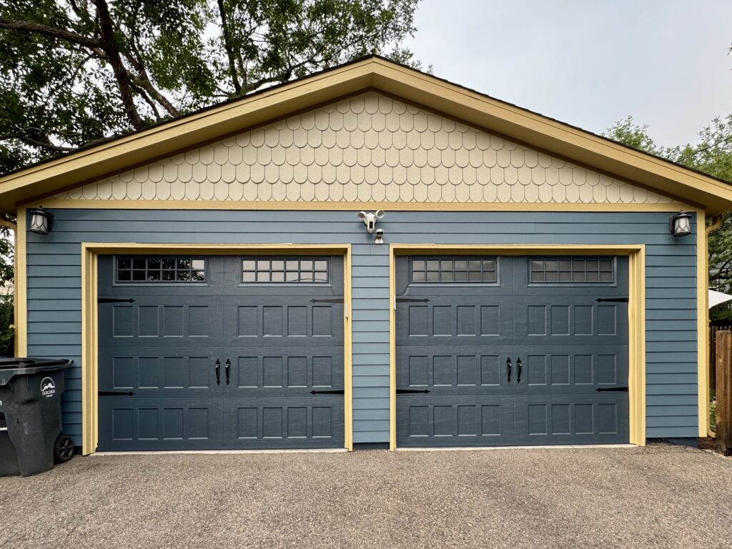
The same colors continue on the detached garage. I love the fact that even this small space incorporates the full color palette. It almost looks like a mini version of the home!
Sample This Blue and Yellow Victorian Color Palette
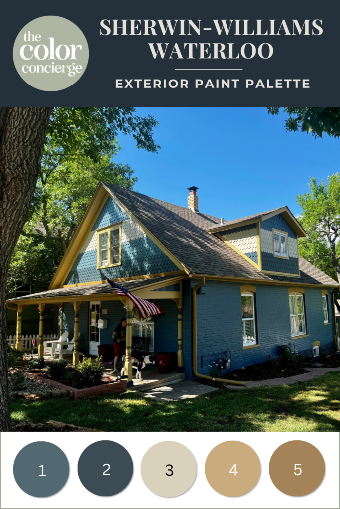
- Waterloo (SW 9141) – Used on the brick, siding, porch beadboard, and part of the shingles.
- Sea Serpent (SW 7615) – Used on part of the shingles, the column accents, the front door, the garage doors, and the foundation stone
- Wool Skein (SW 6148) – Used on the porch ceiling and on the lightest band of the fish-scale shingles.
- Downing Straw (SW 2813) – Used on the fascia, soffits, frieze, flashing, trim, sills, gable peak vent, porch surrounding beam, columns, inner porch walls, and storm door.
- Rookwood Antique Gold (SW 2814) – Used on the gutters, downspouts, gable horizontal trim, roofline crown moulding, inner corner moulding, lintels, brick eyebrows, brackets, column accents, mailbox, and client entry door.
Other Historic Victorian Palettes We Considered
In every paint color consultation, we design a series of palettes so our clients can compare their options and choose the look that feels most like home. Before landing on the blue-and-gold Victorian color scheme above, our client considered three other beautiful options. We created Photoshop renderings of their home for each palette, to help the homeowner envision what the house would look like.
Any one of these palettes would have looked stunning, so here they are as bonus inspiration:
Bonus Palette 1: Blue and Olive
A unique and eye-catching look drawn from the client’s inspiration photo, this palette is similar to the client’s final choice but the yellows lean more toward green rather than orange/gold.
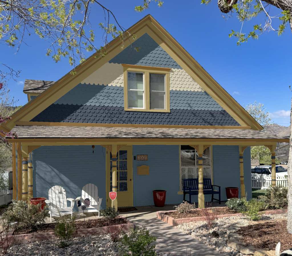
Sample This Palette:
- Dusted Olive (SW 9028): Fascia, soffits, frieze, flashing, trim, sills, gable peak vent, porch surrounding beam, columns, inner porch walls, storm door
- Chamois (SW 6131): Gutters, downspouts, gable horizontal trim, roofline crown moulding, inner corner moulding, lintels, brick eyebrows, brackets, column accents, mailbox, client entry door
- Wool Skein (SW 6148): Porch ceiling, shingles
- Waterloo (SW 9141): Shingles, brick, siding, porch beadboard
- Naval (SW 6244): Shingles, window swirls, column accents, front door, garage doors
Bonus Palette 2: Green and Blackberry
This palette is built around our client’s business and its brand colors. We love purple and green together! We paired a berry purple with a soft gray at the client’s request, and the raspberry tone looks wonderful next to the flagstone.
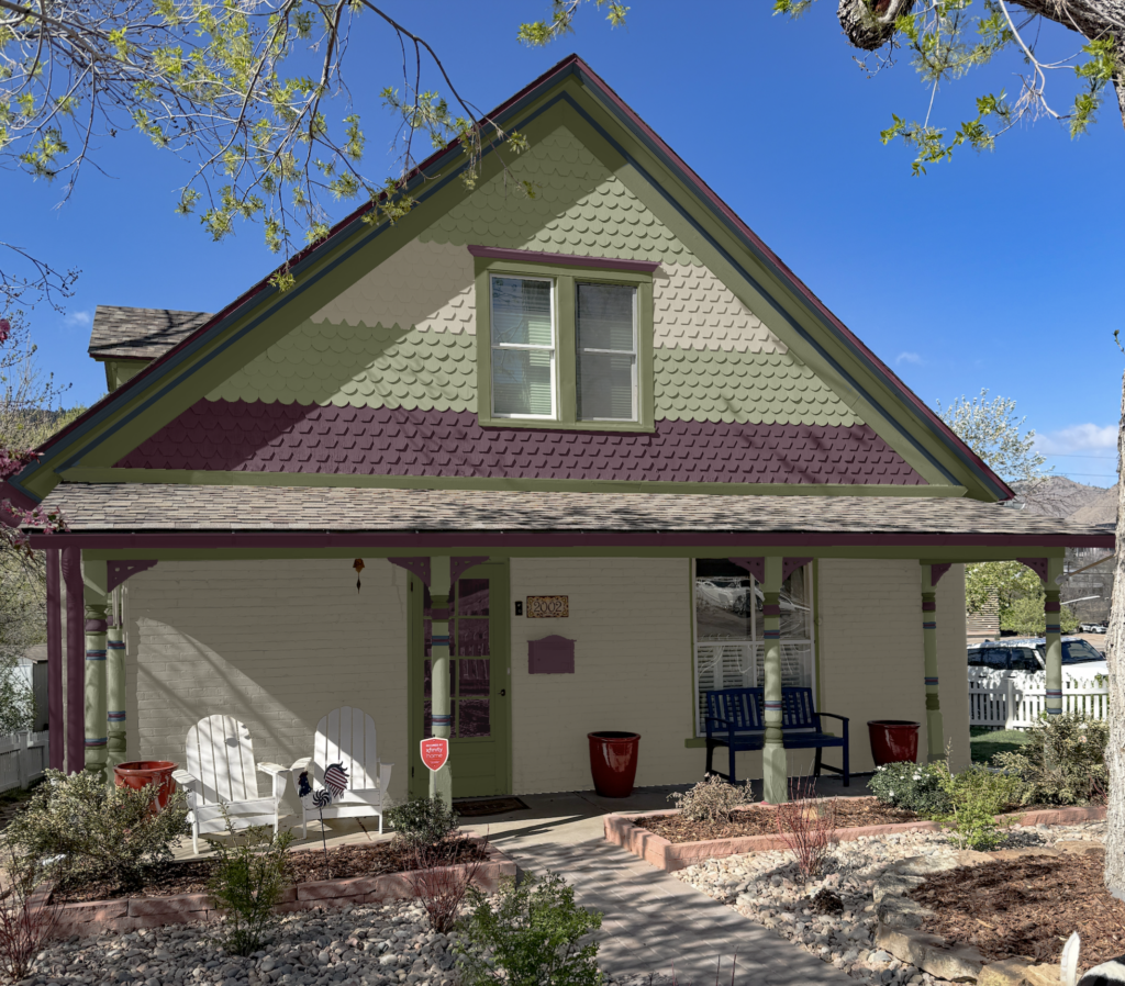
Sample This Palette:
- Oakmoss (SW 6180): Fascia, soffits, frieze, trim, gable peak vent, porch surrounding beam, inner porch walls, column accents, storm door
- Green Onyx (SW 9128): Columns, brick eyebrows, shingles, siding, porch beadboard
- Analytical Gray (SW 7051): Porch ceiling, shingles, brick
- Blackberry (SW 7577): Gutters, downspouts, flashing, gable horizontal trim, brackets, lintels, window swirls, column accents, mailbox, front door, garage doors, client entry door, shingles
- Sea Serpent (SW 7615): Roofline crown moulding, inner corner moulding, angled shingles, columnarage doors
Bonus Palette 3: Light and Classic
This is a stunning palette that references the gorgeous colors from the home’s house-number plaque. We designed this one with lighter trim to show how the home reads with an overall light and classic look.
Sample This Palette:
- Grecian Ivory (SW 7541): Fascia, soffits, frieze, trim, gable horizontal trim, gable peak vent, lintels, porch surrounding beam, inner porch walls, porch ceiling, columns, storm door, brick eyebrows
- Bunglehouse Blue (SW 0048): Gutters, downspouts, shingles
- Burgundy (SW 6300): Flashing, brackets, column accents, front door
- Artichoke (SW 6179): Shingles, brick, siding, porch beadboard
- Vogue Green (SW 0065): Roofline crown moulding, inner corner moulding, column accents, garage doors, shingles
- Chamois (SW 6131): Window swirls, column accents, mailbox, client door
Key Learning Points
This historic Victorian exterior went from washed-out and faded to warm, colorful, and full of character with a simple but layered blue-and-yellow exterior color palette.
- For Victorian and historic homes, aim for a simplified palette – in this case, just five colors – so each architectural detail can stand out without overwhelming the home.
- Skip the expected white trim when it suits the home; layering two related golds, like Downing Straw and Rookwood Antique Gold, highlights fine millwork while keeping the look cohesive.
- Ground a palette with a strong body color and use darker accents — like Sea Serpent on the foundation, doors, and shingle details — to add depth and tie the whole home together.
Remember: NEVER, EVER use paint matches from a different brand than the one specified. Results are poor and there are no standards for the sheens. Even though your painter may truly believe it can be done, don’t do it. See results from paint matching here.
No matter what, always test your paint colors. It’s a standard best practice. Whenever I test my paint colors, they are perfect, and when I don’t test they turn out wrong. Learn how to test your paint colors here.
Online Color Consulting
Still need help picking the best paint colors? Discover our Online Color Consulting Packages.

Related Posts
- Coastal Victorian Exterior Color Palette
- Our Favorite Exterior Paint Colors for Victorian Homes
- Historic Exterior Paint Color Update
- Best Exterior Blue Paint Colors and Palettes
- A Painted Gentleman: Victorian Paint Color Scheme
About the Author

Hi, I’m Michelle Marceny, founder, owner, and Principal Color Designer at The Color Concierge. I believe a fresh coat of paint can completely transform a space. The Color Concierge was born out of my drive to help clients fall back in love with their homes. My clients trust me to help them find the perfect paint color for their home – whether it’s a whole-house paint color scheme or ideas for a single room.
Since The Color Concierge was founded in 2017, we have completed over 3000 color consultations, both online and in-person. I am a Certified Color Expert with 7 years of experience creating interior and exterior color palettes throughout North America.
We love your comments! Please note that the blog is meant as general advice, and it is not possible to give out specific answers to your paint questions. If you want more specific advice, our Online Color Consultations will help you pick your paint colours. Thank you for your understanding.
