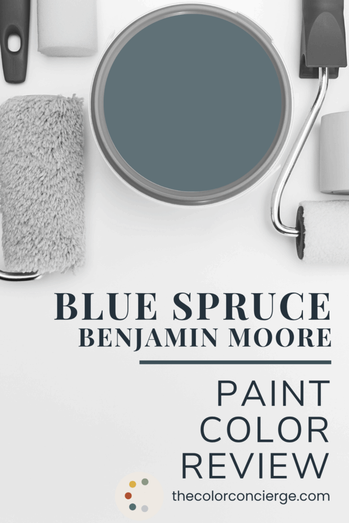
Learn all about Benjamin Moore Blue Spruce (1637) in this paint color review.
Benjamin Moore Blue Spruce is a darker blue-green paint color that is perfect for accent walls, a color drench, accent rooms and other spaces within a home.
We absolutely love using this hue for clients who love color. It’s bold and beautiful but also muted enough to not be too overwhelming in a space.
Wondering if BM Blue Spruce is right for your next project? Keep reading for our full paint color consultant review and explore real client photos of Blue Spruce paint.
*This post contains affiliate links for products I use and love. If you click on some links and make a purchase, I will get a small commission at no cost to you. This helps pay for the costs of the blog, so I can continue to offer great content to our readers.
About The Color Concierge
Our Colorado-based paint color consultants make finding the right paint colors for your home easy. Whether you’re painting the exterior or interior of your home, our simple yet effective process lets us get your paint color right the first time. We’ve helped thousands of homeowners transform their homes into a space they love. Learn more about ONLINE COLOR CONSULTATIONS today.
What Color is BM Blue Spruce?
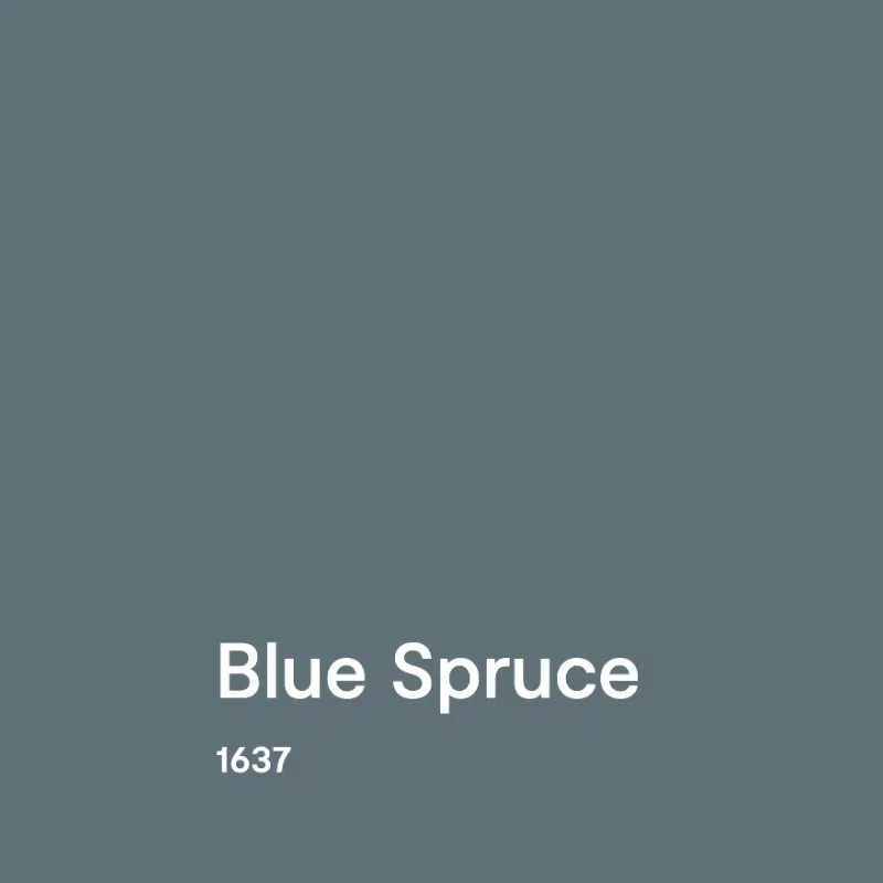
Blue Spruce by Benjamin Moore (Sample) is a gorgeous, dark blue-green paint color that leans more toward blue. We love to use this color when clients want a dark blue interior paint. Sometimes, the blue colors people most often reach for, like Benjamin Moore Hale Navy (Article), look almost black indoors. But Blue Spruce is light enough that it won’t risk being too dark in place. It’s dark enough to look like a dark blue and light enough so that you can see the color.
What is the BM Blue Spruce LRV?
Blue Spruce has an LRV of 16.81. It’s a very dark color, but still very far from black. LRV, or Light Reflectance Value, is a number from 0 to 100 that measures how much light a paint color reflects or absorbs. A value of 0 means it’s pure black, which absorbs all light, while 100 means it’s pure white, which reflects all light. Most paint colors fall somewhere in between.
Is Blue Spruce warm or cool?
Blue Spruce has some warmth from green tones, but I’d still consider it a cool paint color. It leans much more toward cooler blue tones than warmer green ones.
What are the Benjamin Moore Blue Spruce undertones?
Blue Spruce has green undertones, which give the color warmth. Still, it leans more heavily toward its muted blue side, so it looks more blue than teal.
Sample BM Blue Spruce
We always recommend that you test paint colors on your home because lighting can change a color completely, both with interiors as well as exteriors.
In the old days, this meant we painted a large poster board with sample pots and a huge mess.
Now we have a better way to test paint, with Samplize Peel-and-Stick samples!
- Samples pre-painted with 2 coats of real paint from the manufacturer.
- Large 9” x 14” samples to see the color better in the lighting.
- Delivered overnight
- Colors are accurate
- Less expensive than painting a large poster board with sample pots
- No mess, and no toxic paint to dispose of
I use these in my color consulting practice for exact results. Discover Samplize peel-and-stick paint samples:
Using Benjamin Moore Blue Spruce Interior Paint
Blue Spruce (Sample) is a gorgeous, deep hue that works great as an accent within a room or whole-house color palette. Below, we’re sharing some of our favorite uses of Blue Spruce paint from real clients’ homes.
Would a Blue Spruce living room look good?
I love the idea of adding a Blue Spruce living room or library to a home. Just keep in mind that with a color this bold, it will work best in a living room that is not open concept. In such a large, open space, this color could feel overwhelming.
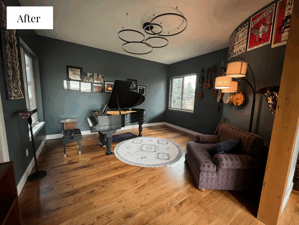
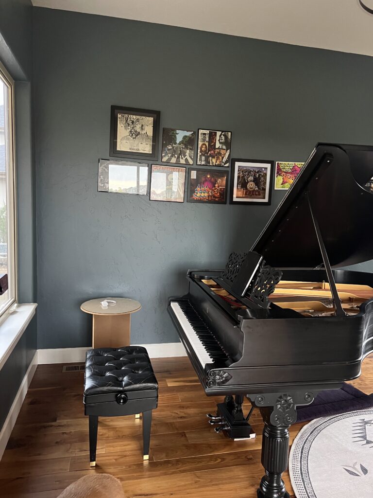
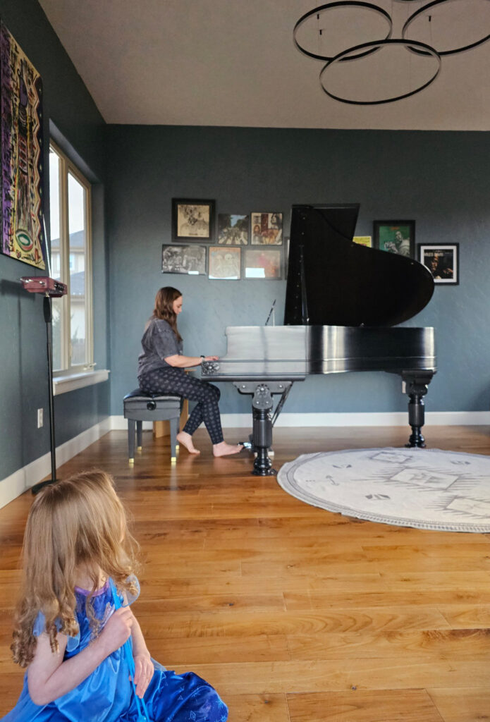
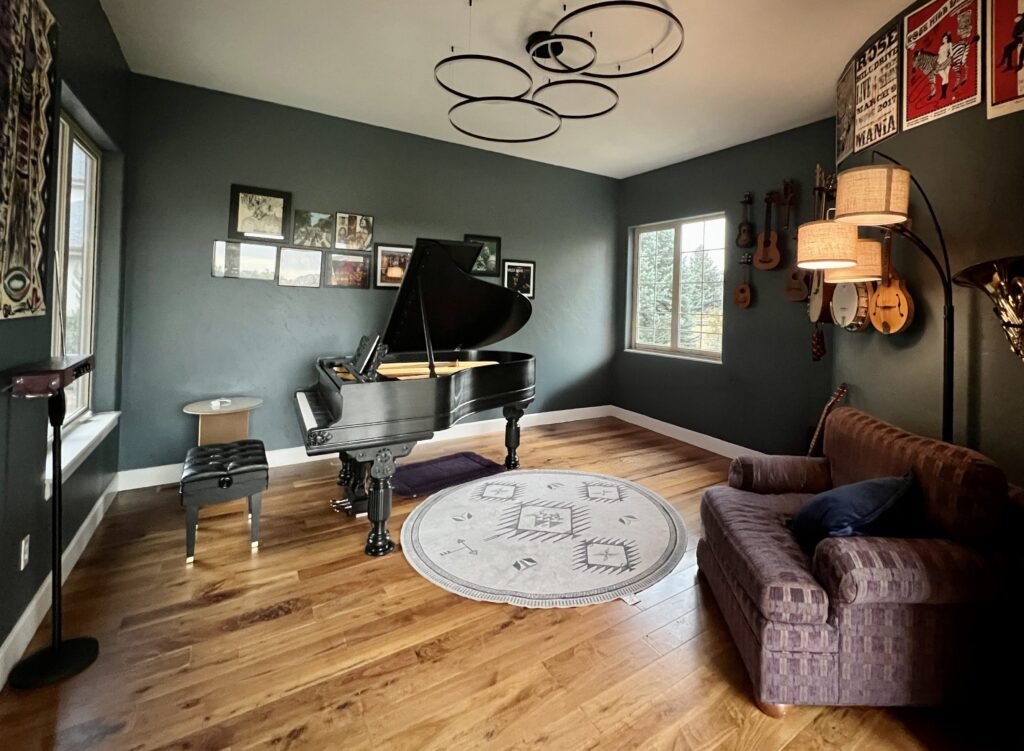
My colleague Maddie worked on choosing paint colors for her sister Kathryn’s home and selected Benjamin Moore Blue Spruce for her music room – a living room-style space within her home (pictured below).
Check out how beautiful it looks with the Blue Spruce trees just outside the window on the right. Benjamin Moore really captured one of the color of nature.
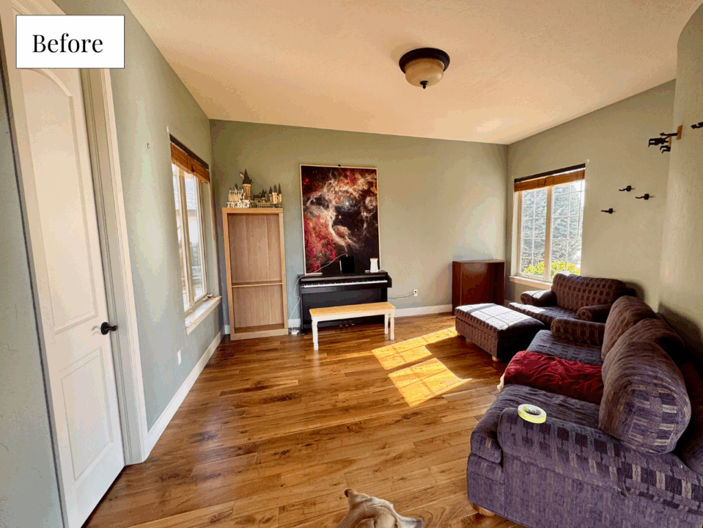
This room was beautiful before painted with a light green color, as seen below, but the Blue Spruce walls really bring this space to life!
I love the way the dark wood grand piano looks alongside the Blue Spruce walls – it’s a truly beautiful combination!
After working on this project, Maddie had a lot to say about Benjamin Moore Blue Spruce – and even used it in her own home:
I LOVE Blue Spruce! It is rich without being too intense, and has depth without being too dark. I painted it in my half bathroom, which had these earthy floors I never liked much, and it made the room feel so much more rich, updated, and intentional. It’s just a gorgeous color to look at.
It pairs beautifully with warm and earthy finishes like wood and stone, but it also looks sleek and elegant with cleaner finishes like white tile and black hardware.
Kathryn painted Blue Spruce in her music room, and it is a stunning backdrop for the grand piano. In her more traditional home, it really added an updated look. She loves the color in her music room because it “gives [her] a nice, calm space to make music.”

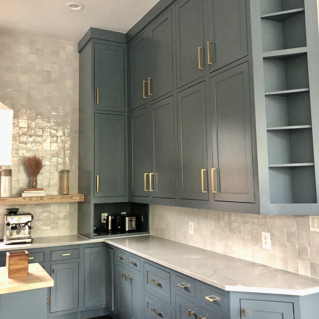
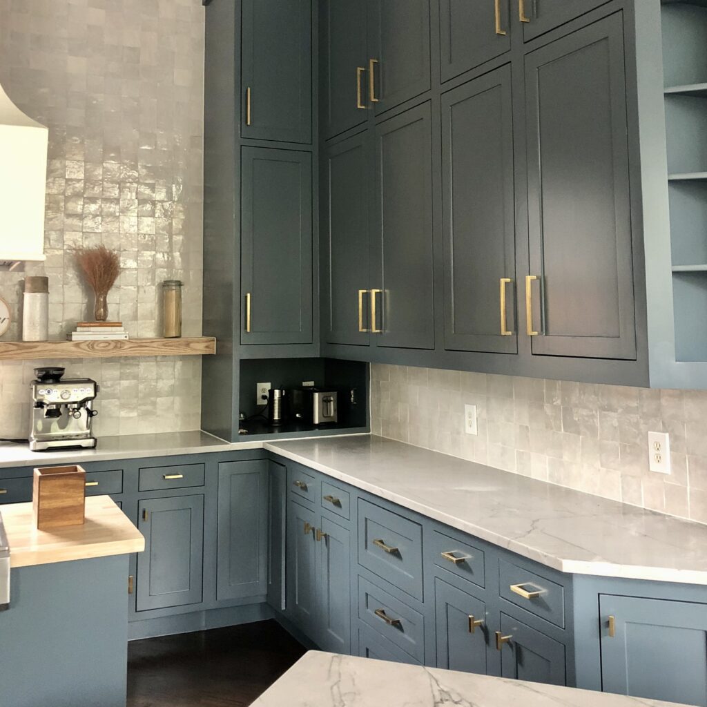
Should I try BM Blue Spruce kitchen cabinets?
Blue Spruce cabinets are one of our favorite uses of this color. If you want colorful kitchen cabinets that aren’t too bright or too dark, Blue Spruce cabinets could work beautifully.
In our client’s kitchen below, Blue Spruce cabinets look seriously gorgeous alongside organic, off-white tile. This room was designed in collaboration with Dianne Cairoli Interiors for her own kitchen! I love the way all of the cabinets are painted with Blue Spruce, wrapping the room in color.
But you could also use Blue Spruce lowers in a tuxedo kitchen color scheme or use it for an eye-catching island.
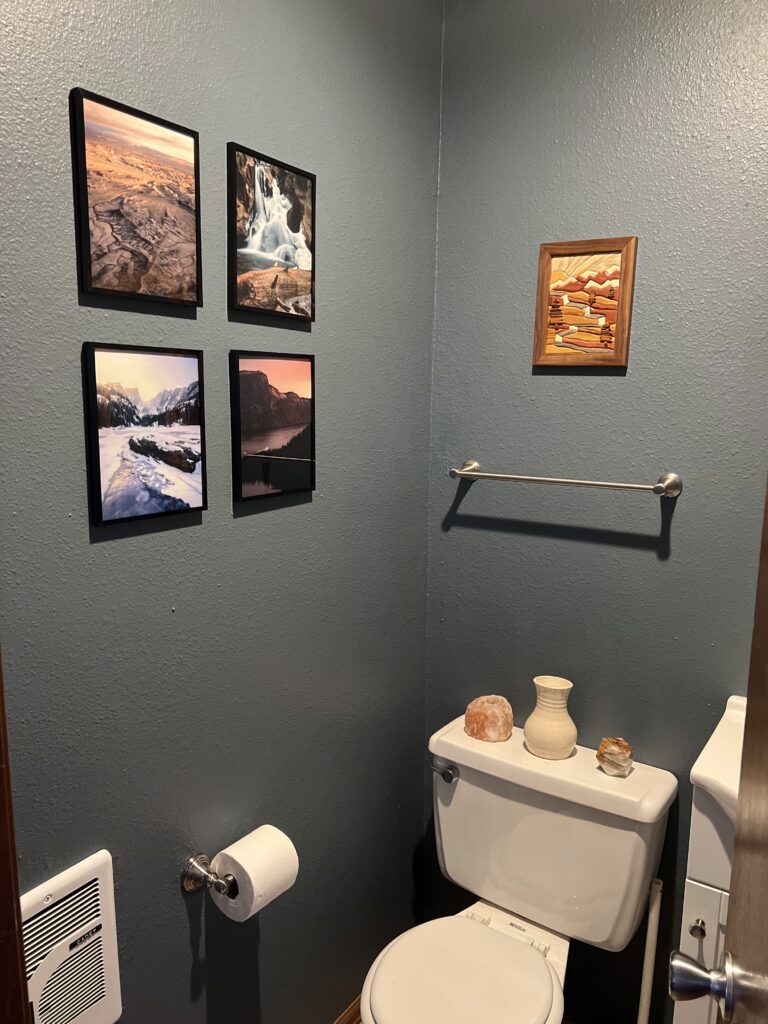
Is a Blue Spruce bathroom a good idea?
Yes, I love the idea of creating a Blue Spruce bathroom. Bathrooms and powder rooms (Article) are excellent places to use accent hues within a whole-home color scheme. Our client’s bathroom, pictured below, looks absolutely stunning, painted with Blue Spruce.
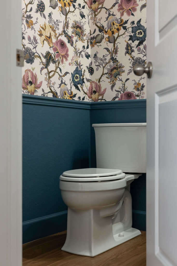
I could also see using this color for wainscoting with gorgeous wallpaper for a powder room, similar to what we did with Benjamin Moore Bella Blue (Article) in my own powder room (pictured below).
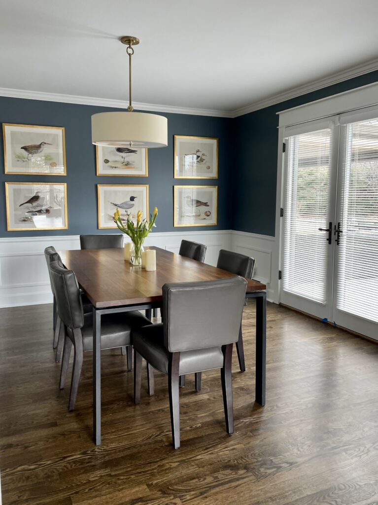
Can I paint a BM Blue Spruce dining room?
A Blue Spruce dining room would be lovely. You could consider drenching all the walls in this rich color or pairing Blue Spruce walls with white wainscoting. We created a similar look in our client’s dining room below with BM Britannia Blue (Article) paint, which is a very similar hue.
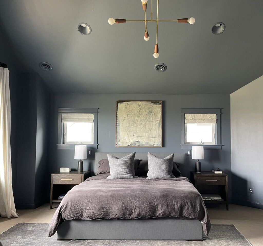
Is BM Blue Spruce good for color drenching?
Yes! I love the idea of color drenching (Article) a space with Blue Spruce paint. This would look really beautiful for an office, library or any other smaller room. You can paint the walls, trim and ceiling with Blue Spruce paint or leave the trim white, which is a slightly less dramatic form of color drenching that we’ve been seeing lately.
Blue Spruce color drenching would resemble this bedroom, which is painted in SW Granite Peak (Article), from our client’s home.
What sheen should I use for Blue Spruce paint?
When painting your walls a dark color like Benjamin Moore Blue Spruce paint, it’s important to use a flat or matte paint sheen. Anything glossier will look too shiny and make it hard to really see the color, almost as if the wall were backlit.
Using BM Blue Spruce Exterior Paint
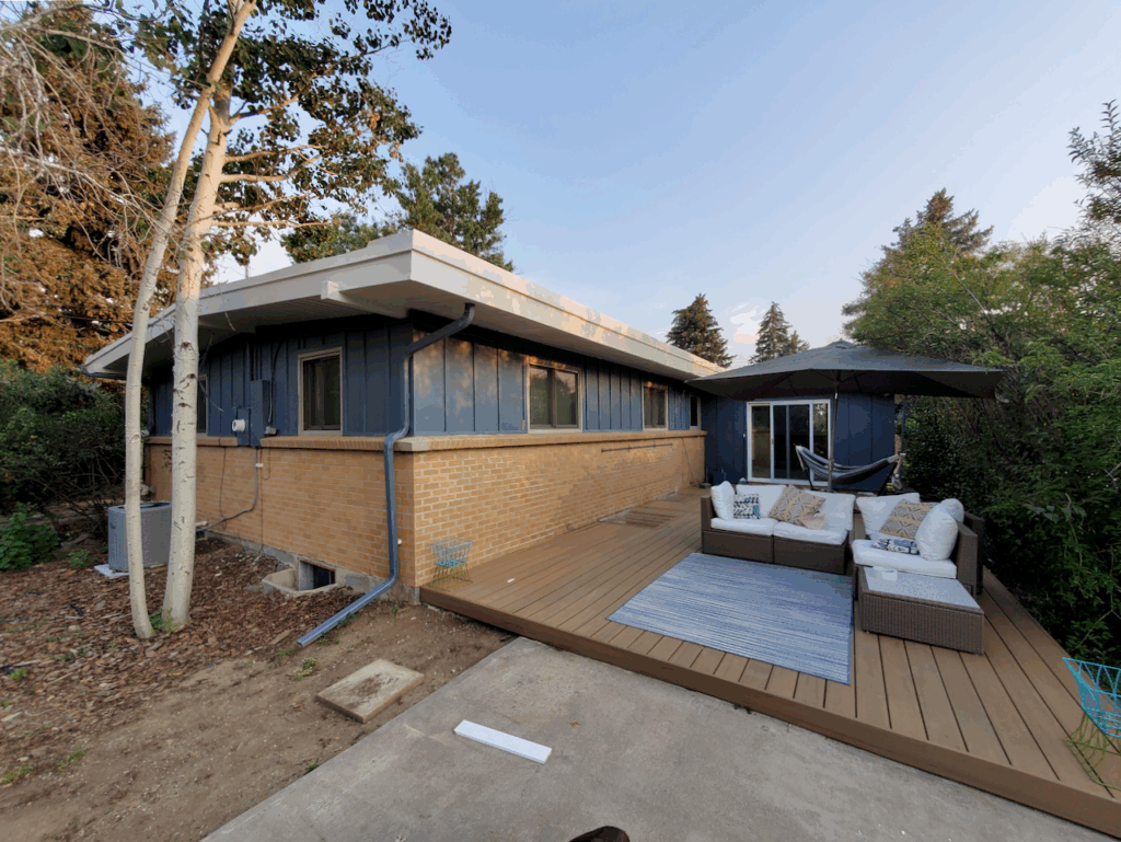
Blue Spruce is a gorgeous option for exterior paint and one of our favorite blue exterior paint colors (Article). It’s dark and muted enough that it won’t look too bright in the sunlight. Instead, the bright sunshine will help bring this hue to life and really help its color shine.
We painted the client’s home below with Sherwin-Williams Granite Peak (Article) paint, which looks very similar to Blue Spruce outdoors. The blue-green hue looks absolutely gorgeous as exterior siding and pairs really well with the home’s warm stone and warm wood deck.
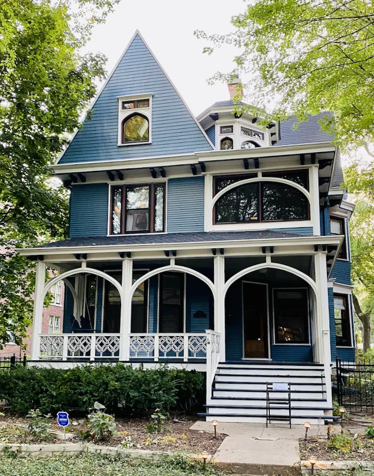
Benjamin Moore Thousand Oceans is another similar paint color we’ve used for exteriors. Blue Spruce exterior paint would look very similar. We used Thousand Oceans on a beautiful painted gentleman Victorian home (Article; pictured below), paired with BM Hale Navy and BM Forest Brown accents and BM White Dove trim. This home looks like a gorgeous gem in the neighborhood!
Best Blue Spruce Coordinating Colors
Blue Spruce is a surprisingly versatile color that pairs well with many different hues. Some of our favorite combinations are below.
Does Blue Spruce go with purple?
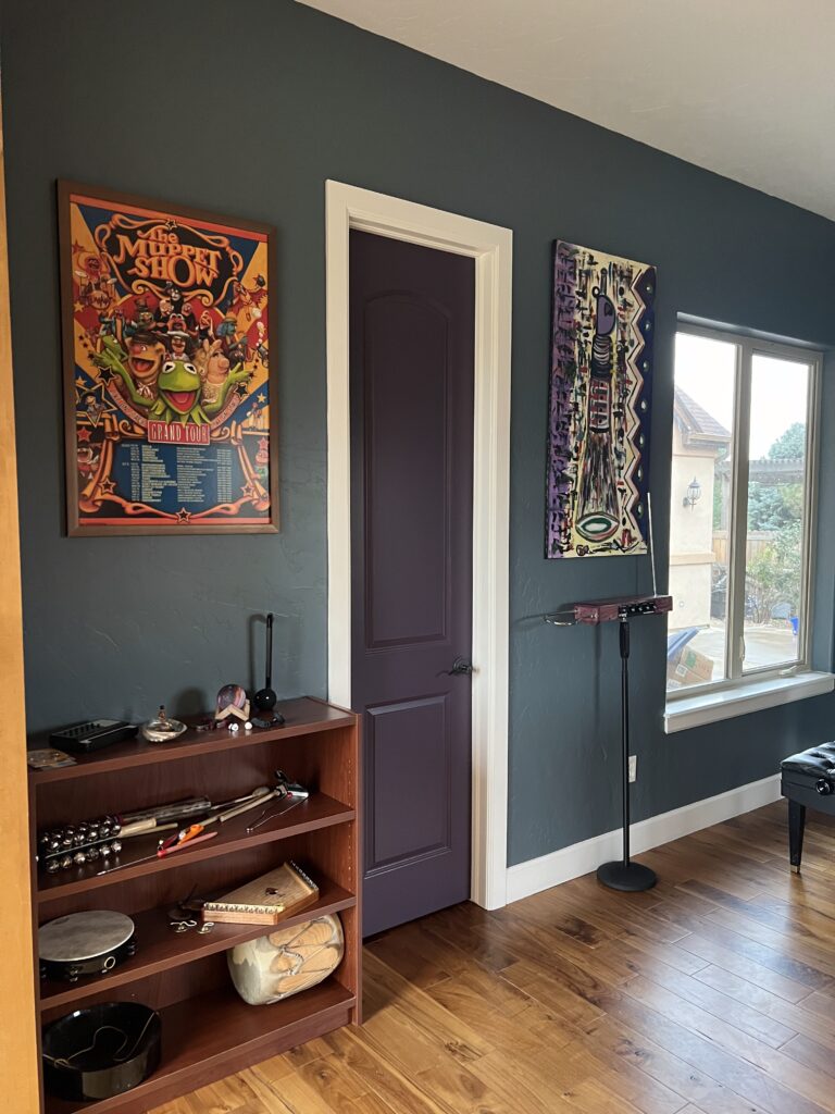
Blue-green paint and purple? This is a pairing you may not have considered but gosh, it’s gorgeous! In Maddie’s sister’s home, one of the most beautiful choices they made was to paint a BM Grappa (Sample) door in the Blue Spruce music room.
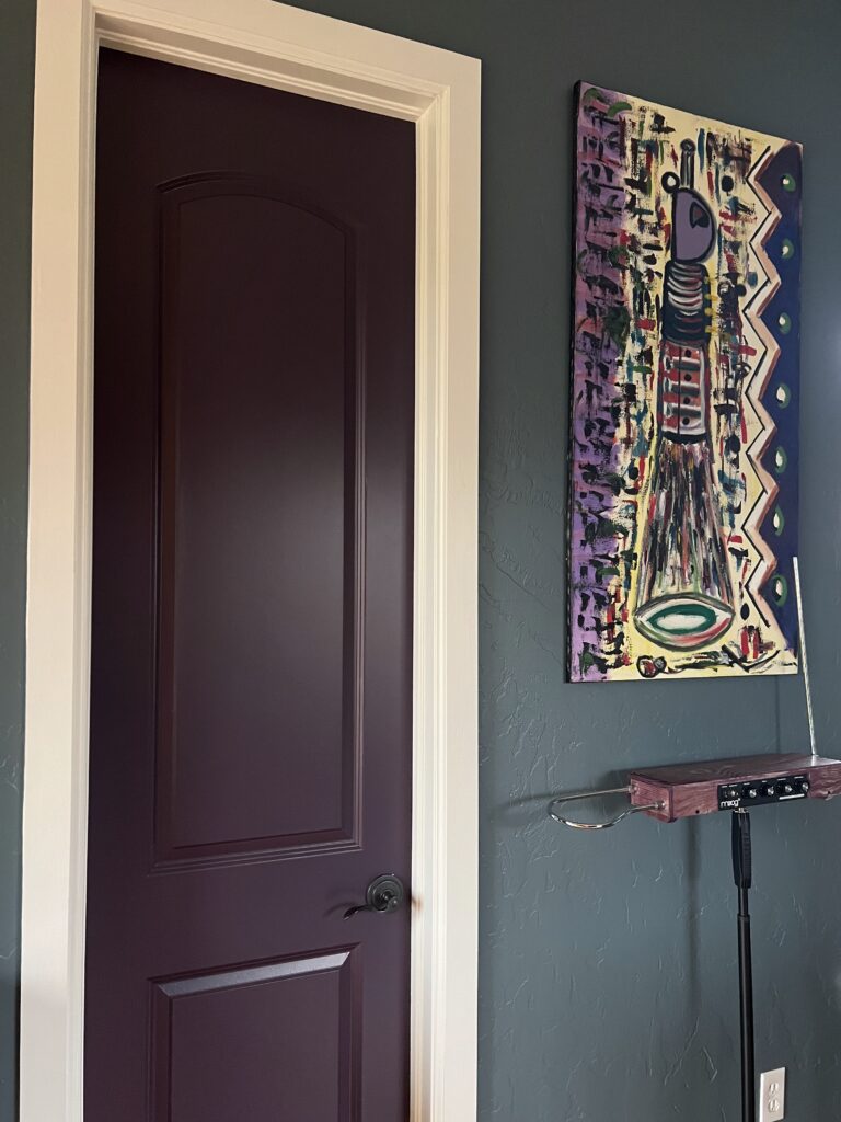
The deep, dark purple hue of the door looks absolutely breathtaking alongside the Blue Spruce walls. It also reflects the muted purple hue of the furniture in the room, tying the whole space together.
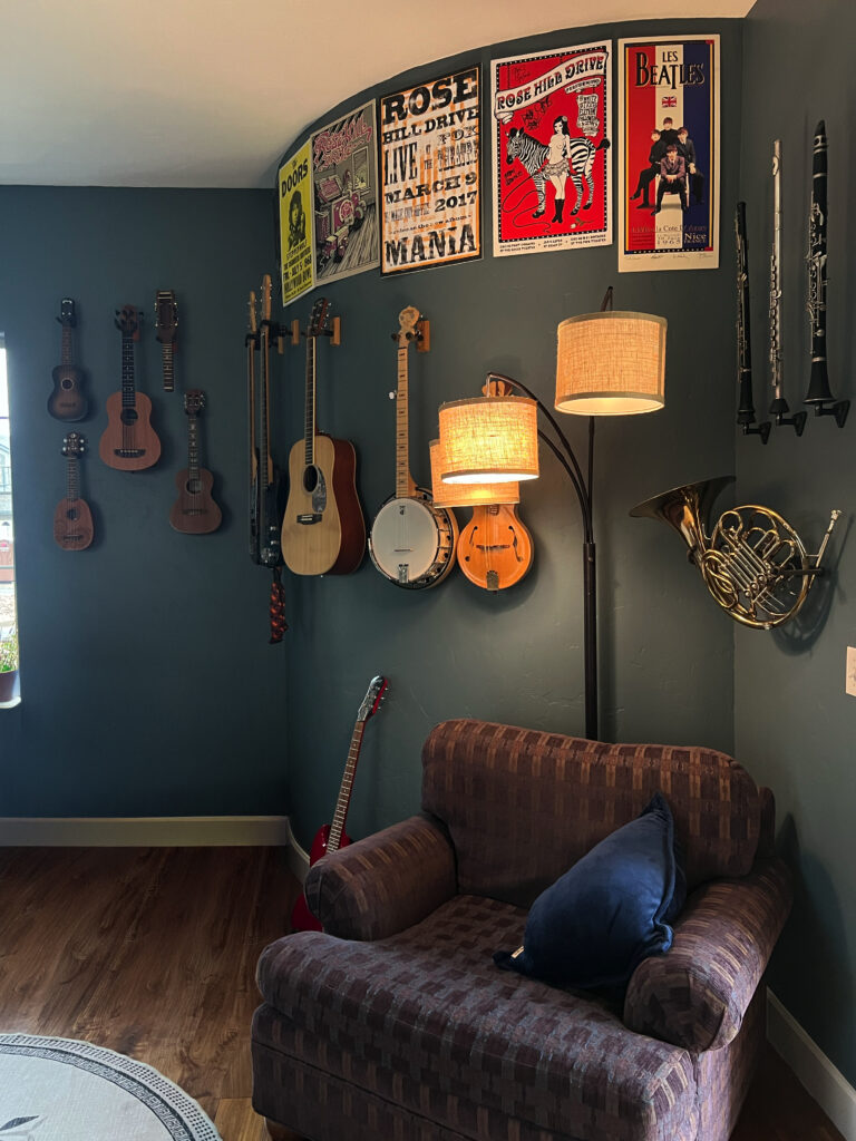
Does BM Blue Spruce go with wood?
Blue Spruce paint looks amazing alongside natural wood tones. Whether you have wood floors or, like Kathryn’s home, a dark coffee-colored wood piano, Blue Spruce complements these features really well.
Does Blue Spruce go with gold?
Blue Spruce paint looks gorgeous with champagne or gold fixtures and decor. If you want to paint Blue Spruce cabinets, for example, pairing them with gold knobs and drawer pulls is a beautiful look. We used this combination in our client’s kitchen, pictured below. The gold fixtures really bring the blue-green cabinets to life.
What are the Best Interior Trim and Ceiling Colors For Benjamin Moore Blue Spruce?
When we’re painting with a dark color like Benjamin Moore Blue Spruce, we like to use a darker, warmer white for trim and ceilings. In the client’s room below, the trim is Benjamin Moore White Dove (Article). BM Swiss Coffee (Article) trim would also look really lovely with this color.
I’d recommend avoiding cooler, starker white trim if you’re starting from scratch. But if your space already has cooler white trim like Sherwin-Williams Extra White (Article) (the most popular trim color in the U.S.), it can still work with Blue Spruce walls.
Best Benjamin Moore Blue Spruce Alternatives
Not sure if BM Blue Spruce is right for your project? Explore the color comparisons below to see how it compares to other popular blue-green paint colors.
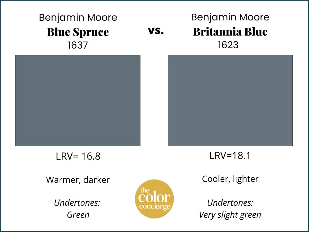
BM Blue Spruce vs BM Britannia Blue
Britannia Blue (Article) and Blue Spruce are very similar, but Britannia Blue is a bit lighter, bluer and cooler than Blue Spruce. It’s also more muted.
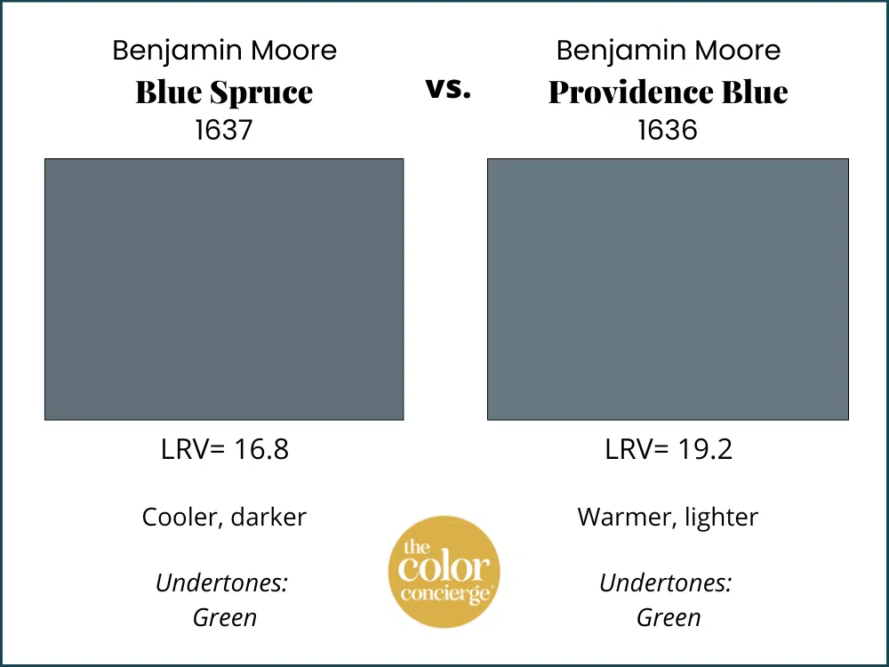
BM Blue Spruce vs BM Providence Blue
Benjamin Moore Providence Blue (Sample) is similar to Blue Spruce but greener and warmer. Providence Blue is also slightly lighter than Blue Spruce, with an LRV of 19.2.
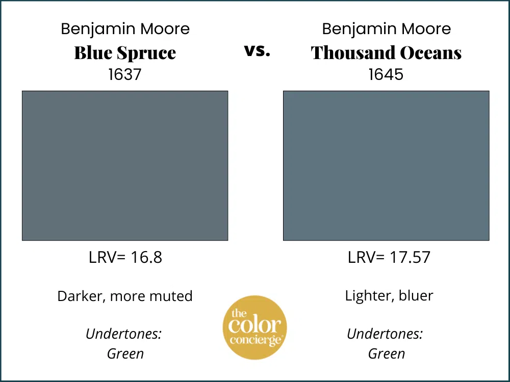
BM Blue Spruce vs BM Thousand Oceans
Benjamin Moore Thousand Oceans (Sample) is another very similar paint color. This hue is a bit lighter and brighter than Blue Spruce, and actually looks a bit bluer and cooler in place.
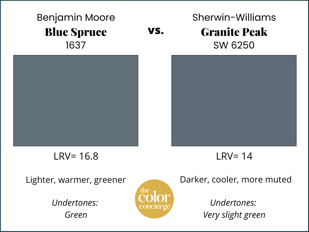
BM Blue Spruce vs SW Granite Peak
Sherwin-Williams Granite Peak (Article) is basically the Sherwin version of Britannia Blue. It’s darker than Blue Spruce, with an LRV of 14, and much cooler, with only slight green undertones.
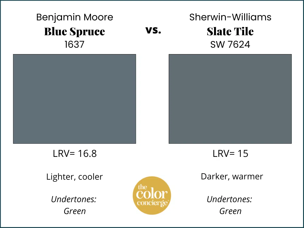
BM Blue Spruce vs SW Slate Tile
Sherwin-Williams Slate Tile (Sample) is the closest matches for Benjamin Moore Blue Spruce. It’s just slightly darker than Blue Spruce, with an LRV of 15 and a bit warmer, with stronger green undertones.
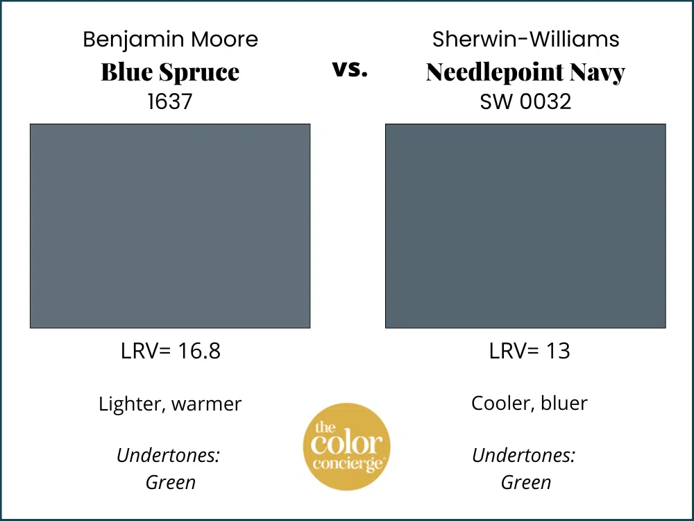
BM Blue Spruce vs SW Needlepoint Navy
Sherwin-Williams Needlepoint Navy (Sample) is a gorgeous blue-green paint color that is a close match for BM Blue Spruce. It’s darker, with an LRV of 13, and a bit cooler.
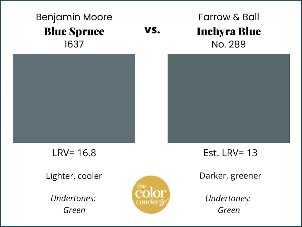
BM Blue Spruce vs Farrow & Ball Inchyra Blue
Farrow & Ball Inchyra Blue (Sample) is another gorgeous blue-green paint color. It’s much greener than Blue Spruce and darker, with an LRV of 13.
Key Learning Points
Benjamin Moore Blue Spruce is a beautiful, dark blue-green paint color perfect for interior and exterior applications.
- BM Blue Spruce is dark, with an LRV of 16.81, but has enough color that it won’t risk looking black indoors.
- Blue Spruce paint is a gorgeous accent color for a whole-house paint color scheme. Use it for accent walls, whole accent rooms, cabinets, and even color-drenching.
- Blue Spruce paint looks best paired with darker, creamier white trim and ceilings. BM White Dove or BM Swiss Coffee are two great options.
- The closest Sherwin-Williams color is Slate Tile, though its not quite as light and clean as Blue Spruce.
- Farrow and Ball Inchyra Blue is very close to Blue Spruce.
Remember: NEVER, EVER use paint matches from a different brand than the one specified. Results are poor and there are no standards for the sheens. Even though your painter may truly believe it can be done, don’t do it. See results from paint matching here.
No matter what, always test your paint colors. It’s a standard best practice. Whenever I test my paint colors, they are perfect, and when I don’t test they turn out wrong. Learn how to test your paint colors here.
Online Color Consulting
Still need help picking the best paint colors? Discover our Online Color Consulting Package.

Related Posts
- A Painted Gentleman Victorian Exterior Color Palette
- Benjamin Moore Britannia Blue Color Review
- Sherwin-Williams Granite Peak Color Review
- Best Blue-Gray Paint Colors
About the Author

Hi, I’m Michelle Marceny, founder, owner, and Principal Color Designer at The Color Concierge. I believe a fresh coat of paint can completely transform a space. The Color Concierge was born out of my drive to help clients fall back in love with their homes. My clients trust me to help them find the perfect paint color for their home – whether it’s a whole-house paint color scheme or ideas for a single room.
Since The Color Concierge was founded in 2017, we have completed over 3000 color consultations, both online and in-person. I am a Certified Color Expert with 7 years of experience creating interior and exterior color palettes throughout North America.
We love your comments! Please note that the blog is meant as general advice, and it is not possible to give out specific answers to your paint questions. If you want more specific advice, please consider purchasing a color consultation. Thank you for your understanding.
